A tour of the Leadenhall Building by Rogers Stirk Harbour + Partners
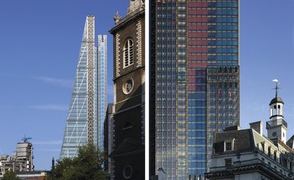
To the occasional visitor, London seems in a constant state of flux, with clusters of tower cranes, raw concrete cliffs of freshly cast cores, city-block sized excavations and miles of hoardings, covered in glossy images of a fast-approaching future. Yet real progress is slow. The new Leadenhall Building - now undergoing a lengthy interior fit-out - took over 12 years from conception to completion.
Rogers Stirk Harbour's latest tower is an unmistakable presence on the City skyline. It was back in 2001 that the site's owners, British Land, set up a competition to transform a humdrum 1960s building into one of the most desirable office addresses in the capital. The site's nearest neighbour is that icon of 1980s high-tech, Lloyds of London, Richard Rogers' immaculately tailored suit for the precise requirements of the 80s-era insurance market. Now Grade I listed and as iconic as any twentieth century building, Lloyds is far removed from the practice's latest structure.
There were plenty of conditions to fulfil in terms of heritage and economics. To achieve the necessary yields, British Land needed to build up to 224m high. But to preserve the views of St Paul's Cathedral, in particular from along Fleet Street, any new tower had to be as inconspicuous as possible. That's how the distinctive angled façade came about, as the tower 'leans back' from Sir Christopher Wren's definitive dome. Unsurprisingly, the £268m tower doesn't magically vanish as a result, but it's a welcome break from 'cigarette pack'-shaped convention.
At ground level, too, the two buildings represent changing design and planning priorities. Rogers laments that Lloyds was originally designed to integrate into its immediate surroundings, almost all of which have subsequently been redeveloped. In contrast, Leadenhall is all about the public realm. By raising the tower up by up to 28m above a new half-acre plaza, RSH has contributed a healthy chunk of space to the land-strapped City. The adjoining St Helen's Square is currently undergoing major refurbishment and the finished result will place the pedestrian in a angular glass and steel jungle, surrounded on all sides by the canted steel and curved glass of the modern era.
Leadenhall itself is tough, a welded gate compared to the filigree of Lloyds. A chunky steel frame supports the office floors, while at the rear a separate structure supports the lifts, which rise up through a polychromatic thicket of glass, beams, pulleys and shafts. There are shades of Mies' Lever House in the chunky steels at ground level, and the plaza with its Pret-gobbling points shielded from fumes and noise by giant slabs of glass, is certainly dramatic. But it's a box set binge, rather than a slow release of intrigue.
That long escalator rising up from the plaza is the start of the journey into a private realm, taking you into a sleek elevated lobby that feels detached from the street. A bevy of screens will soon scroll into life, pumping out facts, figures and snippets of news, while employee access is carefully controlled via what Graham Stirk refers to as 'iPod-like reception desks'.
This is a spec building - that is to say it wasn't designed with a tenant in mind. But no modern corporation wants a sub-standard HQ, so every aspect of the Leadenhall is tailored to perfection. The lift lobbies are striking for the purity of the detailing and the cars themselves are billed as the fastest panoramic lifts in the world. From lobby to 45th floor takes barely 30 seconds as you ascend, Iron Man-like, above the City. It'll be an addictive thrill for the new masters of the universe who'll be taking up big chunks of floorspace, including AON and Amlin Insurance. 6,000 people will eventually work here, filling these pristine spaces with office chairs and countless tons of electronics. The views, as you'd hope, are spectacular, looking south over Rafael Viñoly's still-controversial tower to the point of the Shard, or north past the Heron to the hills beyond.
Wallpaper* Newsletter
Receive our daily digest of inspiration, escapism and design stories from around the world direct to your inbox.
'This is a private building that has a fantastic piece of public space at the ground floor,' says Rogers, explaining how the constraints of planning, the willingness of clients and the ongoing march of technology has shaped this new addition to the skyline. Yet for all the pointy-edged drama of the tower itself, the Leadenhall's lasting legacy (apart from bringing the name 'cheesegrater' into architectural parlance) will be that plaza. For the first time, pedestrians can stand back and see the perpetual animation of the Lloyds façade, the silvery elevator pods sliding up and down the stainless steel surfaces. Rogers could never have foreseen that this piece of street theatre would one day be a backdrop for one his practice's most prominent new buildings.
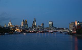
The building - now undergoing a lengthy interior fit-out - took over 12 years from conception to completion
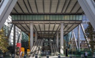
By raising the tower up by up to 28m above a new half-acre plaza, Rogers Stirk Harbour have contributed a healthy chunk of space to the land-strapped City
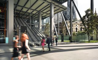
The adjoining St Helen's Square is currently undergoing major refurbishment and the finished result will place the pedestrian in a angular glass and steel jungle, surrounded on all sides by the canted steel and curved glass of the modern era
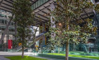
'This is a private building that has a fantastic piece of public space at the ground floor,' says Rogers, explaining how the constraints of planning, the willingness of clients and the ongoing march of technology has shaped this new addition to the skyline
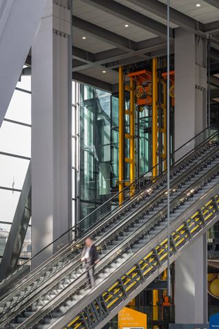
That long escalator rising up from the plaza is the start of the journey into a private realm, taking you into a sleek elevated lobby that feels detached from the street
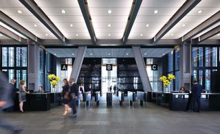
Employee access is carefully controlled via what Graham Stirk refers to as 'iPod-like reception desks'
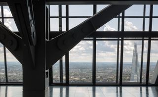
The new masters of the universe will be taking up big chunks of floorspace, including AON and Amlin Insurance. 6,000 people will eventually work here, filling these pristine spaces with office chairs and countless tons of electronics
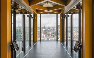
The views, as you'd hope, are spectacular, looking over St Paul's Cathedral, Rafael Viñoly's still-controversial tower, and towards the point of the Shard
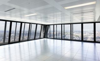
Office space with panoramic views
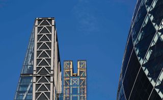
A chunky steel frame supports the office floors, while at the rear a separate structure supports the lifts, which rise up through a polychromatic thicket of glass, beams, pulleys and shafts
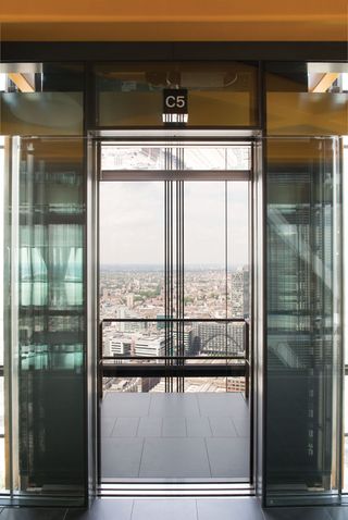
The lifts are billed as the fastest panoramic elevators in the world. From lobby to 45th floor takes barely 30 seconds as you ascend, Iron Man-like, above the City
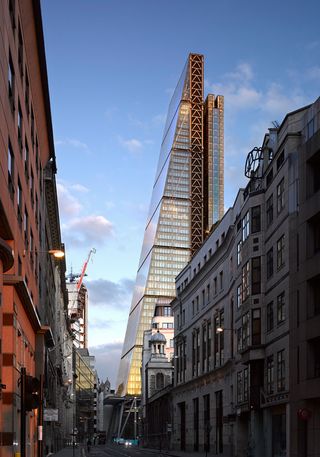
For all the pointy-edged drama of the tower itself, the Leadenhall's lasting legacy (apart from bringing the name 'cheesegrater' into architectural parlance) will be that plaza at its base
Jonathan Bell has written for Wallpaper* magazine since 1999, covering everything from architecture and transport design to books, tech and graphic design. He is now the magazine’s Transport and Technology Editor. Jonathan has written and edited 15 books, including Concept Car Design, 21st Century House, and The New Modern House. He is also the host of Wallpaper’s first podcast.
-
 A celestial New York exhibition showcases Roman and Williams’ mastery of lighting
Lauded design studio Roman and Williams is exhibiting 100 variations of its lighting ‘family tree’ inside a historic Tribeca space
By Dan Howarth Published
-
 ‘He immortalised the birth of the supermodel’: inside Dior’s career-spanning retrospective of photographer Peter Lindbergh
Olivier Flaviano, curator and head of Paris’ La Galerie Dior, talks us through a new Peter Lindbergh retrospective, which celebrates the seminal German photographer’s longtime relationship with the French house
By Jack Moss Published
-
 Take a bite: Laila Gohar and The Luxury Collection’s ‘Cakes & Candles’ are a sweet treat for the senses
Laila Gohar’s six cake-inspired candles draw on The Luxury Collection’s hotels around the world – where guests can enjoy matching edible confections
By Tianna Williams Published
-
 East London's disused gasholders are being reinvented
Regent's View by RSHP reinvents a pair of disused gasholders in east London as contemporary residential space and a publically accessible park
By Ellie Stathaki Published
-
 Richard Rogers exhibition delves into the architect’s ideas at Chateau La Coste
A new Richard Rogers exhibition created by Ab Rogers opens at the late architect’s final design, the Drawing Gallery at Chateau La Coste in France
By Ellie Stathaki Published
-
 Step inside No. 33 Park Row’s Penthouse 3 by RSHP in New York
We offer a sneak peek inside Penthouse 3 at No. 33 Park Row by RSHP in New York
By Ellie Stathaki Published
-
 RSHP: a new name for a new era of collaborative design
Rogers Stirk Harbour + Partners rebrands as RSHP, heralding a new era of collaborative design for the architecture practice, following Richard Roger's passing in 2021
By Jonathan Bell Last updated
-
 Airport jetty by RSHP provides a polychromatic welcome to Switzerland
The Aile Est, or East Wing, at Geneva Airport, a dramatic, polychromatic jetty, is the newest project by Rogers Stirk Harbour + Partners in Switzerland
By Jonathan Bell Last updated
-
 Remembering Richard Rogers (1933 – 2021)
We celebrate the life and career of Richard Rogers, one of the most influential architects of our era and winner of the 2007 Pritzker Prize, who passed away on 18 December 2021 at age 88
By Jonathan Bell Last updated
-
 No. 33 Park Row: RSHP's first New York residential project completes
No. 33 Park Row is Rogers Stirk Harbour + Partners' first foray into residential architecture in New York
By Ellie Stathaki Last updated
-
 How Rogers Stirk Harbour + Partners built The Macallan’s Speyside distillery
Look back at the journey behind the creation of the award-winning The Macallan Distillery in Scotland’s Speyside, by renowned architecture studio Rogers Stirk Harbour + Partners
By Simon Mills Published