Bernard Tschumi Q&A exclusive
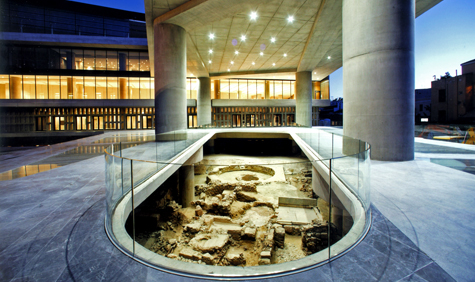
After nearly 30 years of planning, and eight years since the international competition was launched for the project, the New Acropolis Museum in Athens is ready: the collections are carefully being moved in as we speak, and the official opening is expected with much anticipation towards the end of the year.
Proudly headed by architect Bernard Tschumi, the new museum project team also comprises local architect Michael Photiadis and the museum’s director Professor Dimitrios Pandermalis, who showed us around the new bright and airy building, where we had the chance to meet Swiss-born Tschumi, and discuss his concept, the design, Athens and the Parthenon sculptures.
Click here to see the New Acropolis Museum.
Describe the building – how does it work?
The building has two layers; one leads to the excavations. It is quite unusual that you actually have to save and show the finds, so the whole building is on stilts. The ground floor is really structured so as to reveal the excavations, which is why you have all the glass, including the glass ramp leading to the galleries.
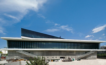
The second layer has all the sculptures and the artefacts related to the Acropolis. This part of the building, its geometry, follows the street’s geometry and pattern. But the top room, the glass enclosure, is really all about the Parthenon – it is absolutely parallel to it. This is why the building makes this strange shift on the top floor, and why the corners seem to stick out over the street.
The whole shape comes out of the conditions of the brief and our solution. We started from that shape and everything proceeded from there. We made it as minimal as possible, in terms of form as well as material, as we did not want to compete with the Parthenon. There were people who advocated that the New Museum should be in the style of the Parthenon; I always say that I did not want to imitate Phidias, but to think like Pythagoras. In other words, think of mathematics and master geometry, and start from a level of abstraction.
Wallpaper* Newsletter
Receive our daily digest of inspiration, escapism and design stories from around the world direct to your inbox.
What are the main materials used?
The materials are very simple: glass, concrete, and steel. Inside it is marble, glass and concrete. The main structure is reinforced concrete.
What lead you to this choice of material?
The concrete I chose is really soft, so it absorbs the light. The sculptures, the real ones, not the copies, are made of marble, which reflects the light. This combination makes the exhibits stand out, which is why I selected it. This is clear in the top room, but also in the sculpture rooms with the big concrete columns; they bring out the sculptures’ detailing, making them look alive.
Did your main idea, the concept and the shape of the building evolve and change a lot during the design process?
Yes, but surprisingly little. You know, sometimes we are lucky and we get it straight away. Even when they found more excavations, we just continued with the same concept, it just worked; we didn’t even have to revise it.
Certain things of course evolved – and these were mainly the exhibits’ layout within the space. Of course we included the sculptures in the plans from the time of the competition, but now that we are putting them in their place and not on a piece of paper, we notice things that would work better, so some have been moved.
What kind of special technology was needed for the building design?
There are two things, which were technologically important for the building, and they have to do with the location, Athens. One is that this is an earthquake country, and the other is that it can get quite hot. The earthquake part means that we had to devise the building in such a way as to include the latest technology. Instead of making the building as heavy as possible, as was the usual practice until recently, we made the structure as subtle and flexible as possible.
This museum is done with the latest earthquake protection technology, developed in the last 20 years from our experience in Japan and California, called Base Insulation System. The lower part of the building is anchored into the ground, but the upper part is actually separated from it by a sort of cushion, like ball bearings, so that the upper part can move separately from the lower part.
The second technical aspect is the glass skin. There is a gap between the double-glazing of the top floor, so the hot air from the galleries circulates through the glass wall gaps, via the ceiling and ends up in the basement, where it is cooled and brought back up in the galleries. We recycle the air all the time to help keep the temperature stable and cool.
How eco-friendly and sustainable is the building?
Museums are never your perfect, sustainable buildings as there are always difficult and special conditions in the brief for preserving the exhibits. Nevertheless the architects can always help as much as possible towards sustainability through design, and that is exactly what we did by recycling the air. We filter it, cool it and recycle it, so we use the least air conditioning possible. The floor itself is marble, so it is also very cool naturally.
The project is very well known, of course, because of the Acropolis, but it is also one of the few projects built by an international architect in Greece. How do you feel about building in Athens?
I don’t think much about being an international architect in Athens per se, but being able to build the closest new building next to the Parthenon, of course is terribly important to me! You have to be very humble and very arrogant at the same time to go through with something like that. This is one of the masterpieces, probably the masterpiece, of ancient architecture, and building next to it, establishing a dialogue with it is very important.
Even though it has concrete structure, the glass makes it a very discreet building. Was that you intention?
Yes, that is exactly what I wanted. And the skylights – you hardly see them. Everything was planned to be as minimal as possible.
The building reminded me of Greek modernist architecture, like the Karantinos-designed Aristotle University buildings, and Aris Konstantinides’ work. Was the design influenced by particular architectural styles or philosophy?
When you decide to search for clarity, for simplicity and put the emphasis on the purity of materials, like I did here, inevitably you will touch upon some other sensibilities that dealt with the same issues.
And there are moments in 20th-century architecture that have done this. Of course they did it slightly differently, for example the slight shift of the upper floor; nobody in the 1970s would have done that. But the minimalism of it, yes, it happened. And I don’t have a problem with that – we don’t live in a vacuum, buildings and styles evolve over centuries, so I am quite happy with it. It means the building is connected with the history, it has evolved in the same way as the Parthenon evolved from a generation of temples before.
Do you feel your architecture, the way you treat buildings, is changing a lot from one project to the next?
Yes and no. It is not about style. But conceptually, there is a very strong coherence in the way I approach the projects. I will always say that the most important thing is the idea. The building itself is just the translation of the concept. So was La Villette, so was a major auditorium I did in France, buildings I did in the US etc.
I always use the materials rather than the forms in order to give expression to a building. I always say 'Architecture is the "materialisation" of a concept'. It is always very much about a logic, as well as the simplicity and the clarity of the expression. So if La Villette and this building have something in common, it is the clarity of the concept.
It is never about fancy shapes, and there is a reason for that. In a way this case is the opposite of Bilbao. Bilbao was a city that didn’t have much of a presence, and for its art museum there were no sculptures to start with. While here, with the Parthenon next door, you build in a relationship with what is already here. You react in different ways for different situations, and it is always a case of translating an idea. That is how I see every one of my projects.
And the question on everyone’s lips; what is your position on the return of the Parthenon marbles?
You would rightly assume that I do support their return. In fact I am absolutely convinced that the marbles will come back. Of course they will. Now that the building is finished and everybody will be able to see the quality of light that you get here, and the way they will be displayed here compared to the way they are displayed in the British Museum, their return will make sense straight away.
Ellie Stathaki is the Architecture & Environment Director at Wallpaper*. She trained as an architect at the Aristotle University of Thessaloniki in Greece and studied architectural history at the Bartlett in London. Now an established journalist, she has been a member of the Wallpaper* team since 2006, visiting buildings across the globe and interviewing leading architects such as Tadao Ando and Rem Koolhaas. Ellie has also taken part in judging panels, moderated events, curated shows and contributed in books, such as The Contemporary House (Thames & Hudson, 2018), Glenn Sestig Architecture Diary (2020) and House London (2022).
-
 In search of a seriously-good American whiskey? This is our go-to
Based in Park City, Utah, High West blends the Wild West with sophistication and elegance
By Melina Keays Published
-
 Esperit Roca is a restaurant of delicious brutalism and six-course desserts
In Girona, the Roca brothers dish up daring, sensory cuisine amid a 19th-century fortress reimagined by Andreu Carulla Studio
By Agnish Ray Published
-
 Bentley’s new home collections bring the ‘potency’ of its cars to Milan Design Week
New furniture, accessories and picnic pieces from Bentley Home take cues from the bold lines and smooth curves of Bentley Motors
By Anna Solomon Published
-
 Out of office: coffee and creative small talk with Tatiana Bilbao
Bodil Blain, Wallpaper* columnist and founder of Cru Kafé, shares coffee and creative small talk with leading figures from the worlds of art, architecture, design, and fashion. This week, it’s Mexican architect Tatiana Bilbao, who is currently designing a brutalist, ethical aquarium in Mazatlán and has an exhibition at Copenhagen's Louisiana Museum of Modern Art opening in October 2019
By Bodil Blain Last updated
-
 At home with Deborah Berke
Architect Deborah Berke talks to us about art, collaboration, climate change and the future, from the living room of her Long Island home
By Ellie Stathaki Last updated
-
 Rheaply redefines circular economy in architecture
On Earth Day 2022, we speak to Rheaply founder Garry Cooper Jr about his innovative business that tackles reuse and upcycling in architecture and construction
By Ellie Stathaki Last updated
-
 Paolo Soleri's sustainable urban experiment Arcosanti enters new era
We meet Liz Martin-Malikian, Arcosanti’s new CEO, who takes us through the vision and future for Paolo Soleri's sustainable urban experiment
By Hilary Stunda Last updated
-
 International Women’s Day: leading female architects in their own words
International Women’s Day 2022 and Women’s History Month: Wallpaper* talks to four leading female architects about dreams, heroines and navigating the architecture world
By Harriet Thorpe Last updated
-
 Sou Fujimoto judges Wallpaper* Design Awards 2022
We chat with Wallpaper* Design Awards 2022 judge Sou Fujimoto about his work in Japan and abroad, and our shortlisted designs and winners
By Jens H Jensen Last updated
-
 Dream the Combine cross-pollinates and conquers
The American Midwest is shaking up the world of architecture. As part of our Next Generation 2022 project, we’re exploring ten local emerging practices pioneering change. Here we meet Minneapolis duo Dream the Combine
By Ellie Stathaki Last updated
-
 Architecture in the words of Paulo Mendes da Rocha
Great modernist Paulo Mendes da Rocha passed away on 23 May 2021 aged 92. Here, we revisit the interview he gave Wallpaper* in 2010 for our Brazil-focussed June issue, talking about architecture, awards and his home country
By Isabel Martinez Abascal Last updated