Separate spaces: Diller Scofidio + Renfro’s new Stanford building is a marvel

Although Diller Scofidio + Renfro's museum commission, The Broad, nearly broke the internet when it opened last month, the new 100,000 sq ft McMurtry Building they designed to house Stanford University's Department of Art & Art History is an architectural marvel in its own right.
'We've been working in the arts and academia for some time,' says partner Charles Renfro, referring to the Institute of Contemporary Art, Boston and the Brown University Creative Arts Center. In the latter, the New York-based firm made a building that was offset by half a floor from one side to the other, essentially creating one continuous space. 'The building acted as a protagonist to the creation of work. It not only demonstrated cross-disciplinary work with the flow of one space to another, it also assisted in the creation of projects that take advantage of the continuous space,' adds Renfro. 'That's where we started thinking about the Stanford project.'
After rounds of early meetings with the students and faculty, it quickly became clear to the MacArthur Genius Award-wining architects that the art-making and art history sides of the building had very different needs, while demanding equal but separate spaces. 'It occurred to us that we could make two separate buildings that would be roughly parallel, so apart but equal,' says Renfro, who took inspiration from the classic Stanford quadrangle design; green areas arcaded with the faces of surrounding buildings. 'We thought it would be interesting to arcade an outdoor space with the two programs in the building.'
As such, the two buildings intertwine in a 'productive face-off' via spiraling glass volumes that are meant to look like 'DNA strands' that wrap around each other diagonally, all while suspending a floating art and architecture library. Inside the spirals, there are also partially glazed windows that allow for serendipitous views into the respective spaces. In addition to the voluminous interiors – which will not only increase class offerings by 35 per cent but allow for art history students to work opposite practicing artists for the first time in the university's history – the firm doubled the outdoor space. There are glass garage doors on the shop and gallery that open to the main courtyard. The painting studios spill out onto the upper sunlit courtyard and even the classrooms have their own open air space, on the third floor, which can be utilised for al fresco lectures.
The separate but equal paradigm plays out on a material level as well, with the making side constructed of 'rough and tumble' exposed concrete walls, steel ceilings and white drywalls, while the art history strand features high tech lighting, projection and speakers in every room, carpeted floors and dropped ceiling (for acoustic absorption), sand stained wooden walls. 'It's a neutral color palette through that strand, 50 shades of gray,' jokes Renfro. Stanford wanted a contextual building that fit in with its vernacular architecture, so DS+R employed stucco on the facade of the art history strand while applying custom zinc panels to the outside of the making strand. They also wanted to make the ground floor interior courtyard 'feel like a room' by installing a warm wooden ceiling, like they did at the ICA, to warm up the sculpture critique and gallery spaces.
While students have been utilising the space for a few weeks, Renfro hopes they use it as a tool that expands their practice. 'There's a matter of dualism we like to bring in to all of our projects,' says Renfro. 'It's a much more casual but super-charged work environment.'
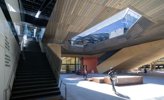
After meetings with the students and faculty, it quickly became clear to the architects that the art-making and art history sides of the building had very different needs, while demanding equal but separate spaces. Pictured: the interior courtyard and oculus

’It occurred to us that we could make two separate buildings that would be roughly parallel, so apart but equal,’ says Renfro. Pictured: classroom with retractable wall
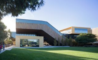
Renfro took inspiration from the classic Stanford quadrangle design; green areas arcaded with the faces of surrounding buildings. Pictured: exterior view of the McMurtry Building
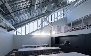
A classroom in the McMurtry Building
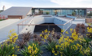
In addition to the voluminous interiors the firm doubled the outdoor space. Pictured: view of the upper courtyard
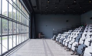
The interiors will increase class offerings by 35 per cent but allow for art history students to work opposite practicing artists for the first time in the university’s history. Pictured: flexible presentation space
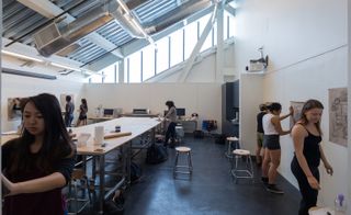
Classroom in the McMurtry Building
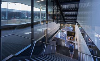
The two buildings intertwine in a ’productive face-off’ via spiraling glass volumes that are meant to look like ’DNA strands’ that wrap around each other diagonally. Pictured: view of stairwell
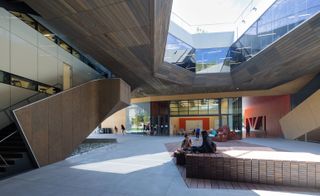
There are glass garage doors on the shop and gallery that open to the main courtyard. Pictured: view of interior courtyard
Wallpaper* Newsletter
Receive our daily digest of inspiration, escapism and design stories from around the world direct to your inbox.
-
 Audi launches AUDI, a China-only sub-brand, with a handsome new EV concept
The AUDI E previews a new range of China-specific electric vehicles from the German carmaker’s new local sub-brand
By Jonathan Bell Published
-
 Inside Izza Marrakech: A new riad where art and bohemian luxury meet
Honouring the late Bill Willis’ hedonistic style, Izza Marrakech fuses traditional Moroccan craftsmanship with the best of contemporary art
By Ty Gaskins Published
-
 Clocking on: the bedside analogue timepieces that won’t alarm your aesthetic
We track down the only tick-tocks that matter, nine traditional alarm clocks that tell the time with minimum fuss and maximum visual impact
By Jonathan Bell Published
-
 Discover Diller Scofidio + Renfro’s Blue Dream house in the Hamptons
A new monograph captures Blue Dream house and the lengthy design and construction process of a quintessential example of contemporary Hamptons architecture
By Jonathan Bell Published
-
 DS+R Prior Performing Arts Center is designed as a public commons
Prior Performing Arts Center by Diller Scofidio + Renfro completes at the College of the Holy Cross in Worcester, Massachusetts
By Stephen Zacks Last updated
-
 Diller Scofidio + Renfro: what’s next?
Diller Scofidio + Renfro announces the official openings and design launches of new buildings in Australia, Italy, China and the USA
By Pei-Ru Keh Last updated
-
 MoMA’s expansion by DS+R and Gensler prioritises connection
By Pei-Ru Keh Last updated
-
 Diller Scofidio + Renfro’s riverside park on London’s Greenwich Peninsula opens
By Ellie Stathaki Last updated
-
 The Shed at Hudson Yards unveiled in New York
By Pei-Ru Keh Last updated
-
 Our first look inside Fifteen Hudson Yards by Diller Scofidio + Renfro and Rockwell Group
By Ellie Stathaki Last updated
-
 V&A unveils two new designs for east London cultural hub
By Clare Dowdy Last updated