Beauty spot: Garcia Tamjidi crafts Kendo’s San Francisco offices
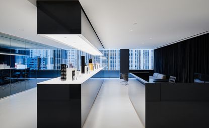
When Kendo, an LVMH beauty brand incubator based in San Francisco, needed to majorly expand into a new space, the company turned to local firm Garcia Tamjidi Architecture Design, known for its ethereally modernist work on projects as varied as the Parker Institute for Cancer Immunotherapy, residential jewel boxes dotted across the bay area and multiple tech offices for both startups and established firms. The people of Kendo, which is currently focused on six pillar companies – Marc Jacobs Beauty, Kat Von D Beauty, Ole Henriksen, Bite Beauty, Formula X and Fenty Beauty by Rihanna – hadn’t ever worked in a space dedicated to and designed explicitly for them. That’s where Garcia Tamjidi came in.
'They’re not retail, but we imported that retail look to energise the internal team,' says Farid Tamjidi. That retail look is centred on a massive, shiny black centrepiece of a long glowing table that appears in the reception area and is repeated in the cafe area directly opposite (a hallmark of the project is long views and repeated motifs). Before moving into their own full-floor office space, Kendo product managers were squeezed together, displaying products wherever they could – on conference tables, in spare hallways, on desks. Now, with the combination of this endlessly long table and the spotlit illumination that elevates products like the Kat Von D Beauty lipstick tubes and the Marc Jacobs Beauty limited edition nail lacquer, it feels like there’s something to really look at.
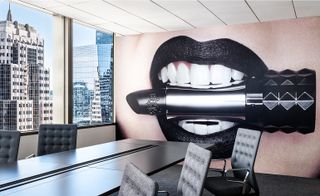
The architects worked on creating an office environment with an invigorating 'retail look'
'We also brought in graphics that reconfirm their cultural identity,' says Michael Garcia. Those graphic, massive print-outs glued to the wall (so they’re changeable along with the trends) help to give a sense of narrative momentum to the otherwise colour-neutral – black, beige, and white dominate – open office desking. Further pops are provided by bright flashes of coloured furniture in the lounge areas and small meeting spaces. 'You’re looking at patterns of windows and colours of glass on all four sides,' Tamjidi says of the views of downtown San Francisco that are visible from the clear floor-length spans. 'A lot of it was hard architecture. Silver, smoke grey glass panelling, a very colour-neutral field of view. We thought it’d be a good juxtaposition to have a pop of colour in the foreground.'
That connection of inside and outside, and bright colours and soft neutrals, is perfect for a company devoted to incubating beauty brands that deal with, essentially, exactly all of that.
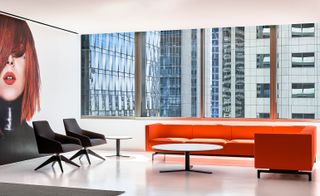
Large graphics and carefully selected furniture provide vivid pops of colour for the interiors
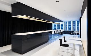
A shiny black centrepiece in the form of a long glowing table appears in the reception area and is repeated in the cafe area directly opposite
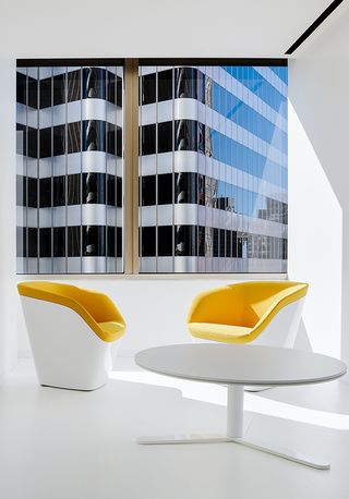
These bright colours create a welcome contrast to the more neutrally-hued hard architecture details
INFORMATION
For more information, visit the Garcia Tamjidi website
Wallpaper* Newsletter
Receive our daily digest of inspiration, escapism and design stories from around the world direct to your inbox.
-
 A new Oxford Street pop-up celebrates IKEA's blue bags
IKEA's iconic blue bag gets its own pop-up concept store, the 'Hus of Frakta'.
By Smilian Cibic Published
-
 Audemars Piguet and Kaws have created the Royal Oak Concept watch we didn't know we needed
The Audemars Piguet x Kaws Royal Oak Concept Tourbillon 'Companion' is slick wrist-worn art
By Thor Svaboe Published
-
 A friendly rivalry coloured by kinship: Wendy Maruyama and Tom Loeser on their two-artist show
'I wanted to make furniture, just not traditional furniture, but weird furniture,' says Wendy Maruyama on ‘Colorama’, a two-artist show presented at design gallery Superhouse (until 11 January 2025)
By Gregory Han Published
-
 On a sloped Los Angeles site, a cascade of green 'boxes' offers inside outside living
UnStack, a house by FreelandBuck, is a cascading series of bright green volumes, with mountain views
By Ellie Stathaki Published
-
 This New York brownstone was transformed through the power of a single, clever move
Void House, a New York brownstone reimagined by architecture studio Light and Air, is an interior transformed through the power of one smart move
By Ellie Stathaki Published
-
 A new Texas house transforms a sloping plot into a multi-layered family home
The Griggs Residence is a Texas house that shields its interior world and spacious terraces with a stone and steel façade
By Jonathan Bell Published
-
 Light, nature and modernist architecture: welcome to the reimagined Longwood Gardens
Longwood Gardens and its modernist Roberto Burle Marx-designed greenhouse get a makeover by Weiss/Manfredi and Reed Hildebrand in the US
By Ian Volner Published
-
 A bridge in Buffalo heralds a new era for the city's LaSalle Park
A new Buffalo bridge offers pedestrian access over busy traffic for the local community, courtesy of schlaich bergermann partner
By Amy Serafin Published
-
 Tour this Bel Vista house by Albert Frey, restored to its former glory in Palm Springs
An Albert Frey Bel Vista house has been restored and praised for its revival - just in time for the 2025 Palm Springs Modernism Week Preview
By Hadani Ditmars Published
-
 First look: step inside 144 Vanderbilt, Tankhouse and SO-IL’s new Brooklyn project
The first finished duplex inside Tankhouse and SO-IL’s 144 Vanderbilt in Fort Greene is a hyper-local design gallery curated by Brooklyn studio General Assembly
By Léa Teuscher Published
-
 Tour Ray's Seagram Building HQ, an ode to art and modernism in New York City
Real estate venture Ray’s Seagram Building HQ in New York is a homage to corporate modernism
By Diana Budds Published