Graduating: Vancouver’s UBC reveals a progressive new extension
In contrast to Arthur Erickson’s and Geoffrey Massey’s Simon Fraser University (SFU) which was designed and built as one, a singular architectural moment in time, Vancouver’s University of British Columbia (UBC) has always been a hodge podge of styles and eras. But in the last decade, dozens of new buildings have graced the campus and raised the architectural ante considerably.
The new Student Union Building designed by DIALOG and B+H is the latest – and is the most ambitious project to date. With a plethora of uses and spaces – from a theatre to office and retail space to a rooftop garden and daycare – it’s almost more of a mini-city than a building.
Merging curvilinear detail into a rectilinear plan over five floors and 250,000 sq ft, the Leed Platinum (a high environmental standard) building features a variety of spatial experiences. Conceived by the architects as part of a highly collaborative process with the student body (whose funds also financed 75 per cent of the $103 million budget) it’s more about ‘meeting student needs than architecture’, says DIALOG’S Joost Bakker.
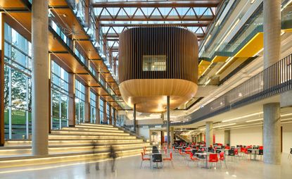
Still, it’s a handsome building. Its apparent complexity is broken down into a relatively simple plan: a long narrow structure bisected by a contemplative ‘galleria’ study area to the east, that features framed views of the mountains and giant glulam beams that recall the upturned hull of a ship, and a light-filled atrium to the west.
The entrance way ushers students into a veritable marketplace of ideas – as well as retail and food venues – its scale and massing broken up by different levels, mitigated by nook like private study areas.
A giant wooden hub called the ‘nest’ floats over the atrium, and contains a black box theatre. An endless stairway to heaven – or higher learning – leads students to a labyrinthine lounge on the roof of the theatre. From this summit, the rest of the building and much of the adjacent square can be admired, lending a sense of ‘graduation’ and arrival.
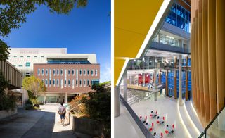
A new Student Union Building designed by DIALOG and B+H is the latest – and is the most ambitious project to date
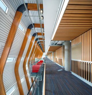
With a plethora of uses and spaces – from a theatre to office and retail space to a rooftop garden and daycare – it’s almost more of a mini-city than a building
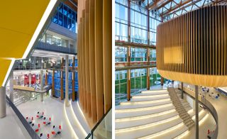
Merging curvilinear detail into a rectilinear plan over five floors and 250,000 sq ft, the building features a variety of spatial experiences
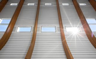
The project, says DIALOG’S Joost Bakker, is more about ‘meeting student needs than architecture’
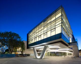
Still, it’s a handsome building, its apparent complexity is broken down into a relatively simple plan
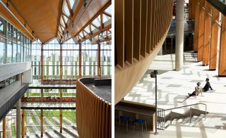
A long narrow structure is bisected by a contemplative ‘galleria’ study area to the east, that features framed views of the mountains and giant glulam beams that recall the upturned hull of a ship, and a light-filled atrium to the west
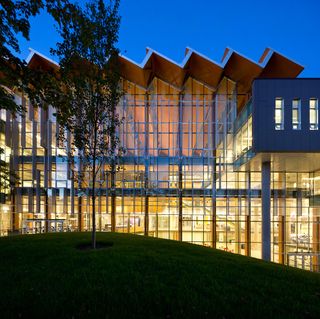
An endless stairway to heaven – or higher learning – leads students to a labyrinthine lounge on the roof of the buidling’s theatre. From this summit, the rest of the building and much of the adjacent square can be admired, lending a sense of ‘graduation’ and arrival
INFORMATION
Photography: Ema Peter
Wallpaper* Newsletter
Receive our daily digest of inspiration, escapism and design stories from around the world direct to your inbox.
-
 Find interior design inspiration at Eba’s new Marylebone showroom
Eba, a specialist in kitchen and living room design, brings its elevated interiors to London’s Marylebone
By Simon Mills Published
-
 An eco-conscious reconfiguration of space revives a London home
An eco-conscious reimagining of a Victorian terraced home for a growing London family, THISS Studio’s Hartley House offers sustainable, spacious living
By Smilian Cibic Published
-
 A guide to the best fashion stores Copenhagen has to offer
Wallpaper* picks the must-visit fashion stores in Copenhagen – from big-name boutiques and historic department stores to local labels and the best in second-hand, each presenting a fresh take on Danish design
By Sophie Axon Published
-
 This sustainable family home is an Ontario retreat in tune with its setting
Ridge House by Superkül is a private Canadian retreat that nods to its context and embraces nature and landscape
By Ellie Stathaki Published
-
 Bunkie on The Hill is a cosy Canadian cottage full of charm
Bunkie on The Hill, a design by Dubbeldam Architecture + Design, is tucked into the trees, slotting neatly into Ontario's nature
By Shawn Adams Published
-
 Wallpaper* Architects’ Directory 2024: meet the practices
In the Wallpaper* Architects Directory 2024, our latest guide to exciting, emerging practices from around the world, 20 young studios show off their projects and passion
By Ellie Stathaki Published
-
 Svima looked to Japanese architecture, 'nature and ecology' for Passageway House in Serbia
The Wallpaper* Architects’ Directory 2024 includes Svima, a young Canadian practice joining our annual round-up of exciting emerging architecture studios
By Tianna Williams Published
-
 Arthur Erickson's Museum of Anthropology at UBC has been given a new lease of life in Vancouver
After an extensive renovation, The Museum of Anthropology is part Shinto shrine, part cathedral, part longhouse – and a temple to learning
By Hadani Ditmars Published
-
 A dramatic new lakeside cabin in the Canadian wilderness rises above the trees
Kariouk Architects' lakeside cabin ‘m.o.r.e. CLT’ explores new material approaches while making a minimal impact on a precious landscape
By Jonathan Bell Published
-
 Forest Retreat is a new low-energy family house in the forests of Ontario
Set beneath a vast roof, Forest Retreat is a rich mix of local materials, craftsmanship and space for an extended family to get together in the heart of nature
By Jonathan Bell Published
-
 Join the West Coast Modern Week's Home Tour 2024 for modernist architecture and more
West Coast Modern Week 2024 comes with its annual home tour courtesy of the West Vancouver Art Museum, offering an extensive, immersive showcase of Canada's modernist architecture
By Hadani Ditmars Published