Interactive floor plan: CNB 100 / Chrisco Yacht
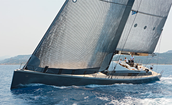
Floating interiors rarely attract our attention. Save for a few honourable exceptions, high-end nautical architecture has ploughed its own aesthetic furrow with scarcely a nod to the refinements, materials, space, light and structural gymnastics that can be found on dry land. But the 'CNB 100 / Chrisco' is a craft cut from a different cloth to its peers.
Designed by notable naval architect Luca Brenta, of the eponymous Milan-based studio responsible for the splendid 'Wally B' and 'Wallygator', the CNB 100 / Chrisco is lithe and elegant. The yacht also has a spectacular interior, created by Wetzels Brown Partners, an Amsterdam studio with extensive experience of translating architectural concepts to transportation design, including private jets and motoryachts (English interior designer Gillian Brown, who founded the firm with her partner, Dutch architect Rob Wetzels, worked closely with Lazzarni Pickering on the iconic 'Wallpower 118').
For the 100ft, composite carbon fibre yacht, the design team were briefed to create every single aspect of the interior, right down to table setting, graphics and the crew's uniforms. Tasked with such a monumental project, the first stage was to set out a simple, coherent palette. The glassy cabin architecture allows lots of natural light into the upper deck, as well as views fore and aft. The sense of lightness is enhanced by the main mast, which is visible from both above and below decks, forming a central focus for the living accommodation. The simple black and white colour scheme is paired with a custom-LED light installation that allows five colours to wash across the walls; it also provides a neutral backdrop for the owner's art collection. All furniture is fitted and custom made, and the china, glassware, vases and other accessories is specially selected from Alessi, Carlo Moretti and Gaetano Pesce, respectively.
The shape of the hull is left visible so as to act as a counterpoint to the objects, cabins and forms within it. Finishes include carbon fibre, leather, linen and silk, a monochrome palette that's complemented by the specially-designed dining chairs, created by WBP to fulfil the demands of life on the high seas without compromising their structural honeycomb form. From outside, the glass volume that extends out of the main deck appears like a solid object, a dark faceted mass that stands in stark relief to the airy, light space within. Luca Brenta's exterior design makes the most of these intersections between deck and hull, exaggerating the sleek lines of this ocean-going machine that's also a testament to the success of a truly intense design brief.
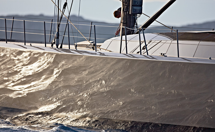
The lithe and elegant vessel was designed by Luca Brenta.
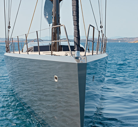
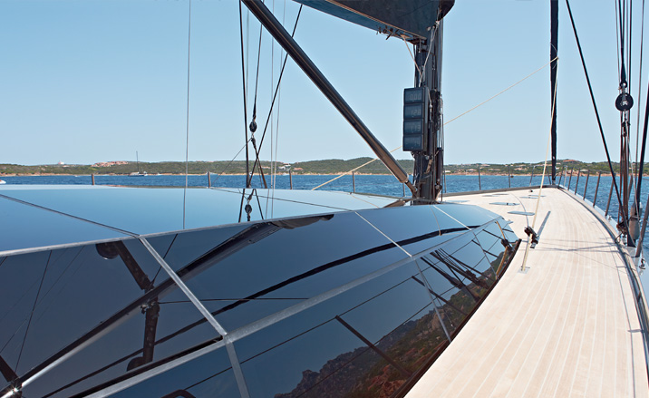
From outside, the glass volume that extends out of the main deck appears like a solid object, a dark faceted mass that stands in stark relief to the airy, light space within
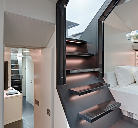
The design team were briefed to create every single aspect of the interior, right down to table setting, graphics and the crew's uniforms
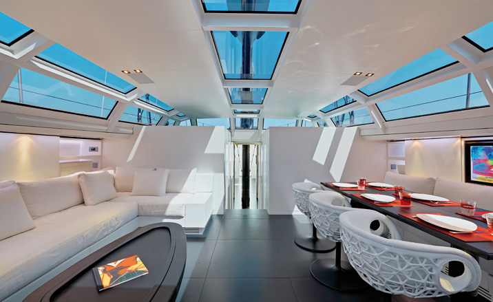
The glassy cabin architecture allows lots of natural light into the upper deck
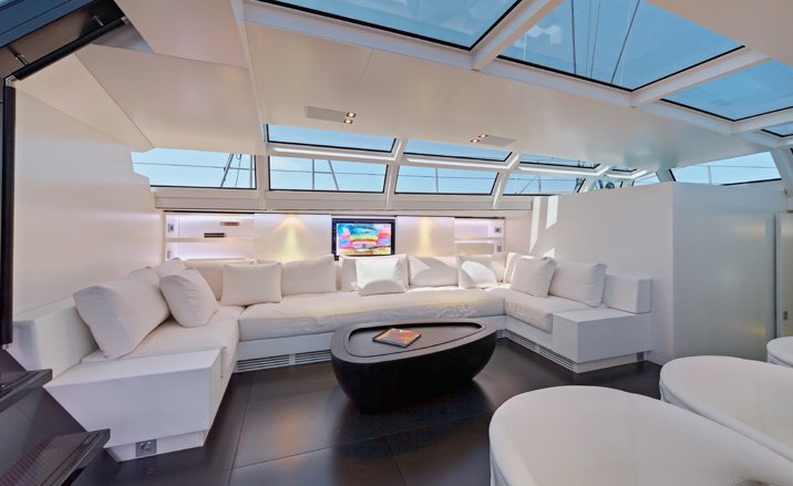
The yacht’s interior was created by Wetzels Brown Partners
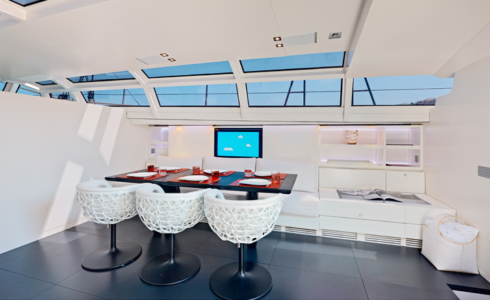
Finishes include carbon fibre, leather, linen and silk, a monochrome palette that’s complemented by the specially-designed dining chairs, created by WBP to fulfil the demands of life on the high seas without compromising their structural honeycomb form
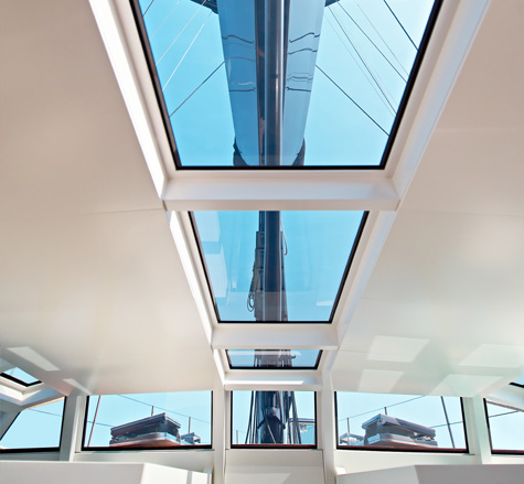
The sense of lightness is enhanced by the main mast, which is visible from both above and below decks, forming a central focus for the living accommodation
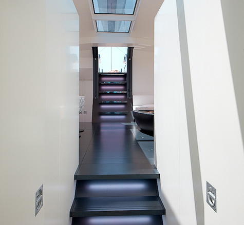
The simple black and white colour scheme is paired with a custom-LED light installation that allows five colours to wash across the walls.
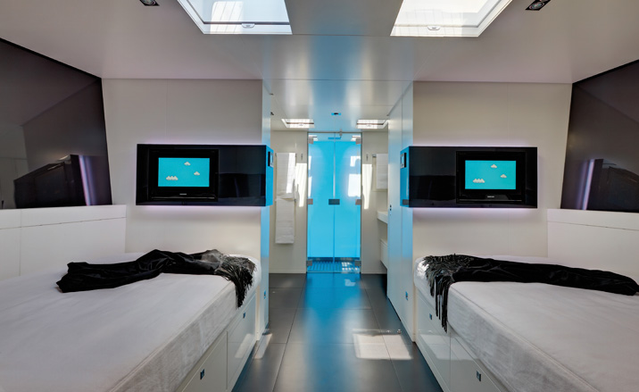
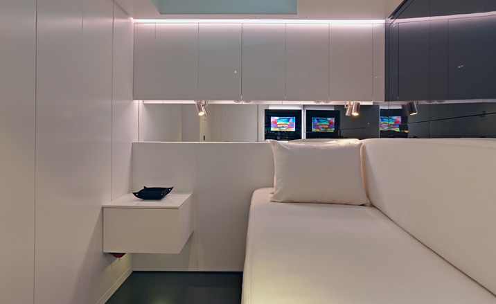
All furniture is fitted and custom made, and the china, glassware, vases and other accessories is specially selected from Alessi, Carlo Moretti and Gaetano Pesce, respectively
Wetzels Brown Partners is an Amsterdam studio with extensive experience of translating architectural concepts to transportation design, including private jets and motoryachts
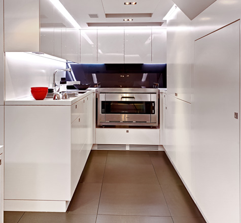
The kitchen of the CNB 100 / Chrisco Yacht
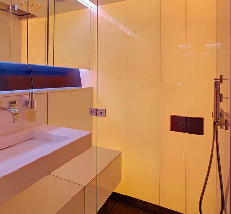
The bathroom of the yacht
Wallpaper* Newsletter
Receive our daily digest of inspiration, escapism and design stories from around the world direct to your inbox.
Jonathan Bell has written for Wallpaper* magazine since 1999, covering everything from architecture and transport design to books, tech and graphic design. He is now the magazine’s Transport and Technology Editor. Jonathan has written and edited 15 books, including Concept Car Design, 21st Century House, and The New Modern House. He is also the host of Wallpaper’s first podcast.
-
 Put these emerging artists on your radar
This crop of six new talents is poised to shake up the art world. Get to know them now
By Tianna Williams
-
 Dining at Pyrá feels like a Mediterranean kiss on both cheeks
Designed by House of Dré, this Lonsdale Road addition dishes up an enticing fusion of Greek and Spanish cooking
By Sofia de la Cruz
-
 Creased, crumpled: S/S 2025 menswear is about clothes that have ‘lived a life’
The S/S 2025 menswear collections see designers embrace the creased and the crumpled, conjuring a mood of laidback languor that ran through the season – captured here by photographer Steve Harnacke and stylist Nicola Neri for Wallpaper*
By Jack Moss