Interactive floor plan: Kindergarten, South Tyrol

Receive our daily digest of inspiration, escapism and design stories from around the world direct to your inbox.
You are now subscribed
Your newsletter sign-up was successful
Want to add more newsletters?
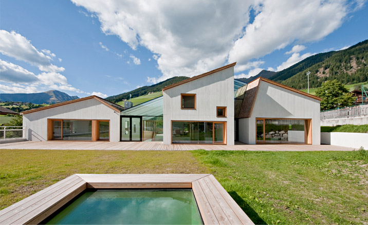
Located in South Tyrol, Italy, this elegant new kindergarten was designed by Vienna- and Bolzano-based architects Feld72; the same team behind the 2006 Wine Centre in close-by Kaltern and the Public Trailer project for the 2009 Shenzhen and Hong Kong Bi-city biennale.
The brief was to create a daycare centre that would be able to ‘speak’ equally to both children and adults, as well as connect with the local culture (a heady mix of German, Italian and local Ladin) and the area’s Alpine nature. 'Building in the Alps has always been characterized by a search for the elemental and the clever use of topography,' say the architects.
Located in the Val Pusteria village, on what used to be an old mini-golf course, the site sits among the village's sports and education buildings, and has its main entrance level in the centre’s pedestrian zone.
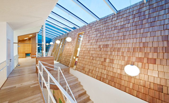
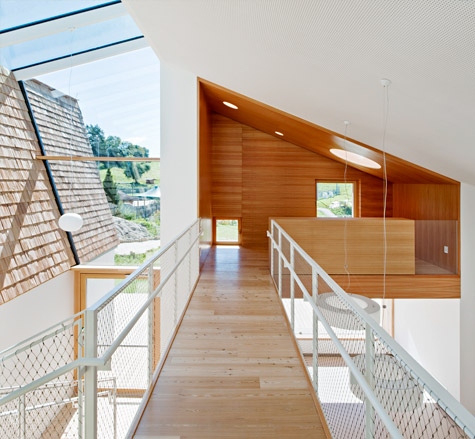
One of the team's main aims was for the building to relate to the nearby structures, using traditional elements and translating them into contemporary forms. The structure's materials – naked concrete and wood and a hand-cut larch shingle roof – underline its modern design with a nod to tradition, especially in terms of shapes. Scale-wise, making the most of the sloping terrain, the architects brought the building in harmony with its environs. Adding a lower ground floor, the kindergarten became much larger in actual size than what is visible from the outside, in keeping with the street’s existing skyline levels.
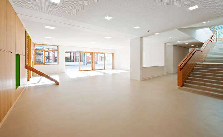
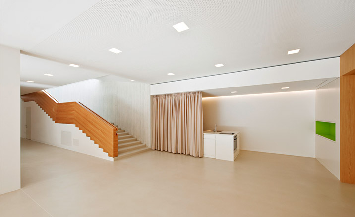
The complex was set to include classrooms, multi-functional common areas, offices, and cloakrooms and also take into account the neighbouring primary school. To achieve this, the architects' design for the school and the kindergarten share a common public area (through a set of sliding doors), while the latter’s outdoor space also merges with an open-air playground.
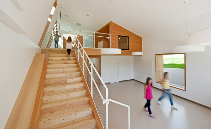
In an attempt to help the pupils recognize their classroom and feel familiar with their own space within the large complex, the architects designed the building as three adjoined ‘houses’. Using these abstract house shapes, the interiors are differentiated and the structure is divided into obvious ‘wings’.
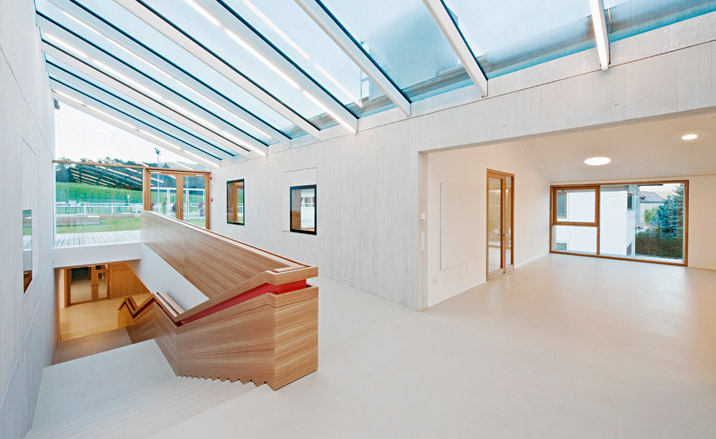
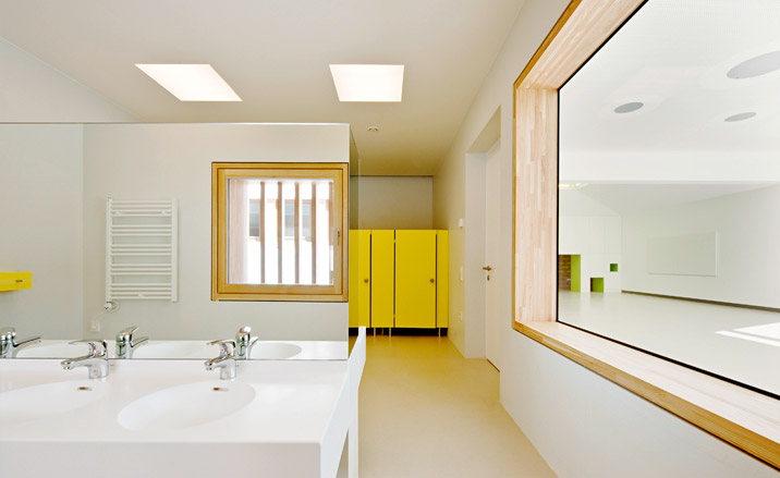
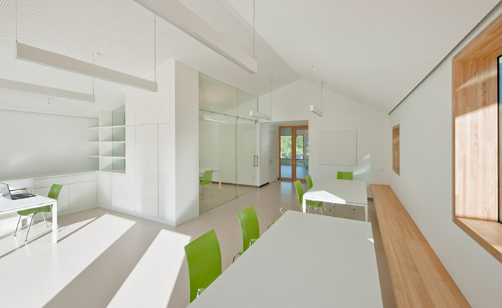
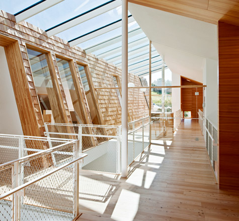
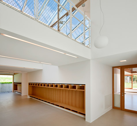
Functional and effective, the design secures the students’ as well as the nature’s wellbeing. All the classrooms are south facing, with skylights and large windows providing the interior with plenty of natural light. Meanwhile, it's no surprise that, using renewable energy sources and a fine natural ventilation system, the daycare centre has received an excellent energy efficiency rating, helping to create a comfortable as well as efficient education hub.
Receive our daily digest of inspiration, escapism and design stories from around the world direct to your inbox.
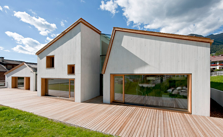
The structure’s materials – naked concrete and wood and a hand-cut larch shingle roof – underline its modern design with a nod to tradition, especially in terms of shapes
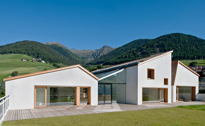
Scale-wise, making the most of the sloping terrain, the architects brought the building in harmony with its environs
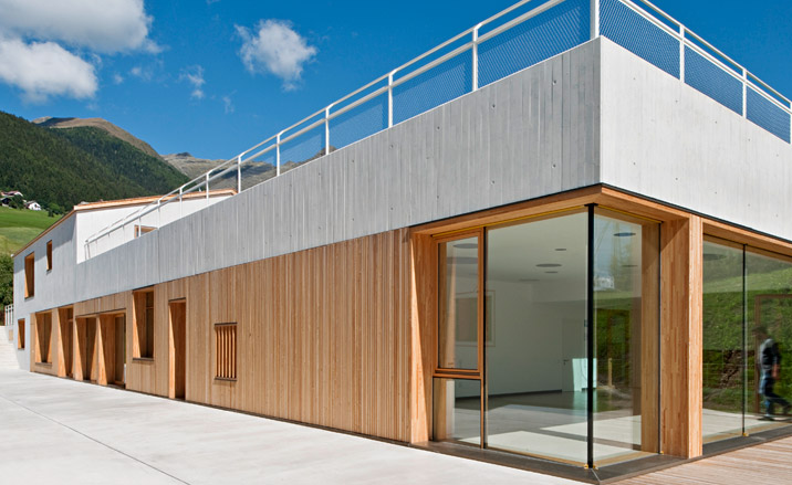
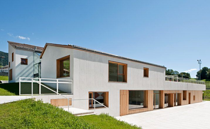
Adding a lower ground floor, the kindergarten became much larger in actual size than what is visible from the outside, in keeping with the street’s existing skyline levels.
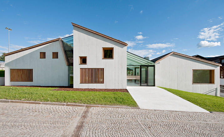
In an attempt to help the pupils recognize their classroom and feel familiar with their own space within the large complex, the architects designed the building as three adjoined ‘houses’. Using these abstract house shapes, the interiors are differentiated and the structure is divided into obvious ‘wings’.
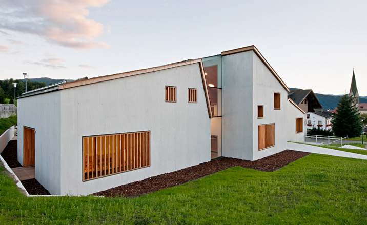
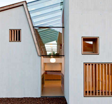
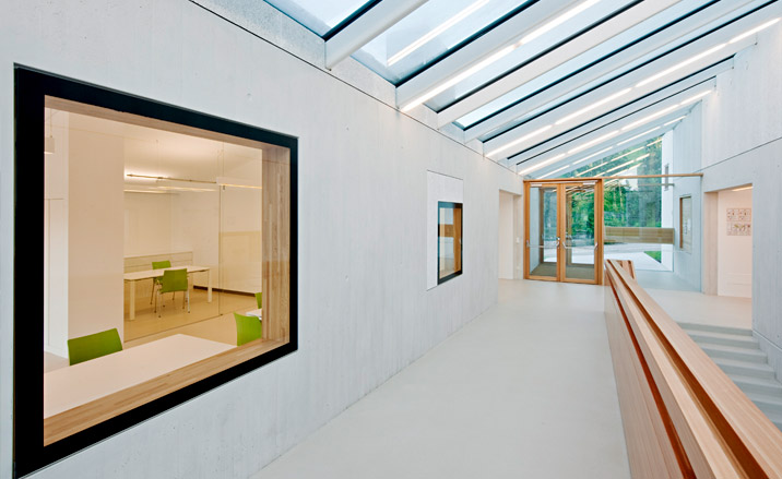
The complex was set to include classrooms, multi-functional common areas, offices, and cloakrooms and also take into account the neighbouring primary school.
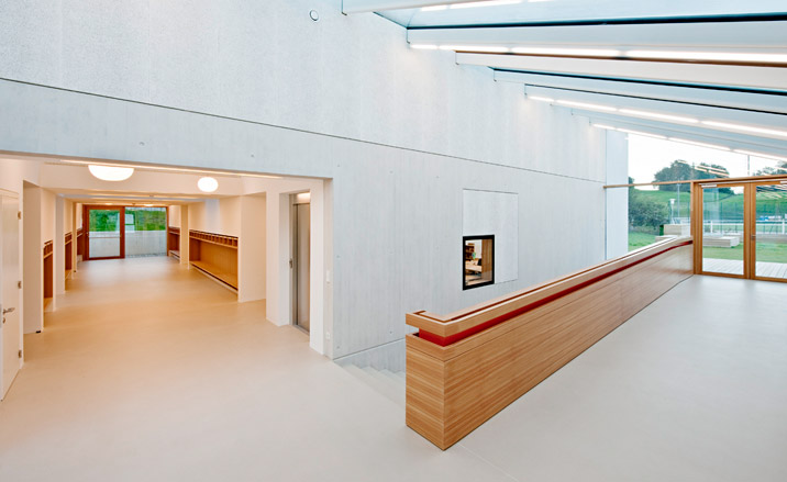
All the classrooms are south facing, with skylights and large windows providing the interior with plenty of natural light.
Ellie Stathaki is the Architecture & Environment Director at Wallpaper*. She trained as an architect at the Aristotle University of Thessaloniki in Greece and studied architectural history at the Bartlett in London. Now an established journalist, she has been a member of the Wallpaper* team since 2006, visiting buildings across the globe and interviewing leading architects such as Tadao Ando and Rem Koolhaas. Ellie has also taken part in judging panels, moderated events, curated shows and contributed in books, such as The Contemporary House (Thames & Hudson, 2018), Glenn Sestig Architecture Diary (2020) and House London (2022).
