Interactive floorplan: Shelter Island House
Receive our daily digest of inspiration, escapism and design stories from around the world direct to your inbox.
You are now subscribed
Your newsletter sign-up was successful
Want to add more newsletters?
Stamberg Aferiat Architecture is a New York-based studio with a broad portfolio of schools, museums, galleries, showrooms and private houses. Mixing the crisp steel-framed aesthetic of high American Modernism with the zinging colours of Miami Deco and 1980s Po-Mo, Peter Stamberg and Paul Aferiat have carved a individualistic niche in contemporary American design.
Their most recent residential project is this pavilion on Shelter Island, just north of the Hamptons, built for their own use.
Noting that some of the most innovative and influential structures in the history of modern architecture arose out of the desire to bring mass production methods to domestic design, the architects set out to 'explore the reality of the industrially produced materials and methods of our time.'
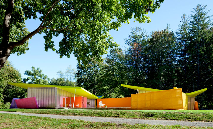
The first thing that strikes you about the Shelter Island complex is the apparently chaotic jumble of planes, walls, roofs and windows. For once, this fragmentation owes nothing to the ultra intellectual deconstructive tendencies of the 1990s, but to the simple desire to abstract elemental forms, creating a composition that is both harmonious and vibrant, more akin to a cubist painting. The latter quality also comes from the colour, for Shelter Island is perhaps the most polychromatic project we have ever seen.
The architects point out that colour has always been integral to modern architecture, a prominence cloaked by the prevalence of heroic black and white photography in the early years of Modernism. Shelter Island showcases a host of colour combinations, using both pigmented materials and new paint technology. Walls, ceilings, floors, inside and out, every planar surface has been given a unique hue, an approach that has been extended to furniture, furnishings and art. The overall effect is belligerent but remarkably harmonious, turning every vista into a frozen composition.
The house is laid out as two independent pavilions around a pool, one containing a master suite, the other a kitchen and living area. This explicit - and acknowledged - reference to Mies van der Rohe's Barcelona Pavilion is then given a contemporary twist, with the plan skewed by two intersecting axes. Tilted over-sailing butterfly roofs and walls extend out from the living space into the poolside area, serving to distort and expand the true extent of the space. Furnishing is minimal and in classic modern style - a spray of Bertoia chairs, lights and furniture by Flos and B&B Italia, while colour blocked art by Kenneth Noland and Ellsworth Kelly appears to have been made for the space.
Art and architectural history collide at the Shelter Island House, yet the end result is not so much quiet homage but riotous celebration, a fusion of many inspirations that creates a truly unique whole.
Receive our daily digest of inspiration, escapism and design stories from around the world direct to your inbox.
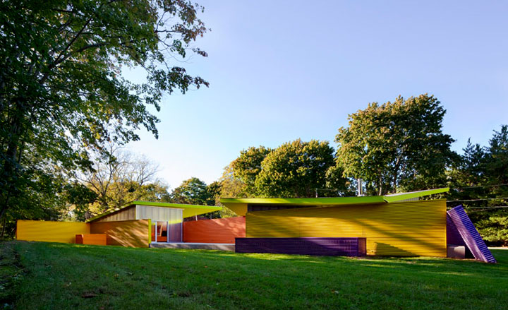
For once, this fragmentation owes nothing to the ultra intellectual deconstructive tendencies of the 1990s, but to the simple desire to abstract elemental forms, creating a composition that is both harmonious and vibrant, more akin to a cubist painting
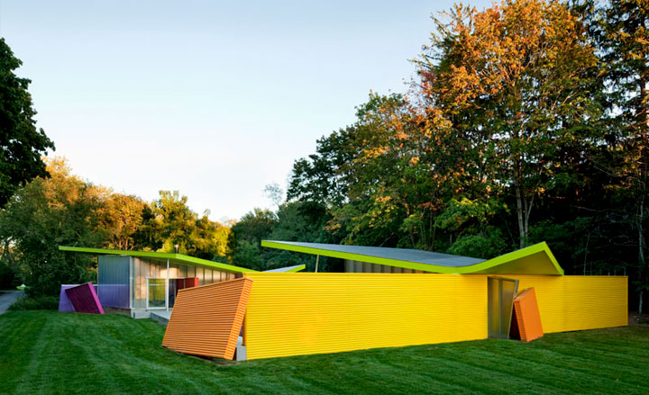
Shelter Island is perhaps the most polychromatic project we have ever seen.
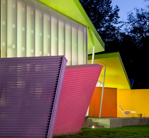
Shelter Island showcases a host of colour combinations, using both pigmented materials and new paint technology
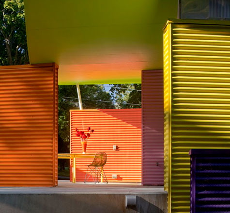
Walls, ceilings, floors, inside and out, every planar surface has been given a unique hue, an approach that has been extended to furniture, furnishings and art.
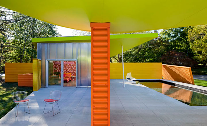
The overall effect is belligerent but remarkably harmonious, turning every vista into a frozen composition.
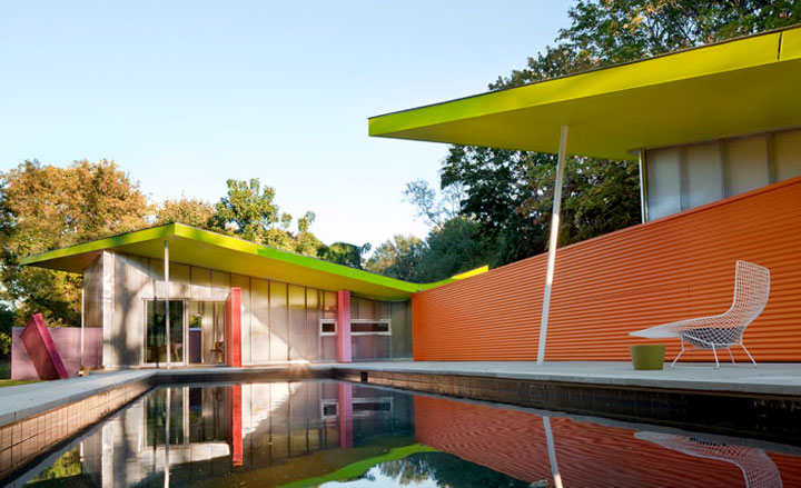
The house is laid out as two independent pavilions around a pool, one containing a master suite, the other a kitchen and living area.
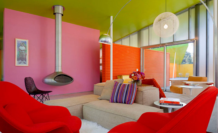
Furnishing is minimal and in classic modern style..
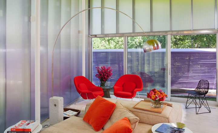
...a spray of Bertoia chairs, lights and furniture by Flos and B&B Italia
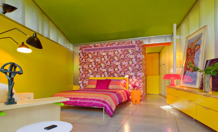
while colour blocked art by Kenneth Noland and Ellsworth Kelly appears to have been made for the space.
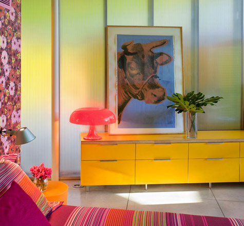
An Andy Warhol print finds its place perfectly amid the zinging colour scheme
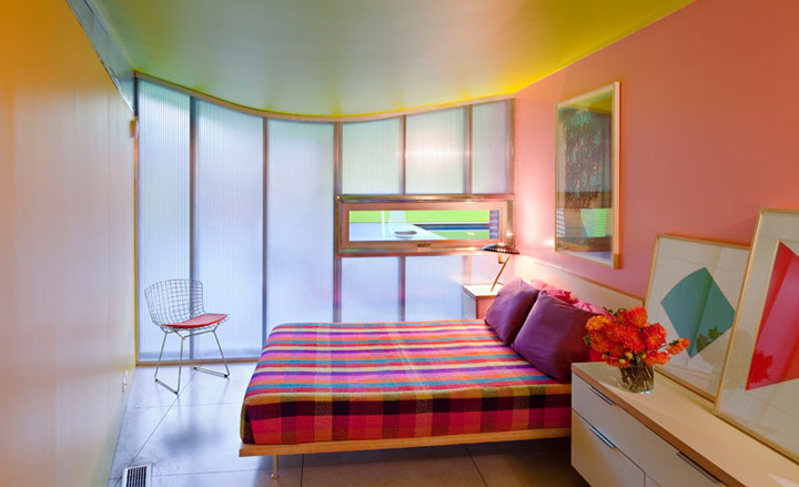
A window in the bedroom shows off the architect's crisp steel-frame that harks to an aesthetic of high American Modernism
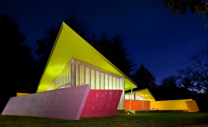
Tilted over-sailing butterfly roofs and walls extend out from the living space into the poolside area, serving to distort and expand the true extent of the space
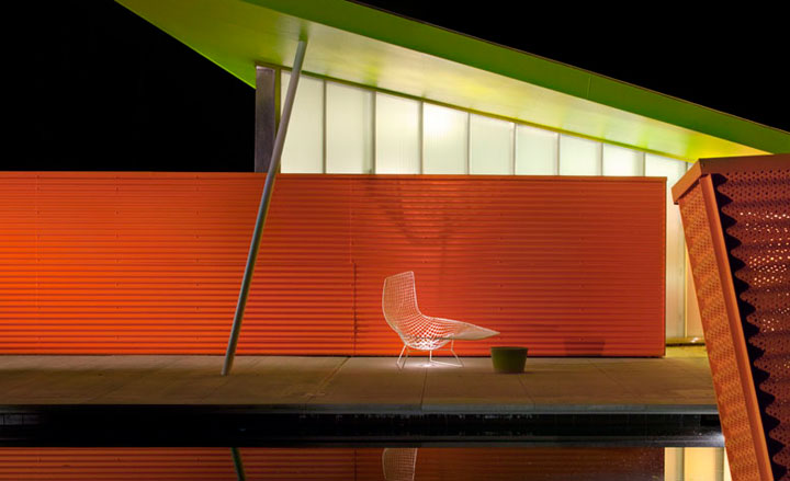
Art and architectural history collide at the Shelter Island House, yet the end result is not so much quiet homage but riotous celebration, a fusion of many inspirations that creates a truly unique whole.
Jonathan Bell has written for Wallpaper* magazine since 1999, covering everything from architecture and transport design to books, tech and graphic design. He is now the magazine’s Transport and Technology Editor. Jonathan has written and edited 15 books, including Concept Car Design, 21st Century House, and The New Modern House. He is also the host of Wallpaper’s first podcast.