Easy breezy: a light-filled Melbourne home by EAT Architects
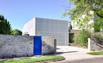
EAT Architects' Moving House in Kew, Melbourne, is immediately striking for its spaciousness, soft light and breezy atmosphere. EAT director Albert Mo and his team performed their customary architectural magic to deliver a private and light-filled home, although faced with a site whose north face opened to the street.
Their solution hinged on a handful of design features, including bespoke vaulted skylights, geometric repetition, light screens, and deft placement of architecture on site: Moving House was carefully positioned to occupy two-thirds of the width of its block; with the other third reserved for the garden. This ensured that green spaces received plenty of northern light. Vaulted skylights were devised to draw the maximum amount of daylight inside from above, rather than the front, so light did not come at the expense of privacy.
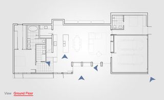
Take an interactive tour of Moving House, Melbourne
A white screen of aluminium slats also envelopes much of the house, fulfilling a number of functions. Its simple form, in the outline of a suburban gable roof, offers structural clarity while subtly referencing the houses on either side in colour and form; and the partially transparent screen lends lightness to the exterior design.
A visitor’s entry experience is prolonged with a brief journey along this facade, past a series of recesses made from cantilevered concrete beams, plants hanging from gutters and tactile, rough concrete surfaces. These provide partial shade and refuge. A lovely green front door (in the same shade used by Corbusier at Chandigarh High Court) with a fine timber handle signal the end of this journey and the entrance proper.
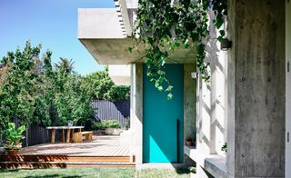
A third of the site was reserved by the architects for outdoor space
The interior is defined by repeated roof geometries – three concrete vaulted skylights, the form-blade columns supporting them, and off-form gutter beams. And despite the raw, industrial feel of these materials, the strongest impression is one of refinement.
The three skylights ensure ample direct daylight, nuanced by the hours and seasons, enters this expansive space; while indirect light is variously projected onto the textured curves of the vaults. The clients have found 'the house’s rawness somehow transports them to a tranquil place,' according to Mo. 'As if the house is part of the nature.'
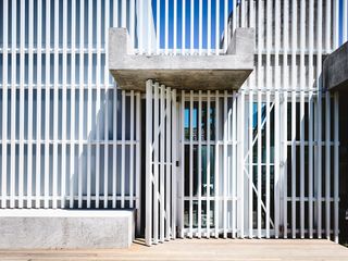
The slats allow light into the interior and create a lightness to the structure
Full glazing of bi-fold doors and windows to the east means the house can be fully opened out to the garden in fine weather. And these features, together with glass louvres at the top of clerestory of skylights, make for excellent cross-ventilation. 'The clients were surprised at how well the house responds to the climate,' said Mo. They also love the animated lights that enter the house throughout the day.
Each evening, as the sun sets to the west, the ceiling vaults are faintly and briefly silhouetted on the white screen. And soon after, the internal glow of artificial lights transforms the stylised street facade into a lantern.
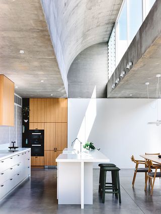
Bespoke vaulted skylights are sculpted out of concrete
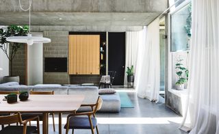
The skylights and floor to ceiling windows bring plenty of natural light into the interior
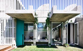
A white screen of aluminium slats wraps around the house
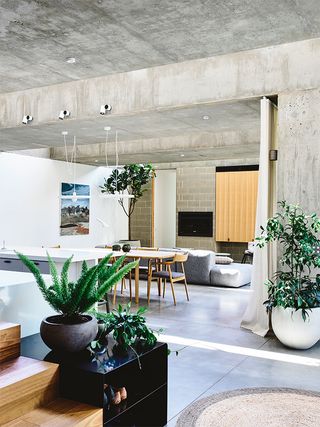
The atmosphere of the interior is defined by the exposed concrete walls and ceilings
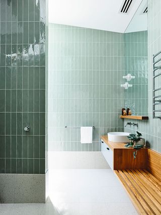
Green tiles in the bathroom reflect the greenery outdoors
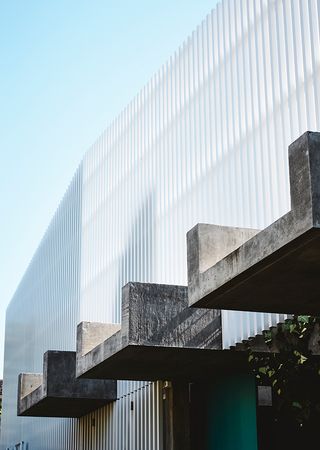
The design of the house bridges brutalism and modernism
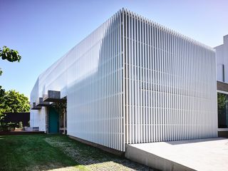
The white slats offer structural clarity and reference the architecture of the neighbourhood for visual cohesion
INFORMATION
For more information, visit the EAT Architects website
Wallpaper* Newsletter
Receive our daily digest of inspiration, escapism and design stories from around the world direct to your inbox.
-
 Take a look at the big winners of the watch world Oscars
The Grand Prix d’Horlogerie de Genève is the Oscars for the watch world – get all the news on the 2024 event here
By Smilian Cibic Published
-
 Revived Scout Motors reveals two all-electric utility vehicle concepts
As Scout throws the covers off its debut Traveler SUV and Terra truck concepts, Wallpaper* speaks to its chief design officer Chris Benjamin about the reborn brand
By Jonathan Bell Published
-
 The don’t-miss Swiss art museums for your next cultural flit
Map these 11 Swiss art museums, worthy pitstops for the culturally curious, from Basel to Zürich and beyond
By Simon Mills Published
-
 A Melbourne family home draws on classic modernism to create a pavilion in the landscape
This Melbourne family home by Vibe Design Group was inspired by midcentury design and shaped to be an extension of its verdant site
By Jonathan Bell Published
-
 Tour this compact Melbourne home, where a small footprint is big on efficiency and experimentation
Northcote House is designed by architects David Leggett and Paul Loh as their own home in Melbourne
By Stephen Crafti Published
-
 Bridging Boyd is the rebirth of a modernist Melbourne home
Bridging Boyd by Jolson is a modernist Melbourne home reimagined for the 21st century
By Ellie Stathaki Published
-
 South Yarra House makes a sculptural statement in Melbourne
South Yarra House by Pandolfini Architects explores the interplay of compression and expansion through a series of surprising sculptural objects in Australia
By Grace Bernard Published
-
 Eclat rethinks 21st-century workspace with a hospitality offering in Melbourne
With new Melbourne co-working space Eclat, Australian designers Forme defy the conventional shared office model through sensitive craftsmanship and hidden high-tech
By Carli Philips Published
-
 This Melbourne aquatic recreation centre’s crafted timber ceiling hints at its sustainability ambitions
The Northcote Aquatic Recreation Centre by Warren and Mahoney opens in Melbourne, blending sleek aesthetics with environmental responsibility
By Ellie Stathaki Published
-
 Tour midcentury gem Fisher House’s 21st century facelift in Melbourne
The midcentury Fisher House by Australian designer Alistair Knox in Melbourne gets a contemporary facelift by Adriana Hanna
By Ellie Stathaki Published
-
 A zero-waste workspace in Melbourne innovates in sustainable office design
A zero-waste workspace in Melbourne for Today Design by Studio Edwards is composed entirely out of readily available materials
By Ellie Stathaki Published