New Tate Modern design
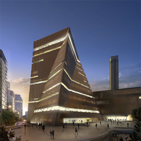
When the Tate Modern extension designs were first unveiled two years ago reactions to the radical Herzog and de Meuron wing were varied. But two years is a long time in the fast changing world of contemporary art and culture, and the Tate’s requirements and demands of the new building changed accordingly, as did the architectural brief.
Without stopping the groundwork on the project, the Tate team sat back down with the Swiss architects and re-worked the brief and design. Today the project’s revised plans were unveiled, presented by Tate Director Nicolas Serota, and Jacques Herzog and the new space is distinctly different. Moving away from the stacked glass boxes, the extension is now a brick, twisted three-dimensional trapezoid, slightly shorter than the original proposal.
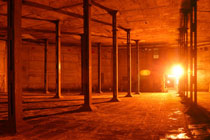
The Tate Modern Oil Tank
The most significant change concerning the building’s program involves the three empty underground tanks, on the south side of the museum, just below the new site. The three vast spaces were originally going to be completely transformed into a big auditorium, while now, following numerous discussions between the Tate team and many artists, they will all remain intact, to be used as exhibition spaces. In the same way, the new, re-worked interiors are much more flexible, as Herzog explained: ‘Even though the building now looks more strict in some ways, inside, paradoxically, it is much flexible to arrange galleries in different ways, and for the galleries to have different shapes, other than just a box’.
A second hard-to-miss shift is the building’s skin, which has changed from glass to brick. Says Herzog: ‘We don’t want to have two Tate Moderns, we only want one – which is one of the main reasons why we moved from the glass boxes scheme, to the brick clad proposal. Not only do we believe that brick helps us create one single Tate Modern, but it’s also much more rough and in some way, a ‘cooler’ material. You find it less today. Almost no one uses it any more, and it’s something that can be re-invented’.
And for the cynical lot who think the changes were made in the sole purpose of cutting costs, Serota was categorical: ‘Nothing has changed in that respect. We are exactly where we were, it is not cheaper, it is not more expensive’. As he explained earlier, the main change is that now ‘the new building sits more comfortably in the site and does not contrast the original volume’.
Working in full speed to secure the remaining two thirds of the budget needed, the Tate are soon to seek planning permission for the new design, and are planning to break ground in summer 2009, aiming to be ready for the London Olympics and open in 2012.
Wallpaper* Newsletter
Receive our daily digest of inspiration, escapism and design stories from around the world direct to your inbox.
Ellie Stathaki is the Architecture & Environment Director at Wallpaper*. She trained as an architect at the Aristotle University of Thessaloniki in Greece and studied architectural history at the Bartlett in London. Now an established journalist, she has been a member of the Wallpaper* team since 2006, visiting buildings across the globe and interviewing leading architects such as Tadao Ando and Rem Koolhaas. Ellie has also taken part in judging panels, moderated events, curated shows and contributed in books, such as The Contemporary House (Thames & Hudson, 2018), Glenn Sestig Architecture Diary (2020) and House London (2022).
-
 At this secret NYC hangout, the drinks are strong and the vibes are stronger
For People's bar, Workstead serves up a good time
By Anna Fixsen
-
 ‘Fall Guy’ director David Leitch takes us inside his breathtaking Los Angeles home
For movie power couple David Leitch and Kelly McCormick, interior designer Vanessa Alexander crafts a home with the ultimate Hollywood ending
By Anna Fixsen
-
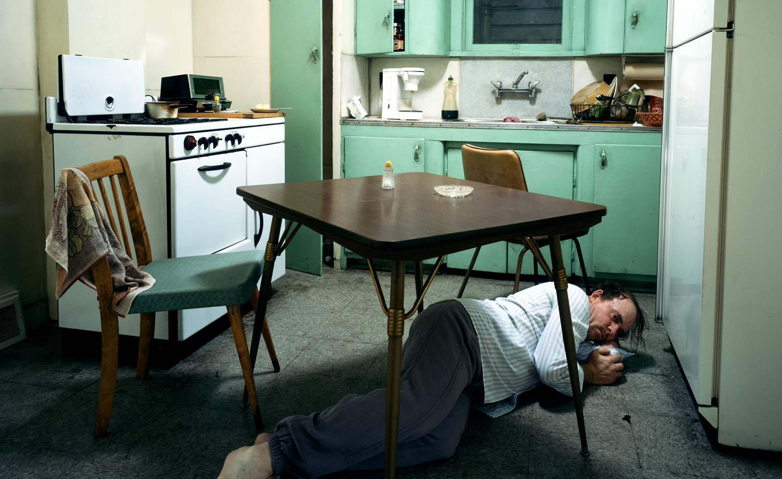 Real or imaginary? Step inside the alternate world of Jeff Wall's photographs
Jeff Wall's major show at MAAT in Portugal dives into four decades of the photographer's career
By Emily Steer
-
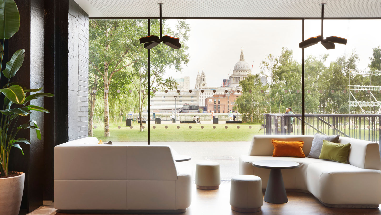 A refreshed Tate Modern cafe offers architectural space for cake, rest and party
The reimagined Tate Modern cafe is here to bring multifunctional 21st century architectural space on the ground level of the much loved London gallery
By Ellie Stathaki
-
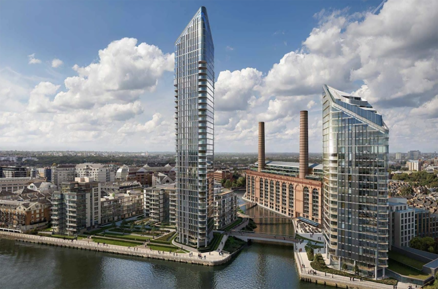 Powerhouse at Chelsea Waterfront transforms Lots Road Power Station
Powerhouse at Chelsea Waterfront is a historical London power station reimagined as a state-of-the-art, contemporary mixed-use scheme, while honouring the structure's past
By Ellie Stathaki
-
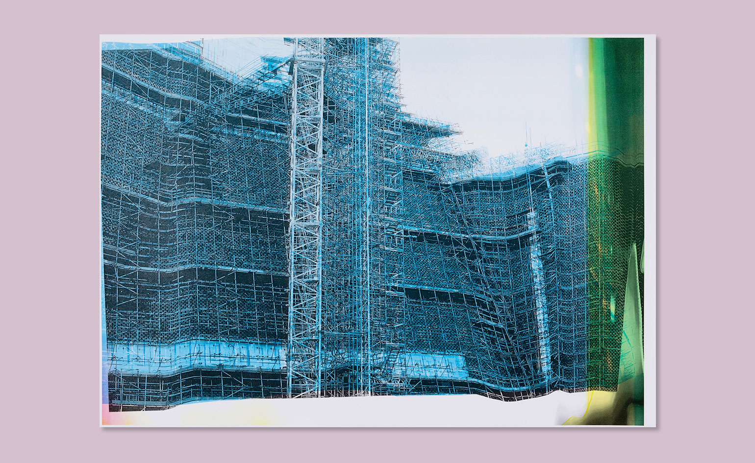 Switch craft: Wolfgang Tillmans’ unique record of the Tate Modern extension
By Charlotte McManus
-
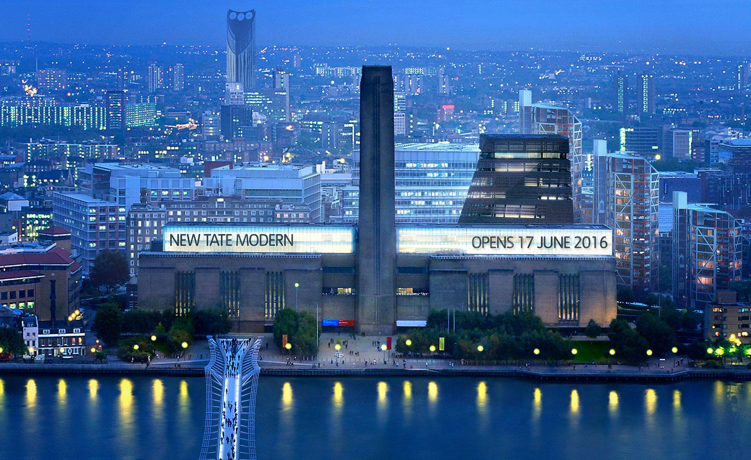 New build: Tate Modern gears up for its extension’s grand opening this summer
By Ellie Stathaki
-
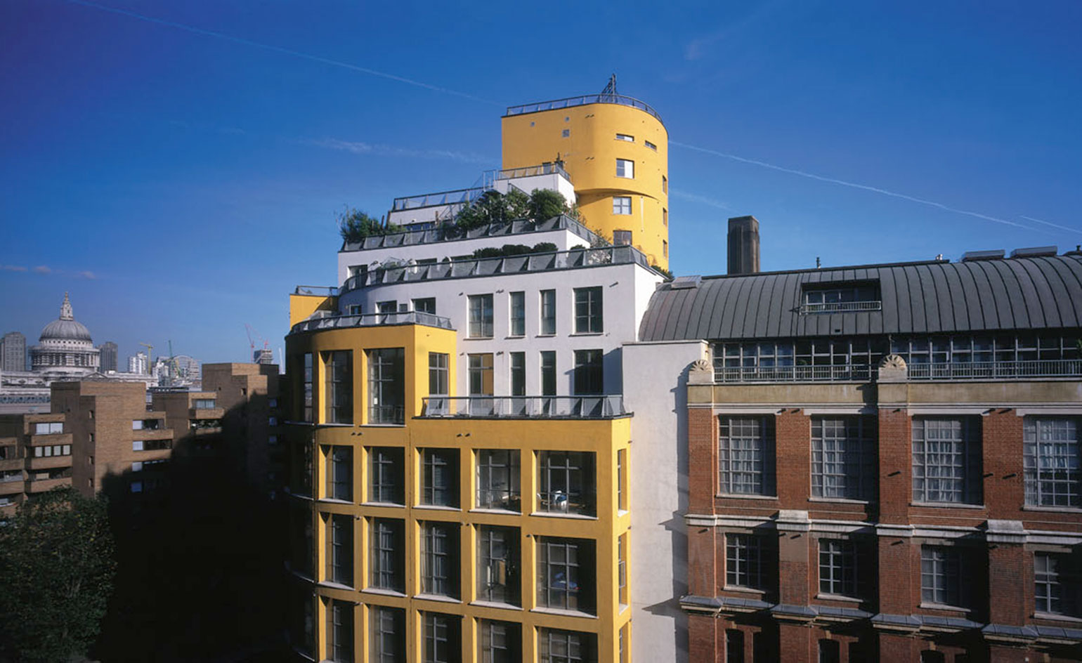 Lofty London living: Harry Handelsman moves back to Bankside
By Simon Mills
-
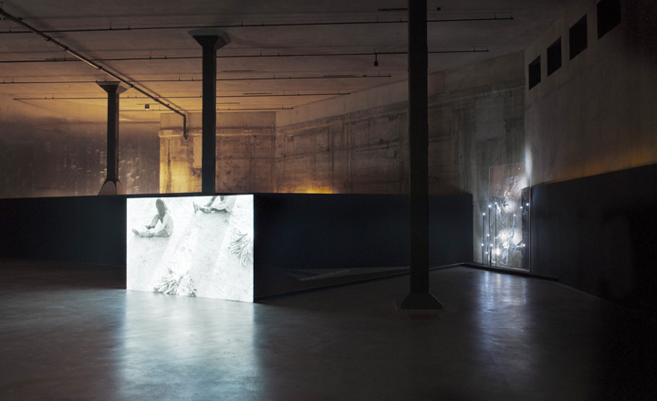 Tate Modern opens the Tate Tanks, designed by Herzog & de Meuron
By Ellie Stathaki