Soul amidst the silos: Herzog & de Meuron’s Vancouver Art Gallery design
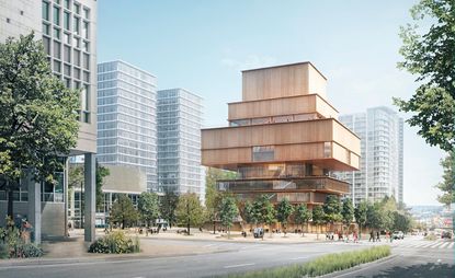
Herzog and de Meuron’s long awaited conceptual design for the new Vancouver Art Gallery reads like a device for contemplating not only contemporary art but also the city’s built and natural landscapes.
Unveiled earlier this week after a long gestation period that included extensive community consultation with artists as well as the city, the design for the proposed $350 million dollar (Canadian) museum offers inspired interplay between the vertical and the horizontal, solidity and transparency, and indoor and outdoor environments.
Speaking at a press conference in the current gallery (a neo-classical former courthouse by Francis Rattenbury renovated in the early 1980s by Arthur Erickson), architect Christine Binswanger, the partner in charge of the project, noted that Vancouver impressed her with its contrast and simultaneous proximity to wilderness and urbanity.
The new design (which will double the gallery’s size) speaks to that on many levels. The totemic wood clad building is essentially a series of stacked, differently sized rectangles lifted up from the ground plane and supported by stilts to create a permeable entrance. The gallery will have a modest, almost residential feel amidst Vancouver’s downtown towers, referencing the city’s earliest neighbourhood, the West End, and the mid-century low rises that Binswanger has high praise for as facilitators of urban fabric.
With seven publicly accessible floors, the gallery’s sculptural form is thicker in the middle for maximum curatorial potential, tapered at the top and punctuated by skylights, with mainly transparent lower levels that animate the streetscape and pedestrian realm and feature a sunken garden.
In contrast to its surrounding skyline, the new design possesses a certain humility; nestled like a serene Shinto shrine amidst bold but generic towers, it taps nostalgically into Vancouver’s logging town past as well as its mid-century optimism. And yet it embraces Vancouver’s verticality – a city of green glass towers – with long punched out rectangular windows that offer glimpses of the city skyline as well as the mountains and water.
Its Eastern influence speaks to Vancouver’s Pacific Rim future and the gallery’s Institute for Asian Art the new building will contain.
A generous ground level public space – designed to keep rain out and let light in – has some vaguely Ericksonian moments, and promises to become a civic gathering place (not unlike Tate Modern’s Turbine Hall); while the gallery itself will be a connector of surrounding neighbourhoods and a beacon for a burgeoning cultural district, encompassing nearby theatres and performance spaces.
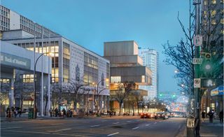
Speaking at a press conference in the current gallery, architect Christine Binswanger noted that Vancouver impressed her with its contrast and simultaneous proximity to wilderness and urbanity. Pictured: West Georgia Street at night
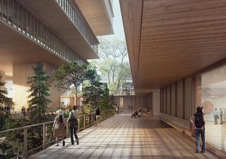
The gallery will have a modest, almost residential feel amidst Vancouver’s downtown towers, referencing the city’s earliest neighbourhood, the West End. Pictured: the gallery courtyard
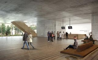
With seven publicly accessible floors, the gallery’s sculptural form is thicker in the middle for maximum curatorial potential. Pictured: the gallery lobby
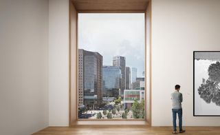
In contrast to its surrounding skyline, the new design possesses a certain humility; nestled like a serene Shinto shrine amidst bold but generic towers, it taps nostalgically into Vancouver’s logging town past as well as its optimism. Pictured: the gallery’s fifth level, overlooking Queen Elizabeth, Plaza and downtown
INFORMATION
Photography courtesy Herzog & de Meuron
Wallpaper* Newsletter
Receive our daily digest of inspiration, escapism and design stories from around the world direct to your inbox.
-
 Architecture director Ellie Stathaki's gift guide for urban explorers
Architecture & environment director Ellie Stathaki shares her tips and wishes for the perfectly curated 2024 gift guide for built environment enthusiasts - and beyond
By Ellie Stathaki Published
-
 Louise Giovanelli pulls back the curtain on spectacle and suspense at The Hepworth Wakefield
'Louise Giovanelli: A Song of Ascents' is at The Hepworth Wakefield from 23 November 2024 - 27 April 2025
By Hannah Silver Published
-
 High jewellery is given a literary twist in Van Cleef & Arpels' new Treasure Island-inspired collection
Van Cleef & Arpels look to Robert Louis Stevenson’s classic adventure story for a high jewellery collection in three parts
By Hannah Silver Published
-
 Master of ceremonies Philippe Parreno brings the Turbine Hall to life
By Ali Morris Last updated
-
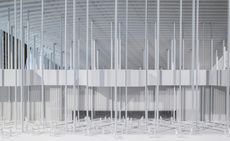 A new show at the Vancouver Art Gallery hints at Herzog and de Meuron's plans for the museum's future
By Hadani Ditmars Published
-
 Design Miami/ Basel 2013: an insider’s view
By Caroline Roux Published
-
 Serpentine Gallery Pavilion 2012, by Herzog & de Meuron and Ai Weiwei
By Ellie Stathaki Last updated