Venice Biennale 2008


Receive our daily digest of inspiration, escapism and design stories from around the world direct to your inbox.
You are now subscribed
Your newsletter sign-up was successful
Want to add more newsletters?
The 2008 Venice Biennale took a typically bold curatorial stance with the theme ‘Beyond Architecture.’ Aaron Betsky, formerly of the Netherlands Architecture Institute, SF Moma and now the Cincinnati Art Museum, invited his peers to fill the corridors and halls of the city’s Arsenale with models, installations and investigations into the evolving conditions of modern architecture. Was Betsky successful? Like every Biennale, 2008 was a year of mixed quality, with the broad sweep of the topic encouraging multiple interpretations, from the literal to the frankly obscure.
Digital
It goes without saying that modern architecture is a digital art. This was spelled out explicitly by the inclusion of David Rockwell, Reed Kroloff and Casey Jones' ‘Hall of Fragments’ as the opening piece, a dense electronic collage of architectural imagery from the cinema, coupled with an interactive screen that responded to the movement of passers-by. The digital realm needs a light touch, however, and nowhere was this made more evident than in the Hadean gloom of the Dark Side club, a fringe event organised by Robert White and Paul Finch.

Click here to see and read more.
The Dark Side is ostensibly a discussion arena, occupying the Palazzo Loredan for the duration of the Biennale as a place for dinners, drinks and more intimate presentations of cutting edge architectural techniques. In practice, that meant a lot of PowerPoint shows, as the international avant-garde proudly touted their digital toolboxes to their peers, delving into NURB curves, splines, parametric design and a host of other highly technical methods for creating modern buildings and objects.
In the Arsenale itself, the fruits of their frantic point and clicking could be observed in the computer-carved flesh, as Betsky's Beyond Architecture theme provided the perfect excuse to wield the trackpad and get down to some speculative ways of creating new forms. In practice, this sometimes resulted in lavish sculptural forms like Zaha Hadid’s Lotus installation (as seen in wallpaper 115) or Asymptote Architects' ‘Three Houses for the Subconscious’, ostensibly proposals for future dwellings but actually highly elegant objects in their own right. At the other end of the scale was what one might call ‘Screensaver Architecture’, the information saturated visualisations so beloved by computer-driven practice, resulting in eye candy that far outstrips - or overshadows - the content, leaving you bleary eyed and not entirely sated.
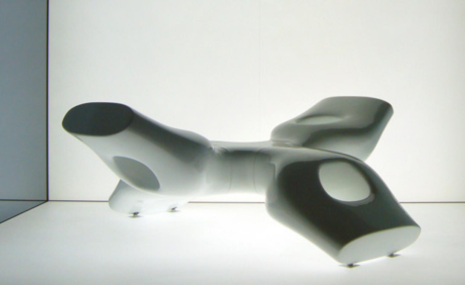
Sometimes this worked just fine. The deliberate science fiction provocations of MVRDV's Skycar City film, a frantic speculation as to how a fictional form of transportation - the ‘skycar’ - would impact upon the cities of the future. But ultimately, the problem with such a broad theme was one of presentation. Greg Lynn’s furniture constructed from crushed, melted and extruded children’s toys had a touch of the Pop Art, but the devil was in the detail of how he calculated the precise volume of plastic needed to form each structure.
Receive our daily digest of inspiration, escapism and design stories from around the world direct to your inbox.
The fanciful megastructures proposed in the Uneternal City section of the Arsenale were intended as a digital response to Rome’s famously staid town planning. Chinese firm MAD Office, with their star-shaped city concept, epitomized the gulf between model-making and virtual forms and architectural practice on the ground. In contrast, the quiet achievement of the Paju Book City project, showcased extensively in the Korean pavilion, demonstrated how the ‘portfolio-of-starchitects’ approach needn’t always result in a confusing collision of egos and forms. Instead, Paju’s ‘culturescape’ is a rare thing, happy architects and happy clients, and a space that has an organic quality despite being less than a decade old.
So what does this all mean for Venice 2010? Will the digital realm continue to dominate? We expect so. Architects continue to enthuse about the opportunities provided by technology, as design and construction dovetail to become a single, contiguous process. The spectacular will continue to dominate - let’s just hope that content keeps pace.
Ellie Stathaki is the Architecture & Environment Director at Wallpaper*. She trained as an architect at the Aristotle University of Thessaloniki in Greece and studied architectural history at the Bartlett in London. Now an established journalist, she has been a member of the Wallpaper* team since 2006, visiting buildings across the globe and interviewing leading architects such as Tadao Ando and Rem Koolhaas. Ellie has also taken part in judging panels, moderated events, curated shows and contributed in books, such as The Contemporary House (Thames & Hudson, 2018), Glenn Sestig Architecture Diary (2020) and House London (2022).
