Receive our daily digest of inspiration, escapism and design stories from around the world direct to your inbox.
You are now subscribed
Your newsletter sign-up was successful
Want to add more newsletters?
Finally, the wait is over. After 10 years, the colossal task of renovating Amsterdam's famous Rijksmuseum is complete - its doors reopen to the public tomorrow (13 April). The inauguration ceremony will see Queen Beatrix open the revamped building with an oversized, polished-bronze key and lock designed by Studio Job - the official opening ceremony, broadcast internationally, will be one of her last engagements before her abdication at the end of the month.
Its €375m overhaul, funded by the national and local government, restores the Rijksmuseum to its former glory, while installing modern technology for the new century. All the additional floors, added throughout the years to fit office and storage space, have been removed, and the murals and floors returned to their original state.
Wim Pijbes, the Rijksmuseum's young director, sees his task as creating 'new experiences, new concepts, new thinking'. He says: 'A museum today is where you can go see some art, meet some nice people, have a good time, get inspired; this is a place where things happen.'
This idea of innovation and inspiration is key to the Rijksmuseum's new age. In the build up to its relaunch, last November the art museum launched Rijks Studio - a groundbreaking new digital collection of 125,000 objects from the museum's collection, accessible to all for free. And to celebrate its unveiling, the museum teamed up with Wallpaper* to host a discussion on digital innovation moderated by our own Editor-in-Chief Tony Chambers, for which we brought together a stellar panel of speakers that included the likes of Christian Borstlap; Taco Dibbits, director of the Rijksmuseum Collections; Renny Ramakers of Droog and Robert Norton, co-founder and CEO of s[edition].
The newly opened museum's 80 galleries showcase its world-famous collection in a sequence that narrates 800 years of Dutch art history, in a single chronological sweep. 'You get a sense of the world in which Rembrandt was producing his art,' says Dibbits. Meanwhile, a new structure in the 7,000 sq m garden, surrounded by a pond, houses the Asian collection.
Seville-based Antonio Cruz and Antonio Ortiz of Cruz y Ortiz were the project's head architects. 'It is every architect's ambition to do such a project,' says Ortiz, 'to build a second era for the existing monumental architecture.' Their vision was to provide a sophisticated building that is as understated as the original, built in 1885 and designed by Pierre Cuypers, was grand.
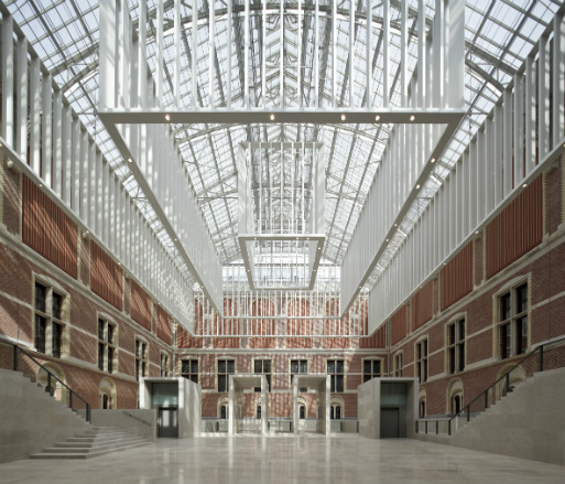
The former museum was divided into two by a central public passage. In its reincarnation, the architects dug deep to create a huge hall to connect the two atriums. A subtle curve across the hall floor is an architectural ploy to build up expectation for the visitor, while a vast atrium lets natural light flood in. Every detail of the exhibition spaces, from the lighting to the frames, has been carefully thought through.
Lighting plays a huge part in the new museum's story. Thanks to Dutch technology giant Philips, the Rijksmuseum is entirely lit with LEDs. The same lighting unit, developed specifically for the museum by Philips' researchers in Silicon Valley, was used throughout. With five lenses, two reflectors and nine LED lights, it produces a colourless, crisp white light that can be tweaked precisely to showcase the museum's masterpieces (which include works by Rembrandt, Vermeer and Hals) in the best way possible. Attached to square, linear or circular frames, these LED units create modern-looking chandeliers in all the galleries.
'The lighting unit is not obtrusive; it is invisible in the space,' says Rogier van der Heide, Philips' vice president and chief design officer, who had worked with the heads of presentation, conservators, curators, the architects and interior designer to find a simple yet sophisticated lighting system for the entire museum. On the museum's masterpieces, colour is complex and composed of many different pigments. Under halogen light the earth tone colours could be difficult to render, but the full-spectrum LED units show them in high definition, giving the objects depth and enhancing the texture of the paint.
Going up to the Gallery of Honour on the first floor, one finds that Rembrandt's magnificent 'Night Watch' remains the centrepiece, as before. The gallery offers a sequence of spaces - and a special lighting experience. Restored 19th century murals are housed in a dimmer environment, then one moves into small galleries with diffused and tranquil lighting - a mixture of daylight and carefully curated LED units. Finally, you arrive before the famous painting itself, which basks in an immense space filled with glorious, serene light.
The showcases are made from non-reflective glass glued without frames, which were designed and developed by French interior designer Jean-Michel Wilmotte, whose credentials include work for the Musée du Louvre and the Musée d'Orsay in Paris. The ultra-transparent glass allows light to reach the objects directly. 'Through technology you see the truth of art, which is the goal of the whole museum,' says van der Heide.
It seems every talent in the country has played his or her part in the museum's renovation. Irma Boom has designed a new logo. The uniforms are by fashion designer Alexander van Slobbe. Droog Design furnished the children's room with a chandelier designed by Richard Hutton and tables and seating by Piet Hein Eek. And classic Dutch furniture, such as Wim Rietveld's lounge chair and Friso Kramer's 'Revolt' chair, is used in the café.
Next, Pjibes plans to bring the two-star Michelin chef Mario Ridder from Rotterdam to the Rijksmuseum. Pijbes has famously curated the slow food festival at the Kunsthal in Rotterdam during the past decade, and he is on a mission to give overseas visitors opportunities to celebrate his country's culture with all five senses.
The Rijksmuseum is a showcase of what this country can do when it really wants something great. Work is not yet finished; this is merely the beginning of a new era for the museum.
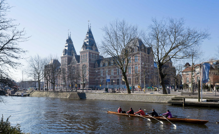
Located in Amsterdam's Museumstraat, the museum has been brought up to date with new technology for the 21st century
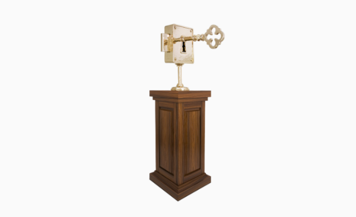
The inauguration ceremony will see Queen Beatrix open the revamped building with a oversized polished-bronze key and lock,
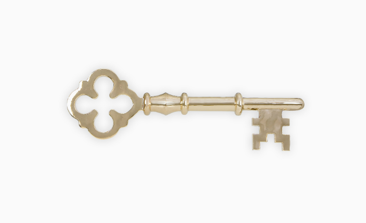
The lock and key were created especially for the event
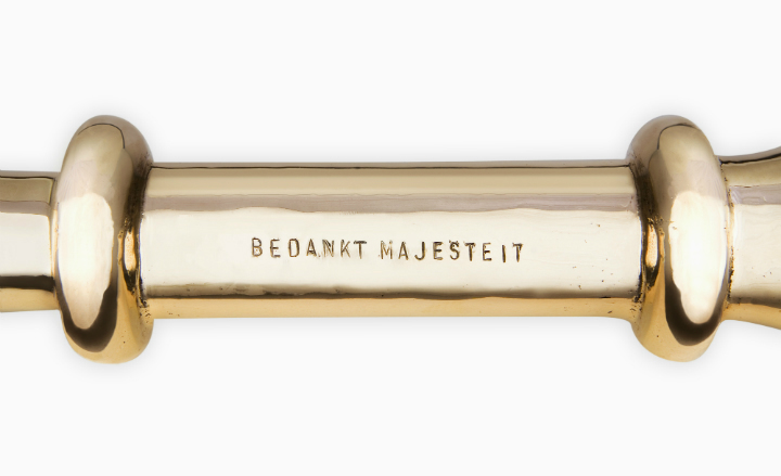
The key has been engraved with the phrase 'Thanks Majesty' in Dutch. The inauguration ceremony will be one of the Queen's last engagements before her abdication at the end of the month
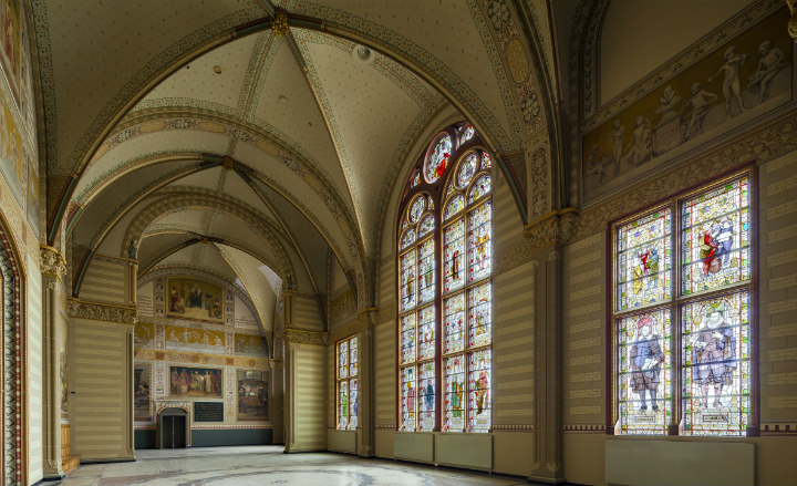
Inside the Rijksmuseum, the galleries offer a sequence of spaces, each with its own lighting experience conceived by Dutch technology giant Philips. Here, restored 19th century murals are seen in a soft, dimmed environment
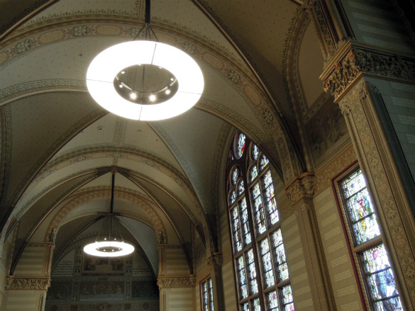
then one moves into small galleries with diffused and tranquil lighting - a mixture of daylight and carefully controlled LED units
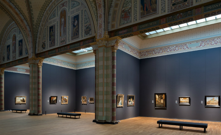
The small galleries are filled with the best of Vermeer, Hals, Rembrandt and other masterpieces of Holland's Golden Age
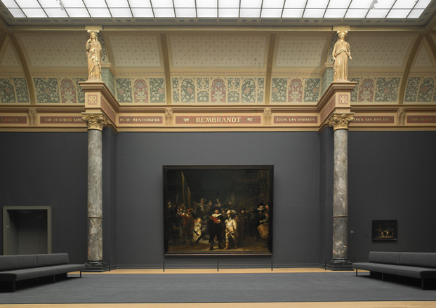
Finally, you arrive before the museum's most famous painting - Rembrandt's 'Night Watch' - which basks in an immense space filled with glorious, serene light. Philips' vice president and chief design officer, worked with the heads of presentation, conservators, curators, the architects and interior designer to find a simple yet sophisticated lighting system for the entire museum.
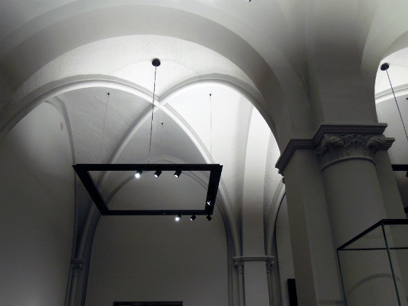
Lighting plays a huge part in the new museum's story. The same lighting unit, developed specifically for the museum by Philips' researchers in Silicon Valley, is used throughout. With five lenses, two reflectors and nine LED lights, it produces a colourless, crisp white light that can be tweaked precisely to showcase the museum's masterpieces in the best way possible. Attached to square, linear or circular frames, these LED units create modern-looking chandeliers in all the galleries.
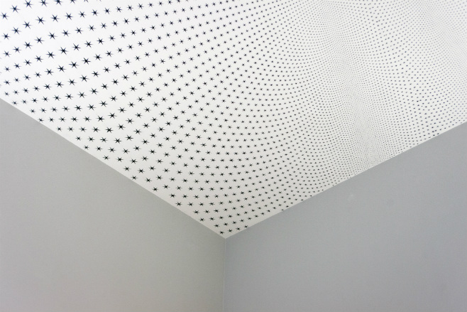
Two newly commissioned site-specific permanent ceiling paintings by the British Turner Prize-winning artist Richard Wright are situated in two antechambers located to the left and right of the museum's Night Watch Gallery. The complex patterns, with more than 47,000 hand-painted black stars, is inspired by the original 19th century decorative wall and ceiling paintings designed by the architect of the Rijksmuseum
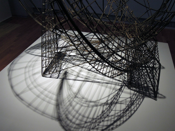
There are many 3-dimensional objects inside the museum. These are illuminated by LED lights with a special filter that produces strong shadows to give objects depth and enhance texture. Pictured is 'Space Circus' (1956-1961)
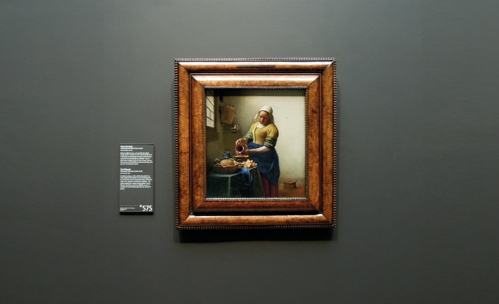
The colours of the masterpieces on show are composed of many different pigments. The full-spectrum LED units show every colour in high definition. Pictured is 'The Milkmaid' (1660)
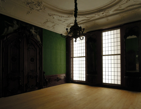
Daylight is also curated, thanks to the use of a sheer to filter the light coming into the galleries - a very simple concept, but one that unifies the space
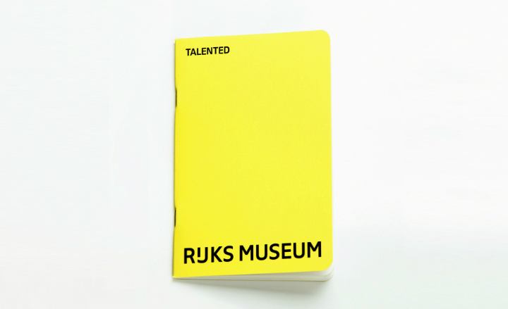
Irma Boom has designed a new logo for the museum, replacing the previous one by Studio Dumbar, which had been in use for 32 years
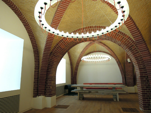
Droog Design furnished the children's Picknick room with a chandelier designed by Richard Hutton and tables and seating by Piet Hein Eek
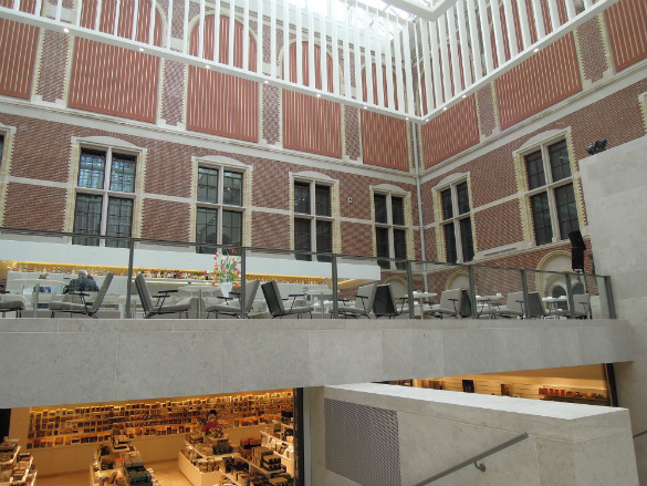
Classic Dutch furniture is used in the café, such as Wim Rietveld's lounge chair and Friso Kramer's 'Revolt' chair
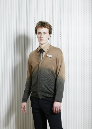
Alexander van Slobbe designed the uniform in the shades of masterpieces in the museum
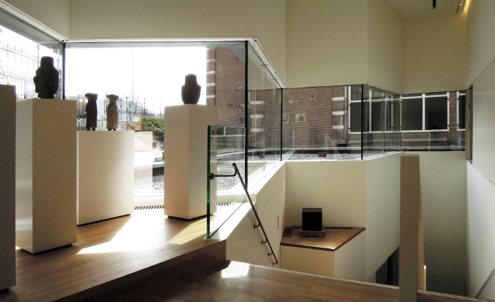
The newly added Asian Pavilion, designed by Cruz y Ortiz. People coming from the south can see the Pavilion's concrete-stone exterior from the museum's entrance. 'It is like a little treasure,' Ortiz says
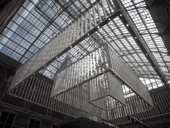
The 10 m-plus hall ceiling is covered by glass and supported by a massive steel structure. A huge chandelier in the shape of the roof unifies the two atriums. It also lets in natural light and provides a serene acoustic experience
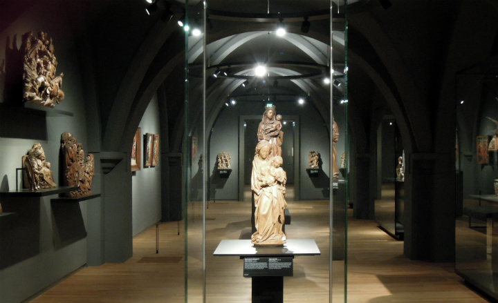
The showcases are made from non-reflective glass glued without frames, which were designed and developed by French interior designer Jean-Michel Wilmotte
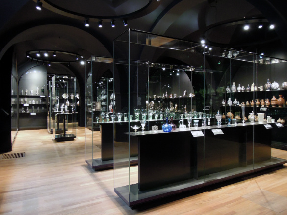
The ultra-transparent glass allows light to reach the objects directly
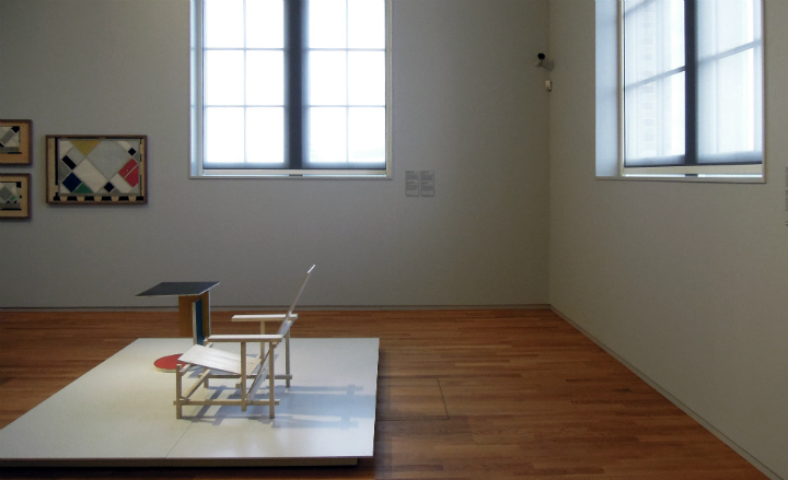
Armchair for Til Brugman by Gerrit Rietveld
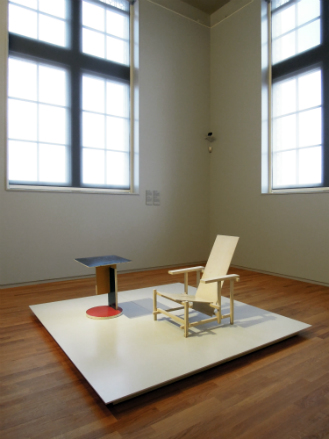
This white variant was commissioned in 1923 by writer Til Brugman for the music room in her house in The Hague

'Eight Stacked Beams' (1928)
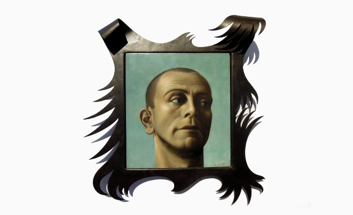
Self-portrait of Dutch iconic magical realism painter Pyke Koch (1936)
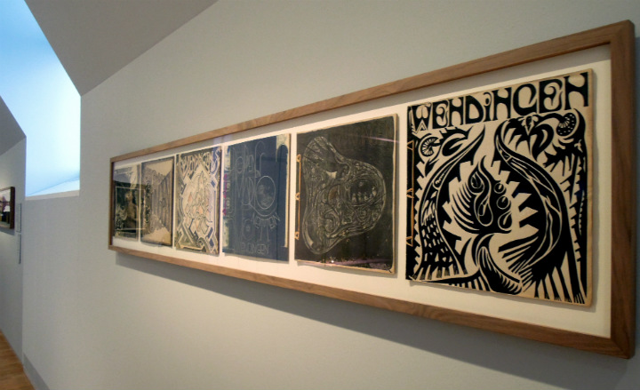
Cover art of the Dutch avant-garde periodical Wendingen in 1920s Netherlands, created by different contemporary artists
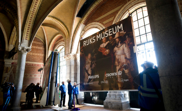
Philips has devised an intelligent, protective cover that keeps works like Rembrandt's magnificent and monumental Night Watch safe from damage by shocks, fluctuations in temperature, and atmospheric humidity
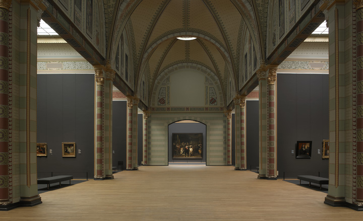
The Rijksmuseum is a showcase of what the Netherlands can do when it really wants something great. Work is not yet finished; this is merely the beginning of a new era for the museum
ADDRESS
Museumstraat 1
1071 CJ Amsterdam
Receive our daily digest of inspiration, escapism and design stories from around the world direct to your inbox.
Yoko Choy is the China editor at Wallpaper* magazine, where she has contributed for over a decade. Her work has also been featured in numerous Chinese and international publications. As a creative and communications consultant, Yoko has worked with renowned institutions such as Art Basel and Beijing Design Week, as well as brands such as Hermès and Assouline. With dual bases in Hong Kong and Amsterdam, Yoko is an active participant in design awards judging panels and conferences, where she shares her mission of promoting cross-cultural exchange and translating insights from both the Eastern and Western worlds into a common creative language. Yoko is currently working on several exciting projects, including a sustainable lifestyle concept and a book on Chinese contemporary design.