In the frame: graphic designer Hans Hillmann’s film posters go on show at Kemistry Gallery, London
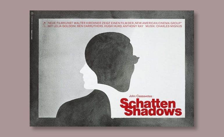
Illustrator Hans Hillmann’s film posters are set to draw new audiences decades after their release. The modernist graphic designer, who passed away this year in May, is being feted with the first UK showing of his work, opening today at London’s Kemistry Gallery.
Born in 1925, Hillmann took up poster design in the fifties while he was still a student at the Werkakademie in Kassel. He described German theatres at the time as a ‘cinematic desert’. Hillmann entered and won a number of film poster design competitions, attracting the attention of Neue Filmkunst, Germany’s first major distributor of arthouse films.
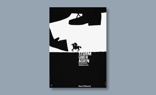
The company started up its own cinemas and set Hillmann to task. Between 1953 and 1974 he designed 130 posters, crafting visuals for mostly foreign films such as Jean-Luc Godard’s Breathless, Vsevolod Pudovkin’s Storm over Asia and Akira Kurosawa’s The Seven Samurai. The German designer collaborated with a niche roster of directors including Luis Buñuel, Federico Fellini, Ingmar Bergman, Jean Cocteau and Edgar Reitz.
Hillmann transformed the art of film advertising in Germany with his innovative style and Kemistry Gallery’s new exhibition explores the full scope of his ouevre. (His work is often likened to graphic design legend Saul Bass - however it’s disputed if the two were ever aware of each other's work at the time, although Hillmann was certainly inspired by his Polish counterparts Jan Lenica and Palka).
‘In the 1950s his designs were very groundbreaking,’ explains curator and film critic Isabel Stevens. ‘His style varies so much so it was important to show this in the [exhibition’s] selection; to include more illustrative, painterly designs as well as more minimalist designs, and those where he used photography.’
Hillmann demonstrated a chameleon-like ability throughout his career, constantly adopting new motifs and techniques. In the 1950s he used a painterly form of illustration, while throughout the sixties his designs increasingly included photography. His first photographic poster, for Robert Bresson’s 1966 Pickpocket, featured a black and white image shot by Hillmann himself of his hand emerging ominously through a coat.
The graphic designer also played with abstraction, layering, ripped paper and - as film budgets increased - colour. ‘Over the course of designing eight posters for Godard's films you can see Hillmann experimenting more and more with colour - some of them are really luminous,’ adds Stevens.
Film posters today, often brimming with credits, logos and websites, are a departure from the striking minimalism that marked Hillmann’s era. ‘His most stark creations were for his poster for Battleship Potemkin and for some of his designs for Godard's films,’ says Stevens. Hillmann’s Potemkin poster was a daringly distilled interpretation of the iconic Russian propaganda film.
To complete the homage to Hillmann, both the Goethe-Institut and Institut Français in London are screening a selection of films that he designed posters for. The triple UK billing is a must-see tribute to the late illustrator, who changed the face of German cinema lobbies.
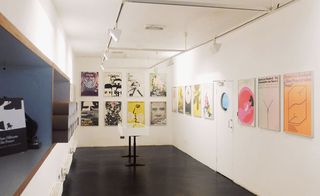
Between 1953 and 1974 Hillmann designed 130 posters, crafting visuals for arthouse films such as Jean-Luc Godard’s Breathless and Vsevolod Pudovkin’s Storm over Asia.
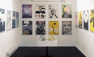
‘In the 1950s his designs were very groundbreaking,’ explains curator Isabel Stevens. ‘His style varies so much so it was important to show this in the [exhibition’s] selection; to include more illustrative, painterly designs as well as more minimalist designs, and those where he used photography’.
Hillmann demonstrated a chameleon-like ability throughout his career, constantly adopting new motifs and techniques.
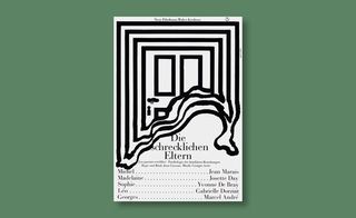
In the 1950s he used a painterly form of illustration, while throughout the sixties his designs increasingly included photography.
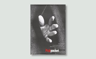
His first photographic poster, for Robert Bresson’s 1966 Pickpocket, featured a black and white image shot by Hillmann himself of his hand emerging ominously through a coat.
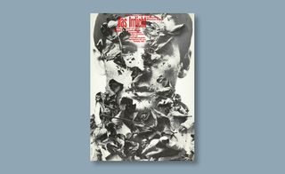
This poster for one of Louis Malle's darkest productions depicts decaying leaves scattered over a black-and-white portrait, alluding to the film's plot about a melancholic man resisting the urge to take his own life.
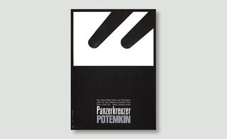
One of his most stark creations, Hillmann’s poster for Battleship Potemkin was a daringly distilled interpretation of the seminal Russian propaganda film
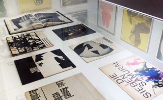
Hillmann transformed the art of film advertising in Germany with his innovative style and the exhibition explores the full scope of his ouevre.

Hillmann also played with abstraction, layering, ripped paper and - as film budgets increased - colour and scale. He produced two different renditions of his poster for Akira Kurosawa’s The Seven Samurai, including a mammoth 11ft wide version (pictured)
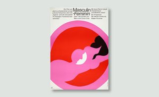
Stevens explains, ‘Over the course of designing eight posters for Godard's films you can see Hillmann experimenting more and more with colour - some of them are really luminous'
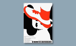
The Loneliness of the Long Distance Runner poster, 1966
ADDRESS
43 Charlotte Rd
London EC2A 3PD
Wallpaper* Newsletter
Receive our daily digest of inspiration, escapism and design stories from around the world direct to your inbox.
-
 Emerging galleries to discover during Milan Design Week
Wallpaper’s Milan editor has the inside track on the younger design galleries coming to town
By Laura May Todd Published
-
 Exploring this whimsical North London home feels like going down the rabbit hole
Wallpaper* series, The Inside Story, spotlights intriguing, exciting or innovative interiors. OntheSq is the result of a renovation of a beautiful period property, which has been dressed in a mélange of designs loosely inspired by 'Alice in Wonderland'
By Anna Solomon Published
-
 This ‘architourism’ trip explores India’s architectural history, from Mughal to modernism
Architourian is offering travellers a seven-night exploration of northern India’s architectural marvels, including Chandigarh, the city designed by Le Corbusier
By Anna Solomon Published
-
 A photographic trip through America’s roadside façades
In her ongoing series, The Mother Road, Hayley Eichenbaum documents the tainted romanticism of roadside architecture on Route 66 in the American Southwest
By Harriet Lloyd-Smith Last updated
-
 Beauty and decay: inside America’s derelict movie theatres
In a new photobook, photographers Yves Marchand and Romain Meffre capture a bygone era of entertainment through decaying American movie theatres
By Harriet Lloyd-Smith Last updated
-
 Art house: Laurence Kavanagh’s filmic works channel Mayfair’s Curzon cinema
By Elly Parsons Last updated
-
 Microfilms: the genre set to challenge the movie industry gets its own UK festival
A new festival in Nottingham plans to bring microfilms to the mainstream in the UK
By Ali Morris Last updated