Sadie Coles HQ invitations

Receive our daily digest of inspiration, escapism and design stories from around the world direct to your inbox.
You are now subscribed
Your newsletter sign-up was successful
Want to add more newsletters?
Though we're told never to judge a book by its cover we can’t help falling for a pretty invitation. And some of our favourites come courtesy of London gallerist Sadie Coles HQ.

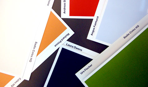
Since her inaugural exhibition by John Curran in April 1997, Sadie Coles has followed the same formula for each of her invitations. Taking the graphic identity of the gallery itself – a grey block that represents the gallery space and is found on all her branded material – she uses the same block on the invitations, allowing each artist to choose their own colour. A piece of the artist’s work is then shown on the inside of the card.
The invitations are made by London-based creative agency, Farrow Design: ‘The nice thing is that we have no control of the colour choice, which leads to some interesting results, such as three white ones in a row’, says Sabine Fasching from Farrow.
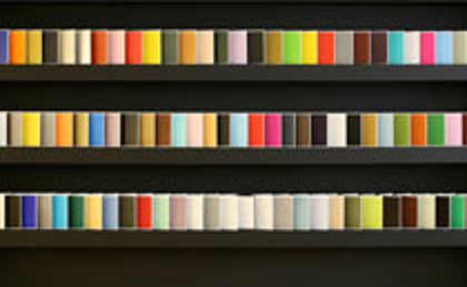
Having reached the milestone of 100 with Sarah Lucas recently, Farrow photographed the collection in its entirety. ‘Looking at all 100 together, you realise the colours were much more vivid at the beginning, becoming more earthy and the last two years have been really muted’, says Fasching. ‘Quite what this means I am not sure, but it’s an interesting observation’.
ADDRESS
Sadie Coles HQ
35 Heddon Street
London W1B 4BP
Receive our daily digest of inspiration, escapism and design stories from around the world direct to your inbox.