Gary Card talks us through his pyramid set for the 2015 Design Awards exhibition
Receive our daily digest of inspiration, escapism and design stories from around the world direct to your inbox.
You are now subscribed
Your newsletter sign-up was successful
Want to add more newsletters?
Since graduating from Central Saint Martins in 2002, the vivid imagination of British illustrator and set designer Gary Card has given birth to the most fantastical flights of fancy, each one studiously brought to life through his unwavering tenacity and unending enthusiasm.
To namecheck just a few of his achievements, he's created shop interiors for Cos and LN-CC, shop windows for Stella McCartney and Liberty of London, extraordinary set designs for Dazed and Confused and T Magazine, numerous headdresses for Lady Gaga and Comme des Garçons as well as hundreds of brilliant artworks and illustrations.
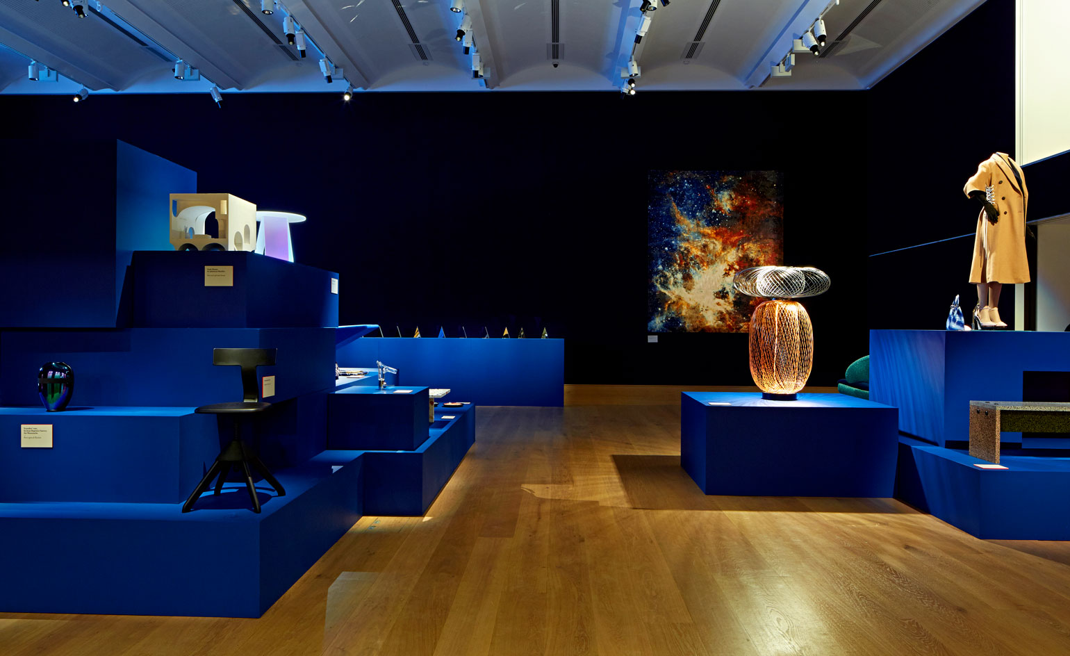
The latest addition to this lengthy list of commissions is the exhibition design for our very own Design Awards, hosted at London auction house Bonhams, which saw the designer build a series of towering multi-tiered pyramids out of intersecting brilliant blocks in our bespoke blue.
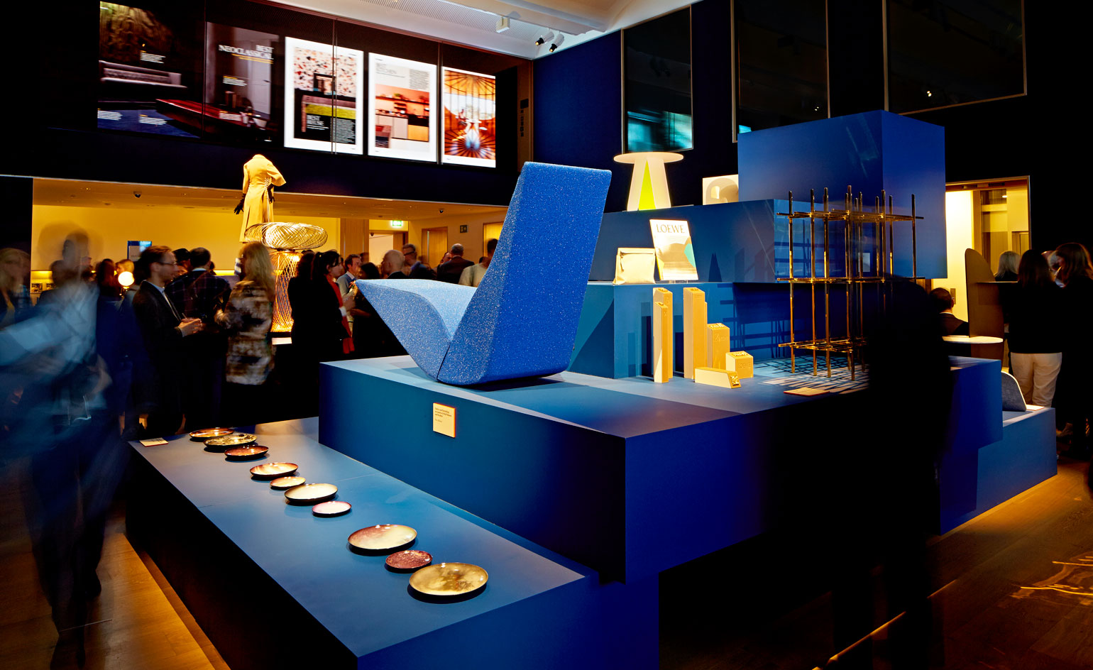
See the Design Awards party at Bonhams auction house
We spoke to Gary Card about his creative vision for the Design Awards exhibition...
Wallpaper*: What was the brief and how did you respond to it?
Gary Card: Sarah [Douglas, Wallpaper's creative director] approached me with the most perfect open brief. I think it was 'design the Design Awards'. The step plinth concept was conjured up with Sarah at a bar in Clerkenwell, drawn on napkin in fact - all the best ideas start on napkins don't they? I said, 'How about a Mayan pyramid plinth system?' - that was the initial impetus.
W*: How did you want visitors to feel when entering the space?
GC: Immediate visual impact is always important so I wanted to design something with an impressive sense of scale that inhabited the space completely. Luckily the Bonhams exhibition space was very easy to work with as it already had a warm, luxurious atmosphere to it - my job was to make something that was completely in tune with that space. I let the architecture of the space inform the design.
W*: You work across a broad spectrum, from fashion to sculpture, is your starting point for a project always the same?
GC: I always start with what the project needs questioning: what are the most important factors that we need to fulfill? At the same time I always design big and adventurous knowing we'll have to scale down. Its important for me to get excited about a design from the get-go. A lot of the time what I'm designing is either logistically impossible or far too expensive to produce but its important to start by saying 'what if...?'.
W*: The Design Awards encompass a wide variety of design disciplines. Was it challenging to create a set that catered to each of the categories?
GC: In short, no. I had faith that all the pieces would start to create their own logic together. One of the first ideas that came to mind was to make a centralised installation, almost like an editorial still-life. I wanted to bring the pieces together into one cohesive form and I liked the idea of all these different designs working together. Having everything on different levels was key. Some of the pieces had interesting juxtapositions between each other, things that wouldn't normally sit together. My goal was to create something that brought these different things together in an interesting yet harmonious way.
W*: Your design is quite restrained in comparison to some of your other works - was this deliberate?
GC: It's about giving the project what it needs. Sometimes a project needs to sing and dance, but a lot of the time it's about making something that simply supports the project. It was important to me to make something that was visually interesting but never overshadowed the pieces on display - it would have been inappropriate to design a display system that was more inventive than the work we were exhibiting.
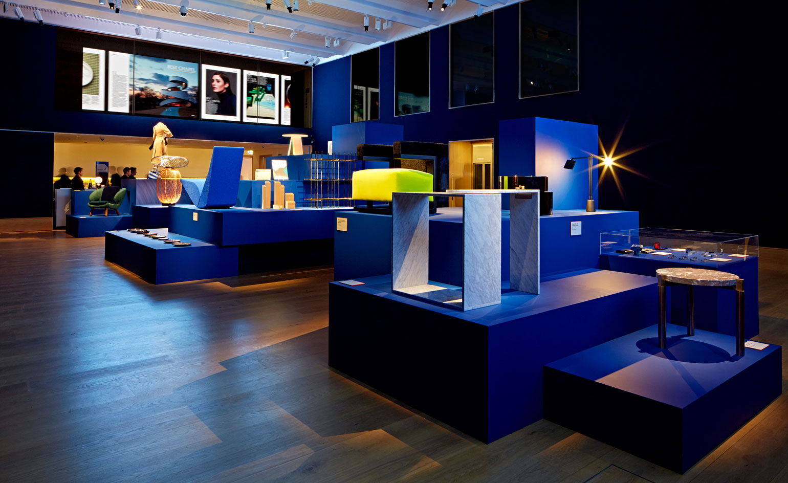
Displayed within London auction house Bonhams, the scheme was conceived as a system of Mayan pyramids in Wallpaper's bespoke blue. Beyond the pyramids, a large LED screen displaying images from the latest issue was mounted on a glass-fronted mezzanine
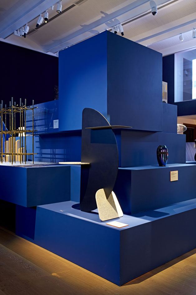
Transforming jeans into furniture, London designers Matteo Fogale and Laetitia de Allegri's clever use of 'Denimite' and 'Marblus' - marble-like materials created from post-industrial denim and cotton scrap - won them the 'Best Denim' award
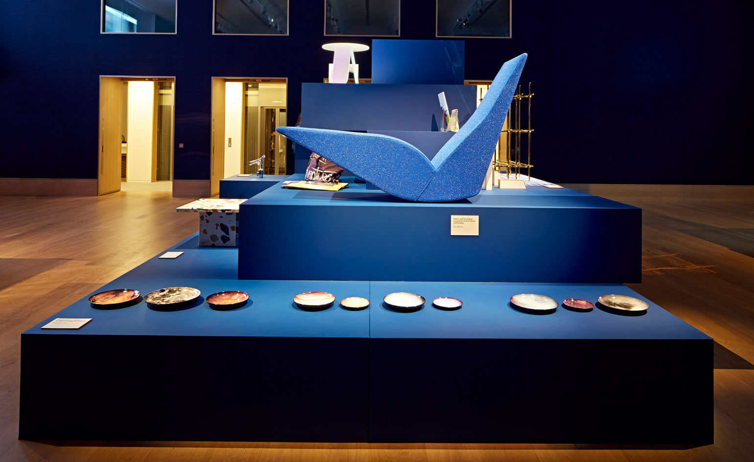
'It was important to me to make something that was visually interesting but never overshadowed the pieces on display,' says Card of his multi-tiered design. Pictured is 'Bird' chaise longue, by Tom Dixon, for Cappellini, upholstered in Kvadrat's 'Pilot' fabric and 'Cosmic Diner' plates, by Diesel Living, for Seletti
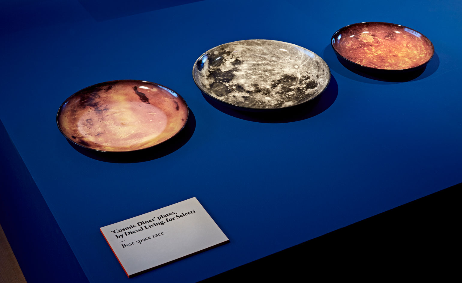
Set against the exhibition's brilliant blue backdrop, this trio of planet-inspired plates that form part of Seletti's collaboration with Diesel Living won top spot in the Best Space Race category
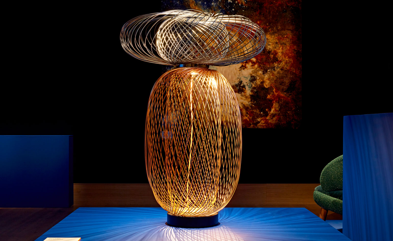
Taking the spotlight, New York designer Stephen Burks' 'Anwar Combinations' floor lamp is part of the debut collection from Parachilna, our Best New Brand
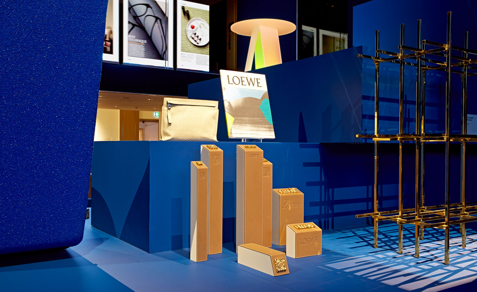
Jonathan Anderson and M/M Paris' fresh identity for Spanish luxury brand Loewe scooped the award for Best Rebrand with a look that nods to both its heritage and contemporary vision
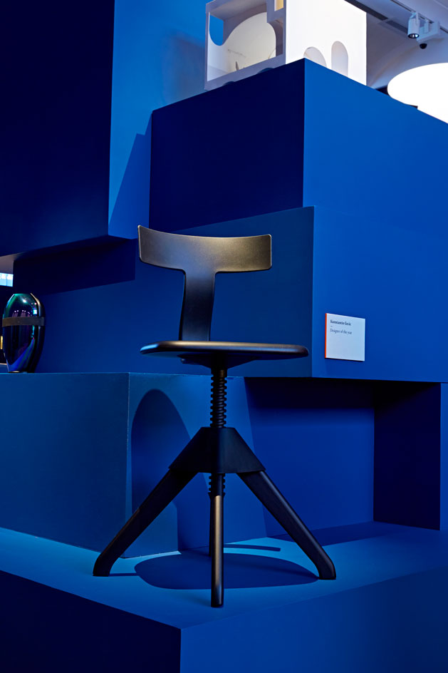
Magis' height-adjustable 'Tuffy' chair by Wallpaper's Designer of the Year Joint Winner, Konstantin Grcic, was on display
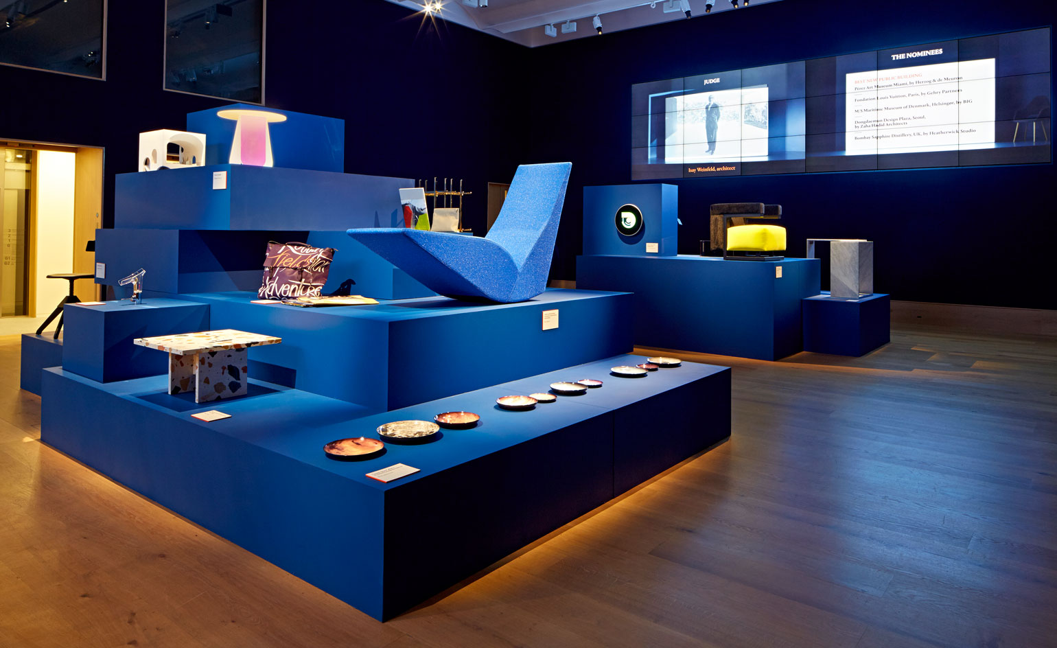
'Having everything on different levels was key. Some of the pieces had interesting juxtapositions between each other, things that wouldn't normally sit together,' Card tells us. 'My goal was to create something that brought these different things together in an interesting yet harmonious way'
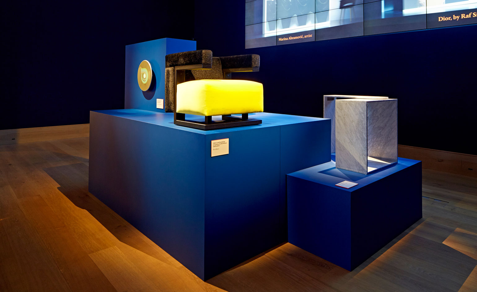
Teaming canary yellow with charcoal grey, Walter Gropius' 'F51' chair for Tecta was the perfect perch with which to show off Raf Simons' fabric collection with textile specialist Kvadrat - winner of our Best Alliance award
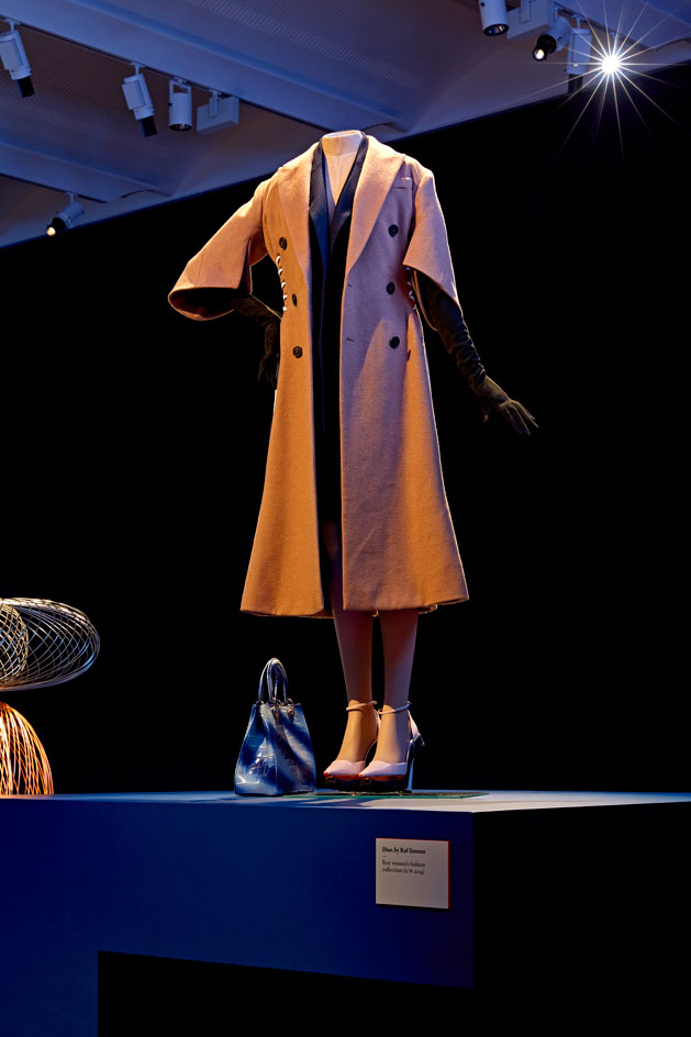
A statuesque mannequin donning a form-fitting Dior coat with brogue lacings represented creative director Raf Simons' well-deserved win in the Best Women's Fashion Collection (A/W 2014) category
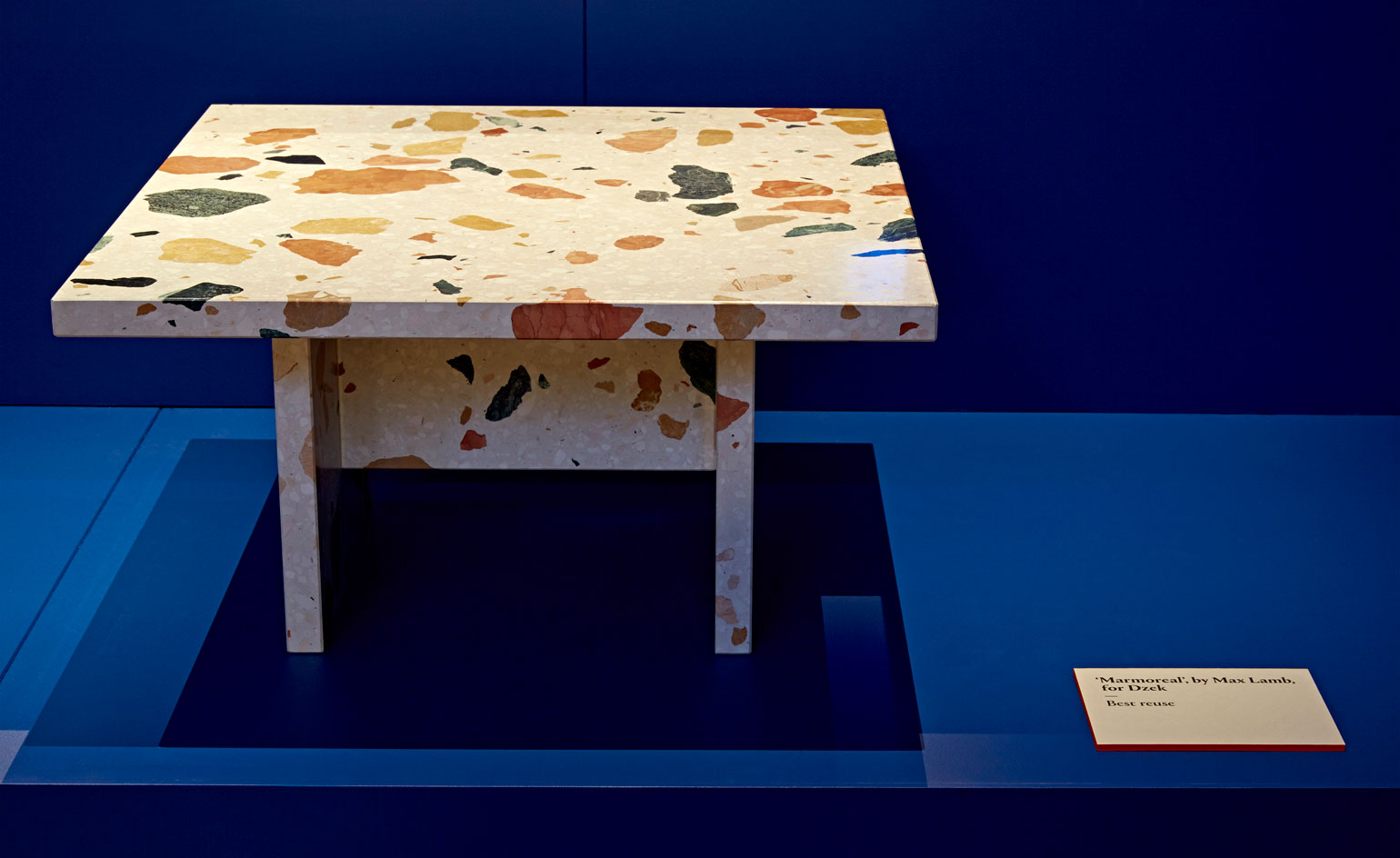
One of two winners in the Best Reuse category, Max Lamb's multicoloured engineered marble for Dzek, 'Marmoreal', is made using large offcuts of four different types of marble set into strong resin binders. Fashioned into a side table, the 'Marmoreal' slabs can also be used for flooring and wallcovering
Receive our daily digest of inspiration, escapism and design stories from around the world direct to your inbox.
Ali Morris is a UK-based editor, writer and creative consultant specialising in design, interiors and architecture. In her 16 years as a design writer, Ali has travelled the world, crafting articles about creative projects, products, places and people for titles such as Dezeen, Wallpaper* and Kinfolk.