Spoonful of sugar: Studio AH-HA gives Biocol a new graphic identity
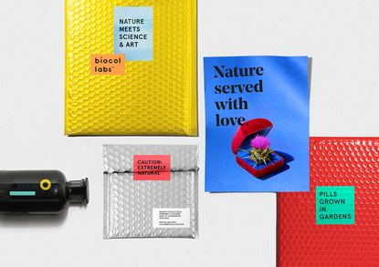
The medical realm is – by nature and definition – a clinical one. Long words, complicated chemistry, microscopic organisms responsible for pain and destruction, small white pills capable of healing and providing relief. With the exception of Damien Hirst's pharmaceutical-inspired art and its many incarnations, this is a world of graphically-challenged anticeptic identities, until now that is. Lisbon-based graphic design Studio AH-HA has created a visual identity for Biocol, breaking the scientific mould in the most spectacular way.
Biocol is a Portuguese medical lab known for championing the chemical-free approach to healing – 'free of nonsense' as they like to call it. Thus, their prescriptions take an uncommon starting point: natural ingredients. That proved to be the same starting point for Studio AH-HA's founding members Catarina Carreiras and Carolina Cantante. 'The colour palette we took from Biocol's ingredient list,' explains Carreiras. 'They only use natural ingredients – from vegetables like artichokes to minerals – which made the palette easy to balance.'
By balance of course, she means pop; simple images jump out against bright backdrops of solid colours. 'The crucial aspect was to simplify the medicine's message, not only in words but in visuals as well.' Striking a balance between artistic endeavour and the creation of a universal language, combining their playful typographic sensibilities with still-life images, the identity they produced is as powerful as it is playful. 'We wanted to make sure that everyone was able to understand it [the medicine] in one glance,' she adds.
Thus the instantly recognisable McDonalds chip holder is filled with asparagus; a cheese plant leaf stands tall in a glass of ice water; a blister pack contains small blossoms instead of pills. These unexpected twists all aim to communicate the function behind the Biocol remedy or potion in question; recovering from a food coma, rehydrating after a night of boozing or easing a cold with the power of nature.
As part of the visual overhaul, Studio AH-HA also created the company's entire branding, down to the envelopes, business cards and stationery. The logo – a simple dot, representative of pills – appears in various guises throughout; puncturing business cards and as the dot of the 'i' in the brand name itself.
Turns out there really is no better source of inspiration than nature.
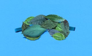
Biocol is a Portuguese medical lab known for championing the chemical-free approach to healing – ’free of nonsense’ as they like to call it. Pictured: Design from their beauty range
’The colour palette we took from Biocol’s ingredient list,’ explains founding member Catarina Carreiras. ’They only use natural ingredients – from vegetables like artichokes to minerals – which made the palette easy to balance’
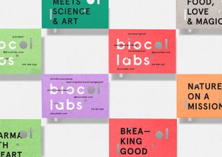
The logo – a simple dot, representative of pills – appears in various guises throughout; puncturing business cards and as the dot of the ’i’ in the brand name itself
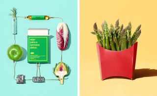
Unexpected design twists all aim to communicate the function behind the Biocol remedy or potion in question. Pictured left: medicine for detoxing, right: the instantly recognisable McDonalds chip holder is filled with asparagus
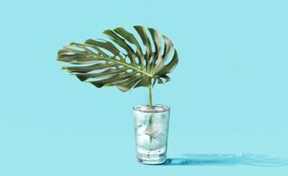
’There is no better source of inspiration than nature,’ the duo behind Studio AH-HA say. Pictured: A cheese plant leaf stands tall in a glass of ice water
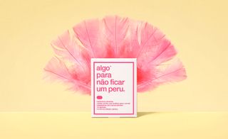
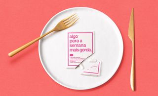
Studio AH-HA has combined their playful typographic sensibilities with still-life images, the identity they produced is as powerful as it is playful. Pictured: medicine for weight control
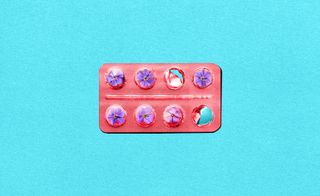
Colourful medicine to be used for restoring the immune system, a blister pack contains small blossoms instead of pills
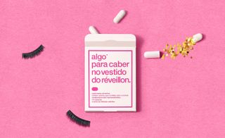
Playful typography on a pill box containing medicine to help fit into that party dress
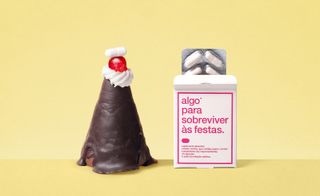
Combined still lifes and bright designs shown on medicine used to survive the boozy festive season
Wallpaper* Newsletter
Receive our daily digest of inspiration, escapism and design stories from around the world direct to your inbox.
-
 Travel editor Sofia de la Cruz’s gift guide for the discerning globetrotter
Wallpaper* travel editor Sofia de la Cruz curates her festive wish list, packed with stylish essentials for those constantly on the go
By Sofia de la Cruz Published
-
 Paul Smith’s Claridge’s Christmas tree is a playful slice of ‘countryside in the centre of London’
Sir Paul Smith is the latest in a long line of fashion designers to curate the iconic Claridge’s Christmas tree. Here, he talks to Wallpaper* about the inspiration behind the tree, which features bird boxes and wooden animals
By Jack Moss Published
-
 Victoire de Castellane nods to Dior motifs in a new fine jewellery collection
For the latest additions to the My Dior collection, Victoire de Castellane turns the house’s signature cannage motif into golden wonders
By Hannah Silver Published
-
 The Shining: new book sheds alternative light on Kubrick’s infamous film
We speak to designer Craig Oldham, editor of the new book The Shining: a Visual and Cultural Haunting about this cross-cultural reframing of Stanley Kubrick’s epic film
By Harriet Lloyd-Smith Last updated
-
 Rimowa celebrates its 120th anniversary with a new visual identity
Wallpaper* takes an exclusive look with CEO Alexandre Arnault and chief brand officer Hector Muelas
By Amy Serafin Published
-
 Decorating Tate: branding specialists North refresh the museum’s identity
By Elly Parsons Last updated
-
Brick by brick: Why Not Associates build deSingel a new visual identity
By Elly Parsons Last updated
-
 Topographic London posters by Melissa Price
By Malaika Byng Last updated
