Calvin Klein collaborates with Jürgen Mayer H
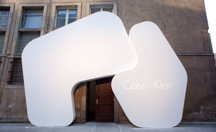
Calvin Klein held its biggest ever fashion event in Europe last week in true Berlin grunge-chic style. In a disused building complex that used to house the city's mint, the American label threw a party that made one wonder whether the printing machines weren't still rolling. White lilies by the metre plus gallons of Veuve and raspberry cocktails served by a small army of gorgeous young men provided extra sensory support to a living installation of some 50 models.
Posing on giant sculptural forms designed by Jürgen Mayer H, one of Germany's most interesting experimental architects, the models sported the coming season's oeuvre from the men's and women's Calvin Klein collections as well as ck Calvin Klein, Calvin Klein Jeans, Beauty, underwear and, in some cases, just their birthday suits. The show was an absolute relief from the bitchy pecking order of the conventional catwalk: no front row hierarchy, no jostling to get a good view, rather a refreshing opportunity to have a good long look at the collections and admire the detailing up close.
Directly after the show, Wallpaper* talked to architect Jürgen Mayer H about the advantages of cross-disciplinary collaboration with Calvin Klein:
W*: How did the commission come about to do this event with Calvin Klein?
A gallerist in New York, Sean Kelly, made the connection last year. He knew that Calvin Klein were looking for somebody in Europe who had all-inclusive ideas about space, architecture and an artistic approach, and brought us together.
Is this your first collaboration with the world of fashion?
Well, we contributed data patterns for the design of a suit for a very young label called Frisch in Berlin recently, but this is the first time we have collaborated on an architectural, spatial environment in connection with the fashion world.
Wallpaper* Newsletter
Receive our daily digest of inspiration, escapism and design stories from around the world direct to your inbox.
What was your starting point? Was the location already fixed?
We started from scratch with location scouting and found five or six very different spaces initially. It was important for Calvin Klein that the space had no fashion connections and that they would be the first to use it in this context, so the mint turned out to be the ideal spot in the end - and it is the one we wanted too.
How did you approach the project?
This is a concept that Calvin Klein has been developing over the past couple of years: not to have a runway show but an art/ museum approach to the presentation of fashion. The models stand still for about two hours in a kind of still life setting and the public walk around them. I find it interesting because it reverses expectations between the object and the viewer in the fashion world and uses a presentation form from a different context and different discipline. Our approach was to develop Stonehenge-like sculptural objects, huge forms of pieces that could fit together like a three-dimensional puzzle. Some were flat, some rounded, some interlocking, some had little cave spaces for the models to lean against or lie in. We wanted to have an intimate relationship between these shapes and the bodies of the models. We liked to play with the idea that a sculpture or a stone can wrap you and protect you like a piece of fabric.
There were six different rooms with six different constellations or configurations of the relationship between bodies and fabric and the fabric alone. Some of them had models on them, some displayed just clothes that were hanging from them or lying on them. We also created a sound element by using software that translates the patterns that we developed for the shapes into a sound structure - sound architecture.
So the sound, or music came from the forms of the pieces?
Yes, from the graphics for their shapes. I think it was a nice connection to have an acoustic quality combined with a visual quality. It was a bit similar, or a continuation rather, to the installations we made for the SF MoMA in our first monograph show last year.
How do you feel about the result in Berlin? Were you pleased with the show?
Yes I was very happy. I think the relationship between human bodies and architectural bodies worked really well. It made it a very atmospheric and successful situation. It was also a completely different audience for me. Since we already work in a cross-disciplinary way between art, architecture, design and planning, this was a nice addition to the approach that we follow.
There is a growing interest in cross-disciplinary work in many creative fields these days -- do you feel also that this kind of 'brand rubbing' is a positive thing for architecture?
Well Calvin Klein is a real brand and we are only just starting to get noticed! So I don't think you can really compare us. I think its about quality and sincerity in what you are doing, it does not matter how well-known or international the brand is. In this case it went very well, the collaboration was very smooth. All of us really wanted to push for the best results.
Did you find that you spoke the same language creatively when working together?
Well, obviously you sometimes have to ask again what each other means by a specific word: When you say 'models' they are talking about people and we are talking about cardboard so there is a confusion that is sometimes quite funny.
Are any more collaborations planned between JMH and Calvin Klein in the future?
At the moment no, but we agreed that the images created looked so good they could make an interesting ad campaign and Tom Murry (Calvin Klein's CEO) was definitely very pleased with the result and would like to work again with us - so who knows?
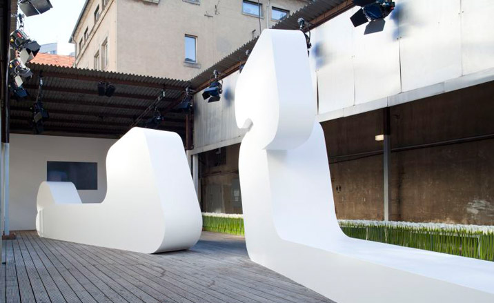
J. Mayer H. Architects were commissioned by Calvin Klein to create a backdrop for the brand's biggest presentation in Europe to date.
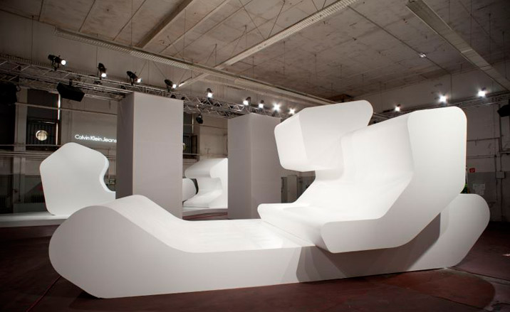
According to Jürgen Mayer H, the installation featured 'Stonehenge-like sculptural objects, huge forms of pieces that could fit together like a three-dimensional puzzle...'
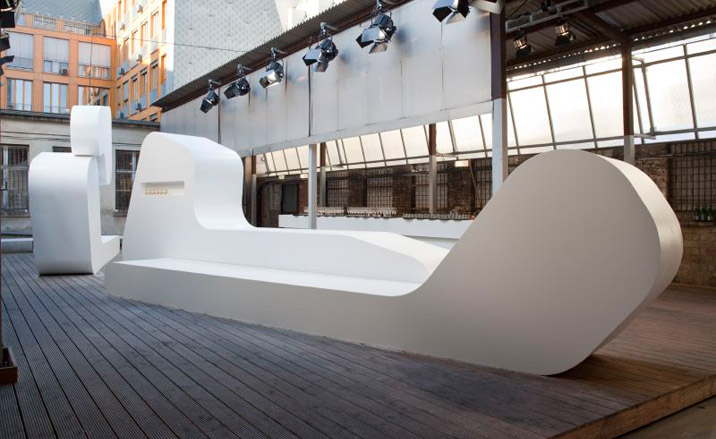
The show marked a different approach by Calvin Klein to the presentation of fashion.
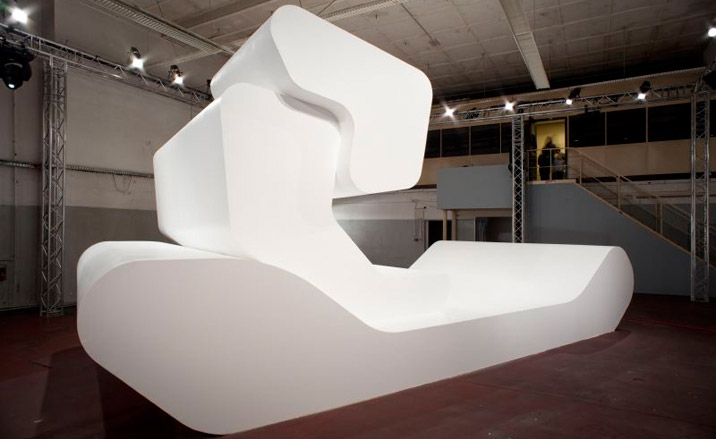
'... Some were flat, some rounded, some interlocking, some had little cave spaces for the models to lean against or lie in.
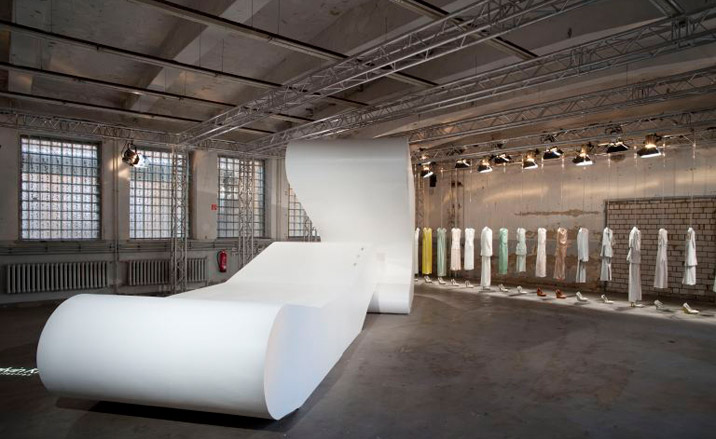
Six different rooms featured six different configurations of the installation.
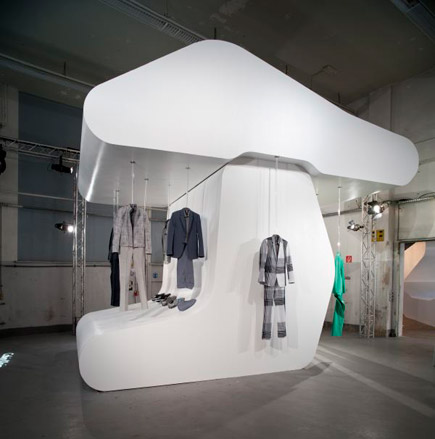
In some rooms, clothes were hung from the sculptures...
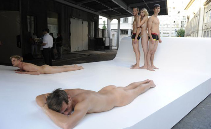
... in other areas, models interacted with the installations...
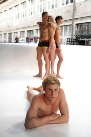
... in some cases wearing very little.
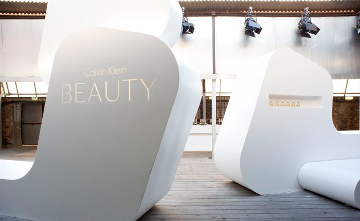
The presentation included an exclusive preview of the new fragrance, Calvin Klein Beauty.
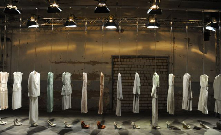
All lines were represented - men's and women's Calvin Klein collections as well as ck Calvin Klein Jeans, underwear and Beauty.
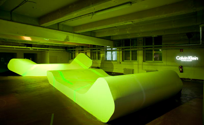
The Calvin Klein underwear room.
-
 At the Sony World Photography Awards 2025, architecture shines
The Sony World Photography Awards 2025 winners are announced, offering a visual feast in the Architecture & Design category
By Ellie Stathaki
-
 Dior holds an enchanting Kyoto show in the midst of cherry-blossom season
Maria Grazia Chiuri chose the grounds of Kyoto’s serene Tō-ji Temple to present a Fall 2025 collection that celebrated Dior’s longstanding links with Japan
By Jack Moss
-
 Giant rings! Timber futurism! It’s the Osaka Expo 2025
The Osaka Expo 2025 opens its microcosm of experimental architecture, futuristic innovations and optimistic spirit; welcome to our pick of the global event’s design trends and highlights
By Danielle Demetriou