Delvaux's new store concept by artists Martine Feipel and Jean Bechameil
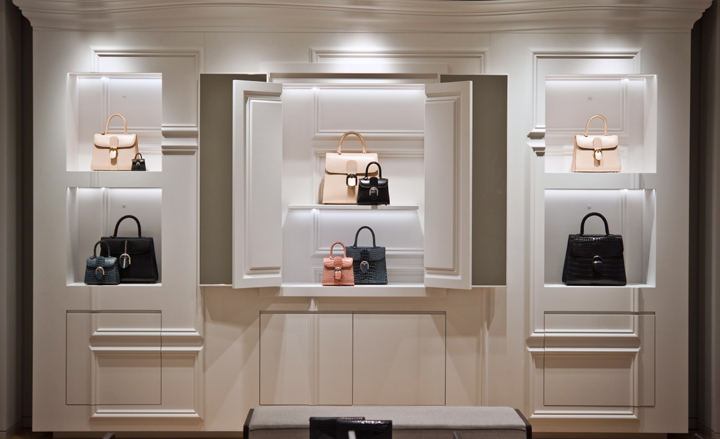
The Belgians may have had a love affair with Delvaux since 1829, but on an international playing field, the world's oldest fine leather goods house has not had the renown it deserves. All that is set to change. Luxury spenders are falling out of love with trend-driven 'in-your-face' product, and in a sea of fast fashion it's the bespoke, handmade item that is garnering the ultimate cachet. Armed with only the best leathers, stellar production values and now a new store concept, which embraces its heritage yet concurrently looks to the future, Delvaux's discreet revolution looks set to take over the luxury world.
A new global store concept, freshly unveiled in the brand's historical Galerie La Reine boutique in Brussels, comes courtesy of Luxembourg-based artists Martine Feipel and Jean Bechameil, together with architect Tiziano Vudafieri. La Reine was chosen as the launch boutique owing to its reputation as one of Brussels' oldest shopping hubs, and the Art Deco arcade exterior serves as a welcome foil to Delvaux's new space.
Dominating the interior is an airy white and grey palette, peppered with industrial wire-mesh panelling and elegant brass fittings. Overall, the feeling is modern, but with notable references to classicism and Surrealism - the later being a very big part of the nation's cultural history. Look closer and seemingly simple display cabinets are bordered with subtle curves and come with hidden compartments. This duality - the contrast of rough industrial material and luxurious finishes, the mix of secrecy and theatricality - is at the heart of Delvaux's store concept.
Feipel and Bechameil have clearly designed it as an elegant ode to Delvaux's Belgian heritage, and yet, crucially, the themes are subtle enough to be applied to stores worldwide. 'My strategy is "think local, act global"', Jean-Marc Loubier, president and CEO of Fung Brands, the privately held investment firm who owns Delvaux, said at the opening. The group's acquisition of the family-owned brand may have caused rumblings when it was announced in 2011, but the fact of the matter is the move has clearly injected funds and international expertise into the running of this small luxury Belgian house.
Loubier reveals that Delvaux's international client base has increased from two per cent to 15 per cent in the past couple of years. He expects this number to grow exponentially and cites the new store concept, which will be rolled out in a 'cluster strategy' of shop-in-shops and boutiques around the world, as a key player in that vision. 'We now have a universe to welcome clients and connoisseurs and tell them a story, which is out of the ordinary. Clearly rooted in Belgium, the project is a global one.'
We caught up with artists Martine Feipel and Jean Bechameil at the opening to talk and asked them about their vision for Delvaux's store concept...
How did your collaboration with Delvaux come about?
Christina Zeller [Delvaux product and image director] invited us to think about the new store concept for Delvaux after she saw our work at the 2011 Venice Biennale, so I guess it was natural that we always had the installation in the back of our minds when ideas were being thrown around for Delvaux. The Venice work was in a typical Venetian pavilion that you walk through, and we used the context of the place and also architectural elements, twisting them to create a new story for Delvaux based on what the brand evokes for us.
Run us through your store concept for Delvaux.
We wanted to start from the idea of 'encapsulation', a concept in computer systems where you are able to create a part of the program which acts almost like a container. The program is locked and you are able to open it, but you can't intervene, you can't change it. There is something about this 'encapsulation' we like - the fact that you have this thing contained in another thing, which contains another thing. We wanted to play on this ambiguity of hiding things and revealing things, where a door opens into another door or a mirror, before showcasing the final object - in this case, the precious bag.
The store concept is in keeping with your work, then, which is based around creating elements of surprise and introducing the unknown into a seemingly ordered space.
We really like the idea of opening things in another dimension. There is a lot of play on dimension in our work, because we often have this thing of working in a place and taking the existing elements and kind of twisting them around, treating the space like an origami that you can unfold and refold in many possibilities, and each time find yourself within another space.
So did you come in with the concept, the 'feeling', first, rather than working to the specifications of a fixed space and then creating fixtures for it?
Exactly. Right from the very beginning, the 'idea' was the root of it all. To make this understood by Delvaux, we decided to build a set, a 'fake shop' if you like, where we experimented with all the different ways of creating a shop over six months. This way we were able to evolve the space and make changes to parts as we went along, taking into consideration any technical problems that we would have never thought about before, being artists, and making changes. The fake boutique was our way of having a physical relationship with the concept, because in our artwork, we do a lot of the work ourselves even though we have assistants helping.
The storage panels look as though they have been deliberately cut with a line that runs through them. It is interesting how even the discreet spaces have a subtle detail that draws the eye.
It really homes in on this idea of encapsulation, but also playfulness. So you can open the doors, move things around, there's something joyful and also surprising. The molded panels, which have been skewed and twisted, immediately look like they are not really in the place they should be. And like you say, they have these borders that intervene in between, giving the whole scene a collage effect.
It's very pleasantly unexpected…
Yes. That's exactly what we wanted to build on - the surprise, the idea of the unexpected, the twist. It starts from something that is in a way traditional, but then is kind of flopped around completely to create something a little bit surprising and even strange.
Wallpaper* Newsletter
Receive our daily digest of inspiration, escapism and design stories from around the world direct to your inbox.
Being artists, this is the first time you've delved into a commercial project. Did you find it very challenging?
In art we are basically free, there is no 'functionality' to consider, it's just our fantasy, our ideas, so I think it was challenging in that respect. But we did then have this great collaboration with Tiziano [Vudafieri], who worked with us and helped us grapple with the technical and architectural details. Our work touches on different mediums - architecture, design and even performance - and it's nice to jump out of the art box and touch other mediums. It's very refreshing.
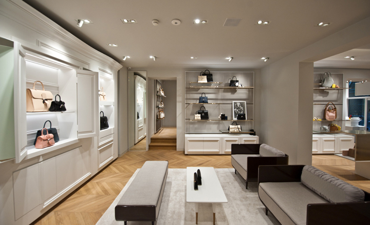
It has been designed by Luxembourg-based artists Martine Feipel and Jean Bechamel, together with the help of architect Tiziano Vudafieri
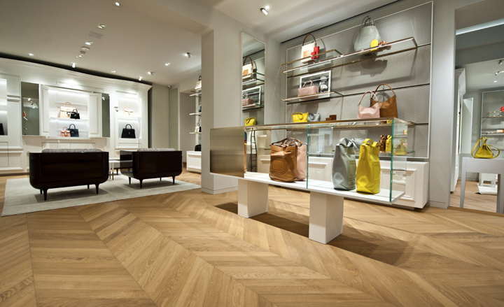
Dominating the interior is an airy white and grey palette, peppered with industrial wire-mesh panelling and elegant brass fittings
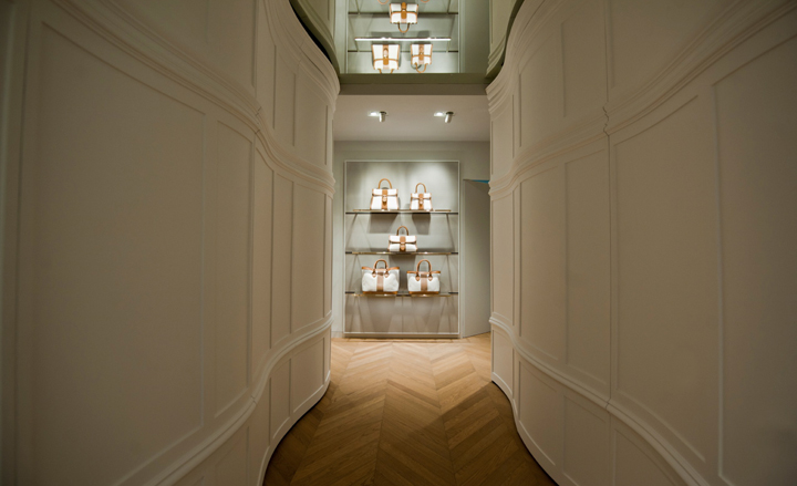
Debuted in the brand's Galerie La Reine boutique in Brussels, the fresh new look was conceived as an elegant ode to Delvaux's Belgian heritage
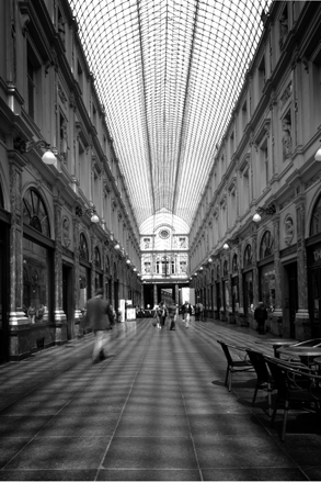
The Art Deco arcade at Galerie La Reine serves as a welcome foil to Delvaux's new space
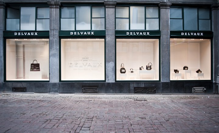
La Reine was chosen as the launch boutique owing to its reputation as one of Brussel's oldest shopping hubs
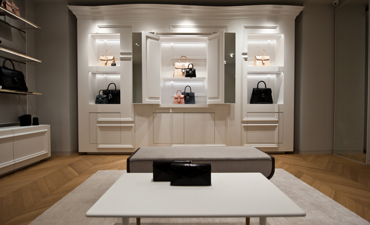
Overall, the feeling is modern, but with notable references to classicism and Surrealism - look closely and seemingly simple display cabinets are bordered with subtle curves and come with hidden compartments
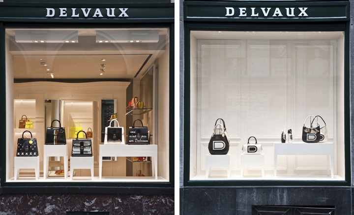
The contrast of rough industrial material and luxurious finishes is at the heart of Delvaux's store concept
-
 Japan in Milan! See the highlights of Japanese design at Milan Design Week 2025
At Milan Design Week 2025 Japanese craftsmanship was a front runner with an array of projects in the spotlight. Here are some of our highlights
By Danielle Demetriou
-
 Tour the best contemporary tea houses around the world
Celebrate the world’s most unique tea houses, from Melbourne to Stockholm, with a new book by Wallpaper’s Léa Teuscher
By Léa Teuscher
-
 ‘Humour is foundational’: artist Ella Kruglyanskaya on painting as a ‘highly questionable’ pursuit
Ella Kruglyanskaya’s exhibition, ‘Shadows’ at Thomas Dane Gallery, is the first in a series of three this year, with openings in Basel and New York to follow
By Hannah Silver