Fashion week A/W 2013 invitations: menswear collections
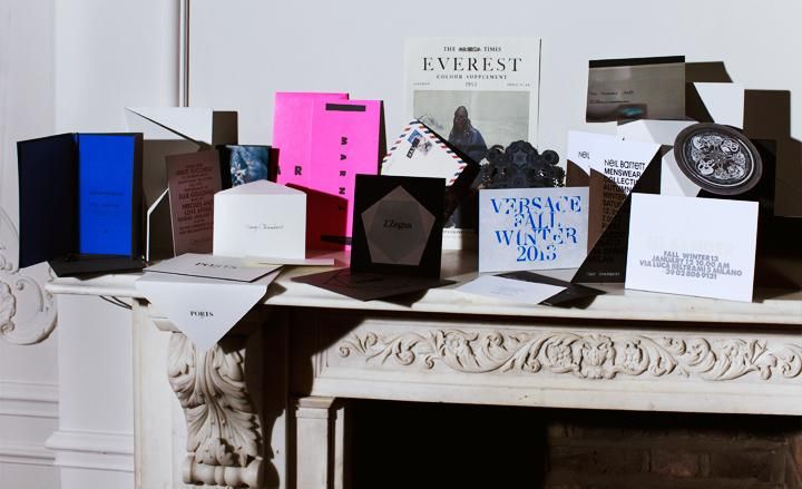
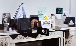
... and our pick from the Paris menswear shows
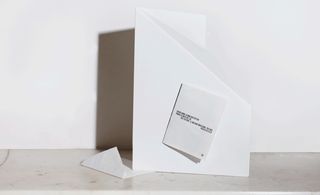
Givenchy: Each season, Givenchy sends out a limited-edition artwork by M/M Paris to guests. This printed illustration in black and white, with the house's logo in gold foil on the reverse, was folded into an elaborate envelope
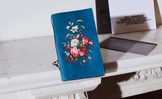
Dolce & Gabbana: This invitation was laid out in a booklet format. Show details alternated with delicate flower compositions on thin paper, the bouquets referencing some of the collection's prints
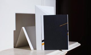
Hermès: A booklet printed with elegant graphic details in black and orange
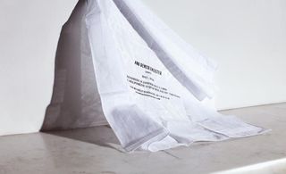
Ann Demeulemeester: For her Paris show, Ann Demeulemeester sent out a humble white handkerchief with a screen-printed motif and show details in simple black type
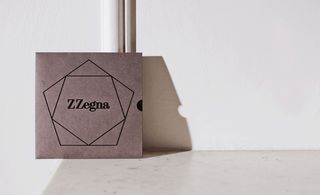
Z Zegna: A pentagonal motif referenced the collection's graphic textures, and the brown card had a contrasting black flock
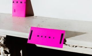
Marni: The bold fluorescent-pink Marni invitation got a punky treatment in matt black with asymmetrical design detail
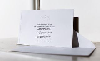
Ballantyne: The Ballantyne logo and crest stood out from an elegantly understated white card, with show details in basic black
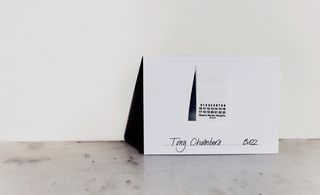
Maison Martin Margiela: A fan of the novelty feature, Margiela sewed a garment tag to a simple white card, with the show details on the reverse
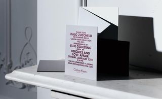
Calvin Klein Collection: This simple card from Calvin Klein displayed the details of the show in matt red foil
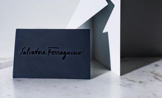
Salvatore Ferragamo: On the front of a plike card, the Maison's logo was embossed in black gloss; show details were printed on the back
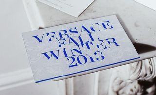
Versace: Bold Klein-blue lettering was interwoven with a sophisticated baroque design on a thick, blue-edged card
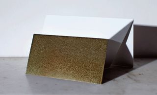
Gucci: The substantial mail-out from Gucci featured a darkened-gold face and edge. On the reverse, a matt black surface was embossed with metallic lettering
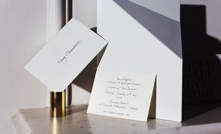
Moncler: The no-frills invitations from Moncler always contrast with the flamboyant narratives of the label's shows. This season's dinner invitation was handwritten on a plain white card
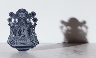
Diesel Black Gold: The 'Cosmic Tour' collection was announced with the delivery of a fantastical stage motif, intricately laser-cut to evoke the brand's psychedelic rock tour theme
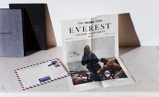
Bally Everest: Over in London, the mid-century Mount Everest explorations recalled on this Bally 'newsletter' celebrated the collection's central theme
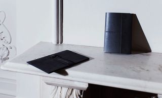
Armani: The two invitations for the Armani brands followed a similar theme. Giorgio Armani's felt envelope, closed with a button strap, revealed a simple black card inside. Emporio Armani's charcoal leather envelope was sealed by a magnet and carried a delightfully contrasting electric-blue card
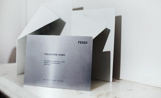
Fendi: This heavy metal offering came printed with only the most essential of show venue information
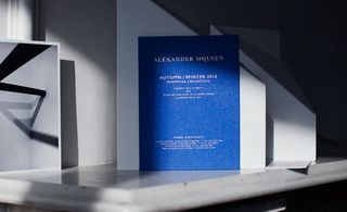
Alexander McQueen: Classic with a hint of drama, the Alexander McQueen show was heralded on a thick blue card with show details in gold foil
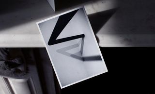
Margaret Howell: An abstract black form making a play of shadows was the prelude to the Margaret Howell show
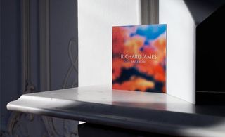
Richard James: More abstract imagery - this time in festive colour from Richard James
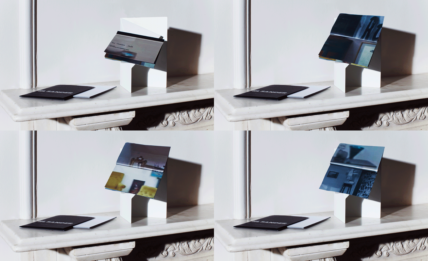
Prada: This invitation featured a teaser of the special set design which previewed a furniture collaboration between OMA and Knoll. The small booklet included compositions of blurred shots inspired by the interiors of the Milanese set
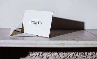
Ports 1961: The simple but sturdy invitation from Ports 1961 was printed on a duplex card with black edging
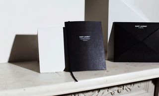
Saint Laurent: Hedi Slimane eschews standard invitations in favour of art booklets. For the latest, designer Brian Roettinger produced a series of black and white abstract ink prints, which were bound in a sleek black journal
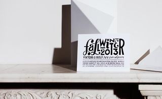
Viktor & Rolf: The invitation design from Viktor & Rolf was driven by a playful typographic illustration on a simple white card
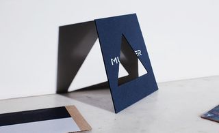
Mugler: A midnight-blue card with a graphic cut-out introduces Mugler on the front, and his show details on the back
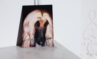
Yohji Yamamoto: Is there any dog more glamorous than the Afghan hound? Here he is, front and centre on the Yohji Yamamoto invitation
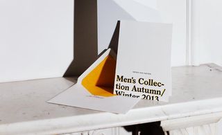
Dries Van Noten: A tangerine drop shadow gave this black lettering a contemporary feel at Dries Van Noten, while the accompanying envelope was lined with the same hue
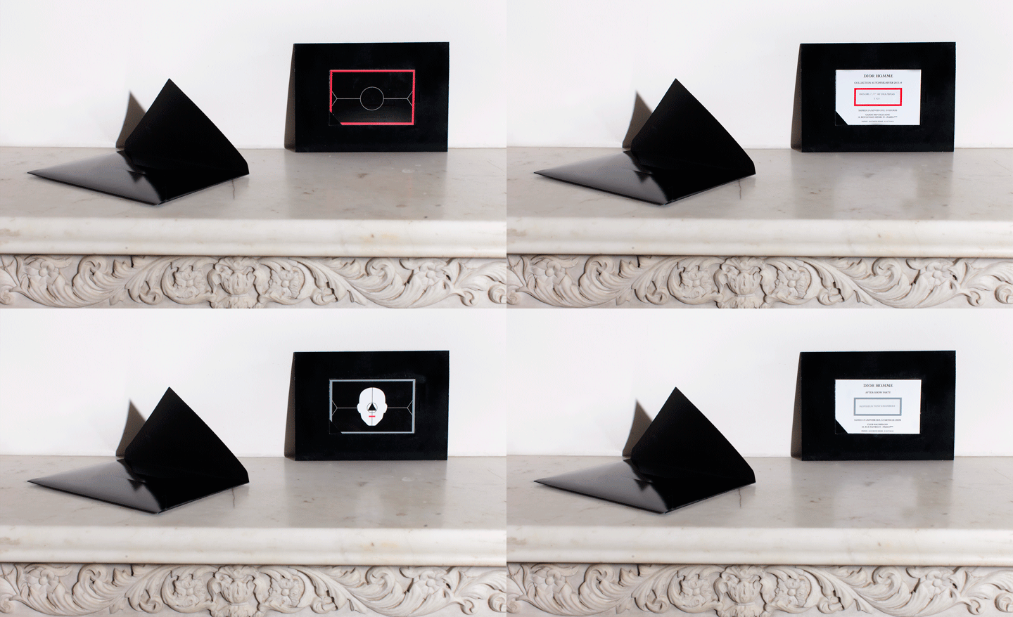
Dior Homme: A sleek black card came with two smaller pull-out tags containing the show details
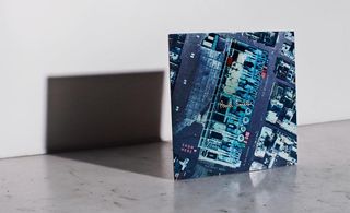
Paul Smith: With the show taking place at the Centre Pompidou, Paul Smith reproduced a negative of the building as seen from above; it doubled as a map for guests
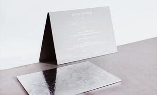
Louis Vuitton: Always working alongside the art world, Louis Vuitton commissioned Dinos and Jake Chapman to design a baroque print. They mined the house's archives and Himalayan imagery for their intricate print, debossed on silver mirrorboard for the invitation
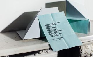
Comme des Garçons: As per the house style for Comme des Garçons invitations, unassuming typography was printed on a sheet of A4 - this season in aqua
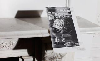
Junya Watanabe: A cheeky photograph of a child in fancy-foil dress introduced Junya Watanabe's Paris show
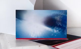
Kenzo: Kenzo sent out a holographic image of clouds passing through the sky, referencing the collection's dreamy prints
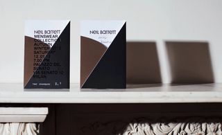
Neil Barrett: A fold-out card for Neil Barrett mixed matt black gatefold with foil block lettering
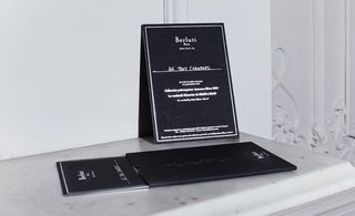
Berluti: For its presentation at Paris' grand Galerie de L'Evolution, Berluti chose an elegant thick black card with silver edging and block lettering
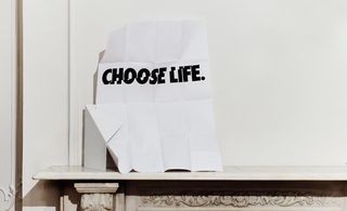
Kris Van Assche: A poster-sized invitation displayed the title of Van Assche's collection in bold black type. The message referenced 'Trainspotting' and Katherine Hamnett's 1980s slogan T-Shirts
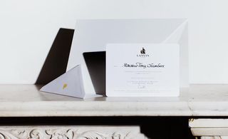
Lanvin: Rounded edges, gold accents and refined calligraphy are trademarks of the Lanvin invitation
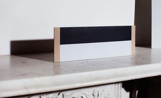
Rick Owens: A rectangle cut from particleboard was printed with black and white graphic blocks for Rick Owens
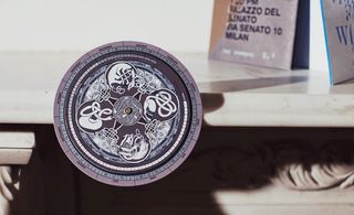
Etro: This season Kean Etro drew inspiration from Celtic symbols for the family brand's collection. The invitation turned them into a spinning 'circle of life' calendar
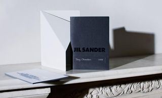
Jil Sander: Matt and glossy black contrasted on the Jil Sander card, which came with bold debossed type and a thick coloured edge
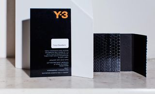
Y3: The art was in the envelope at Y3's invitation to its first men's fragrance launch, sleek and black with a geometric motif
Wallpaper* Newsletter
Receive our daily digest of inspiration, escapism and design stories from around the world direct to your inbox.
Jack Moss is the Fashion Features Editor at Wallpaper*, joining the team in 2022. Having previously been the digital features editor at AnOther and digital editor at 10 and 10 Men magazines, he has also contributed to titles including i-D, Dazed, 10 Magazine, Mr Porter’s The Journal and more, while also featuring in Dazed: 32 Years Confused: The Covers, published by Rizzoli. He is particularly interested in the moments when fashion intersects with other creative disciplines – notably art and design – as well as championing a new generation of international talent and reporting from international fashion weeks. Across his career, he has interviewed the fashion industry’s leading figures, including Rick Owens, Pieter Mulier, Jonathan Anderson, Grace Wales Bonner, Christian Lacroix, Kate Moss and Manolo Blahnik.
-
 Piaget’s new Sixtie watches recall a glamorous history at Watches and Wonders 2025
Piaget draws on historical codes with the trapeze-shaped Sixtie watch collection, revealed at Watches and Wonders 2025
By Hannah Silver Published
-
 A contemporary Swiss chalet combines tradition and modernity, all with a breathtaking view
A modern take on the classic chalet in Switzerland, designed by Montalba Architects, mixes local craft with classic midcentury pieces in a refined design inside and out
By Jonathan Bell Published
-
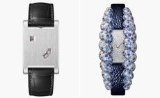 Cartier dials up the glamour at Watches and Wonders 2025
Cartier revamps much-loved watch collections, from Privé and Panthère to Tank and Tressage, upping the sparkle at the watch fair in Geneva
By Thor Svaboe Published