Receive our daily digest of inspiration, escapism and design stories from around the world direct to your inbox.
You are now subscribed
Your newsletter sign-up was successful
Want to add more newsletters?
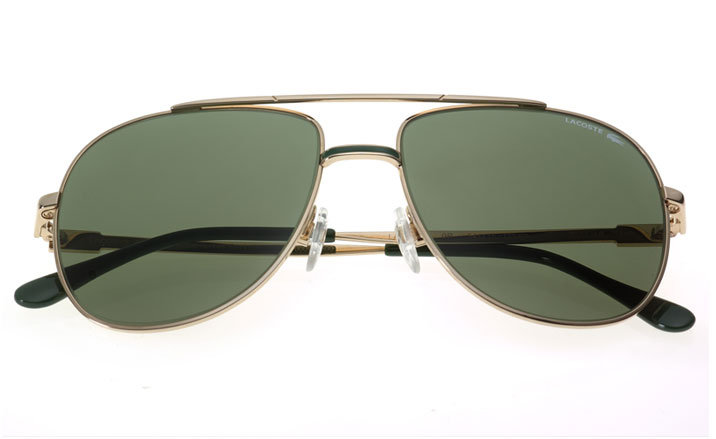
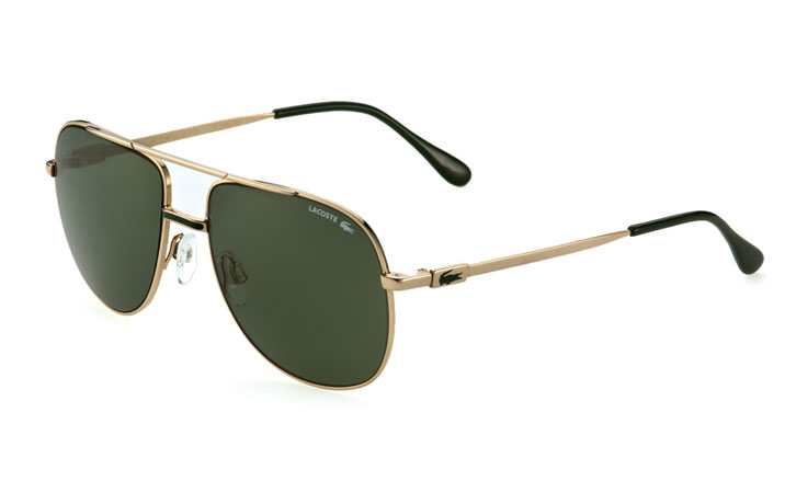
Heritage sportswear brand Lacoste has reissued a limited edition number of its original sunglasses from the 1980s. The Lacoste 101 aviator-style frames have changed very little in the 30-year gap since they were first introduced – a testament to the quality of the originals, or perhaps a sign that 1980s eyewear is replacing 1950s as the mode du jour.
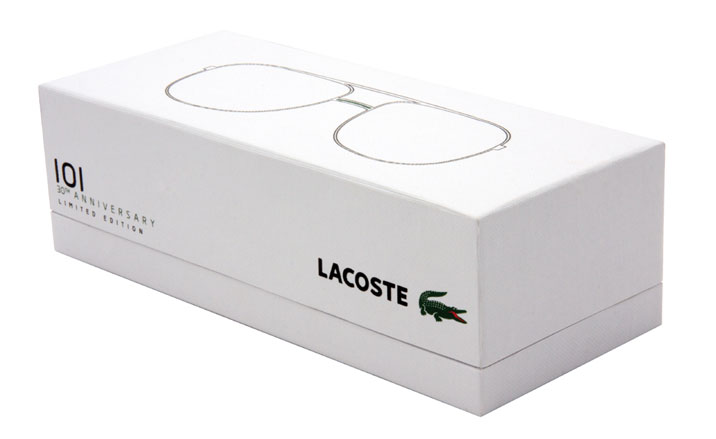
In fact the only thing that has been tweaked from the originals is quality of the debossed alligator logo on the temples. The packaging, created by French industrial designer Christophe Pillet, who is also the design director of Lacoste eyewear, has been given a retro futuristic update.
Taking the brand’s tennis heritage as a starting point, the white cardboard box and rubber green case fit neatly inside the tramlines of the sport’s colours and each box contains an official certificate card with the serial number of the frames. In select stores (including Colette, Dover Street Market and 10 Corso Como) the 101s have been reissued in a limited edition run of just 1,000 so you’ll have to be quick off the mark to get your hands on a pair...
We spoke to Christophe Pillet to find out more:
How did you get involved in the project?
We have a global plan to focus on the iconic products of the brand, from the first polo to footwear. So when we found the 101 sunglasses in the archives we decided to reproduce them immediately.
What is your connection to Lacoste?
Receive our daily digest of inspiration, escapism and design stories from around the world direct to your inbox.
I first designed the shop concept for them, then was involved in designing bags and watches and eventually eyewear. Today I serve as the Design Director for the brand.
How did you devise the design for the packaging?
When we re-release iconic products, we have to make sure that the packaging and environment (shop display, communications photos, etc...) are well connected. The funny thing about the 101 package is that after we designed it like it is, we then found photos in the archives of its packaging from 25 years ago and it was almost the same!
This year there have been more reissues than ever across many creative disciplines – why do you think this is?
There is a fear of the future. Because of so many changes and instability, people are now dissappointed with the future, so they look towards classic or iconic products with a certain nostalgia. During times of crisis, companies can either invest heavily into R&D and launch new products and new stories or they can go back and remind consumers what made them great in the first place.
If you could bring any one thing back to life, what would it be?
Optimism for the future.

The green rubber case, by Christophe Pillet

The Lacoste 101s have changed very little since their original issue in 1980

The only difference from the originals is a cleaner debossing of the green alligator logo on the arms
Jack Moss is the Fashion & Beauty Features Director at Wallpaper*, having joined the team in 2022 as Fashion Features Editor. Previously the digital features editor at AnOther and digital editor at 10 Magazine, he has also contributed to numerous international publications and featured in ‘Dazed: 32 Years Confused: The Covers’, published by Rizzoli. He is particularly interested in the moments when fashion intersects with other creative disciplines – notably art and design – as well as championing a new generation of international talent and reporting from international fashion weeks. Across his career, he has interviewed the fashion industry’s leading figures, including Rick Owens, Pieter Mulier, Jonathan Anderson, Grace Wales Bonner, Christian Lacroix, Kate Moss and Manolo Blahnik.