Serpentine Gallery Pavilion 2010 by Jean Nouvel
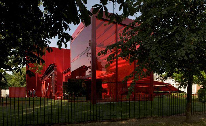
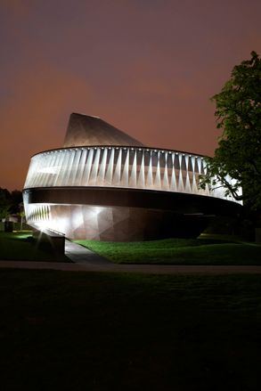
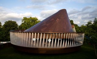
Jean Nouvel's new blaze of red steel in London's Hyde Park is the tenth in the Serpentine Gallery's series of summer pavilions, whose past pedigree of architects includes Zaha Hadid, Oscar Niemeyer and Saana, to reel off a few. Rarely one for quiet gestures, the French architect - whose previous projects include Paris' Institut du Monde Arabe and the Copenhagen Concert Hall - has created a bold geometrical structure with a soaring, 12m tall cantilevered wall. Here, we see it under construction and take a look at the full series of experimental pavilions.
Watch the film of Nouvel's Serpentine Gallery Pavilion under construction
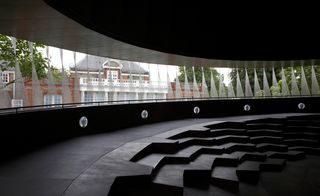
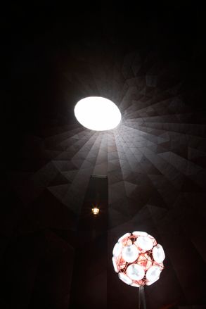
Nouvel's design consists of a series of retractable awnings and freestanding walls. It's a fluid, open space whose glass roofs and fabric screens manipulate the light to often hallucinatory effect. 'I wanted to play with the diffusion of light and diffraction of the surrounding images,' he explains. Inspired by British icons, like the London bus and the post box, the flaming structure is the first Serpentine pavilion to embrace colour. Says Nouvel: 'It's a symphony of different reds.'
Last year's floating pavilion by Saana inspired a high level of interaction from the public and this year's looks set to do the same. The pavilion invites people to play - be it with its ping pong tables or chess boards - and the space is strewn with an eclectic collection of benches, stools and mattress-like pouffes in varying shades of red. It may be a little haphazard for our liking, but it's intentionally so. 'I want disorder in this place,' says Nouvel.
This year's pavilion will also be home to the Serpentine café and a series of talks. Each year the architects are given just six months to complete their structures from the moment they are invited. Says Nouvel of his pavilion: 'It's not meant to be a perfect exercise of beautiful architecture. It's about the sensations that it provides.'
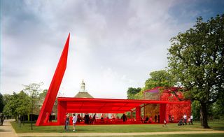
The frame of the structure was constructed in steel. A 12m tall, cantilevered wall emerges from the ground to the left of the pavilion at a gravity defying angle
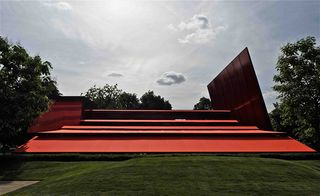
Nouvel's design consists of a series of retractable awnings and freestanding walls
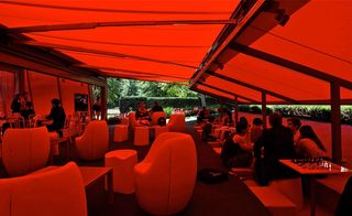
It's a fluid, open space whose glass roofs and fabric screens manipulate the light to sometimes hallucinatory effect
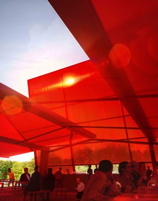
'I wanted to play with the diffusion of light and diffraction of the surrounding images,' says Nouvel
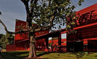
The pavilion will be home to Serpentine Gallery cafe and a series of evening talks
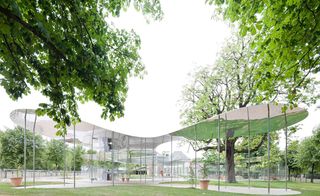
Serpentine Gallery Pavilion 2009 by Kazuyo Sejima and Ryue Nishizawa of Sanaa. Photograph by Iwan Baan
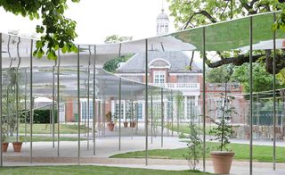
Sanaa described their structure as like 'floating aluminum, drifting freely between the trees like smoke.'
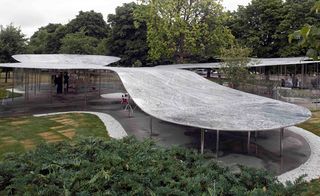
With no walls and no sense of physical restriction, Sanaa's hovering pavilion perched upon a sparse collection of wispy columns.
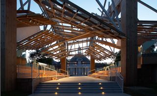
Serpentine Gallery Pavilion 2008 by Frank Gehry. Photograph by Nick Rochowski
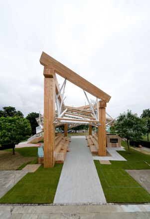
Gehry created a twisted mesh of glass, timber and steel, supported on four massive columns
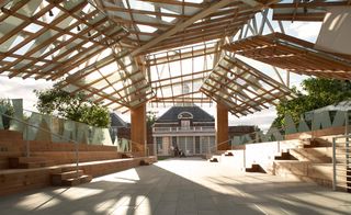
Generously proportioned stepped platforms along the sides transformed the space into an amphitheatre
Serpentine Gallery Pavilion 2007 by Olafur Eliasson and Kjetil Thorsen. Photograph by John Offenbach and Luke Hayes
The duo created a timber-clad structure, reminiscent of a giant spinning top
They experimented with vertical dimensions, abandoning the single-level structures of past pavilions
Inside the Olafur Eliasson and Kjetil Thorsen's pavilion
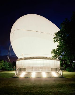
Serpentine Gallery Pavilion 2006 by Rem Koolhaas and Cecil Balmond. Photography by John Offenbach
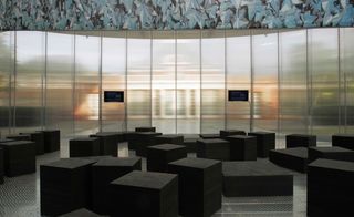
The centrepiece of the design was an ovoid-shaped inflatable canopy that floated above the gallery’s lawn. The walled enclosure below the canopy functioned both as a café and forum for televised and recorded public programmes, including live talks and film screenings.
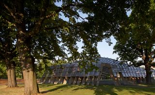
Serpentine Gallery Pavilion 2005 by Alvaro Siza and Eduardo Souto de Moura with Cecil Balmond. Photograph by Richard Bryant
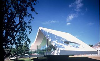
Serpentine Gallery Pavilion 2003 by Oscar Niemeyer. Photography by Richard Bryant
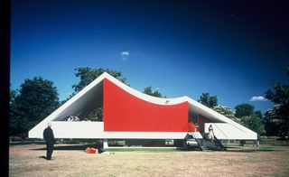
Built in steel, aluminium, concrete and glass, its ruby-red ramp contrasted with the surprise of a partly submerged auditorium, affording views across the park.
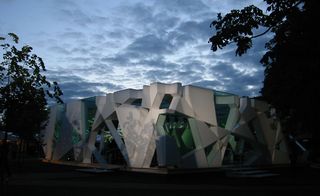
Serpentine Gallery Pavilion 2002 by Toyo Ito. Photography by Stephen White
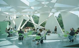
The numerous triangles and trapezoids formed by this system of intersecting lines were clad to be either transparent or translucent, giving a sense of infinitely repeated motion.
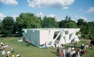
The form of the box was created by an apparently random jumble of straight lines created by feeding algorithms into a computer.
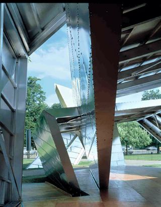
Serpentine Gallery Pavilion 2001 by Daniel Libeskind. Photography by Hélène Binet
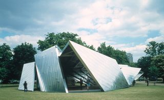
Named 'Eighteen Turns', the structure was created from sheer metallic planes assembled in a dynamic sequence.
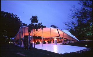
Serpentine Gallery Pavilion 2000 by Zaha Hadid. Photography by Dafydd Jones
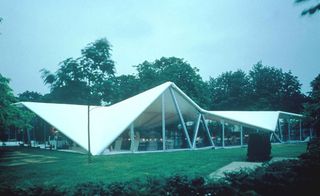
Taking its form from a triangulated roof structure, spanning an impressive internal space of 600sq metres, Zaha Hadid's pavilion was built primarily from steel
ADDRESS
Serpentine Gallery
Kensington Gardens
London W2 3XA
Wallpaper* Newsletter
Receive our daily digest of inspiration, escapism and design stories from around the world direct to your inbox.
Malaika Byng is an editor, writer and consultant covering everything from architecture, design and ecology to art and craft. She was online editor for Wallpaper* magazine for three years and more recently editor of Crafts magazine, until she decided to go freelance in 2022. Based in London, she now writes for the Financial Times, Metropolis, Kinfolk and The Plant, among others.
-
 Lexus makes its mark on Milan Design Week 2025 with four new interactive installations
Lexus’ annual installation at Milan Design Week focuses on human-centred technology and the role of data and design in shaping the luxury car of the future
By Jonathan Bell Published
-
 First look: Ikea’s new Stockholm collection is a venture into affordable luxury
At Milan Design Week, we meet with Ikea designer Paulin Machado to hear about the inspiration behind the new collection and to discuss the future of design in a disconnected world
By Tianna Williams Published
-
 Is Kiyoshi Kurosawa's 'Cloud' the techno thriller for the decade of online desperation?
Japanese director Kiyoshi Kurosawa dives into the black market world of merchandising in his latest techno thriller
By Billie Walker Published
-
 Looking at people looking at art: inside the mind of a gallery attendant
Visitor experience workers at London’s Tate Modern, Serpentine, Barbican and V&A share what it’s like to watch people looking at art during a time of changing attention spans and rising vandalism
By Kyle MacNeill Published
-
 Gerhard Richter unveils new sculpture at Serpentine South
Gerhard Richter revisits themes of pattern and repetition in ‘Strip-Tower’ at London’s Serpentine South
By Hannah Silver Published
-
 Tomás Saraceno’s spider-led show at Serpentine has legs, and lots of them
‘Web(s) of Life’, the first major UK show by Tomás Saraceno, is a living, collaborative and multi-species call to climate action involving everything from dog-friendly sculptures to ‘spider diviners’ – but no phones allowed
By Harriet Lloyd-Smith Published
-
 Steve McQueen to screen his harrowing film 'Grenfell' at London’s Serpentine
Acclaimed film director and artist Steve McQueen will screen his film, Grenfell, at London’s Serpentine South gallery (7 April-10 May 2023), six years after the Grenfell Tower block blaze killed 72
By Harriet Lloyd-Smith Published
-
 Barbara Chase-Riboud at Serpentine: alternative monuments, parallel histories
‘Infinite Folds’ at Serpentine North Gallery celebrates Barbara Chase-Riboud, the American artist, novelist and poet who has spent more than seven decades pondering history, memory, and the public monument
By MZ Adnan Last updated
-
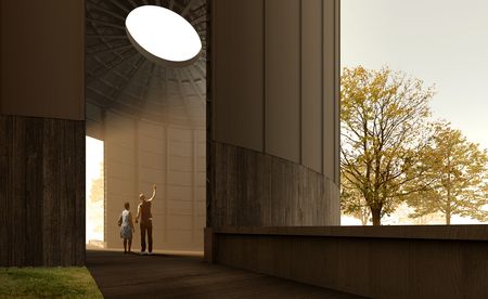 Theaster Gates’ design for Serpentine Pavilion 2022 revealed
The American artist and urban planner reveals his plans for the Serpentine Pavilion 2022. Black Chapel has spirituality, music and community at its heart
By TF Chan Last updated
-
Tom Hingston on designing for Serpentine Galleries, the V&A, and Wallpaper*
London-based art director and graphic designer Tom Hingston discusses his visual identities for Serpentine Galleries
By TF Chan Last updated
-
 140 artists on saving Planet Earth
In the book 140 Artists’ Ideas for Planet Earth, Serpentine Galleries’ Hans Ulrich Obrist and Kostas Stasinopoulos, alongside leading artists offer innovative solutions to the climate crisis
By Nuray Bulbul Last updated
