Venice Architecture Biennale 2010
Like every other conference, biennale, triennale, festival and trade show, Venice suffers badly from journalistic impatience. We've spent the past few weeks being buffeted by invites, sneak peeks, first glimpses and previews for this year's 12th Architecture Biennale, so making appearance at the event itself seem rather superfluous. Happily, we were wrong, for some things can't yet be distilled into streams of bytes for snappy global dissemination.
For a start, there's the atmosphere. The aesthetic contradiction of bringing the latest selection of avant-garde imagery, forms, ideas and presentations to one of the world's most harmonious and unchanged cityscapes isn't lost on the Biennale's participants; Venice is a place of contradictions, where black-clad, bespectacled professors of deconstructivism, parametricism and post-post modernism appear permanently intoxicated by the patina of murky canal water on ancient stone, weather-beaten facades and a sense of permanent, ongoing decay.
With this dichotomy set, the first order of business at the Biennale is traditionally a quiet but crucial race to out-intellectualise one another. This task is undertaken with gusto by the many national pavilions within the usually sedate Giardini, their wildly varying forms alive with the practically Olympian sport of curating. But 2010 is different, not least because the curator, Kazuyo Seijima of SANAA, appeared to have asked everyone to pare their more lyrical tendencies down to a single paragraph.
Just fifteen minutes of fast walking and scanning in the Arsenale elicited the sense that this year there's a little more heft and gravity to the main show. Why? Perhaps it is the very visceral feel of the materials, the water, wood, paint, dense clouds of moisture, sound, and light that makes this a more experiential, rather than theoretical, Biennale. The elements are all represented, as one would hope with an architectural show, but whereas previous years have relied on great textual screeds to support each invited exhibit, this year the architecture speaks for itself.
It was also resolutely uncommercial. A few developers, be they private or state, hovered on the edges, indicating that unlike its art counterpart, the Architecture Biennale is far from being a riot of sponsorship and co-branding. Perhaps that's just a sign of ongoing straitened times, but it was also notable that mega-structural project announcements and exhibits were few and far between. That said, Asian projects and studios were more prominent than ever before, with the West Kowloon Cultural District launching itself with a starry press conference featuring Foster and Koolhaas, and Singapore, Korea and Japan also making a strong showing.
Conversely, one of the other overriding themes of this year's show was preservation, with several pavilions and exhibitors showing how adaptation and reuse could be both economic regenerator and aesthetic success. 3D presentation was also in vogue, most notably in Wim Wenders' epic, but rather soupy, filmic portrait of SANAA's Rolex Learning Center. You also had to get the specs out in the Australian pavilion in Giardini, where slick night-time photography presented a Melbourne skyline that was more akin to Hong Kong or Las Vegas than a land down under.
Meanwhile, Wallpaper's own party in Venice celebrated the architectural gathering itself. Held in a private apartment at the gorgeous Palazzo Grandiben Negri near the Arsenale, the event was realised in conjunction with our lovely co-hosts, London-based Mackenzie Wheeler Architects.
Wallpaper* Newsletter
Receive our daily digest of inspiration, escapism and design stories from around the world direct to your inbox.
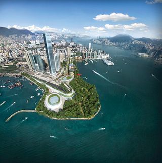
Hong Kong in Venice
OMA's presence in this Biennale was surely felt; not only did the Dutch practice celebrate its founder's Golden Lion award and present an installation in the Sejima-curated section, but it also was involved in designing the proposed masterplan for arguably one of the largest commercial projects on show. Additionally, OMA were not alone in that project; British architect Norman Foster is also heavily involved in the same masterplan, all for Hong Kong's brand new West Kowloon Cultural District. Part of the Biennale's collateral events and situated centrally just outside the Arsenale, the Hong Kong in Venice exhibition offers a glimpse of the city's vision for its new state-of-the-art cultural district.
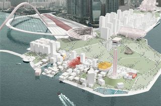
Hong Kong in Venice
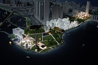
Hong Kong in Venice
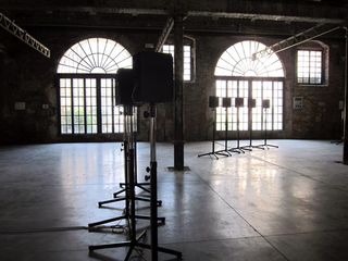
Janet Cardiff
Canadian installation artist Janet Cardiff created the Biennale's most sonorous and emotional space, setting up forty speakers in a circle and piping a specially commissioned choral work. In a uniquely eerie experience, the voices of the 40 singers spring out of the void from all angles, battering the visitors, dazed from a sweaty stumble through the rest of the Arsenale, into a moist-eyed reverie.
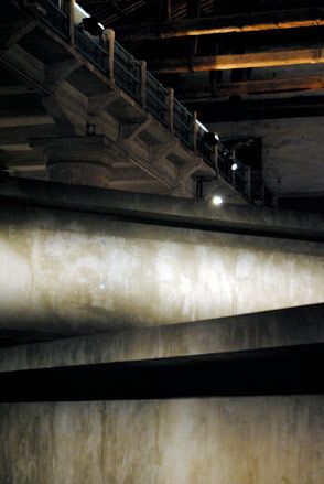
Anton Garcia-Abril and Ensamble Studio
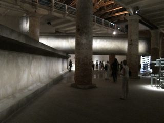
AGA and Ensamble's Hemeroscopium House is one of the most audaciously self-promoting residences built in recent times, a composition of concrete, steel and an artfully placed boulder. Their Biennale installation recreates the house's dramatic structural ploys, threading two vast beams through the columns of the Arsenale. More of a theatre set than a piece of real engineering art, it still conveys a powerful presence.
Anton Garcia-Abril and Ensamble Studio
Junya.Ishigami+Associates
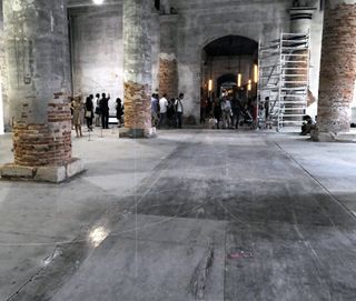
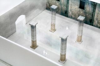
Ethereal to the point of invisibility (and suffering a few structural issues by the time the press gained access to the Arsenale), Ishigami's installation Architecture as Air: Study for Château la Coste, took the Golden Lion for best project.
Junya.Ishigami+Associates
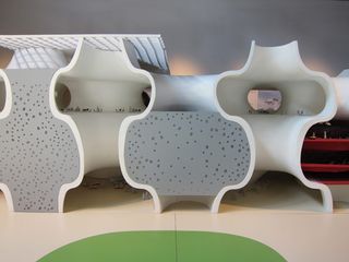
Toyo Ito architects
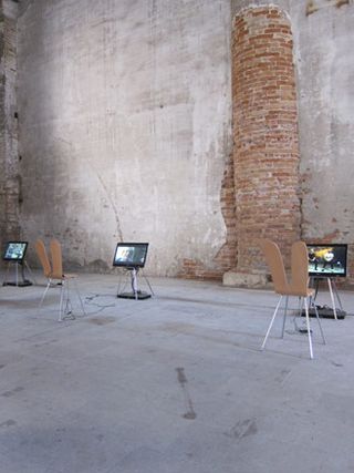
Hans Ulrich Obrist
Super-curator extraordinaire, Hans Ulrich Obrist took on the role of official chronicler of the Biennale's army of participants, presenting a room full of talking heads, with each and every architect, designer and artist fielding questions from the world's most indefatigable interviewer.
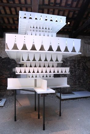
Valerio Olgiati
Swiss architect Valerio Olgiati is showing a project for a monumental Russian art museum that looms out of the fog like an inverted wedding cake. Rendered in plaster, the forthcoming Perm Museum XII has an almost Gormenghastian feel.
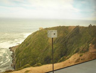
Pezo von Ellrichshausen Architects
Chilean stars Pezo von Ellrichshausen Architects are showing off their simple yet utterly beguiling Fosc House and Poli House using models, a stick and wall-sized photographs. Not quite as good as perching on the edge of the raggedly beautiful South Pacific coast, but as close as you'll get in the stifling heat of the Giardini.
OMA
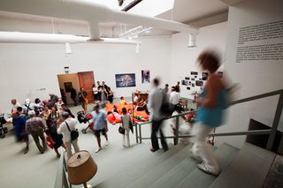
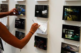
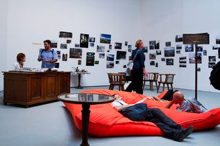
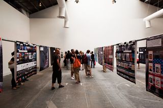
It was paradoxical that Rem Koolhaas should receive the Golden Lion at the 2010 Biennale. In previous years, it was all too easy to spot the OMA acolytes, with the info-saturated imagery, and dense splurges of research and data. But instead, Koolhaas was garlanded at a time when research-led exhibits gave way to experiential ones, and most of us sighed with relief. The studio is also exhibiting, choosing the Biennale to state a fresh approach. OMA's 'Preservation' installation in the Palazzo delle Esposizioni includes an overview of the office's 35 years of practice spliced with a study of rapid urbanisation and a stark warning at the losses to built culture as a result. The firm also shows a collaboration with Benetton to convert Venice's 13th Fondaco building into a 'culturally-programmed department store', as well as the expansive master plan for the West Kowloon Cultural District.
courtesy of OMA
OMA
OMA
OMA
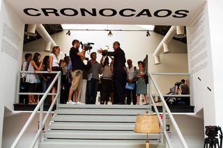
OMA
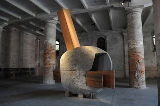
Smiljan Radic and Marcela Correa
Opening the Arsenale show was this moody piece of sculpture, entitled 'The boy hidden in a fish'. A monumental lump of granite pierced by a finely wrought cedar wood frame, the piece alludes to Chile's recent catastrophic earthquake
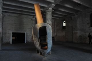
Smiljan Radic and Marcela Correa
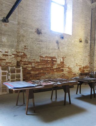
Studio Mumbai
One of the true highlights of the long parade through the Arsenale, Studio Mumbai created a fleeting sense of how these long, 15th--century industrial buildings must have felt in their heyday. 'Work-place' was formed from a forest of craft, carpentry, tools, maquettes, models, and samples - a stylised and romanticised version of the practice's working methods.
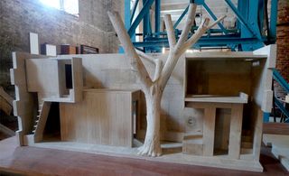
Studio Mumbai
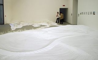
Fiona Tan + Kazuyo Seijima + Ryue Nishizawa
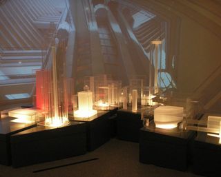
Seijima and Nishizawa collaborated with artist Fiona Tan to create large scale, installation-style context models of recent building studies, filling an entire room in the Italian International Pavilion with their bright white delicate miniatures.
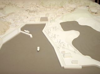
Fiona Tan and Kazuyo Seijima and Ryue Nishizawa
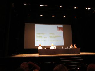
Wim Wenders
German director Wim Wenders was invited by Kazuyo Seijima to document SANAA's Rolex Learning Center in Lausanne. Wenders spoke entertainingly about the shoot - cajoling the architects to parade around the vast ramped floor plan on a pair of Segways, for example - and alluded to his struggles with the script, which he bashed out one evening during production. Although 'If Buildings Could Talk' was presented in sumptuous 3D, the breathy voiceover and thousand-mile stares of the subjects made it something of a curate's egg.
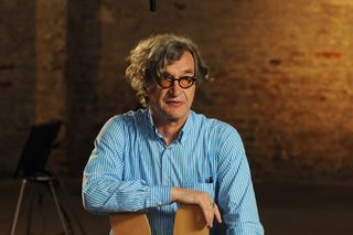
Wim Wenders
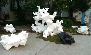
Aranda/Lasch with Island Planning Corporation
We all saw and admired New York based Aranda/Lasch's installation at the Arsenale in 2008 and following its success, the duo is now back for the Biennale's 2010 instalment; this time in collaboration with Island Planning Corporation and with the support of none other than Italian mega-fashion brand Fendi. Aiming to create 'something people can use', the architects designed a series of sculptural prismatic volumes beautifully scattered outside the Giardini's Palazzo delle Esposizioni for everyone's use.
www.islandplanningcorporation.com
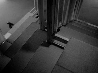
Depaor
Invited to participate at the main Architecture Biennale show for the first time, Irish practice dePaor architects have put together a wooden folly for the Palazzo delle Esposizioni, combining architecture and smell. Built out of pleated linen and lavendered softwood the structure is named '4am' and explores the idea of domestic space. The architects were also involved in co-curating the nearby Irish national pavilion, which showcases the cultural landscape of Ireland through the work of de Blacam and Meagher architects.
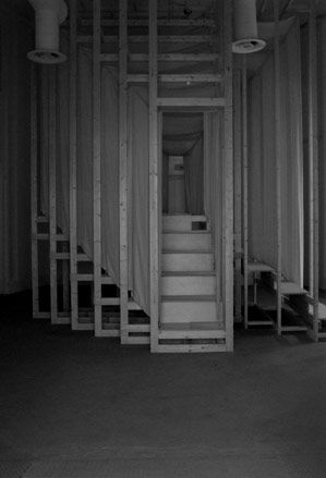
Depaor
Do-Ho Suh and Suh Architects
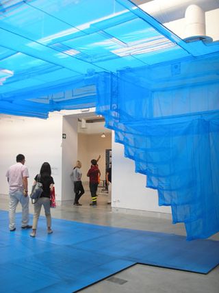
Part of Sejima's curated section and located in the Palazzo delle Esposizioni, artist Do-ho Suh and Suh Architects 'Blueprint' installation's strong presence fills the room. Exploring the idea of boundaries in residential design and domestic use, the design features a horizontal hanging 1:1 façade reproduction of Suh's New York townhouse mirrored in the house's front elevation print lying on the floor beneath it. The stricture's vivid blue hand-stitched transparent net nylon fabric adds to its dramatic effect and provides a calm yet powerful space for reflection.
Thomas Demand and Caruso St John
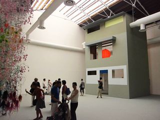
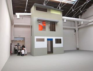
This is not the first time iconic German photographer Thomas Demand has paired up with multi award winning UK practice Caruso St John. For this year's Biennale, their Nagelhaus installation focuses on the notion of artificial memory, linking two old buildings in Zurich with the 'Stubborn Nail' - the story about the Chongqing province private owner who refused to sell and vacate his house to give way to a large development - all of course in full accord with its creators' shared reputation for perfectionism and clean structured syntheses of shapes and forms. Their installation in Giardini's Palazzo delle Esposizioni is based on their architectural proposal for the Swiss city's Escher Wyss Platz - a former industrial part of town, about to get an urban makeover with restoration road works and a new tramline - and the reuse of two old buildings beneath the viaduct running through it. The structure stands crisp and towering in the pavilion's central space and is imposing yet playful.
Thomas Demand and Caruso St John
Olafur Eliasson
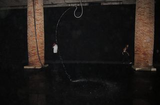
For his 'Split Second House,' Danish artist Olafur Eliasson has set strobe lights swirling through dripping water to create writhing snake like patterns that are gone in a flash. A background sound of cracking whips, and the dark, disorienting space in the Arsenal adds to the spook factor of his installation.
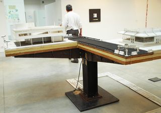
Tom Sachs
In what was formerly the Italian pavilion, artist Tom Sachs displayed sculptures dedicated to the legacy of Le Corbusier. Most of the works on display are not new, but highlight the relationship between Le Corb's masterpieces and modernity and modernity's dark-side; capitalism. Old versus new, low tech versus high tech and pieces emphasising heightened security are general themes.
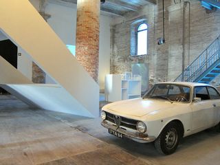
Piazzasalone by Mark Pimlott and Tony Fretton
'Eighteen-year-olds interact in web space, but traditionally people meet in public spaces. So we created one,' says British architect Tony Fretton of his Piazzasalone, an installation made with long-term collaborator Mark Pimlott which features a vintage Alfa Romeo bought on eBay and people-sized models of various projects. He adds: 'The idea behind the installation is that the buildings I make bring people together in the hope they will be sociable.'
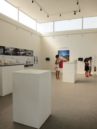
Brazil
Brazil's modest concrete structure plays host to an exhibition celebrating 50 years of Brasilia and, naturally, the recent output from Oscar Niemeyer, as well as work by (far) younger architects like Wallpaper* favourites SPBR.
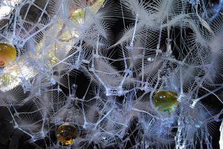
Canada
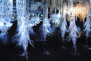
The most old-fashioned pavilion - inside and out - this smoked glass and steel structure, by Italian masters BBPR, houses an installation by architect and sculptor Philip Beesley titled 'Hylozoic Ground', a hissing, translucent inverted garden of clear acrylic fronds and stalks. It is certainly atmospheric, with something of the neo-organic quality of the models of Antoni Gaudi, and there is also a refreshing absence of digital media on display. Even so, the biological/architectural crossover feels rather out of time, a science fiction vision from the past (rather like the country's pavilion itself), awaiting a revival of interest.
www.philipbeesleyarchitect.com
Canada
Germany
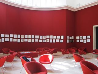
Germany's monumental neo-classical pavilion was the scene of several controversies in 2010, not least the calls from some elements of the country's cultural classes to knock down the rather unwelcome remnant of Nazi-era architectural bombast (by Ernst Haiger) and replace it with something a bit more representative. We say leave the architecture - if every country was allowed to do a regular re-vamp, the Giardini would be a permanent building site. More troubling is the exhibition within, which combines a series of small (but mostly rather charming) drawings, with a splash of airport-décor interior design and very little else.
Italy
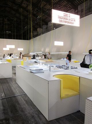
The national exhibition was relocated at the far end of the Arsenale and poses the self-reflective question: Why, exactly, is contemporary Italian architecture so invisible on the international scene? The answer is relatively hard to fathom, given the generally high level of quality of the works on display. We especially like the study of the country's myriad illegal buildings, thrown up with no regard for legislation or planning.
Korea
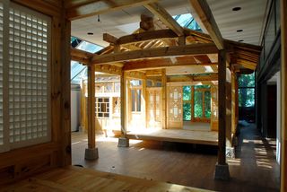
The South Korean pavilion is a rich mix of old and new, from traditional craftsmanship to Smartphone apps. Ignore the clutch of modish phrases (Differential life integral city, collective intelligence urbanism) and enjoy the fine traditional carpentry that intersects the internal volumes of Seok Chul Kim's quaintly, quasi-modern high-tech pavilion.
Russia
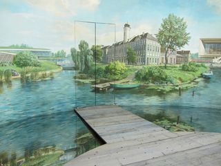
Continuing the preservation theme - of paramount importance in a country hellbent on decimating the recent past - Russia's pavilion celebrated its complete restoration earlier this year. While the first room has been stripped back to its original condition, the central rotunda contains an eye-popping diorama in a (hopefully) pastiche socialist realist style, before leading through to some examples of successful reuse projects.
Switzerland
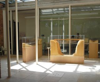
The Swiss pavilion, 'Landscape and Structures', combines an exhibition of models and photographs of the work of Jürg Conzett, one of the country's pre-eminent structural engineers, and a rich photographic exploration of the its structural history by Martin Linsi, undertaken in collaboration with Conzett.
Belgium
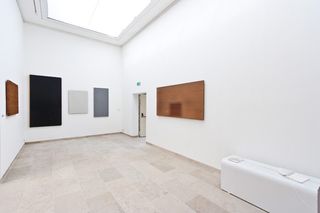
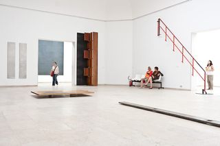
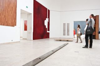
In keeping with the Biennale's 'preservation' tendency, the Belgians presented the beautiful Usus/Usures show in their national pavilion in the Giardini. Curated by Rotor - a group dedicated to the study of materials - the exhibition features a series of large pieces of used material from all over the country (the result of the group's six-month long research) in a minimal white gallery-like space. From scratched wood to worn tiles, the material tableaux showcase quite literally where the Belgian people meet architecture.
Belgium
Belgium
China
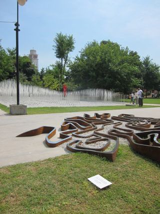
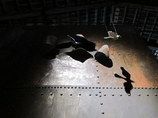
A constellation of architects, designers and artists, including Zhu Pei, Fan Yue, Wang Chaoge, Wang Wei and Xu Lei, helped put together this Biennale's welcoming and multi-faceted Chinese pavilion. Located right at the end of the Arsenale in a gorgeous disused petrol tank warehouse and the grounds outside it, the Chinese national contribution, entitled 'Here for a Chinese Appointment', responds to the festival's theme commenting on the interaction of man and architecture and was curated by New York and Beijing based Tang Keyang.
China
Holland
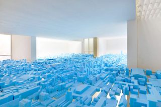
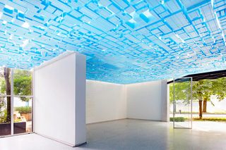
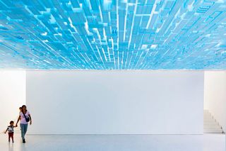
A comment on architecture as a place of meeting, the Netherlands Pavilion discusses the idea of vacancy in contemporary cities. Encouraging the Dutch government to consider reusing the numerous unoccupied buildings in the country through their installation, curators Rietveld Landscape point out that while Holland's dense urbanity is indisputable, its numerous and often beautiful vacant buildings are a much less-known architectural fact, ready to be taken advantage of.
Holland
Holland
Japan
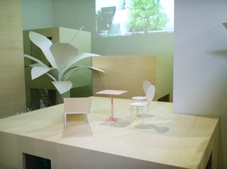
Not only did Ryue Nishizawa assist his SANAA partner with the overall Biennale curation, but he was also busy looking after Japan's national participation. His 'Tokyo Metabolising' exhibition, planned together with Yoshiharu Tsukamoto, celebrates the 50th anniversary of the Japanese Metabolism movement, by highlighting the evolution of the country's contemporary architecture since then, as well as urban life in Tokyo, while also looking at large-scale reconstructions of some of Nishizawa and Tsukamoto's latest work in the city.
Poland
Taking the idea of risk to a whole new architectural level, the Poland Pavilion and its curator, Elias Redstone, challenges visitors to jump to conclusions; quite literally. A metal mesh structure leads the curious guests to its top, prompting them to take a risk and jump off it, only to land in a cloud-like soft fabric structure. Designed to provide just what it says in the box, the Polish Emergency Exit exhibition is engaging. Its just a shame the jumping had to be controlled after a point, due to somewhat exaggerated health and safety regulating.
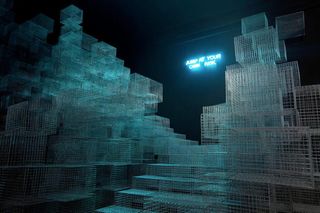
Poland

Poland
Australia
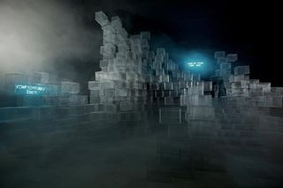
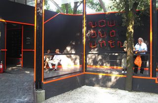
With one of the fastest growing (and most rapidly aging) populations in the world, the Australians felt it was time to explore, in 3D, how their nation will have adapted to the influx of people by 2050. Pioneering stereoscopic aerial photography of east coast growth and west coast mining is on display in a blackened out pavilion, in which visitors don 3D specs. A film sequence depicting visions of Australian cities in 2050 and conjured by 17 different architectural practices only adds to the Avatar-inspired surroundings.
Bahrain
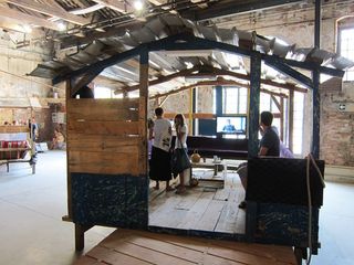
Noura Al-Sayeh and Fuad Al-Ansari, architects from the Kingdom of Bahrain, transported three fishermen's huts from its ever-developing coastline to the Arsenale and is now inviting visitors to step inside them and watch interviews with fishermen whose livelihoods are under threat from large developers. Whimsical and moving, it scooped the Biennale's Golden Lion award for the best national pavilion.
Czech Republic and Slovakia
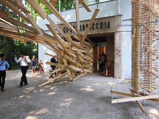
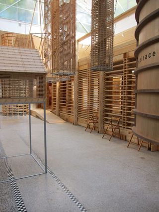
Our buildings are failing us. It's time to go back to nature and create 'friendly' buildings. This is the message from Martin Rajniš, Jana Tichá and Irena Fialová, the curators of the Czech and Slovakian pavilion. Using wood to create abstract sculptures, hollow towers and houses in miniature, they have conjured a touchy-feely space, in which (hired?) children played Jenga-like games on the floor with random blocks.
Czech Republic and Slovakia
UK
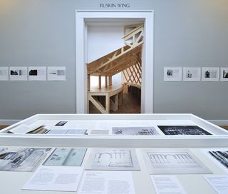
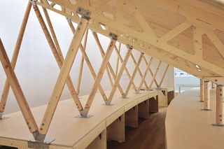
British architects muf directed this year's pavilion, and decided everything within it should be made in Venice. Hence a 1; 10 model of a section of the 2012 Olympic Stadium was crafted by gondola builders in Guidecca, while photos taken by the Gavagnins, a Venetian couple who obsessively documented the city as a hobby, were placed in 'a gallery', juxtaposed with scribblings and sketches from John Ruskin's Venice notebooks from 1850. Seven of the notebooks made it in to the pavilion, which was christened Villa Frankenstein, in reference to Ruskin's criticisms of Victorian Britain.
UK
US
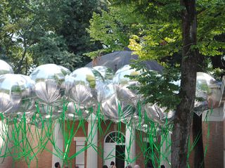
With the Obamas growing their own veg in the White House gardens, it's no surprise that self-sufficiency, re-usability and eco issues are at the fore in the US pavilion. Seven architectural practices with PC credentials are exploring ideas such as an urban farm in an Arizona Strip mall, aquaculture in the waters around NYC, reworking skyscrapers into closed loop communities and infrastructures to protect coastal areas from rising sea levels and storm surges.
US
Ellie Stathaki is the Architecture & Environment Director at Wallpaper*. She trained as an architect at the Aristotle University of Thessaloniki in Greece and studied architectural history at the Bartlett in London. Now an established journalist, she has been a member of the Wallpaper* team since 2006, visiting buildings across the globe and interviewing leading architects such as Tadao Ando and Rem Koolhaas. Ellie has also taken part in judging panels, moderated events, curated shows and contributed in books, such as The Contemporary House (Thames & Hudson, 2018), Glenn Sestig Architecture Diary (2020) and House London (2022).
-
 Casa Dragones' 'Quiote Bar' evokes the essence of agave fields and terroir'
Casa Dragones' Quiote Bar is designed by Gloria Cortina who blended modernity and myth to create a tequila bar inspired by a flowering stalk of the agave plant
By Henrietta Thompson Published
-
 Year in review: the top 10 cars of 2024, selected by transport editor Jonathan Bell
What are our cars of the year? We’ve scoured the archives to unveil the machines that most impressed us over the past 12 months, from retro revivals to high-tech EVs
By Jonathan Bell Published
-
 An Indian mud house - and more, on Sketch Design Studio's natural material wonders
Sketch Design Studio in Rajasthan, India does wonders with the simplest ingredients
By Vaishnavi Nayel Talawadekar Published