Library architecture and design: a worldwide guide
Modern library architecture and design is an evolving craft as technology changes the dynamics of space, yet we will always crave the act of choosing a classic novel from a bookshelf-lined wall with a ladder for top-shelf access. Each project here, from the new Matsubara library in Japan, to the Stavros Niarchos Foundation Library by Mecanoo and Beyer Blinder Belle in New York, is a case study on the modern history – and future success – of the library as a public resource and a place for ideas and contemplation. Jorge Luis Borges once wrote: ‘I have always imagined that Paradise will be a kind of library.’ We’re inclined to agree.
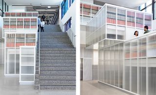
La Trobe University Library, Australia
Kosloff Architecture
Melbourne based studio Kosloff Architecture elaborated on its take on what the new library should be for this commission for La Trobe University in Bendigo. Challenging the perception of the ‘traditional library' and adding a strong layer of community engagement and openness to their design, the team reimagined an existing shell into a space featuring playful transparencies, spatial articulation and colour. The interior spans three levels and includes consultation rooms, ASK La Trobe information pods, postgraduate lounge, and a board room.
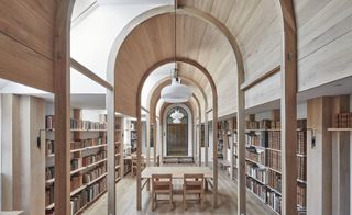
Dorset Library, UK
Aidan Crawshaw
Crawshaw Architects has given a new twist to traditional library architecture with this re-invented out-building in Dorset, UK. Adjoining a Grade II-listed Georgian farmhouse and water mill, the new library is housed within a transformed former cowshed and farm equipment store. Architect Aidan Crawshaw, the London-based studio’s founder, was commissioned to transform a substantial portion of this long brick building into a library and office space, with the intention on creating a home for a substantial collection of historic books on Palladian architecture. Crawshaw, working with his colleague Pandora Dourmisi, chose to preserve the proportions and form of the original farm building. The library is based around a long central arched nave flanked by a pair of aisles containing the book stacks, a modern interpretation of classical proportions. These not only reference the Palladian book collection but were constructed using carpentry and metal-working methods that hark back to the building’s days as part of a working farm.
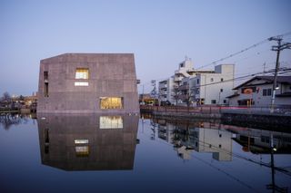
Matsubara Library, Japan
MARU Architecture
This project, which replaced an existing library on the same site, stands out for its sculptural qualities and striking location, next to a reservoir. MARU Architecture drew on this setting as well as the city's character for their design. ‘When we visited Matsubara, we were struck by the reservoir ponds and ancient tombs dotted throughout the city,' explain the architects. ‘These man-made structures were on a much larger scale than the residential neighborhoods surrounding them, and over the course of many years had come to resemble natural landforms. They brought to mind civil engineering projects on a grander scale than architecture, reflecting our own project’s unique conditions—that is, a library built in a pond.'
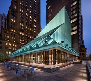
Stavros Niarchos Foundation Library, USA
Mecanoo and Beyer Blinder Belle
Wallpaper* Newsletter
Receive our daily digest of inspiration, escapism and design stories from around the world direct to your inbox.
Meet the Stavros Niarchos Foundation Library (SNFL), New York’s brand new central circulating library, designed by Dutch architects Mecanoo in collaboration with Beyer Blinder Belle Architects & Planners. The project sits within the 1914 shell and steel frame of the old Mid-Manhattan Library. The existing building was redesigned and topped with an eye-catching, angular roof. ‘Libraries are the most important public buildings of all,' says Francine Houben, principal of Mecanoo.
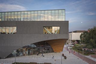
Charles Library at Temple University, USA
Snøhetta
Snøhetta has shelved away its latest library design at Philadelphia’s Temple University. Sitting at the heart of campus, the Charles Library was developed in collaboration with engineering firm Stantec. The layout rethinks conventional library tropes, introducing a wave of technologies and collaborative and social learning facilities to the 39,000-strong student body. Flowing wooden arches, elegant glass volumes and a striking three-storey domed atrium lobby are capped by a 47,300 sq ft green roof, one of the largest in Pennsylvania. This contributes to the site’s stormwater management system, which relocates heavy rainwater to two underground catchment basins.
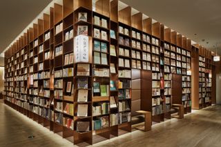
Yan at MIXC, China
Tomoko Ikegai / Ikg Inc
Shenzhen Bay’s MIXC commercial complex plays host to a bookstore design well read in Zen Buddhist philosophy. Realised by Ikg Inc’s Tomoko Ikegai, (who also designed the historically-imbued YJY Maike Centre Flagship in Xian), Yan was conceptualised with the theme of ‘life in the East’. The store’s layout embodies this expression – a rammed-earth wall closes off the interior as a space for personal emotional and mental reflection. The rammed-earth wall is composed of numerous colourful local soils, while mock Italian travertine tiles express the idea of accumulation and experience developed over many years. The store’s slim, golden bookshelves, meanwhile, fade into the wall, implying that visitors are immersing themselves in a sea of books and knowledge (where, in accordance with Buddhist philosophy, we can discover truth for ourselves).
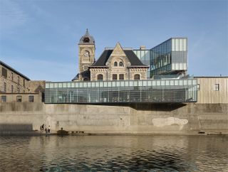
Idea Exchange, Canada
RDHA
A listed masonry post office dating to 1885 has gained a new glazed pavilion that wraps around the existing architecture and cantilevers slightly over the bank of the Grand River in Cambridge, Ontario. This structure is Canada’s first ‘bookless’ library. Instead of books, it holds a hoard of facilities including maker spaces, a black box theatre, film and audio recording suites, gaming areas, a children’s centre, a floating classroom and outdoor rooftop terrace. The architects struck up a conversation between old and new across the design. Ceramic frit patterns on the glazing were inspired by the texture of the historic stone façade. And as well as the contemporary extension, the historic post office has been carefully preserved and adapted to its new function. Window openings in the old building are now entrances to the Reading Room Café. The exposed roof structure in the attic maker space has been adapted with sleek LED lighting and a new glass ceiling reveals the clock tower in action.
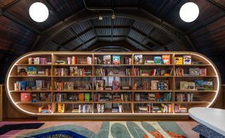
Children’s Library at Concourse House, USA
Michael K. Chen Architecture (MKCA)
Tucked snugly into a mezzanine space, Concourse House children’s library has been designed by NYC-based Michael K. Chen Architecture (MKCA) for story-telling and other book-inspired events. The layered and colourful space was designed to visually stimulate children who are being supported by Concourse House, a Bronx-based charity working to prevent homelessness by providing families with safe transitional housing and social services. Custom-designed solutions created an inspiring, adaptable and neat space for multiple uses. A curved illuminated shelving unit fits into the shape of the barrel vaulted ceiling, providing a creative backdrop and a screen to enclose the library as a cosy environment separate from the double height multi-purpose hall beneath. Variations of texture include a bright carpet and a smooth back-painted glass erasable writing surface on the paneling. As well as being made possible through donations of time, money and books from Sisters Uptown Bookstore, the library was designed pro bono by MKCA who also co-ordinated in-kind donations associated with the project.
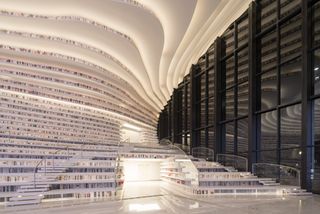
Tianjin Binhai Library, China
MVRDV
Within MVRDV’s futurist Tianjin Binhai Library, a rippling wave of cascading bookcases stretches from the floor to the ceiling. These bookcases orbit the luminous ‘Eye’: an enclosed sphere that contains an auditorium space. Of the five storeys, the first two consist primarily of reading rooms, book storage and lounge areas. The upper floors offer meeting rooms, offices, computer and audio rooms and two rooftop spaces. The library is part of a larger framework that sees the city of Tianjin Binhai receive a whole new cultural district. Spanning some 33,700 sq m, the project took only three years to complete following its initial sketch up. It now acts as a junction point for the city’s Central Business District, old town, residential districts, commercial areas and government quarter. Writer: Luke Halls
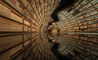
Zhongshuge Bookstore, China
XL-Muse
The writing’s on the walls, ceiling and floors of Yangzhou’s bookshop, where an optical illusion turns an ordinary, rectangular room into a cylindrical tunnel. Created by Shanghai-based studio XL-Muse for book retailers Zhongshuge, a black mirrored floor paired with two walls of arched shelving helps to create a seemingly never-ending funnel of books. The design is inspired by the rich cultural heritage of Yangzhou, said to be a historical gathering place for literati and poets. The lead designer Li Xiang took inspiration from a verse in the classic Chinese romance novel A Dream of Red Mansions, by Cao Xueqin, which is thought to refer to the area in which the shop now stands. (‘Spring flower and autumn moon, green hills and clear water; 24 bridges, relics of the Six Dynasties,’ it reads.) The arched shelving represents the ‘24 bridges’ in Xueqin’s verse, and a swerving line in the ceiling represents the ‘clear water’ or river. Visitors are supposed to flow with the river, swept along by the black mirrored floor, deeper into the bookshop and ‘into the vast ocean of knowledge,’ explains Xiang. Writer: Elly Parsons
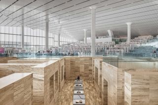
Qatar National Library, Qatar
OMA
Completed in 2016, OMA’s Qatar National Library was conceptualised to express the importance of the book in the 21st century. Consequently, its design intertwines study, research, collaboration and interaction. The library is conceived as a single room, bringing together thousands of readers with its million-volume-strong collection, which includes important and rare Middle Eastern manuscripts. The building’s edges are elevated, which gives it a triangular geometry both inside and out. Rows of shelving are thus topographically expressed, flowing down from above and interspersed with mixed-use spaces. They are also materially linked to the building, rising from its white marble flooring. Six metres below the main level, the library’s heritage collection is housed in a seemingly excavated space, dug out from beige travertine. Writer: Luke Halls
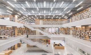
Utopia, Belgium
KAAN Architecten
Puzzling its way through the Flemish city of Aalst’s irregular streets and stray squares, Utopia (as the building has been named) comprises a sprawling 8,000 sq m structure extending from the shell of a former military school, which now serves a dual purpose as the city’s library and performing arts academy. The building’s renovation has been so sensitive and seamless that it’s difficult to know if you’re standing in the new extension or the old schoolhouse; but outside the distinction is subtly marked by the direction of the ‘Red Aalst’ brickwork – long flat bricks are laid horizontally across the new extension, to counter the vertically-oriented bricks of the old school façade. Writer: Elly Parsons
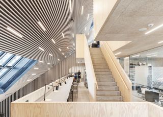
Tingbjerg Library and Culture House, Denmark
COBE
COBE’s slender, street-length library and culture house in Tingbjerg is an extension of the local school, and has given the Copenhagen neighbourhood a new lease of life. The firm selected a material palate inspired by the area’s rich modernist lexicon, including yellow brickwork and warm wooden plywood, paying respect to and blending into the surroundings. At its narrowest, the building is only 1.5m wide. The building’s final design is the result of collaboration between not just the Tingbjerg School and COBE, but also the neighbourhood’s residents and social housing corporations fsb and SAB. Fulfilling the needs of a diverse user range resulted in an aesthetic inspired by a typeset case. Onlookers are able to peer into the library’s internal ongoings through a transparent glass façade. Visitors can engage with a number of activities in spaces geared to provide classes, workshops, lectures and musical performances. Writer: Luke Halls
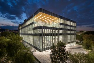
Tecnológico de Monterrey New Main Library, Mexico
Sasaki
Sasaki was first drafted in by Tecnológico de Monterrey to transform its original 1969 library. The firm was met with a hurdle – the building was in dire need of extremely costly seismic upgrades, which would heavily limit any proposed future development. As a result, the New Main Library now stands in place of its predecessor, and features an open-plan layout that considers future flexibility and today’s larger student body. The transparent structure expands upon the previous library’s functionality, providing 150,000 books; two special collections; new teaching laboratories and private and group study spaces. Larger study spaces are internally and externally boxed by books, and feature overhead terraces that act as social lounges. At the rooftop level, a sky terrace provides a unique panorama of the university campus and the Cerro de la Silla mountain, its backdrop. Writer: Luke Halls
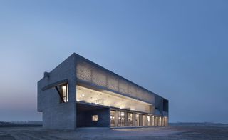
Seashore Library, China
Vector Architects
Vector Architects are the imaginative brains behind this ocean and book-lover’s paradise. Set on China’s Bohai Sea Coast, the modern concrete structure keeps things simple as the dramatic views do all the work. Vector’s lead architect Gong Dong wanted to express a series of complex relationships in the design, negotiating the idea of boundary, the movement of the human body, the shifting light and the ocean view. You may have trouble focusing on your book as panoramic windows are thrown open to let in the sounds of the surf; fortunately, the library’s meditation rooms account for that. Retreat to the top floor, where window slits let in just the right amount of light to illuminate the areas under the curved concrete ceiling. Writers: Daisy Alioto and Frederika Fraser
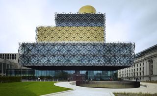
Library of Birmingham, UK
Mecanoo Architecten
Dutch firm Mecanoo Architecten won the opportunity to design the largest public library in Europe. In a brutalist city, the Library of Birmingham’s ringed facade certainly stands out. But it's actually a nod to two other city institutions – the steel and metal industries. The core of the design is the Book Rotunda, where elevators ferry visitors across the openings between floors. However, it’s another rotunda on the roof of the building that will catch a theater-lover’s fancy: the Shakespeare Memorial Room from the library's original Victorian building has been carefully reassembled at new heights. Writer: Daisy Alioto
The Weston Library, UK
Wilkinson Eyre Architects
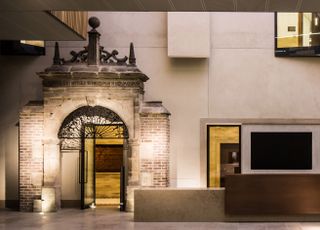
In 2015, Oxford’s original New Bodleian library reopened as The Weston Library with a redesign by London firm Wilkinson Eyre. The refurb includes nods to original architect Sir Giles Gilbert Scott with lighting reminiscent of his narrow vertical windows. It also incorporates a 15th-century gateway that once stood in London’s Victoria and Albert museum. The architects gutted and then rebuilt the centre of the building to give it a new heart in the form of Blackwell Hall, a 13.5m high space with views in from many of the library’s internal corridors and narrow linear roof lights that echo ‘the long thin repeated vertical windows of many of Gilbert Scott’s buildings,’ states Jim Eyre. Writer: Daisy Alioto
Stormen Konserthus, Norway
DRDH Architects
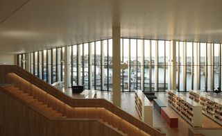
Bodø – a Norwegian peninsula in the Arctic Circle – was significantly damaged during the Second World War. Stormen Konserthus by British firm DRDH Architects is a combination library and concert hall that was central to the city’s reconstruction. Although the building is unlike anything else in the town, the architects still made an attempt to speak the local vernacular, with a ribbed concrete façade that mirrors local timber. Meanwhile, the library’s large windows bring the harbour indoors. The building also looks towards the city. DRDH cut away corners of the buildings to create spatial relationships with bars across the street, and a subtle inclination in the front façade of the library makes way for a sculpture by Norwegian artist AK Dolven. ‘We wanted to create a street scene in the centre of the city once more,’ says DRDH co-director Daniel Rosbottom. Writer: Malaika Byng
Tama Art University Library, Japan
Toyo Ito & Associates
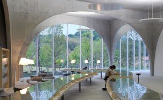
Toyo Ito’s library is an example of outstanding campus architecture, thanks to the ingenious structure and spatial organisation. His preliminary design for an underground space was eventually raised above ground; turned upside down, the scooped out volume adopted the arch as the best way of dividing up the space, while simultaneously articulating the exterior of the building. The sloping surface of the ground floor, used for exhibitions, plays and dance performances, stimulates creativity, according to the architect. The most challenging technical element to construct was the 20-centimetre thin curved walls, which contain steel plates for reinforcement in the middle and specially curved glass to keep the façade clean.

Geisel Library, US
William Pereira
So named because it houses the Dr. Seuss collection, the Geisel Library was designed by William Pereira in the 1960s. The tiered Brutalist vision is eight stories, two of which are subterranean. Latvian-American architect Gunnar Birkerts updated the design in the 1990s. Pereira may not have the same name recognition as other mid-century architects, but amidst today’s concrete resurgence, his design is as captivating as ever. California-native John Baldessari also lent his talents to the library in the form of permanent installation READ/WRITE/THINK/DREAM on the ground floor. The library accommodates 3,000 readers, and originally housed 2.5 million humanities and social sciences volumes over 255,000 sq ft. Its resting site was chosen from a shortlist of 19, and was selected as it displays ‘a sense of place’ and ‘spirit and nobility’. As it’s located at the heart of the campus, the library was elevated so as to not cause congestion at ground level, and also acts as a visual point of reference.
Ellie Stathaki is the Architecture & Environment Director at Wallpaper*. She trained as an architect at the Aristotle University of Thessaloniki in Greece and studied architectural history at the Bartlett in London. Now an established journalist, she has been a member of the Wallpaper* team since 2006, visiting buildings across the globe and interviewing leading architects such as Tadao Ando and Rem Koolhaas. Ellie has also taken part in judging panels, moderated events, curated shows and contributed in books, such as The Contemporary House (Thames & Hudson, 2018), Glenn Sestig Architecture Diary (2020) and House London (2022).
-
 Time, beauty, history – all are written into trees in Karimoku Research Center's debut Tokyo exhibition
The layered world of forests – and their evolving relationship with humans – is excavated and reimagined in 'The Age of Wood', a Tokyo exhibition at Karimoku Research Center
By Danielle Demetriou Published
-
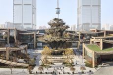 Tour Xi'an's remarkable new 'human-centred' shopping district with designer Thomas Heatherwick
Xi'an district by Heatherwick Studio, a 115,000 sq m retail development in the Chinese city, opens this winter. Thomas Heatherwick talks us through its making and ambition
By David Plaisant Published
-
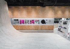 Vans’ West End store turns skatepark, with a 200 sq m travertine ramp
Part store, part community hub, Vans West End in London ramps up its skateboarding credentials with a design by Andrea Caputo Studio
By Simon Mills Published