Graduate Directory 2011
Pedro Saito

Faculty of Architecture and Urbanism of University of São Paulo, Brazil / 2009
Architecture
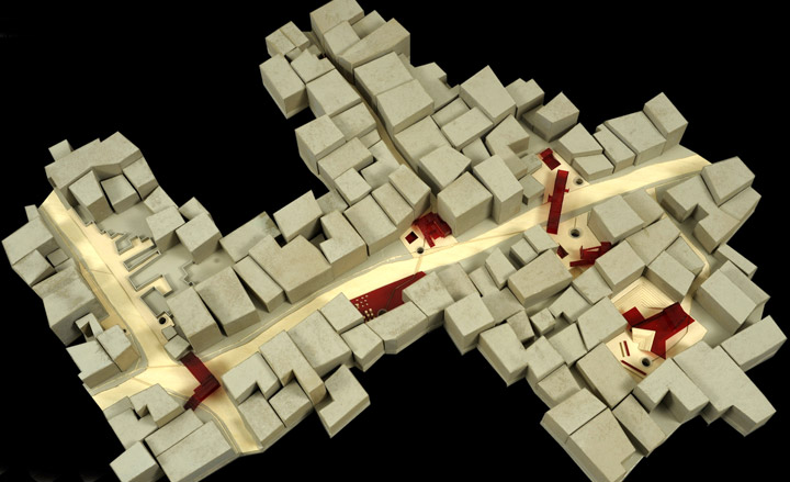
When Brazilian architect Marcos Acayaba recommended Pedro Saito to us, we knew he had his reasons. Award-winning Ubatuba-born Saito not only graduated from the University of São Paulo with a highly praised thesis project on public spaces and subway infrastructure, he also combines architecture with visual arts experience. Working as a graphic designer and art director, Saito has freelanced for book publications and magazines, which he carried out alongside his architectural study. Following training periods at different Brazilian practices, including Acayaba’s own firm, he started work on his own projects, kicking off with a house designed for two software developers in Ilhabela, due to be completed later this year.
Most inspired by: BIG, for their communicative architecture; contemporary Japanese architects, especially Suppose Design Office and Sou Fujimoto. Gehl Architects for the way they investigate urban spaces; and some of my best teachers: Antonio Carlos Barossi, Angelo Bucci, Alexandre Delijaicov and Marcos Acayaba.
Kin Cheong Chan
University of Hong Kong, China / 2009
Architecture
Wallpaper* Newsletter
Receive our daily digest of inspiration, escapism and design stories from around the world direct to your inbox.
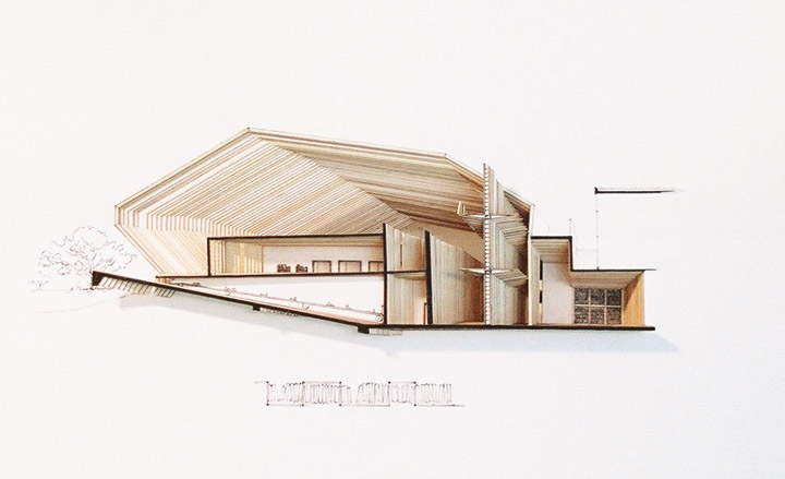
Even though Kin Cheong Chan only recently graduated with a Distinction-awarded thesis project on the design of a Chinese Embassy building in Tokyo, his work has already reached far beyond the Chinese borders. Since 2008 he has collaborated with Professor Eric Schuldenfrei on two major projects – the ‘Chain City’ installation they were involved in for New York-based practice Diller Scofidio + Renfro was shown at the 2008 Venice Biennale, while their design for a noise barrier architectural competition for the Hong Kong government was awarded third prize. Currently employed at international practice RMJM, Chan is involved in various competitions and builds in mainland China.
Most inspired by: BIG

Ken Chung Tat Lee
University of Hong Kong, China / 2010
Architecture
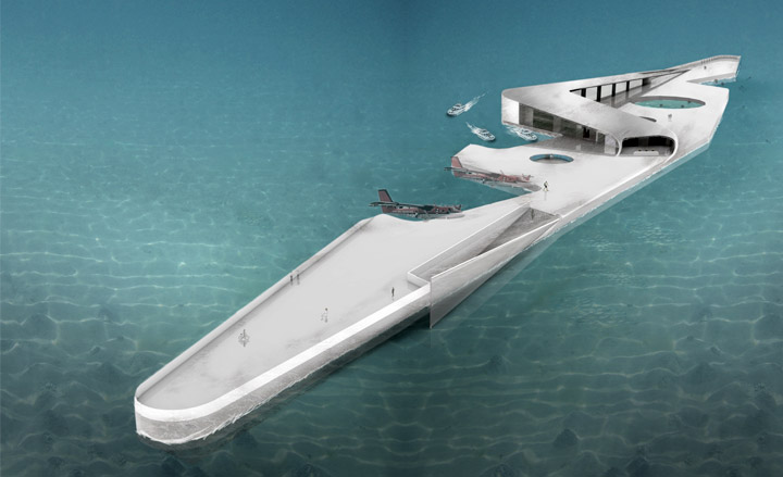
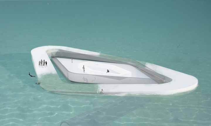
Since graduating, 25-year Ken Lee has been working at Hong Kong-based studio Wong and Ouyang Architects. The Chinese-British designer cites his education as being instrumental in teaching him independent thinking, as well as the ability to transform a mental picture into a physical space and communicate this. Drawing inspiration from the works of Bjarke Ingels, Future Systems, Diller Scofidio + Renfro, and Archigram, as well as the surrealist paintings of Rene Magritte, Lee used his thesis project to conjure up a series of floating platforms designed to absorb and accommodate changes in nature and the environment, without compromising their function (a floating hotel, dive school and water park).
Would most like to work with: BIG in Denmark, and Diller Scofidio + Refro in New York.
Eva Rosborg Aagaard
Royal Danish Academy of Fine Art Architecture School, Denmark / 2010
Architecture
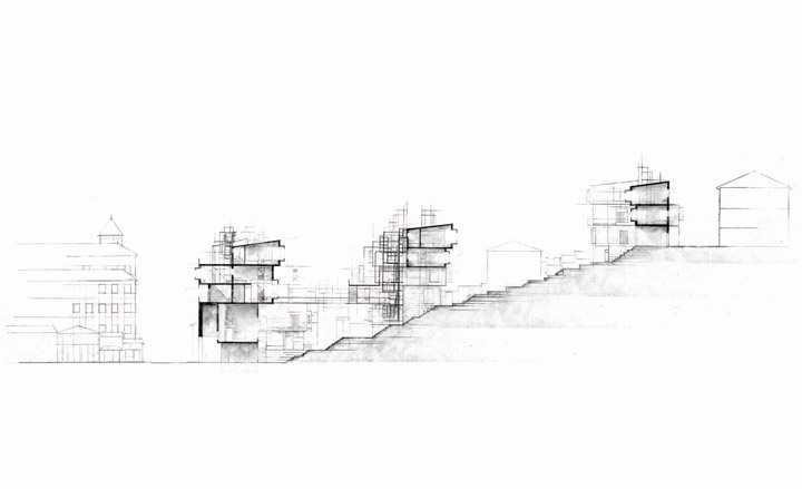
Having travelled extensively during her studies, 30-year old Eva Aagaard produced a dense, rich tapestry of architectural images for her diploma project, a hotel in Sarajevo. 'I learned the value of the investigational architectural process,' she says of her studies, 'My travels and fieldwork have been my biggest inspirations - to experience foreign cultures and see how other people live have challenged my approach.' Issues of local culture and context pervade her work. The hotel, rendered as a dense array of interlocking boxes, is designed for both short and long stays, and is inspired by a traditional roadside inn. Aagaard is currently teaching at the Aarhus School of Architecture.
Most inspired by: Alejandro Aravena and Elemental’s approach on the social impact of urban projects

Deepak Jawahr
Städelschule, Germany / 2010
Architecture
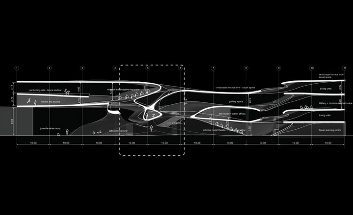
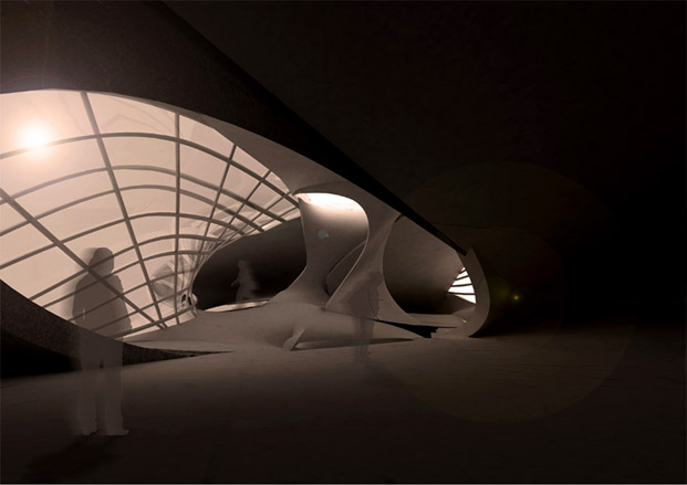
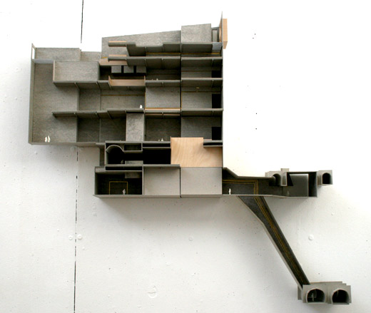
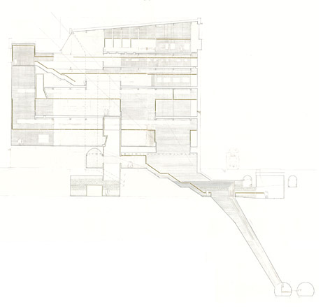
Indian national Deepak Jawahr is currently pitching his skills at design competitions, as well as showing the world his thesis project, a performing arts centre in Rio de Janeiro. 'After graduation, my manifesto is now that 'real complexity lies in sufficient simplicity,' he says, 'my personal experience is that seeking "complexity" is getting fashionable – and problematic. It is vital to address the core of the problem.' Citing Rem Koolhaas and Ben van Berkel, one of his tutors, as major inspirations, Jawahr believes that architects need to start moving away from image-oriented design. 'Architects should represent the values of society, not individual ambitions,' he says. His graduation project blends complicated forms with a simple structure, with a circulation that forms a complex, 'vortex-like', intersection within an arts building.
Most inspired by: OMA's research wing AMO.
Michele Albanelli
Städelschule, Germany / 2009
Architecture
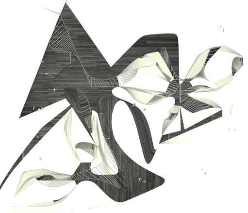
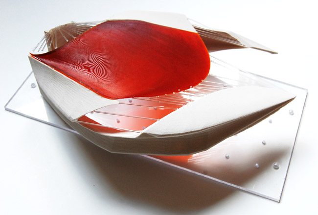
Even though he only finished his Masters at the Stadelschule last year, Italian Michele Albanelli already has extensive professional experience – ranging from work in private Roman architecture practices to one-off personal independent projects. Albanelli, who was highly commended by the Frankfurt school’s dean Ben van Berkel, designed a youth hostel in Brazil for his final year project, while in 2008 he won the Günter Bock Prize for the best student work. He is now busy with more independent work, and has just completeed the interior design for a small private library in Italy.
Most inspired by: ‘Rem Koolhaas and OMA, or David Adjaye.’
Yehwon Kim
Georgia Institute of Technology, US / 2009
Architecture
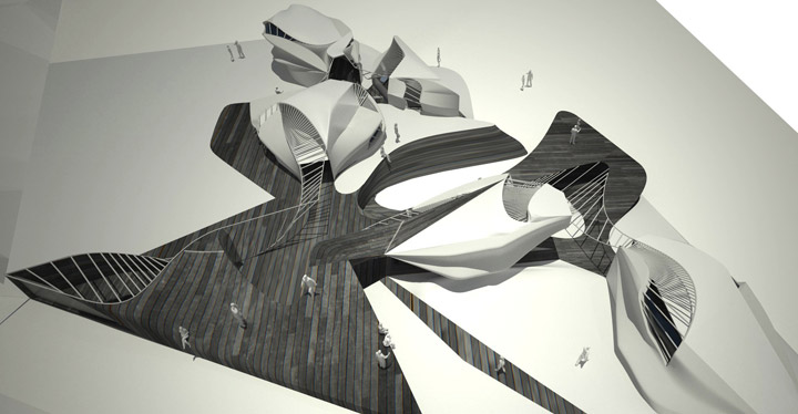
A graduate of the Georgia Institute of Technology in Atlanta, Yehwon Kim also combines studies at the École Nationale Superieure d'Architecture de Paris La Villette and the Yonsei University in Seoul with numerous student scholarships. One of her last year projects was the Joyous Dancer, a creative design of a wearable architectural environment, while her largest final year work revolved around an aquatic centre. Adding to that her extensive professional experience at the Gwangju Design Biennale for 2011 and Mooyoung Architects and Engineers in Seoul, and it’s no wonder that celebrated Korean architect H-Sang Seung asked Kim to join his Seoul-based company, Iroje, even before she graduated. Kim is now involved in many of the firm’s international projects, as well as being responsible for the busy practice’s publications and exhibitions management.
Would most like to work with: Oscar de la Renta. I love his sleek, sophisticated and classic style.
Maciej Jakub Zawadzki
Warsaw University of Technology, Poland / 2009
Architecture
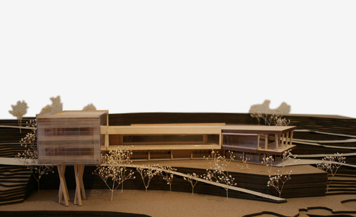
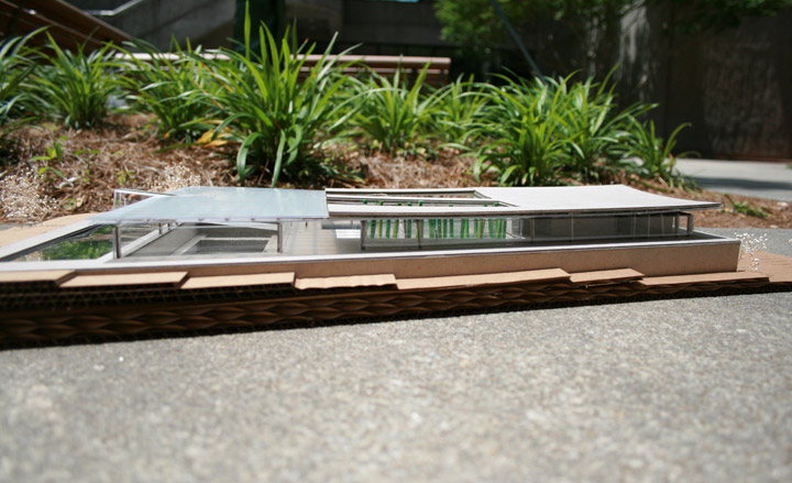
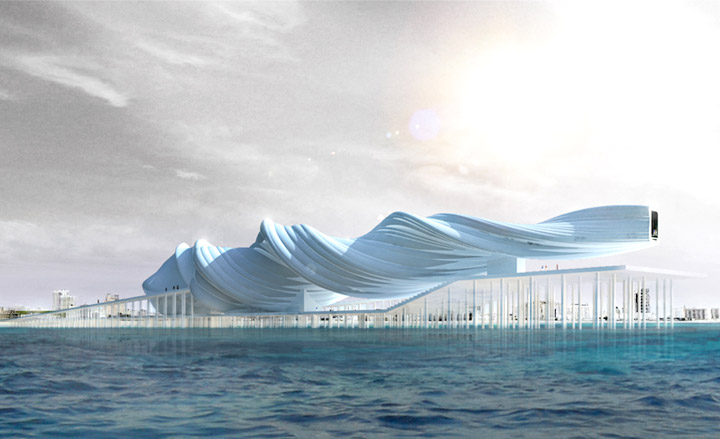
Alongside both an undergraduate and postgraduate degree from the Warsaw University of Technology, Maciej Zawadzki enriched his time in academia with a scholarship exchange program to the Sint-Lucas School of Architecture in Brussels. His thesis included the design of a unique museum space off the Miami shore; the Museum of Latin American Immigrants evolved from a set of computer-generated spiralling forms, resulting in the building’s final aerodynamic shape. Following small stints at Warsaw practices SDA Architekci and Hermanoqicz Architekci, he moved to Copenhagen to join SEA and then BIG, where he is currently based.
Most inspired by: my father, who was an architect. And the work of young Spanish architect Alvaro Garcia Mendive.

Estelle Lépine
Ecole Polytechnique Fédérale de Lausanne, Switzerland / 2010
Architecture
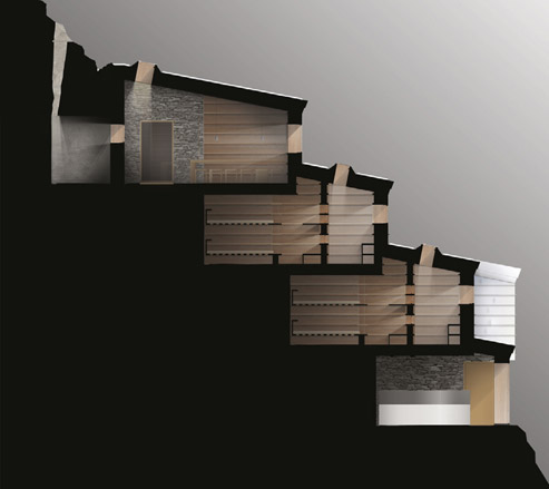
Estelle Lépine’s thesis comprised the design of a high-altitude refuge centre in l’Aiguille du Gouter a Saint-Gervais en Haute-Savoie in France, a project she completed with flying colours. Currently engaged in PhD research at Ecole Polytechnique Fédérale de Lausanne, studying the impact of the energy standards and rules on buildings and their users, she is aiming for a career in higher architecture education. This doesn’t mean that Lépine hasn’t had her fair share of architecture practice; training stints at Atelier Cube in Lausanne and Latitude Architects in London provided her with the appropriate professional perspective, as did her first personal independent project, a family chalet in the French Alps, which is currently under construction.
Most inspired by: a truly open-minded client, so we can create a project that will please both them and myself; and maybe make other people dream.

Matthias Rippmann, Michael Knauss and Silvan Oesterle
ETHZ, Switzerland / 2007
Architecture
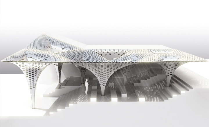
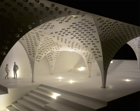
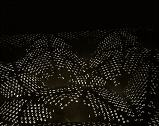
Three years after graduating from the prestigious ETH Zurich and the University of Stuttgart, Michael Knauss, Silvan Oesterle and Matthias Rippmann formed their own practice, ROK. Their exceptional combined portfolio includes professional experience with UNStudio, Gramazio & Kohler, Behnisch Architects, Werner Sobek and LAVA and academic lecturing at schools like the Bauhaus University in Weimar, Harvard Graduate School of Design, the Architectural Association in London and ABK Stuttgart. Their most recent project, the Flat2Form System, outlines a unique method for bending two parallel sheets of the same material into a predefined geometric shape, using a matching hole pattern in their surfaces.
Most inspired by: Frei Otto.
Shin Koseki
Ecole Polytechnique Fédérale de Lausanne, Switzerland / 2010
Architecture
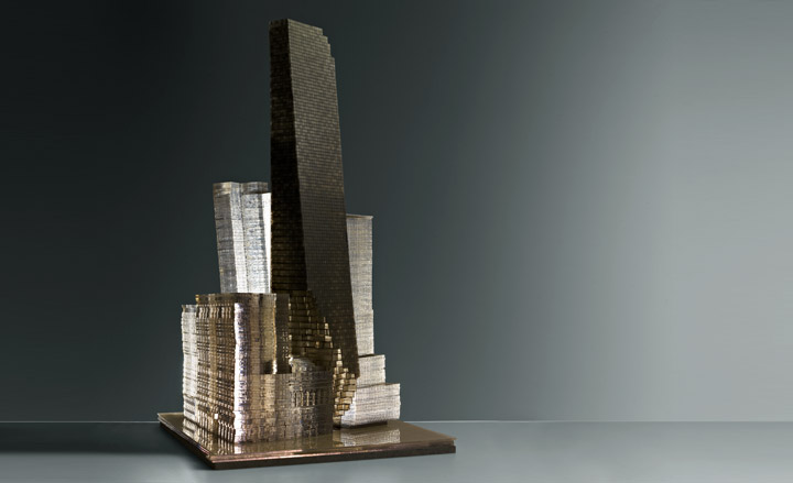
Following on from a degree in architecture at the university in his home town of Montreal, Shin Koseki started his Masters in 2007 at the Ecole Polytechnique Fédérale de Lausanne, where he won his tutors over with his thesis – a multi-functional super tower in Lower Manhattan, cleverly interconnected with the island’s existing urban fabric. After graduation, he started a PhD at the same institution on ‘the implementation of an economy of use values in the production of a new urban model’. Combining excellent student work with experience in practices like Fuksas Associati, Reiser-Umemoto and Atelier Braq, Koseki offsets his heavyweight architecture academia credentials with a separate creative portfolio in photography and graphic design.
Most inspired by: people who trust me and whom I can trust, people with beautiful minds and adventurous ideas.
George Calver
Oxford Brookes University, UK / 2011
Architecture
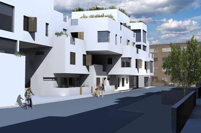
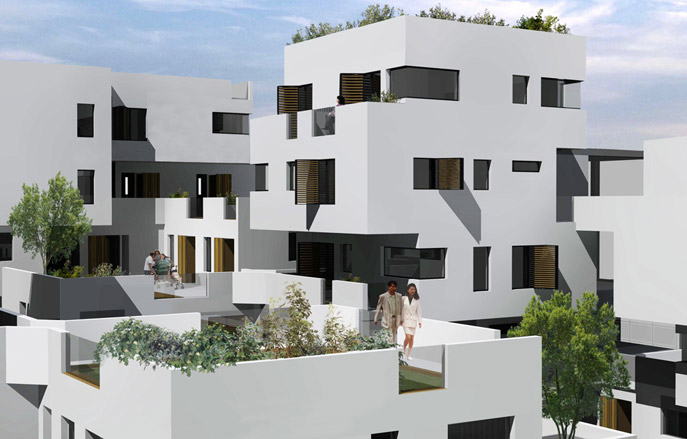
George Calver's work draws inspiration from the work of Louis Kahn, Peter Barber, Álvaro Siza and Herzog and de Meuron, amongst others. The 23 year-old British architect will finish his diploma in May 2011 and describes his understanding of architecture as a 'holistic system of influences from the built form and function, to its socio-cultural context.' 'The most important thing I took from my studies was architecture's integral relationship with people,' he says, going on to explain that the current economic climate is the biggest challenge facing architects and students alike, along with sustainability and the need for restoration and renovation. 'Existing buildings need to become energy efficient and sustainable without drastically changing the user experience or their lifestyles.' His graduation project focused on low-cost housing and the integration of sustainable technology.
Most inspired by: Louis Kahn and Caruso St John Architects.
James Wignall
Royal College of Art, UK / 2011
Architecture
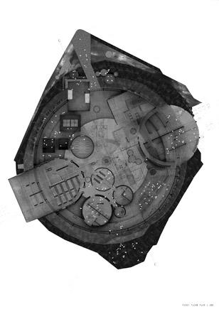
James Wignall has previously worked at jobs as diverse as a design consultant for the V&A Wasted project at the 2009 London Design Festival, a deputy unit leader at Nottingham University, and a designer with Heatherwick Studio, and is currently creative director at his own design firm, Wignall & Moore. His architecture degree at Nottingham University (where he currently teaches) was followed by a Masters at the RCA, where he won the Sustain Award and was nominated for the Conran Award and the RIBA Silver Medal. Wignall’s aim is to combine architecture, design and sculpture through his work. His favourite project, the cast iron and bronze Double Sided River, is essentially an intersection of two maps; in section it shows the River Thames and in plan, the Thames floodplain.
Most inspired by: Constantin Brancusi, or possibly George Roy Hill while he was making Butch Cassidy and the Sundance Kid.
Jorgen Tandberg
Architectural Association, UK / 2010
Architecture
The Norwegian-born Jorgen Tandberg is currently working at Factum Arte in Madrid and embodies the pan-European character of the 21st century architect. His studies at the AA included the creation of a well-publicised Bat House project (with Yo Murata), a richly decorative, highly poetic folly that's also a breeding space for rare species. Tandberg draws inspiration from artists and architects such as Mies van der Rohe, Gert Jan Willemse, John Hejduk, Étienne-Louis Boullée and Gerhard Richter. 'Architecture can't determine how people behave,' he says. 'It can only contain their actions.' His graduation project, The Immeuble Cite, is a Hedjuk-inspired megastructure for the 'post-Fordist worker'.
Most inspired by: the job I have now, but at some point I would like to set up my own practice.

Nandi Marshal Han

Manchester School of Architecture, UK / 2010
Architecture
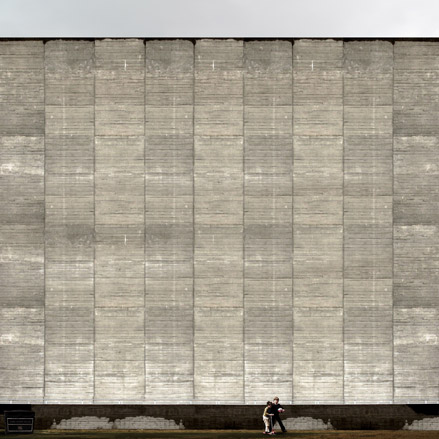
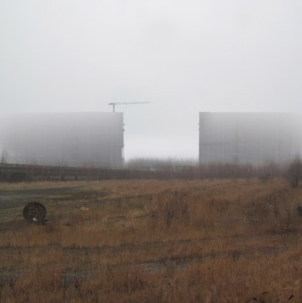
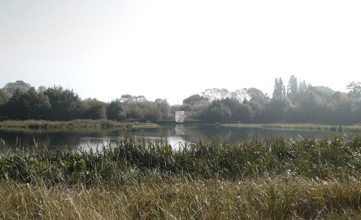
When Nandi Marshal Han was announced as the winner of the 2010 Architecture Foundation Student Travel Award, sponsored by Kohn Pedersen Fox (KPF), we knew this soon-to-be graduate was one to watch. Following his well-deserved Award-related trip to Lhasa in Tibet to research on the development of urbanisation and the public space within the Holy City, he took up a work placement at KPF. A multi-award winner for his student designs and creative work, Han has also contributed to research publications at Manchester Architecture School with a special focus on urban masterplanning and sustainability.
Most inspired by: KPF – they are a great commercial company. OMA for their experiments, Steven Holl for his interpretation of architecture and nature that has always inspired me. I would love Peter Hall to be my mentor in research.
Nicholas Elias
The Bartlett School of Architecture, UK / 2010
Architecture
Nick Elias graduated from the Bartlett in 2010 and currently works at Foster and Partners. 'At the Bartlett I learnt how to think very critically about objects and their influence on our living structure,' says the 21-year-old. 'I also learned that architecture does more than just talk about 'image', it analyses the experiences felt when confronted with either an object or a building.' Drawing influences from the conceptual work of Lebbeus Woods and Perry Kulper, Elias used his graduation project to focus on water use in the UK ('and the rapacious nature of the average Brit') and how it might be reduced, rendering his concept with an intricate series of drawings that are a feast for the eyes.
Most inspired by: concept design and art.

Rachel Witham
Cardiff University, UK / 2010
Architecture
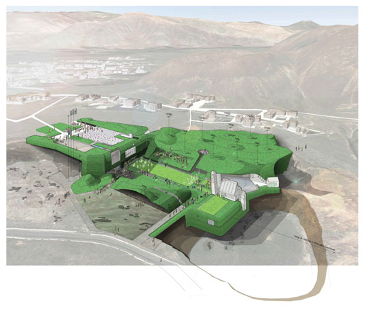
Rachel Witham graduated this summer, taking with her a clutch of awards for her final year work. Currently engaged on a competition-winning design study, the 24-year-old is also adept at working with poured concrete to make hefty but elegant homewares. Her influences tend towards the more solid, fundamental school of architectural design, including the Smithsons, Leslie Martin, Pierre Chareau, Hans Scharoun and Sir John Soane. Her own work is richly textured and layered, and her graduation project, 'Curating Curation', set out to shape space through the arrangement of objects and knowledge. 'I have come to really admire architecture that is born out of ingenuity and inherent complexity yet as a whole forms a coherent and rich experience,' she explains. Witham hopes that 'good affordable architecture with longevity and no frills' will emerge from the current austere climate.
Most inspired by: the more solid, fundamental school of architectural design, including the Smithsons, Leslie Martin, Pierre Chareau, Hans Scharoun and Sir John Soane
Thandi Loewenson
The Bartlett School of Architecture, UK / 2010
Architecture
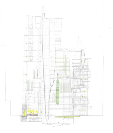
Thandi Loewenson is a Zimbabwean Part 1 student with an eye for the elaborate, complex and interwoven space. Currently working at Emulsion Architects (see W*70) in London, the 21-year old describes her studies at the Bartlett as being as much about 'social and political science' as the study of creating physical environments. 'I'm inspired and challenged by the chaos and incredible ingenuity that necessity produces in poor communities,' she says. Drawing inspiration from the now-demolished Kowloon Walled City in Hong Kong, she designed an urban tower for 'living, recreation, and algae farming,' an Archigram-esque slice of dystopic futurism that's sustainable but kind of chaotic, part Heath Robinson, part Carlo Scarpa, yet still strangely beautiful and functional.
Most inspired by: Enric Ruiz Geli at Cloud 9 Studio in Barcelona.
David Maple
Columbia University, US / 2010
Architecture
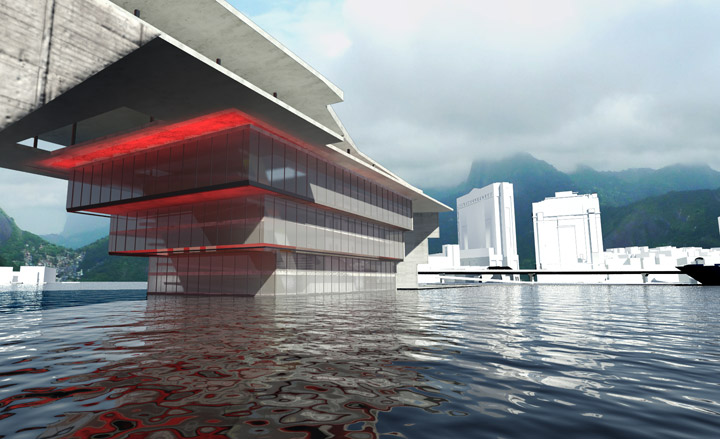
Coming highly recommended by architect and Columbia tutor Galia Solomonoff, whose design studio David Maple completed during his studies for an MSc in Advanced Architectural Design, this graduate stood out for his imaginative seaside redesign and reinvention of the casa grande housing scheme for Rio de Janeiro; a model that has been adopted in the past by the likes of Oscar Niemeyer. Combining studies in New York’s famed architecture school as well as a bachelor of architecture from Pennsylvania State University, Maple has also been awarded several prizes for student work and design excellence. He is currently employed at Openshop Studio in New York, a boutique practice where he also gained earlier professional experience in-between courses, while a Columbia University book including his contribution is expected to hit stores in spring 2011.
Most inspired by: my brother Scott.

Joaquin F Stearns
Columbia University, US / 2010
Architecture
Stearns was born and raised in Buenos Aires, where he began his studies in architecture. Moving to the US in 2003, he graduated from the Architecture School of the Pratt Institute in New York with the highest honours and followed through with a Masters in Real Estate Development from Columbia University. His business-minded studies, combined with experience at architecture practices and real estate development companies, have already earned him great acclaim. His thesis, Urban Interventions: A Catalyst to Development Opportunities in the City of Sao Paulo, is about to be published as a book and has been presented to developers and investors in Brazil and New York.
Most inspired by: New York City architecture.


Studio Hopson Rodstrom
Columbia University, US / 2010
Architecture
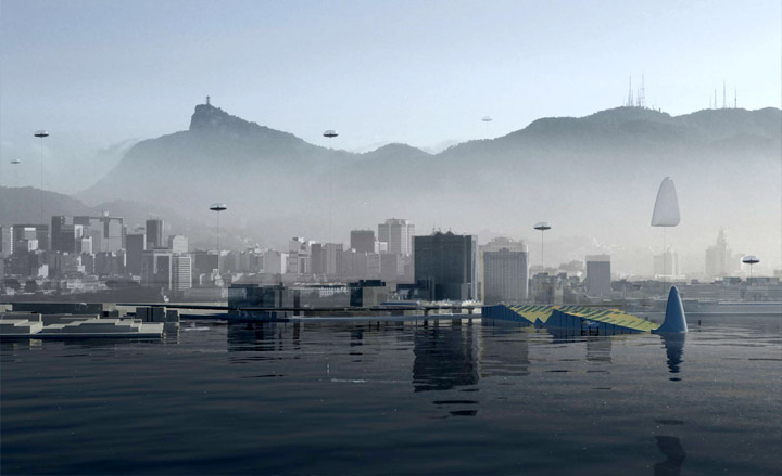
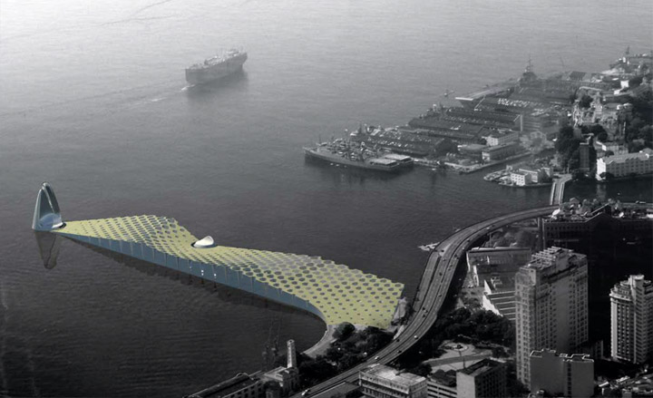
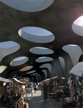
Nicholas Hopson and Klara Rodstrom, both architecture graduates of the University of Southern California, took a three-year break from academia in 2006 to gain valuable professional experience in offices like Leeser Architecture, Sander Architects and Work Architecture Company, before continuing with further studies at Columbia University. Since starting their architectural studies, the pair have taken part in numerous publications and exhibitions, but their Impressao Olimpica project for Rio de Janeiro at the Galia Solomonoff studio at Columbia was the one that especially caught our eye. It examines the effect of an impressive sci-fi temporary media and communication complex for the upcoming Rio Olympics that can be adapted to benefit the area’s infrastructure post-Games.
Most inspired by: SANAA, Herzog & de Meuron, OMA, and Peter Zumthor.
Megan Panzano
Harvard University Graduate School of Design, US / 2010
Architecture
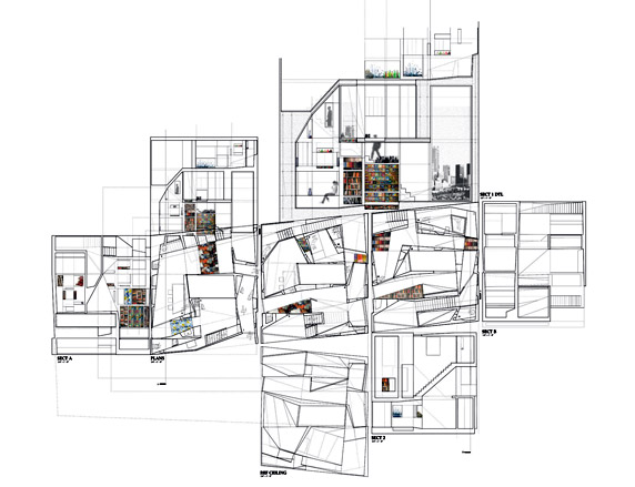
Megan Panzano currently works and teaches in Boston. 'At the GSD, I got the continuous thrill of the feeling when you're "onto something" working on a design problem - it's a feeling that never goes away, whether you're in or out of the studio,' she enthuses. Citing the work of Carlo Scarpa, Enric Miralles, Pablo Beitia, and the artists Joseph Cornell and Josiah McElheny, as influences, Panzano is dedicated to maintaining attention to detail in the face of economic adversity. Her GSD thesis project, 'A Living Archive', fuses the qualities of home and museum, storage and display.
Most inspired by: SHoP in New York, and OMA for their research and innovative views.

Savina Romanos

The Cooper Union, US / 2010
Architecture
A result of her Cooper Union Irwik S. Chanin School of Architecture course, which she completed in 2010, Savina Romanos’ work was also shown at the Arch Schools exhibition at the AIA NY Centre for Architecture this past autumn. Her thesis project, entitled 'Dark Earth: Fire Centers and Territories', is a global research on fire, focusing on the case study of a specific forest site in the Zografos neighbourhood of Athens, Greece. Nurturing a deep interest in the connections between art and architecture, Romanos explored the both constructive and destructive effects of fire, zooming in the series of wildfires that appeared during the Greek countryside’s recent history since 1995. Through her research Romanos aimed to turn a fire’s negative results into fertile ground for positive architectural development.
Most inspired by: Peter Zumthor, Tod Williams and Billie Tsien, Enric Miralles-Benedetta Tagliabue, Alexandros Tombazis.
Yael Hameiri
The Cooper Union, US / 2010
Architecture
It is not just that Yael Hameiri combines in her academic CV two years in the City College of New York Architecture School and a further four at the influential Cooper Union school that makes her work stand out among her fellow-graduates; it is also that she earned a Cooper Mack Research Fellowship and several academic scholarships to do it. Her work has already represented her school at the Archiprix International 2011 & MIT Cambridge, Best Graduating Projects exhibition and competition and has been shown at the Arch Schools Exhibition 2010 at the AIA Center for Architecture in New York, while one more show at the Herzliya Museum of Contemporary Art in Israel featuring her designs is due to open next June. Following graduation, Hameiri landed an enviable position at the New York outpost of Shigeru Ban Architects, which will undoubtedly add kudos to her already rich list of professional experience.
Most inspired by: communities and great thinkers, to make places that can hold memories.
Carlos Felix Raspall Galli
Yale School of Architecture, US / 2010
Architecture
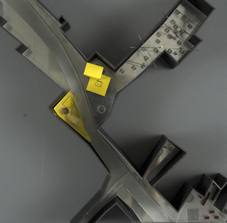
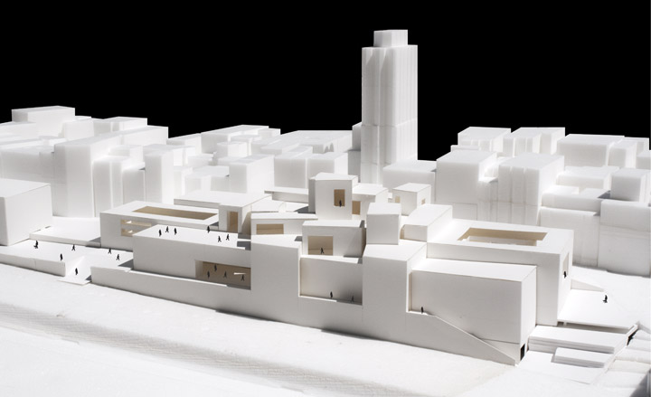
Having been taught by some of the biggest names in contemporary architecture, including Greg Lynn, Peter Eisenman and Frank Gehry, and with three years research experience on sustainability at the Habitat and Energy Research Center at Buenos Aires University, Carlos Felix Raspall Galli is well equipped to face the professional architecture world. Argentinean Raspall previously studied at the University of Buenos Aires before finally leaving academia in 2010 with a final project focusing on a concert hall in Istanbul. Keeping it local, Raspall is currently employed at Pelli Clarke Pelli in New Haven, even though his previous experience spans posts at the Takenaka Corporation in Osaka, Japan, and MSGSSS Arquitectos in Argentina, as well as a number of independent projects.
Most inspired by: Enric Miralles and Kazuyo Sejima.


Anne-Marie Armstrong
Yale School of Architecture, US / 2010
Architecture
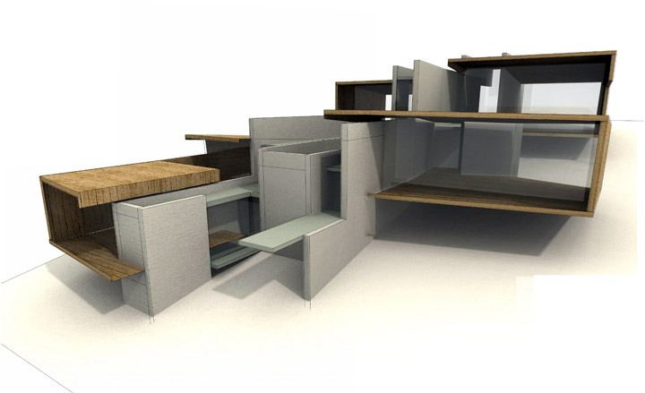
Now a junior designer at Gehry Partners in LA, Anne-Marie Armstrong’s professional experience ranges from curatorial work at the Storefront of Art and Architecture in New York to design work at Kohn Pedersen Fox and Diamond and Schmitt Architects in Toronto. The Canadian-born Armstrong obtained her Bachelor degree at University of Waterloo, Ontario, before completing a prestigious Masters at Yale, where she was awarded a continuous flow of prizes, scholarships and fellowships, including the H I Feldman Prize for the best solution to an architectural problem in an advanced studio.
Most inspired by: Herzog & de Meuron, Atelier Bow-Wow, and Patrizia Moroso.
Nicolas Fayad
Harvard University Graduate School of Design, US / 2010
Architecture
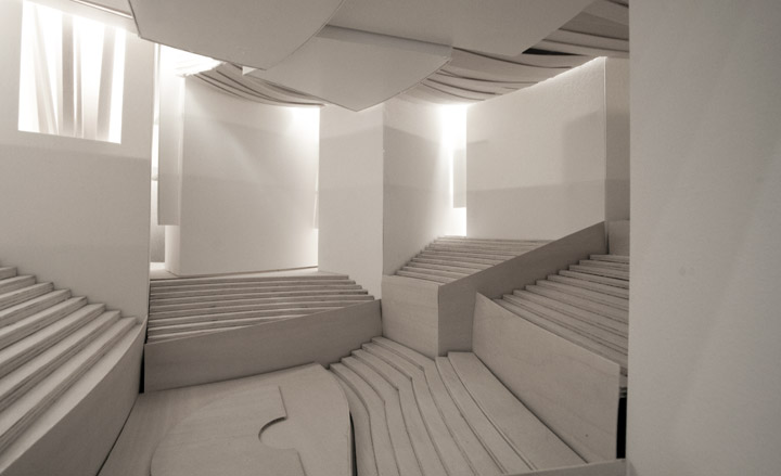
Lebanese national Nicolas Fayad followed his BA at the American University of Beirut with a Masters at GSD, interspersed with a spot of experience at firms including Ateliers Jean Nouvel. The 25-year old cites John Hedjuk, Enric Miralles and Thom Mayne as influences, along with the art of Naum Gabo, Marcel Duchamp and Robert Smithson. 'I came to Harvard seeking new models of practice that would examine new forms of collaboration,' he says, 'I am interested in an architecture which emerges from contextual constraints, simultaneously striving for programmatic resilience.' Striving to reign in the excesses of digital design, his award-winning graduation project, 'Brittle Steps,' looks at the topography of a site in Chongqing, China, a stepped row of elaborate, interrelated structures that creates a new landscape for the site and a new world of spatial possibilities.
Most inspired by: Morphosis.


Joe Williams
Oxford Brookes University
Architecture
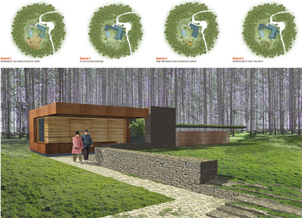
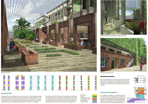
Joe Williams' influences splice the socially progressive approach of Ralph Erskine and Danish urban design Jan Gehl with the formally ambitious architecture of Bjarke Ingels and Charles Correa. With a stint at Feilden Clegg Bradley under his belt, the 25-year old Briton is set on making 'a positive contribution to the field of social housing in the future.' Williams believes that high-density urban housing is the most pressing concern for today's architect. 'This will require a re-examination of the nature of habitation and the radical innovation of conventional housing solutions,' he says. His RIBA-award winning graduation project, 'Make Bethnal Green,' was inspired by 'Erskine's premise that "a housing development with dwellings only is an incomplete organism"'. Shared space therefore became the focus, to help 'begin to reverse the trends of living, working and playing in isolation.'
Would most like to work with: 'Edouard Francoise's recent social housing 'Eden Bio' is inspirational in re-asserting the importance of dwellings with nature; I would undoubtedly cherish working at his practice in Paris. The private residential work of Rahul Mehotra Associates (RMA) in Mumbai is equally appealing.'


Chiara Onida
Central Saint Martins, UK / 2010
Design
‘I’m fascinated by traditional artifacts,’ says Turin-born designer Chiara Onida. ‘I love simple solutions, especially the ones determined by necessity or by need of adaptation. I like small, crafted details as well as primitive shapes.’ For her final year project she developed ‘The Domestic Soundscape’, a collection of objects that explore the possibilities for using sound and rhythm to celebrate the small rituals involved with everyday domestic activities.
Most inspired by: Martino Gamper and Faye Toogood

Elina Järvinen

Aalto University, Finland / 2010
Design
Helsinki designer Elina Järvinen impressed the Milan Salone crowds in 2007 with her ‘Tre’ light, which is now being manufactured by a Finnish brand. She believes her objects should make their users happy: ‘A good product is like a good friend: it fulfills functional needs and communicates on the emotional level.’ She says of her latest project, ‘Able’, that it is ‘a new kind of furniture that combines the functions of a table with that of storage furniture.’
Most inspired by: the great Scandinavian designers of the 1900s such as Kaj Frank.
Hanne Enemark
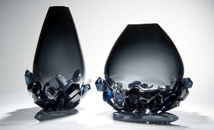
Royal College of Arts, UK / 2010
Design
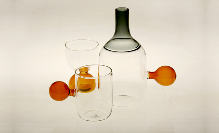
Hanne Enemark has been working with glass since 2002. She studied at the Design School on Bornholm Island, Denmark, before moving to London to study at the RCA’s ceramics and glass department. ‘My work explores glass’ incredibly versatile nature; its optics, transparency and fragility. By working both with the glass in its soft flowing state and in its cold hardened state, I create shapes that emphasise the purity and honesty of the material.’
Most inspired by: Lena Bergström, Anna Torfs and Louis Thompson.
Harry Parr-Young
Bucks New University, UK / 2010
Design
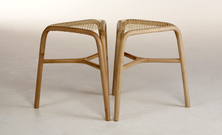
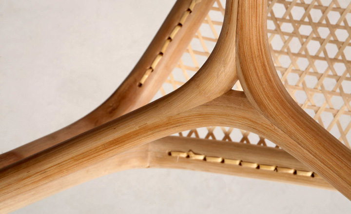
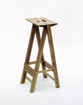
Harry Parr-Young’s interests in design revolve around creating well-considered solutions combined with the experimental use of a variety of materials. ‘I have a passion for cultural diversification expressed through design, which led to my reinterpretation of rattan cane.’ His ‘RSM I’ stool plays on rattan furniture’s perceived association with the exotic and the outdoors, using splice joints and triangulation.
Most inspired by: the Castiglioni brothers, Dieter Rams, Hans Wegner and Carlo Scarpa.

Hye-Yeon Park
Royal College of Arts, UK / 2010
Design
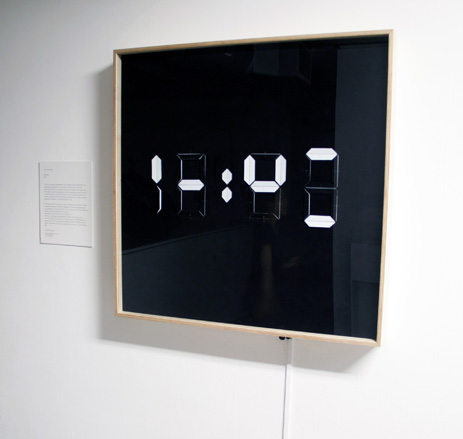
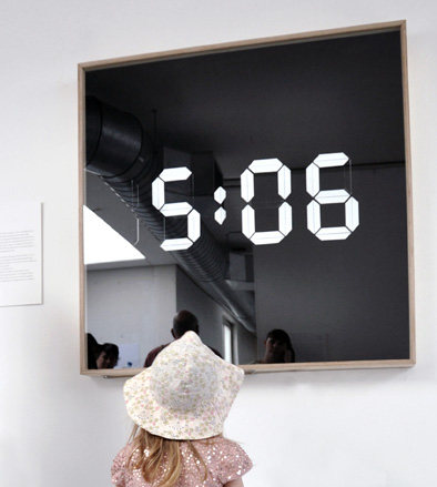
Hye-yeon Park starts any design project by asking: ‘What is it about an object that we take for granted?’ For his Mr Clock project, this process threw up the less than obvious question: ‘Why can’t a clock take a rest when we’re not looking at it?’ At first glance, Mr Clock seems to playfully flip between nonsensical configurations of each seven-segment digit. But this as you walk up close it remembers itself and resumes its time keeping function.
Most inspired by: mathematician Tobias Dantzig and Korean poet Kim Chun-Su.

Iina Vuorivirta
Beckmans College of Design, Sweden / 2010
Design
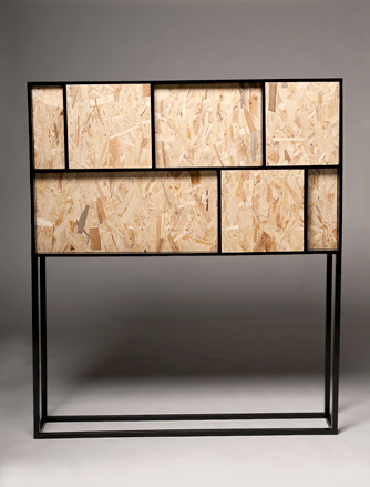
Iina Vuorivirta, who moved from Finland to Sweden to study product design, believes in minimalism and pure forms: ‘“Enough is enough”, I like to say. In my work it is the material that determinates the shape.’ In her ‘4th of July’ cabinet, Vuorivirta lets the oriented strand board play the main role: ‘I wanted to pay attention to a material usually hidden under several lays of plaster. I try to ensure that the messages, materials and forms all support one another.’
Most inspired by: the pureness of Jasper Morrison, the heritage of Alvar Aalto.
www.beckmans.se/iina-vuorivirta
Irie Takuro
Tama Art University, Japan
Design
For Irie Takuro, a native of Hiroshima, her work is all about securing the relationship between the user and the product through a design solution. ‘I came up with the idea of having the product be customizable so that a new and closer relationship can be made between the two. The inspiration came from observing a craftsman I interviewed, and seeing the close relationship between him and the tools he has been using for over 40 years.’
Most inspired by: Achille Castiglioni, Sori Yanagi and Kenji Ekuan
James Shaw
Kingston University, UK / 2010
Design
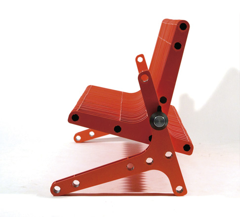
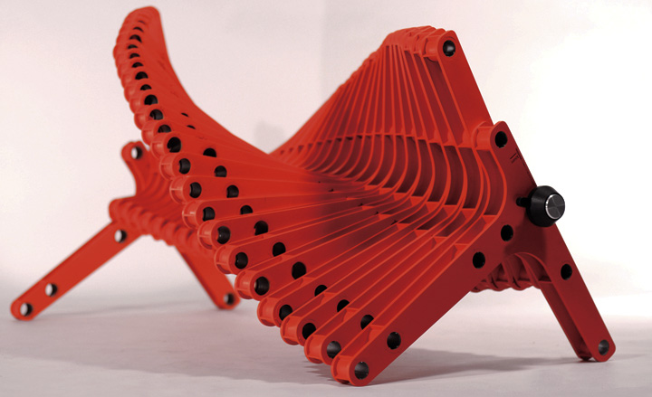
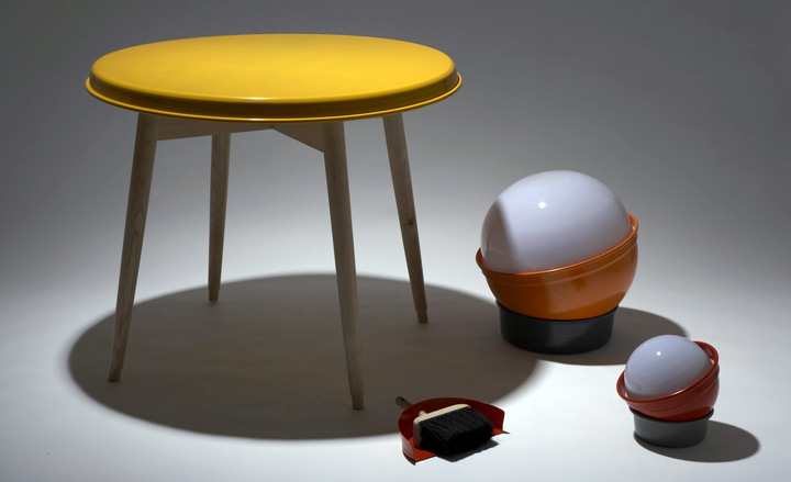
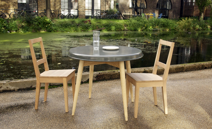
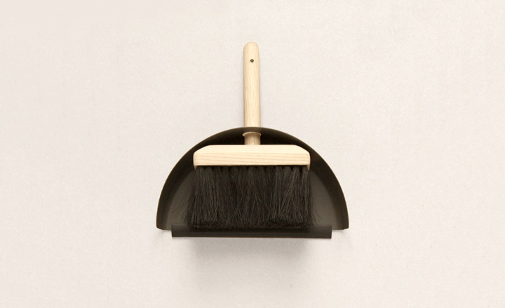
James Shaw studied at Kingston University, where he says, with admirable simplicity, that he ‘learnt how to make things’, and is now based in London. He has a manufacturing-based approach to design: ‘I am interested in creating objects which are entirely appropriate to their material and manufacture in order to give them longevity, utility and a simple innate beauty.
Most inspired by: Andrea Zittel for her pragmatism; Jasper Morrison for his refinement; Jurgen Bey and Hella Jongerius for their playfulness.
Jeanette Dalrot
Konstfack College, Sweden / 2010
Design
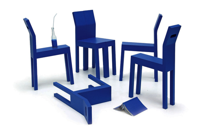
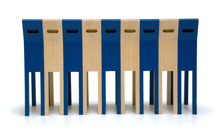
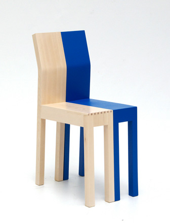
Jeanette Dalrot’s sharing chair concept questions how much comfort it is reasonable to abandon for the possibility of sharing a seat. ‘I want to investigate ordinary needs and their possible solutions. I am trying to create environments and objects that do not require, but that do facilitate, interaction. I believe in trusting people’s ability to recognize and appreciate design and let them be entertained. Availability and equality is important to me in my work.'
Most inspired by: my surroundings and the needs and desires of people I meet; the anti-design philosophy of Ettore Sottssas, Achille Castiglioni´s way of reinventing everyday items.
Jennifer Rabatel
ECAL, Switzerland / 2010
Design
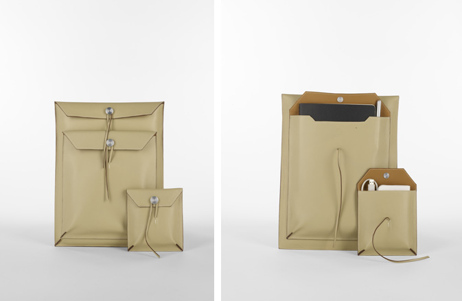
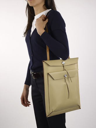
Jennifer Rabatel begins her designs with a lot of drawing. In that way, she believes, she can think her way to innovation. ‘I try to keep my work as simple as possible, but consistent with the idea of durability and in a way that highlights the beauty of the materials and the assembly itself. Good objects are really only good if they last in time.’ Her collection of mirrors and bags is designed to show that luxury can be found where you least expect it.
Most inspired by: Achille Castiglioni, Le Corbusier and Charlotte Perriand.
www.jenniferabatel.blogspot.com


Lisa Allegra
ESAD Strasbourg, France / 2010
Design
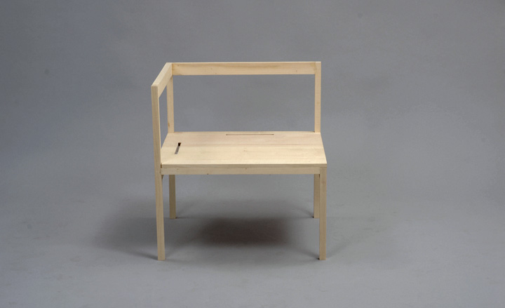
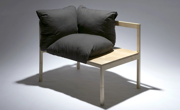
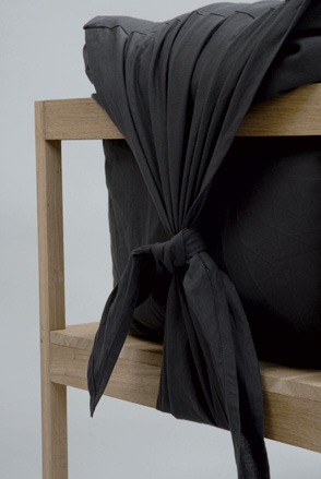
Lisa Allegra believes that an essential object is not necessarily a simple object, but one that brings a moment of calm amid the permanent cacophony of our cluttered lives. ‘The pillow is the main ingredient of this ‘Sumo’ seating proposal. It combines comfort and rest. Its shape tells of a warm welcoming attitude. This seat leaves open a great contrast between rigidity and flexibility, sensitivity and opulence. It is elegant and heavy, skinny and fat altogether.’
Most inspired by: Jasper Morrison and Donald Judd
Lukas Peet
Design Academy Eindhoven, Netherlands / 2009
Design
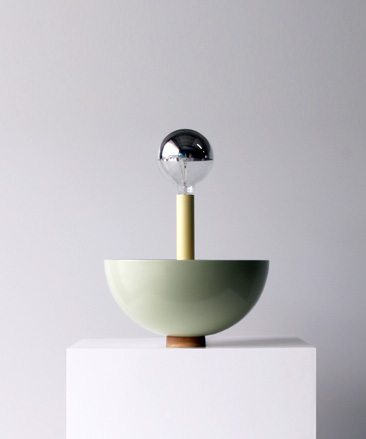
Lukas Peet grew up in the Canadian Rockies where his father worked as a goldsmith and jeweller. ‘My main approach to design is based on a strong use of shape and form, combined with interesting materials, with the function and use heavily determining those aspects. The goal of the ‘Table Light’ project was to create a light that would illuminate the table surface as well as the ceiling while leaving the space between free from direct light.’
Most inspired by: My father, Ilse Crawford, Aldo Bakker and Jan Boelen.
Martha Schwindling
HfG Karlsruhe, Germany / 2010
Design
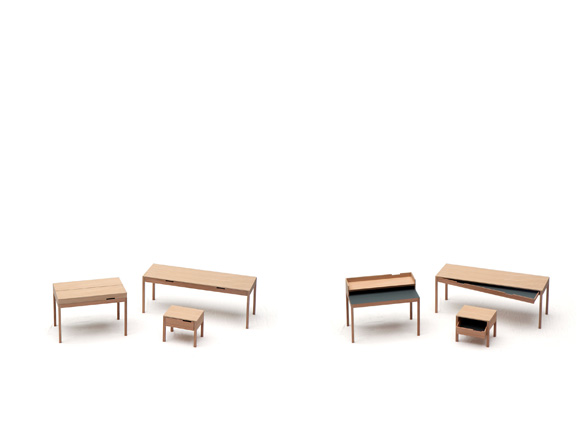
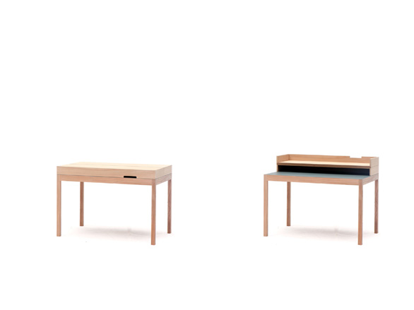
Martha Schwindling’s work focuses on simple products with a twist. Her ‘Die Drei’ series of tables, made of elm, veneer and linoleum, is a project about ‘opening and closing, and finding a surprising interior’. The three tables come with unconventional opening mechanisms. While other drawers tilt or wear out after some time, my desk and side table use these asymmetric movements as their functional principles,’ she explains.
Most inspired by: Sam Hecht and Naoto Fukasawa.
Martin Ku
Beckmans College of Design, Sweden / 2010
Design
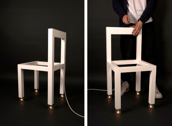
Martin Ku studied art history before deciding to focus on design, and he believes this has influenced his approach. ‘My work is based on the conviction that the products around us are created through a social agreement on what we expect them to look like. By adding, subtracting and changing functions in objects, I force the users to redefine what they see.’ His ‘Armatur’ project is shaped like a chair but is actually a light.
Most inspired by: Norwegian theatre scenographer Bente Lykke Møller.
Tor Palm & Mattias Rask
Linköping University, Sweden / 2010
Design
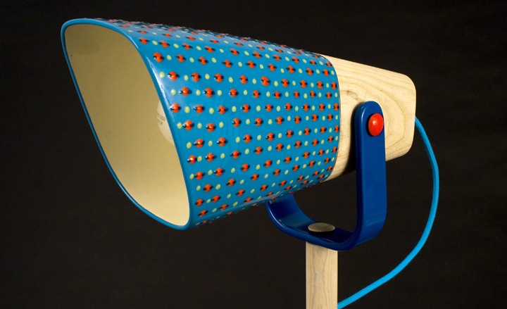
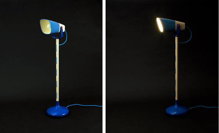
Mattias Rask and fellow graduate Tor Palm have formed a partnership to work with artisans from around the globe. ‘Hopefully our work will generate more work for the artisans and help keep specific crafts alive in poorer parts of the world,’ says Rask. Their final year project, a standing lamp called Last Fruit Standing, was created in partnership with ceramicists at The Potters Workshop in Cape Town; they are now working with artisans in Vietnam.
Meike Langer
HfG Offenbach, Germany
Design
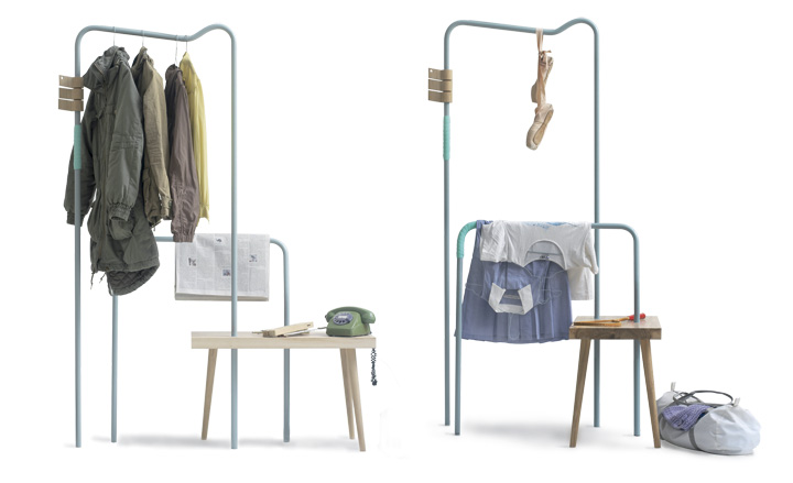
Meike Langer studied at ECAL for one semester before studying industrial design in Offenbach. She is now freelancing in Frankfurt for the Studio Reinhard Dienes. 'I try to create functional objects that will be used and lived with by people in the long term,' she says. 'Every detail of an object needs to be thought of and justified, but this does not need to show in the design. I rather wish my objects to appear light and easy to handle.' For her diploma work she created a clothes rail and bench: 'I aimed to create a functional object that would adapt easily and that would find its way into peoples homes as a longtime companion.'
Most inspired by: Cecilie Manz, Inga Sempé and artist Monika Sosnowska.
Sarah Böttger
HfG Offenbach, Germany / 2010
Design
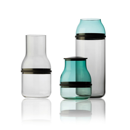
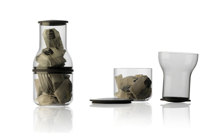
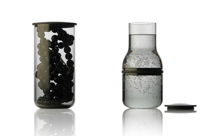
Sarah Böttger's ‘Juuri’ collection of containers was inspired by the glass manufacturing process. ‘There are three different shapes, cut in eight different places, that can be joined together in various combinations. I enjoy experimenting with different materials and processing techniques. Traditional crafts can be as fascinating as high-tech methods. I believe that the overlap between them can create interesting collages and unusual results.’
Most inspired by: Ronan and Erwan Bouroullec for their surprising solutions.
Satoshi Yoshida
Aalto University, Finland / 2010
Design
Japanese designer Satoshi Yoshida studied industrial design and worked at a design firm in Osaka before moving to Finland in 2007 to complete a masters in furniture design. ‘I believe that designers have to keep updating their ideas to reflect contemporary living,’ he says. His ‘Align’ bookshelf is ‘an extraordinarily narrow bookshelf which allows the alignment of both small and large books harmoniously and efficiently.’
Most inspired by: Finnish designer Ilmari Tapiovaara.

Yuya Kurata
Royal College of Arts, UK / 2010
Design
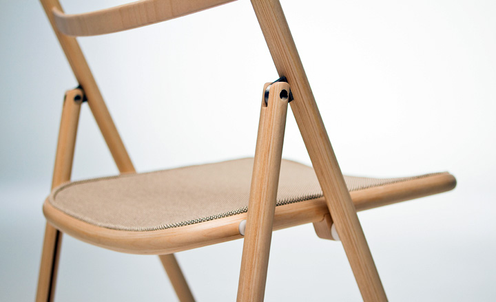
Yuya Kurata studied craft and industrial design at Okayama University. After three years’ practical experience as a designer for an Osaka lighting company, he moved to London to do an MA in pro09ct design at the RCA. ‘I like to focus on enhancing the practicality within everyday life and actual lived experience. Newly designed products should make a difference, even if it's small, and at the same time, blend in with the existing environment.’
Most inspired by: Muji's consumer-focused products


Wai Lun Wong
RMIT University, Melbourne, Australia
Packaging
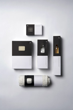
Wai Lun Wong considers design to be a tool to directly express messages to audiences instead of languages. 'Design should be simple and clean to let people understand it easily. That is the direction in which I always try to take my work. My Ware House project is for a company that sells products for the home. I used simple graphics and die-cut shapes to emphasize the quality of the products. The shape of the die-cut is exactly the same as the shape of the product.'
Most inspired by: Kenya Hara, design director of Muji.
Ludwig Bruneau Rossow
Westerdals, Oslo, Norway
Packaging
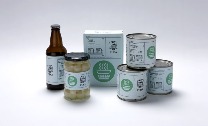
Ludvig Bruneau Rossow is an Oslo-based graphic designer who works mainly with printed matter. His work varies from visual identities to editorial design and packaging. 'I believe that packaging design should have a function and not just appear as decoration. The ideas behind my projects vary from technical to emotional concepts, but it is always very important for me that my design is based on an initial conceptual idea.'
Most inspired by: I'm a great fan of Herb Lubalin for his typographic work and Stefan Sagmeister for his ability to solve projects in new and surprising ways.
Abby Brewster
Portfolio Centre, Atlanta, US
Packaging
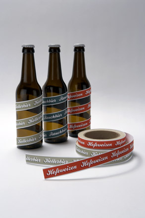
Now freelancing in New York, Abby Brewster is motivated by the belief that the place where functionality and creativity meet is where a project comes alive. 'My approach could perhaps best be summed up by the Shaker adage: "Beauty rests on utility."' Her project for Triumph Brewing Company is a packaging system that allows for the mass-production of the bottles that are distributed to three brewpubs; the labelled tape allows each location to only package what they are currently brewing.
Most inspired by: the Shaker style
www.cargocollective.com/abbybrewster
Sarah Déry
UQAM, Montreal, Canada
Packaging
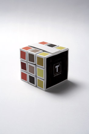
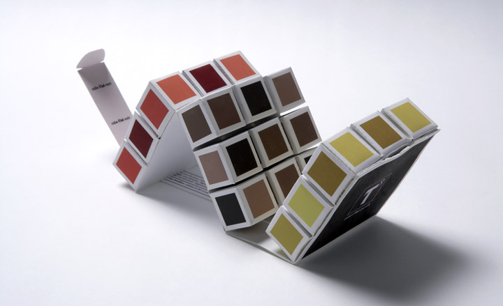
Sarah Déry studied graphics at the Sherbrooke CEGEP and recently graduated from UQAM’s graphic design program. 'I like to seek concepts which combine visual impact and emotional response. I work to create objects that provoke, inspire nostalgia or simply make people smile. Packaging must also ensure an optimal use of materials, as well as encourage re-use for secondary purposes. My project T3 is inspired by Rubik’s cube. It is an environmentally friendly tea package, containing 27 cubes of compressed tea. The entire package is made from a single sheet of paper, folded and cut to allow the user to detach each cube as needed.'
Most inspired by: Design agency Peter Gregson Studio
Roberta Zanette
UniRitter, Porto Alegre, Brazil
Packaging
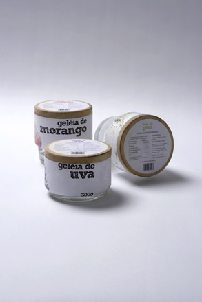
Roberta Zanette loves ceramics, packaging and modular products. She graduated in industrial design in 2009 and for her final year project decided to draw packaging for jam and jelly products that are popular throughout southern Brazil. 'I had two main goals with my project: to affect the environment as little as possible and to develop a product which would provide easy access to a great number of people. Across all of my design work, which also includes ceramic tableware and photography, I try to focus on the development of smart products that are linked to sustainability, quality of life and well being.
Most inspired by: ceramics; modular products
lovelypackage.com/student-work-roberta-zanette/
Neal Fletcher
University of Central Lancashire, UK
Packaging
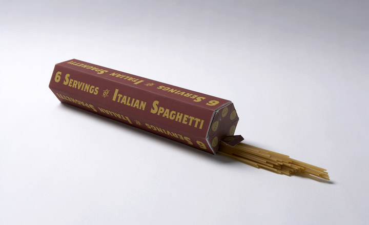
Neal Fletcher believes in approaching design as an outsider: 'I feel it's important not to complicate things too much, design should be accessible to anyone, regardless of your knowledge.' He chose a spaghetti package for his project because he was always wasting spaghetti by cooking too much. 'There are already measuring devices for spaghetti on the market but nothing within the packaging itself, giving the consumer the spaghetti in six equal servings to save on waste, the packaging can then be re-used and kept forever.'
Most inspired by: Reducing waste.
Niklas Hessman
Broby Grafiska College of Cross Media, Sunne, Sweden
Packaging
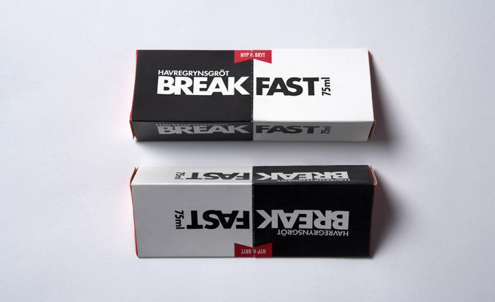
Niklas Hessman approaches design as an actor who studies human typologies: 'I always think to myself that a designer is a person who sees things in society and the world around them as nobody else is seeing it. We are much like actors trying to study peoples’ habits and personalities.' In his own packaging work he hopes that its key feature is innovation, thereby eliminating the need for too much surface styling.
Most inspired by: Amore, a design studio in Stockholm, and Grandpeople, a group of designers in Bergen, Norway.

Fernando Jorge
Central Saint Martins, UK / 2010
Jewellery
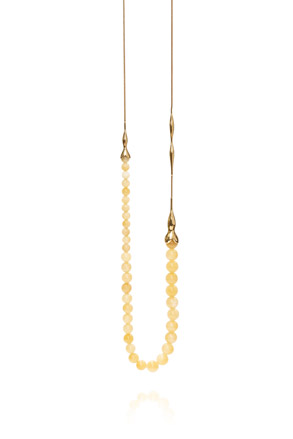
Brazilian Jorge’s fluid pieces perfectly encapsulate the laid-back sensual vibe of his home country. Stints at a large jewellery manufacturer in Sao Paolo and later at the renowned Carla Amorim undoubtedly imbued Jorge with a commercial savvy, while his design aesthetic was honed by a subsequent MA at Central St Martin’s. The result is a strikingly beautiful and saleable collection. Milky quartz is skillfully cut to appear dripping from molten gold settings, while cabochon cut smoky quartz and large soft nuggets of rhodochrosite form the aptly named ‘Curvy’ and ‘Cheeky’ ring.
Most inspired by: living in London
Harry Hornby
Central Saint Martins, UK / 2010
Jewellery
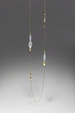
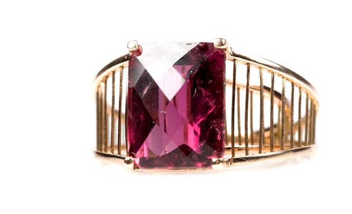
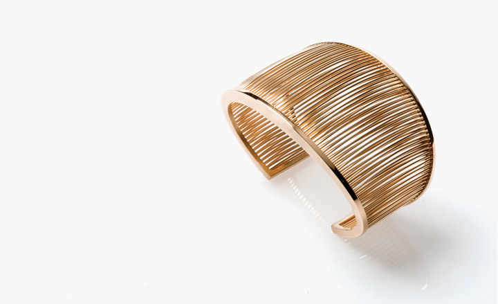
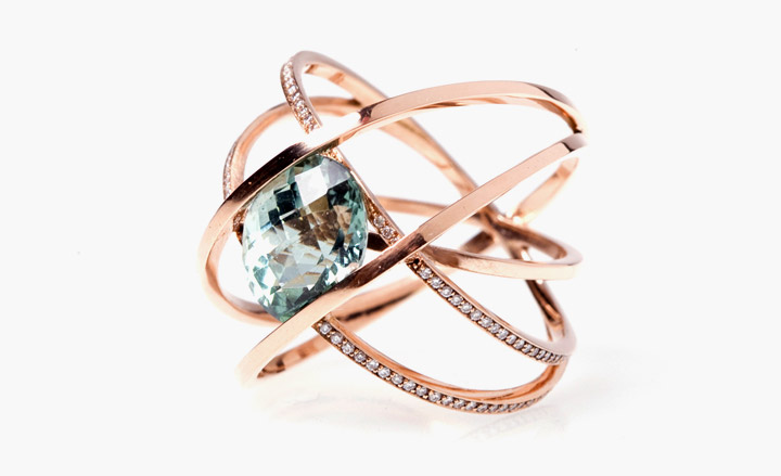
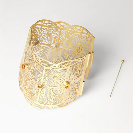
It’s no surprise that Asprey has snapped up Harry Hornby to inject some of her aesthetic into its design team. With goldsmithing skills honed at Cartier in 2009, and the industry recognition of a ‘Bright Young Gem’ award in 2010, her sophisticated and luxurious pieces belie her years. We particularly like the layering of fine gold wire in her rings and cuffs, with large ‘floating’ gemstones set within.
Most inspired by: Bridget Riley, Naum Gabo and Barbara Hepworth.
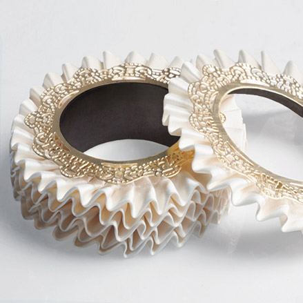
Julie Impens
Central Saint Martins, UK / 2010
Jewellery
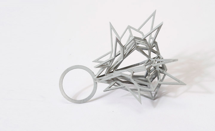
Impens’ strength lies in her ability to mix unconventional materials with laser-cut gold-plated brass. And so silk ruffles are sandwiched between metal, thoughtfully lined in a deep burgundy flocking. Impens sites her home country of France as having a huge impact on her work, particularly Marie Antoinette and the court of Versailles. But don’t let that put you off, the sculptural form of the stiff Venetian silk anchors her pieces firmly on the right side of girly.
Most inspired by: French Rococo style
Lotta Veromaa
University of Art and Design, Helsinki, Finland / 2010
Jewellery
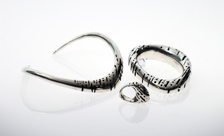
Veromaa draws on a variety of techniques to create her jewellery. Her latest collection ‘Transit’ was designed on a computer and then cast using the age old ‘lost wax’ technique. In the case of the necklace 6 separate elements were then soldered together and the interior oxidized black to throw the polished exterior into sharp relief. It’s no surprise to discover Veromaa studied architectural imagery of future city plans to gain inspiration - the apertures in her jewellery remind us of windows in a cityscape. Think 2001: A Space Odyssey meets Paco Rabanne, only better.
Most inspired by: movies, books, objects, buildings, nature, people
Myia Bonner
Middlesex University, UK / 2010
Jewellery
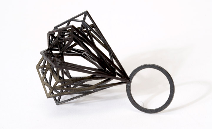
By creating and finishing each piece by hand Bonner hopes to instill some of the rarity of a real diamond into her graphic pieces. Large 3-D gold-plated models of diamonds make successful pendants while her perspex ‘diamond’ rings challenge ideas of scale and value. As the 2010 winner of EC One’s Unsigned competition, her collection will be sold in store from Dec.
Most inspired by: science, nature, fashion, culture, the designer Gareth Pugh



Andre Chiang
Restaurant Andre, 41 Bukit Pasoh Road, Singapore
Food
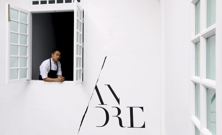
Having spent his formative years under the watch of such culinary luminaries, it’s no wonder that Chiang, now 31, has challenged himself to develop his own culinary principle for his new establishment, Restaurant Andre. ‘Octa-philosophy’ is based on eight characteristics; unique, texture, memory, pure, terroir, salt, south and artisan, which shape Chiang’s changing menus. An adventure for the senses, Chiang’s delicately presented plates aren’t short on delicacies, be it Alba white truffles or foie gras. His experimental approach sits particularly well in the restaurant’s intimate premises; a beautiful colonial shophouse, armed with a cellar of rare and small-production French wines. Chiang’s talents aren’t confined to the kitchen either; tables also feature flatware and decorative pieces made by the chef himself.
Sample dish: Heritage Kyoto aubergine braised with cockscombs and duck tongues (to absorb its natural collagen,) coated with smoked eggplant “Crème Anglaise” and topped with Atlantic free-farmed caviar from France.
Andreas Dahlberg
Bastard Restaurant, Mäster Johansgatan 11, Malmö, Sweden
Food
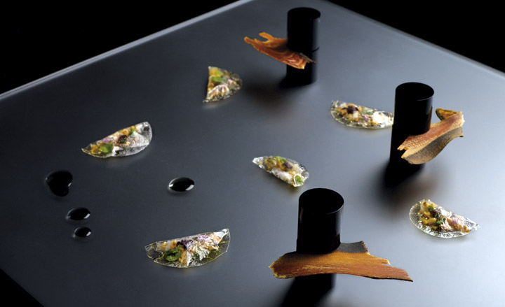
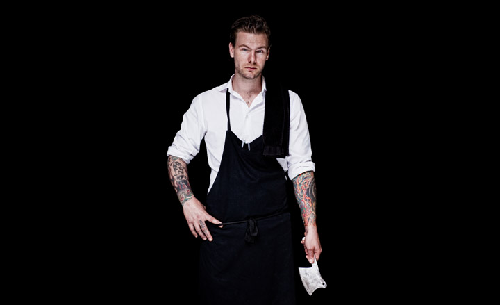
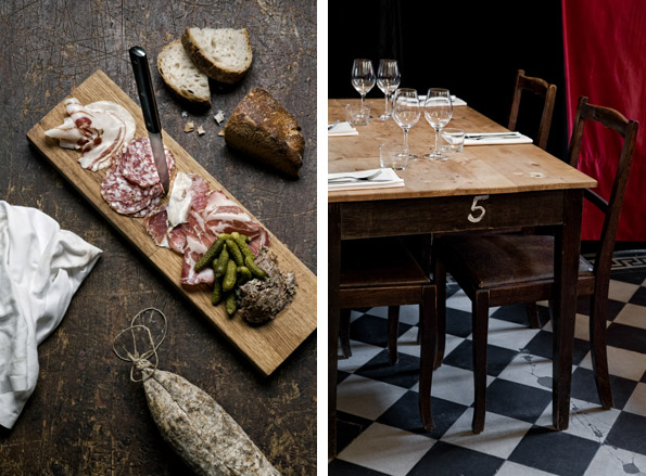
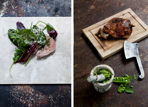
Andreas Dahlberg is 31 and has been cooking for more than half his life. A year ago he and a partner opened Bastard, an easygoing place with a big-city feel, bare wood tables, and a long bar serving organic wines. Though Dahlberg was actually born out of wedlock, the name was chosen simply because it’s 'punchy, it stands out, it’s not too long.' That’s the sort of Nordic directness that you will find in his dishes, made with just a few ingredients, carefully sourced, and for the most part locally. Espousing ‘nose to tail eating’ à la Fergus Henderson, Dahlberg manages to work miracles with bits of animal that aren’t, in essence, that appetising – we’re talking trotters, ox cheek, tongue. Portions are generous, flavours earthy but rounded. He insists on 'happy' animals, which means that when he can’t find lamb, chickens or beef raised with love he won’t serve them. Fortunately, he has a good pork producer, so you can always count on finding the Bastard Planka, an assortment of sausages, pâtés, and rillettes, many of them housemade, served with Swedish butter and sourdough bread. He loves serving off-cuts such as beef heart in a variety of ways, including grilled, thinly sliced and marinated with capers, garlic, and balsamic vinegar. He calls his cuisine 'contemporary European home cooking,' though with typical Nordic humility he says it’s a work in progress.
Sample dish: The 'Bastard Planka' , a mix of pâtés, sausages, hams and rillette served with homemade sourdough and swedish butter.
Bel Coelho
Clandestino, First floor, Alameda Franca, 1590, Sao Paulo, 01422-001, Brazil
Food
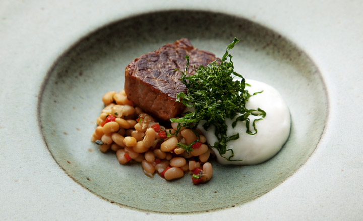
Coehlo’s style for her new weekly venture, Clandestino, is experiental with molecular techniques and textures. It’s name is a reference to the meals that the chef used to cook at her own place or at her friends’ houses. Located above Dui, the restaurant she opened In 2009, Clandestino only opens once a week (on Thursdays), at night, for a maximum of 15 people – and only with a reservation. “Our wish is to provide people with a unique food experience”, says Bel. In order to reach her goal, she set a 12-steps-menu with modern techniques such as the creation of flavor spheres, long and slow cooking and vacuum cooking. Flavours and traditions from Brazilian, Portuguese, Spanish and Asian foods influences her dishes.
Sample dish: Clandestine Codfish Soup – a recipe that her mother used to cook for her father. “ he would always ask for soft egg yolks, almost raw” In Bel’s version, some modern techniques are allied to her old memories, resulting in a low-temperature boiled egg served with a cod brandade foam, corn “farofa” – a kind of Brazilian flour – and coriander olive oil. Other highlights of the menu are dishes like the Oysters in Misso and Yuzu Sauce with Shisso Olive Oil Pearl and the Lamb Stew with Chickpeas, Green Peas and Peppermint Spheres

Hugo & Victor
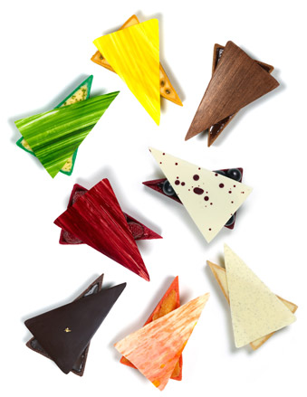
Hugo & Victor, 40 Boulevard Raspail, 75007 Paris
Food
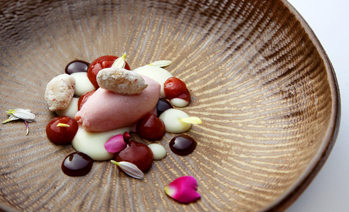
From the outside, newly opened patisserie Hugo & Victor looks like a high-end fashion store: once inside, carefully lit boxes and counters convey the feeling of a jewellery shop where macaroons and chocolates can be picked like pendants. Behind the scenes pastry chef Hugues Pouget’s is on a quest for perfection: after working for Ladurée and training under Eric Fréchon and Guy Savoy, he is now creating his own new tastes. Chocolate, caramel and vanilla remain on the menu all year long as the ‘permanent’ collection, while seasonal collections come and go: blueberry and peach in summer, grape and fresh almonds in September, pomegranate and clementine in November. Pure geometric shapes, subtle combinations and dramatic setting: Hugo & Victor reaches new sugary heights.
Isaac McHale
Elliot’s 12 Stoney Street, London SE1
Food
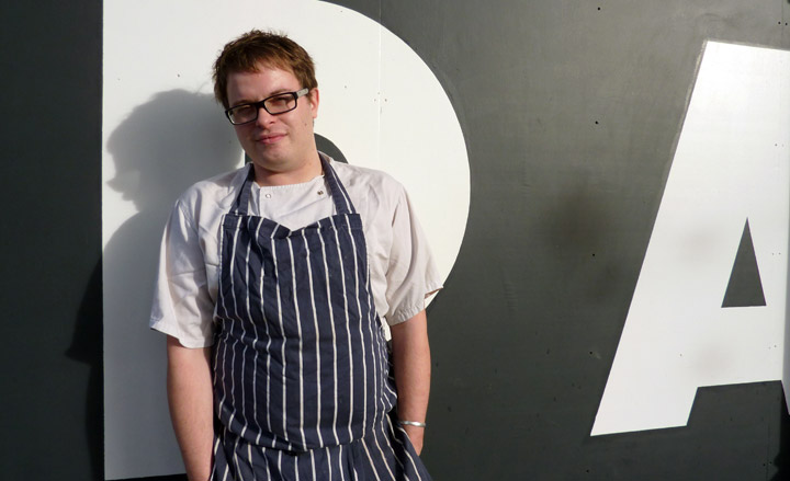
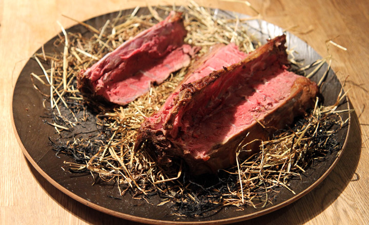
Having spent much of last year as an active member of London’s influential underground supper scene, trying out his restaurant concept last summer in a temporary location in East London’s Victoria Park, Isaac McHale will open Elliot’s this spring ‘It will be casual but gastronomic, fast paced and informal, but with a high level of skill in the kitchen’ says McHale. It will pare back the excess luxury of high end restaurants, such as napery, dedicated sommelier, 'free courses' and luxury ingredients. He is sourcing as much as possible from adjacent Borough market, and developing relationships with the farmers and artisans there, but he is also interested in heritage nurserymen and seed catalogues, and is working with Chegworth Valley Organic Orchards in Kent, who are growing rare, and forgotten varieties of fruit and vegetables to his specification – including china rose radishes, tokyo turnips, celtuce, veitch's autumn giant cauliflower, jaune d'obtuse carrots, mangold wurzel, sweete cicely, musselburgh leeks, white vienna kohlrabi, bella vista apples, hamburg turnip, root parsley, hollow crown parsnips, winter savory. He is also developing with Chegworth a cask-aged apple vinegar, in the Modena style, to a Danish recipe, with their organic english apple juice. Overall, McHale’s food is exciting, thoughtful and tasty but affordable.
Sample dish: Buttermilk fried chicken in pine salt; first of the seasons pheasant eggs with cauliflower and smoked fonduta; Pink Brandywine tomatoes with Iced goats milk; baked Plaice with elderflower and fennel; Smoked roast cap of ribeye (spinalis dorsi) with runner beans and beer pickled onions; Rump of lamb with summer squash, dates and curry leaves; Old Spot pork with cider apples and kohlrabi; Mackeral with celtic mustard and dill pickled cucumbers; Venison baked in hay with frumenty

Magnus Nilsson
Fäviken Magasinet, Fäviken 216 830 05 Järpen
Food
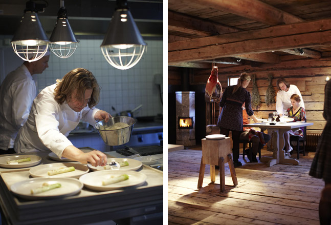
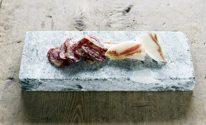
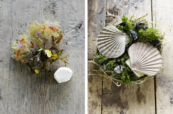
The 12-seat restaurant Fäviken Magasinet is at the upper reaches of the globe, 750 kilometres north of Stockholm in the Swedish wilderness. Young chef Magnus Nilsson, 28, grew up in this remote region before leaving for Paris. Pascal Barbot taught him the value of excellent products, which turned out to be his greatest lesson. Nilsson is a true hunter-gatherer, and nothing in his kitchen comes from more than 200 kilometres away. That may seem impossible in an area where it snows six months a year, but 'I’ve never worked with better produce than here,' he exclaims. In spring and summer he forages daily for lichen, berries, and mushrooms, while in autumn he hunts for moose and grouse. Every vegetable he serves grows on the estate. His cooking is poetic and minimalist, meant to maximize the potential of each product. There are rarely more than three ingredients on a plate, such as wild trout roe in a warm crust of pig’s blood. Or Norwegian scallops, cooked live in their shells over a fire of juniper branches, then served unseasoned in their own cloudy broth. Nilsson says this is a prime example of his style: 'It’s a combination of the perfect ingredient and the perfect cooking technique.'
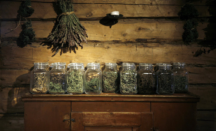
Sample dish: lightly salted wild tout roe in a warm crust of dried pigs blood; Preserved leek, sheeps cream whisked with vinegar fermented beer and grated cods roe; Black Grouse gently cooked in a pot of dried herbs collected from local meadow. Grillied Goat kid, steamed broccoli, potatoes slowly fried in lightly rancid lard; Wild raspberry ice;unseasoned scallops cooked over burning juniper branches; crispy lichens seasoned with cured eggs or shavings of smoked char to dip in thick cream and fresh garlic
Giovanni Passerini
Rino, 46, rue Trousseau, 75011 Paris
Food
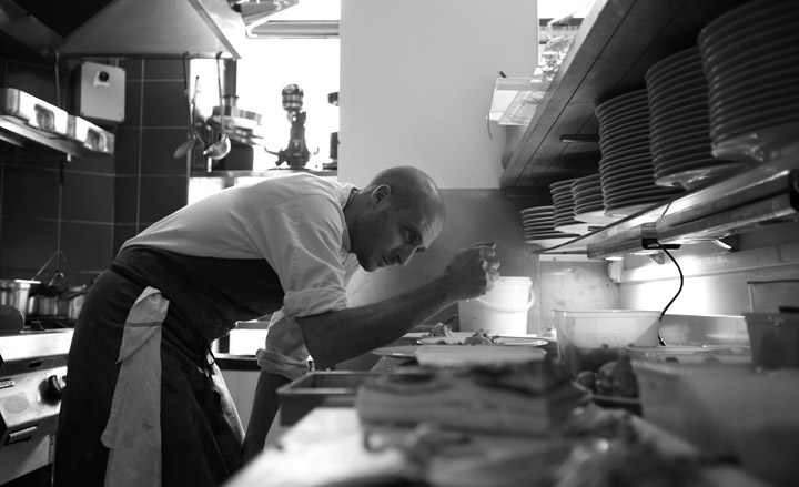
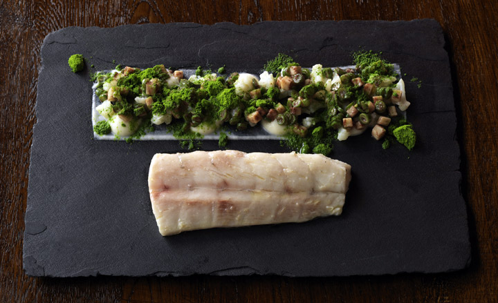
Thanks to the Italian military for neglecting to call up Giovanni Passerini in 2002, while service was still compulsory, the reluctant finance major followed his true calling, and hit the road and learnt to cook, and has now become one of the most exciting young chefs in Paris. The Roman native started late, at 26, and trained on the job, meandering from one European kitchen to another, from Cologne to Rome, Madrid, and finally the French capital. Here, he learned what he calls 'rock ‘n’ roll cooking' from Iñaki Aizpitarte and intuitive technical brilliance from Petter Nilsson. In February of 2010 he opened Rino, a 24-seat gastro bistro in the 11th arrondissement. On a no-choice menu, he serves dishes where products—mainly vegetables, fish and seafood—are combined in surprising ways with a minimum of tampering and a maximum of flavour. 'I don’t cook by formula,' he says. 'Mine is an artisanal cuisine that requires being at the stove, using my hands, touching a roast duckling or whatever and only then knowing it’s done.' The results are imaginative, delicious, and nourishing to both the body and soul.
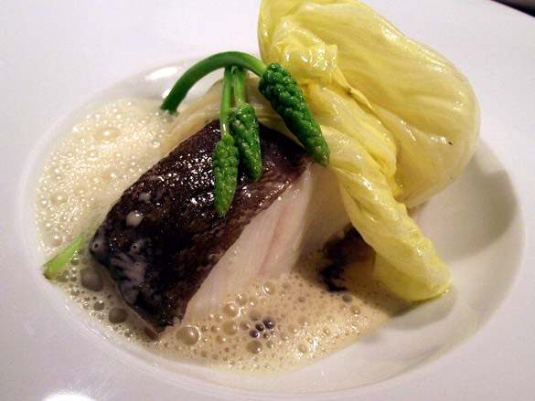
Sample dish: Cod filet with wild asparagus, choux de Paques, tapenade and an emulsion that's a lighter version of the Basque pil- pil sauce; Asparagus accompanied with pollen vinaigrette, whelks and wild herbs. Escargot ravioli with bitter roots and leaves in a clear parsnip consommé.
Samin Nosrat
Pop-up General Store, San Francisco, US
Food
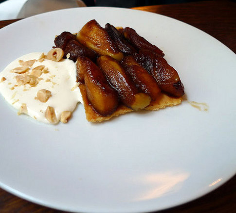
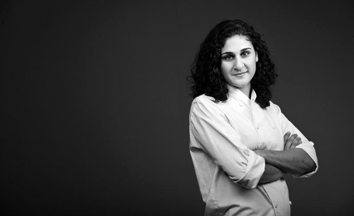
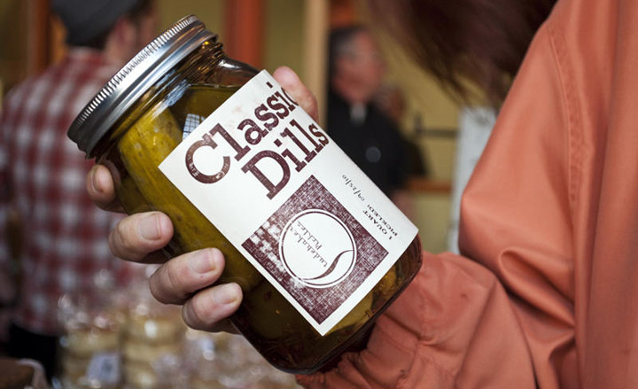
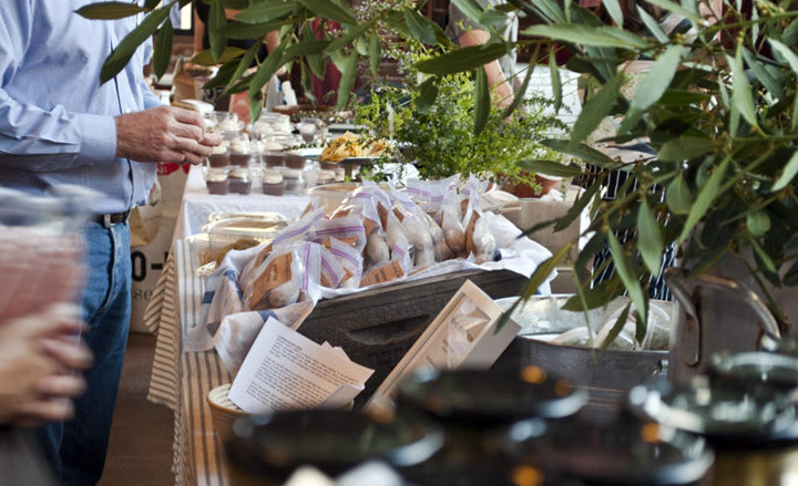
Samin Nosrat juggles many roles while always wearing a chef’s hat – of some description. Passionate about food instilled in her during years spent in the kitchens of the famous Chez Panisse (where she still does shifts), and then working with Chris Lee, another CP alumni who started the late but lauded Eccolo, she now runs food workshops, blogs, supperclubs, and with Lee, this temporary market. The Pop up General Store has a farmer’s market feel and sells a wide selection of local produce, including basic organic ingredients, alongside homemade goodies such as sausages, boudin blanc (made by Lee), homemade pasta, bread, soups, pizza, pickles, and pastries. Among the producers are a good number of chefs past and present from Chez Panisse, and other respected local eating establishments.
Sample dish: anything you can make from the above.

Christian Puglisi
Relae, Jægersborggade 41, 2200 Copenhagen
Food
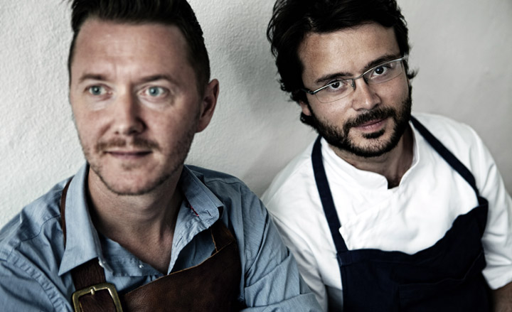
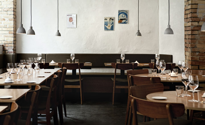
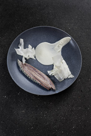
With an emphasis on simple cooking and top-notch ingredients, his debut venture in a formerly seedy part of Copenhagen is winning rave reviews. Just, 28, his cooking CV reads like a veteran’s and his time at Noma comes through most clearly in Relae’s monochromatic, product-driven menu. 'I learnt about perfection, I learnt to want to do my best and I learnt to push my own boundaries to become better.' He says 'I try to focus on a maximum of three to four components in each dish to derive a precise kick of flavours,' he says. 'I don’t do a lot of herbs and my platings are much more simplified.' And the virtue of simplicity shows, especially in a constantly evolving vegetarian menu. Puglisi’s mixed heritage (his father is Italian and his mother Norwegian) is reflected too in his preference for mixing southern European produce with Danish ingredients. The restaurant’s name roughly translates to ‘relay’ and connotes power and electricity. 'And that is what a great kitchen needs to be, electric,' says Puglisi.
Sample dish: Mackerel marinated at 40 celsius to manipulate the structure from its raw state to a creamy texture, served with raw shavings of cauliflower and a lemon purée. Typical vegetarian dishes: par-cooked beetroots, vinegar and local seaweed; salad onions with elderberries and sorrel; tiny organic broccoli, parsley and nuts; and a fennel gratinee of layered apples.
Stevie Parle
The Dock Kitchen
Food
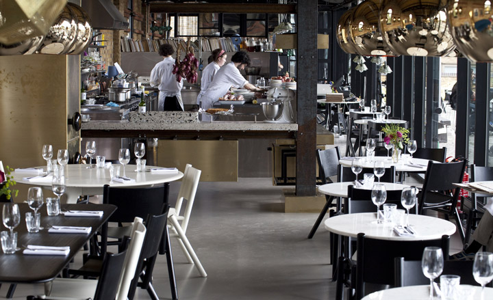
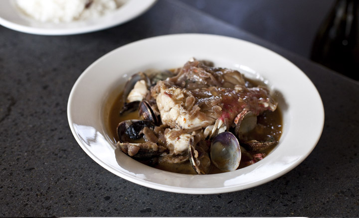
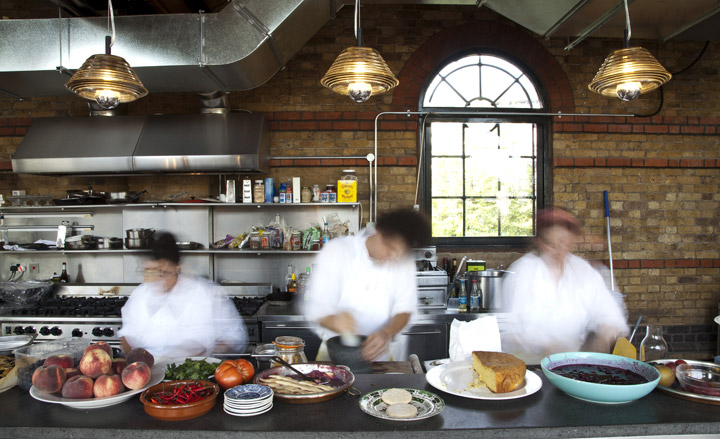
The Dock Kitchen is part of Tom Dixon’s new West London complex that houses his showroom, studio, pop-ups stores and workshops and this, the hot new lunch destination – all in a Victorian goods yard on London’s Grand Union Canal. Stevie Parle, already at just 25 is the winner of the Observer’s Uk Young Chef of the Year, has a book out, and a column in the Guardian newspaper and is heading up the Dock Kitchen. He honed his passion for regional foods at some of London’s best loved restaurants and travels the world in a constant search for ‘honest, generous and simple foods’ that he can bring together onto one very modern looking menu. His food is packed full of rich flavours from all (and some quite unfamilar) corners of the world and is presented in a wholesome, unfussy, home-cooked fashion. While the menu hops from India to Spain, Thailand to Greece, Provence to Iran and Mexico, he doesn’t really do fusion within individual dishes, so the purity of each line of flavour is preserved.
Sample dish: chicken livers with seven spice pomegranate molasses and pitta bread served as a starter. Spanish octopus, Roosevelt potatoes with parsley and Turkey pepper flakes; Lamb tashreeb slow-cooked with Iraqi spices and dried lime with artichoke pilauf.


Tomislav Martinovich
Tomislav , Level 2/13 Kirketon Road, Darlinghurst, Sydney
Food
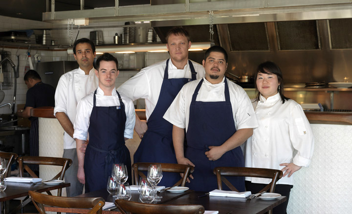
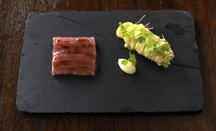
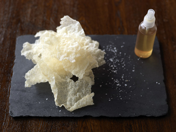
It has been called Molecular bistro and Martinovich certainly makes use of ‘crumbs’, ‘ice’ and sorbet to bring his dishes together. The secret to all three came down to the prized Pacojet machine which churns frozen mixtures into snow like powder. The siphon cannister and water bath are also feature highly. Texture is very important to Tomislav: taking classic Australian favourites he manipulates dishes but not so far that they lose their true composition. Martinovich opened Tomislav Restaurant at the beginning of 2010. It’s not, he insists, Blumenthal’s molecular gastronomy that inspires his compact menu of idiosyncratic dishes. “It’s supermarket shelves,” the 35-year-old explains. “What you see every day and what I grew up with.” Hence the triple-cooked crinkle-cut chips. It’s the humour of his food, along with the setting (the restaurant has glimpses of Harbour Bridge and is across the street from the iconic Coca Cola sign), that’s already won him a legion of local fans.
Sample dish: A deconstructed vanilla cheesecake: cream cheese mousse, served with sous-vide rhubarb and rhubarb sorbet and topped with cheese jelly. It’s a play, he explains, on the Sara Lee cheesecake he first encountered as a lad. Other dishes include poached bluefin tuna dish, which features wasabi glaze, soy parsley crumbs and parsley cress. To accompany the rice crackers, Tomislav makes a sour cream and chive dip that’s been through the siphon cannister tranforming it into a soft puff looking much like shaving foam.

Senta Simond
ÉCAL/´Ecole Cantonale d’Art de Lausanne, Switzerland / 2010
Photography
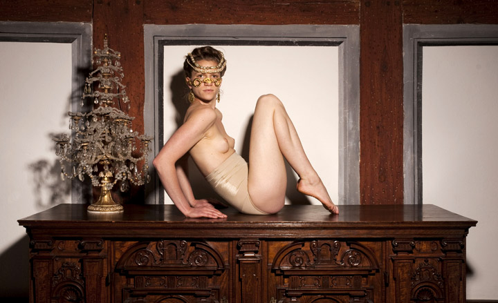
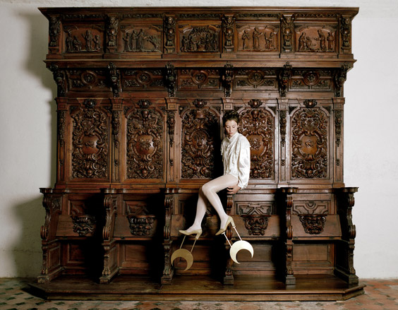
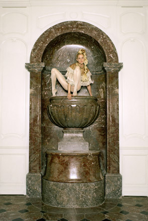
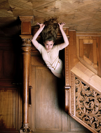
‘Feminine, sensual and a bit dark,’ is how Senta Simond describes her photography, a medium she arrived at after her teenage years were spent watching the cinematic feats of Fellini, Kubrick, Godard and Argento. ‘I prefer to say I’m interested in images rather than just photography,’ she elucidates. In line with her heroes, her final project focused on the creation of whole environments. ‘It’s a collection of women, styles, decors and places. Of greatest importance to me is the placement of these elements. It’s a mix of all my fascinations, envies, whims and obsessions. I wanted to stop time and create my own universe.’ Watch out for further articulation of Simond’s imagined worlds; she’s about to launch her own fashion magazine as part of her Masters.
Most inspired by: Hellen Van Meene or Katy Grannan as a photographer and the stylist Panos Yapanis
Gary Lafargue
LCF, France / 2010
Photography
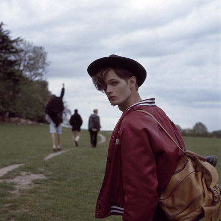
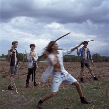
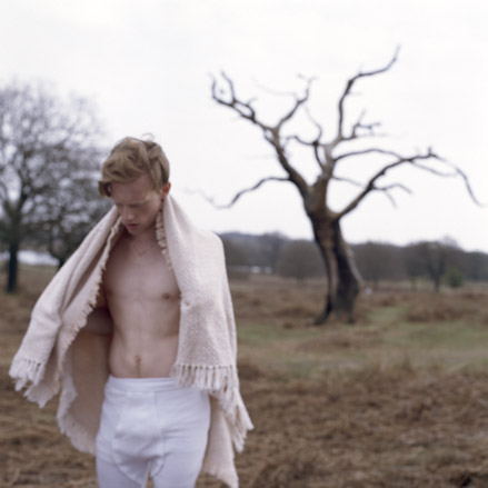
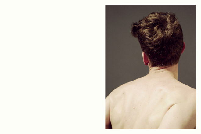
Skate culture, psychedelia and 1970s erotica are just some of the myriad of influences that fuel Gary Lafargue’s work, which he describes as ‘soft, and pastely.’ However, it is people, he says, that he likes to capture most of all; having picked up his father’s old 35mm as a teenager in France, Lafargue became hooked on snapping his friends – and he hasn’t looked back. Thematically, his work explores youth, masculinity and sexuality: ‘It strives to question the idea of masculinity within a group. I wanted it to give a sense of community and brotherhood with a slight homoerotic tension. I looked at Amish and hippie communities, and films such as A Clockwork Orange.’ His burning ambition? ‘To photograph ghost towns in northern America. I have a fascination for them.’
Most inspired by: Corine Day, Wolfgang Tillmans, Venetia Scott, Ryan McGinley, Harmony Korine, skate culture, psychedelia and 70s erotica, Beat writers and French new wave.
Darren Harvey Regan
RCA, UK / 2010
Photography
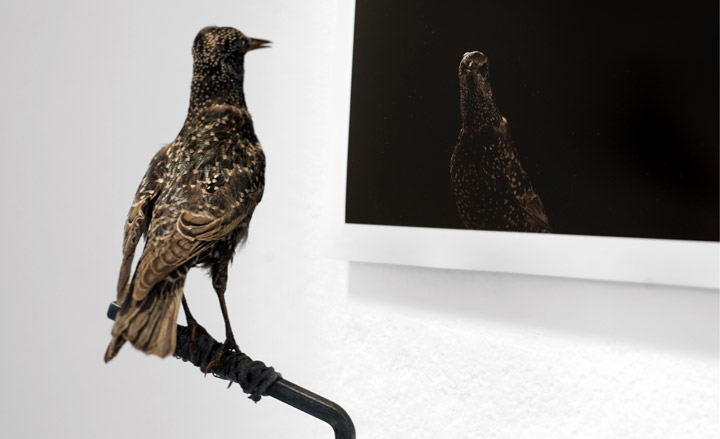
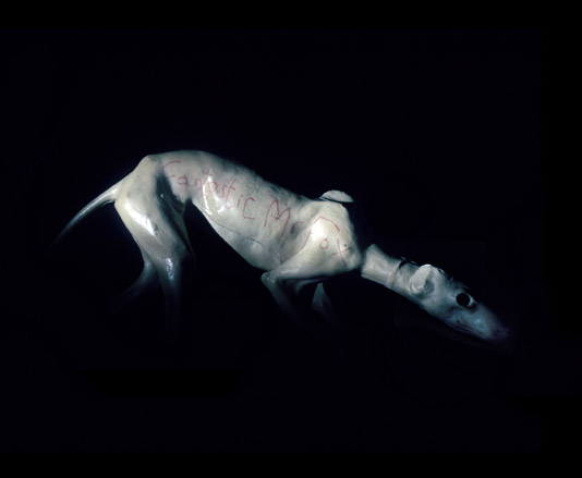
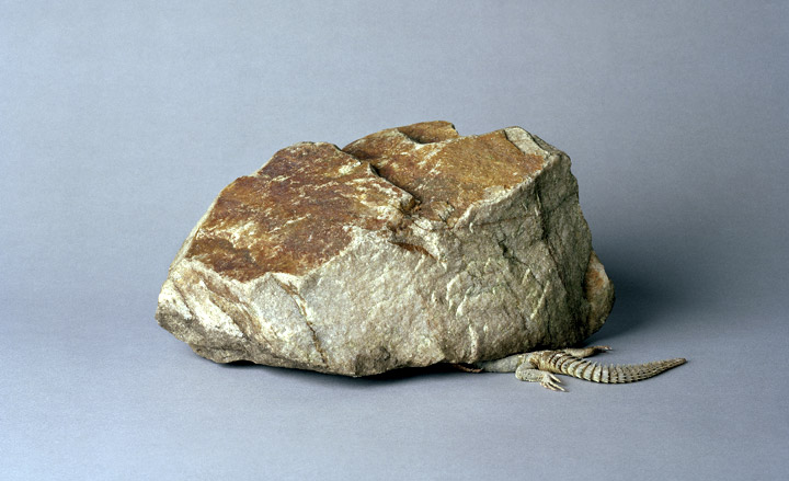
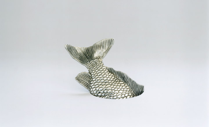
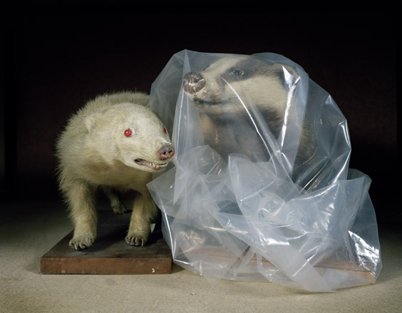
It might all have been so different for Darren Harvey Regan; it was only ‘on a whim’ that he took up photography at A Level, and discovered to his surprise that he liked it. ‘It seemed to suit my way of thinking,’ he says. ‘It’s been a love-hate relationship ever since.’ As far as we’re concerned, it’s all about the love. His final project – ‘nothing like I’d imagined’ – was a mélange of photography and installation, and featured a wall-mounted squirrel, sprayed red. These days, Harvey Regan can be found, often ‘gazing into the middle distance’ from whence he garners inspiration, and applying that inspiration to the idea of ‘photography as object.’ ‘I’ve got an idea involving a prayer mat I’m quite partial to,’ he says intriguingly.
Most inspired by: Hal from Hal Silver.
Natalia Serikova
The Rodchenko Moscow School of Photography and Multimedia, Russia / 2010
Photography
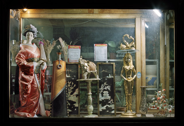
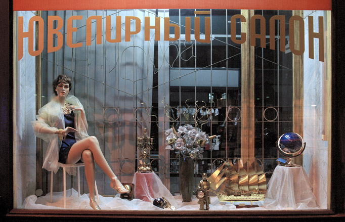
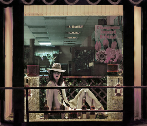
‘To be honest with oneself’ is the prime piece of advice that Natalia Serikova gives any aspiring photographer, repeating the words like a mantra. For her, this honesty manifested itself in her final project, which she sees as formal research into objects, and how they are first created and later ordered. ‘The items placed behind the shop-window gain new meaning - everything they symbolize is on sale. Still-lives are supposed to evoke pleasant associations from the customer and arouse the desire to possess. These compositions are not only the symbol of welfare and pleasure but are supposed to express sophisticated taste and a sense of beauty,’ she says.
Most inspired by: Square America, Bechers, Andreas Gursky, Martin Parr, Boris Mikhailov.
Ikegami Satoru
Tokyo Zokei University, Japan / 2010
Photography
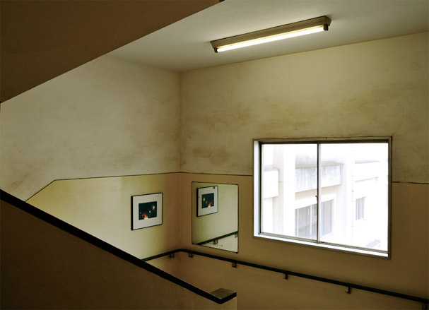
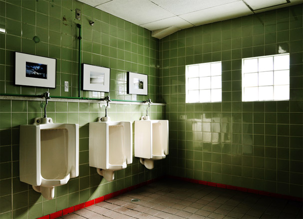
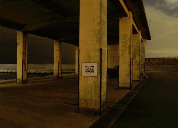
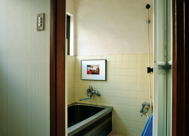
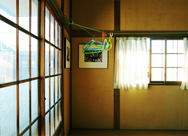
Ikegami Satoru is interested in the complete constructed worlds that photographs can reveal. ‘Compared to the West,’ he says, ‘Japan has a custom and culture that very few pictures should adorn themselves. But in the presence of such a culture were it born, what would the landscape look like?’ Satoru answered his hypothetical question by creating a ‘stopping place’ to be decorated with photos of unusual landscapes. He sees, within each image, two worlds; one that is decorated with a frame, and the other which is simply the landscape and the ‘snap’.
Luke Norman and Nik Adam
UCA, University of Creative Arts, UK / 2010
Photography
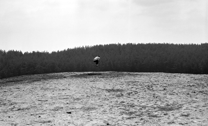
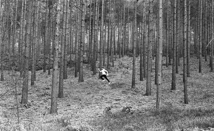
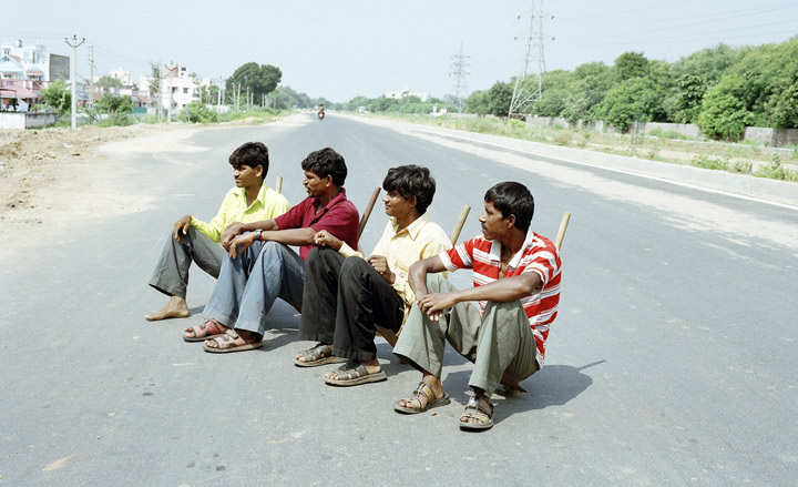
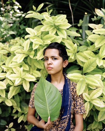
Although this duo has only been collaborating since 2009, Luke Norman and Nik Adam have been dizzyingly productive. With two complete bodies of work - titled ‘Fade In Darkness’ and ‘Principles & Theories of Space-time Manipulation’ under their belts – they’re now working on a third, ‘Peacock’, shot during a residency in Ahmedabad. So far, so prolific. But then Norman and Adam are keen never to be pigeon-holed; while previous works have pursued a pseudo-scientific methodology, the pair is keen that each project should be stylistically and aesthetically divergent. One common thread, however, is that ‘we pride ourselves on seeking out the irreverent, innovative and sometimes unconventional.’
Influences: Taiyo Onorato & Nico Krebs, Jason Evans
Dalila Ingold
School of Applied Art, Vevey, Switzerland / 2010
Photography
‘Between documentary and conceptual documentary photography’ is where Dalila Ingold places her work. Certainly the human element – Ingold’s first degree is in anthropology - is paramount in her imagery. ‘In the Shadows’ addresses the issue of refugees alongside their Swiss institutional counterparts. ‘Not being able to work makes it impossible to establish cultural links to the society they live in. They wait. They have stopped being what they once have been, and have not yet become what they might become,’ she explains. Ingold is currently exploring a rural area in Switzerland to get to the bottom of her negative feelings towards the place.
Most inspired by: Oliver Chanarin, Yto Barrada, Gilbert Fastenaeckens, Valérie Belin, Alec Soth, Ryan McGinley and Annie Leibovitz.
Tatiana Grigorenko
Yale School of Art, US / 2010
Photography
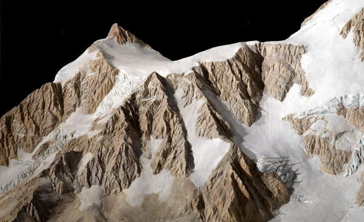
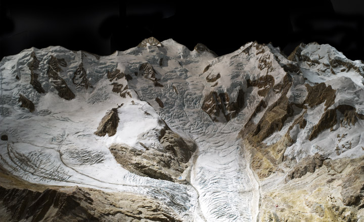
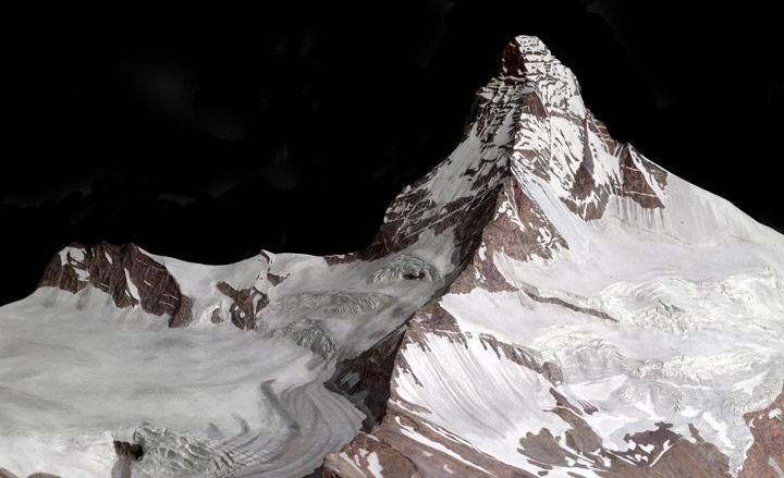
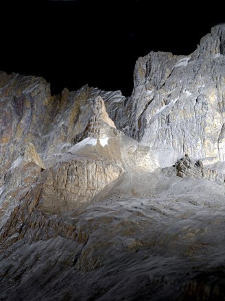
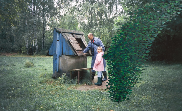
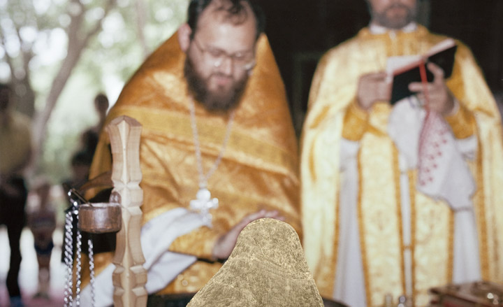
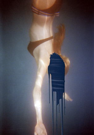
Tatiana Grigorenko’s first foray into photography was not entirely auspicious. ‘I took an intro class in a dank basement, where the heater would perpetually overheat the water and wreak havoc on our film.’ It is, then, testament to her passion for the medium that she persevered. She describes ‘The Disappeared’, her final project, as an exercise in anti-portraiture; constructed as a series of images in which the protagonist is missing, Grigorenko was inspired by Soviet-era images manipulated to make individuals literally vanish from history. Taking old family photographs, she meticulously removed herself using collage and paint. ‘The tangible proof of an existence becomes physically modified, and the meaning of other peoples’ gestures is changed or becomes meaningless,’ she explains.
Influences: Pierre Huyghe, Omer Fast and Cindy Sherman. I just saw Pierre Huyghe's 2-hour film shot in a defunct museum and was completely transfixed. Fast's ‘CNN Concatenated’ is a work of pure genius, and Cindy Sherman's exploration of self-portraiture speaks for itself.

Adam Woodfield
Nottingham Trent University, UK / 2010
Photography
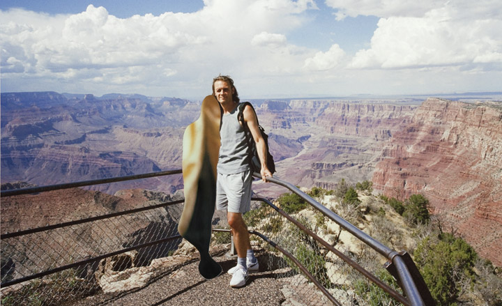
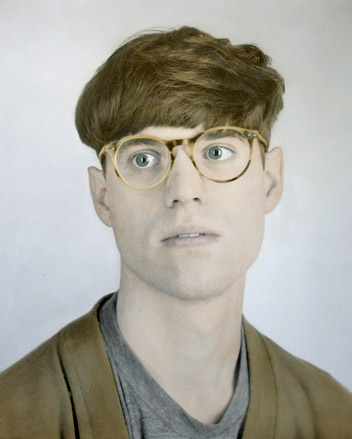
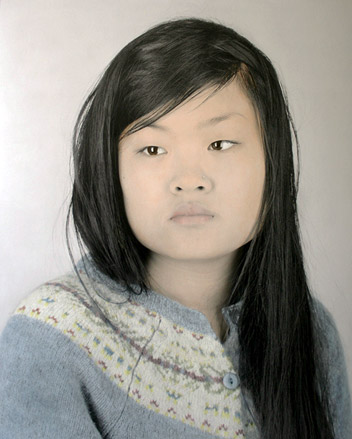
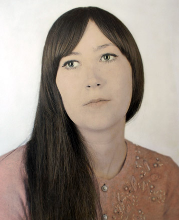
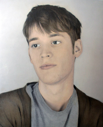
Adam Woodfield’s photography draws attention to the artifice of the medium by creating images that defy their own authenticity. He experiments with outmoded processes, including hand-tinting and the old cinematic tradition of rear projection. His most current work – a series of hand-tinted portraits produced for his degree show – have a sense of nostalgia, the tones evoking moments of melancholy in his sitters. ‘The gazes in the portraits remain unfixed, pointing towards an indiscernible point in space. This denies the audience any clear relationship with the sitter, heightening the mood of detachment enforced by the tinting process.’
Most inspired by: ‘I love the work of artists such as Mark Lewis, whose film Rear Projection: Molly Parker takes an old process (in this case, rear projection) and approaches it in a contemporary way.’
Olga Andrianova
The Rodchenko Moscow School of Photography and Multimedia, Russia / 2009
Photography
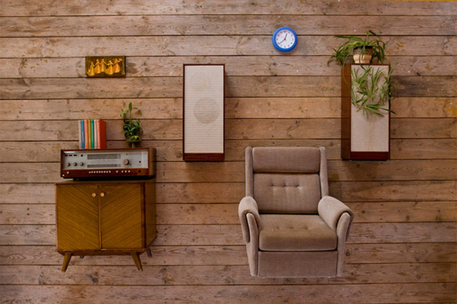
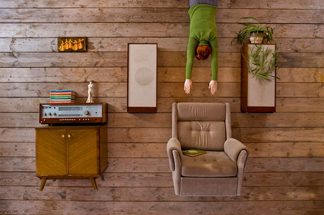
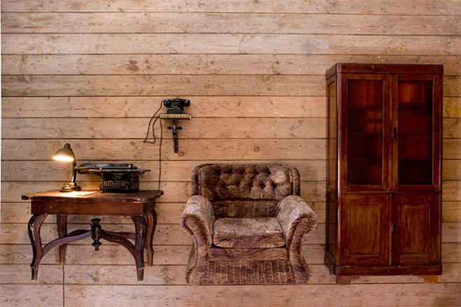
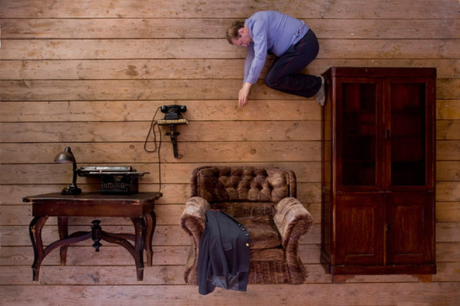
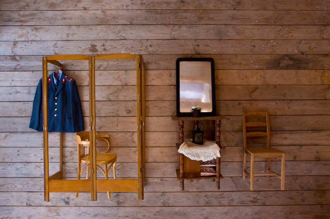
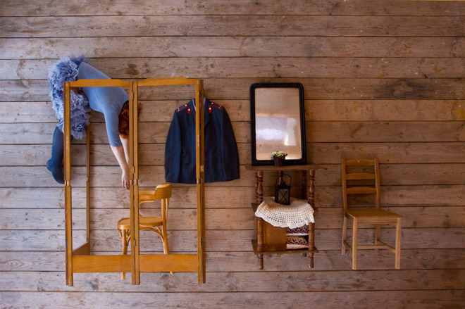
Olga Andrianova came to photography via a sociology degree and a period of travelling around Russia and Europe. She has worked with the photography and video artists group KRAN_30 on a series of projects about life in provincial Russia. In her final year, she created her ‘Open Door’ project in a studio in her garden using furniture from her neighbours’ houses. The project explores the idea of rationally constructed subjects that are, in fact, non-supported structures with a feeling of emptiness, fragility and entropy.
Most inspired by: The poetry of the Russian artist, writer and poet Dmitri Prigov.
Daniel Aires Grazina
ÉCAL/École Cantonale d’Art de Lausanne, Switzerland / 2010
Photography
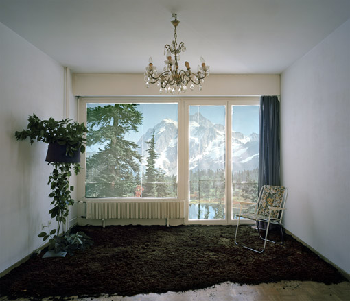
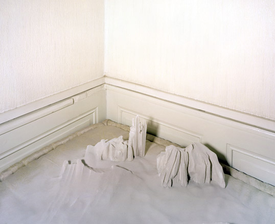
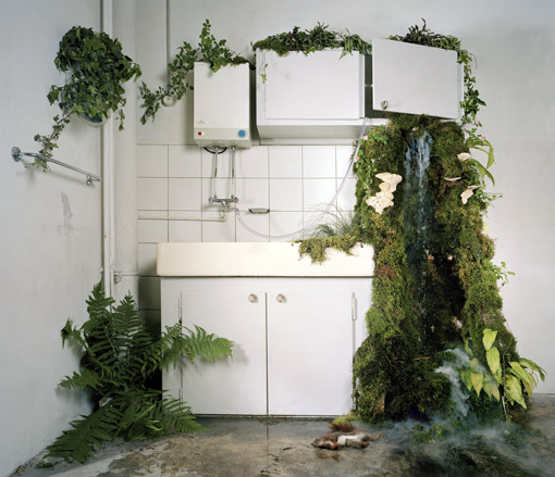
Lausanne-based Daniel Aires Grazina’s project ‘Nature Humaine’ takes the birth of a post-human nature as its starting point. ‘My images are built as indoor dioramas in which a stereotypical nature is reenacted in a domestic environment,’ says Grazina. ‘Domesticated, sterilised, embellished – we construct nature to conform the utopian image we have of it, reducing the frontier between reality and fiction.’
Most inspired by: Nature, Peter Greenaway, Joris-Karl Huysmans and sci-fi movies.
Duane Nasis
London College of Fashion, UK / 2010
Photography
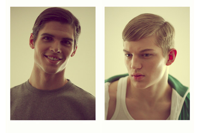
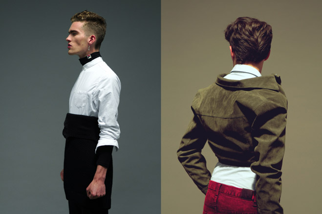
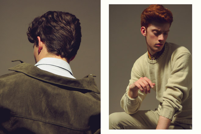
Duane Nasis grew up as something of an outsider as a Filipino in largely Western expat enclaves in Dubai. ‘I never really fit in anywhere, which affected the relationship I have to other people, making it objective and typological. This is challenging because “successful” fashion images always aim to establish that connection between the model and the audience, wholly dependent on the photographer, to draw people in. This was something I explored in my final major project, looking at both masculinity and individuation, and the role of clothing as an intermediary between the two.’
Most inspired by: Candice Breitz, August Sander, Willy Vanderperre and Thomas Ruff.
Harriet Whitaker
Nottingham Trent University, UK / 2010
Photography
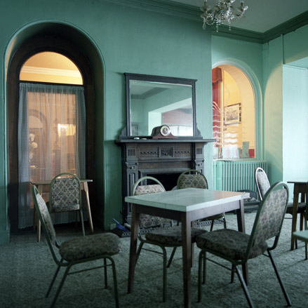
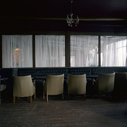
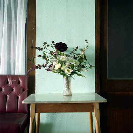
Harriet Whitaker focused on the interior of a Victorian hotel for her final year project ‘1860’. ‘While they depict the physical interior in detail, the images are more about the presence felt through absence within the frame. We will never know what previous events have taken place in the hotel; therefore we create false histories based on the signifiers within the image to account for what we see. The images are my attempt to show a history of sorts, but as the hotel’s past memories are inaccessible to us, it is not a concrete history, but an ever-changing story we individually create.’
Most inspired by: Stephen King’s ‘Lewis’s Fifth Floor’, Gareth McConnell’s ‘My Grandfather’s House’ and Jason Oddy’s ‘Waiting Rooms’ series.
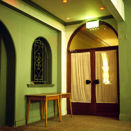
Hrvoje Slovenc
Yale University School of Art, US / 2010
Photography
In the series ‘Home Theater’, Hrvoje Slovenc photographed domestic spaces that appear to be artificial and even hyperreal, as if constructed as sets for a movie or a play. ‘I am interested in life as a form of theatre, particularly in ways domestic spaces have been acted in and acted upon,’ says Slovenc. ‘I am intrigued by the “scenes” that people construct in their homes, with all their semiotic referents, not just to their individual pleasures, but, more importantly, to the ones that are socially prescribed. What strikes me in the spaces I photograph is the proximity and even overlapping of performative spaces and traditional domestic spaces.’
Most inspired by: Brassai, Weegee, Philip-Lorca diCorcia and Gregory Crewdson; painters Stanley Spencer and Edward Hopper; and film-makers Yasujiro Ozu and Akira Kurosawa.

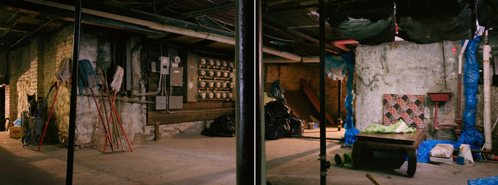


Romain Hügli
ÉCAL/´Ecole Cantonale d’Art de Lausanne, Switzerland / 2010
Photography
To create the work for his diploma show Romain Hügli, who trained as an artist before studying photography for four years at ECAL, built models based on idealised homes, architecture and spaces created by users of the online role-playing game Second Life. He then photographed these three-dimensional versions. ‘This work seeks to have a critical view on the evolution of human society – from an ideal to a dystopian universe through Second Life, a virtual world governed by the same capitalist appropriation mechanisms as in real life, but sliding slowly to a dysfunctional society.’
Most inspired by: ‘I find the work of Tonk (Taiyo Onorato & Nico Krebs) very interesting. I also like the artist Slinkachu.’

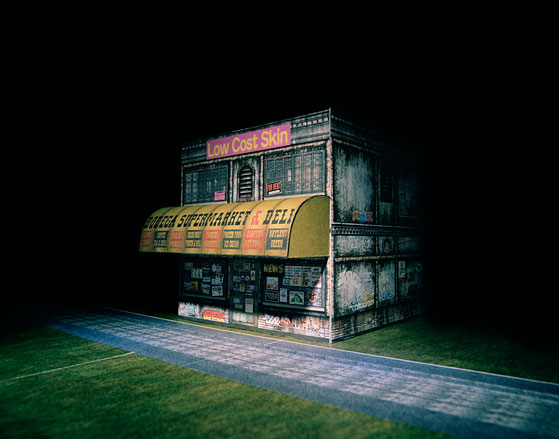
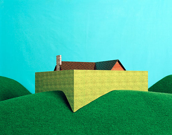

Silja Magg
Parsons The New School for Design, US / 2010
Photography
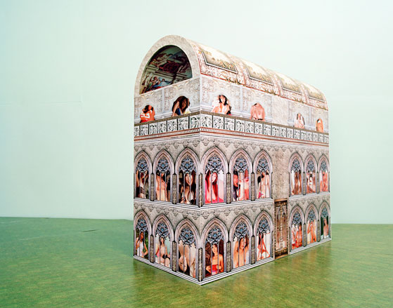
Silja Magg is an Icelandic photographer based in New York. She recently graduated from the BFA course in photography at Parsons. ‘My main inspiration in photography is probably growing up in Iceland – Icelandic rawness, wasteland, darkness and the mystic scenery. I have tried to bring those elements into my work. I love to do dramatic set-ups and create a certain world and characters in my work.’
Most inspired by: ‘I am drawn to fashion photography right now, but at the same time I am influenced by movies, so you get kind of a mixed vibe of those two elements in my work.’
Jake Evanz
The University of Brighton, UK / 2010
Photography
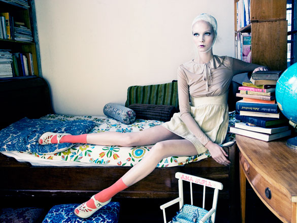
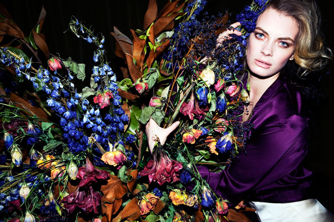
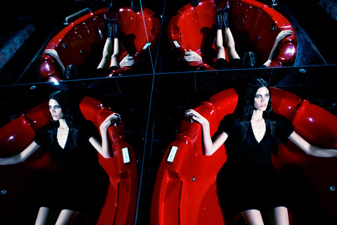
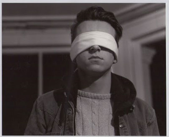
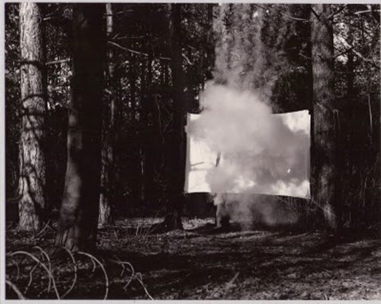
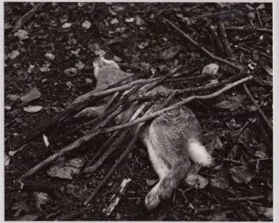
Jake Evanz’s project ‘The Unintentional Voids of Herr Barockter’ was his response to the question of reality and truth in photography and is premised on the idea of a lost reel of footage by a fictitious Russian film-maker called Lucas Drazhba. ‘Instead of just standing behind the camera, I created my own warped realities and scenarios in front of it. This would involve anything from creating sets in a forest, blindfolding housemates, making smoke bombs, building dens, basically anything I could imagine. But random photographs were not enough, I wanted to make people question the truth of them further, so I decide what they needed was a back story and then I came up with ‘The Unintentional Voids of Herr Barockter’.
Most inspired by: Stephen Shore's work in American Surfaces.
Lucas Foglia
Yale University School of Art, US / 2010
Photography
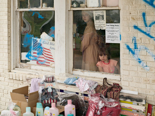
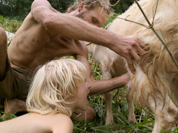
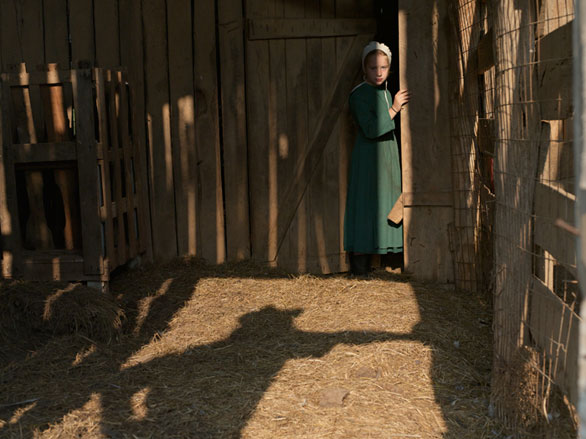
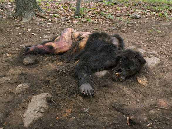
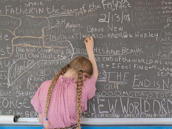
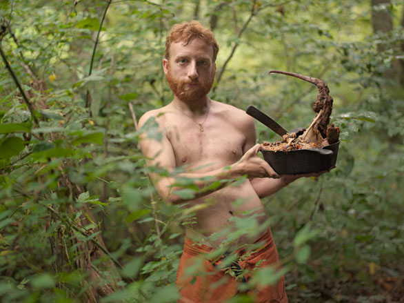
For his ‘Re-Wilding’ project Lucas Foglia travelled around southeastern United States befriending, photographing, and interviewing people who had left cities and suburbs to live off the grid. Some were motivated by environmental concerns, religious beliefs or predictions of economic collapse. ‘My subjects build their homes from local materials, obtain their water from nearby springs, and hunt, gather, or grow their own food,’ says Foglia. ‘They are working to maintain a self-sufficient lifestyle, but no-one I found lives in complete isolation from the mainstream. They do not wholly reject the modern world. Instead, they step away from it and choose the parts they want to bring with them.’
Most inspired by: The short stories of Breece D’J Pancake and Rick Bass. Artists such as Robert Adams, Robert Frank, Edward Hopper, Justine Kurland, Josef Koudelka, Jackie Nickerson, Stephen Shore, Mark Steinmetz, Joel Sternfeld and Larry Towell.
Sabrina Friio
School of Applied Art, Vevey, Switzerland / 2010
Photography
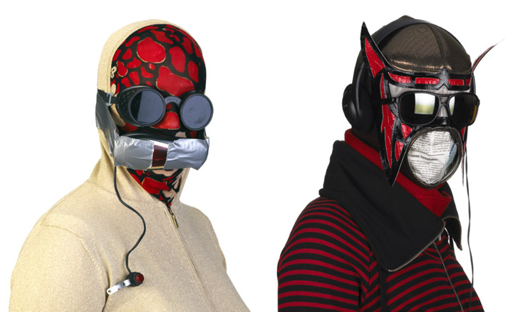
Sabrina Friio’s work focuses strongly on the human figure and questions of identity in contemporary western society. Her framing is an important part of her portraiture, with a neutral, white background used to eliminate notions of time and space and give her images an exaggerated realism. Frequently the work appears as a series of specimen-like images, where the subjects’ personalities have been mercilessly removed. ‘In this latest project, I worked on the theme of protection. I padded the models in areas in a way to protect both the people and the objects on them.’
Most inspired by: ‘Oliviero Toscani and Valérie Belin for their forms.’
Craig Dawson
Speos Photographic Institute, Paris / 2010
Photography
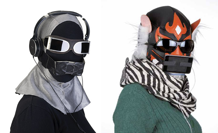
In a previous incarnation, Craig Dawson was a professional dancer. His recent retirement spelt the naissance of his photographic career – though 20 years spent on the stage are clearly evidenced via his images. ‘My final project was a continuation of my shaving foam portraits. I based it on a improvisation I did as a dancer a few years ago which got transformed for the stage; I wanted to explore this foetal form the body takes while covered in the foam.’ His interest can be traced back to the moment, aged 14, when his father gave him a Praktica 35mm camera, but it is to his dance roots that he looks for inspiration: ‘When completely lost I generally go back to things I know and experiences I had a as dancer improvising in the studio and on stage,’ says Dawson.
Most inspired by: Bettina Rhiems


Adam Cruft
Middlesex University, UK / 2010
Illustration
‘Isolation and emotion seem to be potent topics within my work,’ says Adam Cruft. ‘This twinned with portraiture is where you have me weak at the knees.’ But Cruft’s formative experiences of the medium had little to do with seclusion; rather it was sitting at opposite ends of a desk from his father – also an illustrator and visualiser – while both sketched and scribbled in unison that he first felt a gravitational pull toward illustration. Gauguin, Toulouse-Lautrec and Norman Rockwell are all idols, but it’s to the advertising guru Paul Arden - who once said ‘it's not how good you are, it's how good you want to be’ - that he refers for inspiration. The culmination of Cruft’s degree work was a set of aquatint etching depicting people in their offices. ‘I liked the rawness and tonal value it gives to my work, I find great excitement in varying the processes and mediums used to forge my line,’ he says.
Most inspired by: Schiele, Toulouse-Lautrec, Freud and Norman Rockwell and animations from people such as Sylvain Chomet.
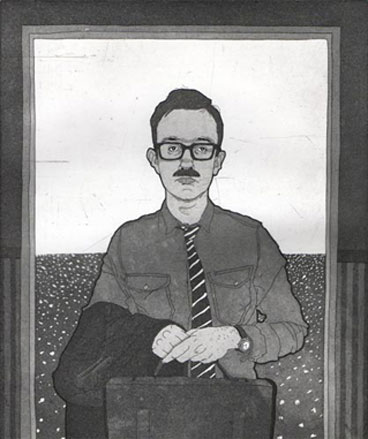
Adrien Parlange
RCA, UK / 2010
Illustration
It was via graphics – which he studied in Paris and Strasbourg – that Adrien Parlange eventually settled on illustration. These days he is busy contributing to a book on language for a French publishing house, as well as feeding his creative drive with that which most inspires him: Japanese etchings, old French silent movies and the ballet. But it was his final project that really captured our imagination. ‘I did a series of monoprint portraits that were allegorical and tried to depict obsessions, weaknesses, or relationships of the characters metaphorically. I like the fact that every viewer can interpret these portraits in his own way,’ explains Parlange.
Most inspired by: Most of Robert Bresson's quotes on cinema can be applied to illustration, and he is very clever. Otherwise I really like Shigeo Fukuda's posters.
Anett Reiche
Central Saint Martins, UK / 2010
Illustration
The focus of Reiche’s practice is print-making and its cross-media possibilities. ‘I’m interested in analogue processes that involve repetitions and layering,’ she says. ‘Rather than appreciating print only for its aesthetic value, I’m concerned with unifying the design process and the final image.’ Reiche’s ‘Lines’ project is a series of experiments to create patterns by re-using a single screen; it included printing onto 16mm film and finding ways for the patterns to generate sound.
Most inspired by: ‘The aesthetic principles used for organisation.’
Clementine de Blignieres
ESAG, Penninghen, France / 2009
Illustration
‘Is there such a thing as a French sense of aesthetics today?’ That was the question that Clementine de Blignieres asked herself during her final project, which explored the concept of beauty through photographs and interviews with a broad sweep of the French population. ‘I wanted to investigate the universal sense of beauty and see how it would materialize differently according to environment, tastes and social classes,’ she says. As such, she talked to a farmer, a photographer, a butcher, an artist, a vagrant and a nun. ‘I realized for each of them a Totem illustration to synthesize their vision of beauty. The whole work is presented in a book called: ‘Le Beau, Mon, ton, son, leur.’ No resting on beautiful laurels for de Blignieres though; since graduating, she’s illustrated a book, worked on the visual identity for three brands.
Most inspired by: Henning Wagenbreth for his tremendous imagination, style, characters and colours. He succeeded in creating a fantastic universe; fun, scary and coherent at the same time.
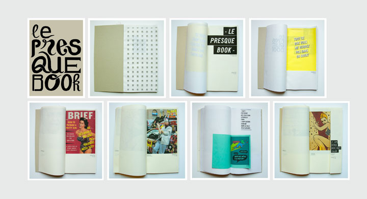
Chris Arrowsmith
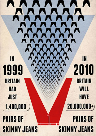
University of Central Lancashire, UK / 2010
Illustration
‘I’ve always been a doodler,’ says Chris Arrowsmith. ‘The difference now is that I try to do it for a living.’ But even before he graduated, Arrowsmith was busy preparing himself for the world of work. ‘For my final project, I set myself the brief of producing 25 editorial illustrations with a deadline for each one. It gave me an insight in to the real life deadlines in the editorial industry.’ But inspiration, he says, is key: ‘If nothing inspires you, it will show in your work.’ Lucky for Arrowsmith then that he is able to find his creative muses everywhere, in ‘any image, any conversation, any situation.’
Most inspired by: my sister, Vicky. She is always pushing me to better my illustrations. She’s the only one I go to for advice, and she’s also a great artist.
Christian Svinddal
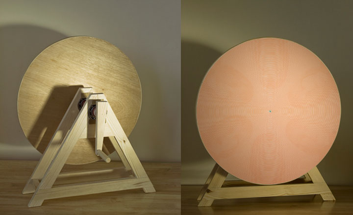
Central St Martins, UK / 2010
Illustration
It was just five years ago that Christian Svinddal first picked up pen and notebook and began to draw – everything from everyday scenes to faraway planet - in earnest. He’s come a long way since. At his final show he exhibited a project based on the basic human desire to see and be seen. ‘It resulted in a portrait hidden in lines, a bit like an optical illusion where a line pattern makes your eyes go crazy. I was exploring the meeting between the viewer and the subject within the image, trying to create a moment of seeing and not-seeing, your eyes shifting from the line pattern to the portrait and back to the lines,’ he says. Svinddal endeavours to steer clear of honing a style, preferring instead to continue surprising himself, and he also enjoys mixing his media; right now, he’s working on a photography project.
Most inspired by: Andy Warhol
Christopher Darling
School of Visual Arts, New York, US / 2010
Illustration
‘First attempt, graphic and child-like’ is how Christopher Darling describes his oeuvre. Indeed, it was as a child that his illustrative prowess was first noticed – at school he was always asked to create the bulletins for concerts and plays, although he didn’t realise at the time that his contributions came under the banner of illustration. And the commissions just keep rolling in; he is currently working on a body of drawings of Robert Johnson that will later be animated for Sony Music. We fell for his MFA thesis, an 150-page diary about a kid struggling with his identity in 1987 written by LA-based writer Christopher Staunton, which he is now preparing to show to publishers in New York.
Most inspired by: My dad was a professional football player and later a minister. He always drew in his free time and has a really nerdy/humorous style. My mum is a writer; so in a weird way my parents really rubbed off on me.
Clay Rodery
School of Visual Arts, New York, US / 2010
Illustration
Batman, says Clay Rodery, was all the stimulus he needed to propel him full-throttle into the world of illustration. ‘When I was four, I came to the realisation that the images of my hero were being fabricated by someone. To be honest, my mission since has been to eventually fill that someone’s shoes.’ His graduate thesis was an investigation into the events of an equally iconic work of fiction: The Wonderful Wizard of Oz, based on a recently discovered sketchbook belonging to Dorothy Gale. But despite Rodery’s extended journeying into classic children’s literature, it tends to be the murkier elements that appeal to him. ‘I guess I respond to not necessarily scary, but maybe troubling material. We are always at odds with the rest of the world in some fashion, and I feel that comes through in the work somehow.’
Most inspred by: my friends.
Daniel Michael Clark
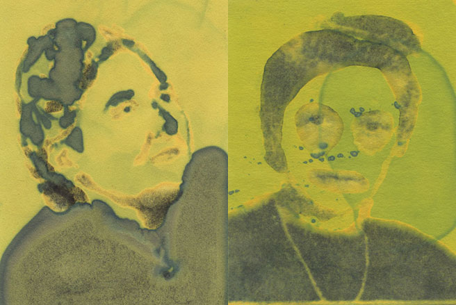
University of Brighton, UK / 2010
Illustration
‘When I was 14, I bought a book called 'Fall' by a great backwards Cornish illustrator/author, Chris Odgers, which made me realise the communicative power of illustration,’ says Daniel Michael Clark. He’s come a long way since then; Clark’s final project was, in his own words, the ‘weirdest thing I’ve ever made.’ It involved, he explains, dropping a small microphone through a floorboard and recording the arguments of his alcoholic neighbours. ‘I created a series of portraits in response to my Attenborough-like 'research' using alcoholic solutions on Litmus paper. The original plan was to put the records to stop-frame animations of me creating the portraits, however I was politely told if I wanted to use the recordings in the project I would have to gain written consent from my neighbours - so the paintings were exhibited alone.’ Clark has just released a mini-album of story based songs called ‘Neighbourhood Spook’ which he’ll later illustrate, and is also working on a commission to illustrate a poetry anthology.
Most inspired by: Ralph Eugene Meatyard, John Stezaker, Hunter S. Thompson, Daniel Johnston - people who aren't afraid to follow their own path.
Francesca Sannino
Camberwell College of Arts, UK / 2010
Illustration
For Francesca Sannino, the British Fatalities of the Afghanistan War moved her to create a series of meticulously drawn portraits of the fallen individuals, each accompanied with personal facts. ‘I became deeply involved with the statistics that were constantly emerging from the media. I wanted to restore these fallen soldiers from statistics into real people; to pay tribute and honour to those who died for their country.’ In fact, so immersed is Sannino in her subject that she’s vowed to work on the project – which has already been part of an exhibition at the Conquest Hospital in East Sussex - until the war is over. ‘The Afghanistan project may be considered a sombre topic but it is a realistic portrayal of what is going on in the world. I am really interested in the media and the way it also responds to people and worldwide issues. As an illustrator I take inspiration from many places and whilst the media may not always be completely trustworthy, it is an interesting medium through which to view the world,’ explains Sannino.
Most inspired by: Michael Landy has the most inspiration technical abilities, which I have strived to achieve within my own work. I am influenced by his intensive dedication and obsession of the subject matter, resulting in the most amazing hyper realism illustrations. It has been reported that the intricate detailing of his work have resulted in lasting eye damage.
www.save-our-souls.co.uk/gallery/francesca-sannino
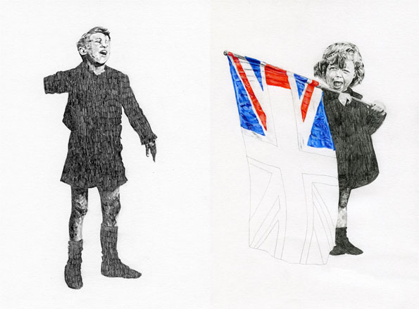
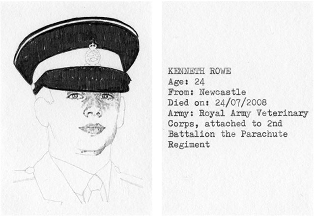
Haruna Sakai
Central Saint Martins, UK / 2010
Illustration
It was the sense of freedom that accompanies illustration – particularly in comparison with design - that first enticed Haruna Sakai. And nowhere is this more apparent than in her final project, which – rather than the traditional illustrative drawing, printing or collage – took the form of a movie. Via ‘Into Nature’, Sakai explores natural theory, chaos theory, golden section, fractal patterns and the L-shaped system. She is currently working as an animation intern, and remains adamant that she will remain as pigeon-hole free as possible. ‘I don’t want to have a style,’ she says. ‘I want to be always free and keep non-boundaries between creative fields.’
Most inspired by: Japanese culture; artists, musicians and designers such as Namaiki, Naohiro Ukawa, Shinro Ootake, Keiichi Tanaami and Jun Takahashi; artists like the Chapman brothers, Hans Bellmer, Matthew Barney, Buckminster Fuller, Carsten Nicolai, John Cage and Semiconductor; nature.
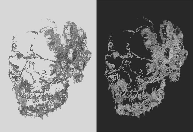
Jacqueline Mertz
Lucerne University of Applied Sciences and Arts, Switzerland / 2010
Illustration
Illustration gives Jacqueline Mertz a way to convey the ideas that grow from her researches into psychology and philosophy. 'I am inspired by objects or occurrences that I see or sample during the daily life. Also by words that I hear and concepts and shapes of nature. It is like collecting benchmarks for my work. My final project animations revolved around the theme of "the inbetween", the social circumstances we're in during daily life.'
Most inspired by: Jockum Nordström and Betsy Walton.
Kate Morrell
RCA, UK / 2010
Illustration
For Kate Morrell, it is the myriad of perspectives from which objects can be read that really rouses her fascination. ‘The interpretation and authorship of museum collections is central to my work,’ she says. It was, however, working with Ray O’Meara who designed archaeology reference book The Treasure Act that first switched her on to the idea of the book format. ‘My artwork involves researching, collecting and organising information into adopted graphic formats such as books and maps. I adopt the language of the material sciences so the work has a pseudo-scientific sensibility,’ she explains. Morrell’s greatest piece of wisdom is to remain ignorant of the outdated hierarchy separating the visual and applied arts. ‘This makes you free to borrow and refer to tools, processes and forms from all disciplines.’ As if to underline this advice, she’s currently working on a sound-based project around audio guides for which she has a long-standing fascination.
Most inspired by: the primitive artefacts and found images in all the great collections and archives I’ve visited. I also admire outsider artists Madge Gill, Guo Fengyi and Scottie Wilson for their strange, repetitive drawings.
Lucy Nurnberg
Brighton University, UK / 2010
Illustration
Lucy Nurnberg drew and doodled her way through the entirety of her lessons at school, but it was only once she looked around some degree shows aged 17 that she was switched on to illustration. ‘So much of my inspiration comes from folklore, religion and mythology, and art that follows in that tradition – I’m into narrative symbolism, trying to tell a whole story in a single image,’ she says. In keeping with this, her final project was a four-pronged exploration into the spiritual, which included a book on global burial rites and customs, a print diptych about clairvoyance, an interpretation of Saint John’s apocalyptic Seven Seals of Revelation, and an animation about nightmares. And we’re not the only ones who were impressed; Nurnberg is now working as an assistant to fellow illustrator Laurie Rosenwald in New York.
Most inspired by: the way Diane Arbus wrote about her photographic subjects blows my mind. She did a project about eccentrics and wrote: 'These are The Characters in a Fairy Tale for Grown Ups.' She sought the magical within the mundane.
Maggie Li
Kingston University, UK / 2010
Illustration
‘Patience, hard work and punctuality,’ are the three pre-requisites Maggie Li cites for being an illustrator. While we can’t testify to her time-keeping, we are positively enamoured with her graphic, textural style. Meanwhile, Li’s energies during the last stretch of her degree were focused on one particularly corrosive emotion in the human repertoire. ‘My final project ended up as an interactive book about jealousy. I chose the subject, not because I'm a particularly jealous person, but more to challenge myself to approach an abstract subject and explore the complex qualities of that particular emotion.’ Li is now part of Zombie collective, a group of artists who run workshops and collaborative events.
Most inspired by: the collective output of mid-century graphics. To name one person, I think Saul Bass is brilliant.
Malin Bergstrom
Konstfack, Stockholm, Sweden / 2010
Illustration
Heavily inspired by astronomy, geometry, vector spaces, storytellers, mountains and matrices, Malin Bergstrom’s work often comes out of experimentation with shapes and textures. Her project, titled, The Eternal Silence of These Infinite Spaces Terrifies Me, is an investigation into the complexity of our world and how our minds deal with it. 'The Universe is here used to represent the multiplex depth of our everyday lives. I wanted to create a series of images containing more than one solution’.'
Most inspired by: the American artist William Rowe and 1920s art deco posters.
Marcel Cowling
Brighton University, UK / 2010
Illustration
Marcel Cowling’s work has a strong architectural bent, but it is towards the prosaic that he feels the greatest draw. ‘I find inspiration in what I see day-to-day and what is part of everyday life,’ he says. ‘It’s objects, places and things which have a distinct aesthetic for me, but which others can walk past without caring.’ In keeping with this, his final project addressed Brighton’s residential balconies. ‘Although we walk past them every day, and they are just an architectural feature, I find them kind of attractive.’ Cowling is currently working on a set of prints and collages exploring 1970s interiors and architecture, examining specifically the line between what is perceived as ‘old tat’ and what is conceived of as ‘retro.’ It was during his BA at Hull that Cowling was first introduced to illustration, but his love for the medium pre-dates that somewhat. ‘Subconsciously, I think it goes back to my favourite childhood book, The Giant Jam Sandwich by John Vernon Lord.
Most inspired by: probably British artists associated with the Pop Art movement – Rchard Hamilton, David Hockney and Patrick Caulfield.
www.marcelcowling.blogspot.com
Niklas Stettler
Bern University of Arts, Switzerland / 2010
Illustration
It was Niklas Stettler's instinct for avoiding derivative work that first led him to illustration. 'I wasn't very interested in copying things so I started drawing abstracts like patterns, textures and geometrical objects.' He stuck with his penchant for geometry, expanding his repertoire of shapes for his final project. 'I tried to let my drawings grow systematically by transferring crystallographic systems into my own drawing technique. Even though my drawings were similar to crystals, I never tried to copy the crystallographic nature visually, but more the construction of it.' Stettler then labelled these shapes 'fasons' in order 'that they become more like a product'. These days, he can be found running his own design studio with a couple of friends, working on editorial design, corporate identities and websites, but happily, he continues his geometric investigations in his free time.
Most inspired by: Kandinsky and Robert Fludd

Owen Gatley
University of West England, UK / 2010
Illustration
Even before Owen Gatley knew what an illustrator was, he spent much of his time drawing characters from comic book and cartoons. ‘I guess my work tends to be nostalgic, and draws on 1950s - 60s design and comics. Although I mainly compose things in Photoshop, I like to use gouache and pencil when I can, so the work doesn't become too computerised or stagnant. I like it when you can see the artist's hand in the work,’ he says. His final project explored the idea of car crashes and glamorous deaths for which he produced 3D paper car models and of which, he says deprecatingly, he’s ‘still quite proud.’ So he should be; as well as a host of editorial projects, since graduating Gatley has produced the artwork for a pop-up book produced by Papersmyths.
Most inspired by: comic book writer/artist Daniel Clowes. I love his dark humour, and his cynical writing style sits so well next to incredibly rendered, often kitsch and grotesque, illustrations.
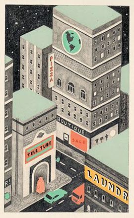
Kazumi Yamada
Musashino Art University, Japan / 2010
Illustration
Curiosity, says Yamada Kazumi, is the foremost quality needed to make a good illustrator. Her natural inquisitiveness found a voice via an extended investigation in to traditional Japanese wooden house and their construction from conception to completion. ‘I wanted, through my work, to show laypeople exactly and plainly how a house like that was built. Illustration was necessary for the task, and I produced a picture book to tell the story,’ she says. It is, says Kazumi, all about observation and technique – two qualities that were evidently recognised in her by the Toppan Printing Company, for whom she now works as an art director.
Most inspired by: my teachers and my classmates.
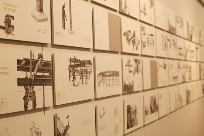
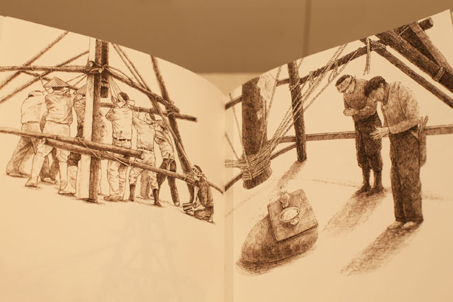
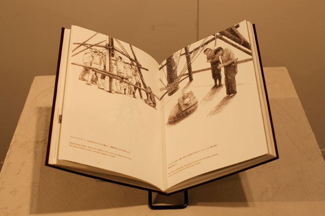

Wassilissa Bock
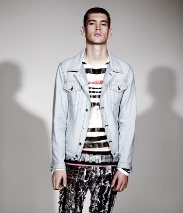
HDK Basel, Switzerland / 2010
Fashion
Born in Germany’s Black Forest, Bock initially studied at London Metropolitan University. Completing internships with Berlin’s von Wedel & Tiedeken and Fiona Bennett, she won the Swiss Ethical Fashion Award with her graduate collection.
Most inspired by: 'memories, foreign cultures, music and handicraft.' In her graduate collection, that added up to a punk aesthetic with painted jeans and shaggy outerwear.
Zara Gorman
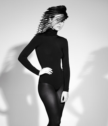
Royal College of Art, UK / 2010
Fashion
Originally working in marketing for blue chip companies, Hertfordshire-born Gorman switched careers four years ago to pursue millinery. She has since completed internships at Bruce Oldfield and Phillip Somerville, and was a finalist in 2010’s ITS competition.
Most inspired by: 'architecture and product design.' That translates to futuristic shapes that fit into Britain’s history of innovative millinery.
Victoria Stone
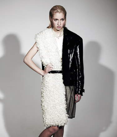
Royal College of Art, UK / 2010
Fashion
Born in Northamptonshire, Stone has been studying in London since she was 18. Working as a visual merchandiser in a vintage store, she has completed internships at Bora Aksu, Giles Deacon and Erdem.
Most inspired by: 'British subcultures – photographs, films, old garments, old books.' Her graduate collection was a collage of sheepskin, shine and tailoring.
Thorbjorn Uldam
Royal Academy Antwerp, Belgium / 2010
Fashion
A former choir boy who travelled all around the world singing, Danish-born Uldam first worked in Barcelona for designers Josep Abril and Gloria Rodriguez Figueroa. Since graduating, he has become a lecturer at Warsaw’s Fine Art Academy.
Most inspired by: 'surprising situations that challenge my idea of how the world is put together.' That means contrasted textures and unusual fabrics like hessian.
Sara Vidas
HDK Basel, Switzerland / 2010
Fashion
Born in Switzerland, Vidas worked with Peter Jensen and textile designer Astrid Grob. She won the Swiss Federal Design Award with her graduate collection, Lili.
Most inspired by: 'the ordinary, everyday life, the street.' Lili was based on what older people wear – Vidas made Peter Pan collars, midi lengths and sensible shoes desirable at any age.
Paula Cheng
Paula Cheng
Parsons School of Design, US / 2012
Fashion
Born in Taiwan, Cheng has been in New York for 12 years. Still studying at Parsons for her Masters (Shelley Fox is her tutor), she has already impressed with the high drama designs of her BA collection.
Most inspired by: a metamorphosis. 'My collection is a metaphor for the recent stylistic transformation I've experienced as a designer as well as a woman.'
Oda Pausma
Fashion Institute Arnhem, Holland / 2010
Fashion
Born in The Netherlands, Pausma worked with Viktor & Rolf and Bruno Pieters while at college. Her graduate collection – which brought one spectator to tears – has since been shown in Amsterdam and Brussels.
Most inspired by: 'Antony Hegarty of Antony and the Johnsons is always a big inspiration to me.' The showman would approve of Pausma’s dramatic designs – see draped chiffon, leather pieces and asymmetric lengths.
Nathalie Fordeyn
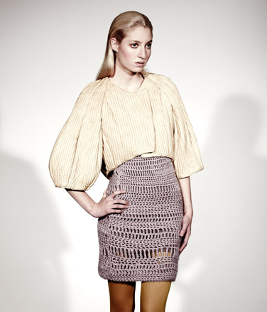
Royal Academy Antwerpen, Belgium / 2010
Fashion
Growing up in Thailand, Belgium and Scotland, Fordeyn brings an international perspective to design. She has worked with Diane Von Furstenberg in New York and is currently completing an internship with John Galliano.
Most inspired by: 'Surrealism, animations and made-up stories.' Her designs included exaggerated necklines, bold headpieces and knitted bubble skirts.
Matthew Harding
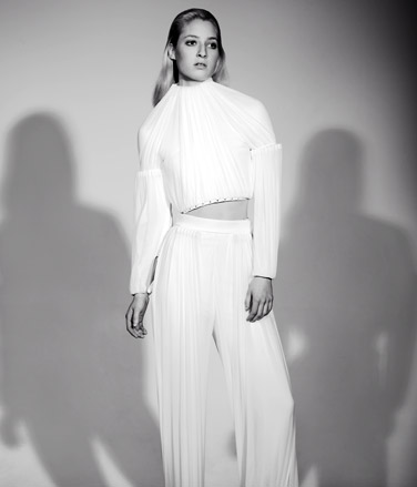
Central Saint Martins, UK / 2010
Fashion
British-born Harding opened the Central St Martins MA show, a sign tutor Louise Wilson tips him for big things. Since graduating, he has won Le Vif Knack Fashion Weekend International Competition in Brussels, and his collection has been stocked by Topshop.
Most inspired by: 'women and contemporary sculpture.' Clean lines, perfect proportions and contrasting textures summed up his collection.
Lisa Bergstrand
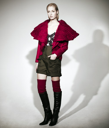
Istituto Marangoni, Italy / 2010
Fashion
Swedish-born, Bergstrand worked as a buyer in Stockholm before studying design. She has racked up the internships – Celine and Adam Kimmel feature on her CV, and she is currently working with Isabel Marant.
Most inspired by: 'the cold, the contrasts, the buildings' of Northern Sweden where she grew up. She created voluminous silhouettes and architectural lines.
Lilly Heine
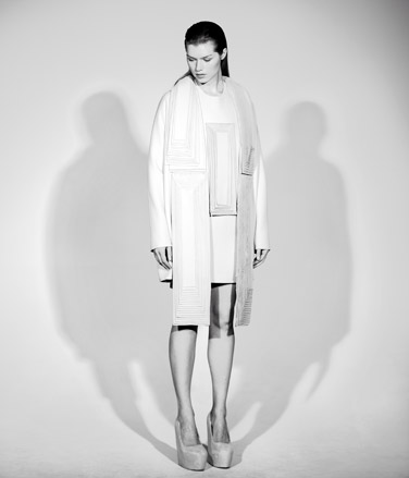
Central Saint Martins, UK / 2010
Fashion
German-born Heine worked on prints with Jonathan Saunders, Stella McCartney, Jimmy Choo and Alexander McQueen before embarking on her womenswear MA. She won both the Harrods Design Award and Chloé Design Award at Central Saint Martins and her graduate collection has been stocked in Topshop. Designs using layers of double wool crepe formed her exquisitely crafted final collection.
Most inspired by: 'art. My ideal customer is someone who sees garments as pieces of art.'
Kajsa Skoglund
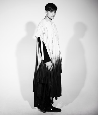
Istituto Marangoni, Italy / 2010
Fashion
Skoglund is from Stockholm but has studied in Florence, Paris and London. Since graduating, she has worked with Christopher Raeburn in the UK and Swedish label Whyred.
Most inspired by: 'everything around me. For example, rust – there is a beauty of something fading away.' Her designs are intended to reflect the spirit of the wearer, with clean shapes and natural fabrics key.
Judith Thomas
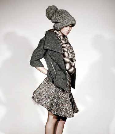
Royal Academy Antwerp, Belgium / 2010
Fashion
German-born Thomas has completed her BA and Masters at Antwerp’s Royal Academy, and now calls the city home. Since graduating, she has been freelancing for a Belgian label.
Most inspired by: 'the dreamworld overprotected children live in.' Thomas’ graduate collection has a Tim Walker style surrealism. See a Lauderee-influenced colour palatte, girlish ruffles and oversized pearls.
Jiska Van Rossum
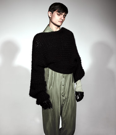
Fashion Institute Arnhem, Holland / 2010
Fashion
Dutch-born Van Rossum saw her graduate collection shown at Amsterdam Fashion Week in July 2010. Currently interning at Louis Vuitton Homme, she plans to launch her own label.
Most inspired by: 'a mix of art, culture and people enjoying life.' Her graduate collection featured an elegant colour palatte and bold shapes.
Hee Lim
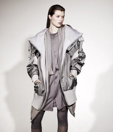
Parsons School of Design, US / 2010
Fashion
Born in Chicago to Korean parents, Lim worked with New York label Wayne while studying. His graduate collection scored him a nomination for Designer of the Year at Parsons. Since graduating, Lim has been working as a freelance print designer.
Most inspired by: 'the paranormal, technology and the future.' That resulted in city-friendly pieces and great outerwear loved by the fashion blogs.
Angela Wyss
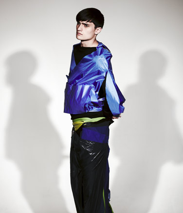
HDK Basel, Switzerland / 2010
Fashion
Swiss-born Wyss worked with the best while studying – Damir Doma, Bernard Willhelm and Maison Martin Margiela feature on her CV. Since graduating, she has designed costumes for a play in her hometown of Chur.
Most inspired by: 'colours, collecting and drinking coffee.' Her collection will appeal to sportswear fanatics.
Shota Sasaki
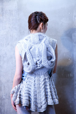
Bunka Fashion College, Japan / 2010
Fashion
Although Shota Sasaki feels that his aesthetic world has been heavily influenced by the Star Wars trilogy and all its attendant ground-breaking special effects and visual complexity, it is, in fact, that simplicity of his work that really attracted us. ‘The concept of the pieces was all about testing the boundary of expression through simple material and method: hand-knitting and using yarn as only material,’ he explains.
Most inspired by: Although there is no particular designer that inspires me, I think my idea was triggered by the visual world of Star Wars.
Natalie Amkie
Centro, Mexico City, Mexico / 2010
Fashion
Skin disease and fashion are not the most likely bedfellows, but for Natalie Amkie, the ‘grotesque’ and ‘painful provided all the impetus she needed for her graduation collection. ‘The fabrics used had all been through a process of active experimentation, like implanting toys on leather to achieve a certain volume and feel or taking photographs of real skin with problems and using it as prints,’ she explains. But then Amkie is no run-of-the-mill fashionista; even as a young child, she her attitude to clothes was a far-cry from reverential. ‘I used to break, cut, paint and even burn my outfits, I was never happy with an ordinary piece of clothing and had to make it unique in some way.’ It’s an approach that has evidently paid off; her third collection, which she describes as ‘pret-a-porter artisanal’ has been entered in to the Hyeres festival, and she is concentrating her energies of taking her brand to an international level.
Most inspired by: my father, who has worked in the clothing industry for 40 years.
Jessica Madden
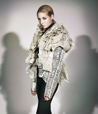
Westminster University, UK / 2010
Fashion
Originally from Brighton, Madden sold her handcrafted pieces at the city’s festival before studying. Since graduating, she has won a British Fashion Council competition to design children’s wear for Harrods.
Most inspired by: 'the structures and textures in nature. I love sculpting fabric in different ways.' Madden’s graduate collection plasticised lace to give a breathtakingly modern makeover.
Andra Dumitrascu
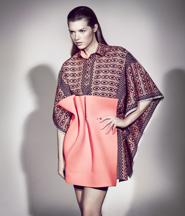
UAK Vienna, Austria / 2010
Fashion
Romanian-born Dumitrascu has learnt from the best – Bernard Willhelm and Raf Simons were her tutors. Based in Germany, she has also worked on costumes for an opera in Hamburg and completed an internship with Wendy & Jim.
Most inspired by: 'suburbs, old people and old-fashioned possessions of all kinds.' Her collection featured woven ponchos, patchworked crochet and paisley prints.
Kathleen Connors
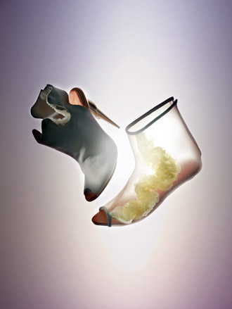
Royal College of Art, UK / 2010
Fashion
With a Chinese mother and English father, footwear designer Connors was born and brought up in Hong Kong. She came to London to study and has since interned at Roger Vivier in Paris.
Most inspired by: 'a ‘scientific-couture’ look.' Her designs contrasted the sweetness of a candy colour palette with minxy molded heels.
Hanna Billqvist
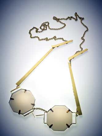
Beckmans School of Fashion, Sweden / 2011
Fashion
Billqvist originally studied art, yet to complete her Product Design BA, she has already created a splash with innovative outlook. The Swedish-born student describes Jamie Hayon and Konstantin Grcic as her heroes.
Most inspired by: 'sometimes just a trivial problem.' Most recently, that was sunglasses. Not your usual sunnies, her designs mimicked the shape of jewellery, with geometric cuts and chain detailing key.
Chloe Shinnie
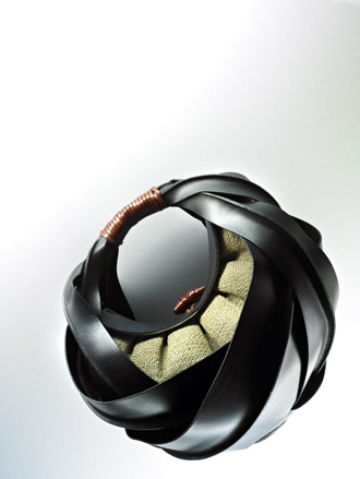
Royal College of Art, UK / 2010
Fashion
With a background in fine art, Norfolk-born Shinnie also studied accessories at London College of Fashion’s Cordwainers College. She has worked at Burberry and is now at Louis Vuitton.
Most inspired by: 'basketry, weaving and knotting.' Shinnie updated these traditional techniques to create eye-catching bags in geometric shapes and juicy citrus colours.
Gloria Landenberger
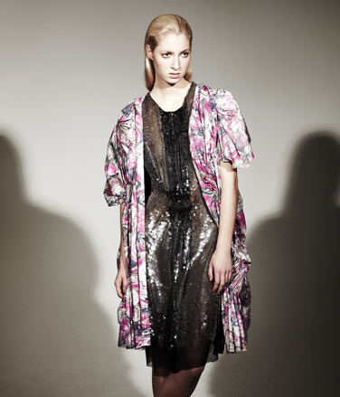
UDK Berlin, Germany / 2010
Fashion
German-born Landenberger studied in Berlin but her degree took her to Paris, where she was a student at Ecole Nationale Supérieure des Arts Décoratifs, and to Stockholm, where she interned at H&M.
Most inspired by: manic depression and 'the work of outsider artists.' Landenberger translated these themes to pretty prints and beige tones, signifying manic and melancholy moods.
Mads Dinesen
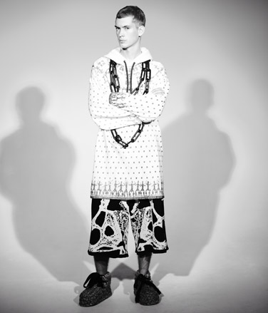
UDK Berlin, Germany / 2010
Fashion
Born in Denmark, Dinesen worked in costume design before his MA. Since graduating, he has completed an internship with London duo, Bouddica. He is also working on an exhibition with female artists interpreting his collection.
Most inspired by: 'the communication that is created between body and person.' His graduate show included raffia shoes, painted faces, swans as hats and great, graphic prints.

Arnaud Milliquet
ECAL, Ecole d'Art de Lausanne, Switzerland / 2010
Graphics
Milliquet’s dalliance with graphic design started in the underbelly of Lausanne’s music scene, when he began designing CD covers and flyers for reggae and dancehall collective, Soldia Sound. Despite continuing his work for them today because it’s ‘always a lot of fun’, the young designer’s final project at ECAL was the polar opposite in subject. Says Milliquet of his brand creation for a luxury hydroplane company, ‘It was based on my personal vision of luxury, an immaterial luxury centered on 4 different elements - the place, the light, the mood, and the atmosphere. I tried to explain that any kind of activities made with these four elements put together, can create a very specific, powerful and luxurious moment’.
Most inspired by: people who aren’t graphic designers. But also people with incredible life journeys like Mike Horn, Jacques Cousteau and Hayao Miyasaki.
Gabriel Andermatt
University of the Arts (ZHdK), Zürich, Switzerland / 2010
Graphics
Despite wishing his style was a little more ‘irrational’ at times, Andermatt reluctantly admits it’s his rationality that is ‘always generating something useful and reasonable’, before continuing ‘I hate it but that’s why my work is like it is’. Graduating with a BA in Visual Communications, his final project explored the use of half-tone screening as a design tool for the process of image reproduction. Demonstrating how meanings and effects of images can be modified, affected and changed by using this tool, the resulting book unites his two different working approaches of systematic analysis and experimental handling, to make the results starkly graphic, but simply accessible.
Most inspired by: everyday life, his vinyl collection and his library
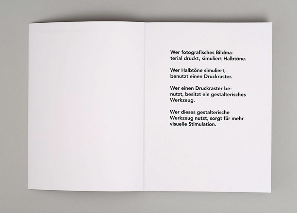
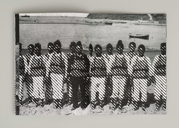
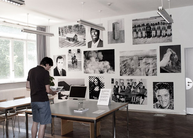
Geetika Alok
RCA, UK / 2010
Graphics
Awarded a DFID Commonwealth Scholarship by the RCA’s Department for International Development, Indian designer Alok’s interest in graphic design was sparked when her 11-year old self overheard discussions between her father and his former students, who had taken up the subject for their degree course. Drawing inspiration from the Indian decorative arts, Alok’s final project ‘Englishes’ is a typographic work which explores the status of English as a language in India. ‘English is interwoven into the vernacular languages of non-native speakers, who speak it but make it different’ she explains, ‘South Asia presents a unique case of language contact, convergence and assimilation - the voices of ordinary people in India betray a tension between the indigenous language of identity and authoritative English, the language of the economy’
Most inspired by: a simple man in a small Indian village making things for pure creation, as well as the works of Jan van Toorn.

Henrike Hiersig
Bauhaus University, Weimar, Germany / 2010
Graphics
Henrike Hiersig says she is influenced by the long-standing tradition of the Bauhaus. 'I merge photography, typography and design into a graphic synthesis and cover a broad range of techniques.' Her final year project was a book on the German aristocracy which included large-scale handmade photographs of families from the Nobility taken with an old baseboard camera, serigraphs on linen and cardboard. 'In my photographic work I attempted to preserve a moment of the portrait subjects' social reality. The subjects' history and their present lives are merged into a single image.'
Most inspired by: the photographs of Tim Walker and Gregory Crewdson
Ivar Martinsson
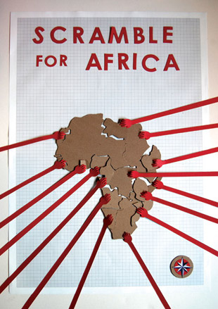
University of Brighton, UK / 2010
Graphics
With an artist father who encouraged him to paint and draw as a child, Martinsson cites his entry into graphic design as inevitable, 'Functionality has always been important to me and graphic design is a functional visual language'. Describing his style as 'minimalist and bold with deliberate imperfections', Martinsson's final project was an ode to the 50th anniversary of bubble wrap. Being a big fan of pop art, specifically Roy Lichtenstein's dotted and graphic artwork, he created a series of five posters that illustrated the different techniques people use to pop bubble wrap. Of this choice to combine two sixties staples, Martinsson reveals 'Bubble wrap and pop art have more in common than one might think'.
Most inspired by: Scott Hansen, Shepard Fairey, Edgars Zvirgzdiņš and the photographer JoAnn Kneedler
Jenny Tondera
MCAD (Minneapolis College of Art and Design), US / 2010
Graphics
Tondera's textural and research-driven work led her BFA thesis trail to Gertrude Stein's century-old book, 'The Making of Americans', and a preoccupation with how she could make the still-relevant themes within this book speak to a current generation. Combining a use of image-making and typography, the resulting narrative-driven exhibition featured a series of visually representative photographs of found objects based on her selection of ten key quotes from the book. Encouraging visitor interaction within the show space, Tondera also devised a newsprint catalogue that contained visual prompts such as map coordinates, to get visitors to assemble the catalogue whilst moving through the space.
Most inspired by: Ed Ruscha (especially his photo books and text paintings)
Jessica Reynolds & Serena Wise
Kingston University, UK / 2010
Graphics
Jessica Reynolds and Serena Wise met on the graphic design course at Kingston University. 'We like to always start with research and try to find a different way of looking at a problem. For the Ikea project we visited the store and watched people shopping which is were we noticed people tend to head for certain colours. That formed the original concept to show the whole Ikea catalogue arranged by colour, we then just had to work out how that would extend to multiple platforms.'
Most inspired by: For the Ikea project Helga Steppan was a big influence. Others we quite like are Fiona Banner, Troika and the illustrator Mario Hugo.
Jessica Reynolds: www.hellojess.co.uk
Serena Wise: www.serenawise.com
Ken Kirton
Central Saint Martins, UK / 2009
Graphics
Kirton is co-founder of printing and publishing house Hato Press, which grew from his final project with fellow graduates Louise Naunton Morgan and Jackson Lam. Wanting to develop a platform that would apply their design skills into collaboration with people from other practices, Kirton's practice uses a mix of printing techniques to create limited-edition runs of publications and artist books. Having begun early at the tender age of five when he commissioned himself to design board games for friends and family, he confesses to being partial to typeface or 'visual language' customization and development, because he feels 'it is a thread that runs through a project and binds its components together'.
Most inspired by: Van Gogh
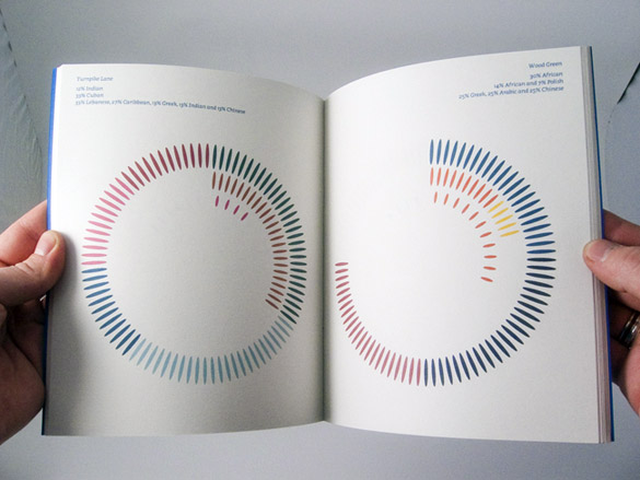
Lauren Harden
Yale, US / 2010
Graphics
'Without the discipline of assignments, making work became overwhelming' says Harden, both of her fine art degree and the subsequent realization that she might not want to become an 'artist'. Continuing on to her MFA in graphic design, she muses 'I like working within constraints. When the possibilities are endless I become paralyzed. When there is structure, I have something to push and pull against'. Having bagged both the Bradbury Thompson Memorial prize and the Schickle-Collingwood Prize at Yale, Harden's final project was a thesis set out within a book. Wanting it to be as unfixed as possible but bound at the same time, the resulting masterpiece was, in Harden's words, 'this incredibly over-complicated project where each page folds open to poster size and can overlap and recombine with other pages'.
Most inspired by: Joan Didion. Marcel Duchamp, Sheila de Bretteville, French New Wave, Joy Division, and lots of photographers.
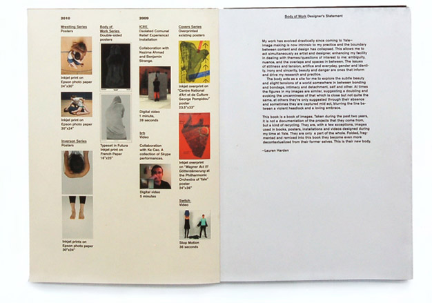
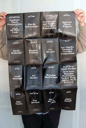
Luke Archer
Bath, UK / 2010
Graphics
Archer's calling to graphic design came to him when he was nine, in the form of his collection of fresh fruit label stickers and an inherent fascination by their subtle difference in typography. His final project, 'Rotary Magazine' was an experiment into magazine content and format. Using 200 random 35mm slides acquired from eBay and an accompanying rotary slide, Archer worked with course-mate Jack Maxwell to create a projected magazine, supported by a print-based version and website. Currently doing a Masters in art direction typography at ECAL, he cites fellow ECAL students Pilippe Karrer and Andy Massaccesi as people he'd most like to work with. Says Archer, 'We are currently working on a new project called Saal Neun, which is a mixture of our different disciplines and cultural perspectives'.
Most inspired by: everything.
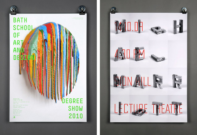
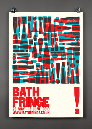
Lydia Skinner
Bath, UK / 2010
Graphics
Skinner's functional approach to design aims to always combine problem solving with effective, memorable application. Her final project was a bespoke book, bound with a double layer cover, which charts how Bath's historical window tax has shaped its architecture. A typological exploration, it also skillfully combines double-exposure photography with more traditional printing techniques such as photo embossing and silkscreen. Not wishing to adhere to certain design constructs, her eclectic style is down to that fact that she tries to tackle each brief in a unique way.
Most inspired by: Alan Fletcher and Stefan Sagmeister.

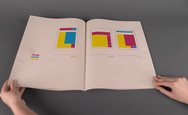
Merel Schenk
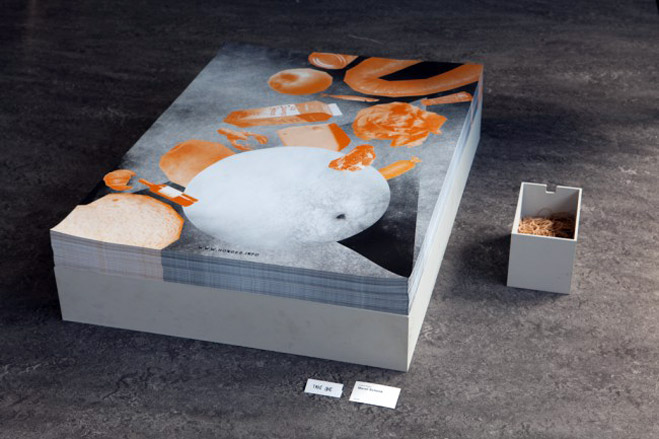
Gerrit Rietveld Academy, Holland / 2010
Graphics
Schenk works primarily with typography, often drawing the characters herself in order to 'determine their precise form and meaning'. She cites youth art school in Rotterdam as a big teenage influence, when, given unlimited usage of the photocopier, she experimented with collages, invitations, and fake IDs. One of her projects, 'Look Who's Talking' is a typographic animation that plays with linguistics by interchanging the character elements that form selected words. Of the project, which was nominated for an award at Prix Europa in Berlin, Schenk says 'By using a mono-spaced font, it becomes clear that in any language, characters act as building blocks'.
Most inspired by: Jean-Luc Godard, Saul Bass, Oliver Laric and book covers from Zwarte Beertjes (a Dutch pocketbook series).
Miles Gould & Pete Dungey
University of Brighton, UK / 2010
Graphics
Given their early aspirations (drumming and carpentry), it's a miracle Gould and Pete came to work together at all. Having met on the graphic design course in Brighton, their collaborative project 'Hook, Line & Sinker' won the entry selection process to brand the University's Faculty of Arts degree shows 2010. Taking illustrations from 1950's catalogues of fishing flies, they used one to represent each course within the faculty, combining these with bold typography. Say the pair of their concept, 'Fishermen use different flies to attract different catch, in the same way different courses attract various industry professionals through the degree shows. All with a cheeky nod to Brighton's fishing heritage'.
Most inspired by: architecture, hiking, music, sculpture, literature, photography, furniture design, sport and film.
Miles Gould : www.milesgould.com
Pete Dungey: www.petedungey.com
Minchaya Chayosumrit
Central Saint Martins, UK / 2010
Communication Design
Chayosumrit's conceptual work aims to be as simple as possible. Her final project deals with how the age of digital reproduction has changed the way we think and feel in society today. 'Much of our time is spent creating work by the use of a machine. The familiarity of undo, redo, copy and paste has changed the way we live as well as the value we place on content and creation itself' says Chayosumrit, who effectively compared the outcome and time spent in creating a repetitive hand-made drawing with that of its computer-generated counterpart, which she then labelled: 'You will never realize until you get closer to the work, until you become part of the process'.
Most inspired by: Sol LeWitt and Agnes Martin
Renato Zülli
ECAL, Switzerland / 2010
Graphics
Zülli describes his design style as 'somewhere between left-handed and right-footed'. Creating a final project that extended beyond the page, he built up an office showroom, basing it on the idea of a company that sold abstract art prints for other office spaces. To go with the construction, Zulli drew a typeface for the company's catalogue, which was used to showcase the paintings.
Robert Huber
ECAL, Switzerland / 2010
Graphics
For his final project, Huber took the subsurface phenomena of alpine permafrost (a frozen mix of rock and debris which exists above certain altitudes) and essentially created a corporate identity for it. By employing a combination of photography, type design and editorial art direction, he created a visually entertaining 'scientific lookbook'. Generally concerned with the creation of a simple but decisive language in his designs, he took research result text from the Swiss permafrost monitoring network, Permos, and enhanced the force and importance of the certain written excerpts, designing and drawing the fonts for the publication.
Most inspired by: fascination and curiosity
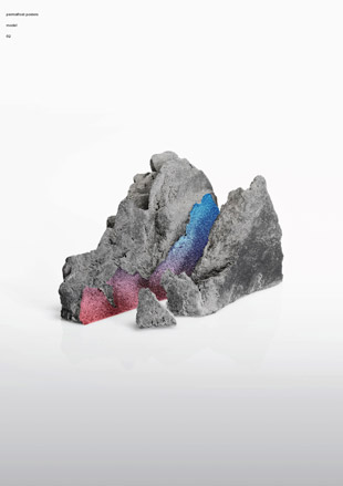
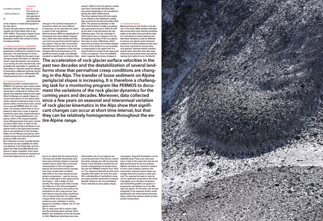
Dries Wiewauters
Werkplaats Typografie, Arnhem, Holland / 2010
Graphics
Dries Wiewauters is a graphic and type designer currently working and living in Belgium as a freelance specialising in printed matter and custom typefaces. 'My work is often based upon a strong fascination for historical references, without being confined to their visual form. The Plaque Découpée Universelle is a nice example of this. The three PDU prototypes – which were made as part of the design of a magazine cover – are a remake of a 1876 stencil by the American inventor Joseph A. David.'
Most inspired by: J.A. David, Joseph Albers, Christophori Scheiner, Aldo Novarese, Frank H. Pierpont, AutoCAD and the London Evening Standard.
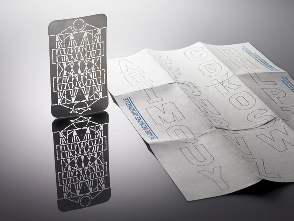
Dimitri Jeannottat
Bern University of the Arts, Switzerland / 2010
Graphics
A follower of the 'less is more' school of thought, Jeannottat's final project is a blend of his two great loves -- music and graphic design. Charting 30 years of independent music culture in Delémont, Jeannottat's home town in Switzerland, the systematic project involved him collecting real material in boxes, classifying these chronologically into a book, and finally putting forward an analysis in the form of a booklet and posters. Says Jeannottat of the final process, which eschewed the chronological organization of the book, 'the analysis is more free in its graphical translation. It has more of my personal vision of the topic. I take objects from the book, but also new material that I made especially for this project'.
Most inspired by: There are lots of amazing graphic designers in Switzerland, and it was great to meet some of them at school during workshops. I like reduced design, when it's simple, well done and with the right link between visuals and topic... A few that I met in Bern: Raphael Koch, Urs Lehni, Tania Prill, Flag...


Alex Brownsell
Hair Stylist, UK
Beauty
Bleach, a two-chair hair salon in London’s hip Dalston run by session stylist Alex Brownsell (pictured) and agent Samantha Teasdale, is fast becoming the be-all and end-all in directional hair. Operational since September in a space shared with the WAH Nails salon, Bleach offers highlights, dip-dying, bleaching and all-over colour in shades ranging from naturals to vibrant blues and greens, which Brownsell rubs in by hand for the perfect, graduated effect. Brownsell, 23, has a knack of making the unthinkable appealing, having pioneered the trend for dyed grey hair and ombre tones, and is now working on a range of clip-in extensions and semi-permanent sprays.
Most inspired by: 1990s TV shows
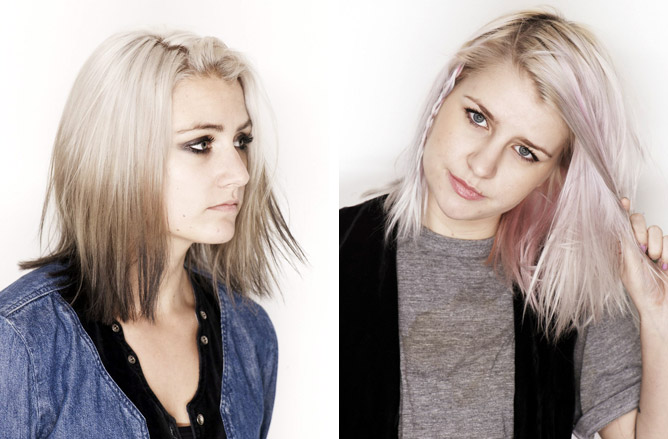
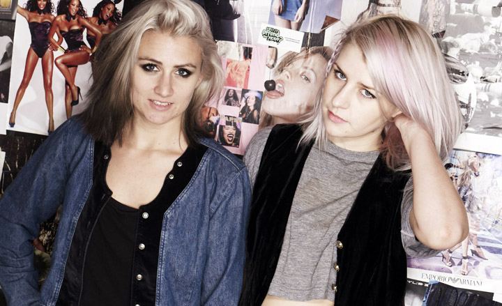
Anne McClain
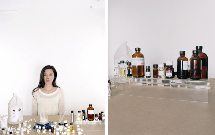
Grasse Institute of Perfumery, US
Beauty
McClain’s olfactory awakening began at the age of 15 when she fell victim to the sweet chocolate notes of Thierry Mugler’s Angel. After being accepted to the highly selective year-long course at the Grasse Institute of Perfumery, the Rhode Island native launched her unisex line, MCMC Fragrances, from her home in Brooklyn in 2010. Apart from her hand-blended creations, McClain also conducts perfume workshops to share her expertise.
Most inspired by: my volunteer work and other community initiatives.

Ned Goodwin
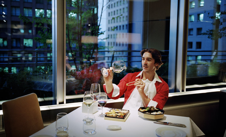
Sommelier, Japan
Travel
The Japanese only drink two litres of wine per person per year, so you can see what Ned Goodwin is up against. Born in London, raised in Sydney and schooled in Paris, where his interest in wine was first established, Goodwin’s knowledge and enthusiasm saw him become one of three sommeliers at New York’s Veritas, a restaurant considered to have one of the finest wine lists in the world. Now based in Tokyo, he became Japan’s first Master of Wine in May 2010. As the wine director of Global Dining and PJ Group restaurants, he travels the world bringing a variety of styles back to Japan and trains restaurant staff in the art of matching Japanese food and wine.
Most inspired by: Jancis Robinson.
Gabriel Stulman
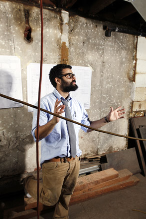
Restaurateur, US
Travel
With his new wine bar Jeffrey’s Grocery, and 18-month-old bistro Joseph Leonard (named after his two grandfathers), 30-year-old Gabriel Stulman has cornered the haute cuisine market in New York’s West Village. Now Stulman – who opened his first Gotham restaurant, Little Owl, at 25, and the popular ‘New American’ joint, Market Place, soon after – is hoping luck strikes a fifth time with Fedora (pictured, in refurbishment), a West Village neighbourhood institution that Stulman has taken over from its original nonagenarian owner. Stulman’s eateries have distinct menus and décor, but share similar service and design DNA. ‘All our restaurants are warm, inviting places, but each offers a unique experience,’ he says.
Most inspired by: Balthazar- and Pastis-owner Keith McNally.
www.jeffreysgrocery.com, www.josephleonard.com
Leon Avigad & Nitzan Perry
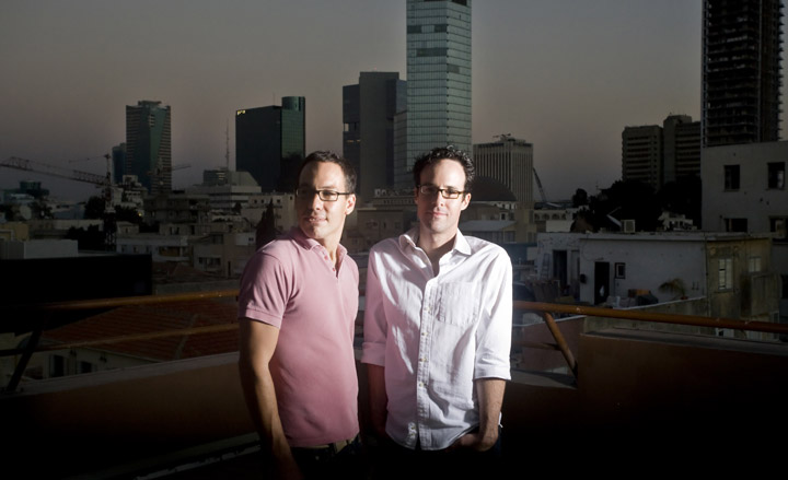
Hoteliers, Israel
Travel
Developers Avigad and Perry of Leopard Hotels aim to inject Tel Aviv with a dose of hip hospitality and small-scale luxury accommodation. Avigad, 39, trained at St Moritz’ iconic Badrutt’s Palace before serving as an executive at Israel’s Dan Hotels, while 34-year-old Perry has a background in advertising. Their first project, Brown TLV, opened in October in a former bank close to Tel Aviv’s historic White City. Next comes BAU TLV, which opens next year in a renovated Bauhaus gem (the duo are pictured on its roof); Pasha TLV, which will be housed in an Ottoman-era mansion in ancient Jaffa; and Beach House Tel Aviv, another Bauhaus beauty, is set to open in 2014.
Most inspired by: André Balazs.
Catarina Portas
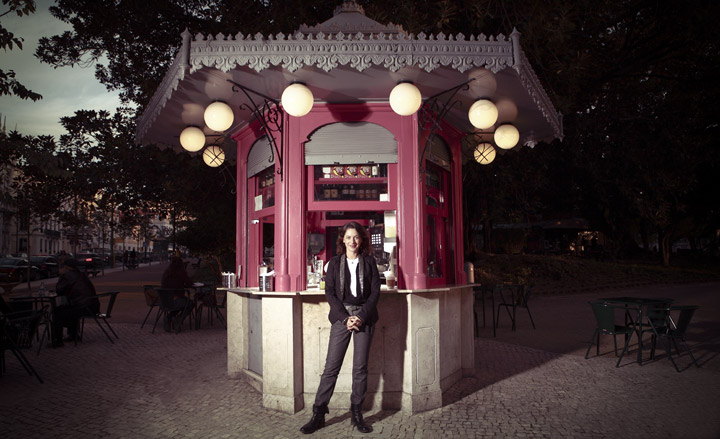
Retail Entrepreneur, Portugal
Travel
Portas started her career making hats with a local milliner, before becoming a journalist focusing on fashion and retail stories. While researching a book about life in Portugal in the 20th century she noticed that many local Lisbon products were still sold in their original packaging dating from the 1920s to the 1960s. Portas snapped up the retro stock and now sells it to style-conscious visitors and nostalgic locals in her first retail outlet, A Vida Portuguesa, in Lisbon’s fashionable Chiado district. The shop stocks a range of items, from soaps and chocolates to notebooks and ceramics,arranged in boxes by theme, and each accompanied by a tiny booklet explaining the products’ origins. Portas has recently opened a new flagship store in Porto, and is now concentrating on the opening of a series of small cafés serving traditional pastries and drinks, such as perfumed milk, in some of Lisbon’s landmark turn-of-the-century kiosks (pictured).
Most inspired by: Manuel Reis, an antiques dealer turned nightclub owner.

Ryu Hashimoto
Tama Art University, Japan / 2010
Transport
Ryu Hashimoto's sleek TT concept is a bicycle built around the idea of emotional engagement. 'When I create my works, I usually do not think about ‘wanting to create something new,’ says Hashimoto, 'My first priority when designing is to prioritize ‘the attraction of the form’. This means that if the form is slick and aesthetic, I have accomplished my goal.' The Tama Art University graduate used the conceptual time trial bike to create a sculptural object that 'looks fast', even why it is standing still, thanks to a strongly modelled frame that gives the Scalo TT an almost organic, bone-like appearance. 'This work might be closer to self-expression, rather than product design,' the 22-year old Japanese designer admits. Hashimoto graduated from Tama in May 2010 and is currently looking for a studio that embraces his aesthetic-led approach.
Most inspired by: aesthetic-led design approaches
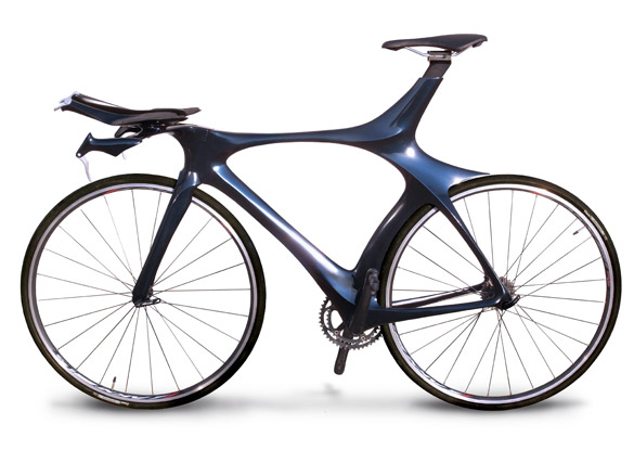
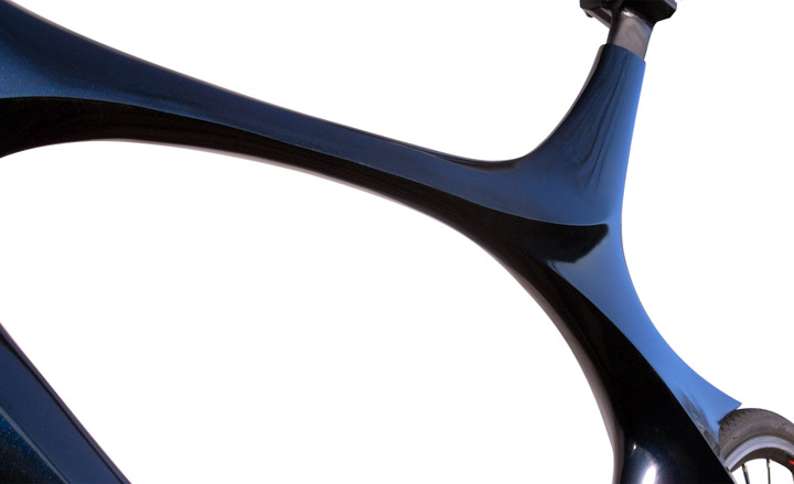
Hoisung Jung
Hongik University Seoul, Korea / 2009
Transport
Hoisung Jung studied Industrial Design at Hongik University, where he was able to hone his design skills on a series of brand-led concept studies. His skilled re-imagining of a small-scale Saab coupe - entitled the New Generation of Saab 96 - neatly blends a strong sense of the Swedish company's design history with a dynamic contemporary shape to create a modern teardop sportster to take Saab into an all-new market. Rumour has it the reborn firm is looking to mine this rich seam of retro design in the near future; they'd do well to study Jung's ideas. Currently employed by Korean industrial giants Hyundia Kia as a design strategist for Kia, Hung is using his design skills to help determine the routemap of tomorrow's products.
Most inspired by: design strategy


Luis Camino
Umeå Institute of Design, Sweden
Transport
The venerable Volvo station wagon was the focus of Spanish student Luis Camino's final year studies at the Umeå Institute. His examination how this iconic boxy form would evolve over the next two decades, thanks to the input of new propulsion technologies and new materials, led to the Twin Zero concept, the Volvo estate for 2028. Twin Zero is all-electric and ultra-safe, the latter a key consideration for such a safety-conscious brand. Describing himself as a mix of 'Spanish genes, American hard work, Italian passion and Scandinavian reason,' Camino's concept was a densely researched and beautifully presented analysis of Volvo's core qualities. Suggesting a gentle evolution of exterior form but a thorough overhauling of the details, including a zero emission propulsion that allows for an ultra-flexible interior, Camino's Twin Zero points to the station wagon as the most sustainable, safe and seductive form of family transport of tomorrow. Unusually, the designer took pains to render up the gradual evolution of the Volvo estate from 2014 onwards to give credence to his ultimate design.
Most inspired by: the Volvo station wagon


Alex McWhirter
Coventry University, UK
Transport
Car culture and product design collided in Coventry student Alex McWhirter's degree project. The Toyota POP is a bold attempt to infuse the budget car sector with the qualities and characteristic of the high street fashion market. Stripped back to the bare essentials, the POP is an electric car marketed as a charity fundraiser: every year a different POP edition goes on the market featuring exclusive trim, colour and designs, all benefiting the manufacturer's charity of choice. Slab-sided, unashamedly functional and formed from recycled materials ; its incredible eye-catching geometric surfacing challenges the notion of automotive form. McWhirter describes the car as being 'designed for longevity and cheapness of manufacture', adding that 'it signals the end of today’s throwaway society and creates a template of sustainability that gives back to society.'
Most inspired by: the global art scene and the original Fiat Panda, ‘geometrically out of this world - outstanding 30 years ago and still is today.'


Kaveh Nasserbakht and Ghazal Sarmast
Azad University of Tehran, Iran
Transport
Kaveh Nasserbakht and Ghazal Sarmast from Tehran's Azad University took inspiration from a telescopic camera lens for their Volkswagen 03 concept. This spindly vehicle is a three seater, with a tubular passenger compartment set within four narrow wheels, giving the whole ensemble the feel of a true 'horseless carriage'. The clever packaging allows for the central section to expand outwards in each direction, with two additional seats unfolding from beneath the central driving seat. The 03 is aimed at the contemporary commuter, a key player in the evolution of the small car and someone whose demands and willingness to push the envelope of accepted design will help usher in a panoply of quirky car forms before the end of the next decade. Nasserbakht and Sarmast's VW-badged machine could be the shape of things to come.
Most inspired by: camera lenses

-
 Dimoremilano and Loro Piana channel 1970s cinema in decadent Milan display
At Milan Design Week 2025, Dimorestudio has directed and staged an immersive, film-inspired installation to present new furniture and decor for Loro Piana
By Dan Howarth Published
-
 The new Google Pixel 9a is a competent companion on the pathway to the world of AI
Google’s reputation for effective and efficient hardware is bolstered by the introduction of the new Pixel 9a, a mid-tier smartphone designed to endure
By Jonathan Bell Published
-
 In Milan, MoscaPartners presents a poetic exploration of ‘migration’
Alongside immersive work by Byoung Cho, MoscaPartners’ Milan Design Week 2025 display features an accessible exhibition path designed for visually impaired visitors
By Cristina Kiran Piotti Published