In the frame: 2016’s standout designs from around the globe
Receive our daily digest of inspiration, escapism and design stories from around the world direct to your inbox.
You are now subscribed
Your newsletter sign-up was successful
Want to add more newsletters?
New home
12 October
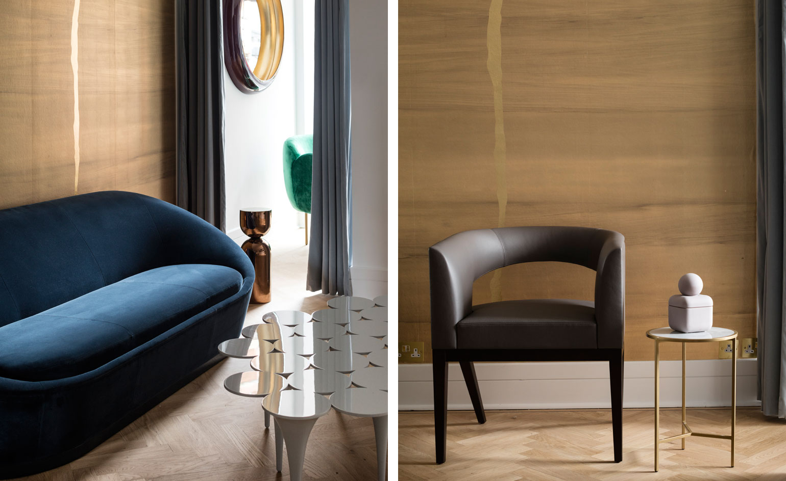
Fulham Road's latest luxury interiors addition is the elegant Sé showroom. The new flagship takes residence in the former David Gill Gallery site and joins the ranks of international brands including B&B Italia and Cassina, which all have spaces in Brompton's Design District.
The narrow set-up exudes warmth, with designer Nika Zupanc's exotic deep green and rich blue upholstered 'Stardust' and 'Sway' seating, and a delectable mix of marble and brass spanning across the collections.
Special additions that adorn the retail space include Luke Irwin rugs and New York-based wallpaper brand Calico's latest 'Satori' metallic print, which acts as an artistic backdrop for the collections.
Writer: Sujata Burman
Uncommon ground
11 October
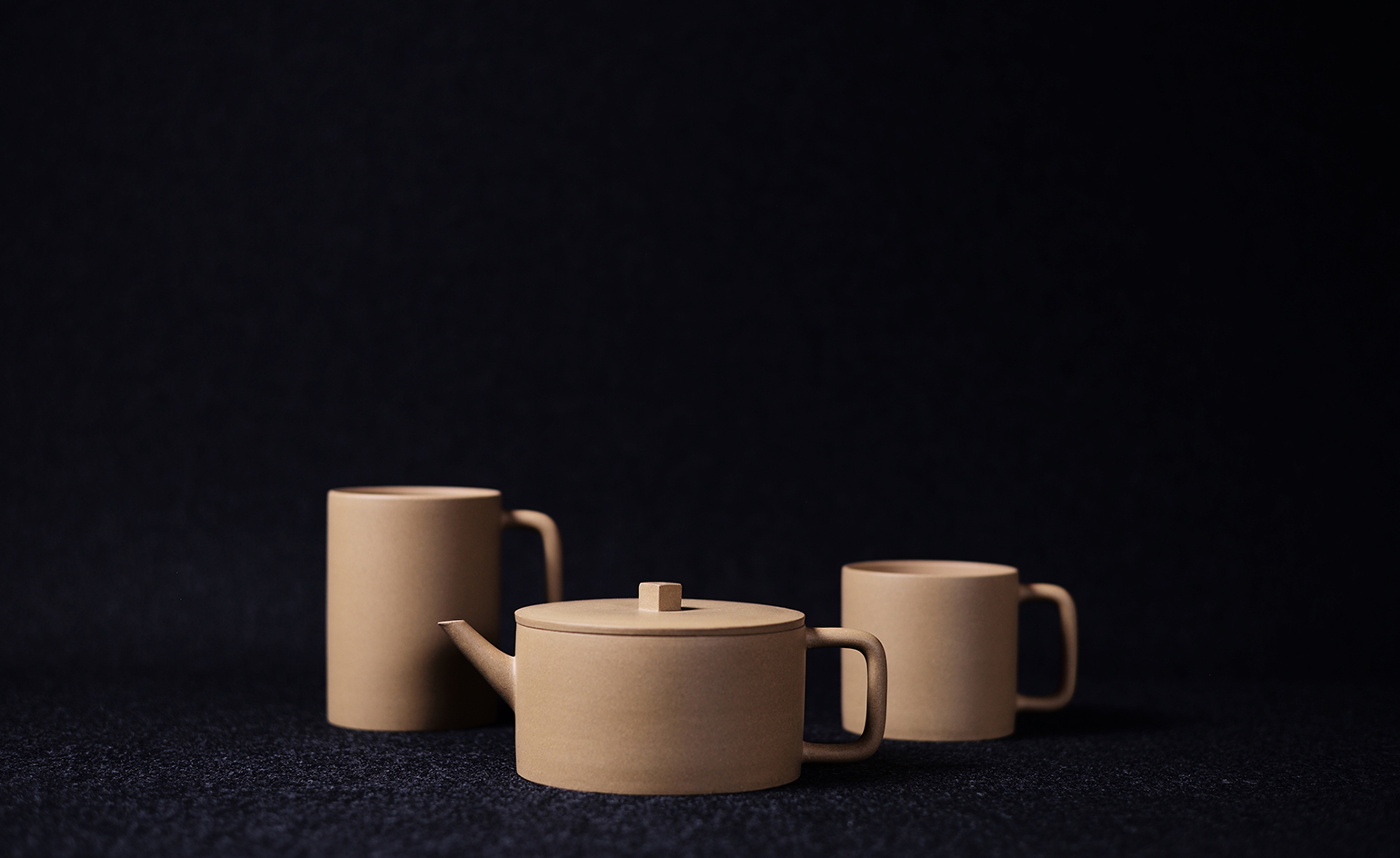
Fascinated by the discovery that, after a certain amount of use, traditional Yixing clay teapots become so seasoned that tea can be brewed just by pouring boiling water into an empty pot, new LA-based brand UNCMMN, founded by Funi Ding and Stacy Zou, set about creating a series of modern tableware using the highly porous clay that is particular to this region in China. Zou and Ding, who grew up in LA and Shanghai respectively, plan to launch one new collection annually based on a different location in the world and an uncommon material found there.
In their first collection (pictured), produced by local artisans in Yixing, pieces include a teapot with a delicate spout and angular handles that recall the structure of bamboo branches, while a set of rounded storage containers reference Yixing’s river rocks. With recent trips including a sojourn in Iceland and a journey into the Navajo Nation, UNCMMN’s 2017 collection promises to be one well worth waiting for.
Writer: Ali Morris
As originally featured in the October 2016 issue of Wallpaper* (W*211)
Right lines
11 October
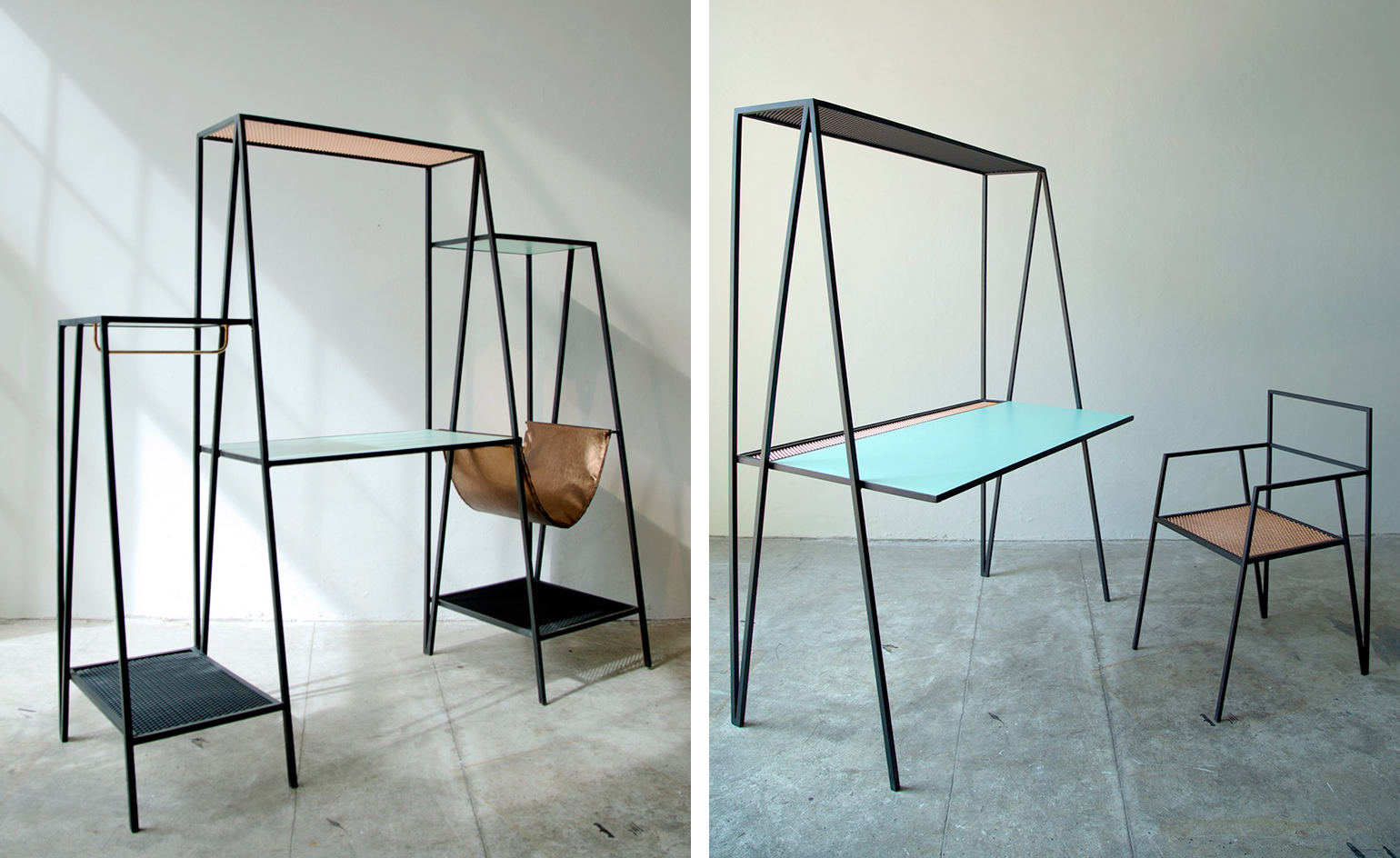
Currently making waves both at home and abroad is new Argentine design firm Ries. The studio was founded in 2015 by Marcos Altgelt, Segundo Denegri and Tasio Picollo, who initially starting working together on furniture prototypes at their modest garage workshop in Buenos Aires while holding down day jobs at design studio La Feliz. The studio’s debut collection 'Alpina' (pictured) consists of a table, a chair, a desk and a shelf, and is characterised by slender, geometric lines and lightweight forms.
It instantly catapulted the studio into the international arena, including an invitation to exhibit at Sight Unseen’s Offsite show at NYCxDesign. There, it also unveiled its new 'Bee' collection, a range of side tables fashioned from tiered hexagonal platforms, in either steel and polished brass or white Carrara and black Marquina marble, which are redolent of the tessellating characteristics of a beehive. The studio’s output has us buzzing with anticipation.
Photography: Sean Lemoine; Writer: Vanessa Bell
As originally featured in the October 2016 issue of Wallpaper* (W*211)
Freeze company
11 October
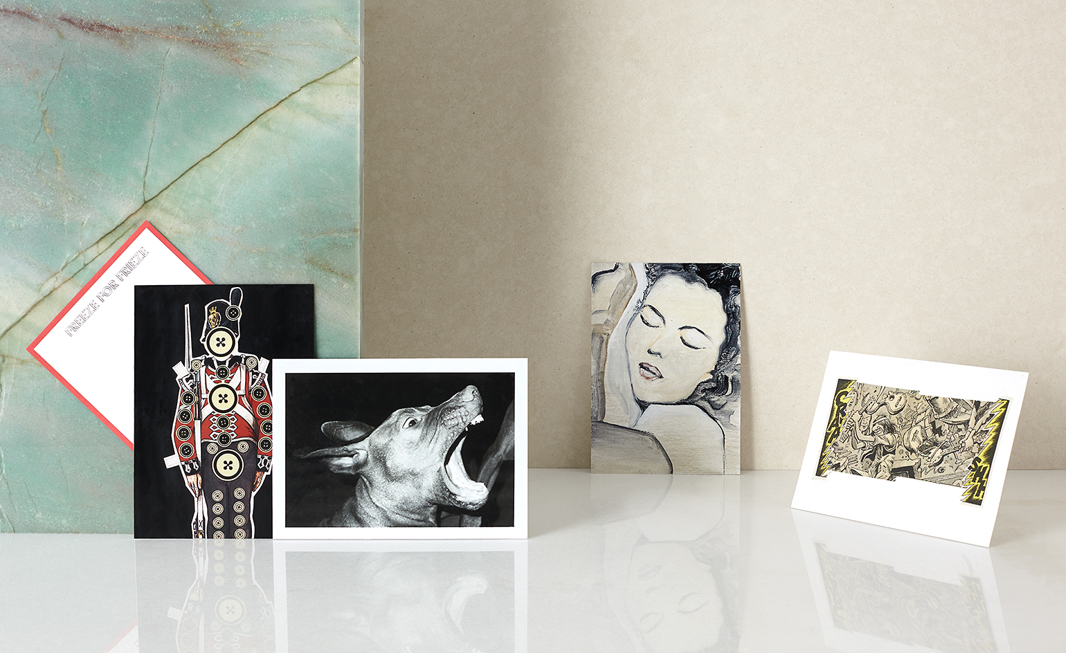
Want a chance to own a Christian Marclay or John Baldessari? Fancy a Juergen Teller or a Peter Lindbergh for your mantlepiece? Moncler has built on the RCA’s renowned secret postcard project by enlisting a global network of artists, designers and photographers to envisage their own cards, with the creators’ identities only revealed after purchase.
The postcards were exhibited during Frieze at Moncler’s new Old Bond Street store and online at Moncler.com from 7–9 October. Selling at a fixed price of £60, all proceeds from the 400 cards will go towards paying for two RCA students’ MA degree tuition for two years. As curator Tim Blanks explains, 'Freeze for Frieze' is ‘a metaphor for the randomness of life’, whereby it’s just as likely that you’ll take home a design by Peter Saville as Chris Martin.
Photography: Marie Valognes, Benjamin Swanson; Writer: Katrina Israel
As originally featured in the October 2016 issue of Wallpaper* (W*211)
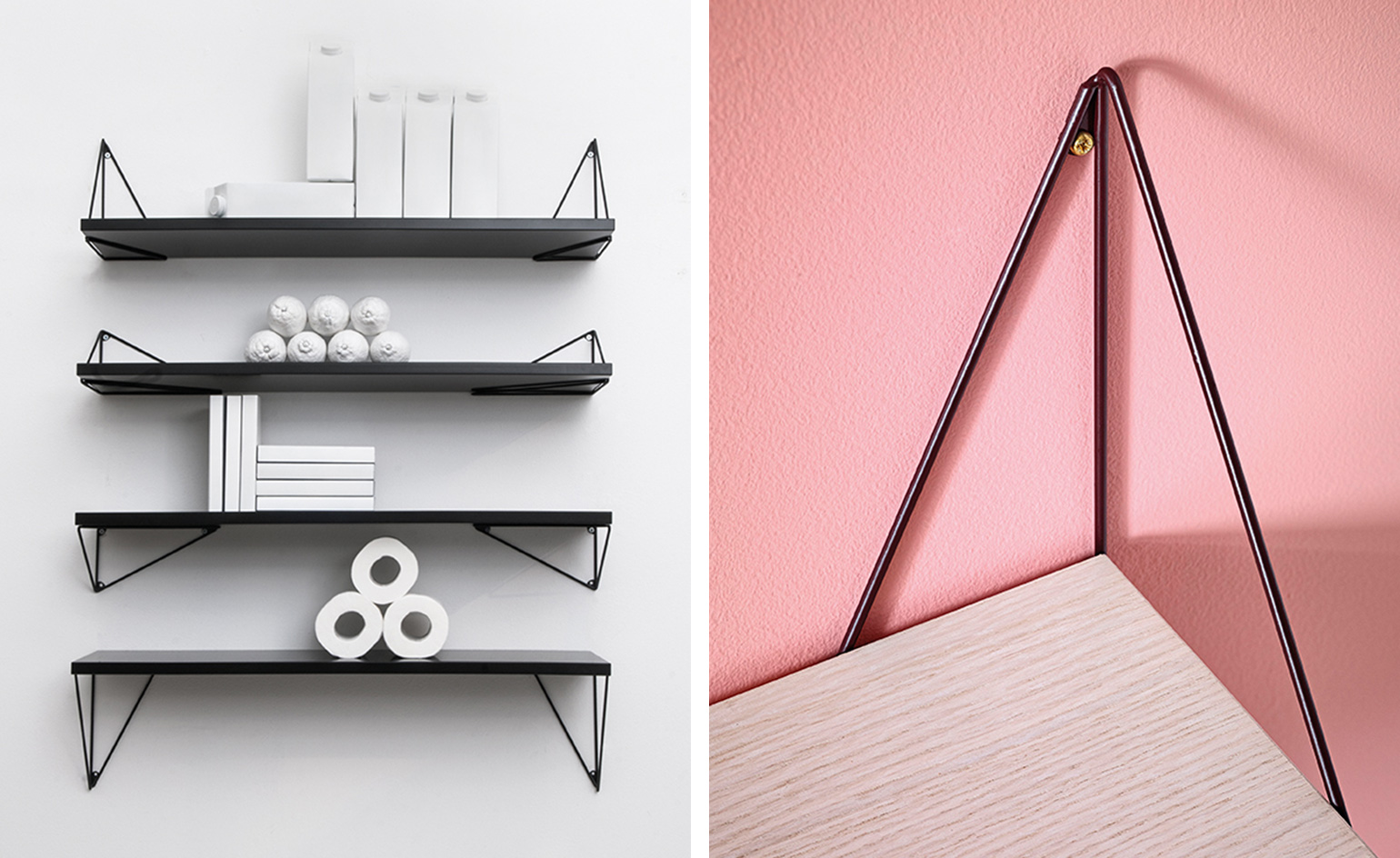
Mathematical shelving
27 September
Designed for Swedish firm Maze Interiors, quirky shelving unit 'Pythagoras' is the brain-child of Gustav Rosén – and it's as geometrically interesting as its namesake. Suspended with a triangular recycled steel wire bracket, the deceptively simple wooden shelves can be reconfigured in myriad ways. Set up is as easy as a² + b² = c², promises the firm, allowing reconstruction at the drop of a hat, depending on the collection of objects on display. As Maze puts it, 'only individual taste and imagination set the limits'. Challenge accepted.
Writer: Elly Parsons
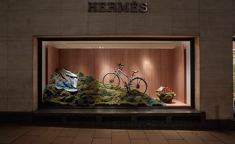
An artist window
15 September
This year's theme for Hermès Bond Street store window, Nature at Full Gallop, was embraced by artist Alexandra Kehayoglou, who's rugs 'immortalise slices of land'.
Inspired by the unspoiled beauty of Hampstead Heath, Locus Amoenus intends to 'recall the feelings of a playful childhood within nature'. Situated in all four of the Hermès windows, the painted tapestries grace both Bruton Street and New Bond Street, transporting allusions of Hampstead Heath's abundant vegetation to the Mayfair's dense urban environment.
A celebration of getting lost in the Heath, the windows recreate the artists' own Locus Amoenus, one she shares with none other than John Keats, which inspired his Endymion there 200 years prior. However, that isn't the extent of Kehayoglou's inspiration: with references to Monet's Poppy Field and Poussin's Landscape with a Man Killed by a Snake, the installation is nothing short of intertextual. For Hermès, windows have always been a space for storytelling, and Kehayoglou's idyllic vision realises their brief in full.
Locus Amoenus is on display until 7 November; 155 New Bond Street, London W1 2UA
Writer: Inez Bartram Vilar
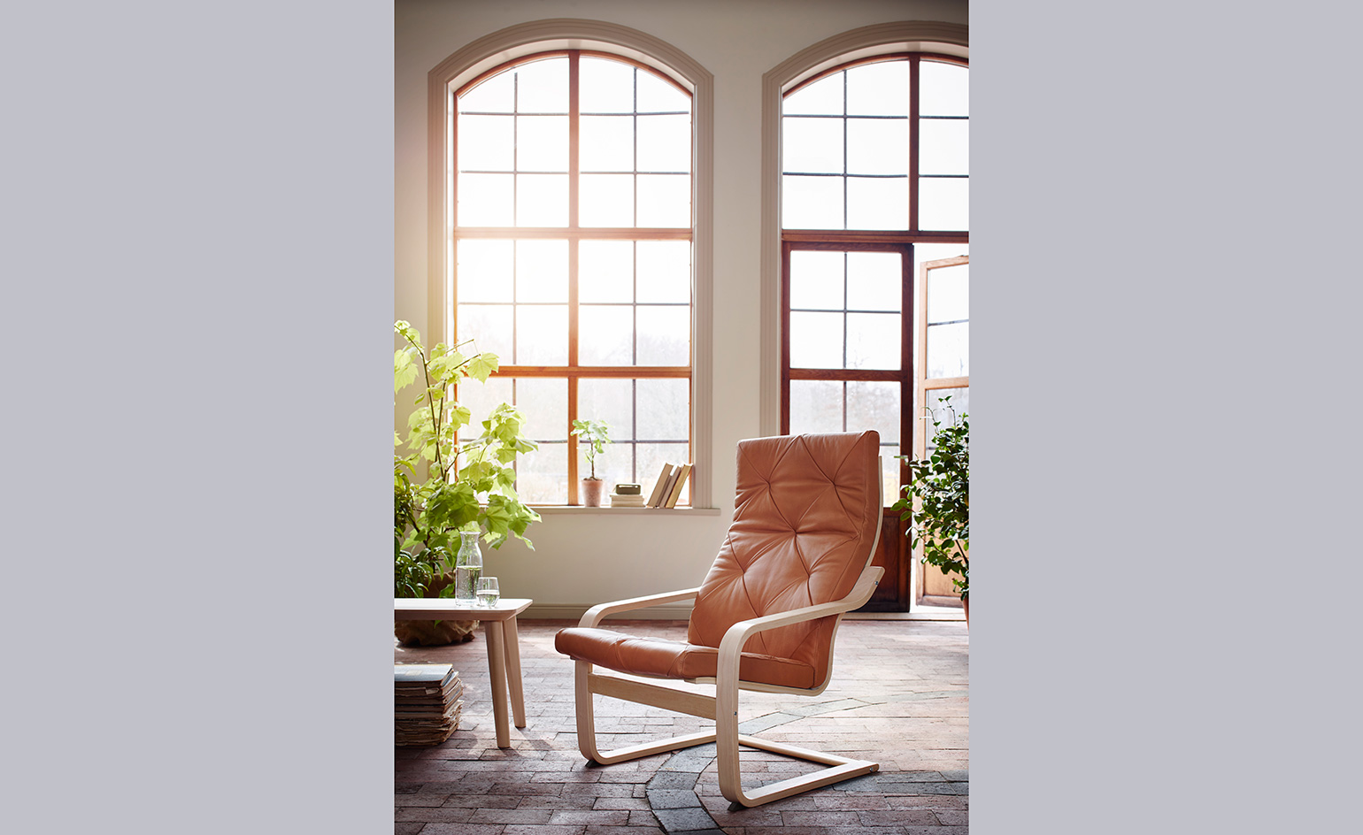
POÄNG's 40th birthday
13 September
It has been 40 years since Japanese-born designer Noboru Nakamura conceived the iconic POÄNG chair. Instantly recognizable, the top-selling IKEA recliner has graced the lounges of over 30 million homes across the globe.
A perfect example of IKEA’s Democratic design principles, the failsafe chair is affordable and accessible at its core. Its clean bentwood frame is versatile and sleek, and perhaps responsible for POANG’s pervasive popularity.
In order to celebrate the big 4-0 the Swedish furniture giant will launch six new limited edition cushion covers and a new armchair frame.
Writer: Inez Bartram Vilar
Receive our daily digest of inspiration, escapism and design stories from around the world direct to your inbox.
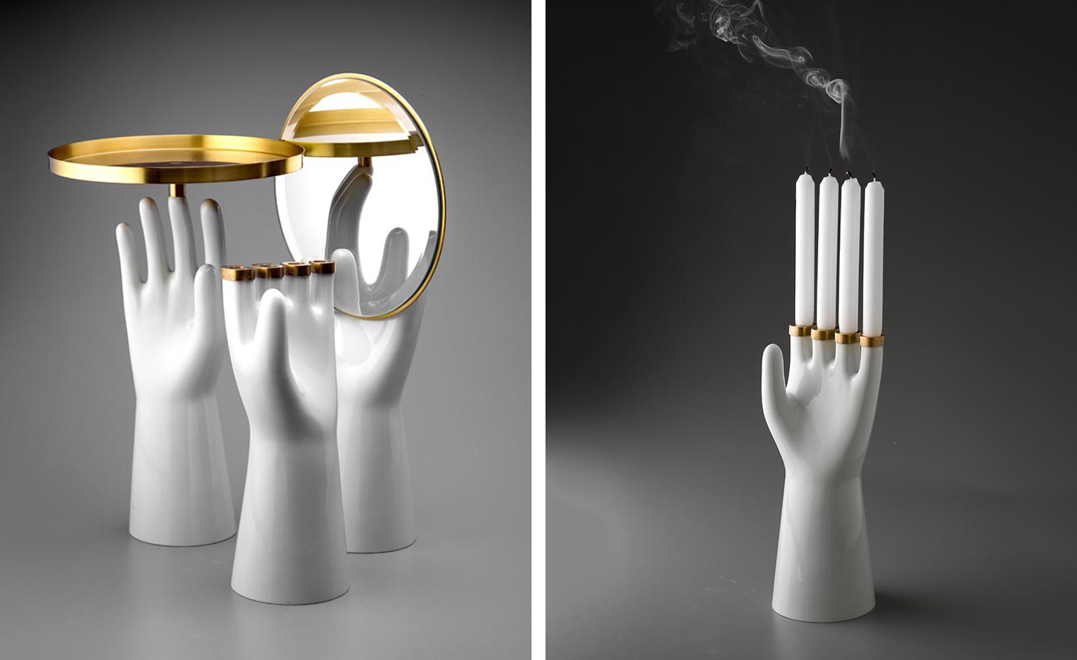
Hände hoch and Akropolis
12 September
After several collections of monumental glass objects, Jakub Berdych of Prague-based design studio Qubus returns to the intimate scale of ceramic accessories. Influenced by two moments from art history, Akropolis and Hände hoch have a slight surrealist spin on them.
The former is a series of individual golden glass cups, resting on the top of antique-inspired ceramic columns, while Hände hoch pays homage to late Czech avant-garde painter František Tichý. Melancholic and magical, it is a symbolic depiction the artist's work, rendered handy by Berdych in a series of three hand-shaped objects including a mirror, a tray and a candlestick.
Writer: Adam Štěch
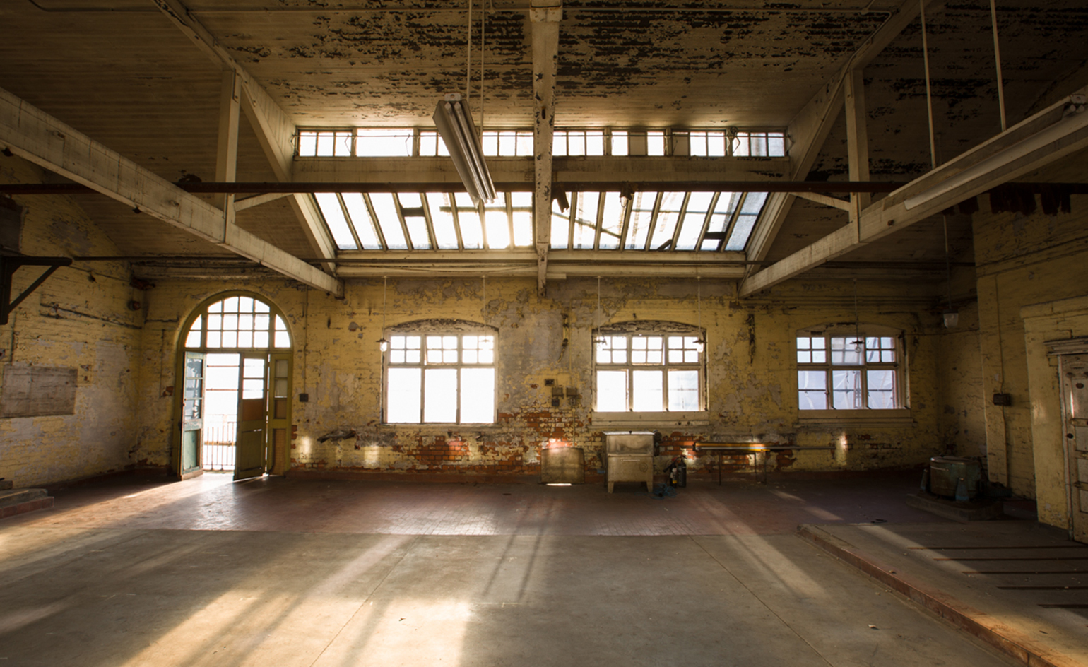
Made in Manchester
9 September
Brought to life via a collaboration between Allied London, Studio DBD and Jamie Scahill, 'Made Here' is a day-long festival, celebrating local Mancunian makers. From artists to apparel engineers, the event promises to showcase the very best Manchester's craft scene has to offer.
Providing the sustenance, Altrincham Market veterans Honest Crust Pizza and meat-lovers Well Hung. Washing this down - a dangerous number of local breweries, hosted by Cave Direct.
The market will be bolstered by a backdrop of music from Manchester’s longest running weekly club night Funkademia, featuring live performances from town favourites, including Slow Readers Club.
'Made Here' at London Road will pop-up this Saturday at the atmospheric old Fire Station, where visitors can meet the makers behind Manchester's culture of creation.
Writer: Elly Parsons
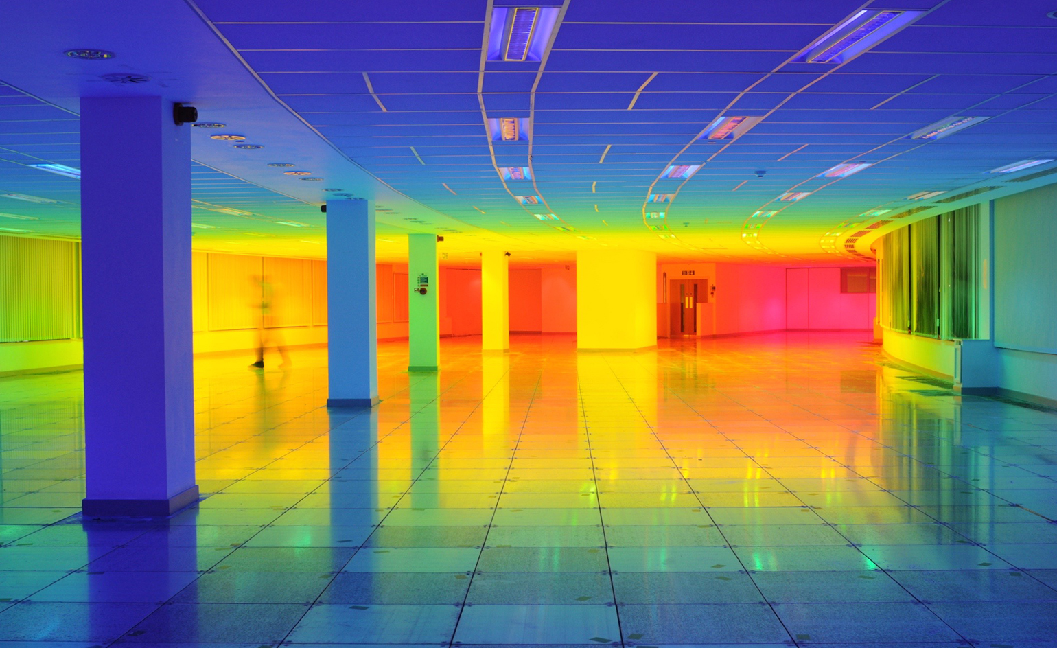
Step into the rainbow
8 September
Manchester-based artist Liz West has a fascination with colour and a knack for using light as a sculptural material. Hot on the heels of the launch of her Spectral Vision installation at London's Natural History Museum, West has taken her eye-catching exploration of hues to the Bristol Biennial, transforming an architectural space into a vivid installation of pure colour.
Our Colour, as the immersive light installation is titled, was designed as an experiment in human colour perception. 'After moving through the space – walking, running, dancing – and experiencing every colour,' begins West, 'people often go back to the colour they find most comfortable; they will then stand, sit or lay there for some time to reflect.'
The installation will be in place until 10 September; The Pithay, Bristol, BS1 2LZ
Writer: Sam Rogers
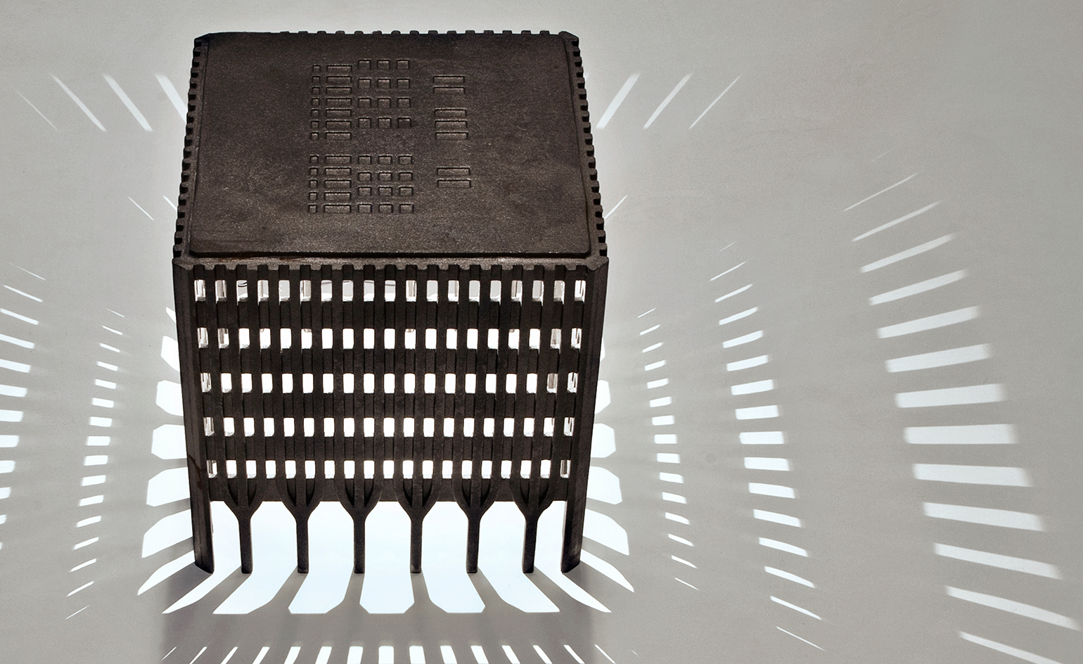
Stand tall
5 September
Fifteen years after the 11 September attacks on New York's World Trade Center, Rolf Bruggink, a designer-architect specialising in recycling, has chosen to remember the Twin Towers in all their 1960s architectural glory with a new lighting range.
The collection comprises 14 beautifully detailed lamp shades that stack to create replicas of the towers, recast at 1:180 of their original scale.
Each iron-cast window and base arch has been hand-carved, with the help of innovative 3D sand-printing technology. These delicate windows allow light to seep out, and dance theatrically across the room – a fitting tribute to the formal qualities of the two buildings that shaped New York's skyline for almost 30 years.
Writer: Elly Parsons
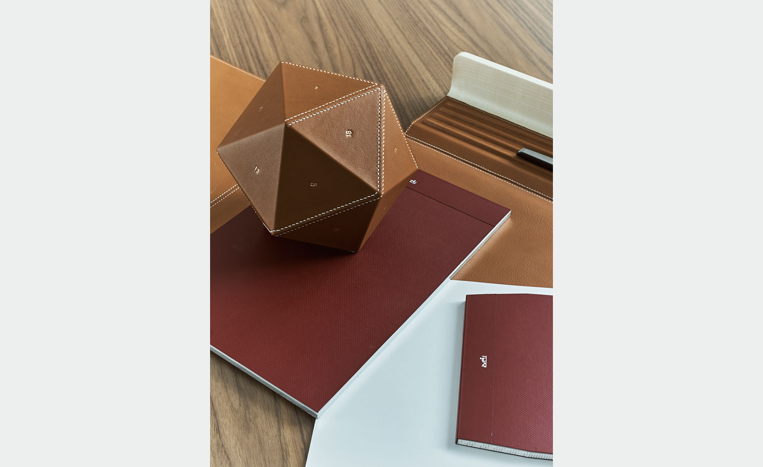
Balancing act
2 September
Earlier this year, Hermès unveiled a collection of objects that celebrate the company’s leather excellence but are also imbued with a whimsical, playful nature. Dubbed ‘Equilibre d’Hermès’, and designed by its in-house design studio in collaboration with Guillaume Delvigne, Grégoire de Lafforest and Damian O’Sullivan, the series is crafted in exquisite fawn bull calf leather and includes items such as spinning tops, a saddle-shaped magazine rack, and a freestanding, balancing magnifying glass. From the collection, the icosahedron paperweight particularly caught our attention for its simplicity, geometric perfection, and luxurious execution. Crafted from leather-covered resin, each of its 20 faces is hand-stitched with a special technique that has only been mastered by few of the company’s craftsmen and stamped with a gold number from 1-20. This design heavyweight certainly gets our stamp of approval.
As originally featured in the September 2016 issue of Wallpaper* (W*210)
Writer: Rosa Bertoli
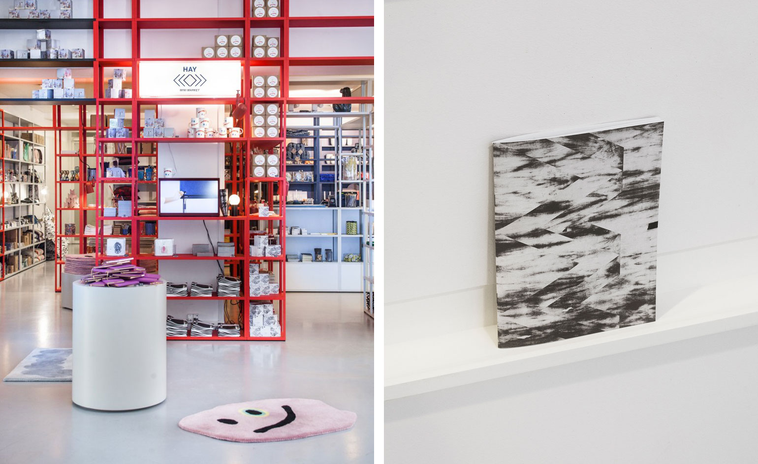
Chart X Hay Mini Market
1 September
Danish brand HAY transported their mobile Mini Market for a special pop-up at Chart Art fair last weekend.
Located at the The Royal Danish Academy of Fine Arts’ Kunsthal Charlottenborg in Copenhagen, the market kept its pop-coloured stacked shelving look, but added some special limited edition pieces.
A selection of Chart artists were invited to create products including stationary, rugs and tableware. Highlights include a whimsical figurative rug by US artist Richard Colman and Swedish designer Catrin Andersson's monochrome notepad inspired by the landscape (pictured right).
Hanging out
31 August
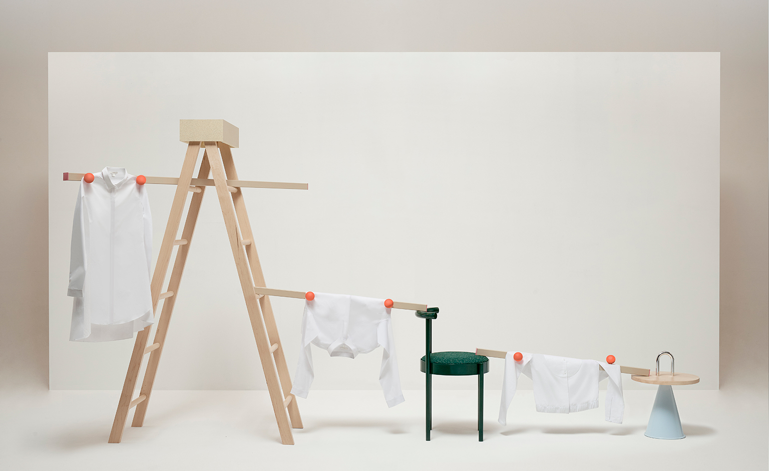
Slinging a shirt over the back of a chair to dry is not a style sin – or so Swedish retailer COS would have us believe, in a new collaboration with Australian designers Daniel Emma.
COS tasked Daniel To and Emma Aiston to create a domestic display for the signature COS white shirt, and the duo responded with tongue placed firmly in cheek. The resulting collection includes a custom chair, side table and robust wooden ladder, with a cluster of orange magnetic spheres used to hold garments in place, peg-free. Shirts and jumpers are slung and invisibly held over the furniture – an innovative and functional way to showcase COS classics.
Allowing clothes to naturally drape in this way might even be better for the fabric, allowing it to dry without creasing, COS explains. 'Hanging out', is installed at both COS Sydney stores and at its Melbourne outpost throughout September.
Writer: Elly Parsons
Knock on wood
30 August
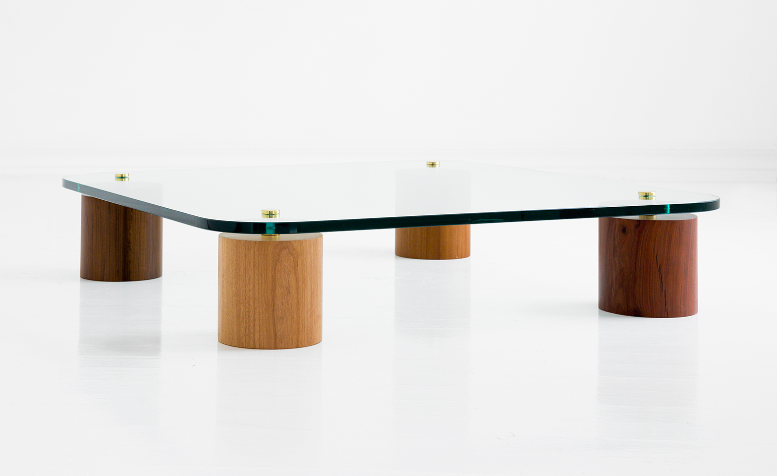
Leandro Garcia's simple but sophisticated approach to architecture earned him a well-deserved spot in this year's Architects' Directory. His furniture design is equally articulate – a prime example being the Tocos coffee table, pictured, released during this year's São Paulo Design Weekend.
Drawing inspiration from tree stumps (the word 'tocos' means stumps in Portuguese), Garcia has crafted robust, cylindrical table legs out of four types of Brazilian hardwood – tauari, ipê, imbuia and cabreúva. A thick slab of transparent glass, raised by slender metal spacers, serves as the tabletop and allows a full view of the legs. Its rounded corners cleverly counter the impression of bulk.
Sturdy yet elegant, Tocos adds to a growing furniture collection that Garcia hopes to produce and sell on a broad scale.
Photography: Ricardo Perini
Writer: TF Chan
Hot desk
25 August
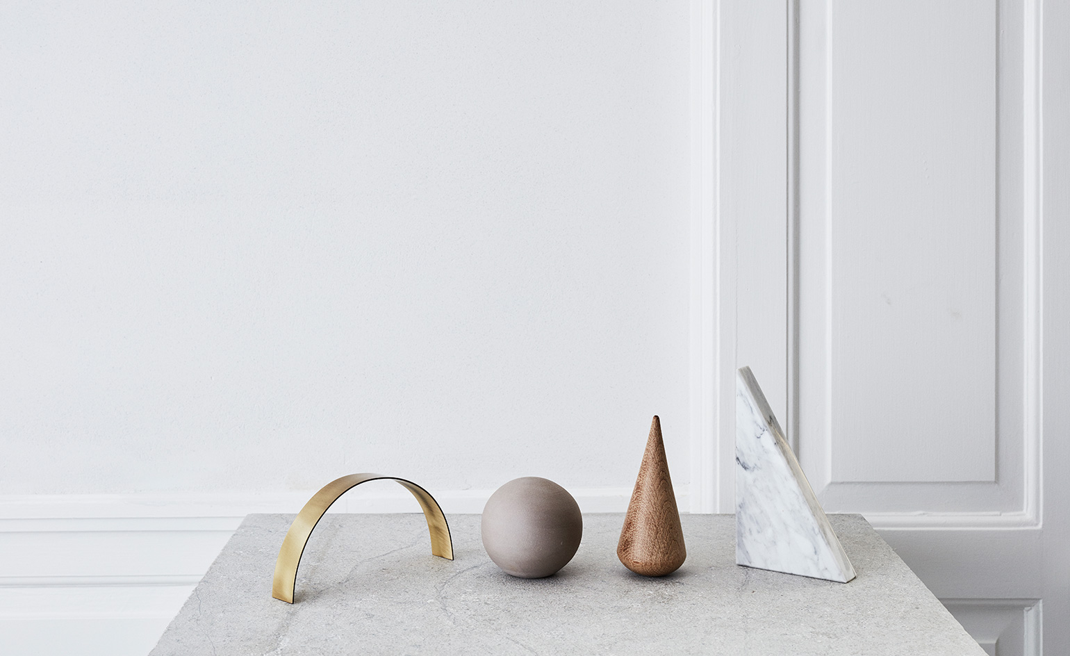
Copenhagen based Kristina Dam Studio's sculptural ornaments are not your average paperweights.
Described as 'a source of inspiration you can rearrange and use every day', the four-piece set comprises a globe of smooth stoneware, a triangle bookend in marble, an upturned wooden cone (purely decorative), and an elegant brass arc, all rendered in an understated Scandinavian palette.
These miniature marvels, along with the rest of Kristina Dram's architectural, geometric AW 2016 collection will show at Maison et Objet this September.
Photography: © Kristina Dam Studio 2016
Writer: Elly Parsons
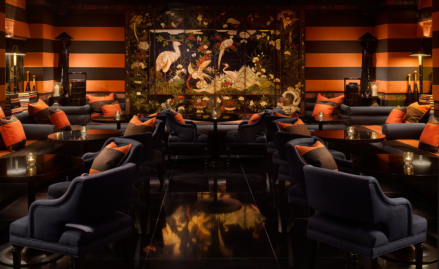
Tokyo drift
22 August
Unwind with a Chai Tea Martini at the newly renovated Blakes Below in South Kensington, designed by Anouska Hempel with an oriental flair. Tucked beneath the world's first 'luxury boutique hotel', Blakes, the new basement continues the hotel's grand tradition as a place to see and be seen.
An opulent east-meets-west theme characterises the intimate two-room space, where the atmosphere is intensified by a live pianist or world-class DJ, depending on the evening.
Enjoy London's best kept secret by becoming a member, as it's strictly friends and guests only from Wednesday to Saturday. Or rent the whole space for a private event from Sunday to Tuesday. Either way, be sure to try the soft shell crab tempura from the bar menu, handcrafted by the hotel's renowned chefs.
Writer: Elly Parsons. Photography: Will Pryce
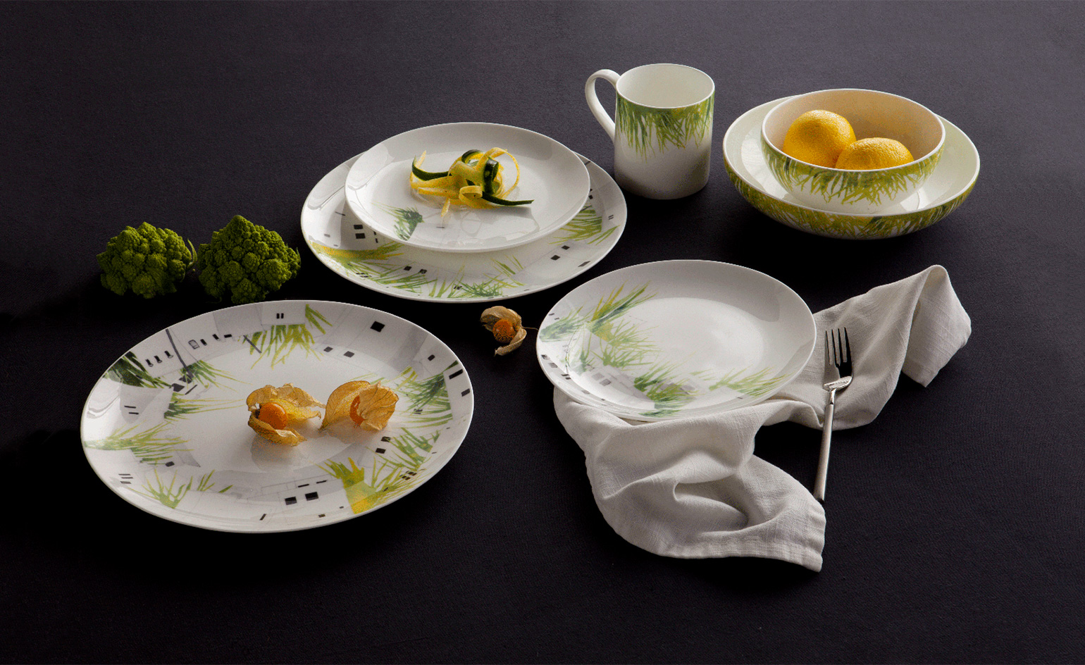
Totally stoked
19 August
Stoke on Trent is the historical home of the British ceramics industry, and it's where design-led pottery brand 1882 Ltd was established in 2011 by relatives of the storied Johnson Brothers tableware designers.
This summer, they've asked Lindsey Adelman to add a grassy, fauna trim to their quality pots. 'I love the look of plants overtaking their surroundings, particularly architectural structures,' she says. 'I wanted to explore a way of taking these three-dimensional environments and creating real items that can be lived with.'
The resulting range - quirkily named 'Power Plant' - marries the longstanding legacy of Stoke ceramics, with Adelman's school of New York urbanism, and her fiercely feminine touch.
Writer: Elly Parsons
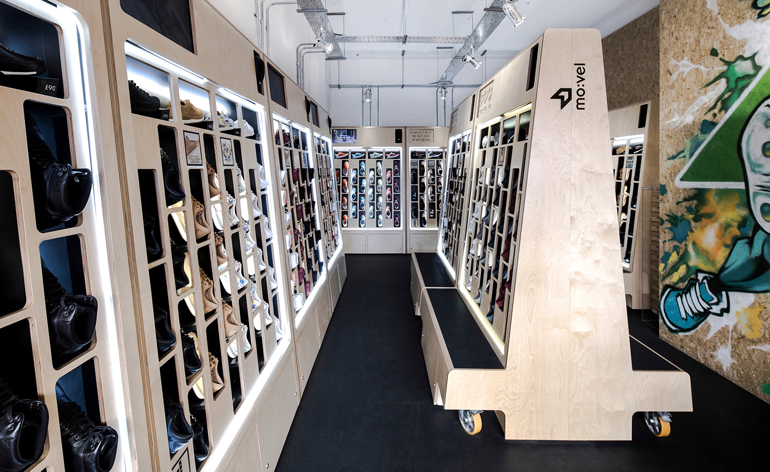
Fancy footwork
18 August
Fleet-footed Brighton-dwellers will be thrilled this summer, thanks to the opening of 'urban shoe' start-up Mo:vel in the Lanes area – where the emphasis is firmly on fast-paced service and unfussy transactions.
Designed by Moxon Architects, the brand's debut shop is storeroom free. All available shoes are out on display, meaning shop assistants can remain on the floor (which is rendered in stylish black recycled rubber). To prevent things getting untidy, Moxon developed modular plywood shelving with 'pick'n'mix' style openings, from which the trainers are neatly dispensed.
A backdrop of custom graffiti on an exposed chipboard base completes the raw-meets-refined look, achieving the 'fresh and youthful' brief Moxon were tasked with.
Writer: Elly Parsons
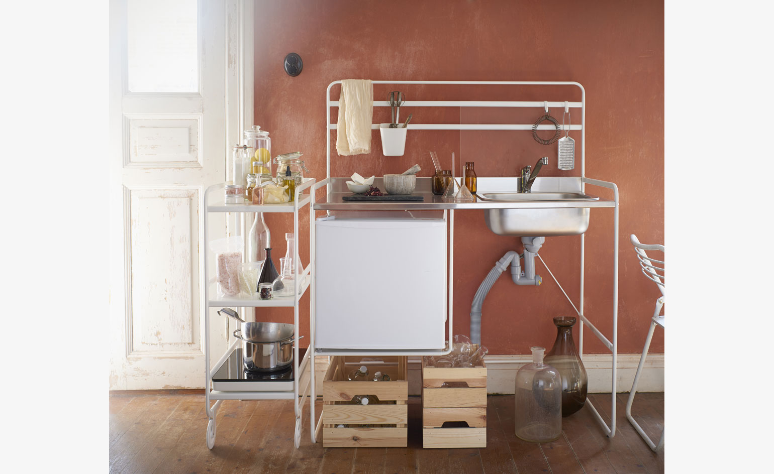
Ikea's moveable micro-kitchen
17 August
It's no secret that we live in a dreadful age for affordable housing, especially in urban hubs like London and its satellites. And a happy melding of skyrocketing rental and purchase prices and stagnating wages means that space is of an increasing premium.
Ikea's existing 'PS' ranges have gone some way to making the most of small spaces, but the Swedish behemoth has taken this ethos to the next level with 'Sunnersta' – a miniature, portable kitchen.
And while the kitchen may seem Lilliputian, the neat, utilitarian set-up features a small unit with worktop and sink, as well as space to customise with a fridge, trolley and induction hob. What's more, the basic iteration costs a paltry £99 – around £2,800 cheaper than the average UK kitchen, by Ikea's estimations. The additions are similarly budgeted – the 'Tillreda' hob is £35, the fridge £69.
Austerity aside, 'Sunnersta' is also recommended as a temporary solution when renovating, or an easy install for an office kitchen.
Bigger, it seems, isn't necessarily better.
Writer: Tom Howells
A heavy-duty new range by Da a is poetry in motion
16 August
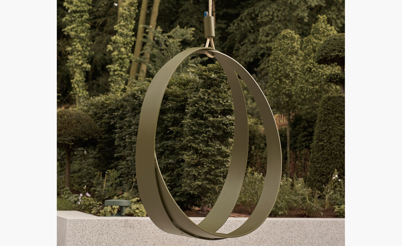
Launched in Lecce, southern Italy, in 2015, design brand Da a (which translates as ‘from to’) follows a simple principle: to create furnishings using the tools and techniques traditionally employed to make heavy-duty machinery.
With a growing collection of indoor and outdoor furniture and accessories designed by a healthy roster of young Italian designers, the brand experiments with old manufacturing processes to bring to life new design ideas. Its latest collection includes the ‘Ring-O’ swing (pictured), a whimsical but technically accurate piece by Saverio Incombenti.
Featuring a hand-welded, curved metal frame, the swing is essentially composed of two intersecting metal rings suspended by a jute rope. The Milanese industrial designer drew inspiration from his penchant for geometric shapes, resulting in a minimal nest that offers the body a few moments of blissful escape.
Writer: Rosa Bertoli. Photography: Phil Dunlop
The Twonky
15 August
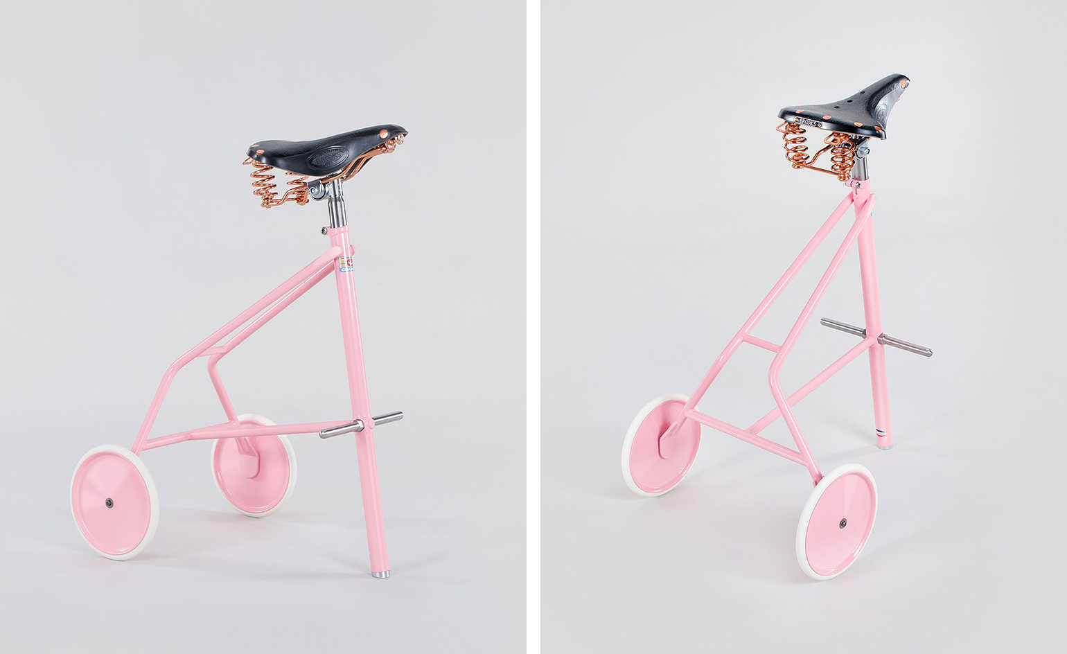
Milton Priest's furniture more interested in sculptural form and provocative design than aesthetic balance and traditional forms. Hence the charm and intrigue of the French studio's latest piece, The Twonky, which takes the steel frame of a bike stool, a Brooks B67 leather saddle with coper springs, and a wheel base to create an industrial yet quirky stool. Part sculpture, part furniture, it is entirely whimsical.
Photography: Courtesy of Milton Priest
Writer: Sam Rogers
Make a racquet
11 August
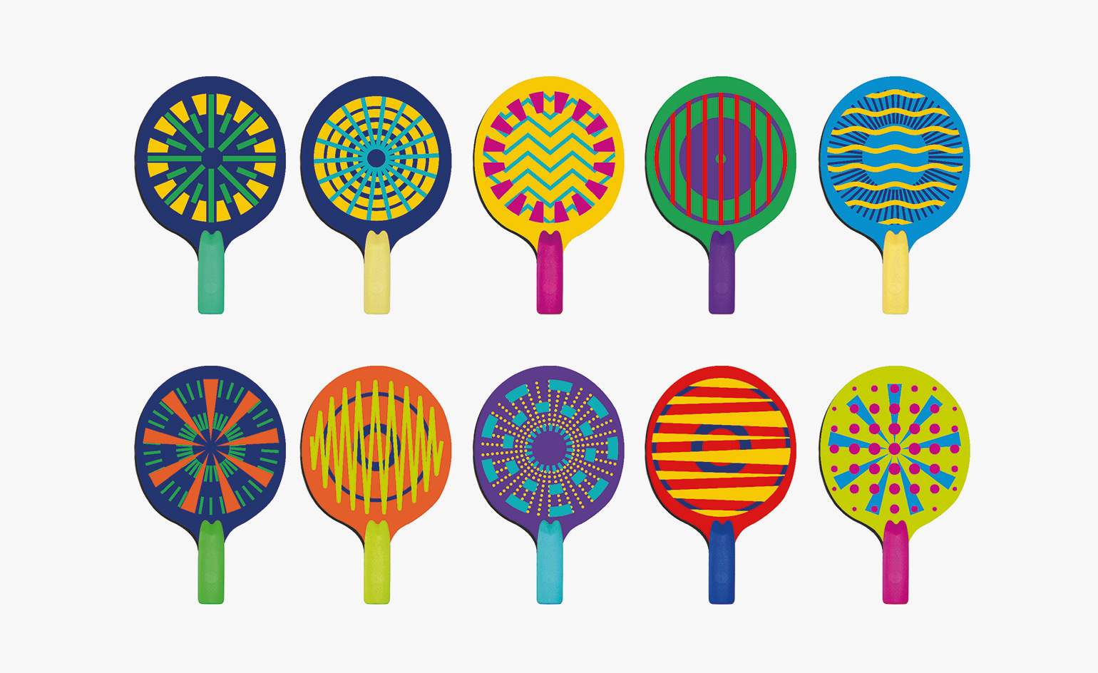
'It’s high speed, energetic and nail-biting,' says International Table Tennis Federation's Steve Dainton about a dynamic new spin-off version of the sport, Table Tennis X, which launches this week at Rio's Olympic Park.
With a visual identity created by Brand Union, the aim is to reach a new generation of players – the ‘always-on' audience, as they've been dubbed. Once engaged, this youthful contingent will be TTX's beating heart, as it rolls out globally in 2017.
Simpler rules, bigger balls and vibrant plastic racquets help to make the game about fun and fast-paced rallying, rather than intricate tactics. It's more accessible than table tennis proper, unrestricted by indoor venues and stuffy umpires, but differs from ping-pong as each set is time-restricted. You can play it wherever there's a table, a stopwatch and a willing opponent. Ace.
Writer: Elly Parsons
Sink into the 'Lagoon' sofa
10 August
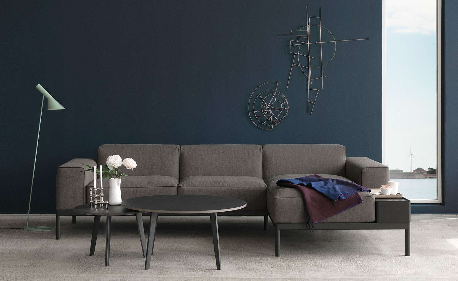
Danish furniture company Erik Jørgensen welcomes a new design duo to the family. Gudmundur Ludvik and Dane Hee Welling, of Ludvik/Welling, make their debut with the 'Lagoon' sofa.
Referencing the Scandinavian principle of 'hygge' (cosiness), the aim was to create 'a lounge sofa to feel at home on – where the entire family can gather and enjoy each other’s company', Ludvik explains.
This laid-back luxury is paired with a minimalist aesthetic. Bordered by an exposed matt-steel frame, 'Lagoon' is available in grey (pictured) or deep blue with contrasting sand-coloured piping, and in a chaise longue version, where the addition of a side table tray signs the sofa off with signature Jørgensen functionality.
Writer: Elly Parsons
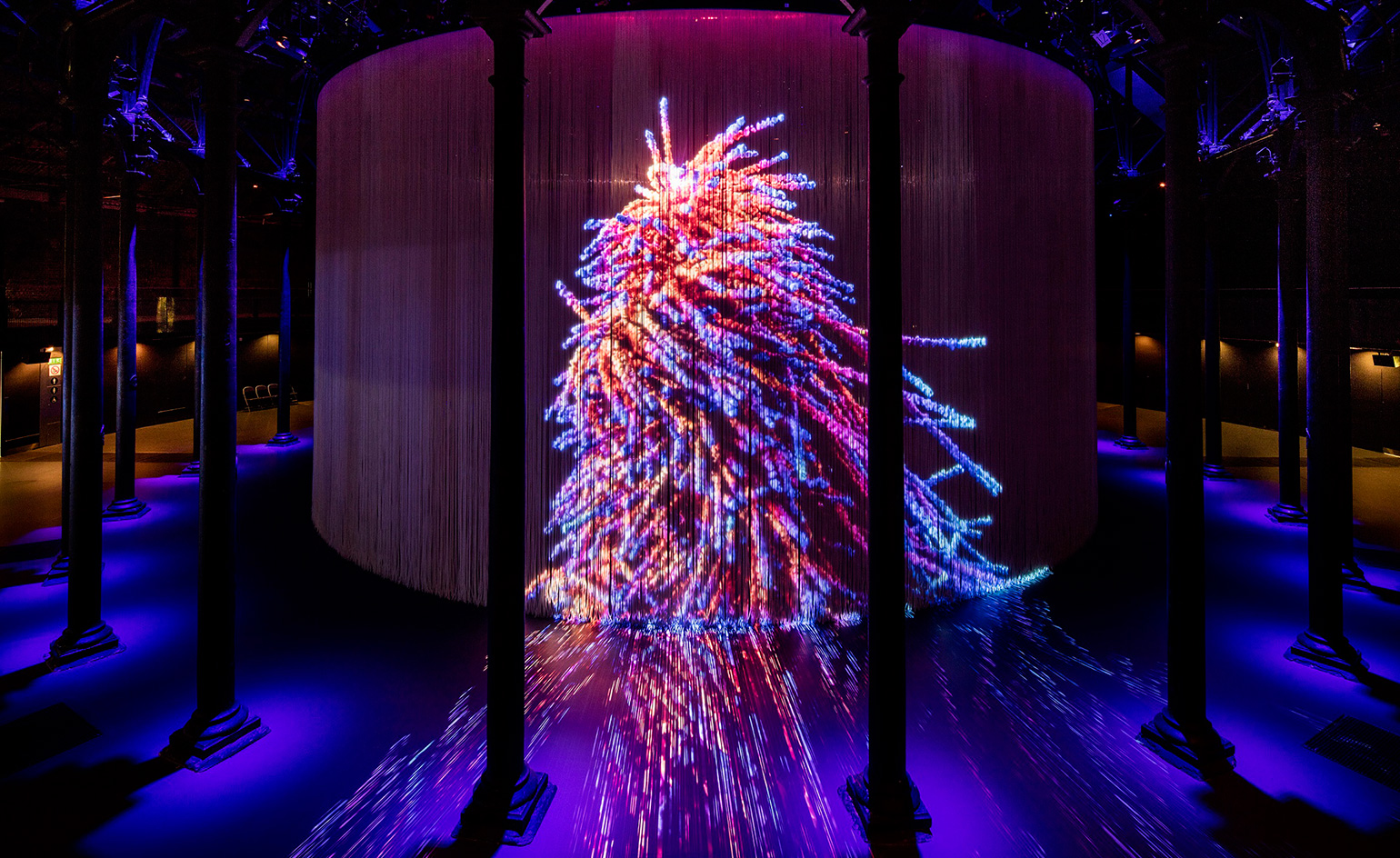
Standing ovation
9 August
Following the success of Ron Arad's Curtain Call at Camden's Roundhouse in 2011, the immersive installation has returned in collaboration with a fresh line-up of artists, including Kutiman, Marshmallow Laser Feast and Universal Everything.
The 360 degree floor-to-ceiling curtain is made from 5,600 silicon rods, suspended from an 18m diameter ring that fills the Roundhouse's main circular hall. The curtain is both a canvas and an imposing sculptural work in itself, providing a unique space in which artworks, digital media and films can be projected in 3D.
Arad invites visitors to 'walk in, penetrate, cross the moving images to get inside the cylinder', where 'you'll be engulfed by images – a captive, but also a creator'. Experience Curtain Call and the corresponding programme of live events until 29 August.
Writer: Elly Parsons. Photography: David Levene
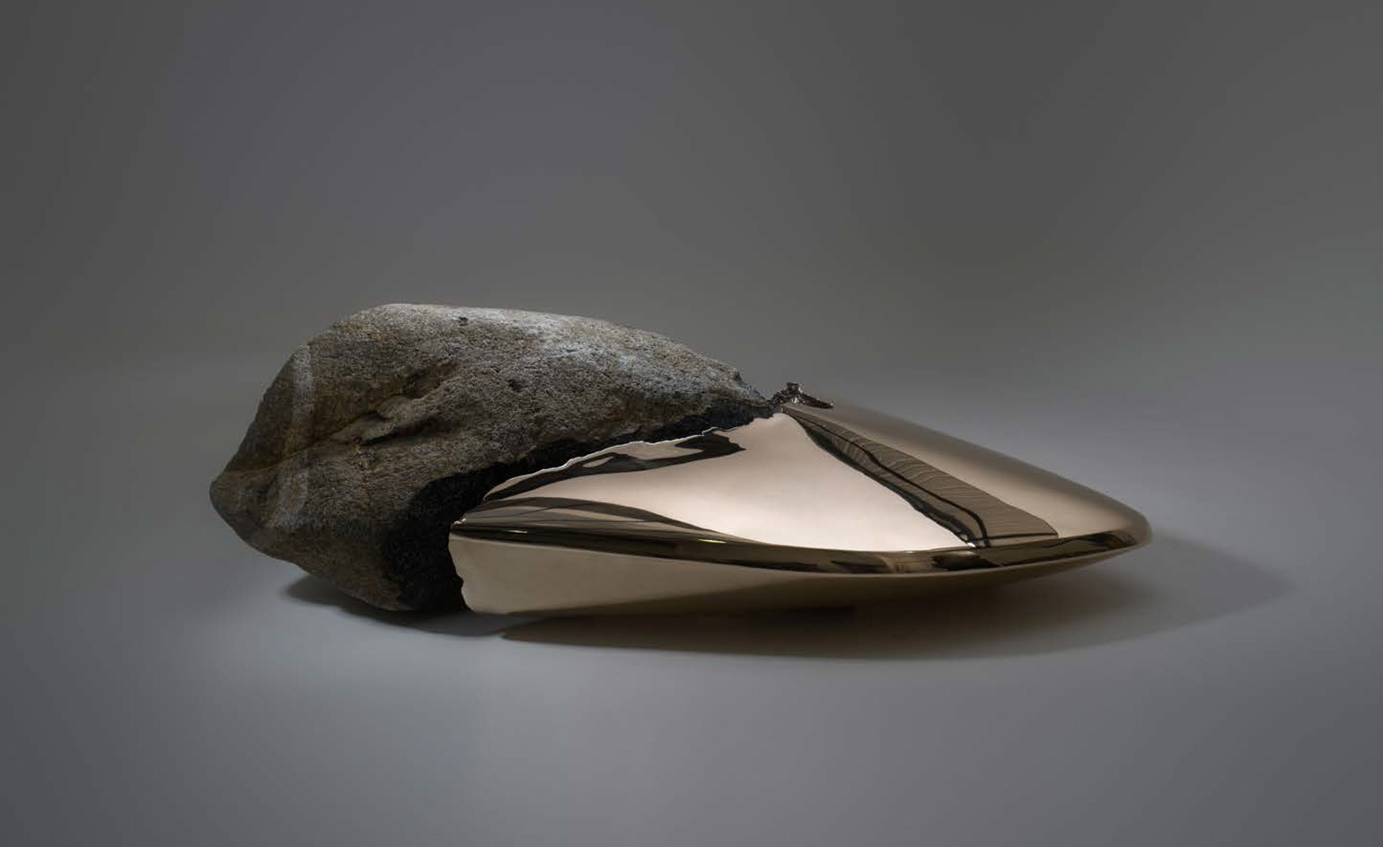
The Lost Fragment
8 August
London design studio Based Upon are master storytellers, as they continue to prove with their second public sculpture The Lost Fragment, installed in London's Berkeley Square until 31 December.
Made from five tons of granite and bronze, the tapered work points towards the Isle of Skye, from where it conceptually and physically originates. The island's lore tells tales of rocks retaining spirits and stories of Skye's people, represented here by the earthy, textural granite, and contrasted by the polished, futuristic bronze appendage.
Together, they make an abstract object of otherworldly quality, made all the more pronounced by its central London setting, where picnickers, commuters and joggers peer on. As Ian Abell – Based Upon's creative director – puts it, the sculpture 'mourns the loss of all that is ancient, the ancestral wisdom cultivated since the origin, stored within a lump of granite 50 million years old'.
Writer: Elly Parsons. Photography courtesy Based Upon
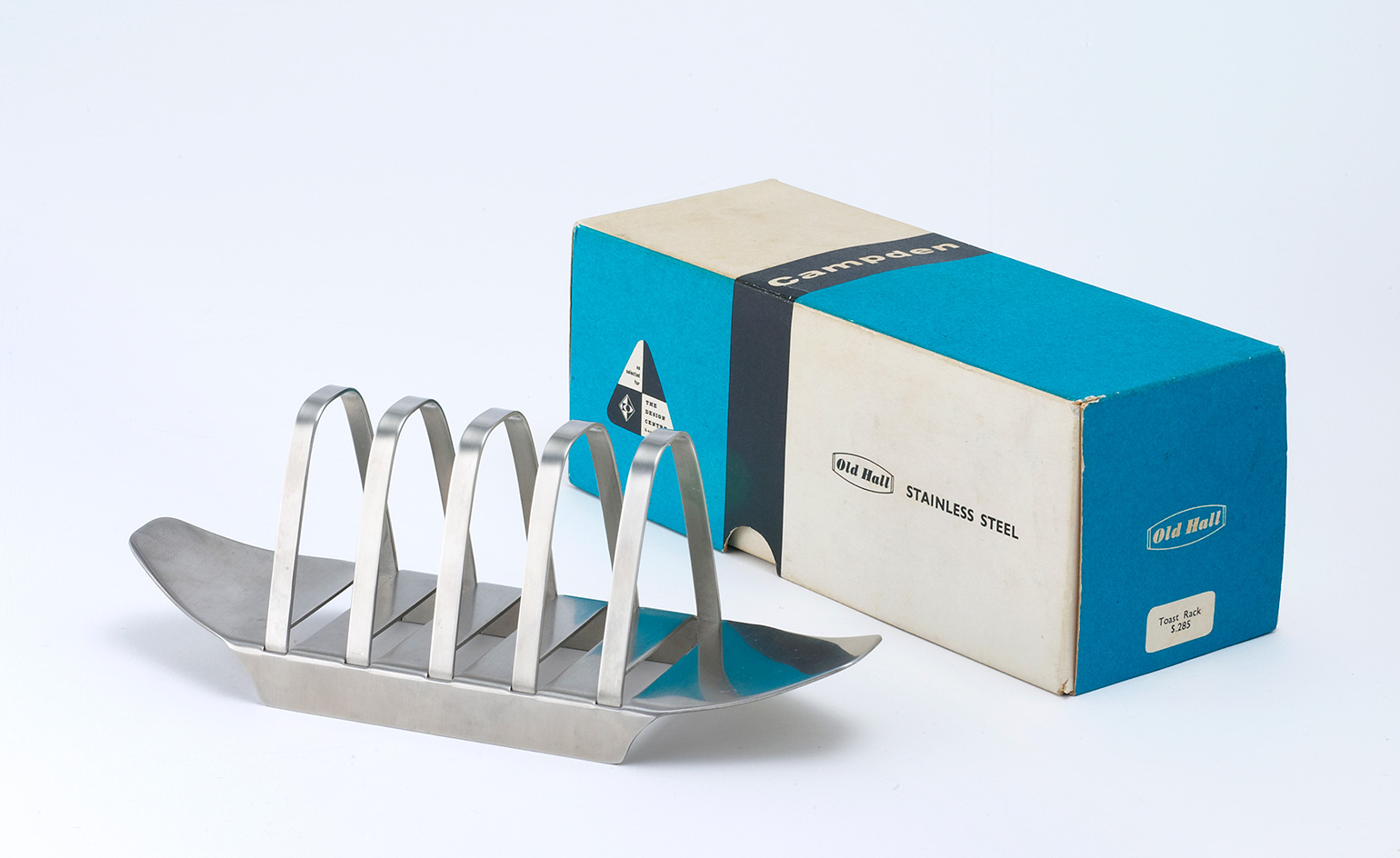
Toast of the town
4 August
Robert Welch's iconic 'Campden' toast rack has decorated breakfast tables since 1956. Now, to celebrate its 60th anniversary, the original rack has been re-released, in a limited edition of 600, priced at £40 a pop.
Aesthetically simple, and made from strong Sheffield steel, 'Campden' epitomises the clean functionality of 1950s design, and claims to last a lifetime. 'All it asks for is a little care', says the original packaging, which has been lovingly remade for the 2016 editions.
The rack, which remained in production until 1982, was lorded for its 'elegant and ingenious construction', and was included in the Council of Industrial Design's 1958 'Design of the Year' exhibition. This year's re-release allows a new generation to enjoy an elevated slice of toast.
Writer: Elly Parsons
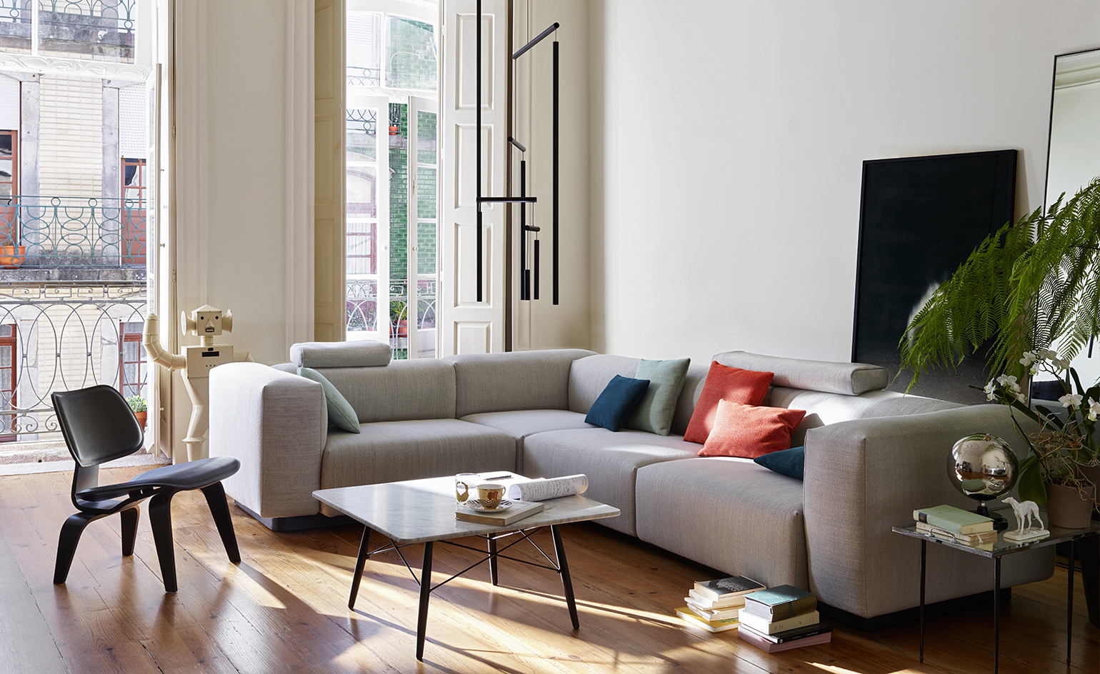
Vitra and Jasper Morrison team up on a modular sofa
3 August
Vitra newest modular sofa comes courtesy of a collaboration with Jasper Morrison.
For the ‘Soft Modular Sofa’ as it is dubbed, Morrison relates his interpretation of what has become a modern classic, with its carefully composed proportions and great comfort. Following his philosophy of ‘super normal’ design, the British designer has expressed the informality of a home environment with his characteristic simplicity and clarity.
Not only designed for comfort – with its various foams and a spring core – and visual aesthetics, the sofa is also made with customisation at its heart. Different sides, corners, central elements and a chaise longue are available, allowing for an individualised experience. With optional elements such as the ottoman and loose pillows, in addition to the wide selection of leather and fabric covers, the sofa functions like an architectural element that can be subtly integrated into any interior.
The 'Soft Modular Sofa' collection is available to buy in the UK from September 2016. Photography courtesy Vitra
Writer: Alix Biehler
Book works
2 August
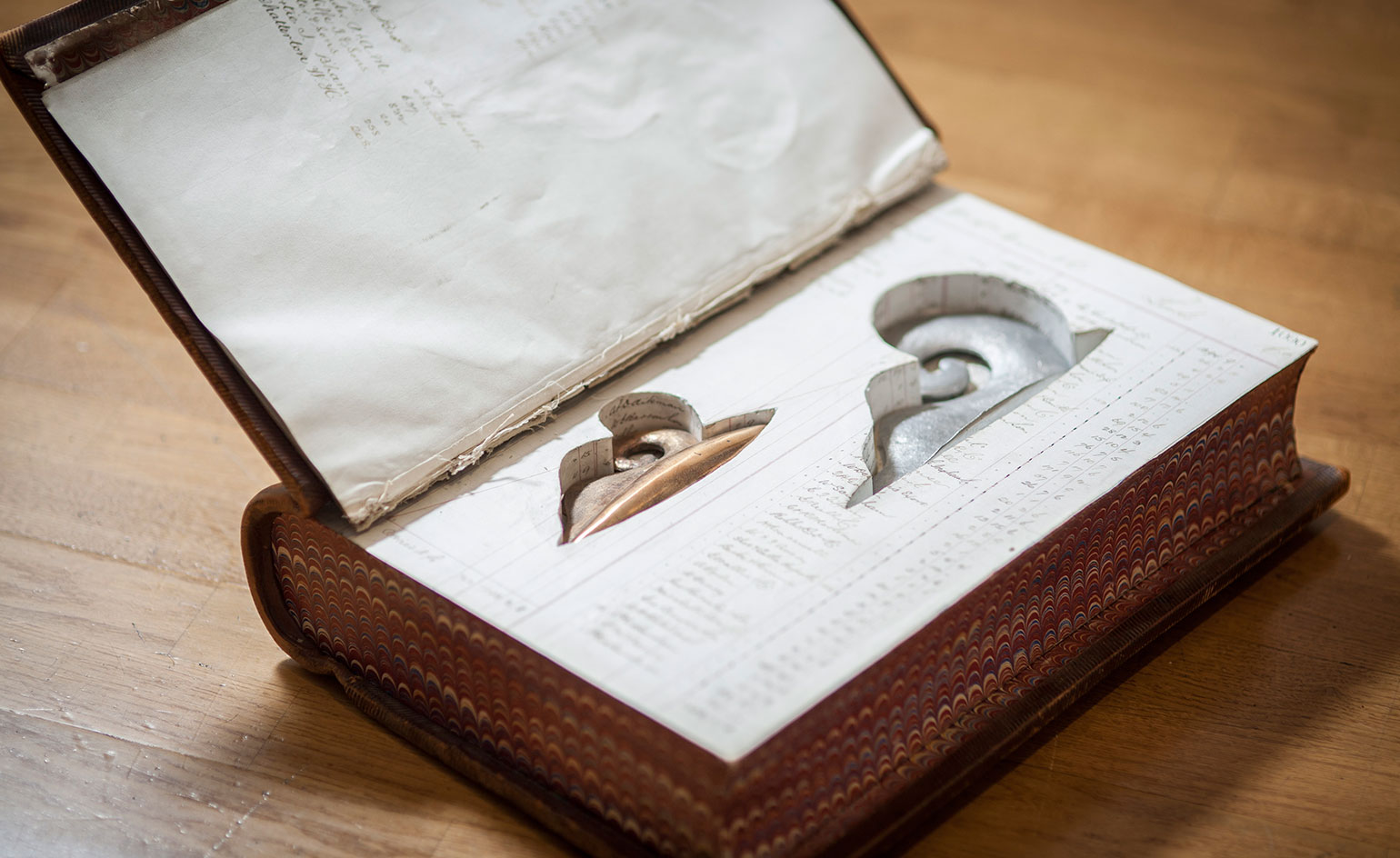
Surprises are in store at antiquarian dealers Harris Lindsay, as Megan Piper presents ‘The Hidden Sculptures’, a new exhibition by Edward Allington.
The collection showcases seven recent ‘book works’ and seven accompanying drawings. Created from antique ledgers that Allington has collected over the past 30 years, his drawings use removed, completed pages of the books as bases for ink and emulsion depictions, while the book works contain concealed sculptures. Motifs in the works reflect his interest in history through rococo-inspired scrolls and imagined forms against the background of once-important numbers and text. The ‘book works’ themselves are presented as historical, through an installation in which gloved visitors open the books to reveal the sculptures within.
‘The Hidden Sculptures’ by Edward Allington is on view until 5 August. For more information visit the Megan Piper website
Writer: Elana Wong
Smooth sailing
1 August
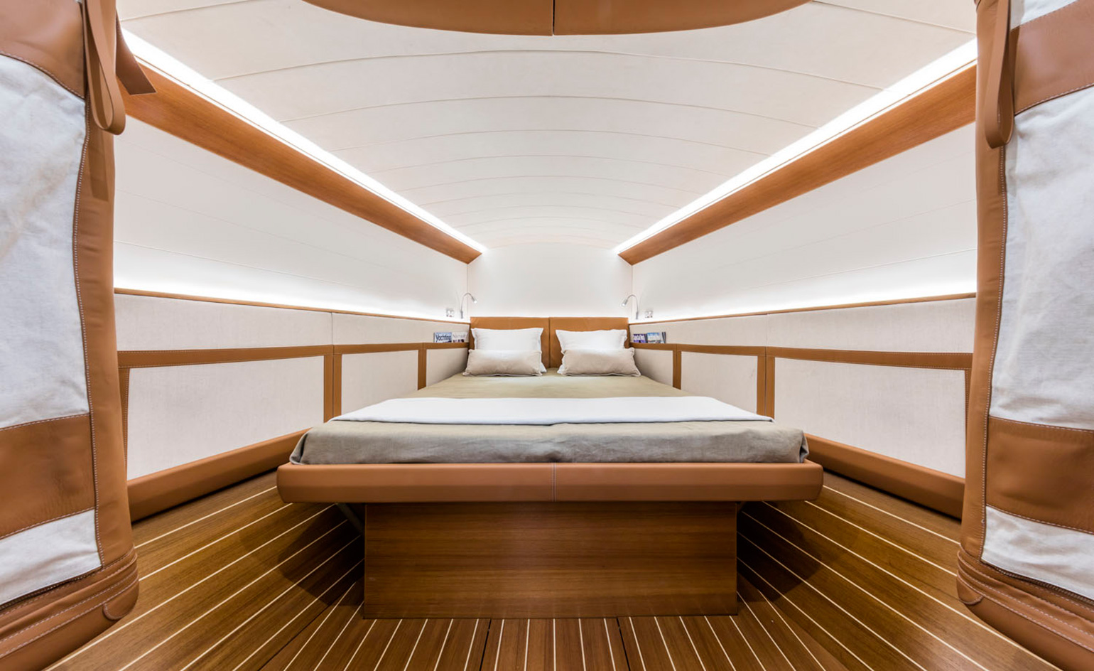
Combining comfort and performance, style and practicality, the ClubSwan 50 is one serious sailing vessel, and the newest luxury yacht from Finnish shipyard Nautor’s Swan. Italian automotive specialists Poltrona Frau ensure the interiors are just as stylish as the shell.
What the cabin lacks in size, it makes up for in sophistication. The super-light carbon headboard and bed frame sport a linear design and are upholstered in Frau leather. This muted, textural feel continues throughout the ship with light colours and a mix of high quality canvas trims that line the berths, tables and fold-down seating.
Kurt Wallner, director of Poltrona Frau’s Interiors in Motion division adds, 'the premium boating segment today offers great business opportunities that we are in a position to seize due to our design experience and outstanding craftsmanship, which means we can create fully bespoke interiors'. Winning qualities that make ClubSwan 50 a champion inside and out.
Writer: Elly Parsons

A Logo for America
29 July
The famous electronic billboards of London’s Piccadilly Circus are set to project a different kind of message. On the 28 July, Chilean artist Alfredo Jaar premiered the third large public screening of his piece A Logo for America. The screenings are accompanying ‘Under the Same Sun: Art from Latin America Today’, the second exhibition of the Guggenheim UBS MAP Global Art Initiative, currently being hosted at the South London Gallery.
A Logo for America originally debuted in Times Square, New York City, in 1987 and was seen by some as provocative for its explicit exploration and challenge to the unequal power relations and socio-political divisions arising from globalisation. The work features the line ‘This Is Not America’ across an outline map of the USA, confronting the ethnocentrism of the US, and its habitual claim to the entire American continent.
A Logo for America will be screened daily until 31 July.
Writer: Elana Wong. Photography: Mark Blower. Courtesy Solomon R. Guggenheim Foundation and the South London Gallery
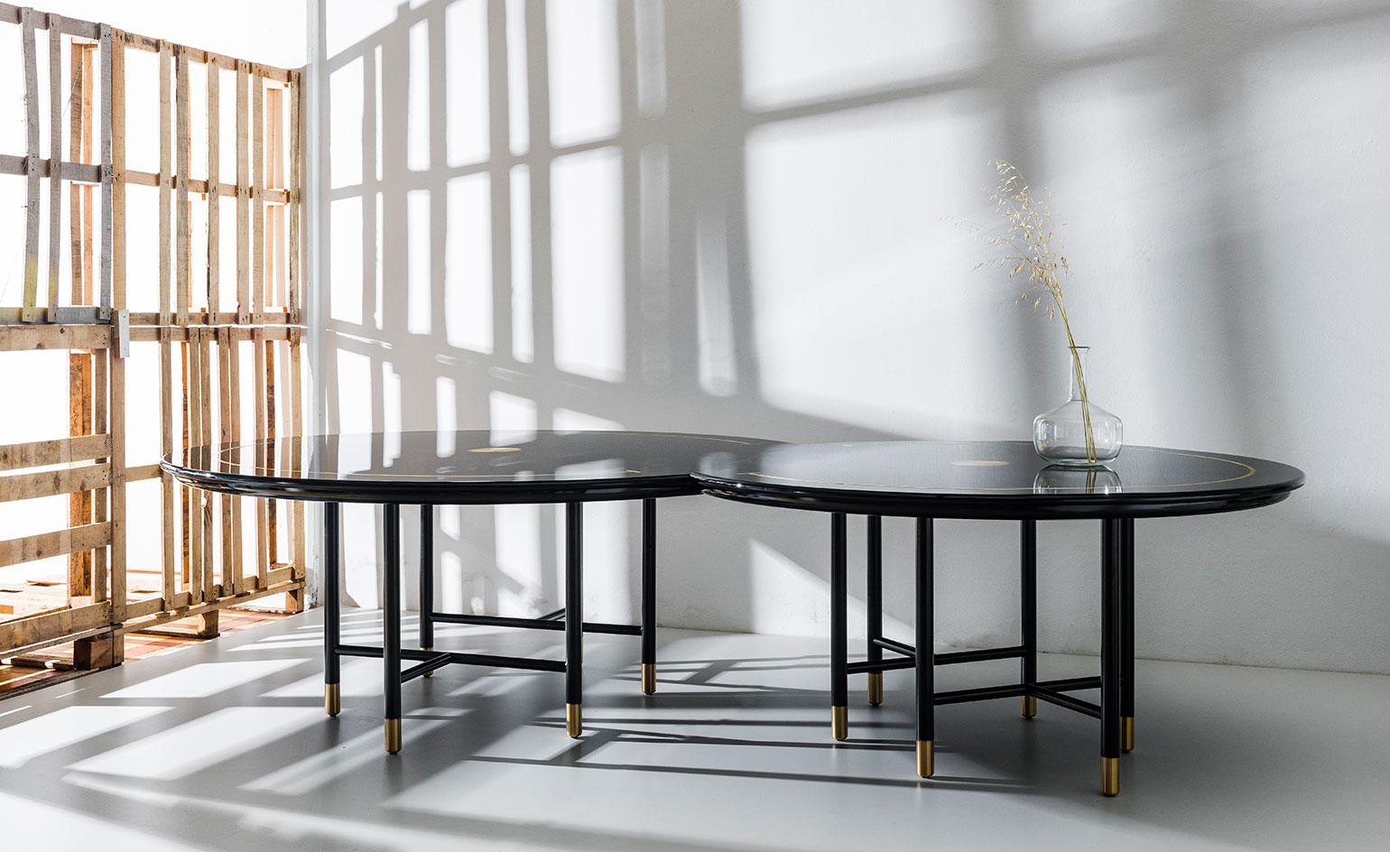
Table 8
27 July
Beirut-based designers david/nicolas describe their aesthetic as 'retro-futuristic'. With geometric shapes, decadent materials and playful accents, they have found success in collaborations with Nilufar, Art Factum, Agresti, Moooi, Vista Alegre among many others.
Last year the duo started their own line of ultra high end furniture, made to order by the finest Italian craftsmen. 'Table 8', pictured, is the newest addition to this studio line. This dining table comprises two circular segments – joined by embedded magnets at the straight edges – which together resemble the number 8 when viewed from above. The table top, made of black lacquered wood and inlaid with brass, feels substantial and opulent; whereas the cylindrical steel legs, capped with brushed brass, are light and elegantly proportioned. With its unique construction, Table 8 allows for varying configurations of diners, and also makes for an excellent conversation piece.
Photography: Emanuele Tortora. Writer: TF Chan
Waynetopia
25 July
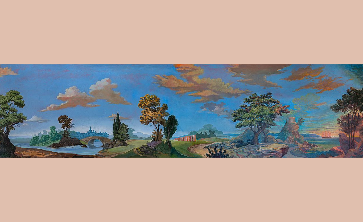
For those who may not be familiar with the whimsical fantasy world of the American painter/illustrator/set designer Wayne White, the visual pioneer has made one of his more intimate works widely available, thanks to a collaboration with Flavor Paper. ‘Waynetopia’ is a classical wallpaper mural featuring a design that White originally painted on the walls of his home in Los Angeles. Digitally captured so that the design captures every detail and texture, including cracks and unevenness from the original walls, the work depicts a continuous scene ranging from a tropical paradise to lost ruins. ‘I wanted to capture the elegance and fantsy of 19th century wallpaper murals, and the fun of taking a trip,’ says White. ‘I love painting the landscape and then stepping into that world, if only with my eyes.’
Waynetopia won this year’s 2016 ICFF Editor’s Award for Best Wallcovering. For more details, visit Flavor Paper’s website
Writer: Pei-Ru Keh
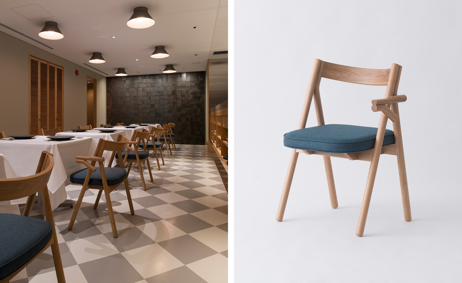
Suitable seating
22 July
Japanese design firm CASE-REAL has found a way for space-efficient elegance with their new chair for Restaurant Saisondor.
Located along a main road in Fukuoka, Japan, the French restaurant required a chic, dust-enduring seating design that maximized its limited space. CASE-REAL took to this task with a casual style of clean lines and neutral, sophisticated colours. The dining chairs furnishing the restaurant are a prime example of this.
Manufactured by E&Y, the chair is unique for its one-arm design, and made of two wooden integrated frames. The one arm ensures the chair is ergonomic for diners in the small space, requiring minimal furniture movement when standing up and sitting down. ‘Due to the limited size,’ says CASE-REAL’s Koichi Futatusmata, ‘there was a need to keep that tables compact, and therefore this chair was designed to suit its needs.’
Photography: Hiroshi Mizusaki. Writer: Elana Wong.
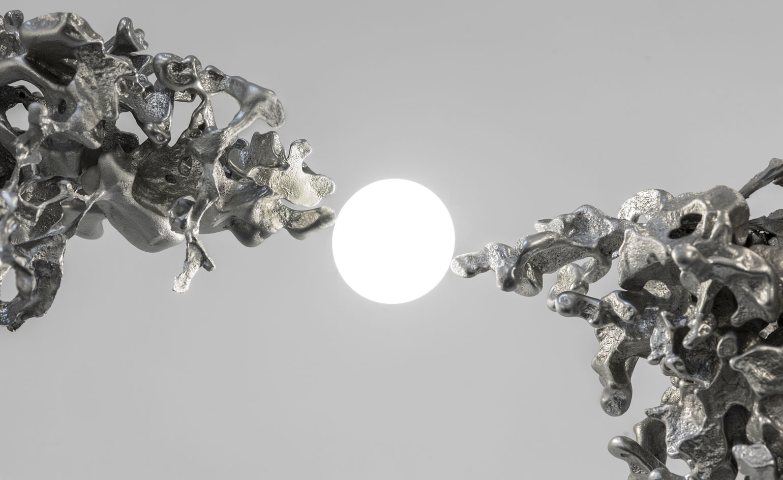
Lighting theatrics
21 July
Dynamic lighting specialists Bocci are taking their theatrics to the Barbican for this year's London Design Festival.
Designed by the Canadian company's creative director Omer Arbel, Bocci has created a colossal installation on the ground level of the brutalist building. Made of 300 free-poured aluminium forms, the abstract sculpture will appear to float from the ceiling via thin cables.
Titled '44,' the chandelier will remain in the Barbican foyer from 14 September until 18 April next year.
Photography: Omer Arbel. Courtesy Barbican x Bocci. Writer: Sujata Burman
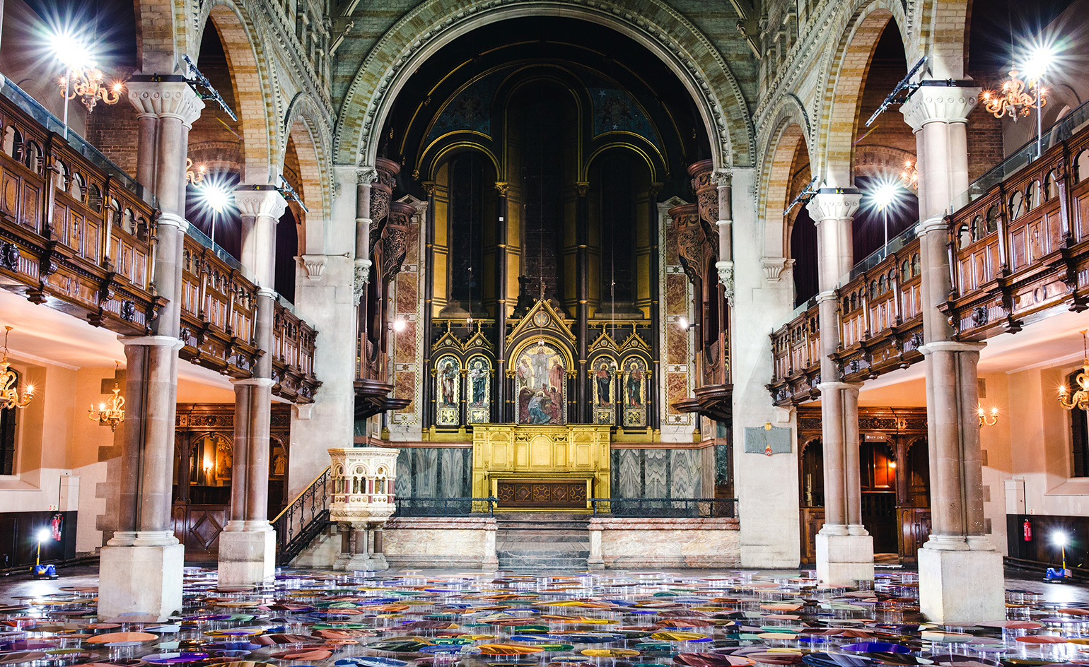
Place of reflection
20 July
Liz West shines a new light in the historic St Mark’s building on Mayfair's South Audley Street this July. The former church has been transformed by her new site-specific installation Our Colour Reflection.
This temporary intervention, a striking display of West’s signature colour-drenched light work, is part of a wider initiative by private property group Grosvenor Britain and Ireland to open up the space to the public before it undergoes reparation and restoration into a new retail space, restaurant and art-minded community hub.
Our Colour Reflection investigates the relationship between colour and light in realising unique compositions and spaces, creating a conversation between the viewer and the church. Made of more than 765 mirrors all set at different heights, the piece reflects up onto different parts of the historic architecture, revealing sections of the interior that would otherwise go unnoticed.
Writer: Elana Wong
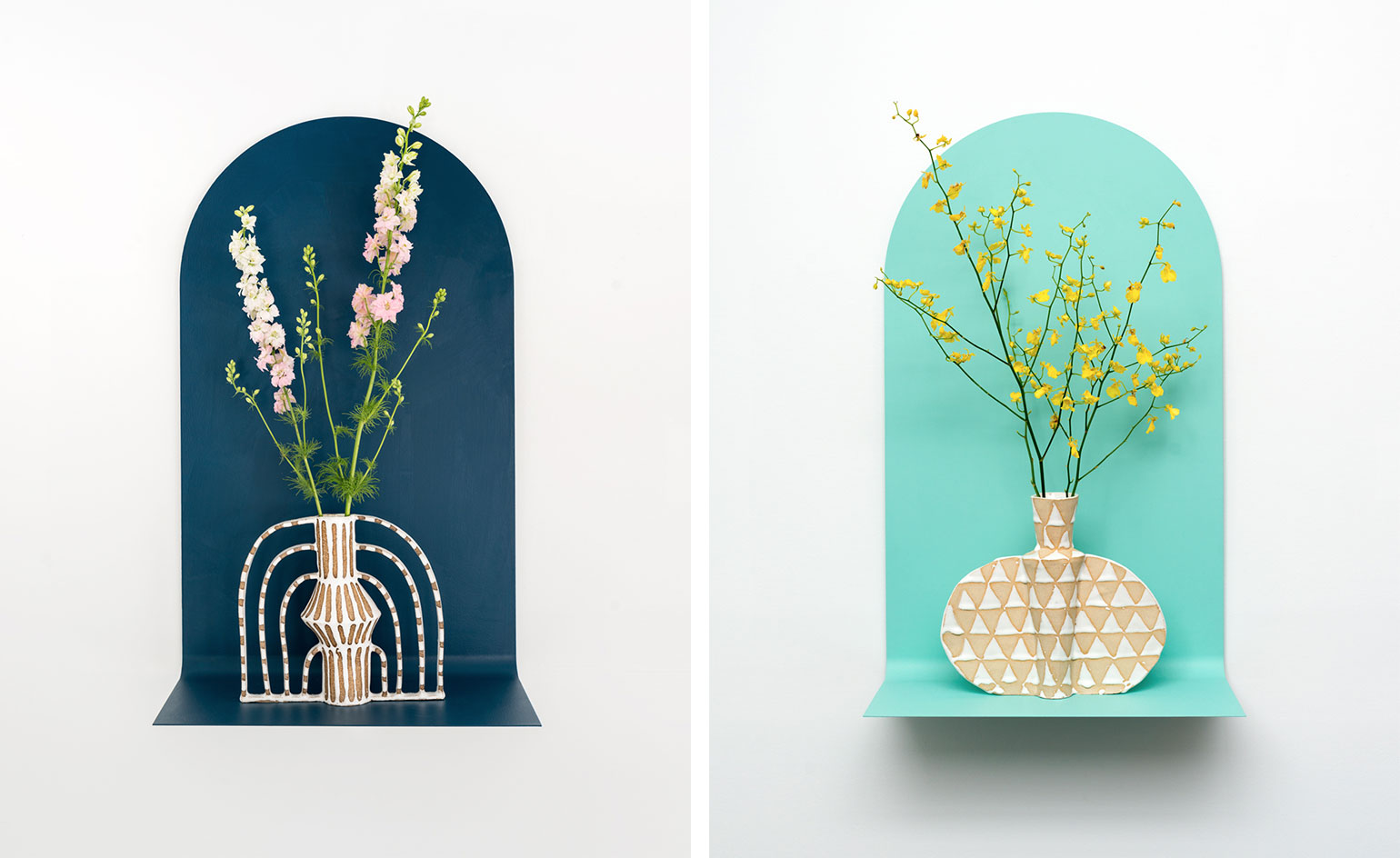
Strike a pose
19 July
Somewhere between photography and ceramics, Brooklyn-based artist Emily Mullin's sill-life sculptures have a uniquely absorbing presence. So much so that new NYC gallery Sunday Takeout has extended her showcase, Vachina, until 24 July.
Drawing upon an array of influences - 1700s court dresses, the asymmetrical nature of early Cycladic vessels and ancient multi-handled Egyptian perfume holders among others - her sill-life sculptures, made of glazed ceramics, sit proudly on curved metal shelves. The painted sheet metal mounts allude to the concept of the cyclorama - the seemingly infinite space used in photography studios that dissolves the line between wall and floor - transforming each shelf into a stage of sorts, and each vessel its own character.
Photography: Harry Griffin. Writer: Sam Rogers
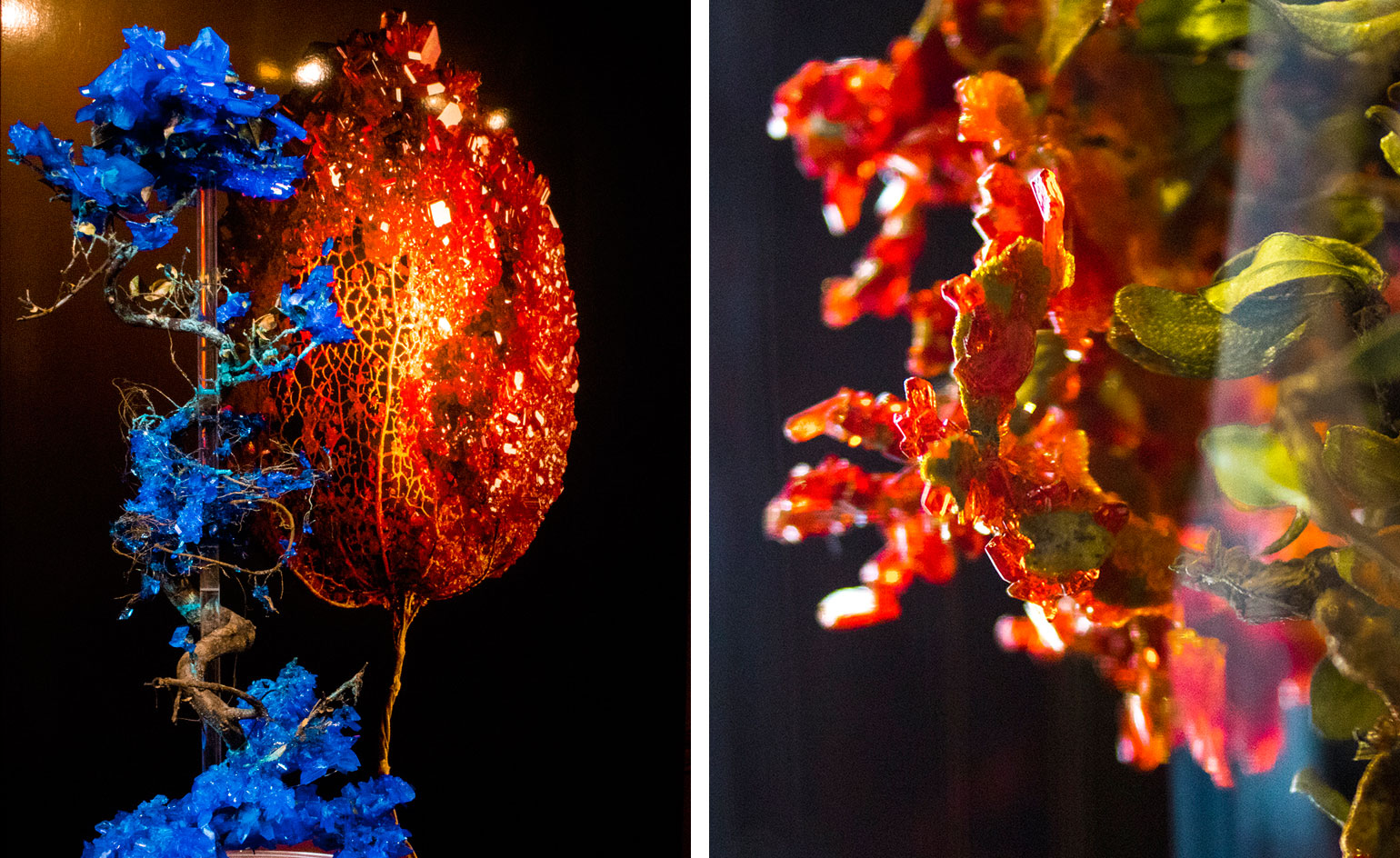
The Sketch forest
18 July
Botanical artist Alyson Mowat is extending the lives of plants with the latest exhibition in Sketch's hallway space.
Titled 'Host', Mowat's recreated forest merges organic with inorganic by encrusting flora with stabilised crystals. Forming sculptures that appear as coral, electric blue and red stones spiral around dark branches, enhancing the natural beauty of the blossoms.
The scientific pieces are accompanied with blooming photographs by Tal Silverman, creating an enveloping garden experience in the creative emporium that will remain on view until 31 August.
Writer: Sujata Burman
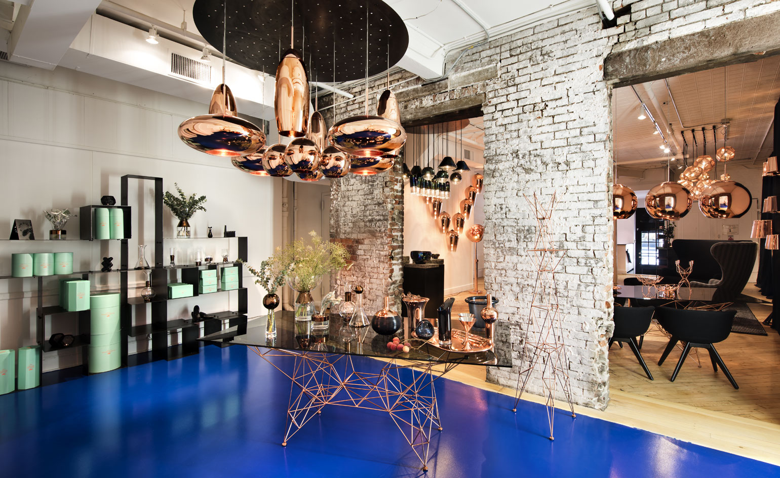
Tom Dixon move to Soho
15 July
Somewhere in between performing on stage as Rough Trade (with our Editor-in-Chief Tony Chambers, no less) and launching a store in Los Angeles, Tom Dixon has also managed to open a four-storey emporium on New York’s Howard Street in Soho. Considerably larger than the first outpost, which operated just a few streets away, the new showroom is aimed at serving passers-by and design professionals alike on this increasingly design-centric stretch. Filled with prototypes, material samples and a rotating selection of furniture, accessories and lighting, the space is as glittering a tribute to Dixon’s work as ever there was one.
Writer: Pei-Ru Keh
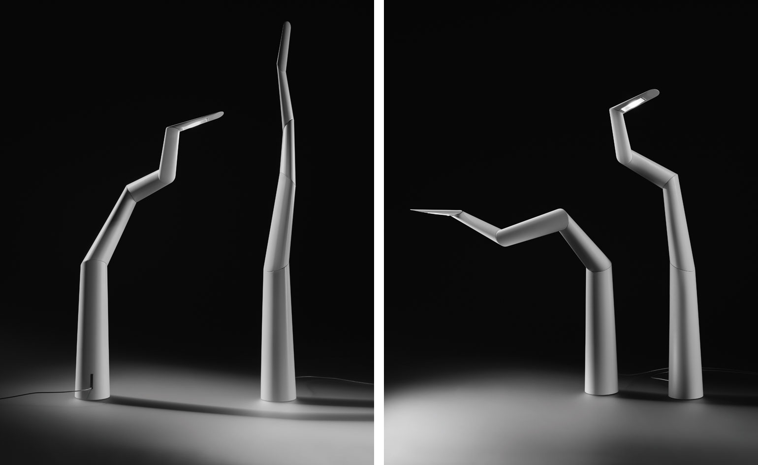
Robotic light
14 July
Taking cues from his own large, kinetic sculpture currently on view outside the Royal Academy, Ron Arad's new 'Spyre' light boasts a similarly robotic energy.
With the scale shrunk down massively, the Corten steel and motors have been replaced with Corian and magnetic joints. The five segments of the ornamental piece move in a disjointed rhythm a la the larger version, as if it naturally wanders in the wind.
The innovative light has been created by German manufacturer Ingo Maurer in an edition of 50, available from the Royal Academy shop, and on view at Ron Arad's summer exhibition at Ben Brown Fine Arts.
Writer: Sujata Burman
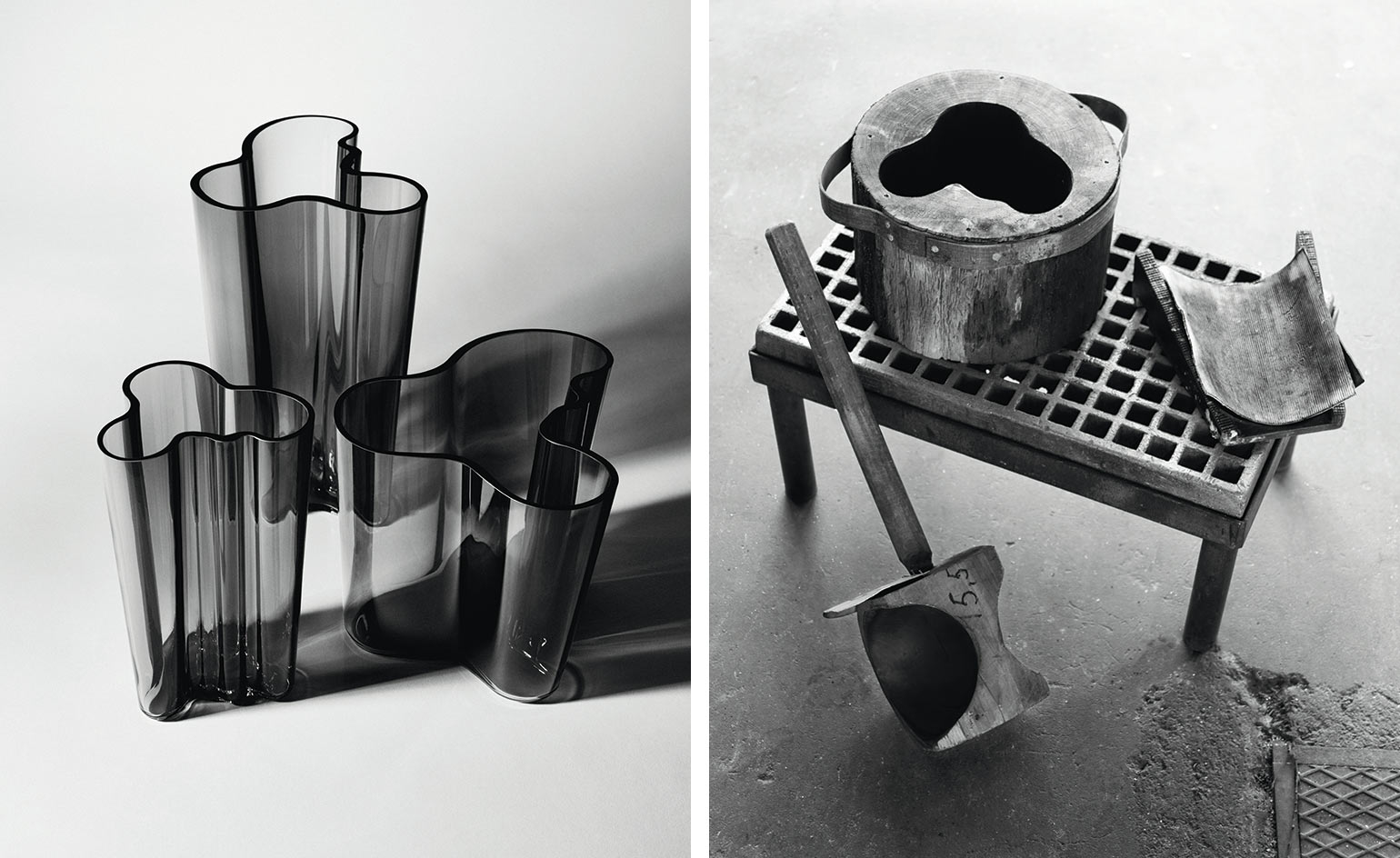
Grey area
7 July
A new colour has been introduced to Iittala's classic Alvar Aalto collection. The sleek, dark grey is available in the most popular sizes of the designer's seminal glassware range. The new hue perfectly complements Iittala's existing autumnal palette, bringing a soft, delicate aesthetic into homes.
This new addition celebrates the 80th anniversary of Aalto’s iconic range, a staple of modern Scandinavian design ever since its creation in 1936. Recognisable for its revolutionary free form, it not only marked a contrasting move away from glass’ traditional geometric tendencies but also allowed the user to decide the object’s purpose.
Individually mouth-blown at the Iittala glass factory in Finland, each vase in the collection is the result of a ten-hour production process. Though Aalto is no longer with us, Iittala continues to share his timeless, organic design.
Writer: Elana Wong
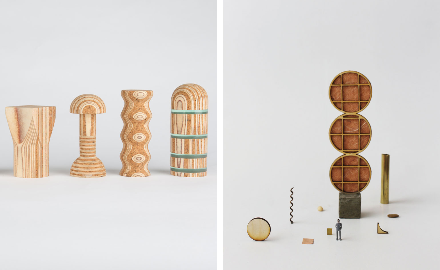
Material play
6 July
Last week saw the first of two installments of the New Designers showcase, a platform exhibition for upcoming design talents from universities across the UK.
Part one focused on contemporary craft and two talents in particular took our interest during the show, mixing materials to create innovative and abstract forms.
Cardiff School of Art & Design graduate Anna Ling, a maker who also specialises in set design, explored Japanese zen gardens in her sculptural 'Monumental' ornaments (pictured right). Inspired by landscape and nature, she plays with scale via different materials such as brass, pebbles and yarn.
Similarly, Theo Riviere, a student at Leeds College of Art, presented his project 'Material Poetry' (pictured left), laminating alternative materials to create patterns in his forms. The whimsical silhouettes of the refined sculptures meld architecture and art.
Part two of New Designers is currently taking place at London's Business Design Centre, running until Saturday 9 July.
Writer: Sujata Burman
Gillick goes underground
5 July
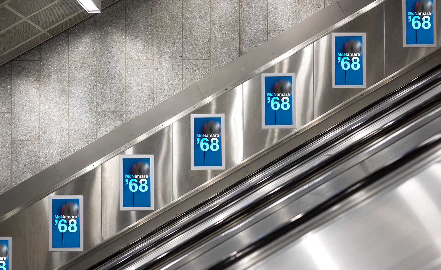
Artist Liam Gillick has been fascinated by the Tube since he was a child. 'It was the architecture and the movie posters that always attracted me most,' he explains. It was this childhood interest that inspired Gillick's longstanding relationship with TfL's 'Art on the Underground' initiative, which he has been contributing to since 2006. For his new project, unveiled yesterday, all 270 stations on the Victoria line have been covered in a series of posters and film installations, titled 'McNamara '68'.
The project takes its name from a film script about the notorious American politician Robert McNamara that Gillick developed in 1992, revolving around underground meetings. For the new series, Gillick filmed original architectural details across the Victoria line – which was completed in 1968, the year that McNamara became head of the World Bank.
Together, the works act as short trailers for a moody detective film, with each clip introducing the 'stars'. Each fictional 'star' is an anagram of one of the Victoria line station names – a mystery for the travelling public to untangle. This supports Gillick's notion that 'the Tube is a space of potential, presentation and scenarios. A semi-public zone for the generation of ideas.' 'McNamara '68' breaks up the Tube's workday bustle; inspiring passengers to think, from platform to pavement.
Photography: Thierry Bal; Writer: Elly Parsons
Clock work
04 July
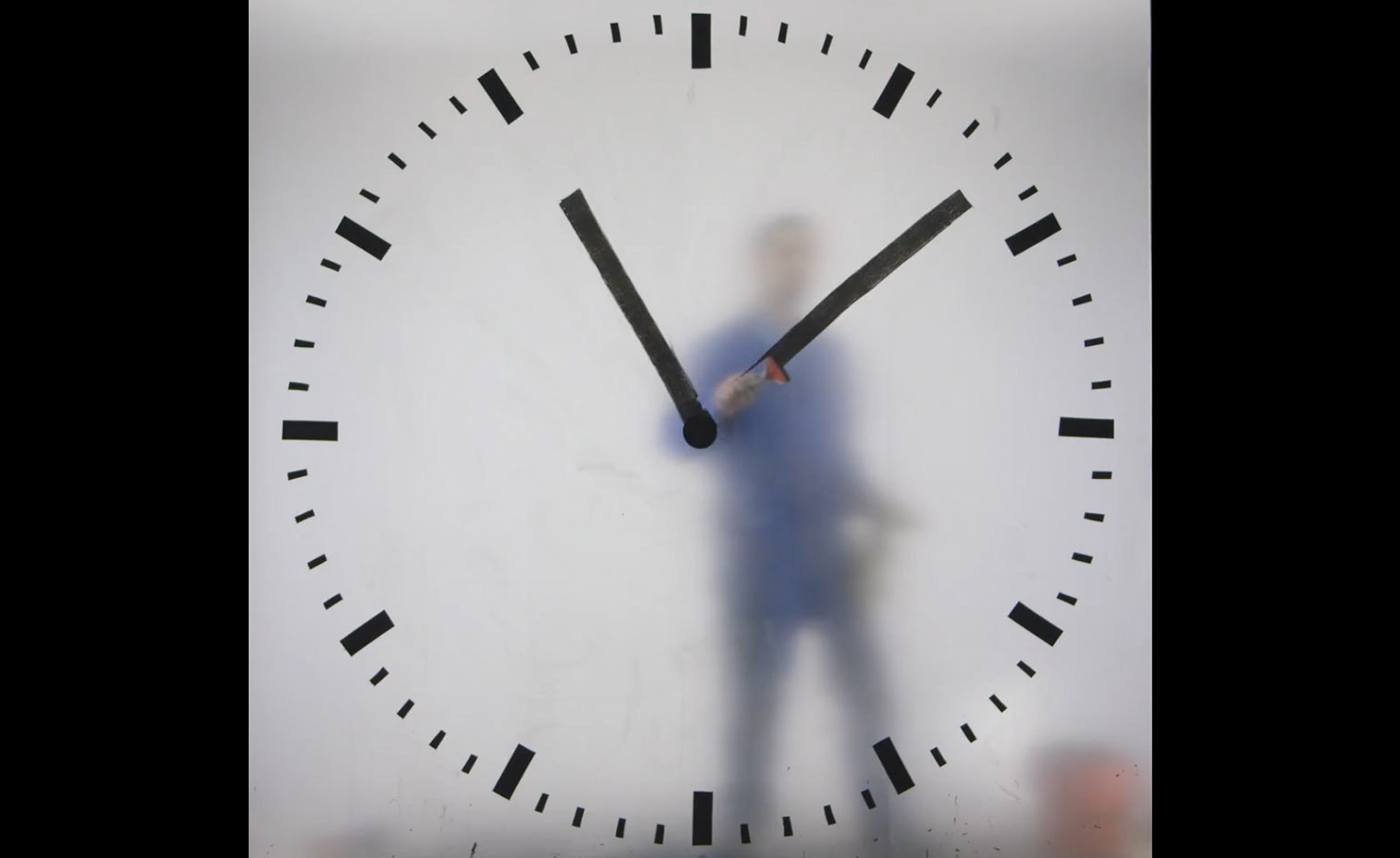
Schiphol Airport in Amsterdam has gained a new clock project from Dutch designer Maarten Baas' 'Real Time' series.
In the film, which took a painstaking 12 hours to complete, a nameless figure (representing an airport employee) paints minute and hour hands repeatedly on the frosted screen of a clock face.
The designer explains, 'Real time is a term that is used in the film industry. It means that the duration of a scene portrays exactly the same time as it took to film it. I play with that concept in my "Real Time" clocks by showing videos where the hands of time are literally moved in real time.'
The imposing installation hangs down over Lounge 2, and replaces the Dutch symbols of tulips, clogs and windmills that previously hung in its place.
Every year, 15 million people travel through the lounge, hosting passengers from all around the world. As well as providing a contemporary focal point, Baas' innovative timekeeping installation might even prevent that last minute departure gate dash.
Writer: Elly Parsons
Office hack
29 June
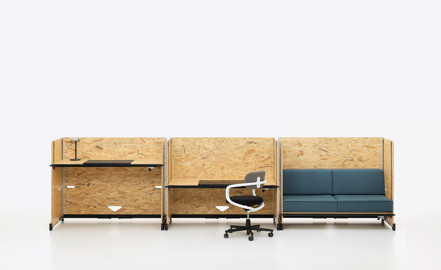
Konstantin Grcic, Wallpaper's joint Designer of the Year 2015, has teamed once again with Swiss innovators Vitra, to create a versatile, industrial office desk solution.
With 'life hack' firmly placed in the internet's vernacular, Grcic introduced the concept of his own office 'Hack' back in 2014 at Orgatec, where it impressed with its raw, unfinished aesthetic and eco-conscious construction. Now the desk system is available to order in the UK.
Adaptability has been key to the project from day one, reflecting the attitude of the young tech companies Vitra cite as their target audience. Each 'Hack' unit forms an autonomous yet elegantly linking element, while the height adjustment feature offers standing, sitting and seating options. The robust wooden partitions provide distinguished spaces for solo projects and group working, as well as the odd moment of modern-office relaxation.
Writer: Elly Parsons
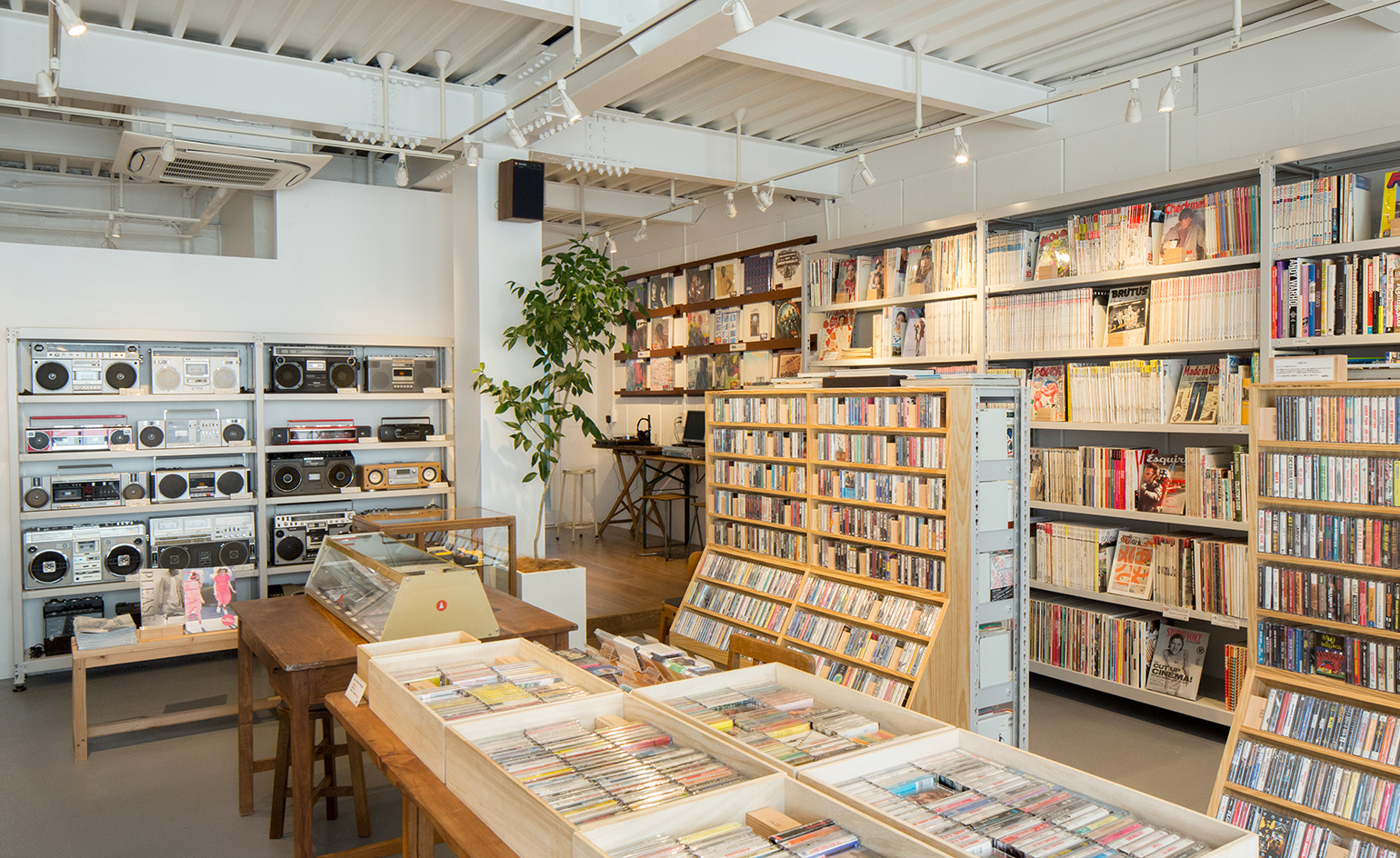
Keeping it reel
23 June
It’s not just vinyl that’s getting analogue fetishists all of a quiver. Waltz, housed in a former warehouse in Tokyo’s funky Nakameguro neighbourhood, stocks audio cassette tapes alongside vintage ghetto blasters and a selection of yellowing design and lifestyle magazines (including early editions of Wallpaper*). In 2004, after stumbling upon the book Mix Tape: The Art of Cassette Culture, edited by Sonic Youth’s Thurston Moore, owner Taro Tsunoda was reminded of the qualities and allure of the humble cassette and started collecting. Fast forward to 2015, when he quit his senior management role at Amazon Japan to set up Waltz. ‘Cassettes are great because of their warm, soft sound, and I just love the size.’ Waltz carries an impressive stock of some 3,500 antique cassettes, mainly from the 1970s to the 1990s, as well as a small selection of new releases from local acts that are going back to basics and releasing their works on tape.
Writer: Christopher Stocks; Photography: Yasuyuki Takagi
As originally featured in the July 2016 issue of Wallpaper* (W*208)
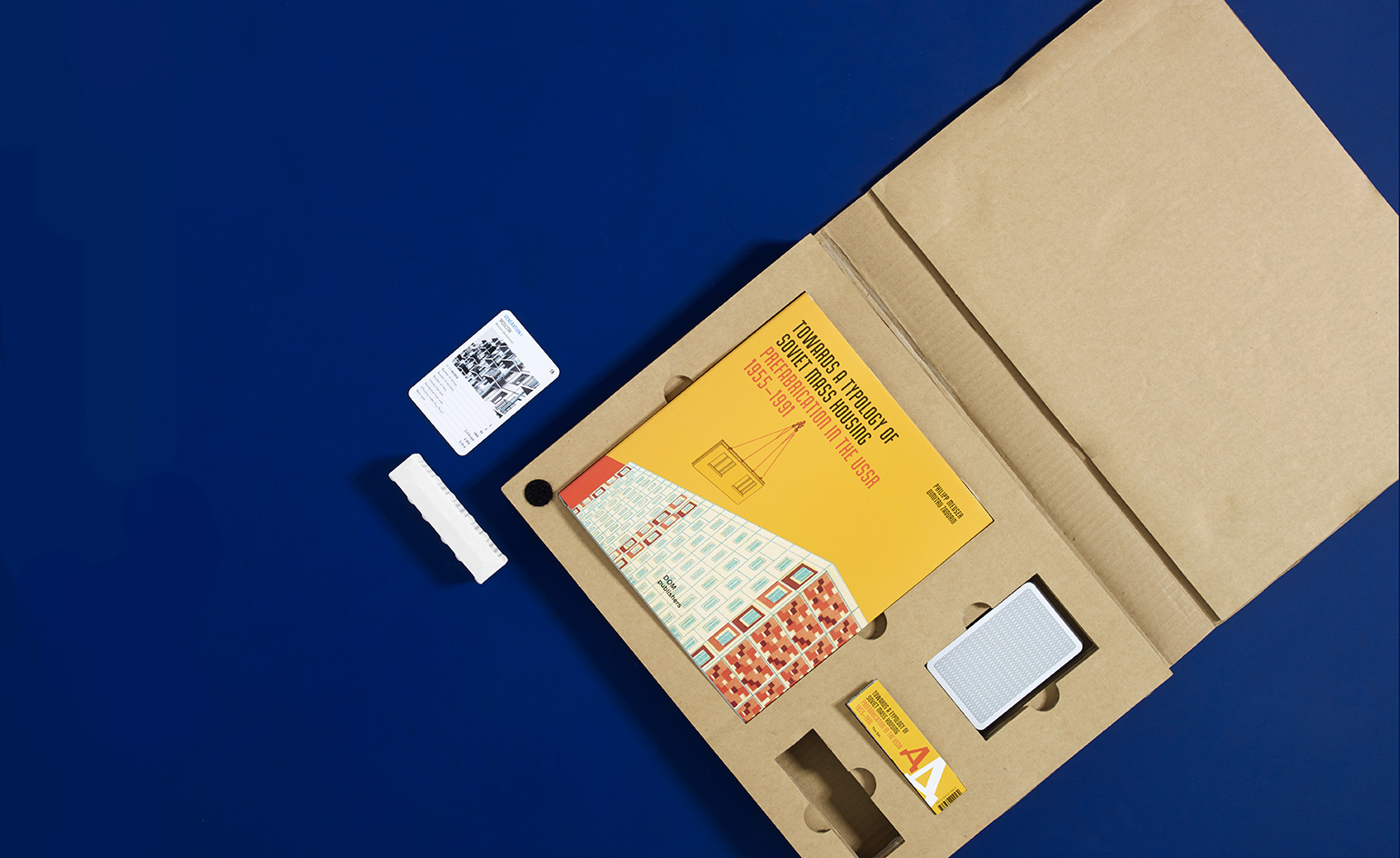
Mass appeal
22 June
From a Western view, the aesthetic draw of Sov-era design is frequently detached from the crumbling reality. Totalitarianism was often expressed in towering concrete, and it’s simpler to love the form while overlooking the ethics. Towards a Typology of Soviet Mass Housing is a more balanced look at the USSR’s post-war push for prefabrication, and includes the successes and failures of factory-built housing. This beautifully presented monograph, paired with a Top Trumps game and scale model, celebrates the grand vision without glossing over the obvious pitfalls of prefabricated ubiquity.
Towards a Typology of Soviet Mass Housing: Prefabrication in the USSR 1955-1991, €68, by Dimitrij Zadorin & Philipp Meuser, published by DOM.
Writer: Jonathan Bell; Photography: Ania Wawrzkowicz
As originally featured in the July 2016 issue of Wallpaper* (W*208)
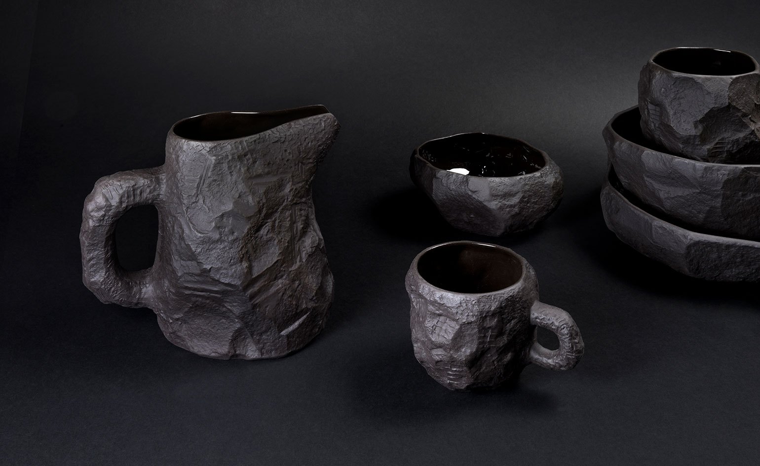
Back to black
21 June
Despite their functional essence, Max Lamb's experimental designs are all about the process and material selection. His latest launch is no exception. The Crockery collection for 1882 Ltd, available exclusively at SCP, follows on from his fine bone china collection, remastered in a jet black palette of adroit ingenuity.
Hand-chiselled models are used to make moulds which are then slip-cast in stoneware before being stained. The interiors are glazed, for functionality, while the exterior remains decidedly raw and textural.
Writer: Sam Rogers
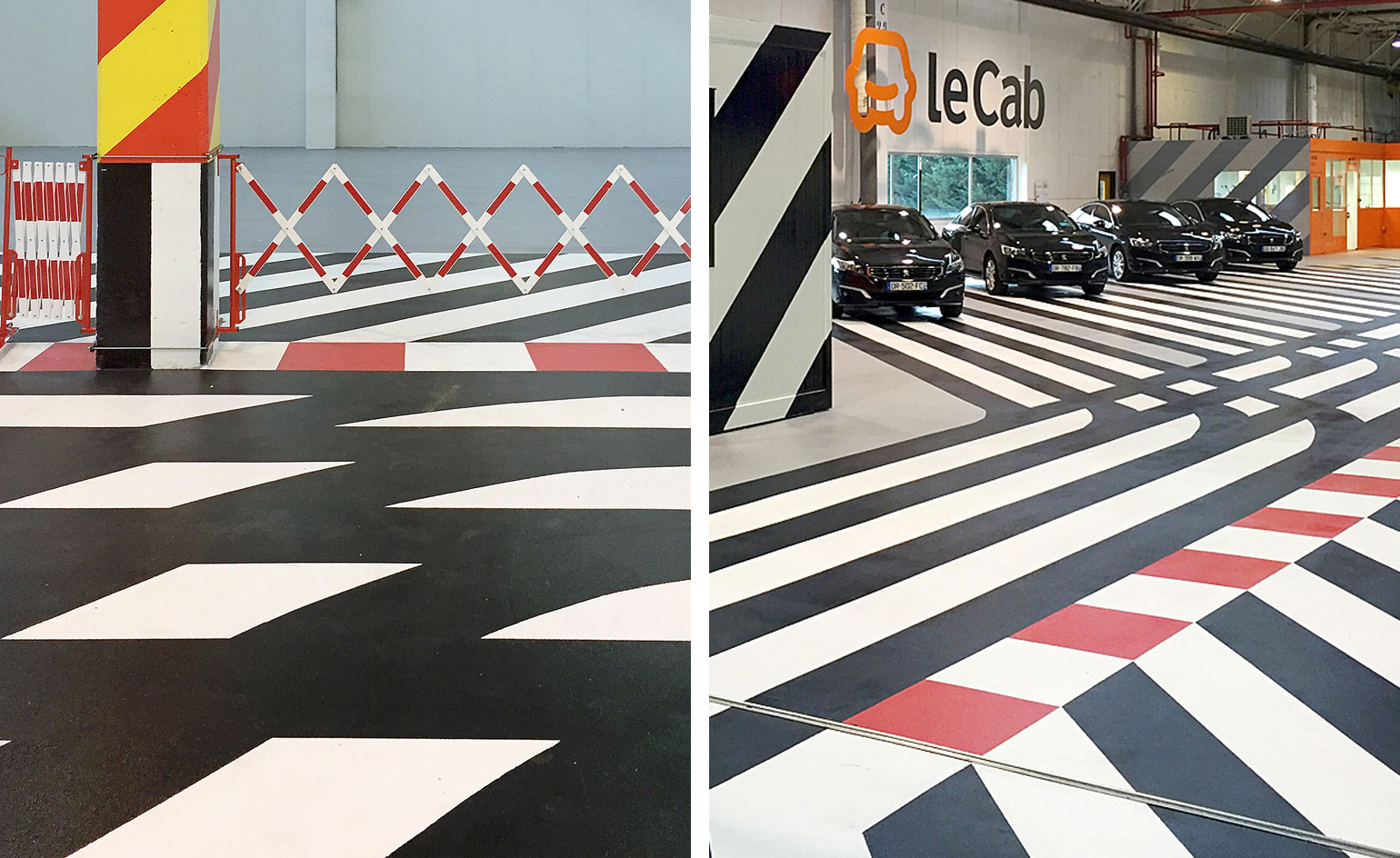
Signs and signals
20 June
Paris-based design studio Pool has bought its graphic sensibility to an unusual new outlet, designing the new workshop for LeCab – a French online transportation company.
Inspired by the codes of signage in transportation – the bold stripes, arrows and lurid hues – the French duo have taken this one step further by covering the walls, pillars and offices with geometrical patterns.
Almost channelling the visual language of artist Julio Le Parc's Hermès scarves, Pool have dynamically transformed what could be a dull and industrial garage space into a printed haven of vibrant directions and networks.
Writer: Sujata Burman
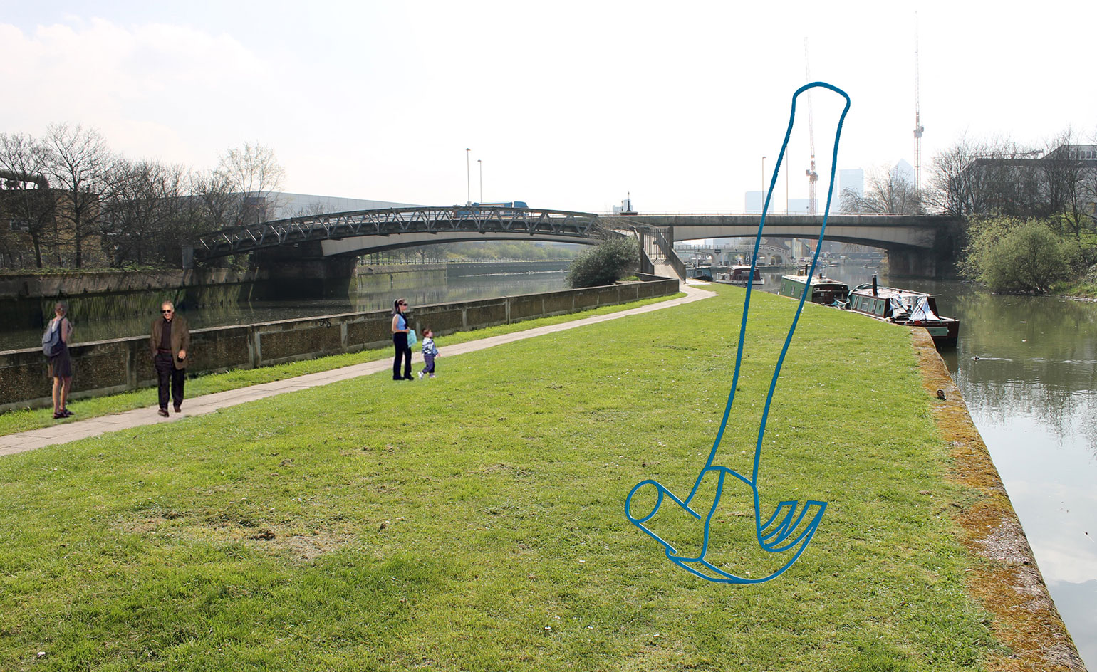
Walk the line
17 June
Hammer, Pitchfork or Wheelbarrow? That is the choice being given to Londoners and art lovers alike as the East End's open air sculpture walk decides which one of three Michael Craig-Martin works to add to their contemporary collection.
The public vote is open until midnight, 26 June, via The Art Stack, while the campaign on fundraising platform Spacehive hopes to raise enough funds to make the installation of the winning sculpture possible.
Once installed, Craig-Martin's large-scale sculpture will join the ranks of Antony Gormley and Damien Hirst who already have works lining the waterside path. Furthermore, it will celebrate the opening of a new ramp, the London Legacy Development Corporation’s Twelvetrees Ramp, which will make that particular segment of the river walk accessible to visitors, linking up the House Mill and Cody Dock.
Pictured: Hammer (2011) Photography: Courtesy of Michael Craig-Martin and Gagosian Gallery
Writer: Sam Rogers
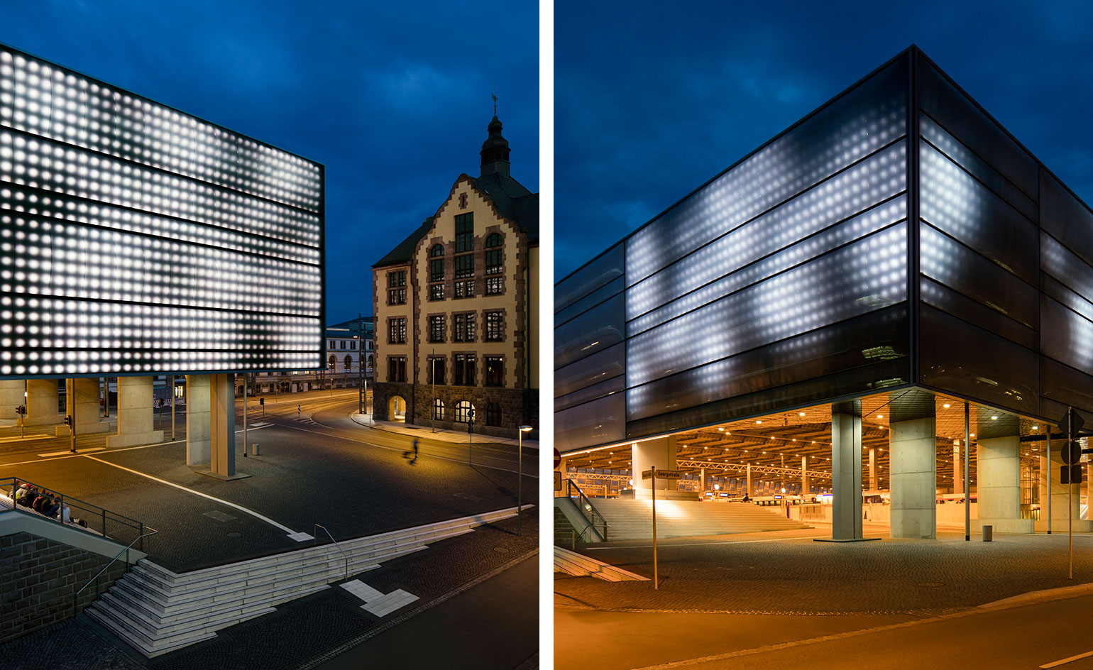
'Swarm Study'
16 June
Scale seems to be the latest focus of London-based art collective Random International. Fresh from having launched their largest Rain Room to date in Shanghai, the London collective is set to launch a new mega-sized version of their Swarm light installation in Chemnitz, Germany.
Taking over the facade of by architects Gruentuch Ernst's Hauptbahnhof Chemnitz station, Swarm Study / IX 'translates the acrobatic efficiency of flocking birds into light'; a study of autonomous actions within collective behaviours. The patterns of the swarm are not predetermined or choreographed, instead each individual light acts according to is own set of criteria in relation to its neighbours.
The latest iteration, due to launch in September, 'invites an experience of architecture as something animate and integrated with surrounding natural phenomena and human activity.'
Photography: Jan Bitter
Writer: Sam Rogers
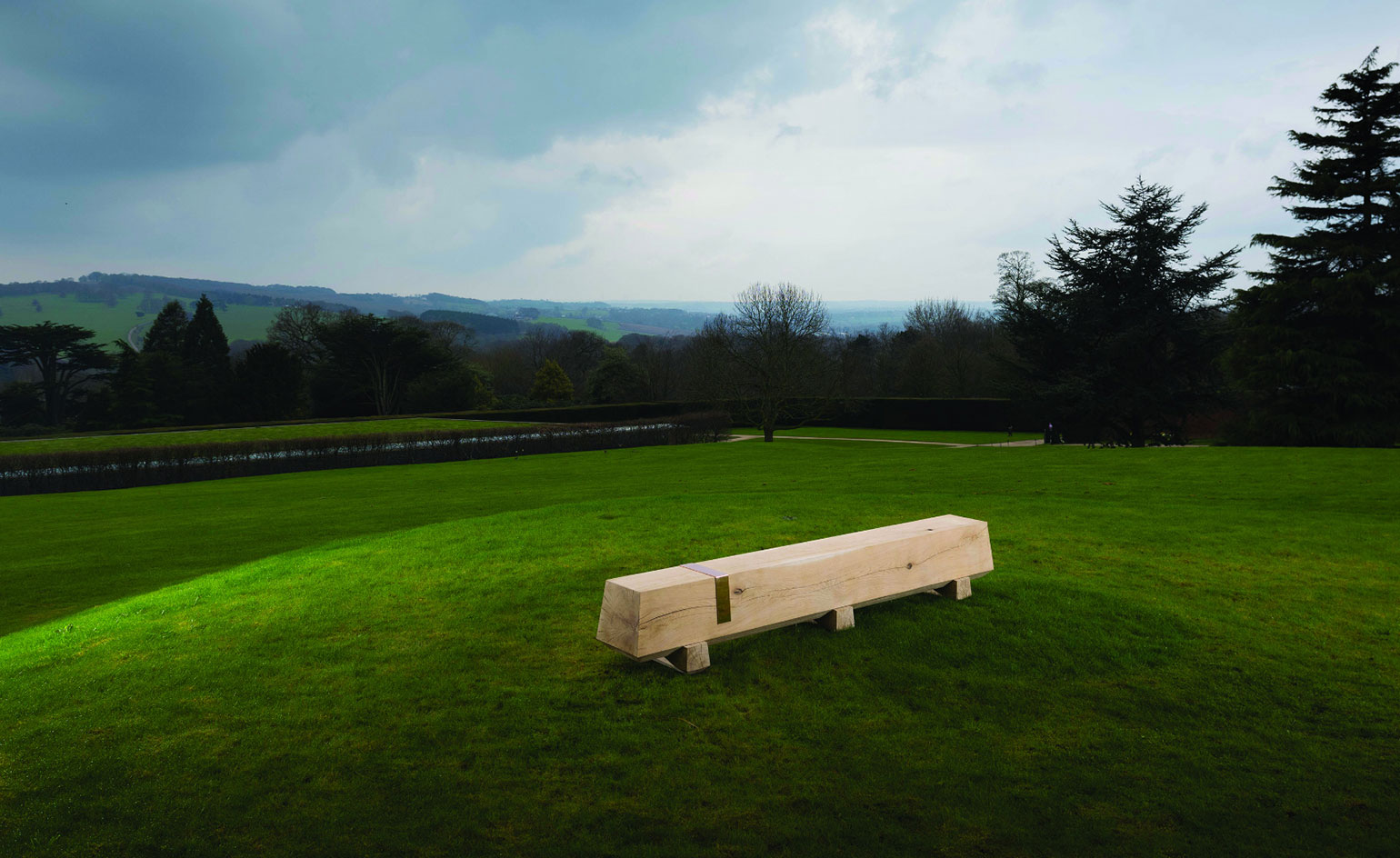
Sculptural seating
15 June
Scale, proportion, quality of detail and finish are key components of Dyehouse, the emerging furniture brand of ONE17 Architects managing partner Mark Lee. The same could be said of Yorkshire Sculpture Park's exhibits, making them a rare and rather perfect fit.
Sitting atop a gentle slope at the renowned exhibition space, the 300kg oak bench is in good company, including British and internationally acclaimed artists such as Henry Moore, Barbara Hepworth, KAWS and Not Vital. Unlike its majestic companions though, the bench is (obviously) designed to be sat on, providing a picturesque perch in the open-air gallery.
'We set out to design a collection that is not only striking aesthetically, but is also practical and can be used every day,' explains Lee. Crafted with the help of Huddersfield-based furniture designers, the Dyehouse Collection is pleasing in its simplicity, and, only six months into its creation, seems to already be a resounding success.
Photography: Jonty Wilde
Writer: Sam Rogers
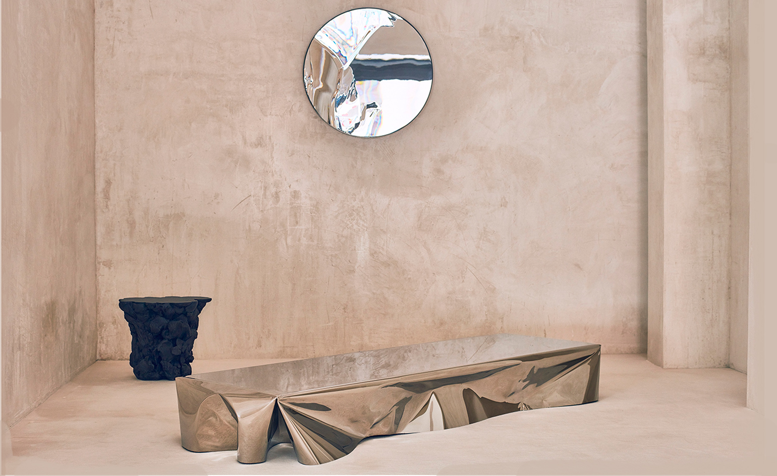
Fluid forms
14 June
Designers Patrik Fredrikson and Ian Stallard began their collaboration in 1995 and have since become internationally recognised as leading exponents of British avant-garde design.
In association with London's David Gill gallery, who showcased their work earlier this year, Fredrikson Stallard have taken their 'chaotic', conceptual designs to Madrid.
Fluido is on display until 15 July at Machado-Muñoz Gallery, and continues the themes established in the David Gill show - fantastical furniture and sculptural objects inspired by geology and the natural world. As gallerist Ana Domínguez Siemens adds, 'these flowing forms are reminiscent of a mountain range, in the case of the "Pyrénées" sofa, or large volcanic rocks in the case of the "Species" seats. The fact you can sit on them seems to be unintentional, as if it were almost by chance.'
Photography: Gonzalo-Machado
Writer: Elly Parsons
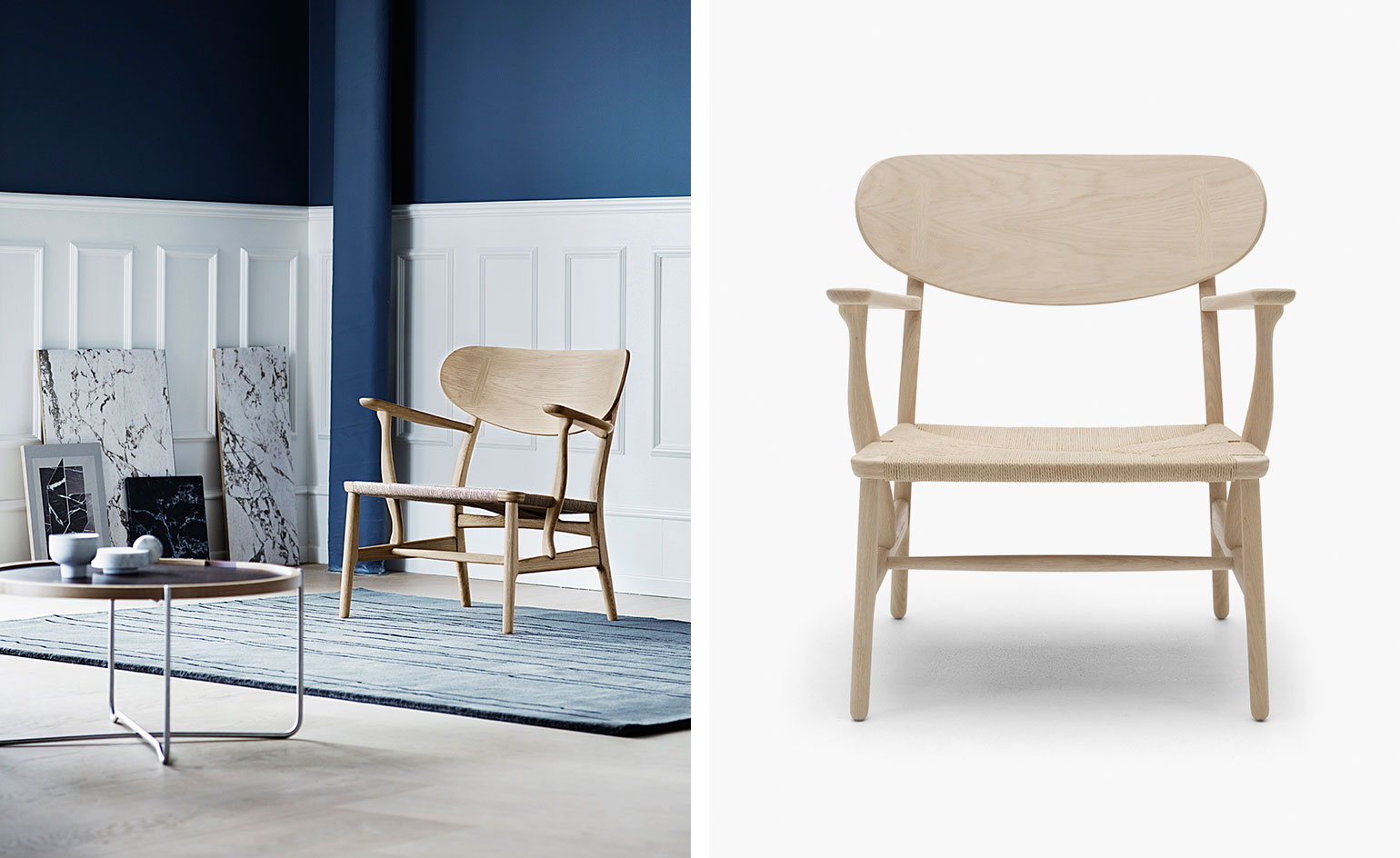
Early classic
13 June
Hans J. Wegner's CH22 lounge chair is well known and loved the world over, and now Carl Hansen & Søn is reintroducing the cult design once again.
Originally one of the first pieces Wegner designed for the furniture company in the 1950s - alongside the iconic CH24 or Wishbone chair - the classic has been out of production for many years. 'Perhaps because of the CH22's complex, intricately detailed construction…' muses Carl Hansen & Søn.
Aside from a few modernised elements, the production process remains the same as it was six decades ago. A form-pressed wood veneer makes the chair's backrest; oblong cover caps joining the back; the frame featuring flat armrests and rounded edges.
A series of limited-edition reissues in soap-treated oak will also be available from 3 June.
Writer: Sam Rogers
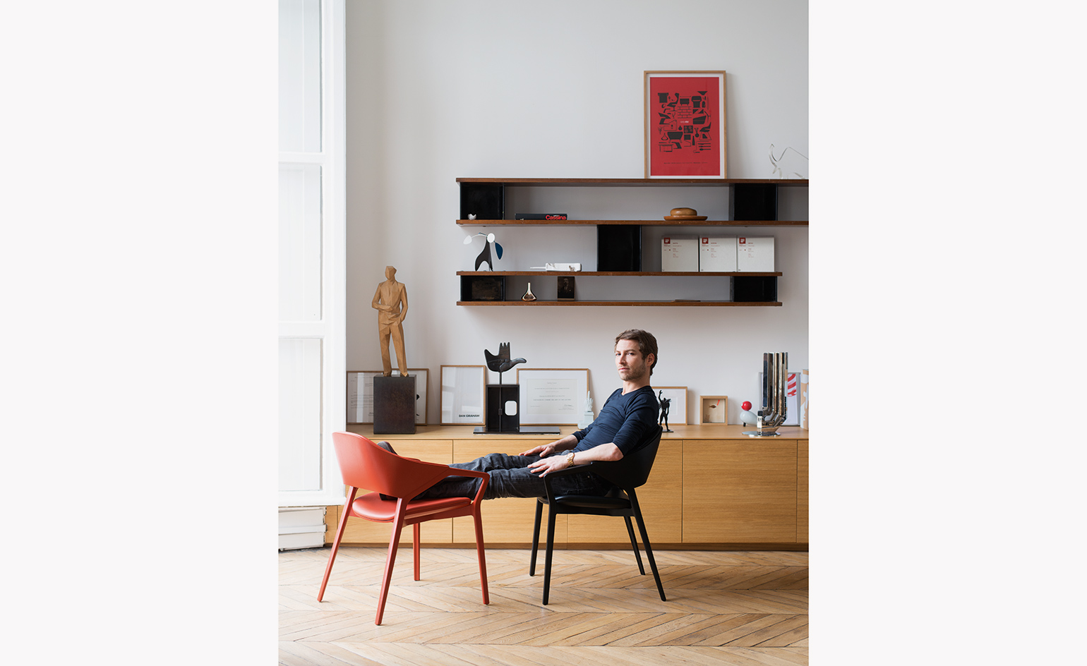
Ico conscious: Ora Ïto champions an Italian stalwart
10 June
As a tribute to the legendary Ico Parisi and his discreet, sensual shapes, French designer Ora Ïto (pictured) has collaborated with Cassina on the ‘Ico’ chair, inspired by Parisi’s ‘814’ chair, produced in the 1960s for the Italian furniture brand. ‘It’s 50 per cent my design, 50 per cent Cassina’s know-how,’ says Ïto. ‘Thanks to our ongoing exchange, we have created a tribute to 20th century classic design and 21st century modernity.’
Writer: Rosa Bertoli
Photography: Albrecht Fuchs
As originally featured in the July 2016 issue of Wallpaper* (*208)
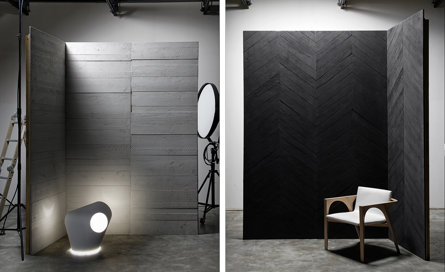
Wood-look
09 June
'Although often undervalued, concrete has become one of the materials of choice for architects,' states interior designer Jean-Philippe Nuel. 'What's funny is to see it almost come back in style and makes something inherently impressive.' Nuel has harnessed this ongoing perspective-shift in a new project with French cement-specialists Concrete LCDA. Together, they have created two series of wood-look concrete panels.
The first, 'The Chevrons Collection' (pictured right) references the parquet floor of a 19th century French apartment, and the second, 'The Timber Collection' (left) recalls the earliest ways of working with concrete, and required detailed research into the textures of spruce wood to achieve the highly textured finish.
Where wood evokes nature and tradition, concrete evokes brutalism and engineering. When used together in this novel way, they create something warm yet decidedly urban.
The panels were debuted during London's Clerkenwell Design Week, and will be on display this September in Paris for Maison&Objet.
Writer: Elly Parsons
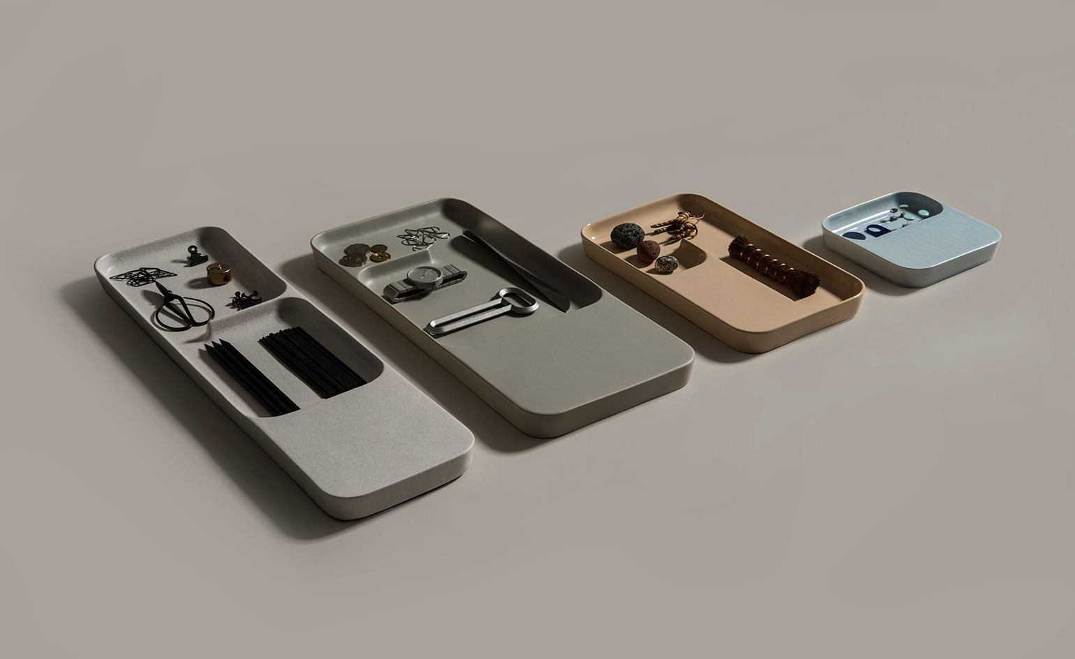
Positive charge
8 June
'We are interested in humanising technology and harmonising it with the interior environment,' says Layer founder Benjamin Hubert of Charge Trays, created for Italian ceramics brand Bitossi Ceramiche.
Originally unveiled at Salone del Mobile and Clerkenwell Design Week, the multifunctional trays are available in four sizes and four glazed finishes; salt, matte, crackle and soba. As their name implies, the Charge Trays use high craft to seamlessly integrate smart technology within the home, creating a wireless charging station for your phone or tablet.
A cleverly concealed compression-moulded silicone module on the underside of each tray houses the induction charging system, while a modular layout on its surface makes for perfect storage or display of the trinkets we carry around in our daily lives.
Writer: Sam Rogers
Awesome awning
28 May
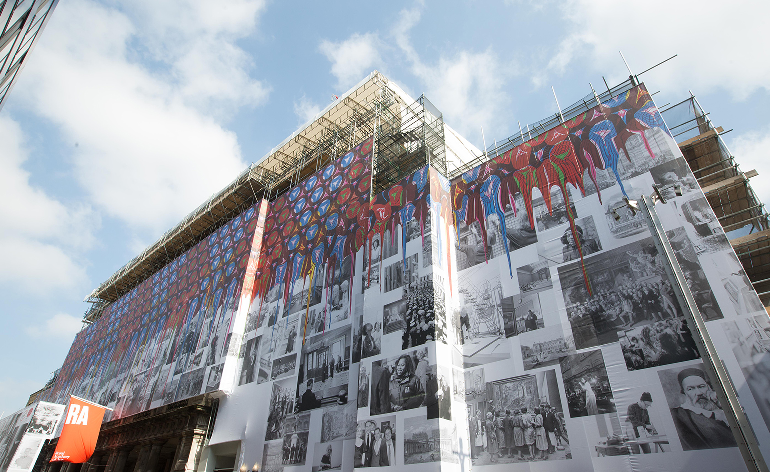
What better way to cover up unsightly scaffolding than with an extravagant piece of public art? This week, London's Royal Academy unveiled a new work by Royal Academician Yinka Shonibare MBE, that drapes over the facade of 6 Burlington Gardens.
The 71m work celebrates the people who have helped make the Royal Academy what it is. Archive photographs of members and Academician's (including Shonibare, as well as the likes of Grayson Perry and Cornelia Parker) are larger-than-life-sized and blazoned across the awning. Around half way up, these photos give way to colourful splashes of dripping paint, realised in the Nigerian-British artist's signature, pattern-laden style.
The shroud hides restoration work of the Italianate building, which is being renovated as part of the Royal Academy's 250th birthday extravaganza in 2018. This vibrant new commission complements the historic establishment's ongoing rebrand as a champion of all that's new and pioneering in the art world.
Writer: Elly Parsons
Mythical presence
26 May
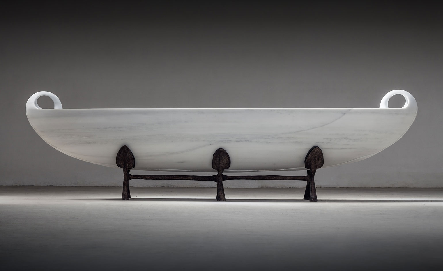
Famed Brazilian artist Saint Clair Cemin's work has been marked by a propensity to change; from sculpture to painting, toy and furniture design, his practice is as varied as his subject matter. His latest work, Psyche, is no exception.
Unveiled at Paul Kasmin Gallery today, the ethereal sculpture was made of a single, 30,000 pound piece of Sichuan marble, delicately crafted to become the fully functional boat that is displayed on a bronze cradle at the Chelsea outpost.
Beyond the utilitarian, the piece transcends the physical realm to illustrate the romantic tale of Psyche, the Goddess of the Soul, and her true love, Eros, which first inspired it. It is the quietness of the sculpture, in spite of its scale, that best reflects the mythical love of Psyche and Eros.
Writer: Sam Rogers
Photography: Courtesy of Paul Kasmin Gallery
Track star
25 May
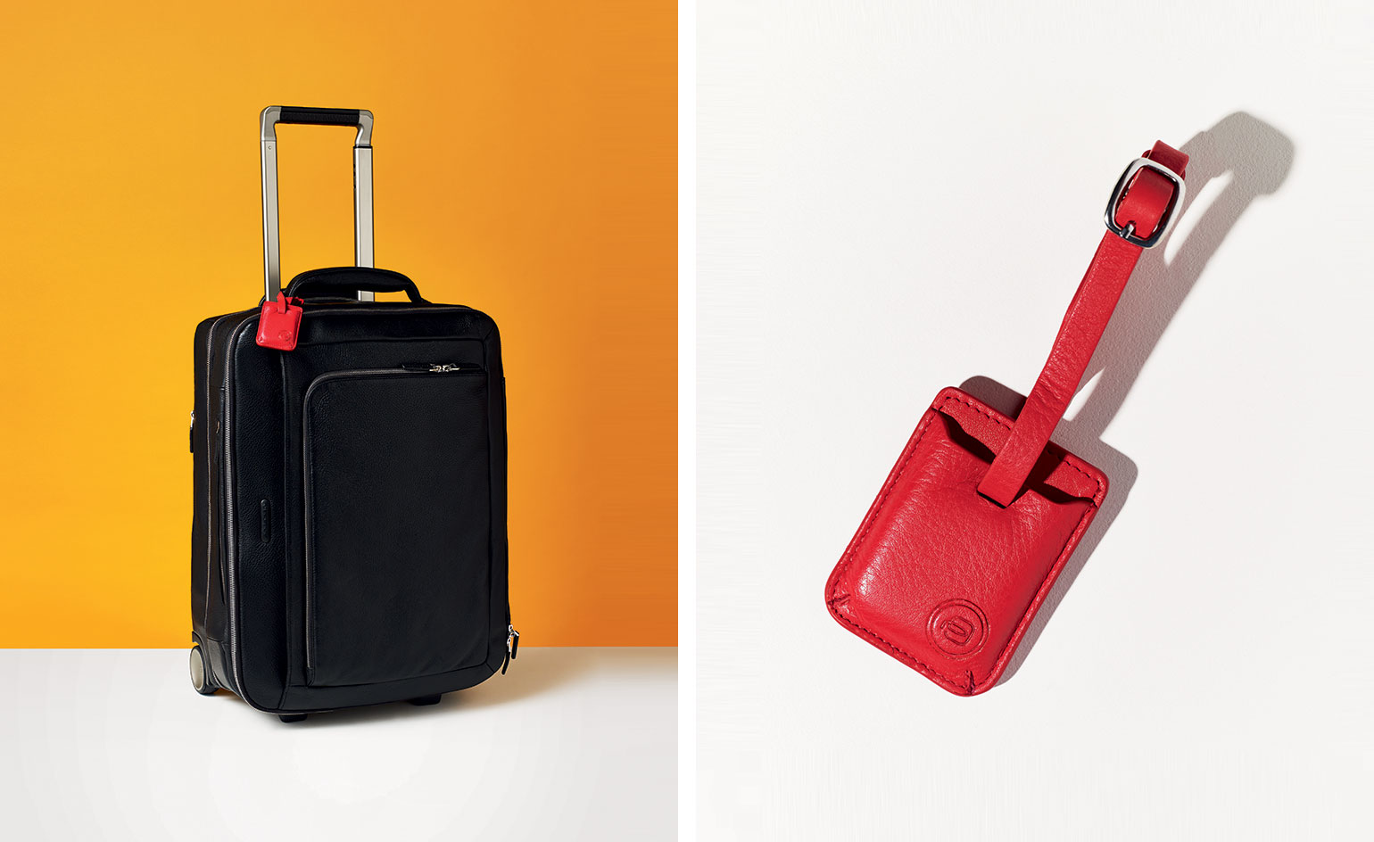
Piquardo launches its new generation of smart luggage with the release of Connequ. Ensuring your luggage is never stolen or left behind on a train or in a cafe, this geo-location tracking device is incorporated into a leather tag that connects to your smartphone via an app. The brand's next innovation will track your bag on a flight so you know it will meet you at the other end.
Photography: Barker Evans
As originally featured in the June 2016 issue of Wallpaper* (W*207)

Graphic celebrations
24 May
If the unveiling of the Victoria and Albert Museum's recent nature-inspired and robot-made installation wasn't enough to get us geared up for the museum's first ever Engineering Season, then news of Tom Pigeon's exclusive print inspired by Ove Arup will.
Available from early June in anticipation of the London museum's 'Engineering the World: Ove Arup and the Philosophy of Total Design’ exhibition, 'Expansion' was influenced by Arup's final and finest structure, the Kingsgate Bridge, completed in 1963.
'We were drawn to the Brutalist form of the bridge, its understated location and the unexpected detail of the bronze expansion joint,' explains designer Kirsty Thomas. '[Our print] 'Expansion' celebrates the geometry and symmetry of this functional design detail, with colours that reflect Arup’s bold use of concrete and bronze.'
The limited edition prints are letterpressed on a traditional 1973 Nuremberg print press by printmaker Tom Mayo and will be exclusive to the legendary V&A gift shop.
Photography: Courtesy of Tom Pigeon
Writer: Sam Rogers
Enjoy the silence
20 May
The use of silence in art is still most inextricably linked with John Cage's 1952 composition 4'33". Cage was inspired to conceive the piece – which consisted of the performer/s specifically not playing their instruments for four minutes and 33 seconds – after visiting Harvard University's anechoic chamber in 1951.
These rooms, heavily insulated to absorb sound, are built to harness as close to absolute silence as is possible. They tend to be located in research facilities – universities and laboratories – and are most commonly used for acoustics testing; but artists and musicians are increasingly seeing the creative potential in such sonically extreme surrounds. None more so than the Dutch artist Simon Heijdens, best known for his organically-influenced projection works Shade and Lightweeds.
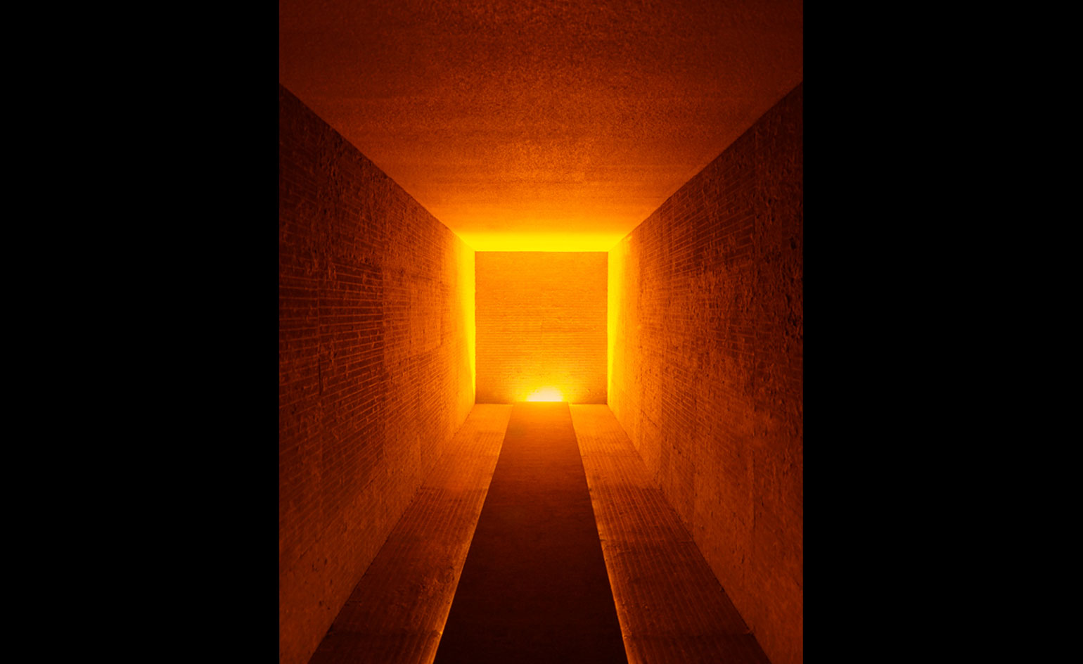
First presented at SXSW in Austin earlier this year, Heijdens' Silent Room is a moveable chamber, originally conceived as a 'black hole within the festival'. Developed with the University of Texas' Department of Acoustic Engineering and Auralex Acoustics, the work is a 40-ft rectangular void built inside a shipping container; a negative space lit by a single monochromatic source, the effects of which are almost reliant on the reaction of the viewer/listener momentarily inhabiting it.
Apocryphal stories of the physical and existential effects of pure silence notwithstanding – the notion that 45-plus minutes in a chamber causes hallucinations is bunkum – the effect is unnerving and unnatural. (Hearing the blood rushing through your own head is, inevitably, weird.) It's an experience Heijdens is looking to take across the globe.
'The idea is to have the piece in as wide a range of environments as possible, and see what it does; it is about how it sits in and reflects to its direct environment,' he explains. 'The cold shower effect from a music festival is [just] the most obvious.'
Silent Room will tour the USA and Canada this year before moving to Europe, largely at music and art festivals such as the Seattle Design Festival and Las Vegas' Life is Beautiful in September, but Heijdens is also on the look out for less conventional locations. Interested parties should contact the artist on studio@simonheijdens.com.
Writer: Tom Howells
Pocket Tube map cover by Tomma Abts
04 January
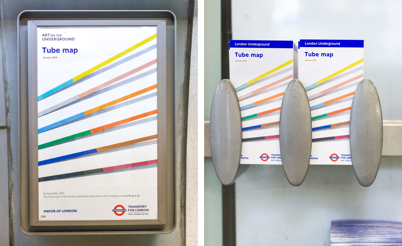
Visual artist Tomma Abts has created a vibrant linear design for the 23rd edition of the pocket tube map cover.
Coinciding with the German artist's twentieth year living in the city, she has realised a simple pencil pattern inspired by colours of the London underground. Abts includes subtle shade behind the innocent hues that appear to exist beyond the page, standing out on the blank canvas background.
Art on the Underground has been commissioning creatives to design the tube map cover for over 10 years with previous designs including an abstract form of maps and connections by Cornelia Parker and Barbara Kruger's satirical wordplay design.
Writer: Sujata Burman
'Making Memeries'
18 May
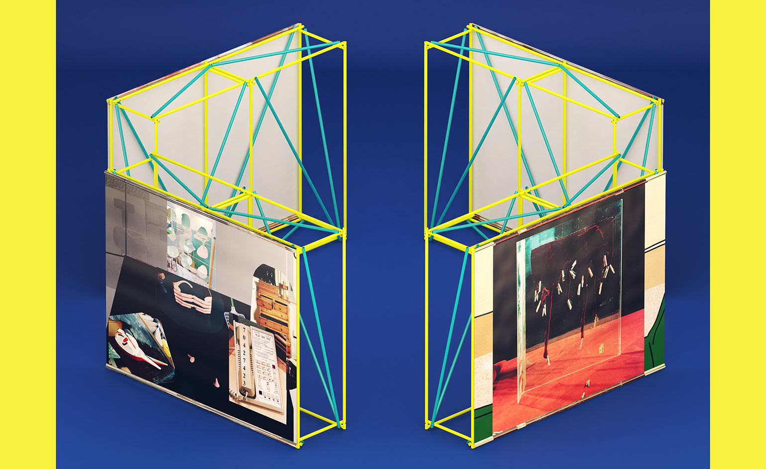
This weekend, for London's Offprint art book fair, memory-making goes digital, as London's Tate Modern plays host to a series of workshops and events on photography in the age of the app.
Curated by Self Publish, Be Happy, the event borrows its title, 'Making Memeries' from US photographer Lucas Blalock's new installation for Tate's Turbine Hall, which doubles as an interactive staging area for the weekend's programme of performances. The installation consists of eight movable panels a little like theatre backclothes. Designed by Italian studio Tankboys the ‘flats’ (pictured) display a new suite of photographs by Blalock, which can be interacted with through the specifically designed 'Making Memeries' App. To achieve this virtual world, Blalock had a little help from the tech-gurus at 'Augmented Reality' studio REIFY.
Director Bruno Ceschel tells Wallpaper*, 'everyone can use the app - and it's free. All you have to do is point your phone at the physical photographs, then they animate and come to life on your mobile screen.'
Writer: Elly Parsons
Photography courtesy Tankboys and Self Publish, Be Happy
Seeing in colour
11 May
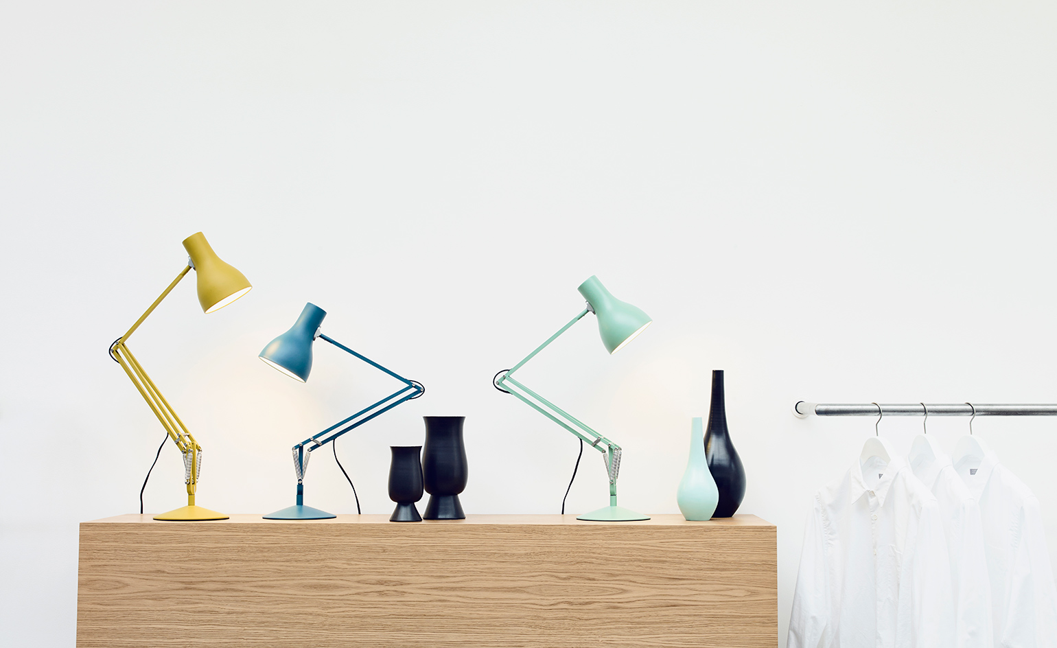
British clothing designer Margaret Howell has used Anglepoise lamps for most of her life. She remembers 'school homework under the light of an original black square based Anglepoise', and later, 'acquiring various coloured styles designed in the 1960s and 70s'. One of her favourites, the yellow 'Apex 90', she 'rescued from a skip'.
It was the memory of pulling this dandelion-yellow lamp from the rubbish that informed her colour choices for a new series of lamps. Howell has added a Saxon blue and a seagrass version to the pre-existing yellow ochre, choosing colours that would act as accents, and sit well in both domestic and working interiors. The well-balanced internal workings remain unchanged from industrial product designer Sir Kenneth Grange's 2004 edition (why mess with perfection?).
The new 'Type 75' colourways will launch at the flagship Margaret Howell shop in Paris in September, as part of Paris Design Week. Until then, they are available to pre-order from the Anglepoise website.
Writer: Elly Parsons
Photography: Jake Curtis. Styling: Despina Curtis
Living(room) art
10 May
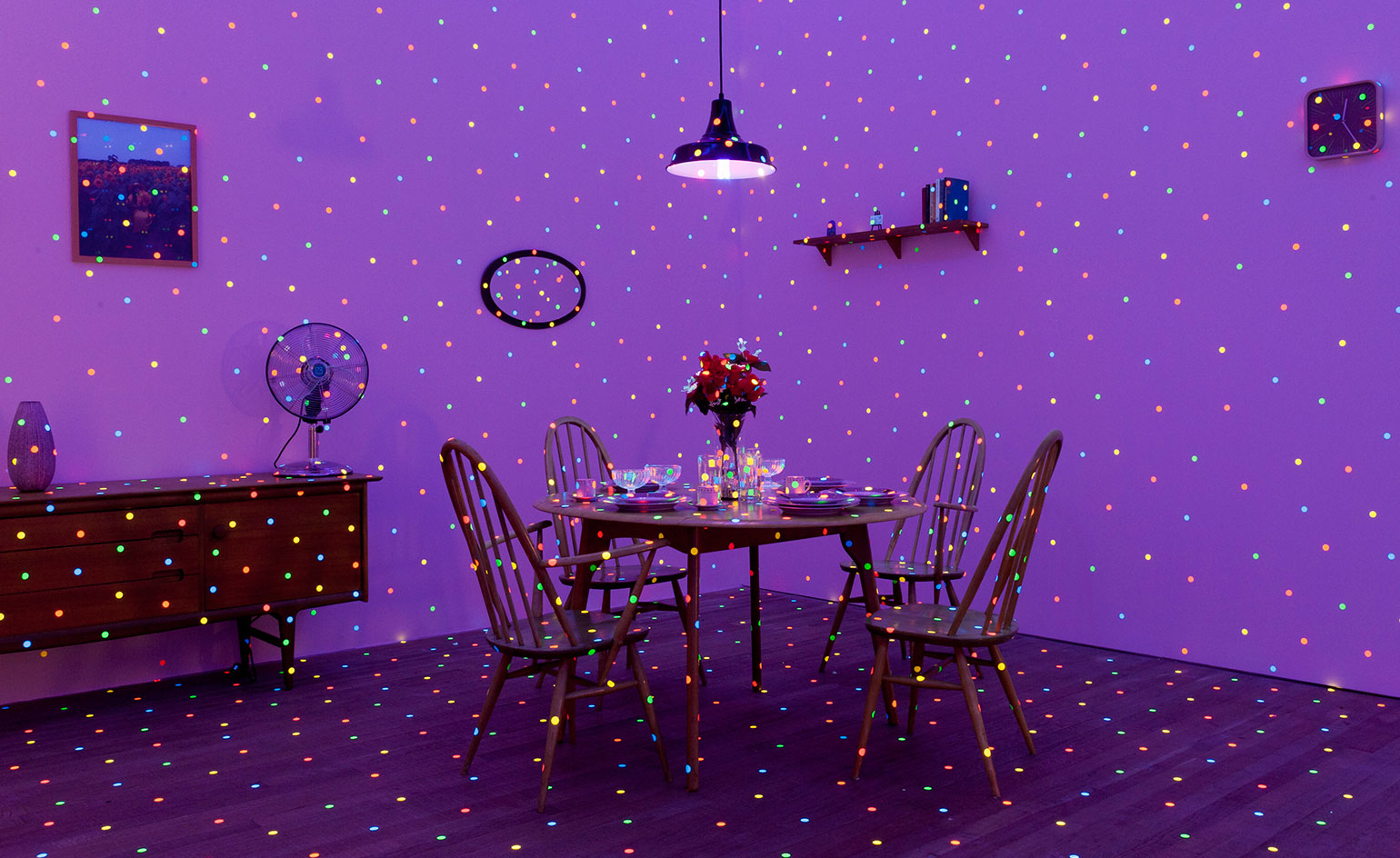
Why live with art when you can live in art? To celebrate the opening of Tate Modern's new Herzog & de Meuron extension this summer, the iconic museum has teamed up with Airbnb to launch a rather unique competition, whereby one lucky Londoner will win a Yayoi Kusama installation. (Imagine if your living room or bedroom were transformed into one of her mirrored rooms or dressed in her signature polka dot patterns!)
Hosts who are currently listing either a private room or an entire home on Airbnb can apply for this unique opportunity via the Tate website, where they will be invited to say why their space should be chosen. Entries end tonight (May 10) so do be quick.
Writer: Sam Rogers
Photography: Lucy Dawkins, Courtesy of Tate
A slice of ancient Egypt in New York
5 May
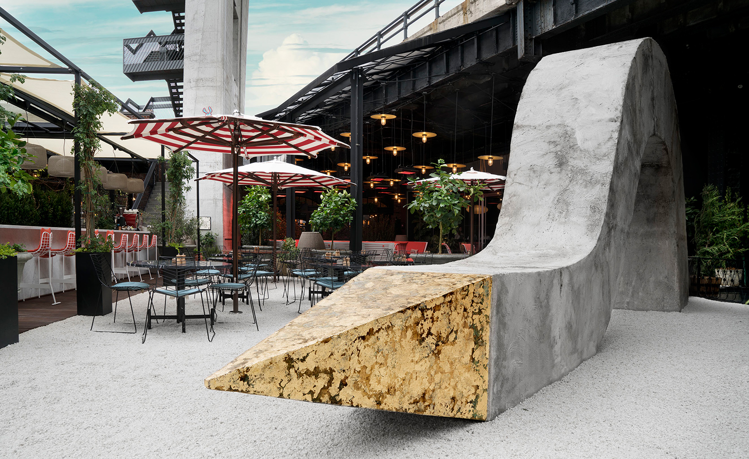
Having previously shown work from the likes of KAWS, Erwin Wurm and, most recently, José Parlá, The Standard High Line Hotel in New York can now add a 30ft Egyptian obelisk to its history of public art displays.
The tapering stone pillar, entitled Strengthlessness, was created by Paris-based, Colombian-born artist Iván Argote. The creative director at Standard International, Claire Darrow-Mosier, saw an aesthetic connection between the sculpture and the architecture of The Standard, and her interest was piqued. She explains, 'The Standard has always supported artists creating work for public spaces, and we were compelled by the provocative power of Argote's piece.'
The building of the imposing concrete and gold sculpture marks not only the start of Frieze New York, but also the redesign of the hotel’s ground-level plaza and new Mediterranean-inspired menu by chef Nina Clemente, which is due to be made public any day now.
Writer: Elly Parsons
Photography: Guillaume Ziccarelli
GO
04 May
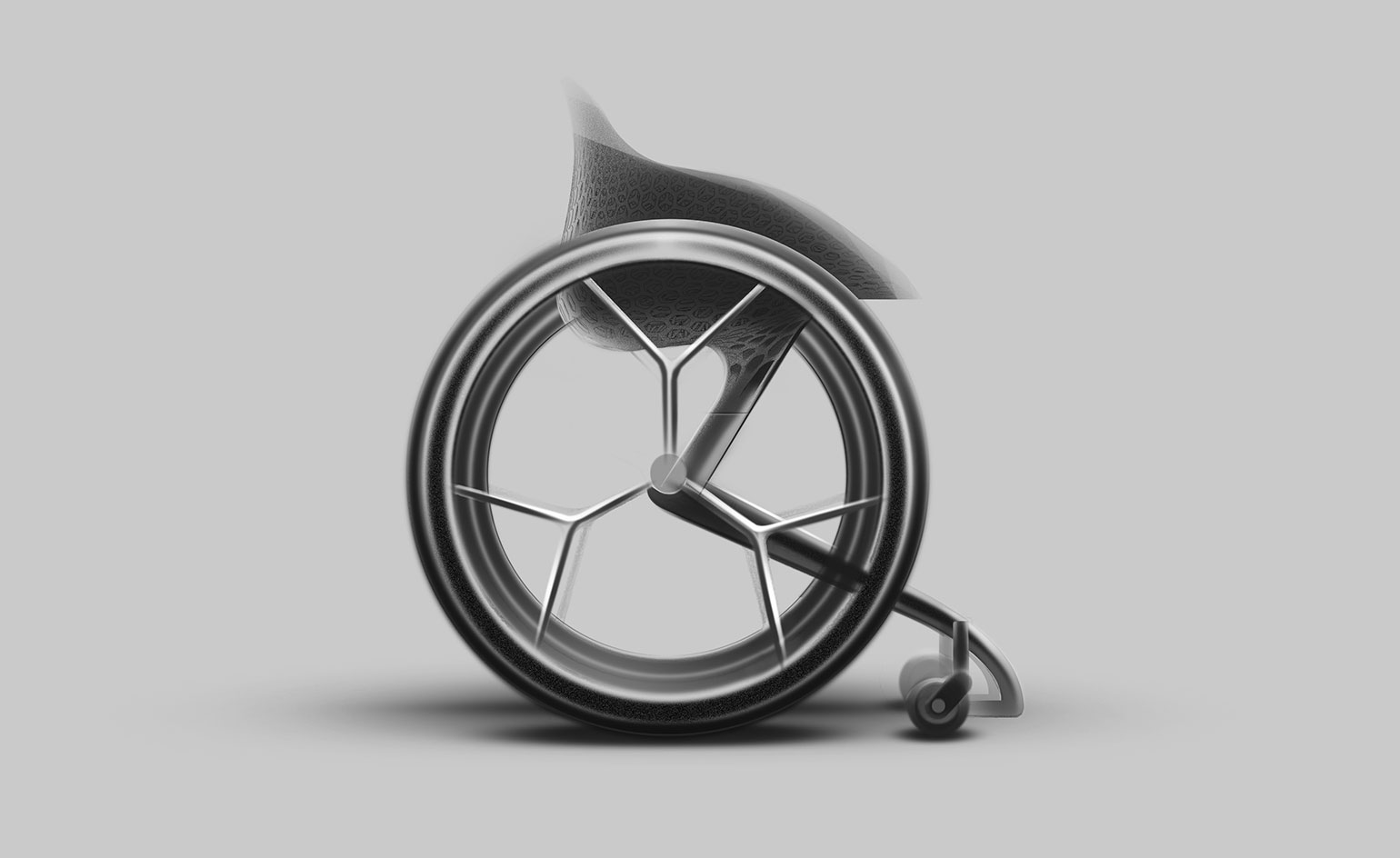
From design agency Layer comes the world’s first 3D-printed consumer wheelchair. Designed by Benjamin Hubert, the GO wheelchair concept came to fruition through collaboration with Materialise – experts in 3D printed software and solutions.
The new mobility device is the result of six months of research by Layer, in which the firm gathered information from medical professionals and wheelchair users themselves. Lightweight and highly functional – Layer conceptualised the GO wheelchair as ‘a more human-centred vehicle to improve the everyday lives of users’.
Mainly constructed of a semi-transparent resin, the GO wheelchair aspires to fit the unique requirements of varying disabilities. To achieve this, the firm has used 3D-printing manufacturing technology which will allow the two components of the wheelchair – the seat and the foot-bay – to be customised to the measurements of each individual user.
Writer: Sam Clark
Frozen assets
25 April
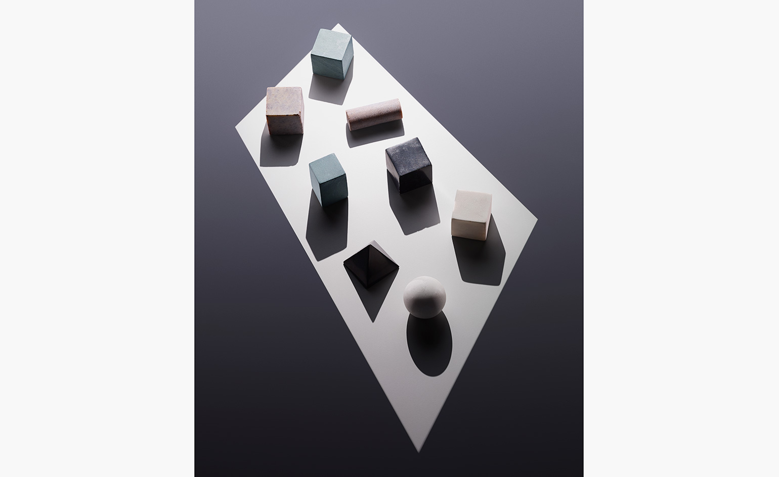
In search of an aesthetically pleasing way to properly chill one’s drink while keeping it undiluted, Norwegian designer Runa Klock came up with these ‘Drink Rocks’, a series of hand-carved soapstone and marble shapes inspired by Norway’s rugged landscape. Use in place of ice to enjoy your tipple as it was intended. From $35
Writer: Sara Sturges
Photography: Andy Barter
As originally featured in the May 2016 issue of Wallpaper* (W*206)
East meets west in Art Brussels
22 April
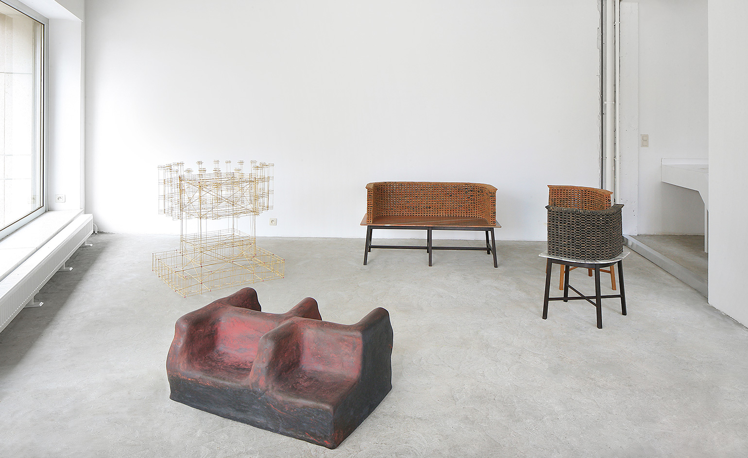
Belgian gallerists Maniera commission architects and artists to develop limited edition furniture collections. For this year's Art Brussels, they've partnered with belgian firm ADVVT and Bijoy Jain's Studio Mumbai to create two unique series, on display from 16 April through 21 May at Place de La Justice in Brussels.
The resulting collections are a world apart in style. Studio Mumbai, who are known for blending tradition and modernity, have created a series inspired by their namesake city. Of particular note is the ornate structure (pictured here on the far left) which is a contemporary take on a 'Tazias' - a miniature cenotaph made to be carried on the shoulders in remembrance of an Islamic saint. The bamboo joints are held by tiny dots of mud so the delicate structure can dissolve and collapse in water at the end of a ritual.
ADVVT, on the other hand, propose a collection inspired by Belgian musician René Jacobs, (father of Maniera co-founder Amaryllis Jacobs). Purely as a mental exercise, they've humorously re-imagined the conductor's study for him, settling upon a bold array of matching, peach-coloured furniture.
Photography courtesy Studio Mumbai and Maniera
Writer: Elly Parsons
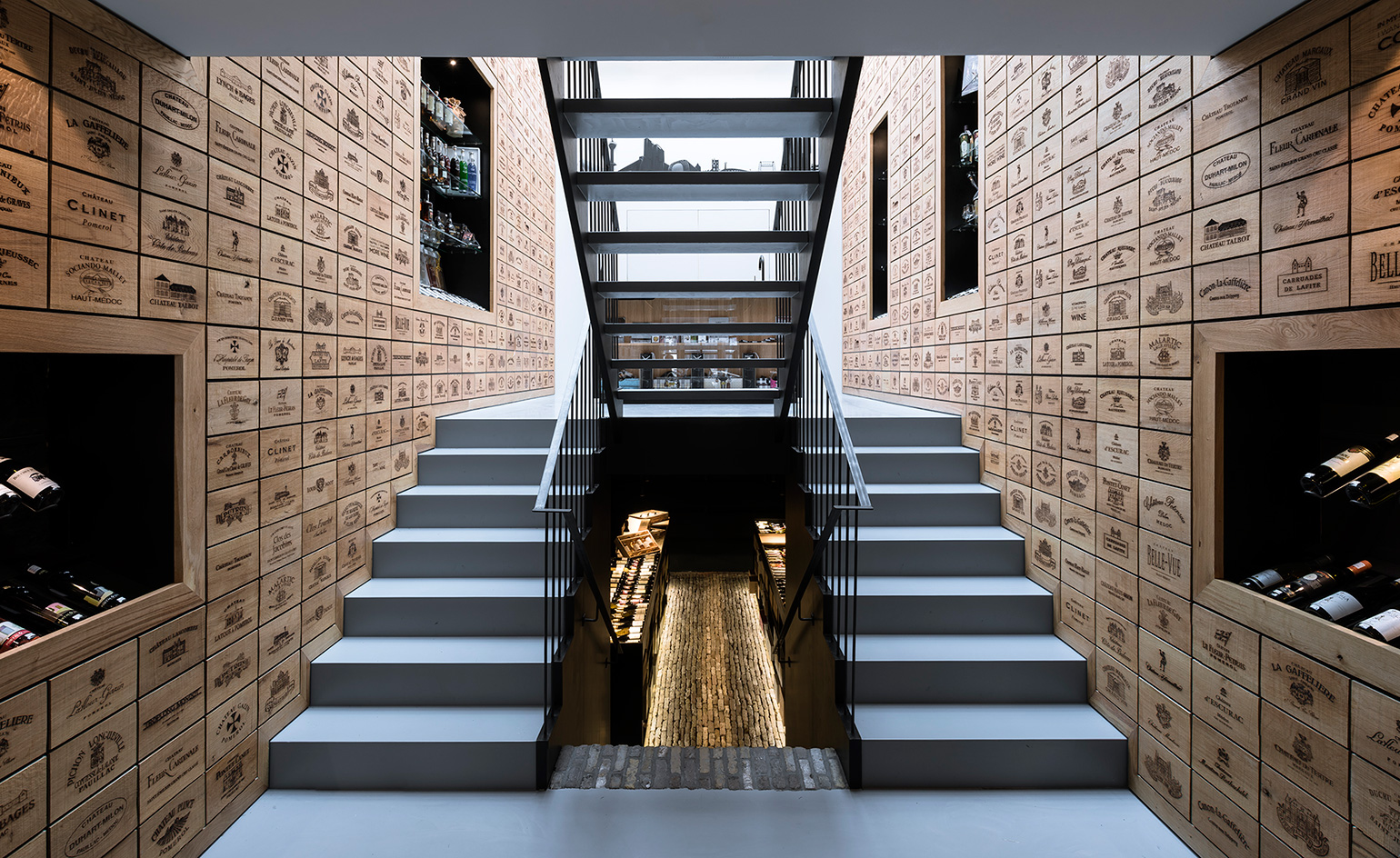
Bottle bank: Wijn aan de Kade wine shop, by AAAN
15 April
Fine wine and inspired architecture meet in this shop designed by Rotterdam-based Studio AAAN. It sits within an 1896 building and spans four levels, with interior walls clad in laser-engraved oak panels bearing famous winery names. There is also a bar, a kitchen, a tasting area and a cellar.
Photography: Andy Barter
Writer: Ellie Stathaki
As originally featured in the May 2016 issue of Wallpaper* (W*206)
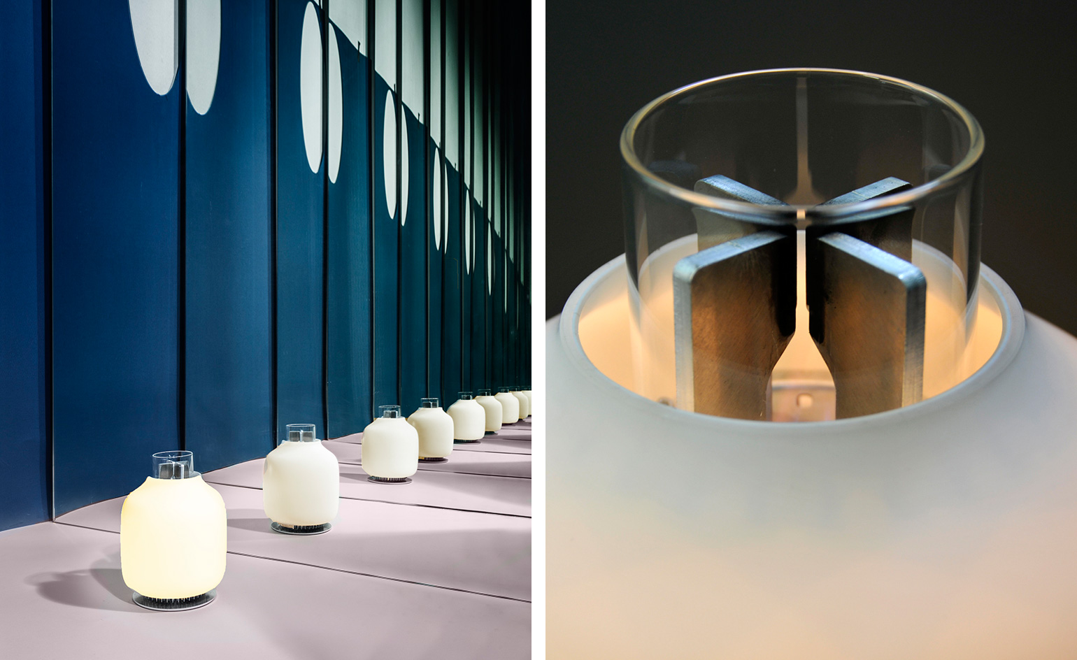
Warm glow
14 April
An LED table lamp powered by a candle might sound like a tautology, but the ‘Candela’ is exactly that. It’s the first product from Astep, a new Copenhagen-based design brand launching at Salone del Mobile and founded by Alessandro Sarfatti, whose parents set up Luceplan in 1978. Using the thermoelectric effect, heat from a candle flame generates enough electricity to power a warm-toned LED light, plus enough surplus energy to recharge a mobile.
Writer: Christopher Stocks
As originally featured in the May 2016 issue of Wallpaper* (W*206)
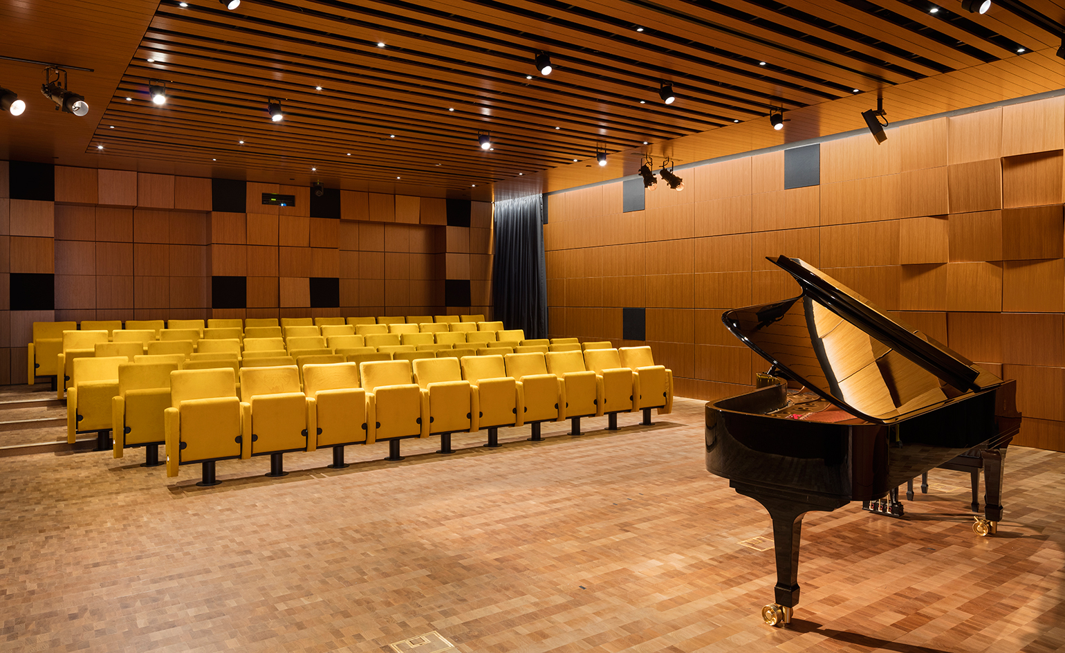
Holding the keys
11 April
Steinway, the piano-maker extraordinaire, has unveiled a 19,000 sq ft showroom and recital hall in midtown Manhattan. Designed by Selldorf Architects and conceived as much as a cultural destination as a retail boutique, the poetic space features an eye-catching, wooden ceiling on the first floor (the undulating design was inspired by the shape of a piano’s rim) as well as sound absorbing panels that make it the perfect acoustic environment. Downstairs, a recital hall with mustard yellow seating (pictured) echoes the colour of the felt that lines the keys of every Steinway piano. There are also practice rooms, recording facilities and speakers tucked in among the wavy ceiling panels, if ever the urge to perform strikes.
Photography: Chris Payne
Writer: Pei-Ru Keh
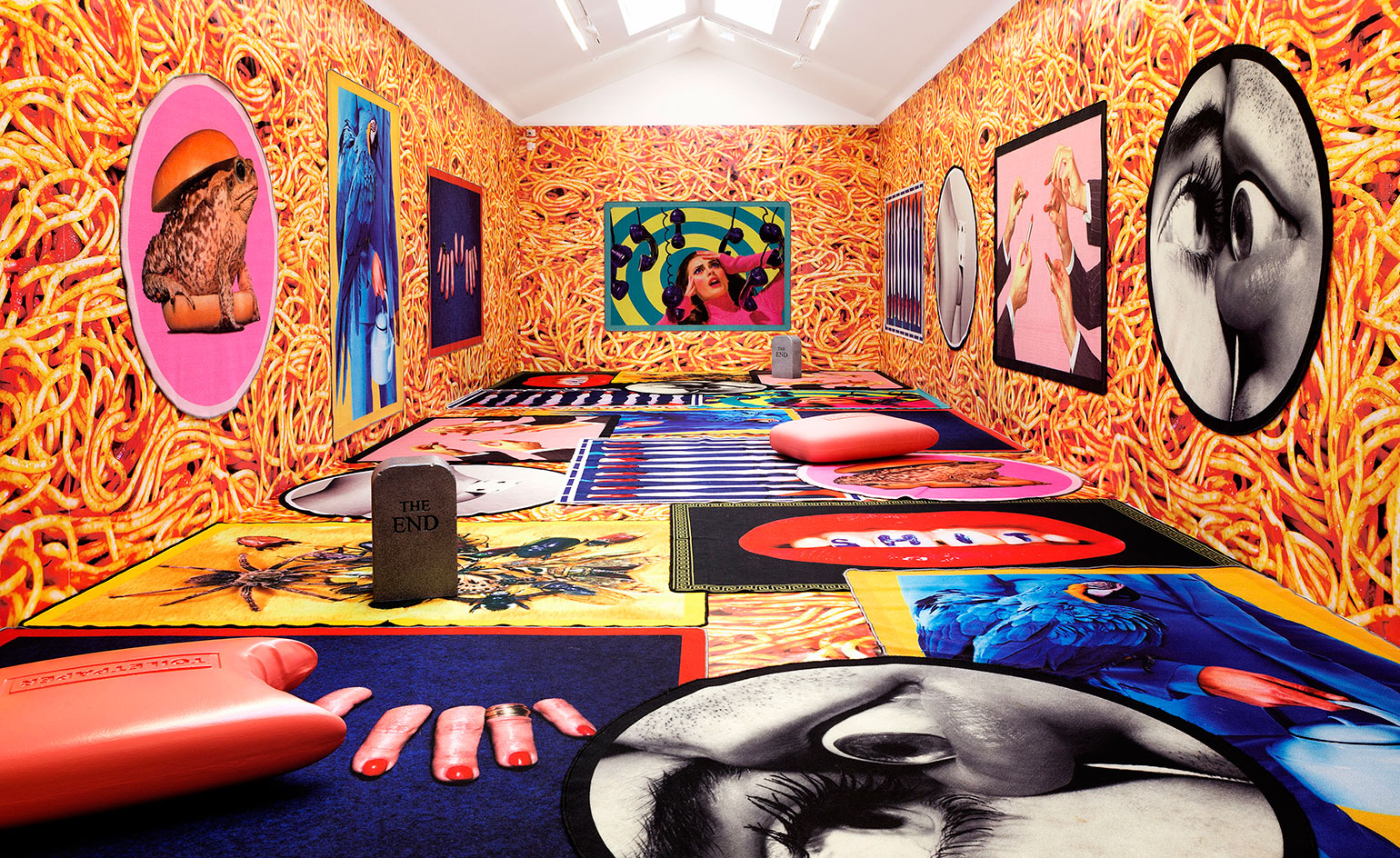
Seletti wears Toiletpaper in Paris
05 April
Paris' Galerie Perrotin is hosting a pop-up shop of epic proportions. Hosting the irreverent rugs of Maurizio Cattelan and Pierpaolo Ferrari's Toiletpaper until 9 April, the new rugs will be exclusively available for purchase at the gallery and via their online store.
A total of 10 designs, including round and rectangular versions, fill the room. Itself transformed from its customary tabula rasa to a spaghetti-covered space. For added spice – not that the provocateurs need more surreal elements in the mix – are the limited-edition pieces created for and with Gufram. 'God', an ode to fertility, greets guests upon arrival while the grotesquely ironic 'The End' stools and 'Soap' pouf dotted around, providing unique vantage points from which to take in the ambiguous tapestries.
The gallery's bookshop also has a selection of pop-up delights through to the end of April.
Photography: Courtesy ToiletPaper, Seletti & Galerie Perrotin
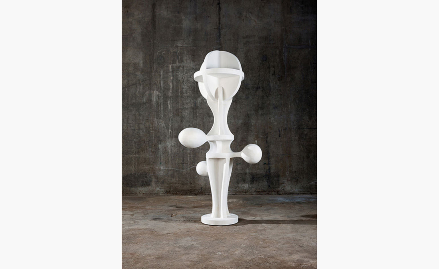
Joep van Lieshout's industrial Ballerina
04 April
The Dutch designer, sculptor, architect and entrepreneur Joep van Lieshout succeeds in making even the lithe form of a ballerina appear mechanical (yet inextricably alive) in this new work.
Van Lieshout says that he doesn't do a drawing before he sculpts; his works simply 'grow and erupt' – here is as if the acrylic resin sculpture is about burst into dance, or throw around impossible water jets.
At over 2m tall, Ballerina is sure to dominate the space in which it is placed; achieving a fragile and temporary, yet transcendental suspension.
Van Lieshout's latest work is on view until 7 May at the Galerie Jousse Entreprise in Paris. The show also includes work from his previous exhibition, 'Primitive Modern', held in Brussels last autumn. After his more industrial, dystopian and utopian series, this show is quieter, gentler in both choice of pale colours and shapes, bringing the organic and the industrial closer than ever before. Van Lieshout's credo is that we should incorporate industrial production in our society's more central visual landscape – this exhibition thus questions the relation between nature, industry and contemporary culture.
Pictured: Ballerina, by Atelier Van Lieshout, 2016. Courtesy Galerie Jousse Entreprise
Writer: Paula Erizanu
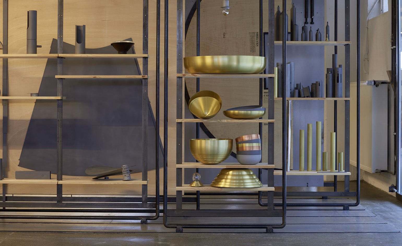
Light house: a newly revamped Stuttgart showroom allows lighting company PSLab’s designs to shine
31 March
Lebanese lighting design and manufacturing company PSLab opened its Stuttgart office in 2009, as a satellite of its Beirut headquarters and to serve as a base for European projects. This year, the 800 sq m industrial space underwent a radical renovation and is now a key hub for the company.
The site houses the offices of the ten-strong Stuttgart team, but also acts as a showroom for PSLab’s extensive lighting collection. Materials were kept to a minimum (concrete, brick and glass for the building, black steel and wood for the interiors), while all the furniture and fittings were designed in-house to allow the brand’s lighting to be displayed in a dynamic and flexible manner.
Movable steel structures serve both to display the products and define the space, which offers an encyclopaedic view of the company’s range.
Photography: Christopher Kain
Writer: Rosa Bertoli
As originally featured in the April 2016 issue of Wallpaper* (W*206)
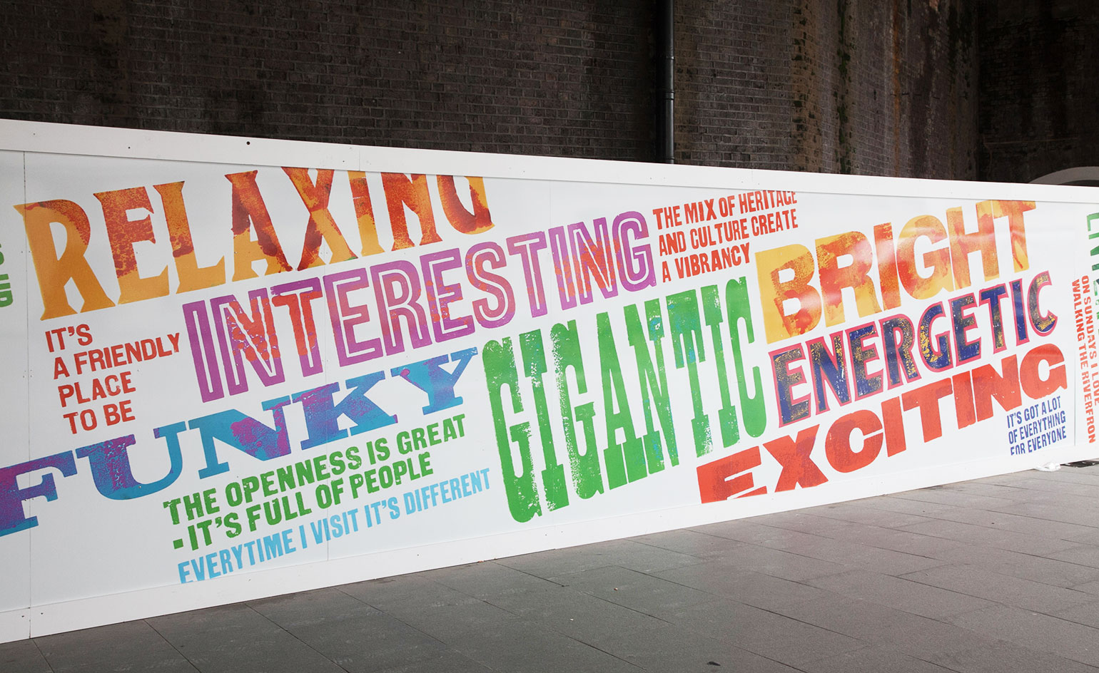
Writing's on the wall
29 March
Building sites are rarely a thing of beauty, but Southbank Place's community-designed hoarding gives the rising development's construction a rather modern appeal.
Created by Alan Kitching, one of the world’s foremost typographers and printmakers in collaboration with the students from local Lambeth schools, the graphic new hoardings create a vibrant atmosphere reflecting the 'physical qualities, attitudes, feelings and experiences of the South Bank – both through the eyes of the students and those who visit the area.'
The words and phrases emblazoned on the wooden facade are the result of 12 workshops run by Kitching with the schools which explored the principles of communication and showcased new artistic methods like letterpress printing and typography.
Ultimately though, it goes to show that London's South Bank is an interesting place to be.
Writer: Sam Rogers
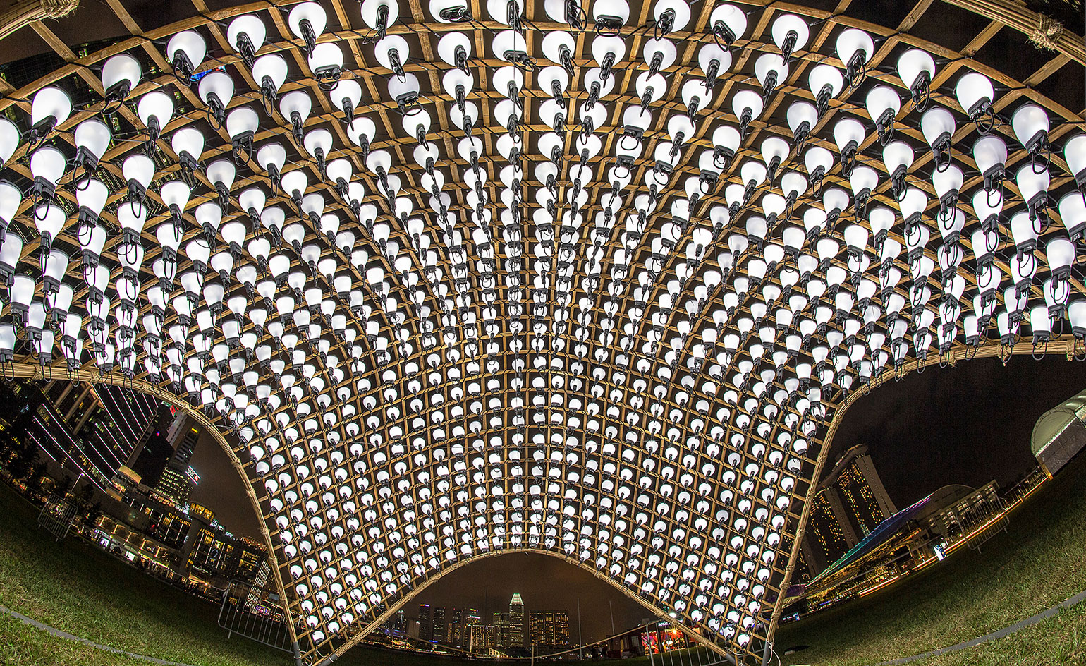
Luminary by nature
21 March
The lights may have turned off around the world to mark Earth Hour over the weekend, but turning off the lights is not the only way to raise awareness, as design and architecture practice Snøhetta can attest.
Instead of plunging us into darkness, the international practice would rather take an illuminating approach. To that end, they have created Lampshade for Asia's leading sustainable light art festival, i Light Marina Bay.
Constructed from a simple bamboo structure and covered with photovoltaic cells (1,000 of them, to be precise), Lampshade's interior dome space provides reprieve from the sun during the day, capturing sunlight to produce it's own light source during the evenings.
If the technology involved doesn't turn you on, perhaps the juxtaposition of hand-made, natural bamboo and ready-made lamps will. i Light Marina Bays ends 27 March.
Photography: © 2016 Urban Redevelopment Authority
Writer: Sam Rogers
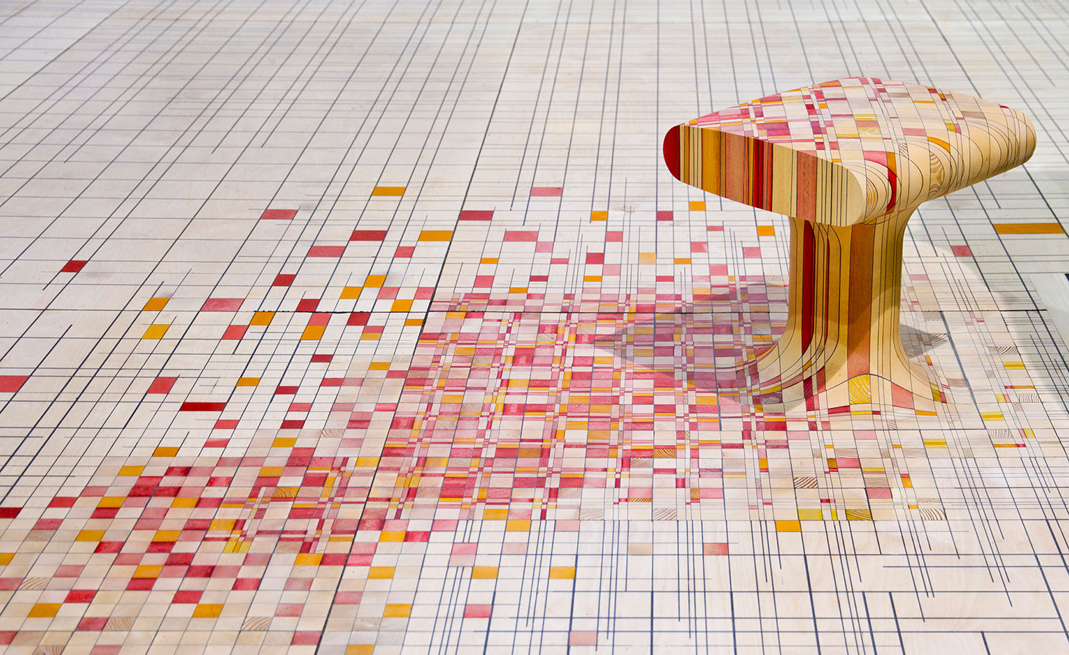
Wooden wonders wanted
18 March
The Wood Awards: Excellence in British Architecture and Product Design is open for entries.
Celebrating the finest timber designs, the annual accolades have become known for celebrant outstanding craftsmanship. Architects and designers are allowed to enter their wood-based products, but this year the public is invited to participate also, nominating contenders via Instagram and Twitter using #WoodAwards2016.
The shortlist will be revealed in July, and winners revealed in November with a number of selected projects going on display during the London Design Festival too.
Pictured: Endgrain by Raw-Edges Design Studio. Joint Bespoke Winner of the 2015 Wood Awards
Writer: Sam Rogers
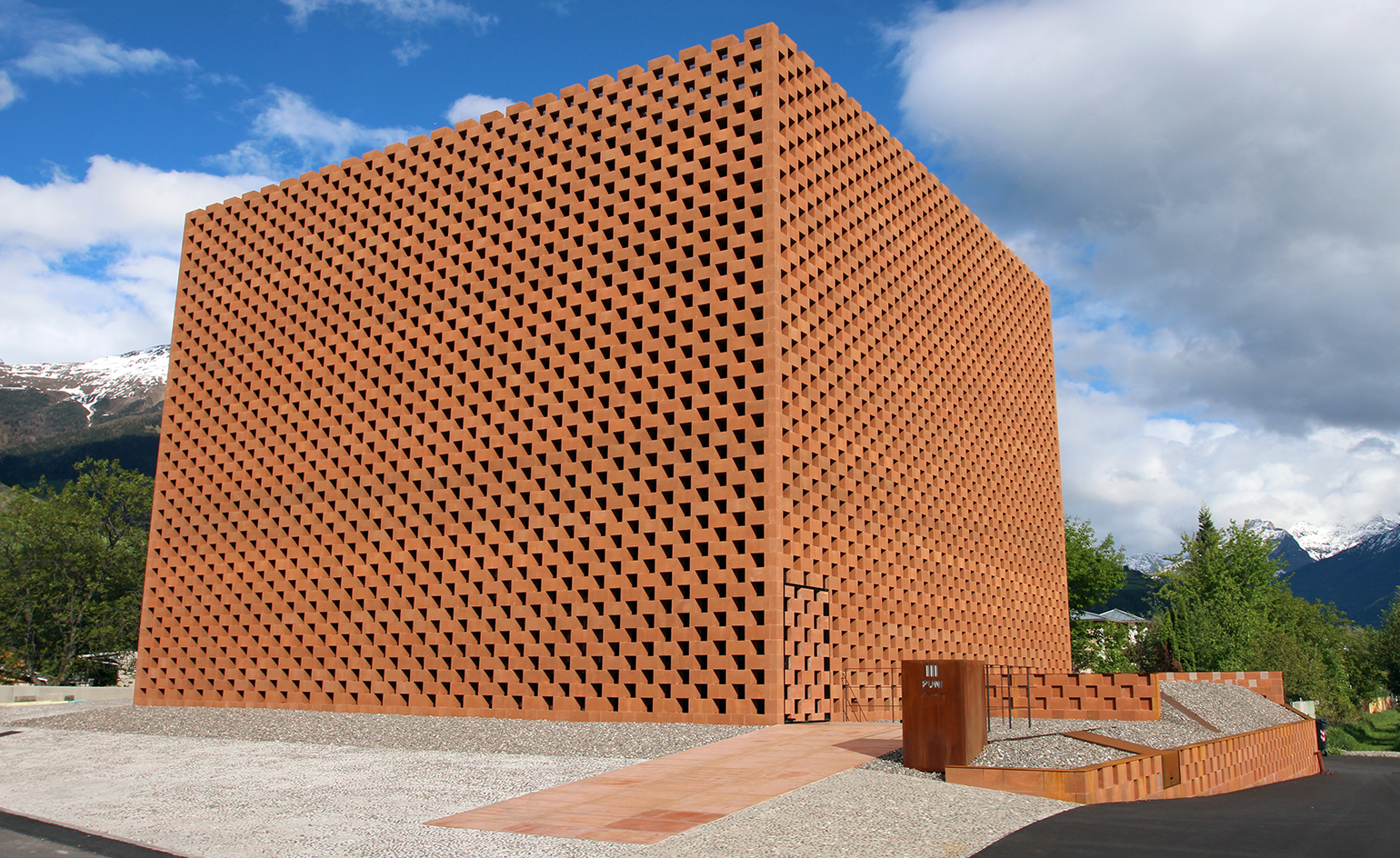
Urban Foray: The Winery Hotel, Stockholm
17 March
The Söder and Östlundh families, who are behind more than 19 hotels across Sweden, have teamed up to cater to the country’s increasing appetite for wine. Their new 184-room hotel and urban winery, housed in a red brick building designed by Archus Arkitektur, is situated in the outskirts of Stockholm. A third family, the Ruhnes, owners of the Terreno vineyard in Tuscany, came on board to ensure that the venture’s viticultural profile is up to scratch, while the services of renowned local wine connoisseur Michel Jamais and chef de cuisine Markus Gustafsson were secured for the hotel’s restaurant and deli. Design agency Southeast is behind the property’s chic industrial look, referencing Tuscany’s old-world wineries and Brooklyn’s industrial warehouses with its polished concrete floors and rough-brick walls. The making of the house wine – 8,000 bottles a year, overseen by Italian oenologist Luca Rettondini – can be observed by hotel guests at the winery, as they walk through the lobby.
As originally featured in the April 2016 issue of Wallpaper* (*205)
Writer: Micha van Dinther
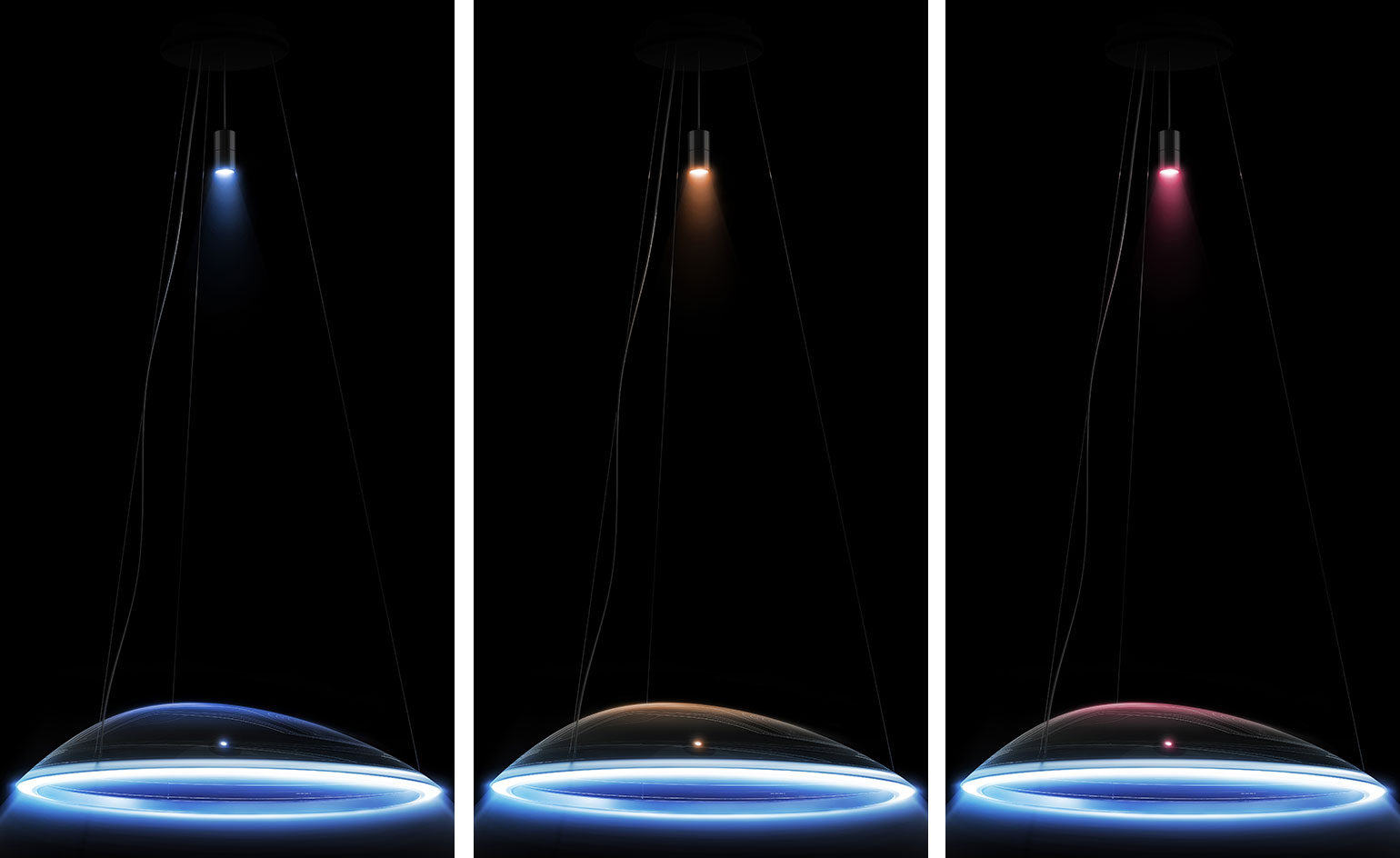
Bright future
14 March
Italian lighting giant Artemide has teamed up with Mercedes-Benz Style to create a new lighting concept unveiled at Frankfurt's Light&Building Fair. The new suspension lamp Amelune combines pure forms, sensual surfaces and intelligent high-tech to create something innovative and new.
Inspired by the underwater world, a tensioned surface reveals a dynamic curve. Instead of a central light source the transparent, shell-like form conceals an aluminium band, welded with an optoelectronic system and a subtle LED strips. Thus the light can be directed and partially refracted at once, creating an almost supernatural glow.
The elegant play of light creates optimal illumination, capable of creating a kaleidoscope of colours. Controlled via an app – also unveiled at the Frankfurt fair – various mood settings, or ambiance lighting as Mercedes refers to it, are possible. The lamp’s body is further illuminated by an additional spotlight, positioned up to 1.5m above.
Writer: Sam Rogers
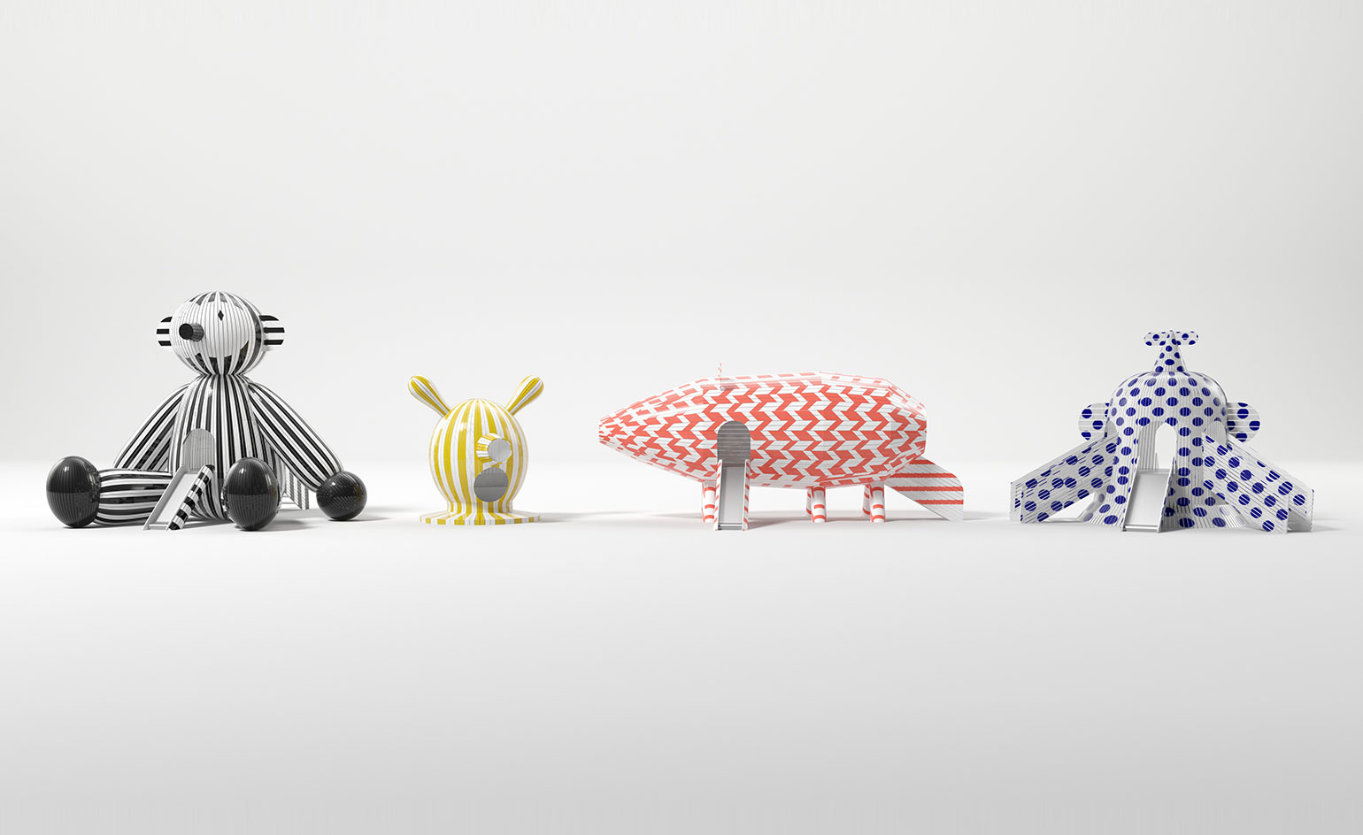
Summer of fun
08 March
Summer can't come soon enough, nor can the unveiling of Jaime Hayon's larger than life installations.
Created for Atlanta's High Museum of Art, 'Tiovivo: Whimsical Sculptures by Jaime Hayon' will see four large-scale wooden sculptures whimsically interpret the familiar shapes of animals and objects that inspire playfulness and joy. Decked out in polka dots or stripes, and fitted out with child-friendly stairs and slides, the sculptures will invite visitors to interact and engage, transforming the art centre's piazza into an outdoor art gallery turned playground.
If the success of 2014 and 2015's installations, 'Mi Casa, Your Casa' and 'Los Trompos', respectively, by Mexican designers Héctor Esrawe and Ignacio Cadena are anything to go by, we are sure Hayon's playful pieces (on view from 3 June) will be sure to impress.
Photography: Rendering of 'Tiovivo: Whimsical Sculptures by Jaime Hayon.' Courtesy of Jaime Hayon
Writer: Sam Rogers
Hypnotic hologram
7 March
2016 marks the fourth consecutive Media Ambition Tokyo (MAT) event, featuring performances, talks and installations on urban technological culture.
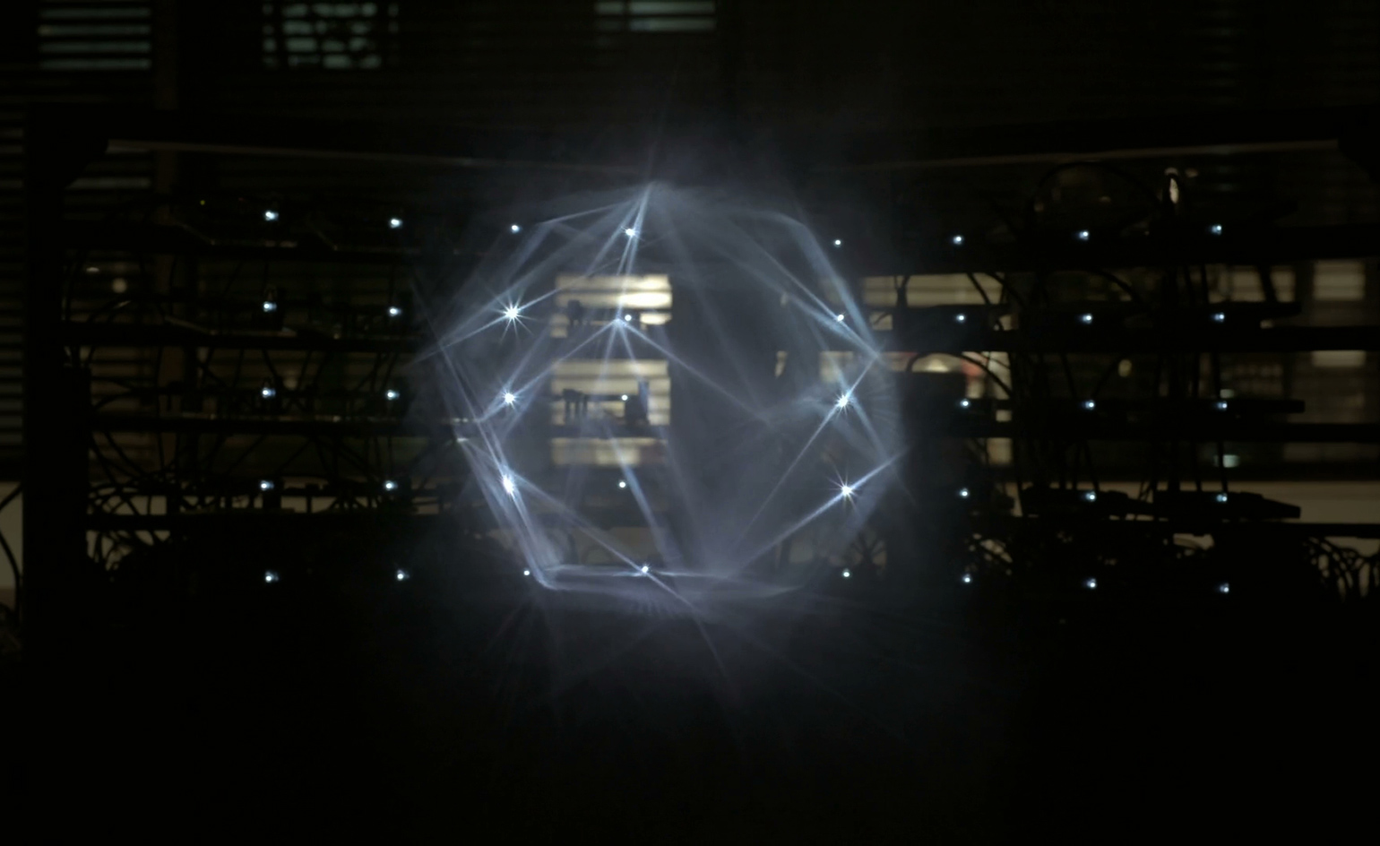
Available to view until 21 March at Roppongi Hills' MAT Lab, The Light of Birth is a kinetic laser and mist installation from Tokyo based visual designers WOW. Forty miniature LEDs shine into the fog, creating an impelling, atmospheric light-work.
Set up is deceptively simple, the lasers calibrated by a virtual coordinate system on a computer. This means the possibilities of what can be formed in the mist are endless – if you can code it, you can create it. Here, we see a glowing geometric constellation, but WOW have also experimented with a bird in flight, a galloping pony and a person walking.
Refreshingly, WOW have taken inspiration for their futuristic display from the natural world. They explain, 'everything you can see with your eyes reflects light in all directions. This hologram reproduces a state of light close to this. The sudden appearance of an artwork of light in an empty space is magical, making you recall the birth of matter.'
Writer: Elly Parsons
All the angles
04 March
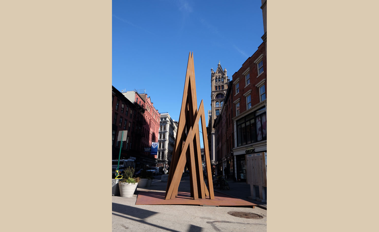
New York’s Union Square is no stranger to spectacles, which makes the arrival of Bernar Venet’s eye-catching sculpture, Disorder: 9 Uneven Angles, feel very much at home amongst the cacophony of the public park and square.
Presented by Paul Kasmin Gallery together with the New York City Department of Transport and the Union Square Partnership, the 25-foot sculpture is made from nine intersecting Cor-ten steel beams, continuing the same exploration of dynamic angles and shapes that Venet has pursued since the 1970s.
Now on view until June 2016, the installation will coincide with Kasmin’s solo exhibition of Venet's work, which will be unveiled on 28 April.
Disorder: 9 Uneven Angles, 2015, by Bernar Venet. Courtesy of Paul Kasmin Gallery
Writer: Pei-Ru Keh
Creative currency
03 March
No company headquarters is complete without a conversation-starting art piece to adorn the walls by Amuneal, the custom fabrication company based in Philadelphia.
Located at Capital One in New York, the piece is comprised of 14,000 pounds of steel. Over 2,000 square feet of the material was machined into individual pieces that were then welded together to create the fluid piece.
Naturally, Amuneal collaborated closely with the sculpture's designer Gensler, who had to reinforce the terrazzo flooring to ensure the sculpture’s weight was evenly distributed. In fact, the piece only touches the floor at two points, giving it a surreal sense of weightlessness.
Writer: Pei-Ru Keh
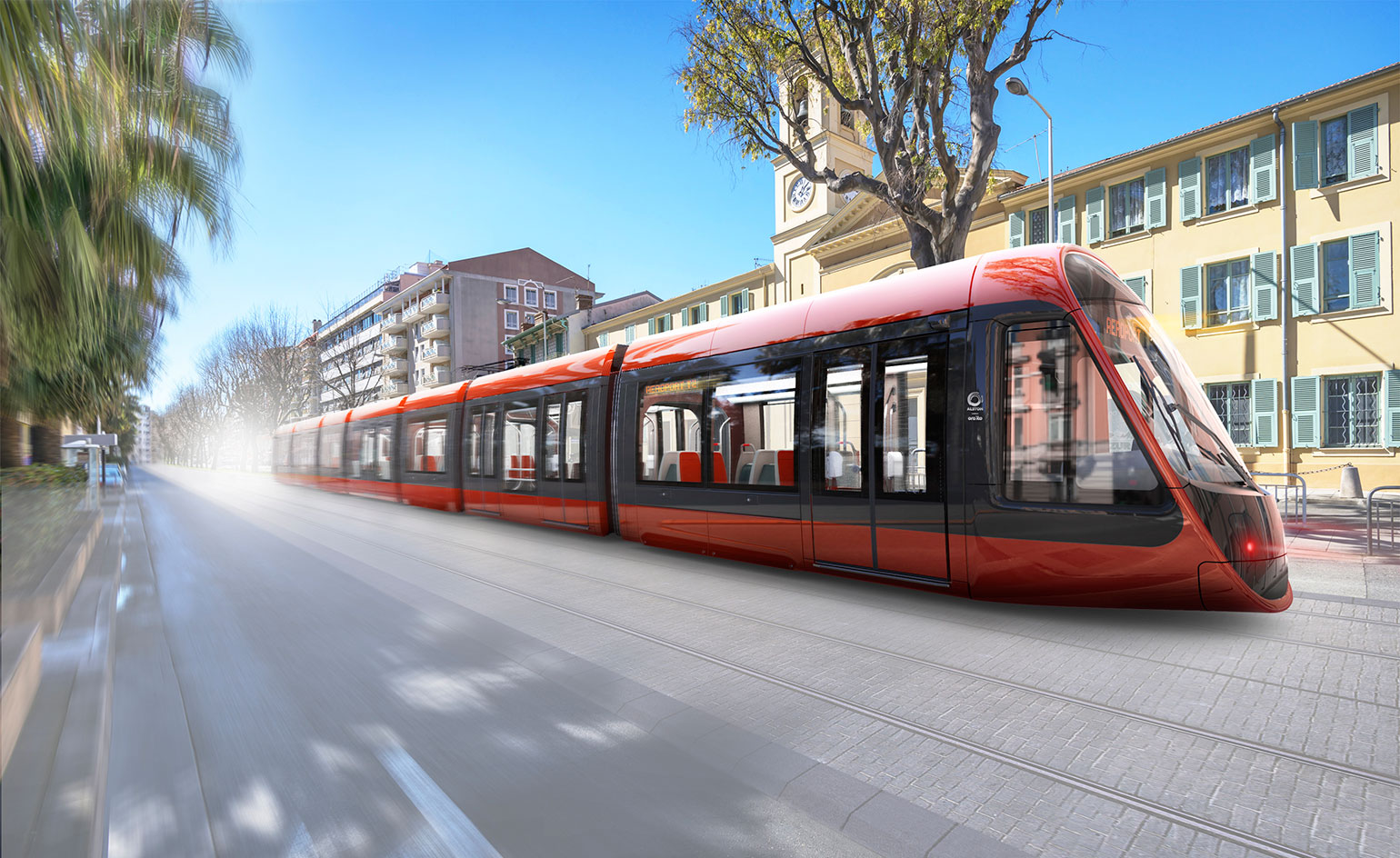
Nice line
02 March
French designer Ora ïto and rail company Alstom have unveiled their designs for Nice's new tramway.
True to form, the design complies with Ora ïto's 'simplicity' ideology, decoding the hi-tech with the user in mind, making it true to its intended purpose.
The Mediterranean city's new tram is as much an achievement of design as it is democracy. Voted on by its citizens, the energy-efficient transport mode is created to 'fit in' with its surroundings. Invasive overhead cables have given way to a modern underground charging mechanism which will give the tram a seamless appearance. The elegant shape's chameleon-like ochre pigments reflecting the facades of the emblematic buildings of the area as it zooms past.
Each 44-metre Alstom Citadis X05 train can accommodate 300 travellers, with 19 vehicles planned for the route thus far. Due to be delivered in the summer of 2017 and implemented the following year, Nice looks ready to roll.
Writer: Sam Rogers
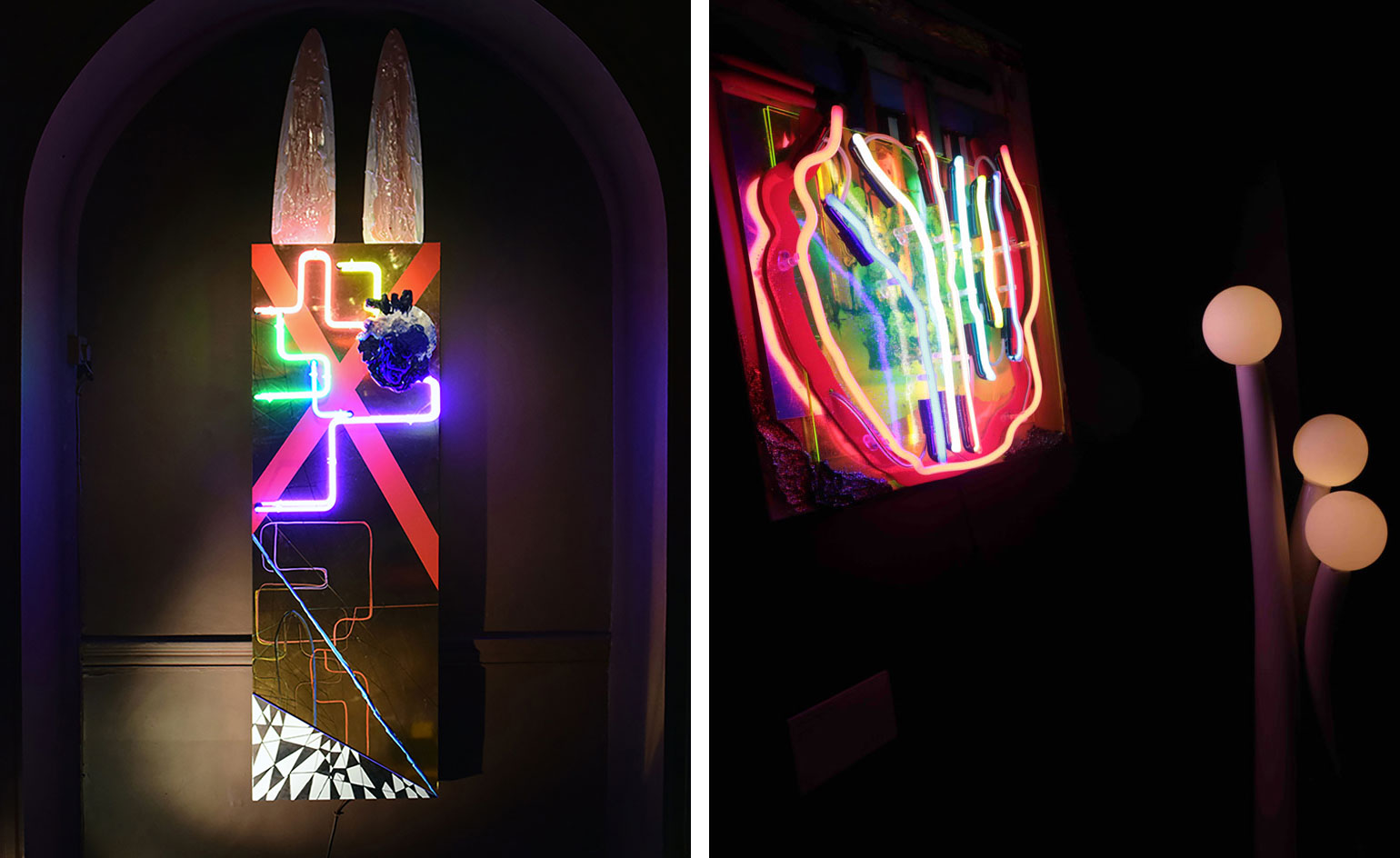
Systems & Networks
01 March
Gracing the decadent, eclectic surrounds of London's creative emporium Sketch this Spring is contemporary artist Taline Temizian's installation 'Systems & Networks.'
Featured in the dim lit entrance, the three different installations merge her abstract worlds of fashion and art through fluorescent lights, vibrant colours and whimsical motifs.
In a weird and wonderful display, each of the pieces capture the essence of connection. To wit, the kinetic 3D sculpture Textured merged networks artefact 1 appears inside a glass box that comprises 14 different coloured layers melding into each other. Meanwhile her neon diptych (pictured) uses tubular lighting to produce map-like routes that glide towards paper machete figures including glittering lips and bunny ears.
Remaining on show until end of April, Temizian's glowing uncanny forms certainly charge up the entrance to the Mayfair spot.
Pictured: Bunny He Bunny She, 2016
Writer: Sujata Burman
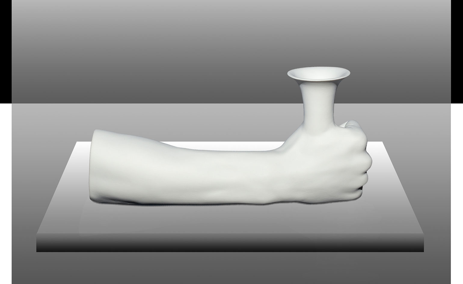
Mythical being
29 February
There are two kinds of objects in the world: those that inspire desire and those that bewilder and amaze. Italian product designer Federico Floriani's latest design, 'Tiresias', is definitely the latter.
More than a mere carafe, this fantastic object is 'a reflection on gender, transformation and acceptance,' says the Venice-based designer.
Inspired by his fascination with Greek culture and classic sculpture, the porcelain piece reflects a rather mythical connection with the human body. An acute attention to detail and a thorough background story are two of the many things Floriani picked up during his time with Italian duo Formafantasma.
One this is for certain: 'strange is better than common.'
Writer: Sam Rogers
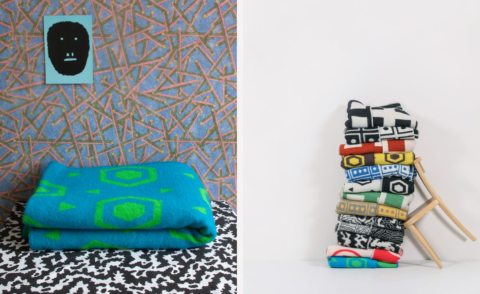
CoopDPS
26 February
Celebrating the ongoing life of pattern from different historical art movements is new textile collection 'CoopDPS.'
Designed by Ettore Sottsass' colleagues, Nathalie Du Pasquier and George Sowden, the digitally printed forms create geometrical shapes that are playfully Cubist and Memphis. From monochromatic grids to spiralled flowers and traffic light polka dots, the prints exist over bed linens and wool throws.
Made for Swiss lifestyle brand ZigZagZurich – a company that merges textile and art – the animated pieces arrive in a spectrum of bold hues and are given conceptual names taken from the solar system and countries all over the world.
Writer: Sujata Burman
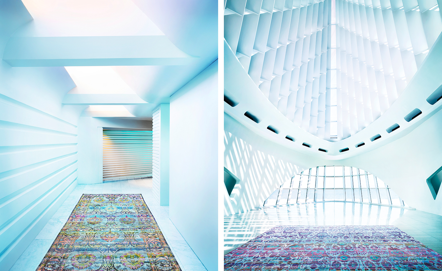
Totally floored
25 February
Although an established design icon in every right, ABC Carpet & Home continues to push the envelope by keeping one eye on the future while respecting design traditions of the past. The latest iteration of this philosophy coming together takes shape in the brand’s Spring 2016 campaign.
Photographed within the Milwaukee Art Museum's Quadracci Pavillion, and designed by Santiago Calatrava, the juxtaposition of ABC Carpet & Home’s artisanally geared wares and Calatrava’s dynamic architectural vision simply makes both subjects sing.
Pictured: ABC Carpet & Home's 'Inspire the Future' campaign, featuring rugs from its Aura and Samoke silk rug collection.
Writer: Pei-Ru Keh
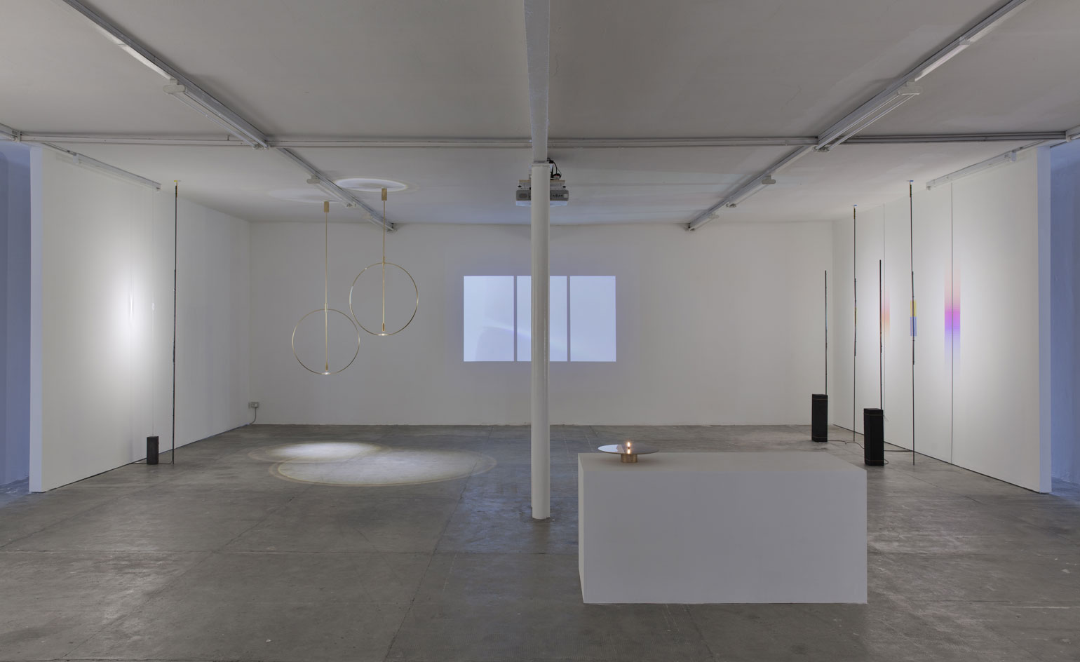
'Anno Tropico'
24 February
Experimental designers Formafantasma are returning to their home turf with a new exhibition at Milan's Peep-Hole.
This time working with the diversity and speed of light, they transform the space into a research centre for illumination working with natural and artificial forms.
Surrounded by a video, soundtrack and graphic drawings, the designers take a step into the worlds of physics and art with their dynamically abstract sculptures. Formed from different materials including iron, concrete and travertine, they combine these with polycarbonate lenses to make lighting in geometric forms.
Anno Tropico imbues the studio's unique poetry while taking us on a an educational journey on the different dimensions of light, in this world, and beyond.
Pictured: 'Anno Tropico' Room 3, 2016 Installation view. Photography: ©2016 Laura Fantacuzzi – Maxime Galati-Fourcade
Writer: Sujata Burman
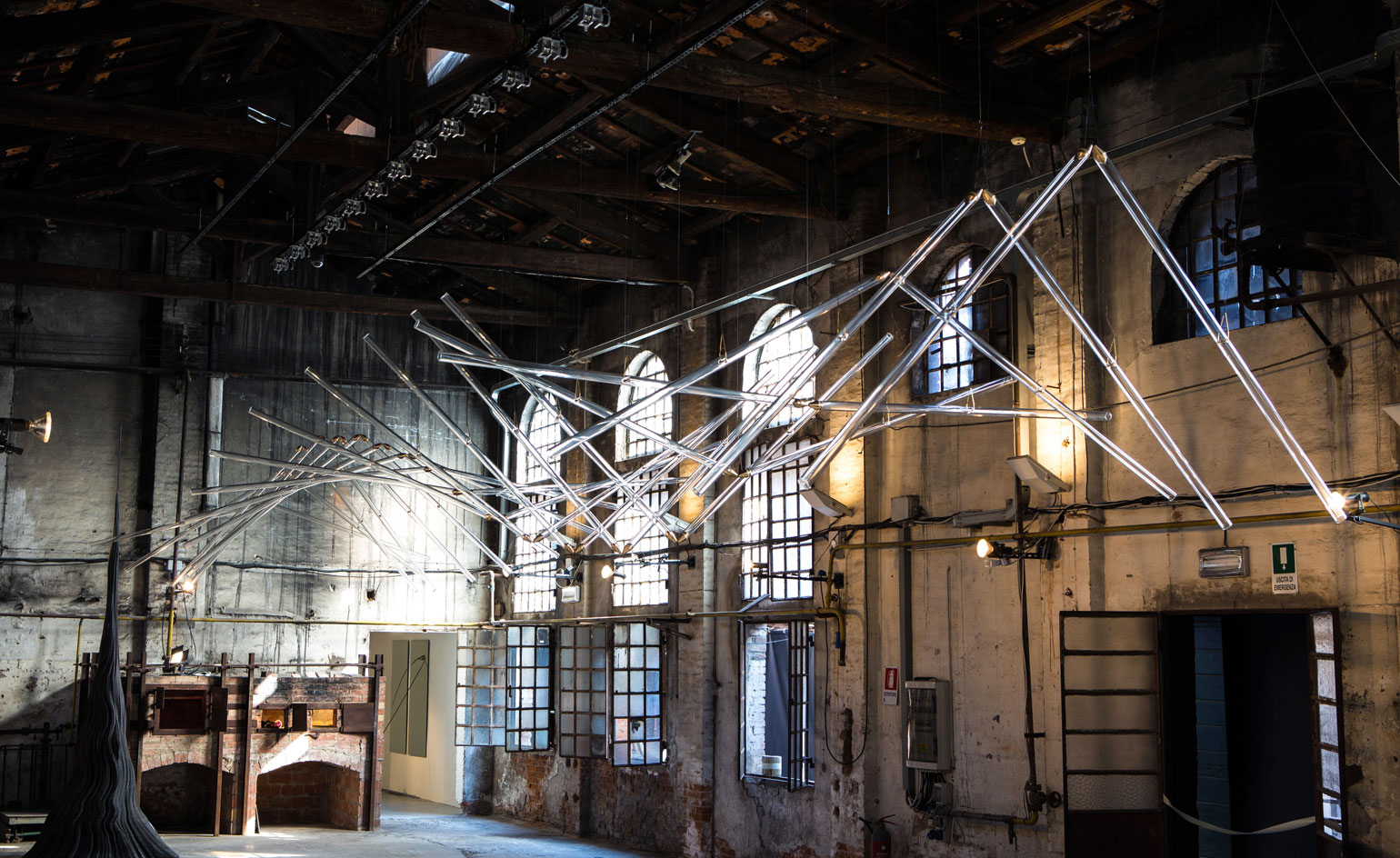
Flight of Fancy
23 February
Ahead of next week’s opening of The Armory Show in New York, the venerable art fair has revealed that Studio Drift will be constructing one of their signature glass sculptures on-site during the duration of the fair.
Taking pride of place in the fair’s champagne bar, and made possible by the Consulate General of the Netherlands in new York, Studio Drift will install ‘In 20 Steps’ – the piece they created for last year’s Venice Biennale (pictured). Like its predecessor, the Armory’s installation taps into the age-old human desire of wanting to fly, though this time the wing-like glass construction is armed with 40 kinetic glass wings articulating the idea of flight.
Writer: Pei-Ru Keh
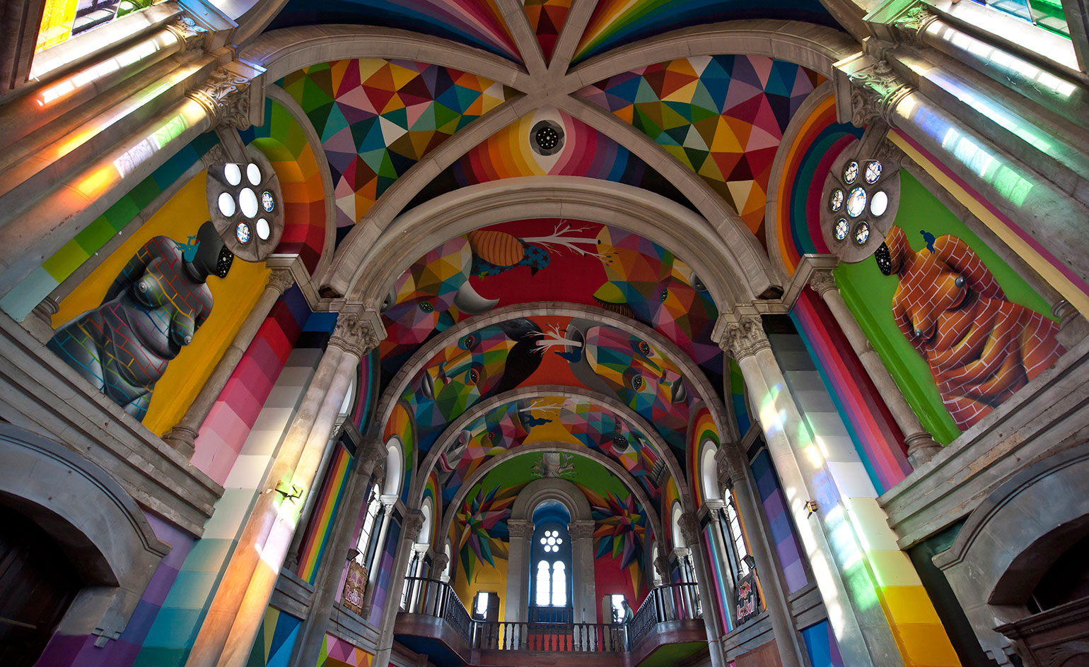
Religious experience
22 February
If skateboarding were a religion, its Mecca would be this: Kaos Temple, aka Iglesia Skate in Llanera, Spain.
Following a crowd funding plea, the church itself has become a work of art, courtesy of the geometric murals of Madrid-based artist Okuda San Miguel. His psychedelic faces, animals and skulls climb the vaulted walls, filling the chapel with colour whilst leaving the arches and frames intact and devoid of decoration, resembling frames, almost.
The former church was bought up by international furniture distributor Iniciativas Habitat in 2007 and transformed into a skate park with the help of the Church Brigade, a group of local skating enthusiasts, to host art and cultural exhibitions. Today it remains an inspiring space; a temple of passion for worn soles.
Photography: El Chino Pomares
Writer: Sam Rogers

'Drawing Machines'
18 February
From 23 to 28 February, computational artist Damien Borowik brings his intricate, chance-driven designs to The Gallery in Clerkenwell, London.
Borowik doesn't just create the drawings, he creates the machines that make them. Harking back to the pioneering computer artists of the 1960s who created their own plotter programmes, Borowik assiduously develops the digital and mechanical abilities of his 'drawing machines', with the final aesthetic firmly in mind.
Alongside his colourful, cityscape inspired etchings, Borowik's high-tech spirographs will be on display. When they're static, they aren't much to look at. But when they whir into action, they're hypnotic. They function remotely - directed by Borowik's adaptive digital programming. The pens swirl, dance and squiggle, creating art of fine detail. Borowik told Wallpaper*, 'The machines have strong performative aspect and can easily captivate an audience', blurring the boundaries between where the creative process ends and the art begins.
Even more surprising, the final pieces are often achieved by accident. Borowik explains, 'My work emphasises chance in the act of creation. For me, this represents an aspect of the human condition where we strive to be in control over our lives, but we never really are'.
Pictured: Expanding Square Composition, by Damien Borowik, 2015. Courtesy the artist
Writer: Elly Parsons
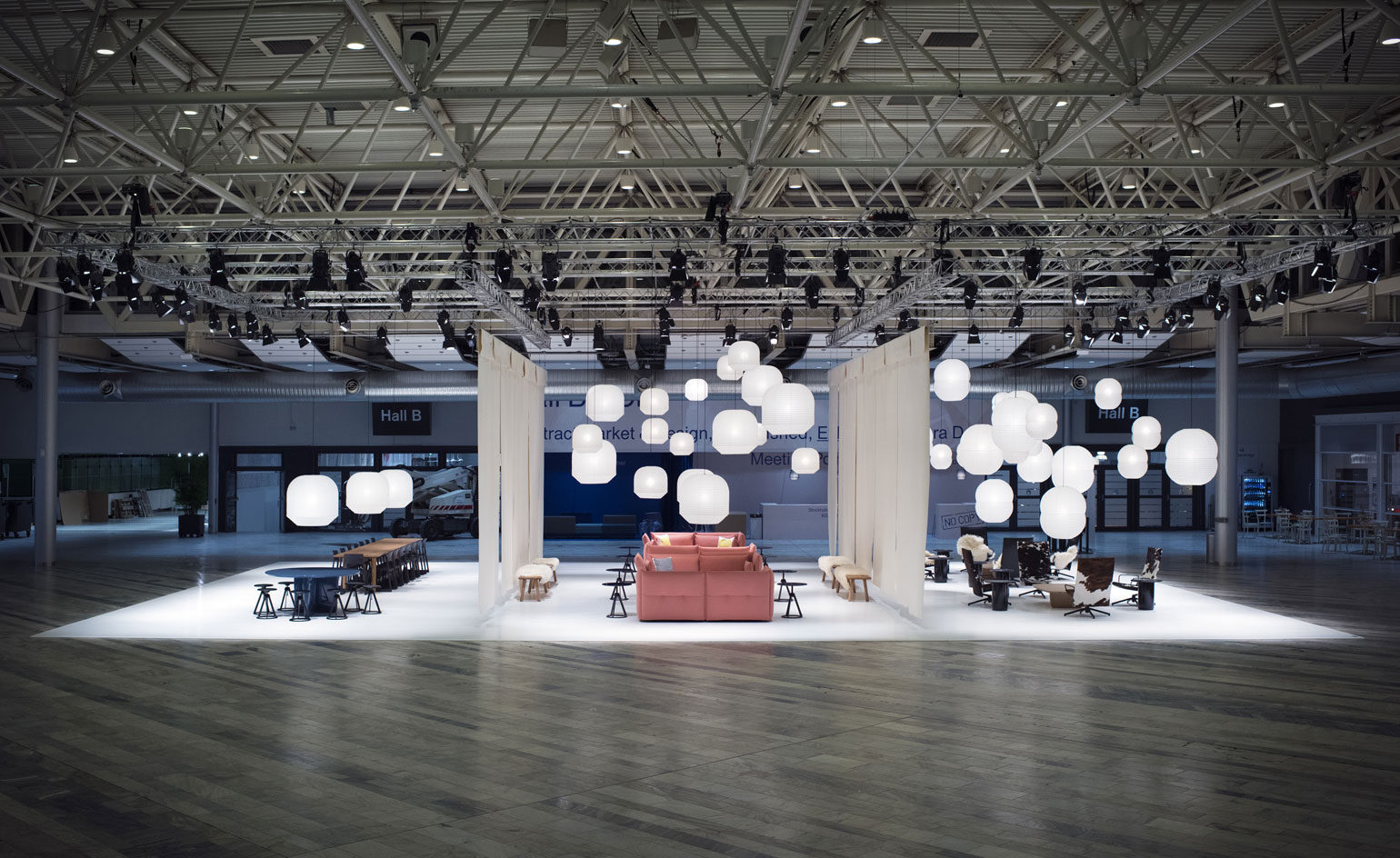
Triptych by Barber & Osgerby
17 February
On show during Stockholm Furniture Fair last week, Guest of Honour Barber & Osgerby created their installation for fairgoers to embrace as they arrived in the halls.
The London-based pair produced three alternatively designed set ups, all delicately divided by white screens. On the one side, cow hides and natural furs create an aura of luxury while on the other, a sharper area of geometric, graphic shapes exists. Nestled between these two spaces we see a softer, playful side displaying the multifaceted style of the duo.
'Each space offers the visitor an environment for relaxation, meeting and working under a canopy of paper lanterns' the designers explain. Walking through Triptych we were surrounded by plenty their recent designs including side tables/stools for Knoll and 'Mariposa' sofa for Vitra.
Writer: Sujata Burman
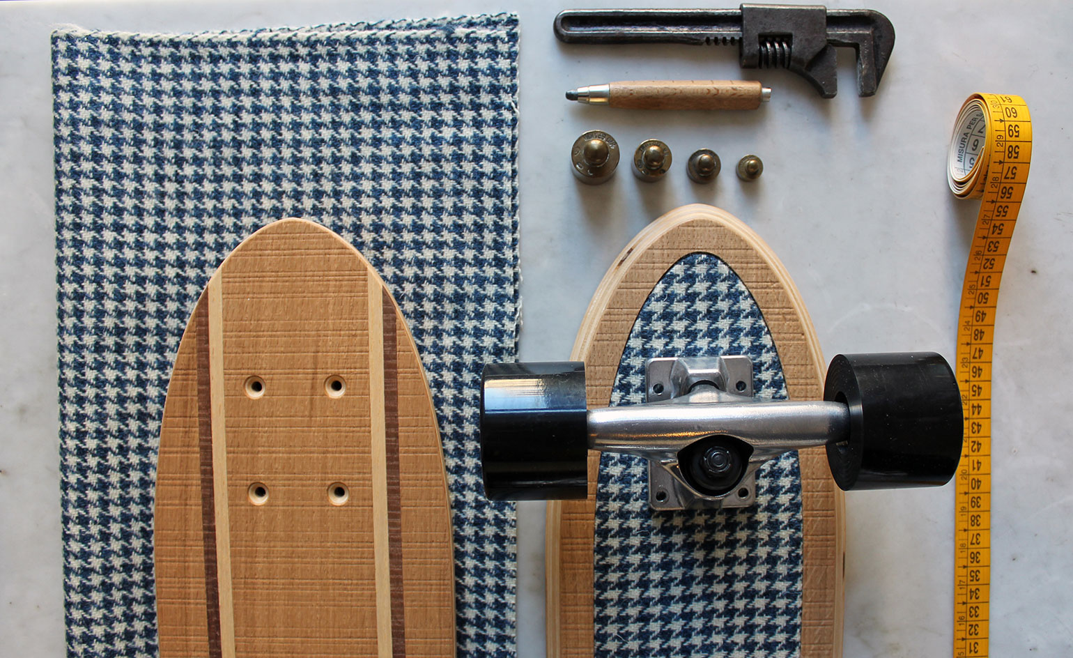
Feel the wood
16 February
Never has the call of the wild been quite so clear – or so stylish. Designer outdoor brand Epoca speaks to the inner adventurer in us all with its fine line of limited edition skis and skateboards.
Showcasing the production process in Milan’s Subalterno1 earlier this month, their designs marry old school charm and skill with modern sensibilities. Vintage-inspired styles are made using natural, sustainably-sourced wood from the Italian Alps and crafted though traditional techniques. A few new productions technologies are also used, including the digital printing of some of the fabrics used for decorative flair. The wood is the main star though; a subtle link back to our roots, back to nature.
Writer: Sam Rogers
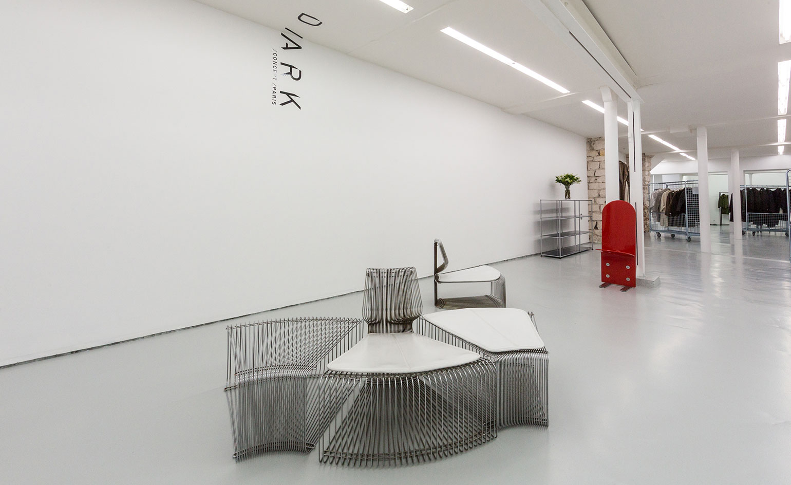
D /ARK showroom in Paris
15 February
A new installation space has opened in Paris, aiming to redefine the parameters of 'the showroom'. Developed by brand strategists D /ARK, and headed up by curator Barbara Grispini, the space features work from fashion brands including Craig Green and Nicopanda, and renowned designers like Charles Eames and Luigi Saccardo.
Each brand has been given the opportunity to define their area completely, creating a 'showroom within a showroom' effect. By delineating each brand's segment with transparent wire furniture, an uninterrupted visual flow is created, allowing the brand's themes to openly interact.
Continuing this free-flowing concept, Grispini was keen to promote a global, genderless space – choosing items and designers that embody this outlook. 'We were looking at what defines modernity and luxury today,' she told Wallpaper*, 'with cross pollination of origins and the challenging of gender boundaries as two key modern factors.'
Writer: Elly Parsons
Photography courtesy D /ARK
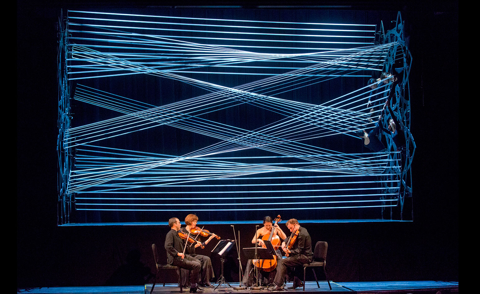
'Seeing Music'
09 February
92Y's Seeing Music Festival in New York intersects sight and sound through visionary interpretations of beloved masterworks.
As part of the festival, Bach's The Art of the Fugue was performed by the Brentano Quartet, with a moving-set backdrop created by engineer Gabriel Calatrava and choreographer John-Mario Sevilla. The installation was inspired by musical instrument strings, and recalls the children’s game Cat’s Cradle. Directed by a troupe of dancers, the luminous strings cross paths, stretching, compressing and pulling into striking new patterns to mirror the contrapuntal nature of Bach's fugue; where two voices, rise, fall and chase each other.
Instead of having one eye on the set and one ear on the music, the two sensory experiences play in counterpoint; the fugue informs the choreography, and the set illuminates the fugue.
The 92Y Seeing Music Festival continues until 18 February 2016.
Photography courtesy 92Y Festival
Writer: Elly Parsons
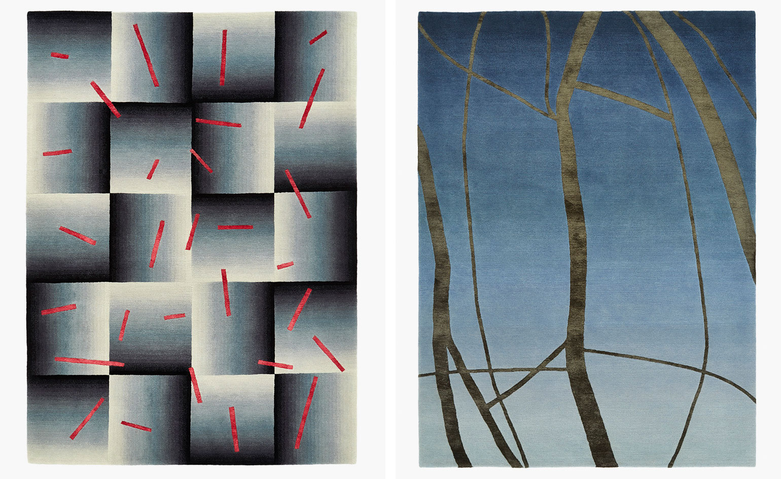
Walking on Art
08 February
Contemporary rug designer Deirdre Dyson's 'Walking on Art Collection' is on show at her newly redesigned gallery on London's Kings Road.
The striking collection uses bold, tonal contrasts to create vibrant imagery and witty optical illusions. Dyson explains, 'the 2016 collection features blocks of colour grading and chunks of silk, integrated in a way that will play on light'.
Each bespoke, hand-knotted carpet benefits from Dyson's keen eye and fine-art training. She carefully judges the variation of different shades in order to achieve a smooth transition between hues and textures.
To complement 'Walking on Art', Dyson has released a book of the same name, which explains her practise and techniques in colourful detail - published by Thames & Hudson, £38.
Pictured: 'Scatter' and 'Twilight' rugs. Courtesy Deirdre Dyson
Writer: Elly Parsons
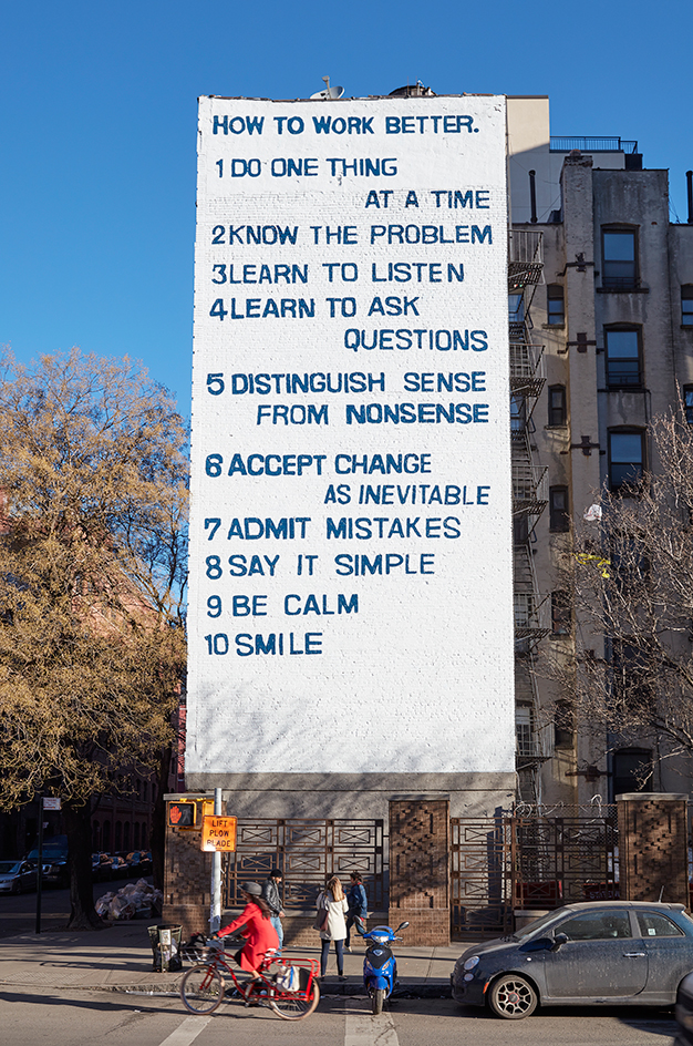
The writing's on the wall
06 February
New York’s Public Art fund brings renowned Swiss artist duo Peter Fischli and David Weiss’s iconic How to Work Better mural to to the corner of Mott Street and Houston Street in Manhattan’s NoHo district. Coinciding with the Guggenheim’s How to Work Better retrospective on the artists’ 33-year collaboration, the mural is being presented in the USA for the first time. Fischli and Weiss originally found the motivational list pinned to a bulletin board in a Thai factory and painted it as a six-story mural on an office building in Zurich in 1991.
The hand-painted, 50- by 20-foot NoHo version is intentionally juxtaposed against a slew of billboards. In this setting, Fischli and Weiss’s playful approach of magnifying the daily human experience is highlighted—the simple concepts to “work better” are as much about life as they are productivity. The artists’ video of a cat drinking milk, Büsi (Kitty) (2001), can be seen at 11:57 p.m. on the Times Square billboards all through February.
How to Work Better is on view until 1 May 2016
Photography: Jason Wyche, courtesy of Public Art Fund, NY
Writer: Olivia Martin
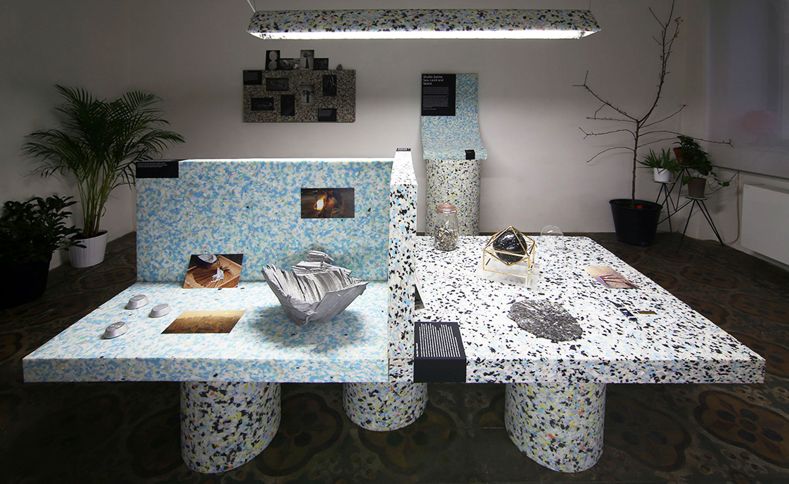
Reuse, recycle
05 February
Wallpaper* favourites Studio Swine and OKOLO have collaborated on an experimental exhibition of decorative recycled objects, on display in OKOLO/PP gallery, Prague.
Anglo-Japanese duo Studio Swine set about designing these performative pieces around the theme of 'Sea, Land and Space'. The objects include Chair/Gyrecraft, formed of recycled plastic bags from the sea; Can city, created from aluminum cans found on the streets of Sao Paulo, and Hair Highway, which explores alternative uses of human hair.
A marble-effect, recycled-foam presentation slab ties this diverse range of projects together. By positioning photographs, prototypes and memorabilia amongst the finished articles, OKOLO have interrogated Studio Swine's design process, as well as giving the gallery an eclectic, 'exhibition in a suitcase' feel. As the curator Adam Štěch explains, 'In all our projects we are seeking a different perspective on the designer's work, to create a behind the scenes, personal approach'.
Photograph courtesy OKOLO
Writer: Elly Parsons
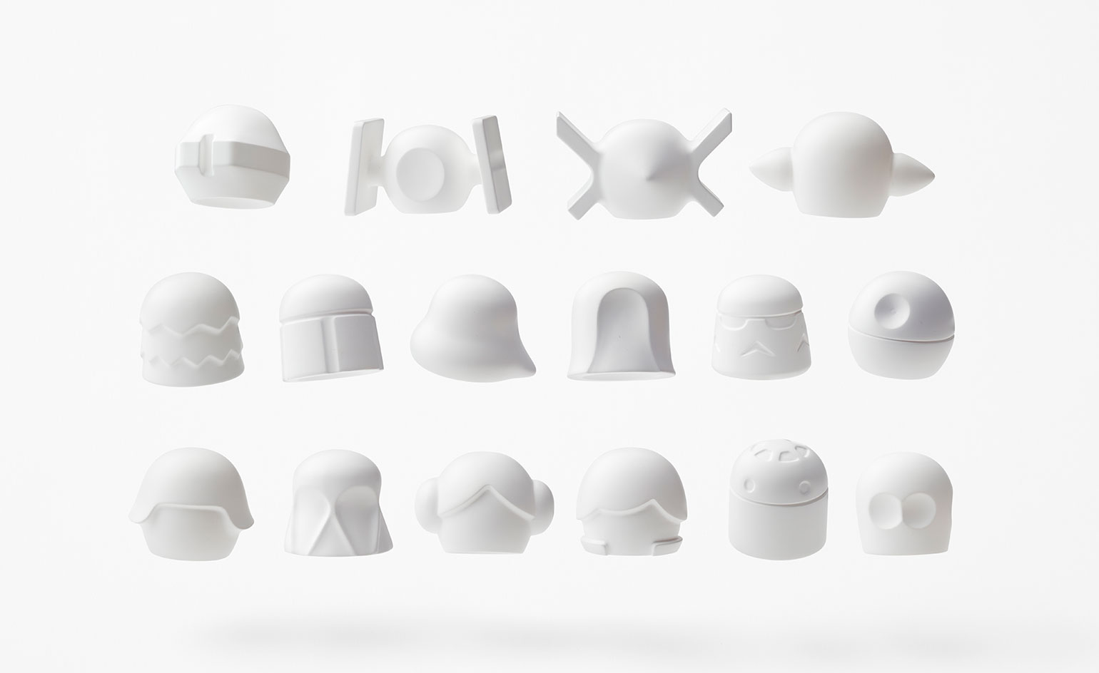
The force awakens
02 February
A long time ago in a galaxy far, far away, the very thought of George Lucas' epic trilogy (turned endless monopoly) ever ending was but a bad dream. In our galaxy, Nendo is further fuelling our Star Wars obsession with his latest designs.
'We wanted to open up new possibilities by creating a simplified 3D form,' explains the Japanese design studio. JJ Abrams' (in)famous characters - including Darth Vader, Han Solo and Yoda - have been simplified to their essence, each with a rounded top and concave base to create instantly recognisable 3D objects. 'These designs are aimed at being used as a type of “material”, offering the opportunity to the designers and manufacturers who have obtained the licenses to develop their products based on these forms,' says Nendo's team. Kitchenware, jewellery and stationery are among the recommended uses.
Photography: Akihiro Yoshida
Writer: Sam Rogers
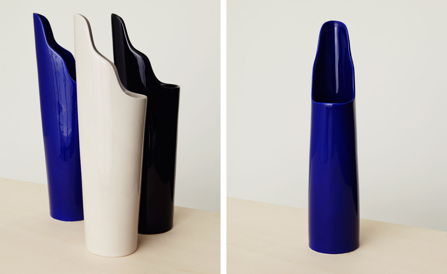
Cascade
29 January
An inaugural design collection for Berlin-based fashion studio FRISUR, these abstract vases are imagined by Fabrica studio designer Pascal Hien.
The ceramic models have been crafted in Italy but employ the minimalist aesthetics of FRISUR's Scandinavian-inspired SS16 collection 'Caraffa.'
Cascade's asymmetric shape allows it to cleverly alter in appearance when rotated from its feminine curves to a clean bold cut. Arriving in three primary hues, the ceramic sculpture stands tall in electric blue, sleek black and subtle cream.
Writer: Sujata Burman
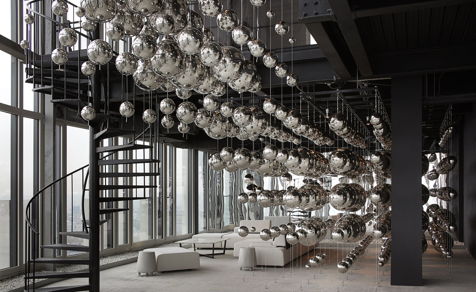
Mercury
21 January
Hanging up high between the 39th and 40th floors at the South Bank Tower is a cosmic installation by London-based architecture firm Design Haus Liberty.
Mercury is made up of over a thousand mirrored spheres symmetrically lined up across a gradient on the two floors. Existing as if droplets of the chemical element stuck in time, the shadows formed coupled with the reflective light it catches through the building's floor to ceiling windows creates a fully immersive, and slightly surreal experience.
'The backdrop of London is reflected into dynamic suspension,' says Dara Huang, the founder of Design Haus Liberty, '[this generates] an infinite space that encapsulates the heartbeat of London.'
Photography: Julian Abrams
Writer: Sujata Burman
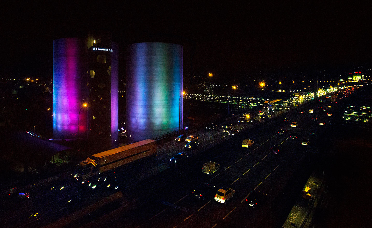
Grasso's SolarWind to light up Paris
20 January
French conceptualist Laurent Grasso’s work stands at the intersection of science and art, and illuminates the relationship between natural and human phenomenon.
His latest large-scale art intervention, SolarWind, launches in Paris’ 13th arrondissement soon (25 January) and will take over two 40m-tall silos concrete silos, which have long been a distinctive architectural feature of the area. Grasso is projecting powerful, multi chromatic beams of light onto their facade, giving them a constantly changing appearance.
There is a great amount of scientific research behind this aurora-like dance as well - working with CNES, the French space agency, Grasso developed an algorithm that would translate solar activity and cosmic movements into poetic fluctuations of colour and light. 'The power of solar flares confronts us with our lack of mastery,' he explains. 'This is both a poetic and philosophical project infinitely expanding our imagination.'
SolarWind opens on 25 January 2016, and will be seen by more than a million motorists along the Périphérique orbital highway every day, as well as from most high-rises in southeastern Paris. Silos Calcia, 25 quai d’Ivry, Paris 75013
Writer: TF Chan
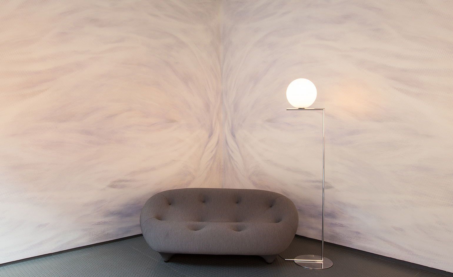
Flavor Paper teams up with artist Ara Starck
19 January
No stranger to turning walls into veritable artwork, Flavor Paper’s latest endeavor taps the creative talents of the French artist (and design offspring) Ara Starck for an immersive wall covering entitled Vortex. Created from individual layers of original charcoal and oil painted artwork by Starck, the swirling, light-toned creation is admittedly one of Flavor Paper’s most complex undertakings. Aided by qualities of the original mediums, Vortex - which is printed on a subtly iridescent fabric - possesses an ethereal sensuality while exuding a sense of movement that becomes increasingly vivid over time.
Photography: Frederica Carlet
Writer: Pei-Ru Keh
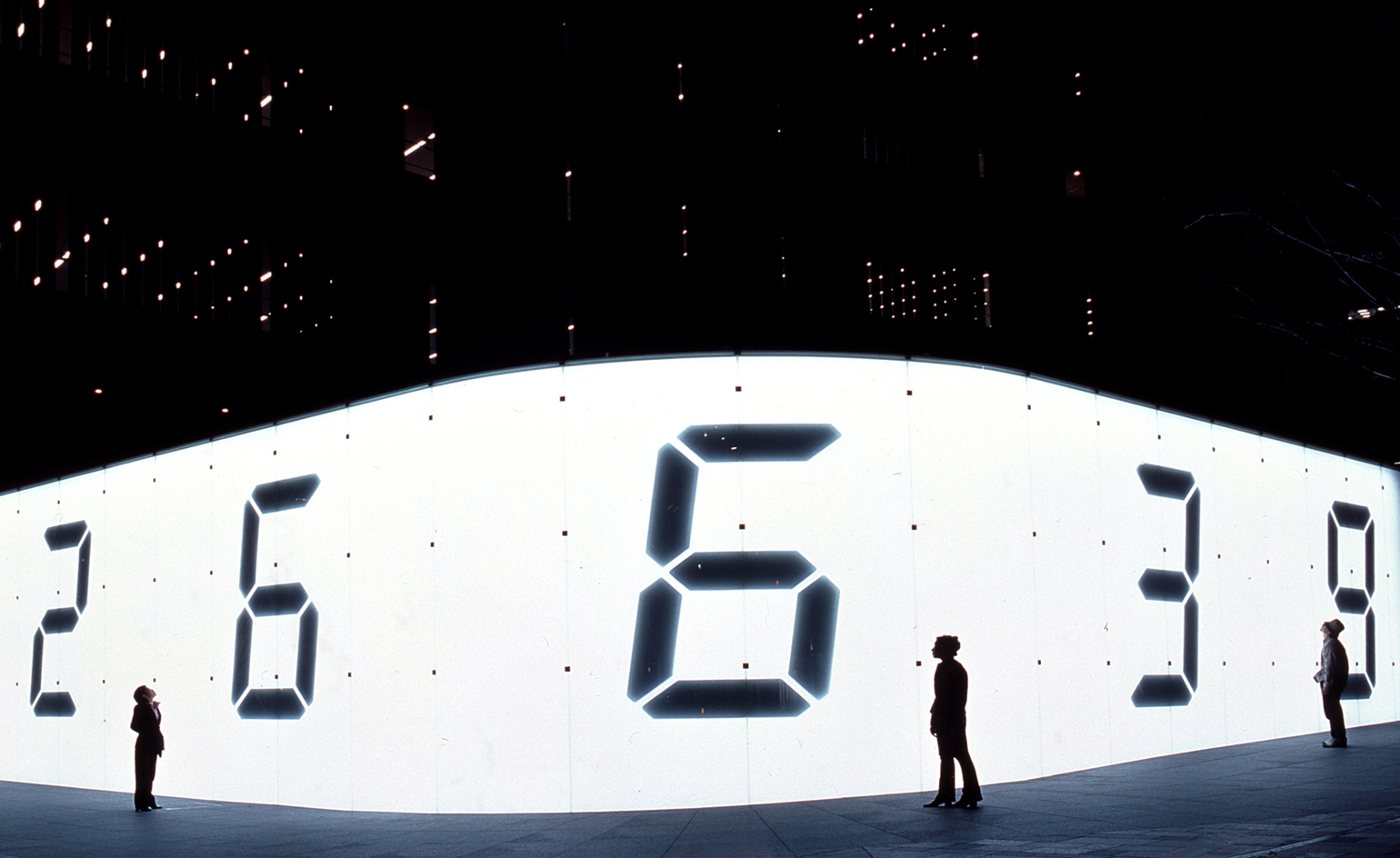
Passing of time
13 January
Artist Tatsuo Miyajima is showcasing a new large-scale public light installation at Art Basel this March. The work Time Waterfall will be projected onto the façade of Hong Kong’s iconic International Commerce Centre on the Kowloon harbour front.
The numbers one to nine tumbling down the front of the building will act as a metaphor for life. By conveying the continual passing of time, the artist describes the work as demonstrative of the need to be ‘living in the present’. The palpable absence of a zero refers to the Buddhist concept of ‘Sunya’, which symbolises ‘void’ or absence and therefore acts as an allegory of death.
Time Waterfall continues Miyajima’s signature LED work, which is exemplified in his 2003 piece Counter Void. He uses the medium to portray his favourite recurring themes of ‘Keep Changing’; ‘Connect with Everything’; and ‘Continue Forever’.
Pictured: Counter Void, by Tatsuo Miyajima, 2003. Courtesy Scai The Bathhouse
Writer: Rhiannon McGregor
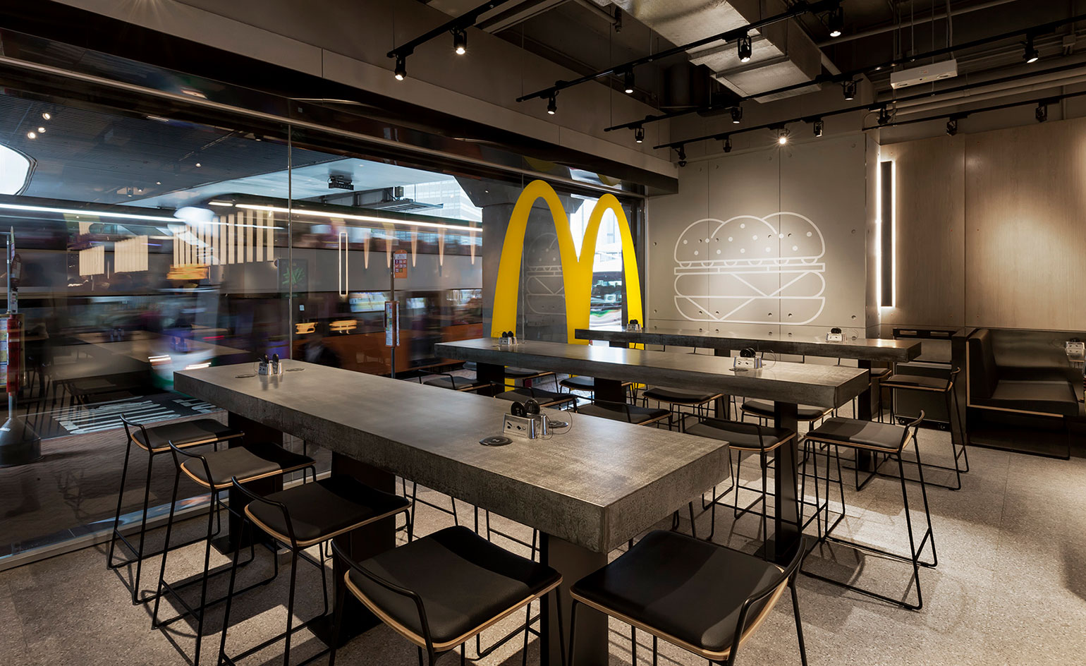
Landini Associates rework McDonald's Hong Kong
13 January
The latest interior from Australian designers Landini Associates uses a simple palette of concrete, glass, stainless steel and wood to reflect the firm’s recognisably pared back aesthetic, which we last saw in tea company T2’s new concept store, T2B.
The commission for McDonald’s Hong Kong offers ‘an experiment in non design’, says Landini. The restaurant showcases a neutral canvas on which the fast food empire can showcase its goods. A specially developed lighting system alters the brightness according to the time of day, so that during the daytime the lights are brighter, while at night they dip to create a more sophisticated ambience.
The pièce de résistance is the restaurant's custom open grill. Customers can watch their food being prepared from nearby tables adding an element of theatricality to the dining experience.
Photography: rosshoneysett.com Courtesy: landiniassociates.com
Writer: Rhiannon McGregor
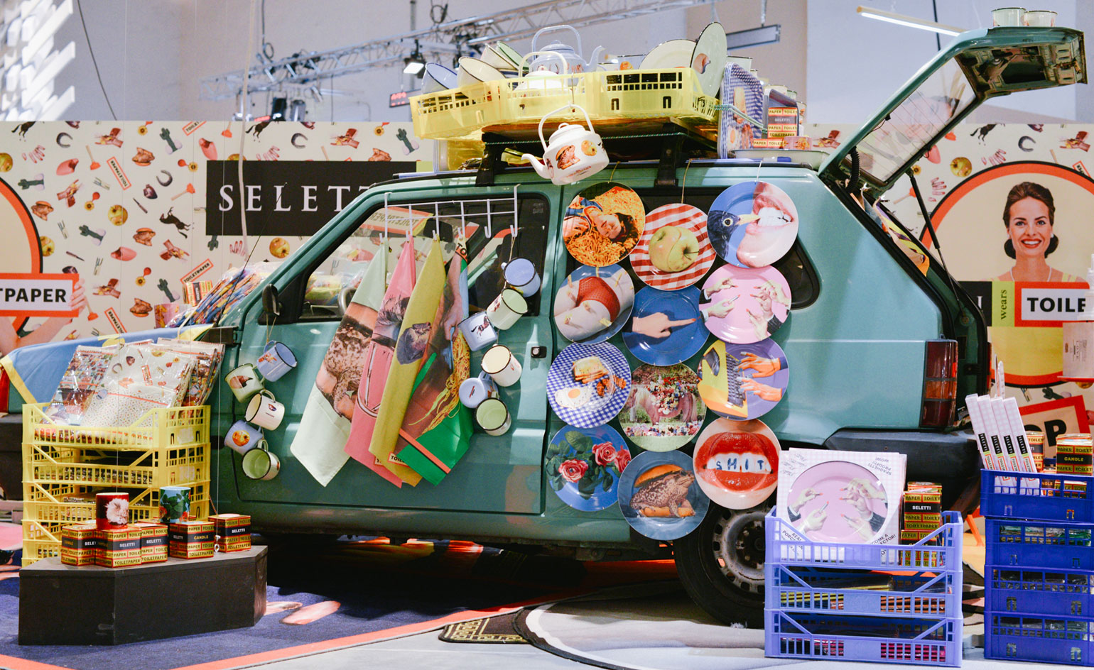
Seletti wears Toiletpaper at Pitti
12 January
Roll up! Roll up! Italian collaborative kings Seletti and ToiletPaper magazine are opening up shop at Florentine menswear festival Pitti Uomo.
Marking the first design collection ever to be invited to the fashion soiree, they will once again be standing out from the crowd with their eclectic vehicles filled with the brave and humourous 'Seletti wears Toiletpaper' range.
On offer are the duo's playfully printed homewares amidst new tote bags and 'strangely scented' candles, exclusively available in this jumble-sale-meets-car-boot-sale whimsical style.
Writer: Sujata Burman
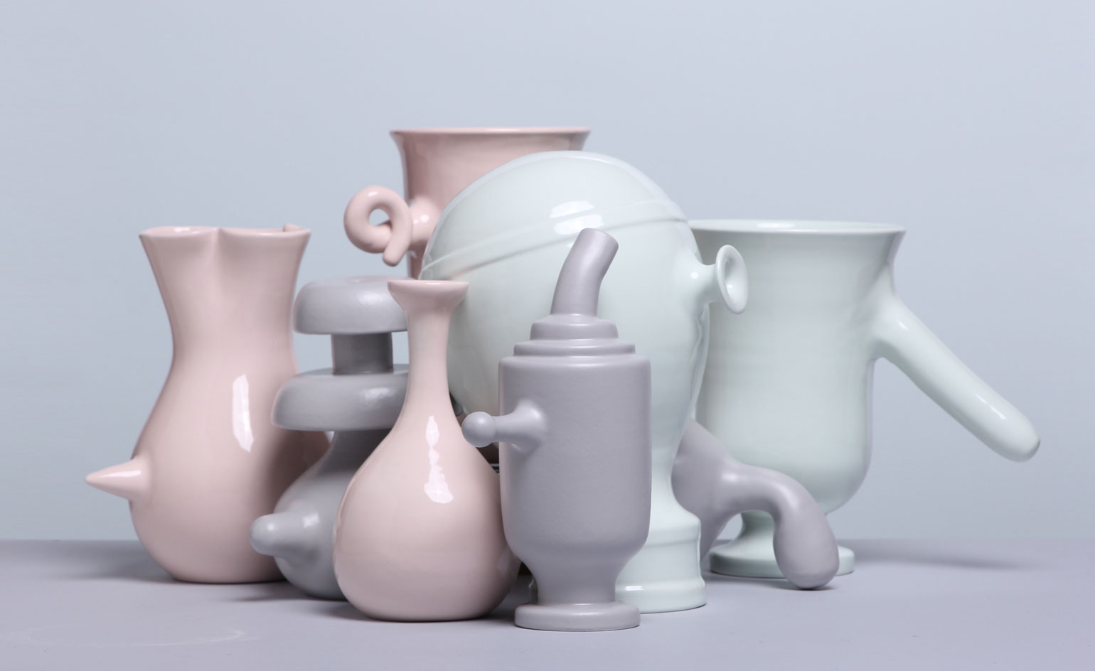
VasoNaso
08 January
Launched on January 1st, designer Matteo Cibic’s latest project will stretch over the whole year, unveiling a piece a day as part of his exploration on the works of painter Giorgio Morandi.
The prolific Italian artist spent his life depicting vases, a habit and an obsession that interested Cibic, who dedicated this project to understanding Morandi’s work. Every day for a year, the designer will produce a vase, each unique and available to purchase from his website for one day only.
Clad in pastel colours and bearing curiously shaped nose handles (hence the ‘Naso’ tile of the project), the pieces will each have a distinct personality and will be a spontaneous creation handmade by Cibic himself.
Writer: Rosa Bertoli
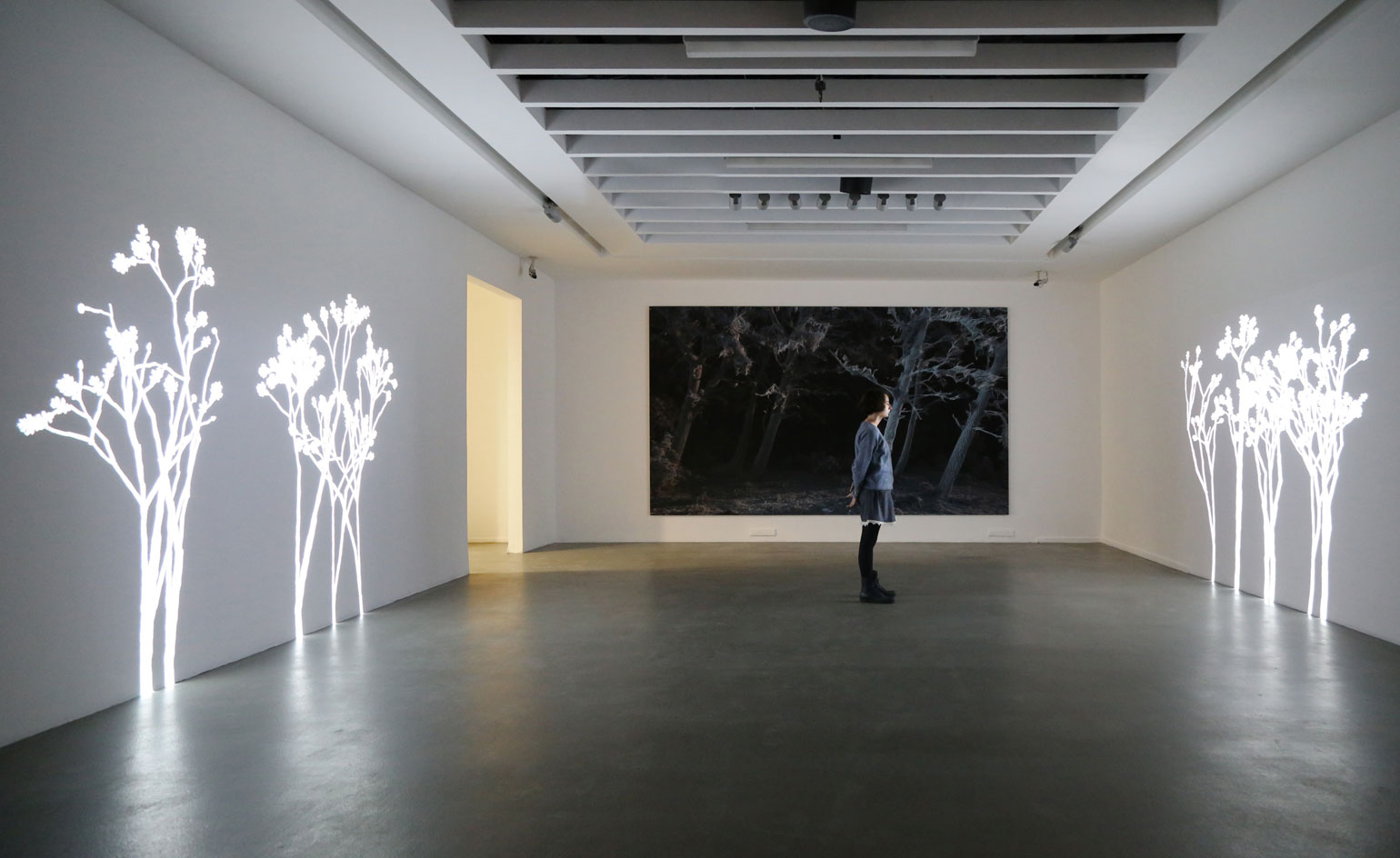
Artificial intelligence
05 January
Currently culminating as part of the group exhibition 'Monochrome' – on show at Istanbul's Akbank Sanat until 13 Feburary – Simon Heijdens' Lightweeds is a lauded projection work that the Dutch artist has been touring globally for the past decade, from Chine to the USA via Korea, the Middle East and Europe.
Conceived as a 'living digital organism', the site-responsive installation seeks to recapture elements of organic spontaneity within the austere gallery spaces it has inhabited. The plant species 'grown' by Heijdens' react to live meteorological and geographic data supplied by sensors outside the gallery buildings, eventually dispersing their seeds to further pollinate the space.
Writer: Tom Howells
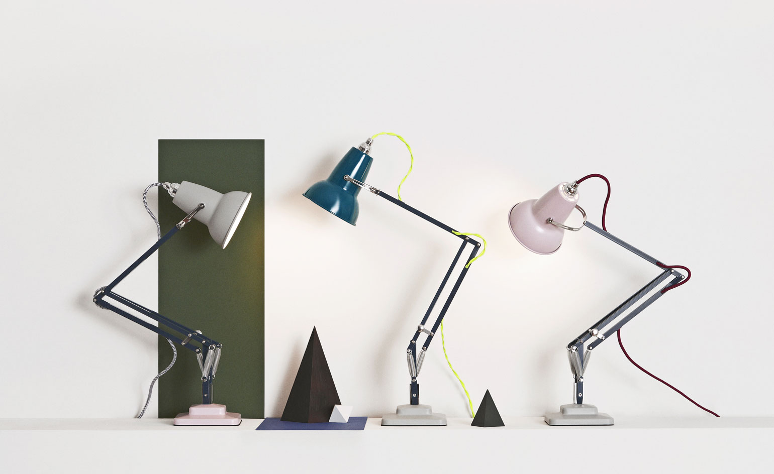
Anglepoise Studio
07 January
Launching today, British brand Anglepoise are fusing colours for 2016 with their new venture, Anglepoise Studio.
With the help of art director (and Wallpaper* collaborator) Despina Curtis, they have introduced a bespoke service offering bicolored lamps with the opportunity to alter the colours of the stand, shade, base and fabric cord. Earthy pink and warm grey are currently on offer in matte and a rich, dark teal and inky slate blue arrive in gloss.
A playful concept whereby even the cables are available in neon yellow or patterned monochrome, the brand are inviting customers to a contemporary world of mix-matching for their classic models.
The studio follows the release of the mini version 'Original 1227' model, a whimsical scaled down version of their iconic 1227 that was released late last year.
Writer: Sujata Burman
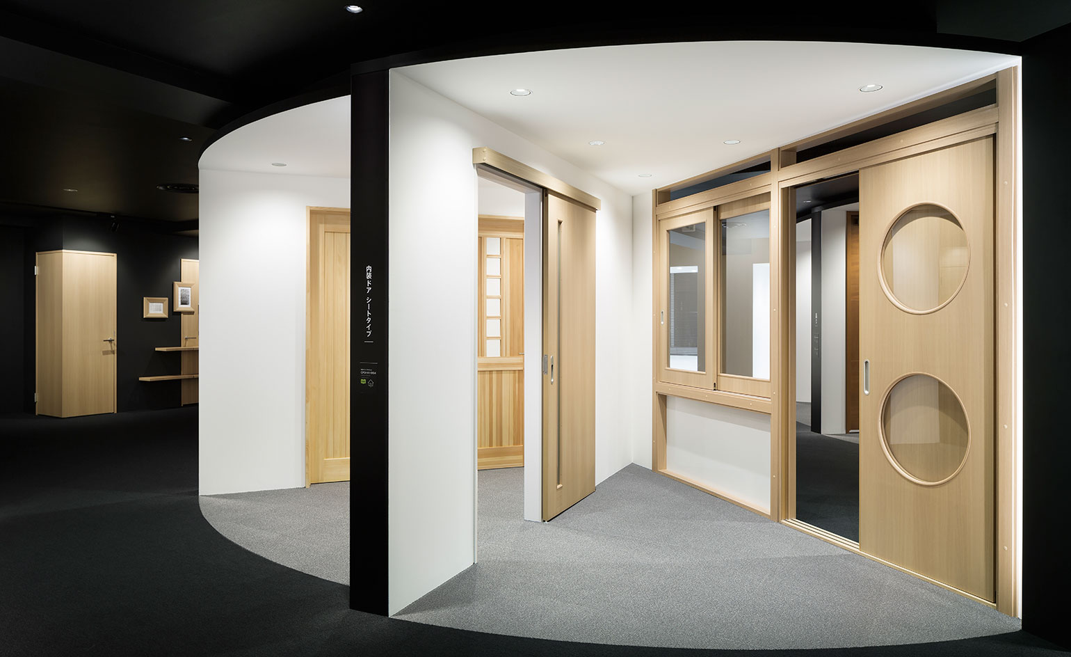
Opening Doors
28 January
Nendo have teamed up with Japanese wooden door manufacturer Abe Kogyo, as part of their 70th anniversary brand renewal, building a new 'opening doors' themed showroom in Tokyo.
The idea stemmed from last year's 'Seven Doors' installation, displayed during Milan design week 2015, where Nendo created 'doors as useful spaces'. Simple wooden frames were embellished with sliding portions, kid-height openings, floating shelves and wooden lamp shades. In the new showroom a host of new Abe Kogyo designs, including doors with wheelchair access, are cleverly set in walls built in a radial pattern. This allows the showroom to become an interactive experience, rather than a 'don't touch' exhibition. The doors can be viewed from both inside and out, as well as giving visitors the opportunity to walk through them, close them, and test their soundproofing abilities.
Throughout the space, the doors trajectory is represented by a shadowed arc, traced along the floor. This arc appears again on the ceiling, on framed blueprints and even across the reception desk, emphasising the point of the project: doors exist to be opened, so why not make the opening process a well designed experience.
Writer: Elly Parsons
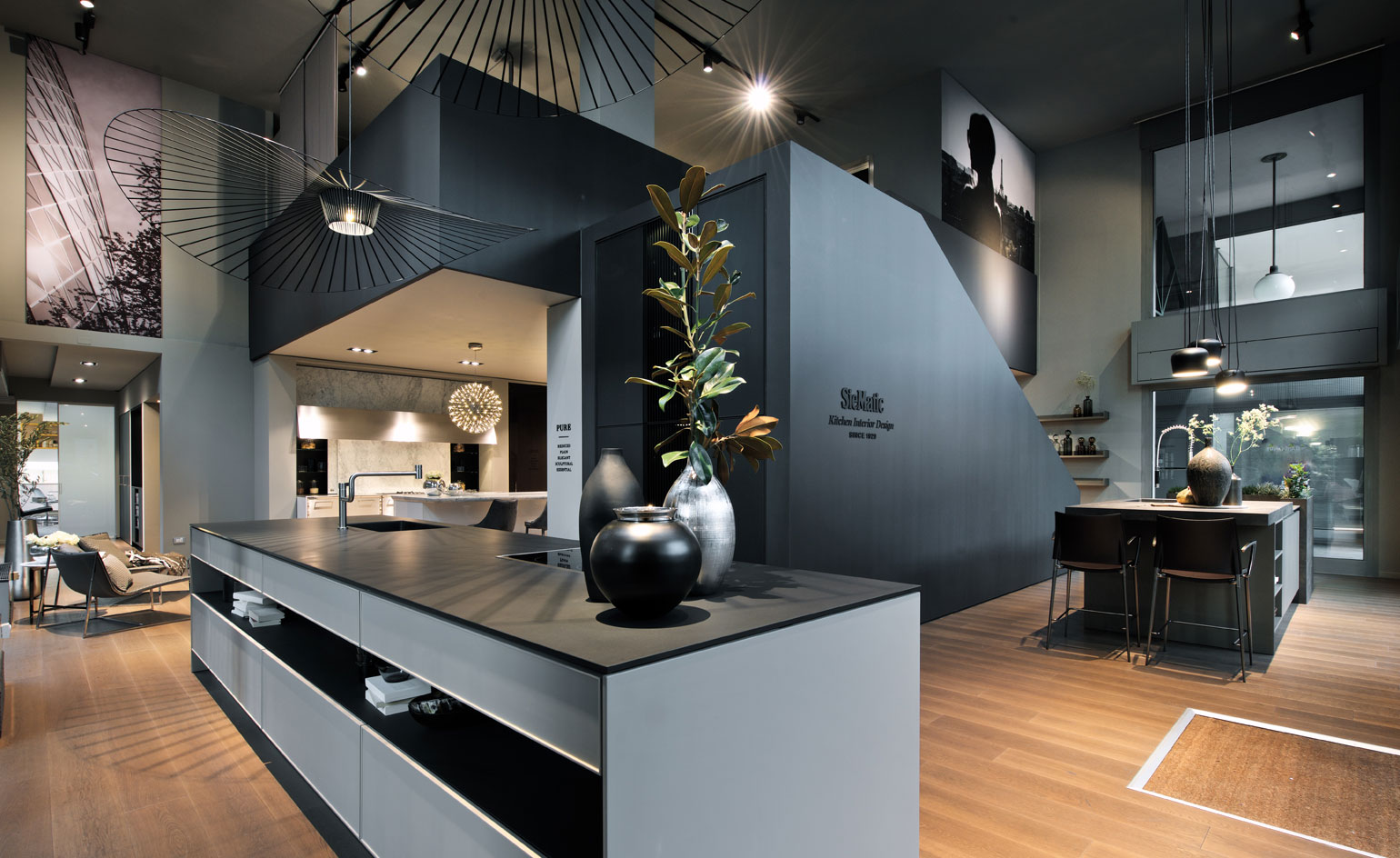
SieMatic Montesanto Kitchen Studio in Milan
04 January
The newly designed SieMatic showroom boasts lifestyle, instead of classic clinical kitchen. While in the midst of recognisable models, the German brand decided to adopt a modern home aesthetic, building the space upon oak floors and sharp hues of grey.
Located in Milan's Porta Nuova district, the space also includes poufs, large graphic lighting and a staircase dividing the floors. The elegant design was realised by Berlin studio KINZO who have spearheaded various office designs for brands including adidas and Soundcloud.
Writer: Sujata Burman
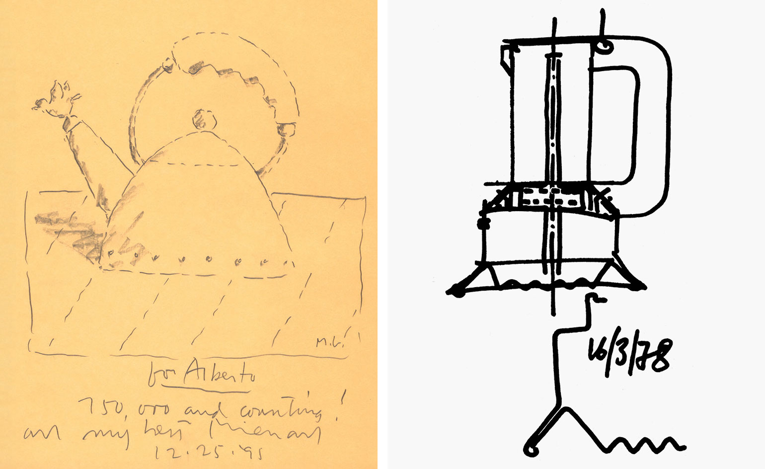
Made in Crusinallo
22 January
Alessi has the ability to capture the hearts and minds of design aficionados, whilst drawing in the big names – Richard Sapper, Michael Graves and Riccardo Dalisi, to name but a few. That - and the Italian brand's impressive evolution – form the foundation of the latest exhibition at The Museum of Applied Arts Cologne (MAKK), 'The Beauty and the Mastery'.
First staged at the Victoria and Albert Museum during London Design Festival 2013, the travelling exhibition charts the history of some of the most iconic elements of the world-famous 'Italian Design Factory.' Among them the 1945 'Bombe' tea and coffee set designed by Carlo Alessi and spanning through to modern day projects, like Marcel Wanders' 'Dressed' collection.
A rare insight into the production and creative processes behind some of their most recognisable pieces, the show features a number of sketches, artwork, prototypes - as well as the finished products themselves. If nothing else, it is an ingenious exploration of the unique Alessi adventure.
The Beauty and the Mastery runs until 3 April 2016.
Pictured: sketches by Michael Graves, left, and Richard Sapper, right. Photography courtesy of Alessi
Writer: Sam Rogers
Rosa Bertoli was born in Udine, Italy, and now lives in London. Since 2014, she has been the Design Editor of Wallpaper*, where she oversees design content for the print and online editions, as well as special editorial projects. Through her role at Wallpaper*, she has written extensively about all areas of design. Rosa has been speaker and moderator for various design talks and conferences including London Craft Week, Maison & Objet, The Italian Cultural Institute (London), Clippings, Zaha Hadid Design, Kartell and Frieze Art Fair. Rosa has been on judging panels for the Chart Architecture Award, the Dutch Design Awards and the DesignGuild Marks. She has written for numerous English and Italian language publications, and worked as a content and communication consultant for fashion and design brands.