Glass half empty?: ’How Packaging Works’ is a statement on misleading concepts
'How Packaging Works' is a statement on misleading concepts
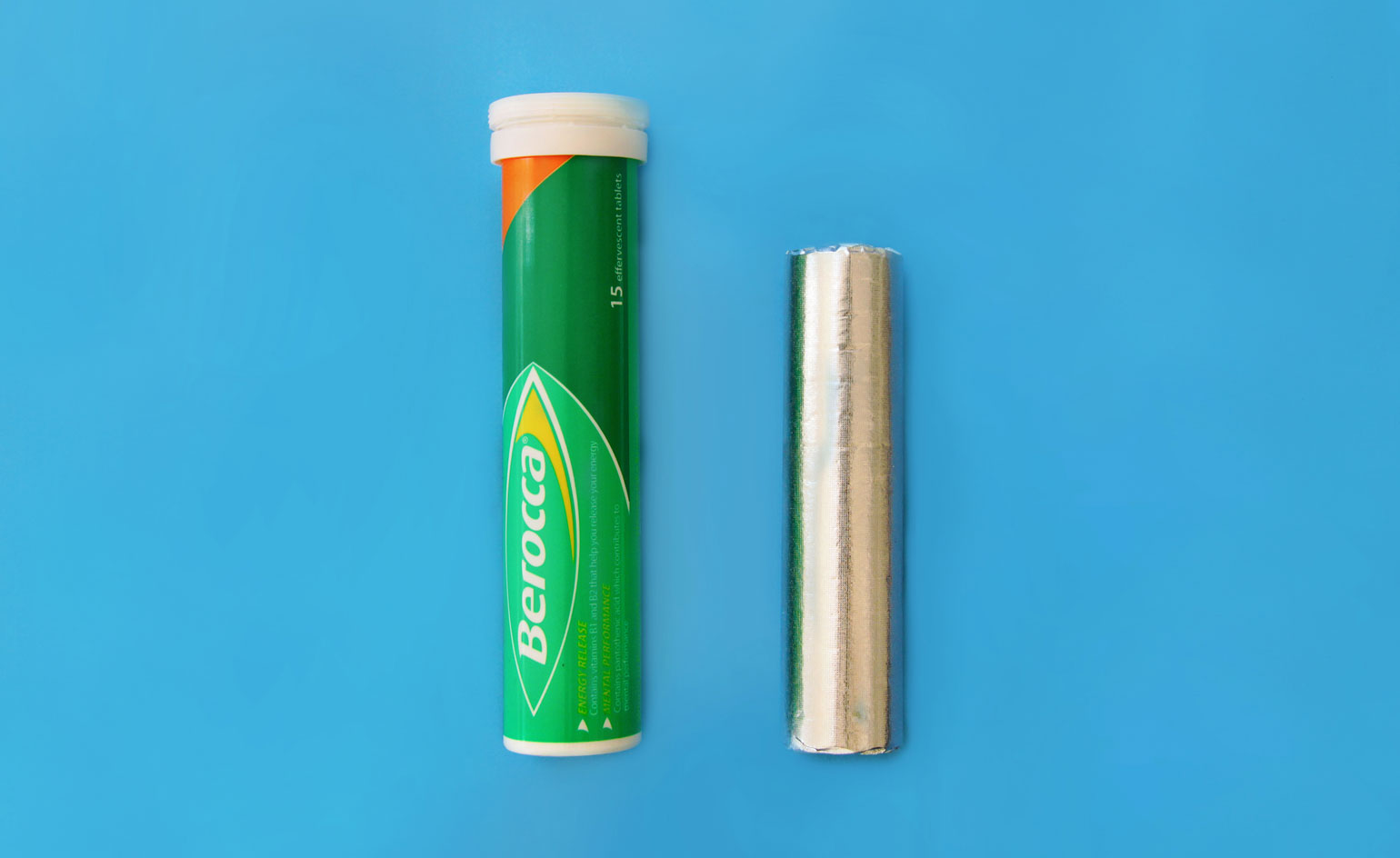
The feeling of opening a packet of crisps only to find it already half empty is never going to be an enjoyable one. Design agency Johnson Banks' latest project, 'How Packaging Works', stemmed from a very similar frustration. While the boutique company is more commonly known for its branding work with international companies including Virgin Atlantic and the Science Museum, this recent photographic experiment came to fruition during a quiet moment over the summer. We spoke to founder Michael Johnson to find out more.
Wallpaper*: What first inspired the project?
Michael Johnson: I've been mildly obsessed by the way that packaging 'fools us' into thinking one thing, then supplies another, for some time. The straw that broke this particular camel's back was my daily dose of vitamins from a tube, the container for which is at least 20 per cent taller than the actual product inside. I'd been thinking for some time that this would make an interesting photographic project, and one that would communicate without words.
Was it something that you worked on collaboratively or a solo project?
Well, the idea has been festering in my head for some time. In a little bit of summer down-time in the studio I asked two of the then interns to take £50 to Sainsbury's and find the best examples of the ways packaging 'lies' to the average consumer.
How does it compare to your other work?
In some respects it's a million miles from our day job, which is doing major branding projects for organisations and not-for-profits. But there's a definite ethical bias to our work and so the project links in that respect by pointing out the everyday occurrence of this. I'm not a huge fan of corporate disinformation in any form.
Why did you select these products specifically?
We had a long list of about 20, shot about 12 and then chose our favourites. The ones that work best are when the contrast is particularly marked, such as the pill packaging.
How did you go about photographing the project and choosing the colour scheme?
It was a challenge – we experimented with different backgrounds and eventually chose coloured [backdrops] to give the images a bit more power. I also wanted to 'end' the essay with a perfect piece of natural packaging, the banana. The skin is only fractionally larger than the product itself, and it even incorporates an inbuilt colour mechanism to let you know when it's under-ripe and over-ripe. Genius.
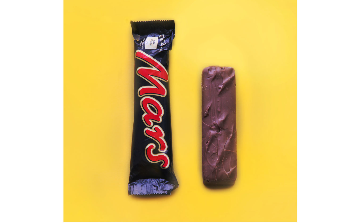
’I’ve been mildly obsessed by the way that packaging ’fools us’ into thinking one thing, then supplies another, for some time,’ says Johnson
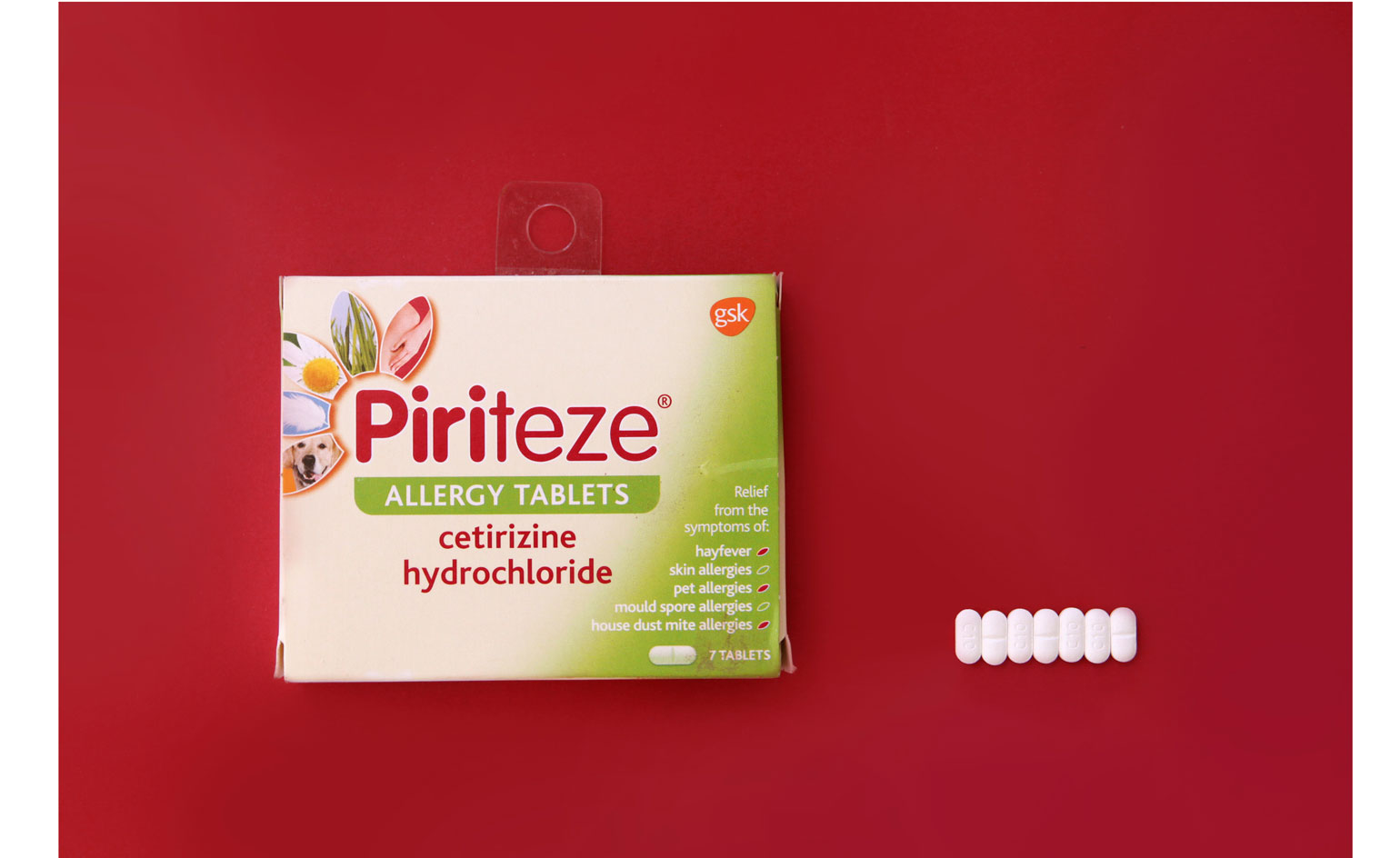
’In a little bit of summer down-time in the studio I asked two interns to take £50 to Sainsbury’s and find the best examples of the ways packaging ’lies’ to the average consumer’

’There’s a definite ethical bias to our work and so the project links in that respect by pointing out the everyday occurrence of this. I’m not a huge fan of corporate disinformation in any form’
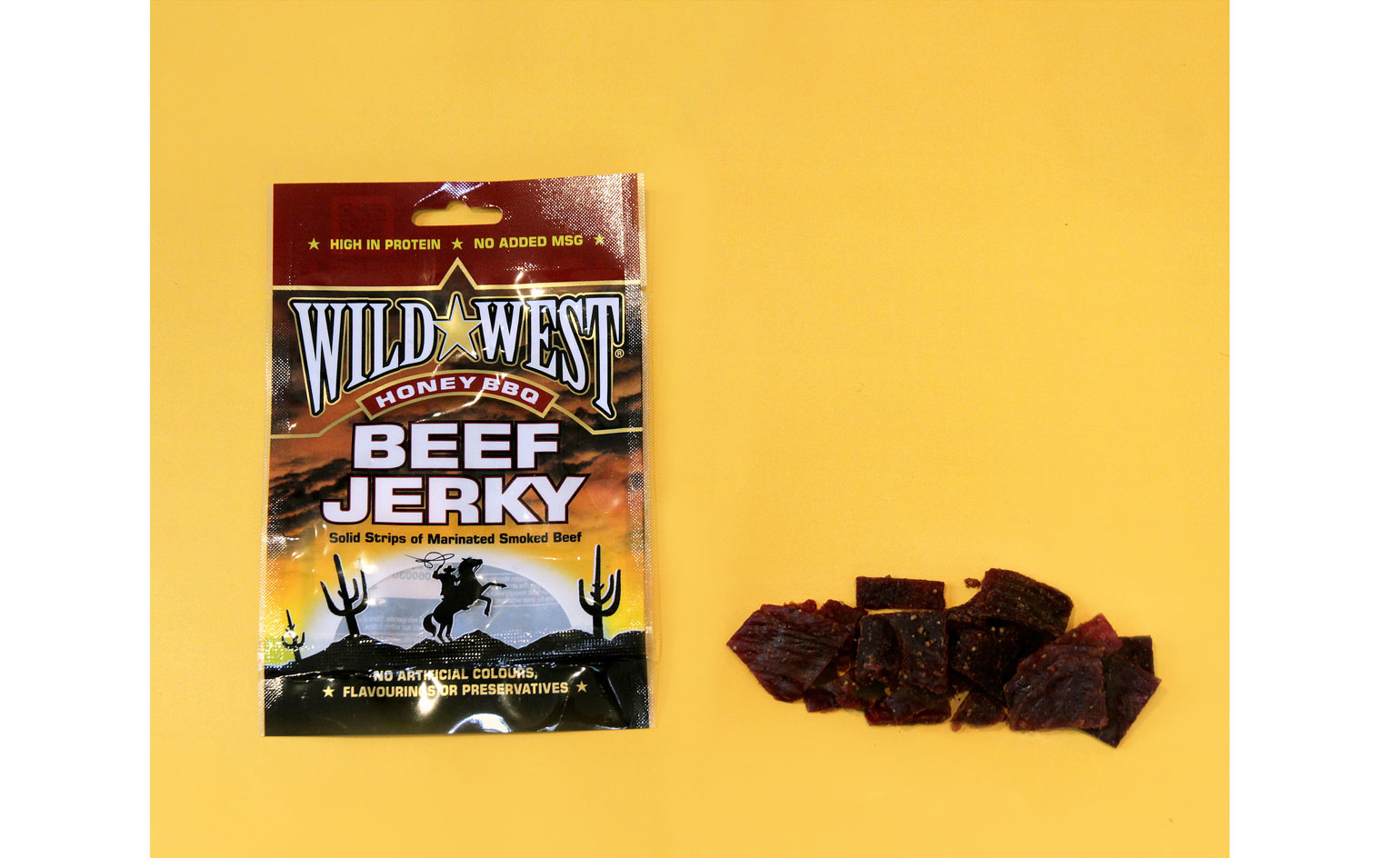
’We experimented with different backgrounds and eventually chose coloured [backdrops] to give the images a bit more power’
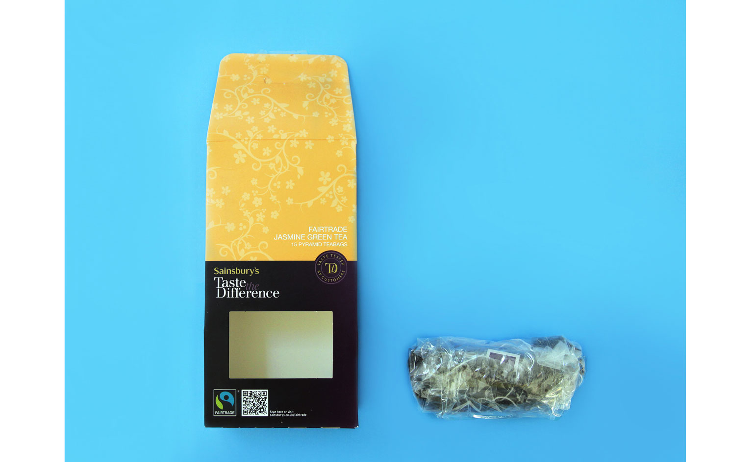
’We had a long list of about 20 products, shot about 12 and then chose our favourites. The ones that work best are when the contrast is particularly marked’
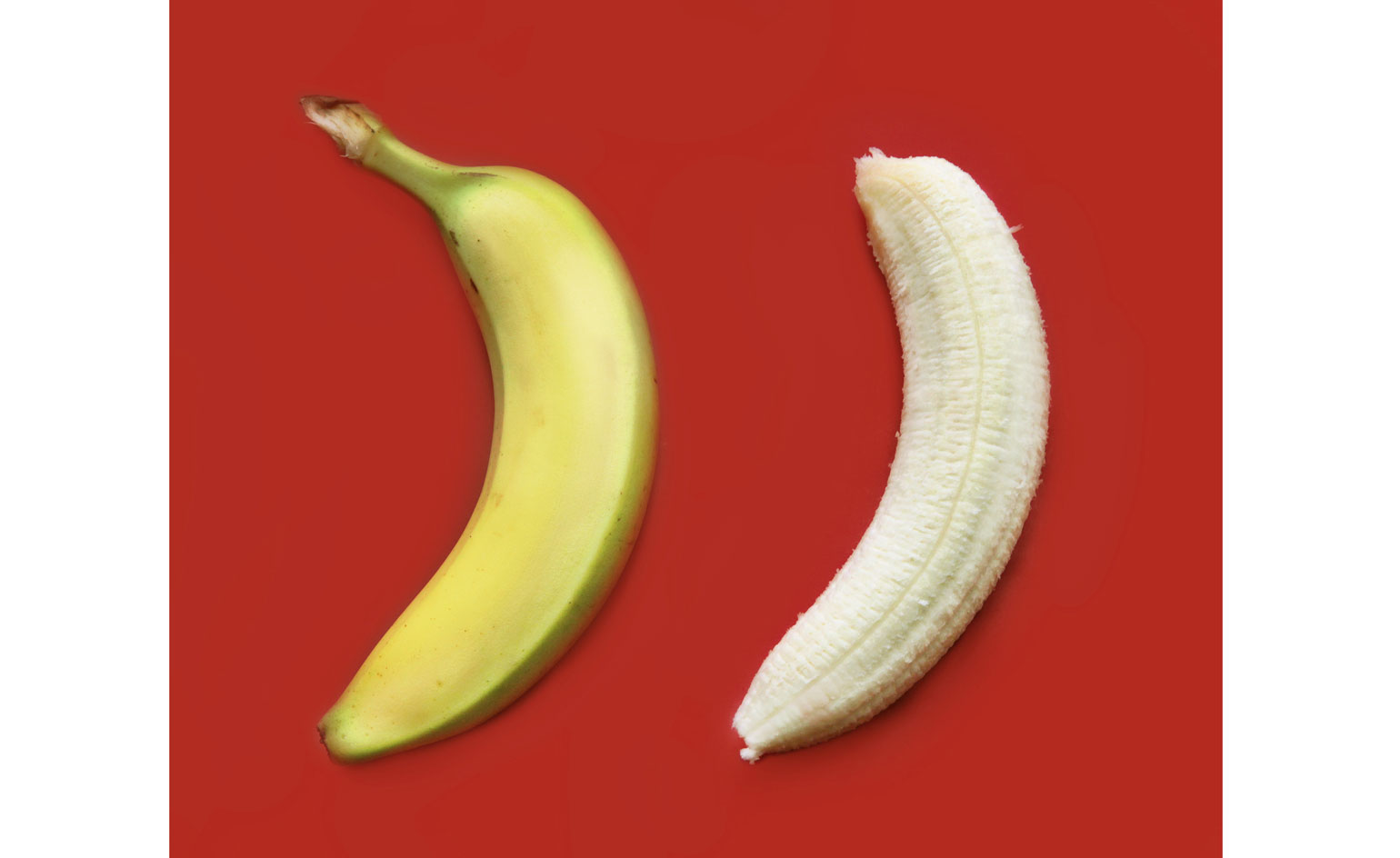
’I wanted to ’end’ the essay with a perfect piece of natural packaging, the banana. Genius’
Wallpaper* Newsletter
Receive our daily digest of inspiration, escapism and design stories from around the world direct to your inbox.
-
 Japan in Milan! See the highlights of Japanese design at Milan Design Week 2025
At Milan Design Week 2025 Japanese craftsmanship was a front runner with an array of projects in the spotlight. Here are some of our highlights
By Danielle Demetriou
-
 Tour the best contemporary tea houses around the world
Celebrate the world’s most unique tea houses, from Melbourne to Stockholm, with a new book by Wallpaper’s Léa Teuscher
By Léa Teuscher
-
 ‘Humour is foundational’: artist Ella Kruglyanskaya on painting as a ‘highly questionable’ pursuit
Ella Kruglyanskaya’s exhibition, ‘Shadows’ at Thomas Dane Gallery, is the first in a series of three this year, with openings in Basel and New York to follow
By Hannah Silver