
Pierre Chareau’s Maison de Verre in Paris is as far removed from Melbourne, Australia, as is Donato Bramante’s Tempietto in Rome. The buildings also straddle different time periods. Chareau’s from the early 1930s, and Bramante’s completed in the early 16th century. Yet both became an inspiration for the conversion of a 1930s Melbourne duplex, comprising two apartments, into a single, contemporary home – as it happens, the one I share with my partner, Naomi.
When we purchased the simple, almost brutalist duplex in South Yarra in 2011, the idea of talking about either Chareau or Bramante would have been odd, given its lack of architectural pedigree. Yet when architect Robert Simeoni first inspected our simple abode, he saw something quite special.
‘There was a wonderful spirit in the existing home, even though it was two separate apartments,’ says Simeoni. He was also captivated by the muted light and the building’s heritage as working-class accommodation in the interwar period. ‘As soon as I stood in the rear courtyard, I could see Bramante’s edifice, something that could stand proud from the original brick structure,’ he adds.

The pavilion-like extension by architect Robert Simeoni features a steel and fluted glass façade and a ‘crown’ of steel panels
In contrast to the original red-brick and partially rendered duplex, a new pavilion-like addition was constructed in steel, with fluted industrial glass on an exposed polished concrete floor. Featuring an angular ceiling that is almost five metres high, it is awash in natural light that enters through a concealed window in what Simeoni refers to as the ‘crown’ – quilt-like exterior steel panels.
Sunlight continually animates the only white wall in this dark, moody pavilion, with the sun’s rays working like natural ‘brushstrokes’. When the light is at its peak, there’s a sharp outline against this pristine white wall. In a similar nod to Chareau, Simeoni inserted a narrow horizontal band of clear glass in the translucent wall and door to allow clear views of the garden when you sit at the dining table.
‘I wanted to capture the quietness of the light and evoke a similar atmosphere to what you experience in the original part of the home, which is more subtle,’ says Simeoni. At night the extension is more like a lantern. Our brief was to create a ‘non kitchen’, more of a gallery space. We wanted to display art and objects we’ve collected on our travels, as well as canisters and crockery. I also envisaged the work of our favourite fashion photographer Robyn Beeche on the walls.
‘The idea was to create fluid, open spaces, while still being respectful of the 1930s features’
Creating one house from two apartments required removing the bathrooms at the core and replacing them with an internal staircase (a luxury after previously walking up and down external stairs every time when changing levels). Rooms were also opened up by cutting through brick walls and leaving the edges raw, supported by exposed steel lintels.
‘The idea was to create fluid, open spaces, while still being respectful of the 1930s features,’ says Simeoni, who treated each room with the same care one would apply to a significant heritage period home. The subtle curvature of the ceiling at ground level was retained and contemporary bathrooms with a 1930s edge were created using D-tiles. The first-floor bathroom was treated like a separate pod, so original roughcast walls could be retained from all sides.
Other concepts evolved as the design process took shape. There’s a subtle delineation of floor treatments, with a dialogue between the original timber floors and the polished concrete in the new wing. Studded rubber makes an appearance in the bathrooms, a detail picked up from Maison de Verre.

Sunlight plays in the new stairwell that was installed to connect the two former apartments
Leading local furniture and lighting designer Suzie Stanford also collaborated on the project, creating crystal chandeliers made from 1930s bowls, dishes and vases, with crystal wall sconces in the main living rooms. ‘People living in these homes would have been given crystal as wedding presents, so it seemed appropriate to “upcycle” these pieces,’ says Stanford, who, like Chareau, also produced seating upholstered in tapestries, sourced from around the world.
The finished result is far beyond our expectations, with the transformation of a simple raw duplex into a richly layered home. It’s certainly not Chareau’s Maison de Verre or Bramante’s Tempietto. It’s a unique environment, tailor-made for a couple who are passionate about architecture, art and design and knew who to turn to in creating something, well, just that much more.
And it seems the Australian Institute of Architects agreed, awarding the project the Marion Mahony Award for Interior Architecture, as well as the John & Phyllis Murphy Award for Residential Architecture in Alterations & Additions for 2019.
As originally featured in the October 2019 issue of Wallpaper* (W*247)
INFORMATION
-
 Seven things not to miss on your sunny escape to Palm Springs
It’s a prime time for Angelenos, and others, to head out to Palm Springs; here’s where to have fun on your getaway
-
 Microsoft vs Google: where is the battle for the ultimate AI assistant taking us?
Tech editor Jonathan Bell reflects on Microsoft’s Copilot, Google’s Gemini, plus the state of the art in SEO, wayward algorithms, video generation and the never-ending quest for the definition of ‘good content’
-
 ‘Independence, community, legacy’: inside a new book documenting the history of cult British streetwear label Aries
Rizzoli’s ‘Aries Arise Archive’ documents the last ten years of the ‘independent, rebellious’ London-based label. Founder Sofia Prantera tells Wallpaper* the story behind the project


-
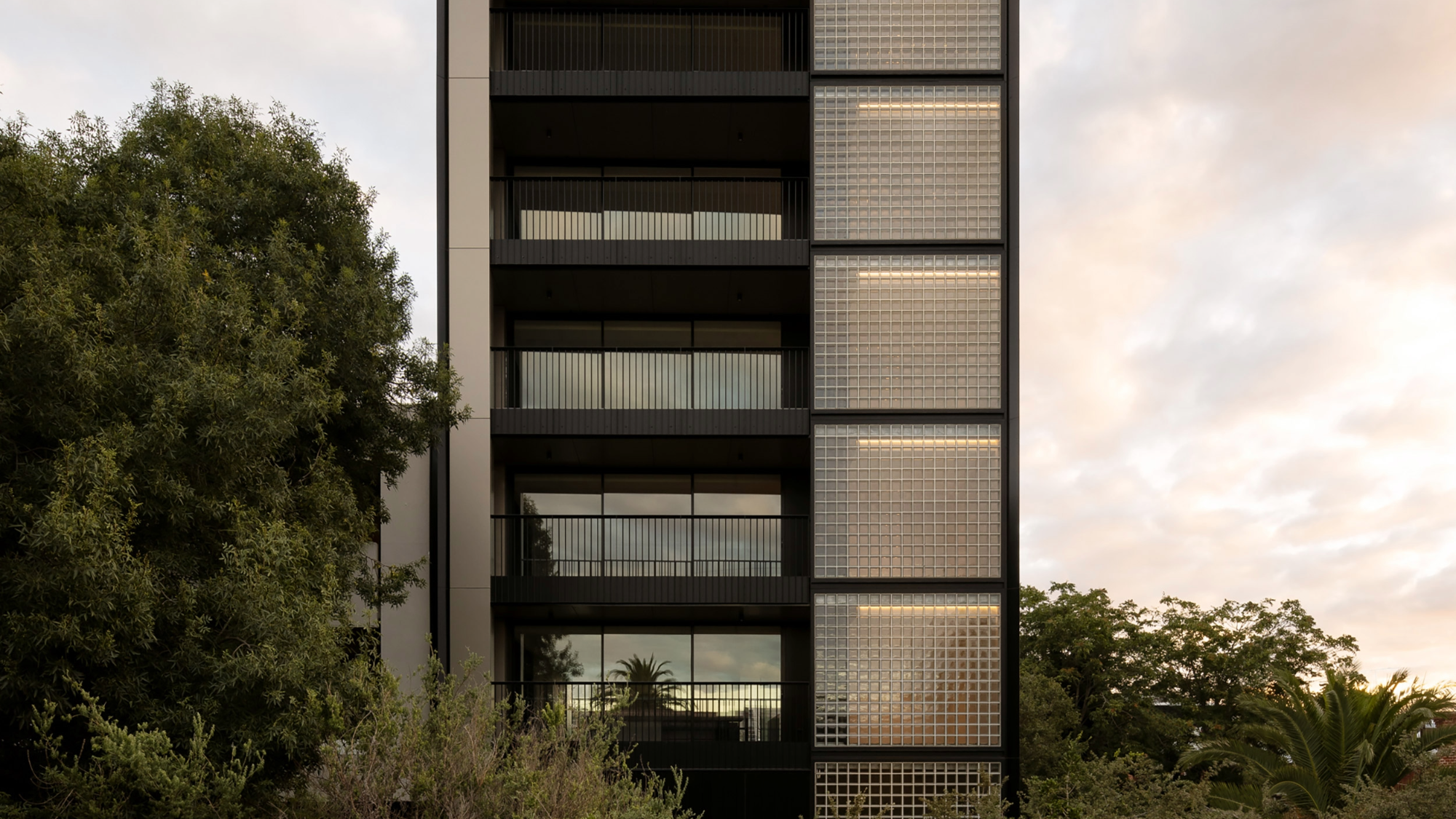 The humble glass block shines brightly again in this Melbourne apartment building
Thanks to its striking glass block panels, Splinter Society’s Newburgh Light House in Melbourne turns into a beacon of light at night
-
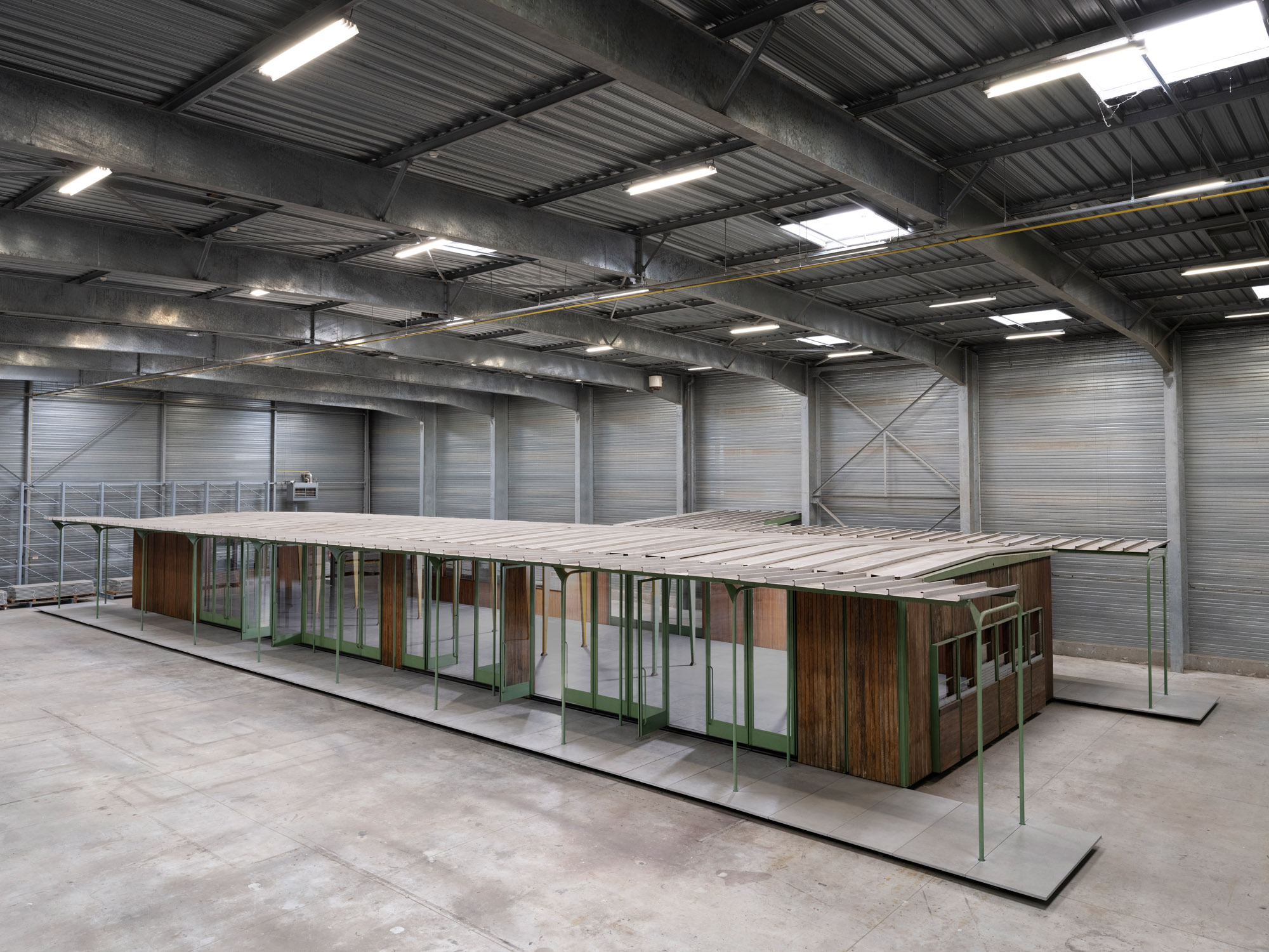 Croismare school, Jean Prouvé’s largest demountable structure, could be yours
Jean Prouvé’s 1948 Croismare school, the largest demountable structure ever built by the self-taught architect, is up for sale
-
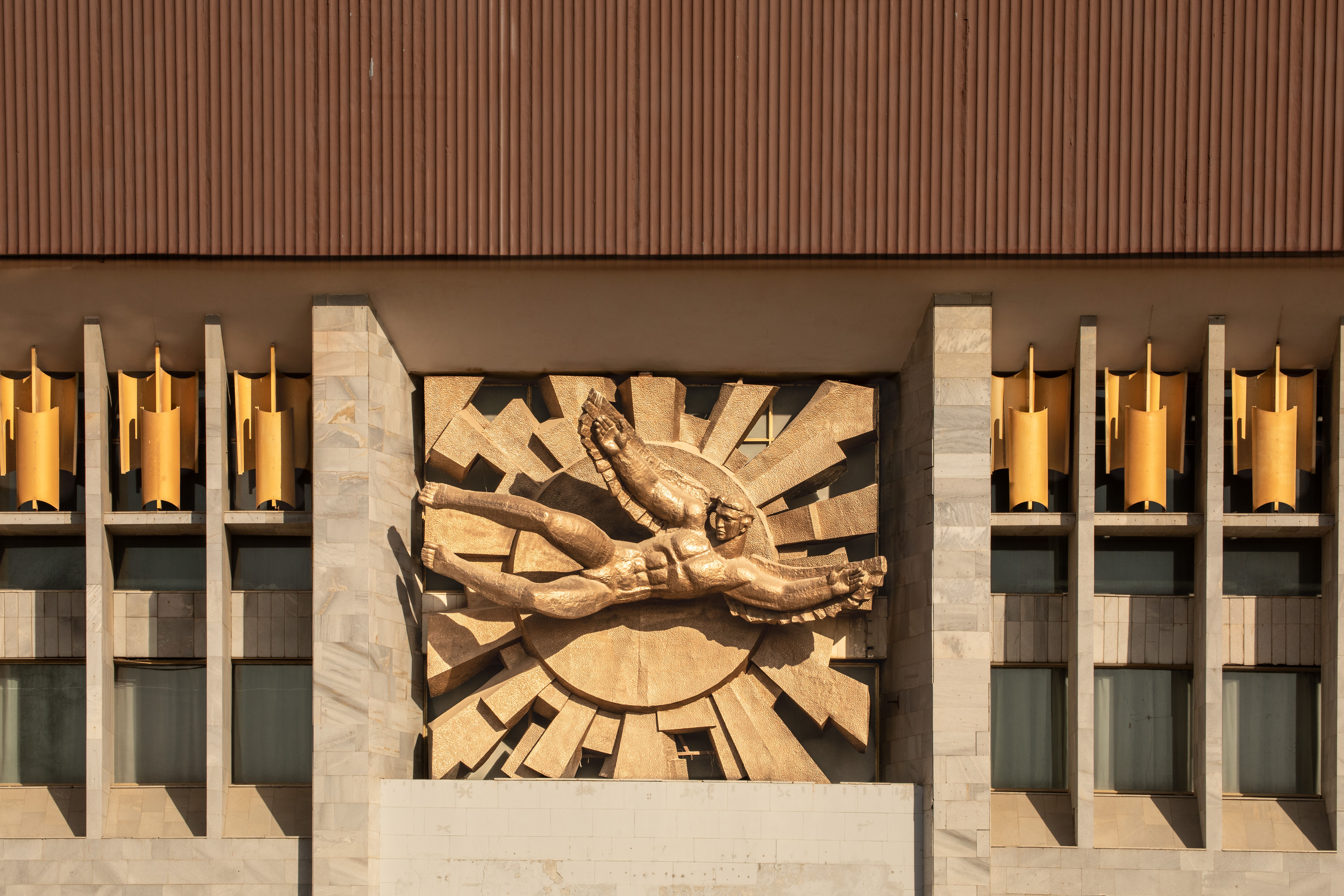 Jump on our tour of modernist architecture in Tashkent, Uzbekistan
The legacy of modernist architecture in Uzbekistan and its capital, Tashkent, is explored through research, a new publication, and the country's upcoming pavilion at the Venice Architecture Biennale 2025; here, we take a tour of its riches
-
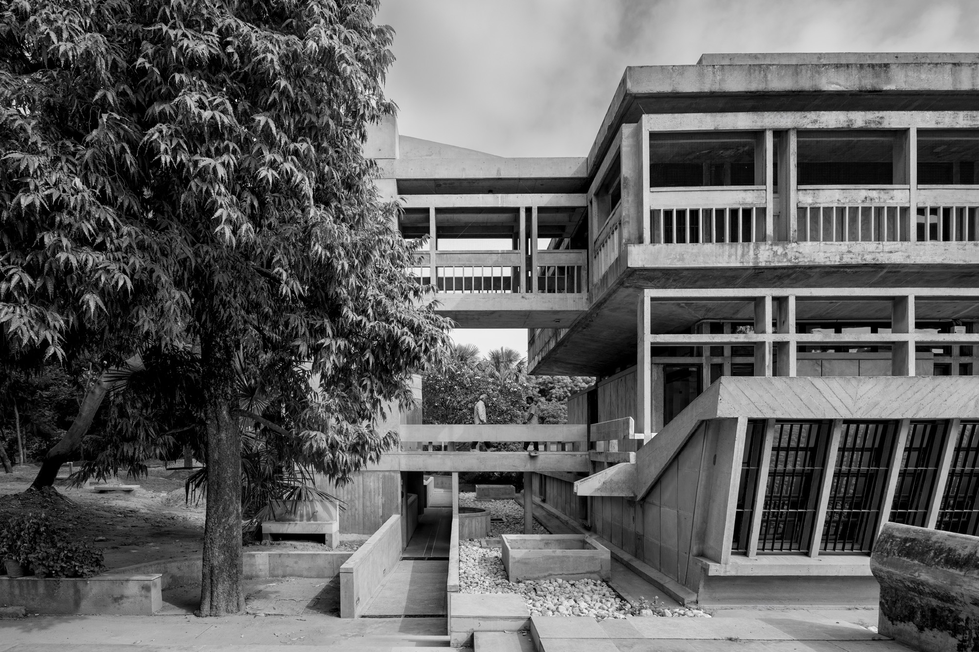 At the Institute of Indology, a humble new addition makes all the difference
Continuing the late Balkrishna V Doshi’s legacy, Sangath studio design a new take on the toilet in Gujarat
-
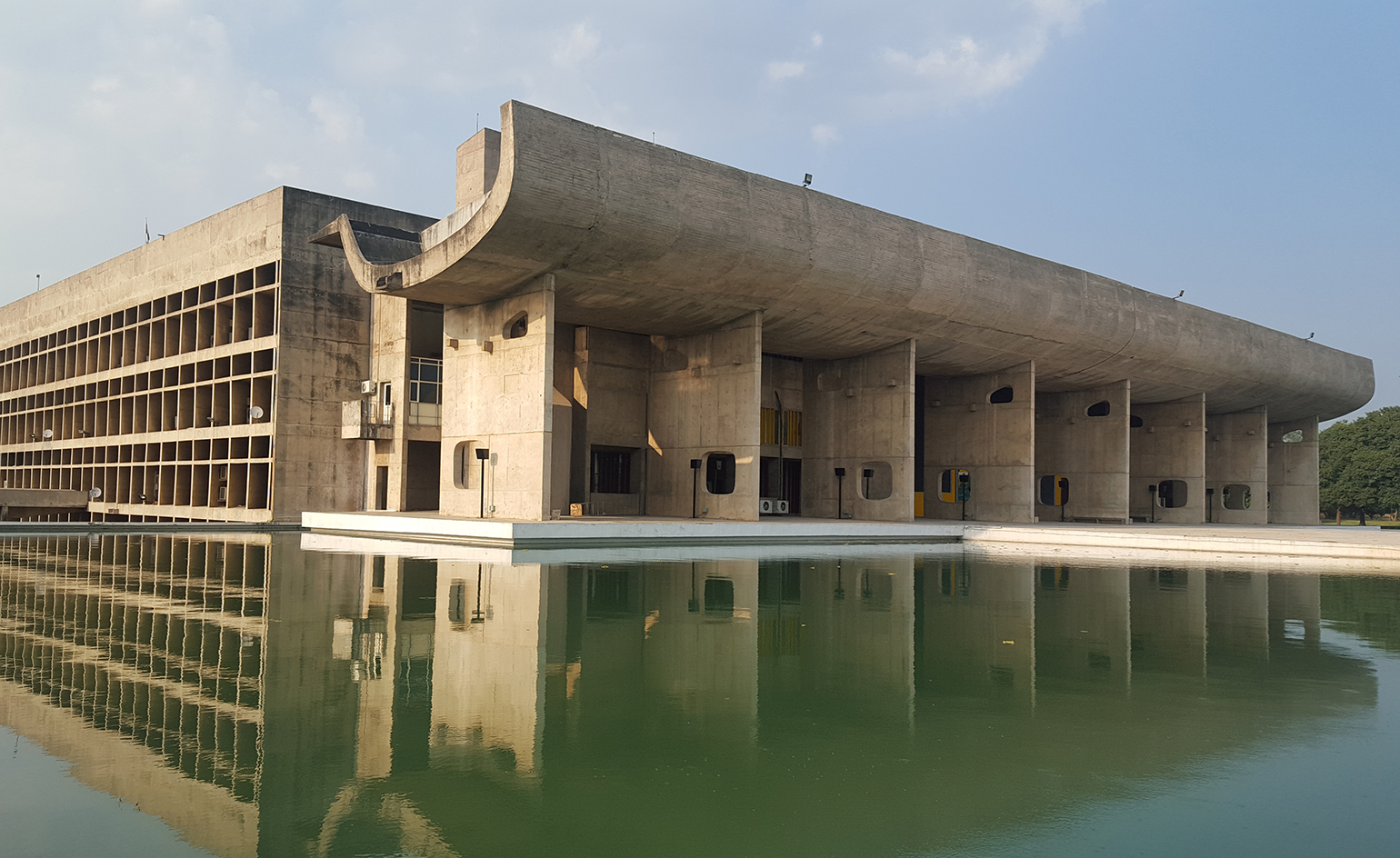 How Le Corbusier defined modernism
Le Corbusier was not only one of 20th-century architecture's leading figures but also a defining father of modernism, as well as a polarising figure; here, we explore the life and work of an architect who was influential far beyond his field and time
-
 A contemporary retreat hiding in plain sight in Sydney
This contemporary retreat is set behind an unassuming neo-Georgian façade in the heart of Sydney’s Woollahra Village; a serene home designed by Australian practice Tobias Partners
-
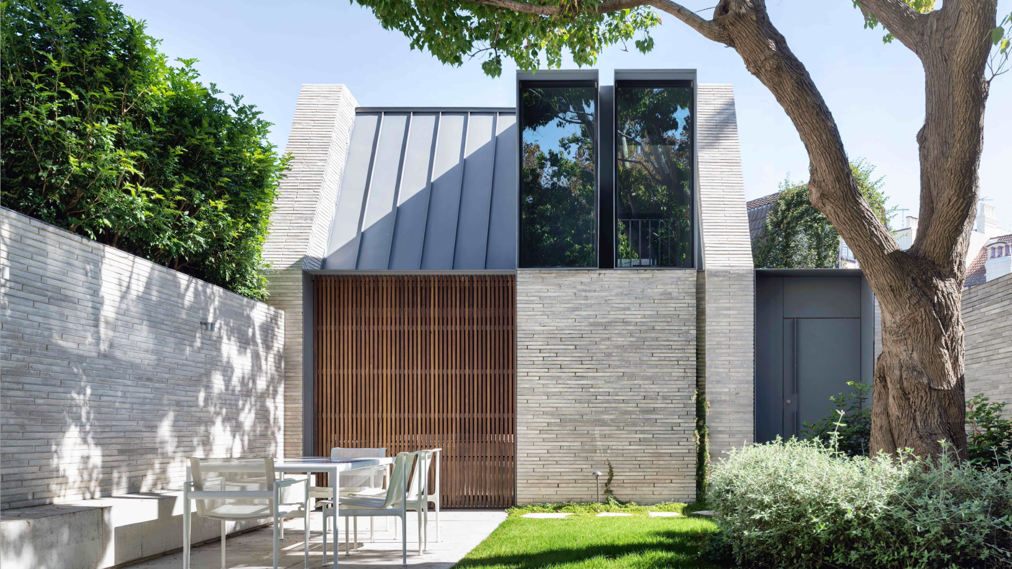
 How to protect our modernist legacy
We explore the legacy of modernism as a series of midcentury gems thrive, keeping the vision alive and adapting to the future
-
 A 1960s North London townhouse deftly makes the transition to the 21st Century
Thanks to a sensitive redesign by Studio Hagen Hall, this midcentury gem in Hampstead is now a sustainable powerhouse.


