Our house: 2016's British Pavilion curators take us on a tour of the modern home
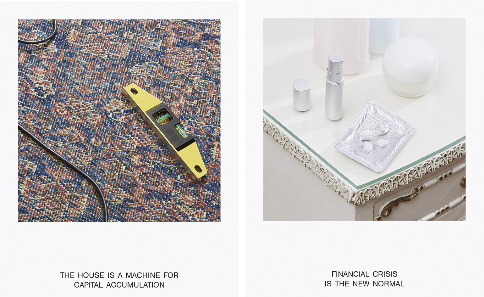
Shumi Bose, Jack Self and Finn Williams are the curators of this year's British Pavilion at the Venice Architecture Biennale. Commissioned after an open call from the British Council for an exhibition proposal that offered an insight into the realm of contemporary British architecture, the trio bring a wealth of curatorial and practical experience – detached from the architectural establishment, yet connected enough to bring together five different architectural responses on the role of the British home now and in the future. Their exhibition, 'Home Economics', divides the domestic realm into five incremental amounts of time: 'Hours', 'Days', 'Months', 'Years' and 'Decades'. The resulting proposals aren't necessarily straightforward investigations of space, but rather musings on community, economics, sharing and time itself.
Wallpaper*: Venice once had a reputation as a place for paper architecture, concepts that stood little chance of construction. As well as highlighting important issues in the UK housing market, what do you hope will come out of this exhibition?
Jack Self: One important question for the curatorial team was, who is this exhibition really for? Of course, it must be for the audience of the Biennale, the general public and the architectural great and good. But it must also be for the British people and we feel a strong obligation to this. We asked if it was possible to make an exhibition that can have a material change in the housing market, and therefore we’re very focused on the idea of a legacy. Unfortunately I can’t go into detail at this point; however at least one of the models is likely to result in built work. The idea of using the Biennale as a springboard for new forms of architecture is very exciting.
You describe the installation as architectural responses, rather than solutions. Do architectural solutions even still exist or is architecture as it’s traditionally practiced only capable of responding to the market?
Finn Williams: We asked our participants to respond to different periods of occupancy with new models for domestic life – not specific architectural solutions. That’s partly because we don’t believe that architecture alone can ‘solve’ the housing crisis. But also because a specific architectural solution to a specific site, brief and client can be a dead-end in terms of its wider influence. We wanted to avoid exhibiting the perfect answers to the wrong questions – the equivalent of designing a beautiful layout for a penthouse that will be sold off-plan to an overseas investor. Instead we want to offer up new models of the home that are relevant across locations, tenures and typologies, and that might, in turn, spark better alternatives.
Asking our participants to design with time as their first concern, rather than space, meant they had to do without these familiar crutches, which wasn’t easy. But it also meant that the models they have come up are more broadly applicable. That in the end is what we understand as the difference between a response, or model, and a solution. A successful solution is often unique. But a successful model is ubiquitous – the more it’s copied the stronger it gets. We hope some of our models will be copied, modified and adopted. And maybe that’s how architecture can start to have a systemic effect on the housing crisis.
How important is economics to the contemporary practice of architecture? Should it be taught in more detail in architecture school?
FW: In the current political, economic and cultural system we all work within in the UK, money has really consumed almost all other value systems that shape the way we build. If you look at our national planning policy framework, economic sustainability consistently trumps social or environmental sustainability when it comes to planning decisions – and this is legitimised through the system of ‘viability’. The results of these viability equations are visible as kind of built bar charts on the skylines of cities across the UK. As other people have said, form follows finance.
The effect of economics on architecture, and our built environment more generally, is a shared interest for all three of us. It’s something Jack and Shumi have written about together through Real Estates: Life Without Debt, and a subject I teach my students at the Royal College of Art and other architecture schools through workshops in what I call ‘creative accounting’. I still find it shocking that it’s possible to go through five years of architectural education without ever being faced with a budget, a cost plan, or a viability assessment – when these are such fundamental tools for achieving and protecting quality in practice. When my students produce viability models for their schemes in my workshops, some of them even try to fake Excel by drawing it in Illustrator. I get them to work with chartered surveyors and developers to see viability not as a constraint on architectural creativity, but as a field for architectural invention in its own right.
That’s an approach we’ve also taken with 'Home Economics'. For example, Julia King has been working in collaboration with a housing association, service designers and a high street bank to design a new type of mortgage. And we hope it’s a message that comes across from the show. Whether you’re interested in building a more beautiful or a more equitable city, understanding the economics of the home is essential.
Of the five responses, which one do you feel is most representative of the changes in modern life over the past decade? And which is the most static and unchanging?
JS: Our ambition was to create an exhibition that is both timeless and timely. On the one hand this means responding to the concerns and crises of today – changing forms of life and the housing question. But it also means recognising that this is not the first, or indeed won’t be the last, time that these concerns arise. The strategy with 'Home Economics' has been to reach backwards into history – and rigorously study how these problems have been addressed in the past – as well as look for clues in the data and built environment that exist right now, in order to better understand what it means to live today.
How have you created environments that evoke the intimacy and familiarity of our domestic realms in a gallery context?
Shumi Bose: Well, I think we moved away from the idea of reproducing a full facsimile of familiarity (à la Elmgreen & Dragset, for example) – largely we wanted the propositional strength of each room to be read as such. The Venice Biennale, with its cacophony of installations and exhibits vying for what we’ve been calling an ‘economy of attention’ – you have to be quite controlled and clear about what the real takeaway is in terms of each idea, while creating a suitable atmosphere and experience to convey them. The exhibition is more like an architectural model, scaled up to full size – which means the essential core of each idea is somewhat abstracted, bringing focus to the spatial proposition and the way the space might be used, rather than an environment that is immersive in its detail.
In our case, we have five entirely separate propositions responding to the theme of contemporary domesticity, so the challenge was in retaining the independence of each, within a coherent framework that suggests the British home.
The pavilion itself is a pretty odd place; based on a Palladian villa, it is quasi-domestic in its arrangement of rooms, but not at the right scale. We decided to work with the space rather than against it, so we arranged a progressive sequence of rooms following the natural circulation route. Our exhibition architects Hesselbrand have done an incredible amount of work in trying to create a domestic datum, for example by cleverly suggesting a ceiling height that evokes residential spaces, or by introducing horizontal rather than vertical light. OK-RM, the graphic design team behind our identity and communication graphics, have also played up some norms from the British home, like the choice of Farrow & Ball paint colours, the floor mats demarcating each space and the informative pamphlet made to resemble a domestic manual.
Finally, the objects we have used to dress each room should provide a modicum of familiarity, just enough clues to suggest how the visitors might imagine how contemporary life might be played out, even to imagine themselves in a particular proposal. The bathroom you see in the ‘Months’ space, for example, might be different to any other, but the number of toothbrushes and titles of toilet-reading might suggest a particular kind of occupancy!
What role do you think the Venice Biennale has in the global architecture conversation?
SB: Of course it seems as though there is an architectural Biennale associated with almost every major city, and some minor ones; it seems to be de rigueur. Probably this signifies what we think is a growing public awareness and understanding of what architecture is and can be. Nevertheless, as the oldest international exhibition of architecture, Venice remains the best and most visible place to hold up architectural, even societal questions, to global scrutiny.
Another point worth mentioning is the composition of the audience: the Venice Biennale enjoys a huge attendance from the general public visiting the city, especially now that the architectural exhibition extends over the summer period. In the way we see our concerns around the idea of home and the changes or patterns of contemporary life, we have been trying through all our endeavours to ensure that this is an inclusive, non-vocational and essential discussion, and so we’re really pleased to be exhibiting at a platform with a broad and general reach. Indeed, the largest majority of visitors are students and young people, so it’s fantastic to know we’ll be speaking to those who are set to inherit our questions and concerns, whether as architects or as citizens.
Due to its age and prestige, there are not too many specific commercial or corporate eggshells to step around; each pavilion and curatorial team sets the agenda with a fair degree of liberty. At its best, the Venice Biennale holds up a mirror to the profession, such that we can reflect and frame the debates pushing us forward.
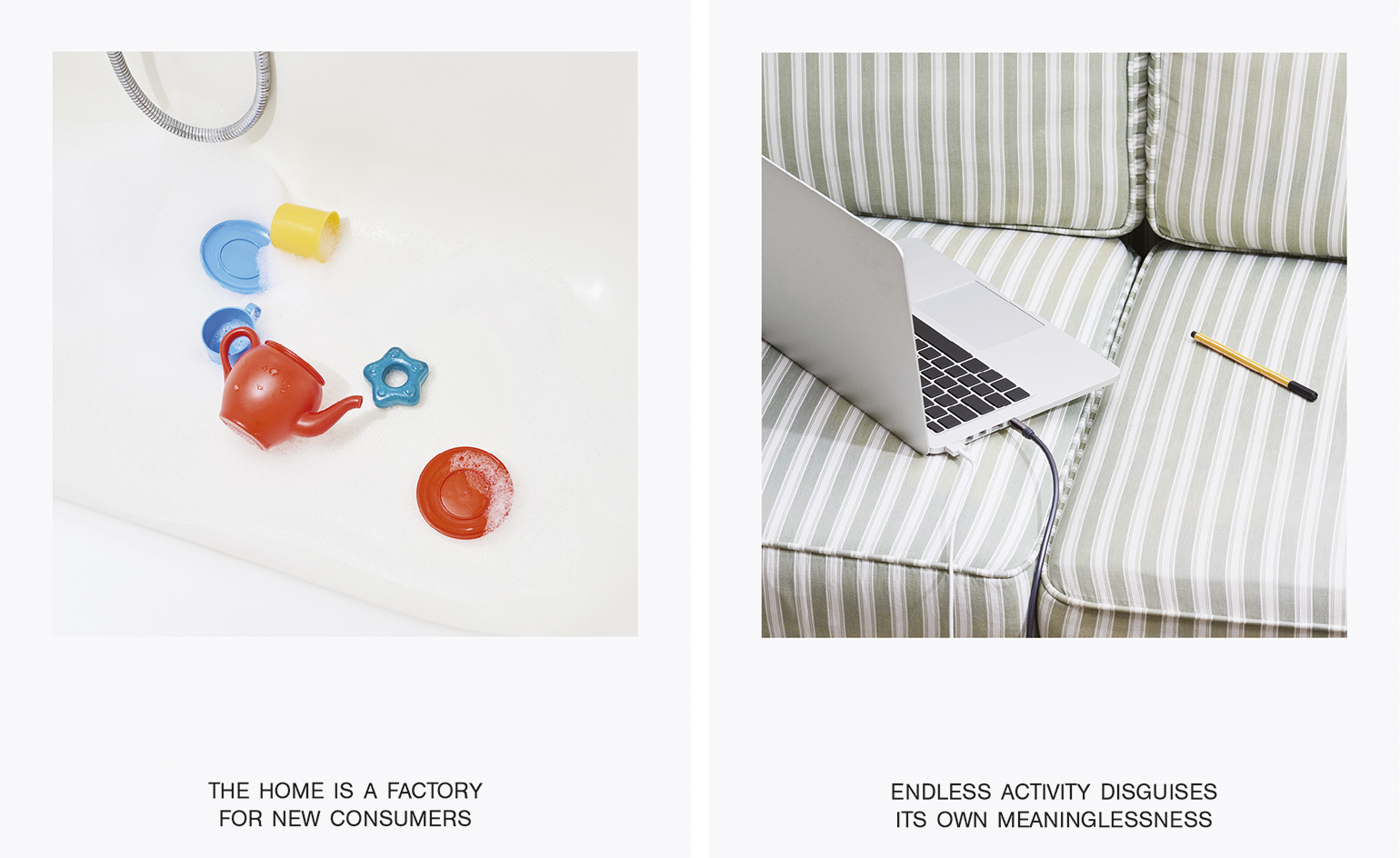
Curators Shumi Bose, Jack Self and Finn Williams bring a wealth of curatorial and practical experience – detached from the architectural establishment, yet connected enough to bring together five different architectural responses on the role of the British home now and in the future. Pictured left: ’Home Economics #15’. Right: ’Home Economics #14’.
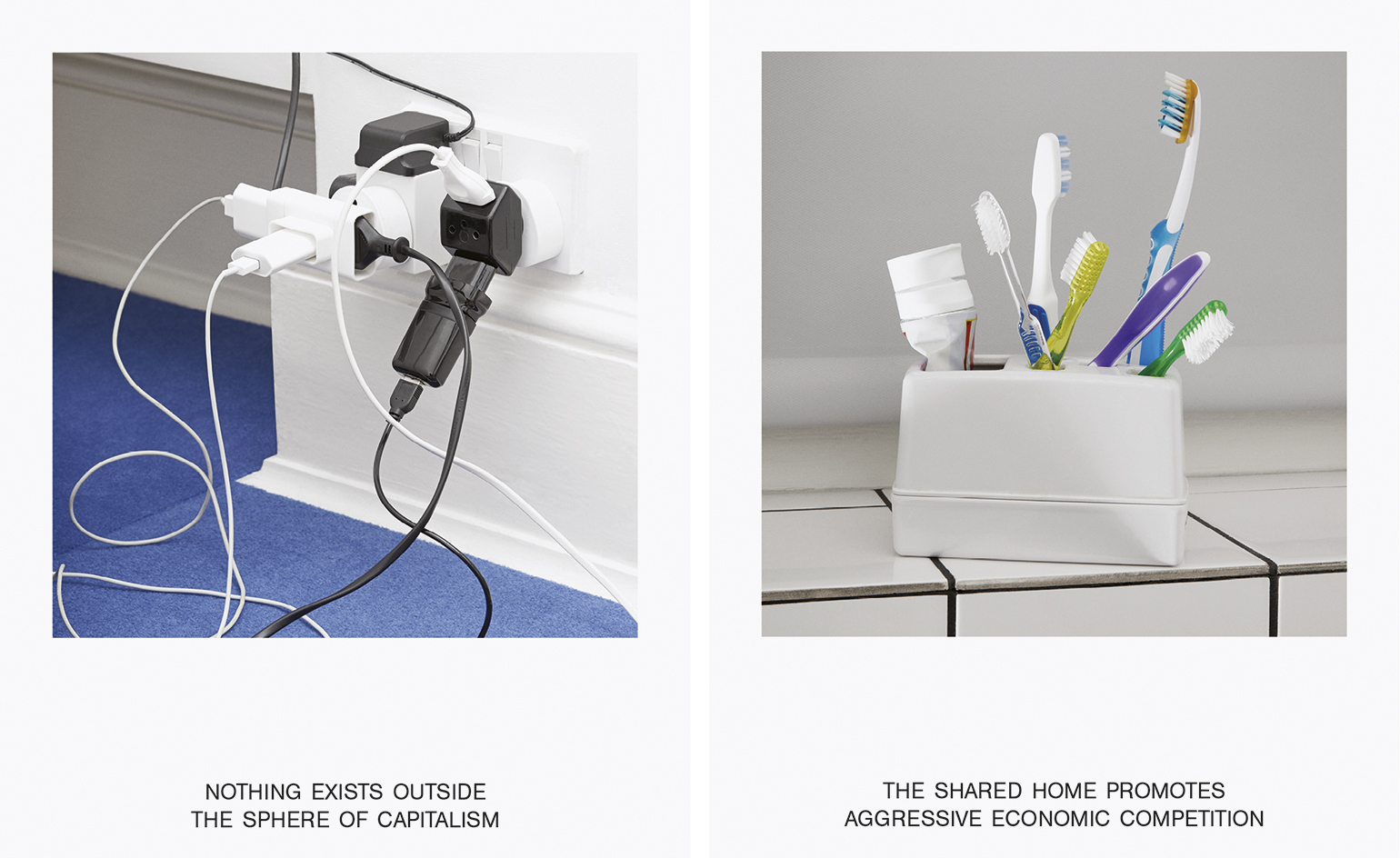
The resulting proposals aren’t necessarily straightforward investigations of space, but rather musings on community, economics, sharing and time itself. Pictured left: ’Home Economics #13’. Right: ’Home Economics #11’.
INFORMATION
’Home Economics’ has been commissioned by the British Council for the British Pavilion at the Venice Architecture Biennale 2016. For more information, visit the British Council’s website
Wallpaper* Newsletter
Receive our daily digest of inspiration, escapism and design stories from around the world direct to your inbox.
Jonathan Bell has written for Wallpaper* magazine since 1999, covering everything from architecture and transport design to books, tech and graphic design. He is now the magazine’s Transport and Technology Editor. Jonathan has written and edited 15 books, including Concept Car Design, 21st Century House, and The New Modern House. He is also the host of Wallpaper’s first podcast.
-
 The Lighthouse draws on Bauhaus principles to create a new-era workspace campus
The Lighthouse, a Los Angeles office space by Warkentin Associates, brings together Bauhaus, brutalism and contemporary workspace design trends
By Ellie Stathaki
-
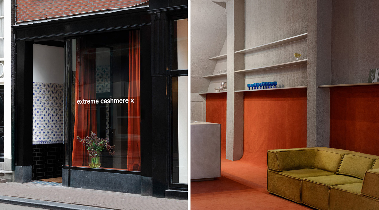 Extreme Cashmere reimagines retail with its new Amsterdam store: ‘You want to take your shoes off and stay’
Wallpaper* takes a tour of Extreme Cashmere’s new Amsterdam store, a space which reflects the label’s famed hospitality and unconventional approach to knitwear
By Jack Moss
-
 Titanium watches are strong, light and enduring: here are some of the best
Brands including Bremont, Christopher Ward and Grand Seiko are exploring the possibilities of titanium watches
By Chris Hall
-
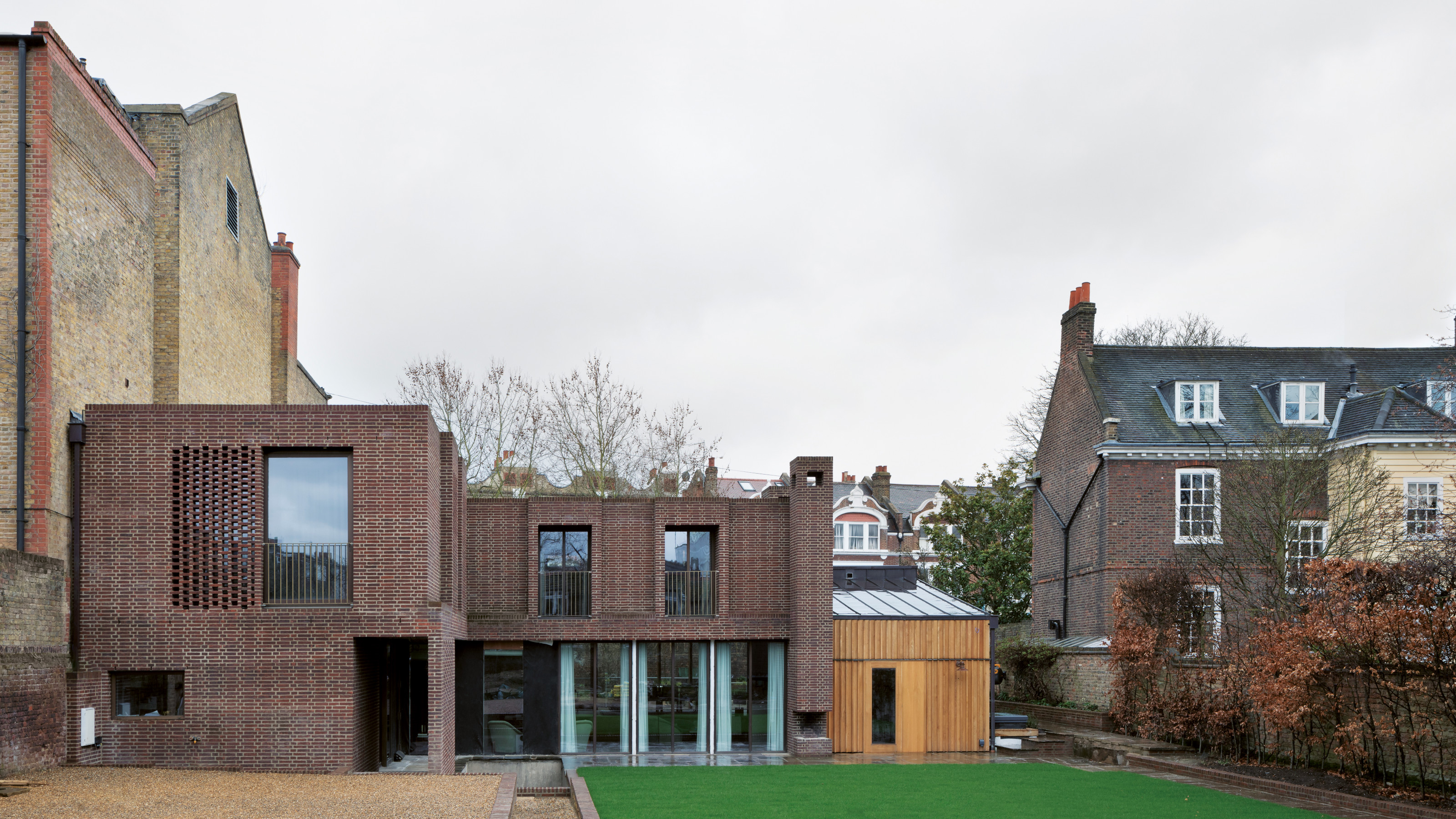 A new London house delights in robust brutalist detailing and diffused light
London's House in a Walled Garden by Henley Halebrown was designed to dovetail in its historic context
By Jonathan Bell
-
 A Sussex beach house boldly reimagines its seaside typology
A bold and uncompromising Sussex beach house reconfigures the vernacular to maximise coastal views but maintain privacy
By Jonathan Bell
-
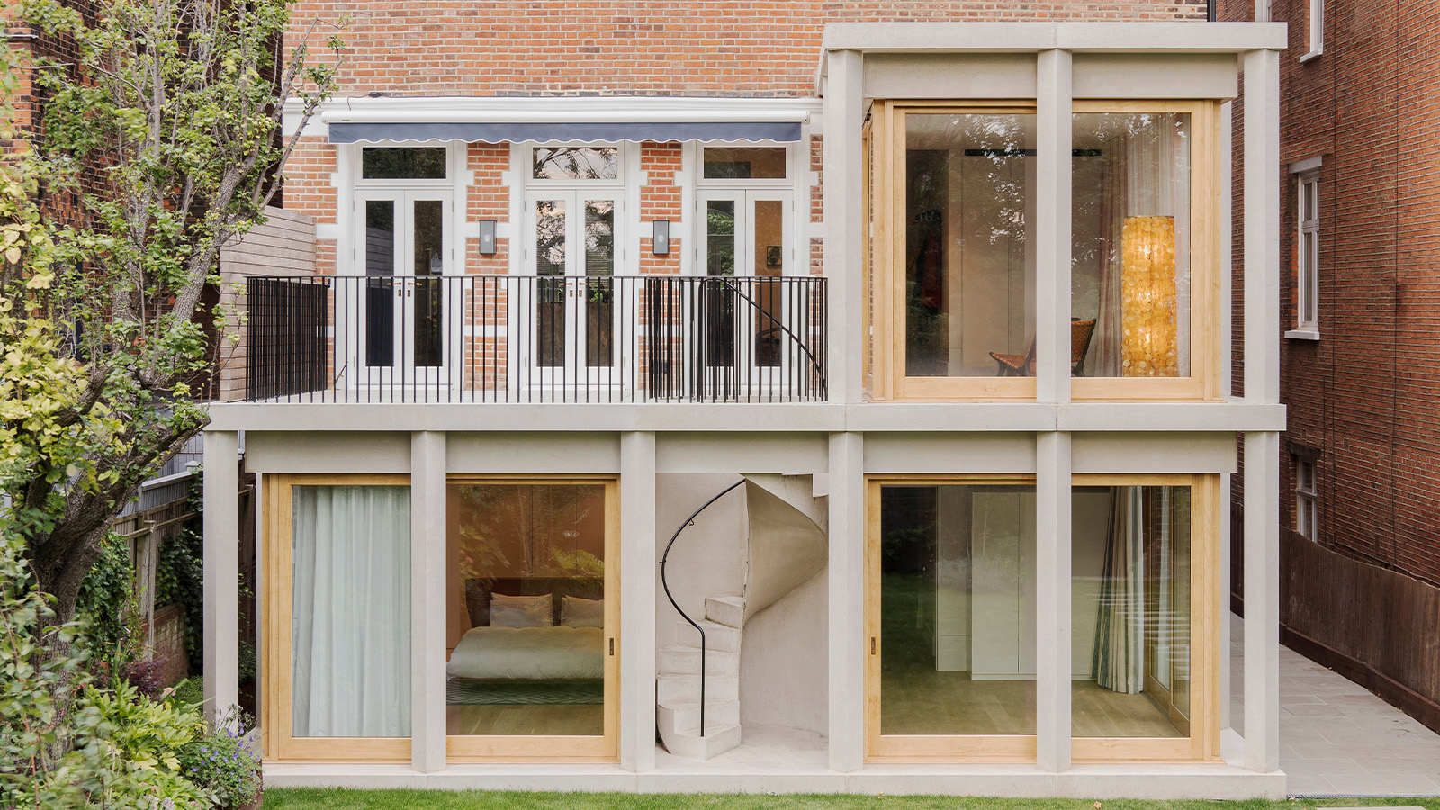 This 19th-century Hampstead house has a raw concrete staircase at its heart
This Hampstead house, designed by Pinzauer and titled Maresfield Gardens, is a London home blending new design and traditional details
By Tianna Williams
-
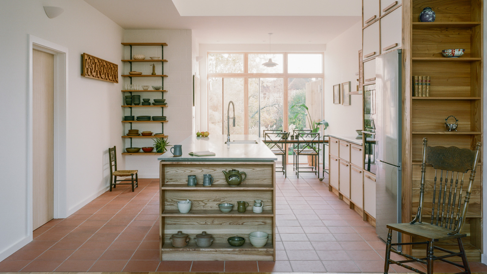 An octogenarian’s north London home is bold with utilitarian authenticity
Woodbury residence is a north London home by Of Architecture, inspired by 20th-century design and rooted in functionality
By Tianna Williams
-
 What is DeafSpace and how can it enhance architecture for everyone?
DeafSpace learnings can help create profoundly sense-centric architecture; why shouldn't groundbreaking designs also be inclusive?
By Teshome Douglas-Campbell
-
 The dream of the flat-pack home continues with this elegant modular cabin design from Koto
The Niwa modular cabin series by UK-based Koto architects offers a range of elegant retreats, designed for easy installation and a variety of uses
By Jonathan Bell
-
 Are Derwent London's new lounges the future of workspace?
Property developer Derwent London’s new lounges – created for tenants of its offices – work harder to promote community and connection for their users
By Emily Wright
-
 Showing off its gargoyles and curves, The Gradel Quadrangles opens in Oxford
The Gradel Quadrangles, designed by David Kohn Architects, brings a touch of playfulness to Oxford through a modern interpretation of historical architecture
By Shawn Adams