A San Francisco live/work space plays with opacity and transparency
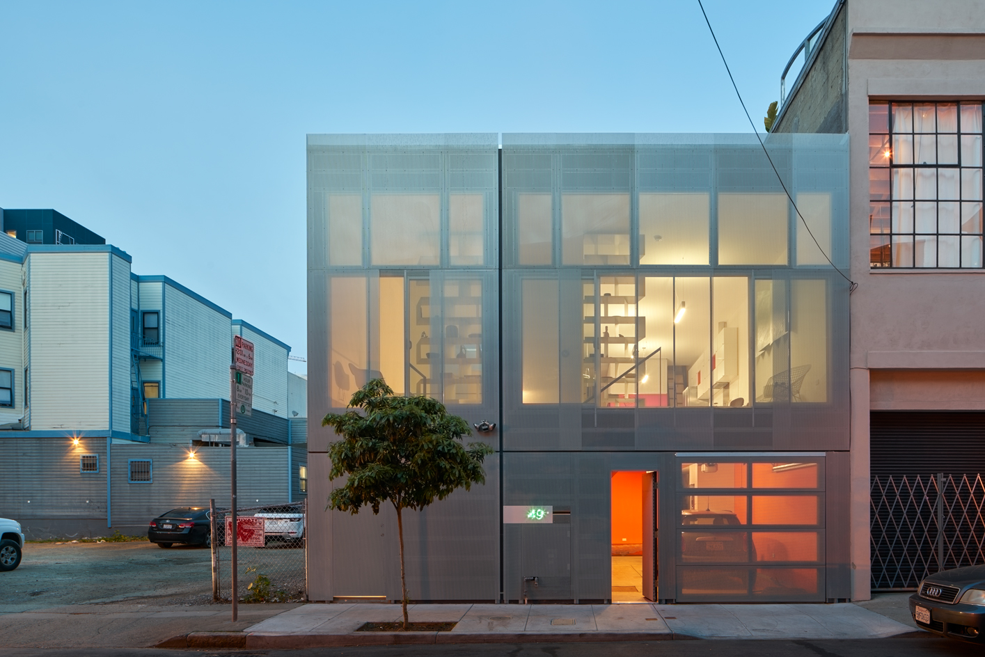
In a gritty but rapidly evolving part of San Francisco’s SoMa (South of Market) neighbourhood, Thai-born artist and architectural designer Raveevarn Choksombatchai (who often goes by the single name Raveevarn) has recently completed a new live-work building for herself. Along these urban streets, it's increasingly common to encounter cutting-edge and experimental architecture shoulder to shoulder with worn industrial structures. Like much of the recent interventions, Raveevarn’s new home-and-studio took on the challenges of a tight, mid-block site.
She responded with a quiet insertion that strikes a balance between engaging its urban surroundings while maintaining a private, secure inner realm. From outside, the almost cubic, two-story structure – clad in metal that echoes the industrial setting – may appear deceptively simple. But on the inside, this courtyard building reveals itself as an architecture of layered veils.
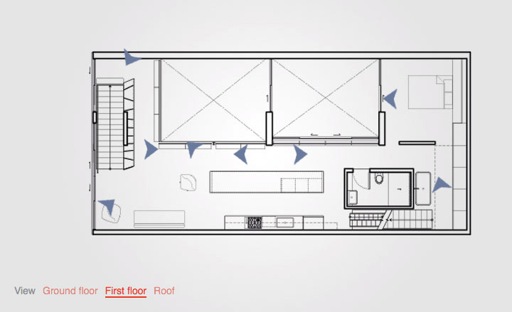
Take an interactive tour of 49 Grace
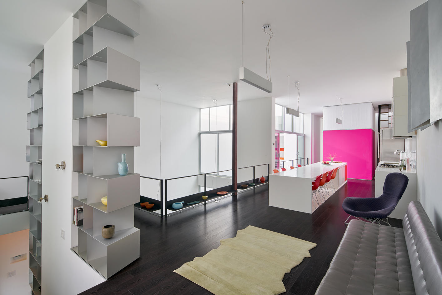
The outermost skin is a rain-screen, a facade of perforated aluminum panels, which overlap to create moiré patterns and other optical effects. Within that shell, a glass-and-metal layer wraps the 226 sq m of interior space; and further inside is a honeycomb of thin, sheet-metal shelving – a practical storage element that forms a two-story partition along the stairway up to the main residential level. Beyond that steel matrix of cubby holes, the design plays with light in finer-grained ways. For example, the freestanding bathroom structures on each floor glow, lantern-like, at their tops, where layers of stretched, translucent fabric form a light-diffusing enclosure. The architect designed all the built-ins, and the place – which includes a garage and a guest suite — also showcases her collections of mid-century modern furnishings and ceramics (much of that pottery is displayed on the steel shelves).
Throughout, there’s an animated play of opacity versus transparency, with screening elements modulating light, shadow, and views in (while simultaneously providing for generous views out). It’s an architecture that changes appearance continually over the course of the day and night, with the facade morphing from quite solid to seemingly ethereal. Meanwhile, across the inner realm, spaces flow together with boundaries subtly defined, as walls of intense colour — such as tangerine and hot pink — punctuate the interior, leading the way.

Clad in perforated aluminium, the house is an animated play of opacity versus transparency.
From the outside, the structure echoes its industrial setting, but inside it's a welcoming family home.
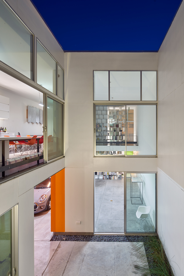
An inner courtyard reveals the two-level structure's different layers.
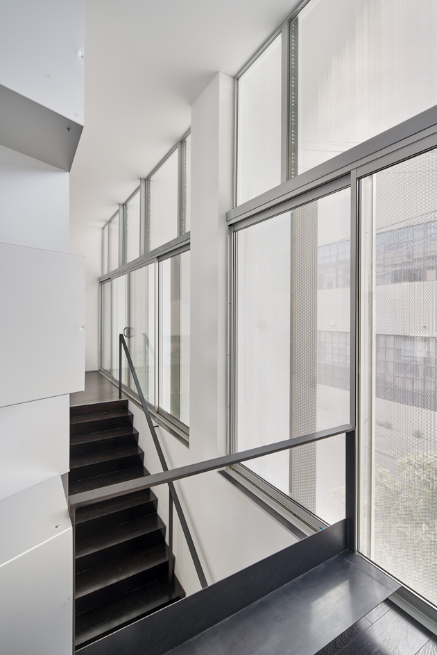
A brightly lit stairway leads up to the main residential level.
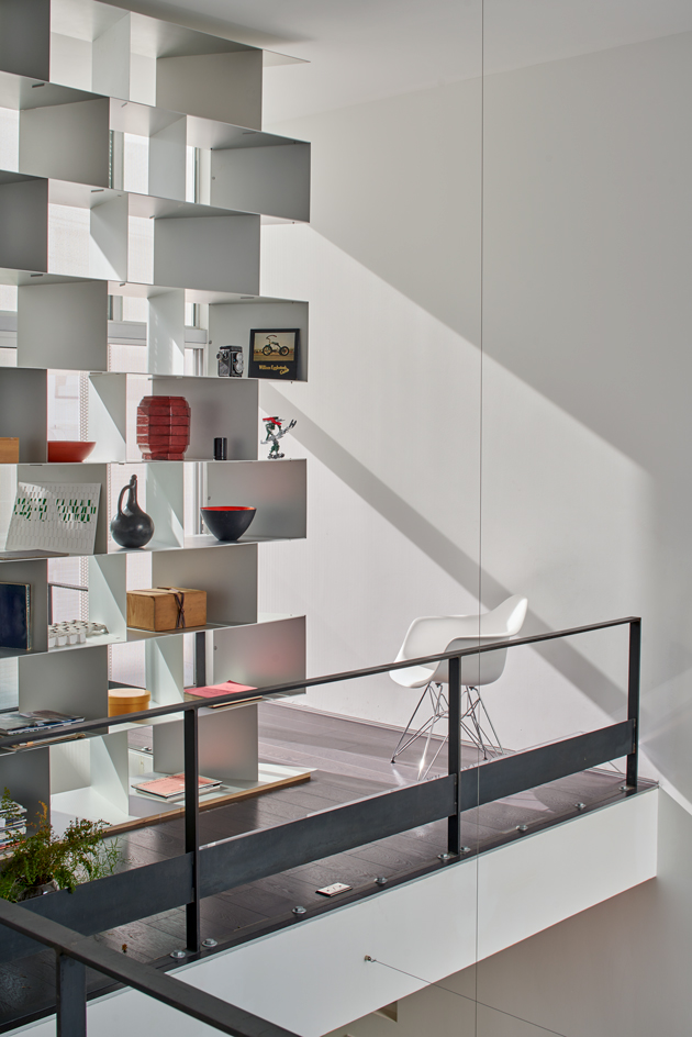
A honeycomb of thin, sheet-metal shelving works as a practical storage element...
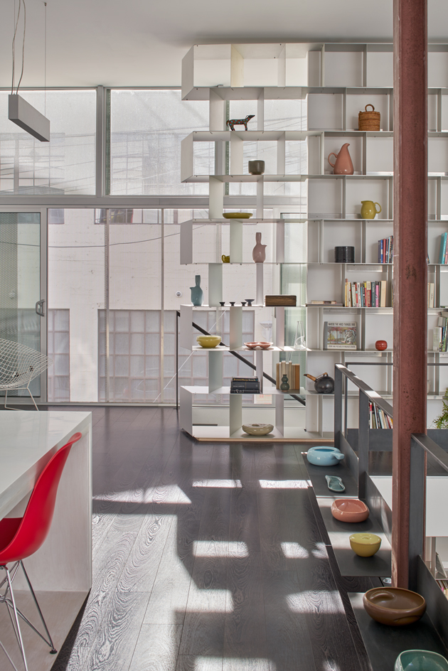
...but also forms a handy two-story partition between spaces.
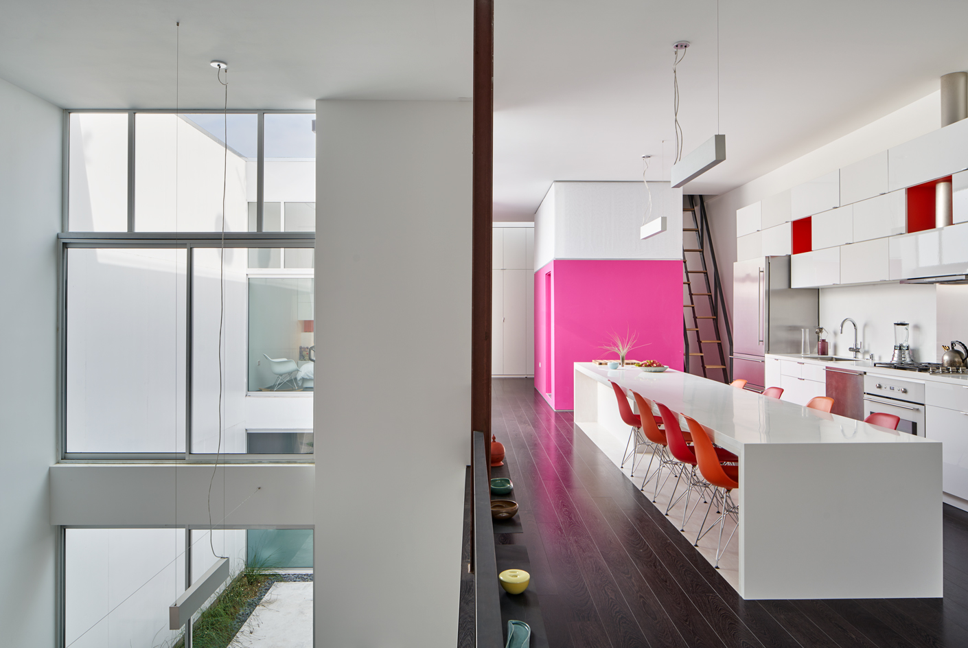
The airy, open plan interior features bright pops of colour, such as tangerine and hot pink.
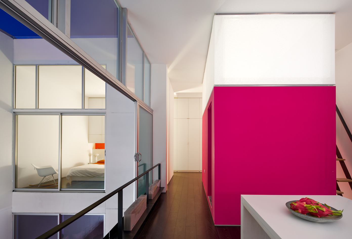
The main living floor features an open plan kitchen and dinning area, but also the master bedroom.
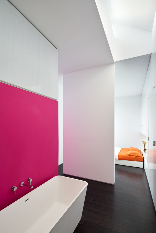
The master bedroom is somewhat secluded from the rest of the house and includes an en-suite bathroom.
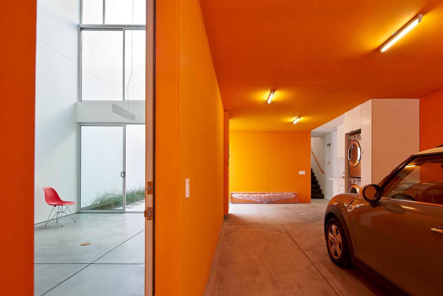
Across the inner realm, spaces flow together with boundaries subtly defined.
INFORMATION
For more information visit Veev Design’s website
Wallpaper* Newsletter
Receive our daily digest of inspiration, escapism and design stories from around the world direct to your inbox.
-
 Put these emerging artists on your radar
This crop of six new talents is poised to shake up the art world. Get to know them now
By Tianna Williams
-
 Dining at Pyrá feels like a Mediterranean kiss on both cheeks
Designed by House of Dré, this Lonsdale Road addition dishes up an enticing fusion of Greek and Spanish cooking
By Sofia de la Cruz
-
 Creased, crumpled: S/S 2025 menswear is about clothes that have ‘lived a life’
The S/S 2025 menswear collections see designers embrace the creased and the crumpled, conjuring a mood of laidback languor that ran through the season – captured here by photographer Steve Harnacke and stylist Nicola Neri for Wallpaper*
By Jack Moss
-
 We explore Franklin Israel’s lesser-known, progressive, deconstructivist architecture
Franklin Israel, a progressive Californian architect whose life was cut short in 1996 at the age of 50, is celebrated in a new book that examines his work and legacy
By Michael Webb
-
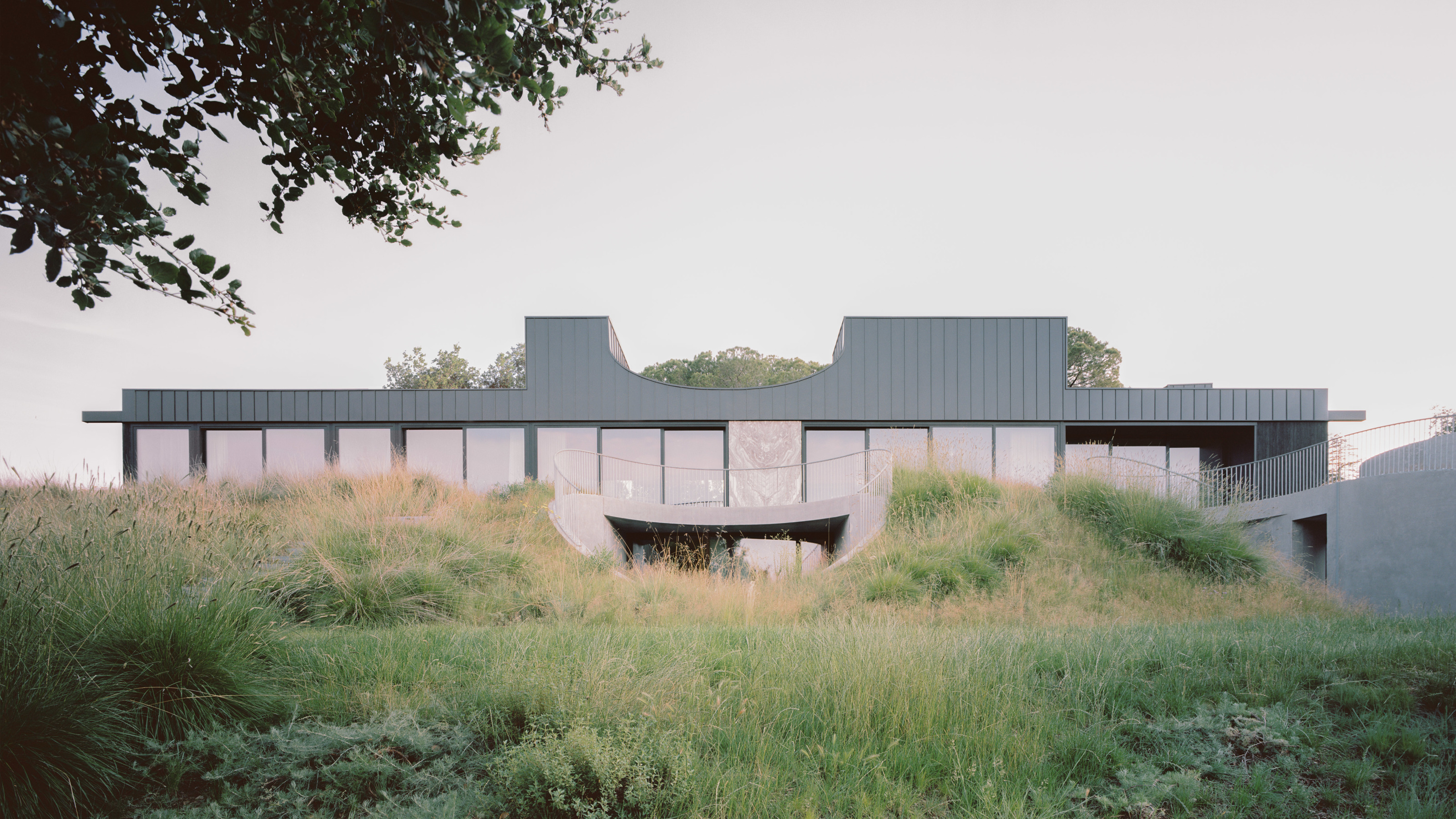 A new hilltop California home is rooted in the landscape and celebrates views of nature
WOJR's California home House of Horns is a meticulously planned modern villa that seeps into its surrounding landscape through a series of sculptural courtyards
By Jonathan Bell
-
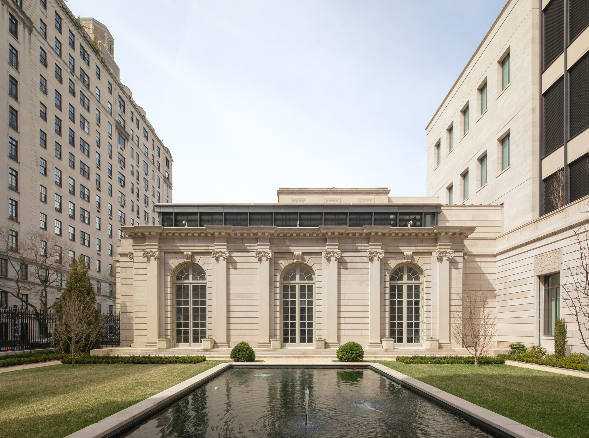 The Frick Collection's expansion by Selldorf Architects is both surgical and delicate
The New York cultural institution gets a $220 million glow-up
By Stephanie Murg
-
 Remembering architect David M Childs (1941-2025) and his New York skyline legacy
David M Childs, a former chairman of architectural powerhouse SOM, has passed away. We celebrate his professional achievements
By Jonathan Bell
-
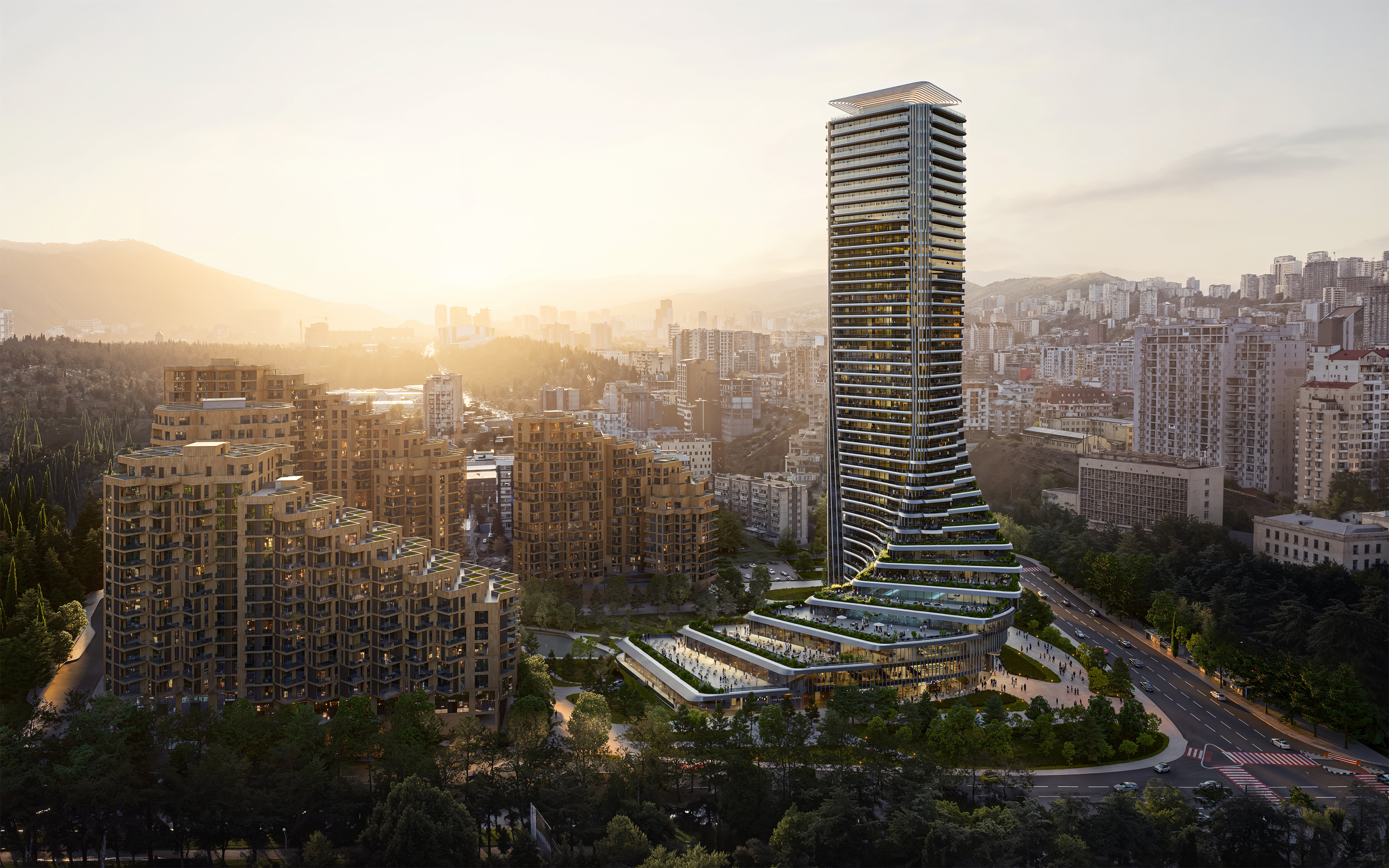 The upcoming Zaha Hadid Architects projects set to transform the horizon
A peek at Zaha Hadid Architects’ future projects, which will comprise some of the most innovative and intriguing structures in the world
By Anna Solomon
-
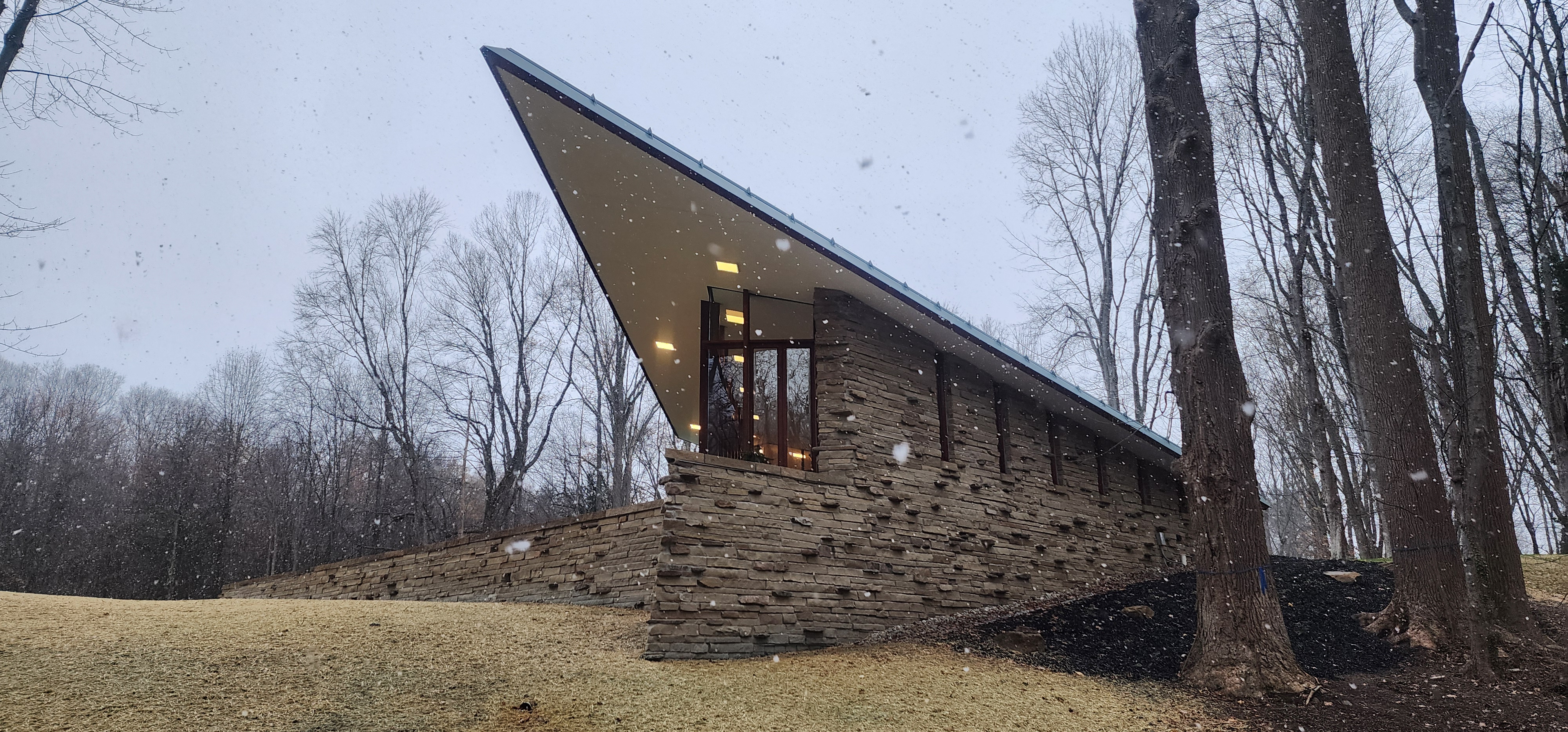 Frank Lloyd Wright’s last house has finally been built – and you can stay there
Frank Lloyd Wright’s final residential commission, RiverRock, has come to life. But, constructed 66 years after his death, can it be considered a true ‘Wright’?
By Anna Solomon
-
 Heritage and conservation after the fires: what’s next for Los Angeles?
In the second instalment of our 'Rebuilding LA' series, we explore a way forward for historical treasures under threat
By Mimi Zeiger
-
 Why this rare Frank Lloyd Wright house is considered one of Chicago’s ‘most endangered’ buildings
The JJ Walser House has sat derelict for six years. But preservationists hope the building will have a vibrant second act
By Anna Fixsen