Adam Nathaniel Furman’s colourful vision for a Tokyo apartment
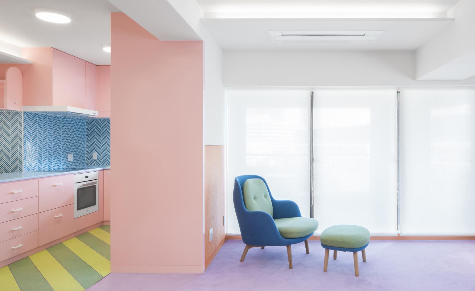
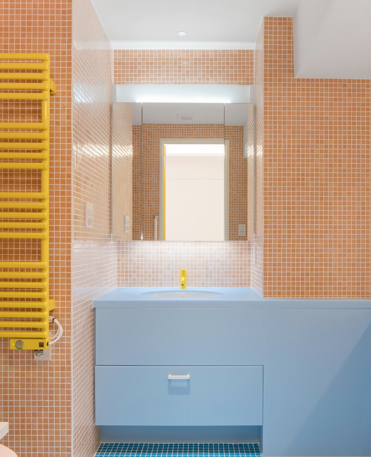
When London-based designer and postmodernism enthusiast Adam Nathaniel Furman came across a client who asked specially for a ‘bubble gum' flat, he knew it was going to be an exciting project. Located in the heart of Nagatacho, the governmental administrative district of central Tokyo, the apartment blends milky pastels and bright yellow accents that come together to form a harmonious postmodernist collage.
However, when the project began two years ago, Furman was presented with a 160 sq m apartment made up of small uninspiring rooms connected by a long, thin corridor that ran straight through its centre.
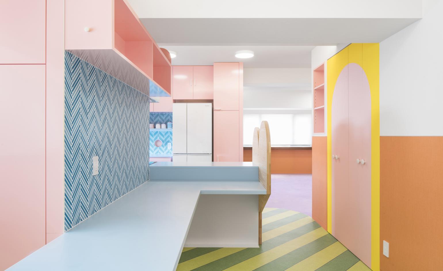
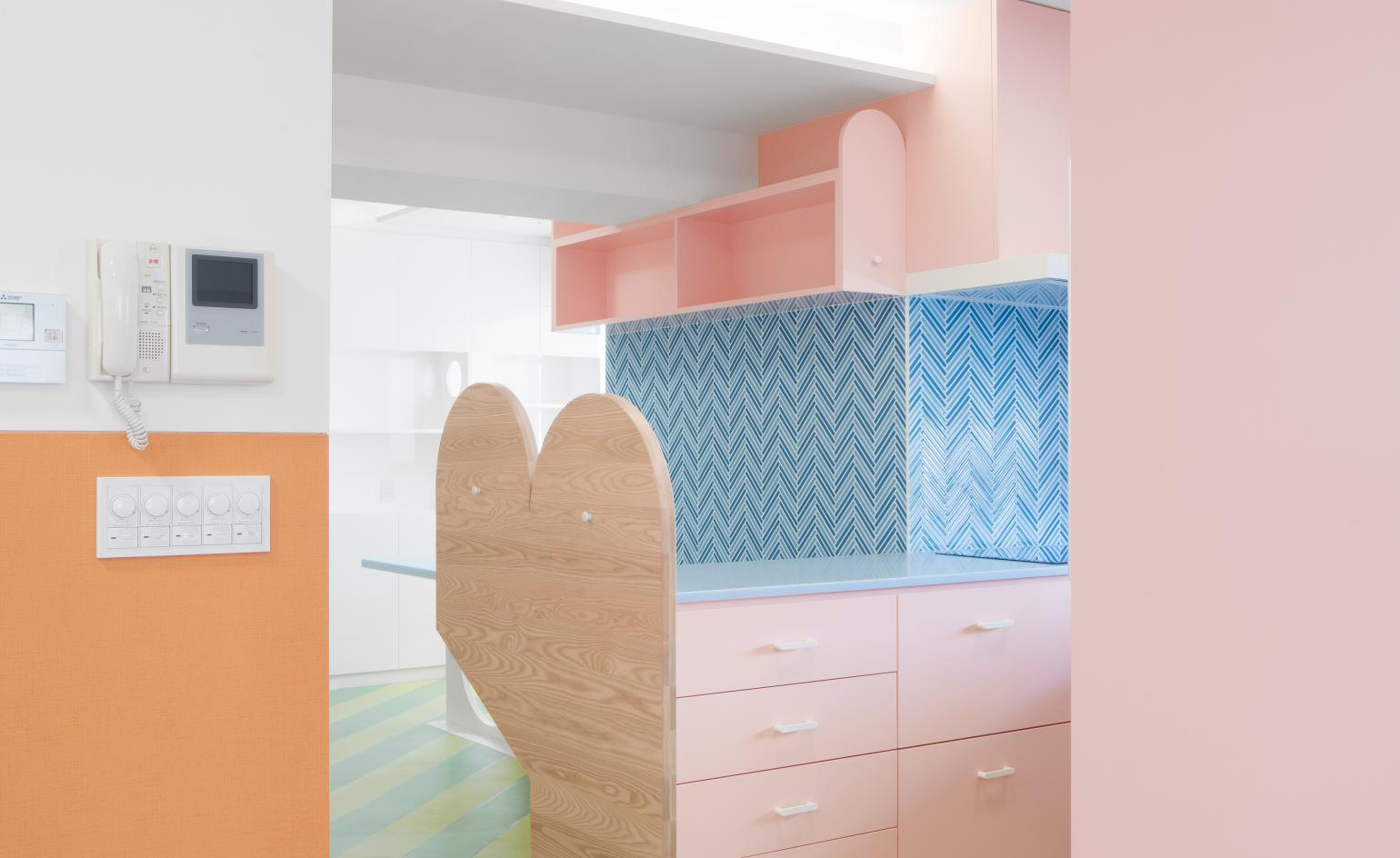
‘The clients had an old property that they have had since the early 1980s, and together with all the new developments going on in Tokyo for the Olympics, wanted to do their place up in an exciting and fun way that matched how Tokyo was changing,' Furman says. ‘They wanted to avoid the small rooms and corridor of the previous layout, so I developed the idea of this large extended kitchen counter, table and screen, which became like a hearth at the centre of the home.'
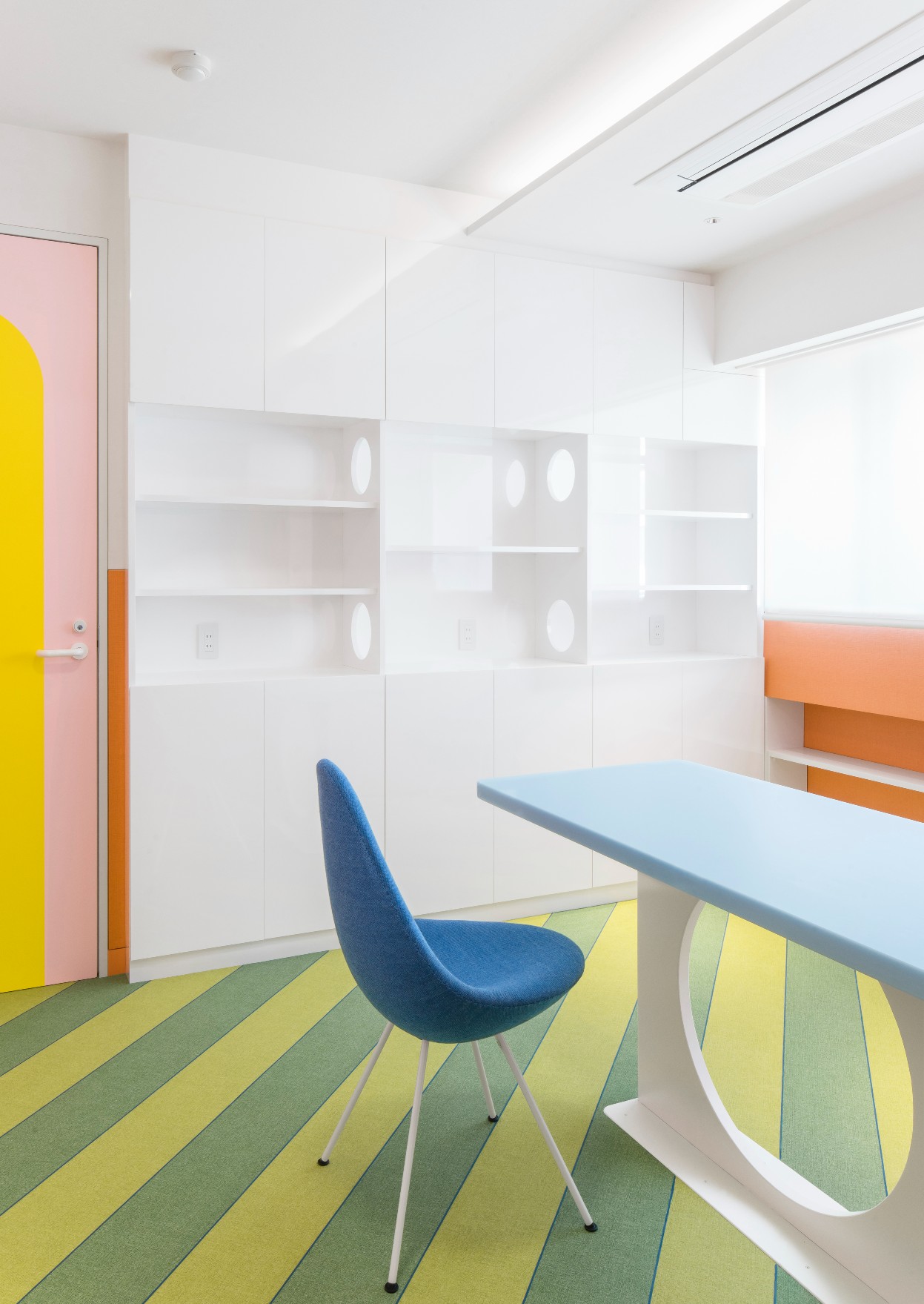
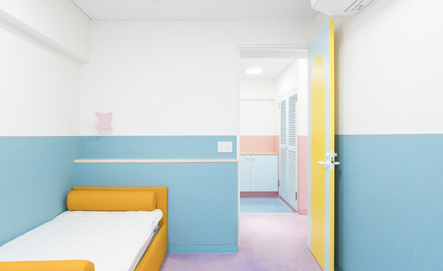
The two smaller bedrooms at the apartment's entrance were widened with double doors that open up to the large living and dining area, and ceiling heights were increased throughout to make the space feel more open and generous. With the proportions increased and layout in place, Furman turned his attention to materials and colours.
‘I am very interested in the sensuousness of rich colour combinations, and have been exploring this through all of my work, at every opportunity,' explains Furman, who has spent the last eight years running Saturated Space, an influential research group at the Architectural Association that publishes and organises symposiums on colour in architecture and urbanism.
RELATED STORY
‘This was a very exciting opportunity because the clients were completely passionate about colour as well, and specifically were keen on pastels, and indeed had even told me that they wanted a "bubble gum" flat, as they put it, later coming to refer to the project as the "watermelon"!'
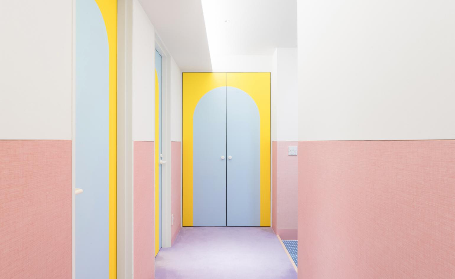
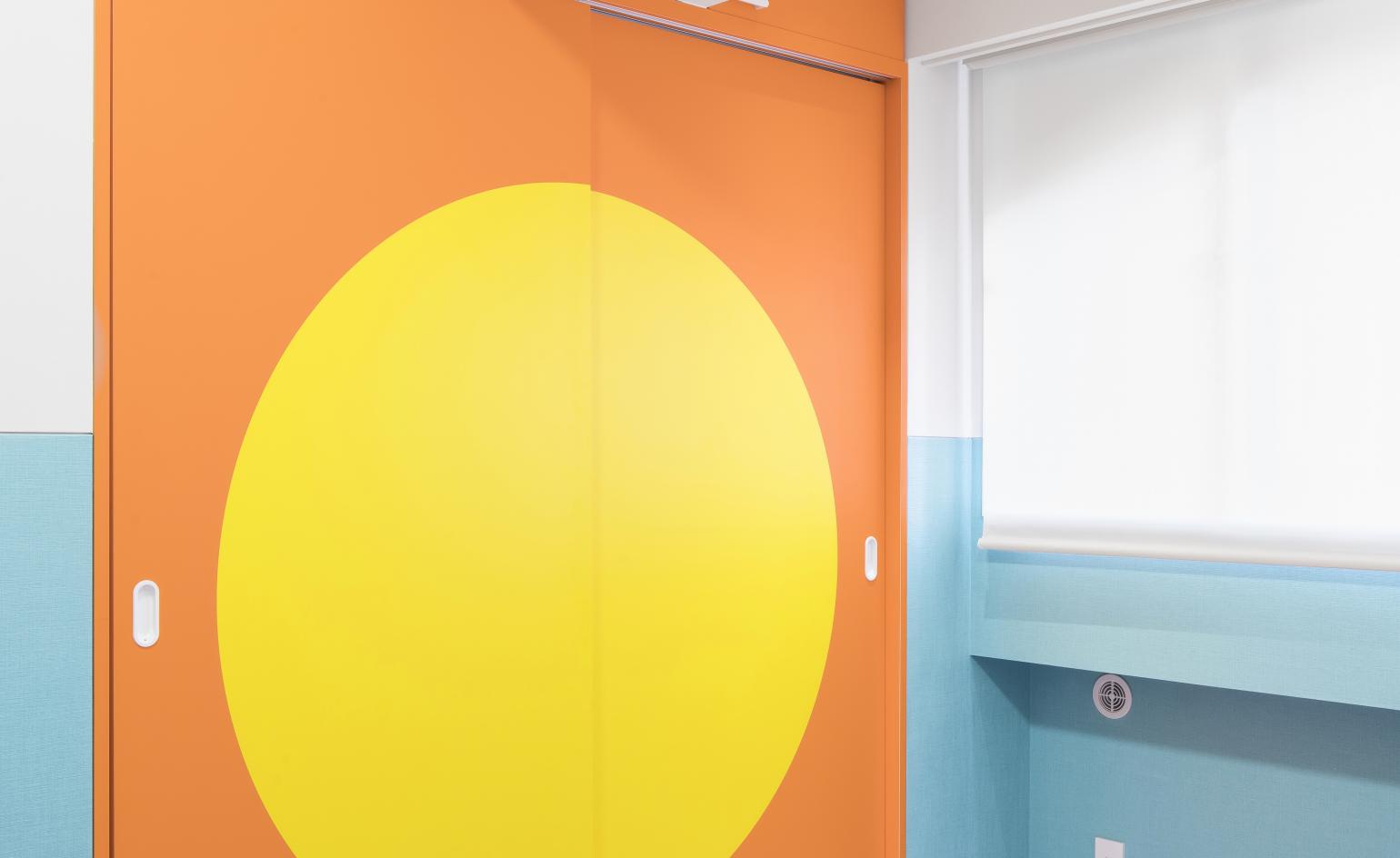
Furman developed what he refers to as ‘a hyper-aestheticized celebration of the senses' – a palette of soft but stimulating pastel hues that are accented with bolder shades, specifically canary yellow, which he says adds a ‘staccato zing' to the compositions. Textures were carefully selected to balance natural surfaces with smoother artificial ones, both matte and glossy, translucent and solid. Meanwhile rigid geometric shapes are tempered by the perfectly curved arc shapes that are emblazoned on doors.
The multidisciplinary designer, whose previous work spans everything from architecture to sculpture, writing and product design, says he has a particular soft spot for interiors. ‘They are where I truly get to create environments that work coherently together across all the areas of interest in design that I have,’ he enthuses.
‘They are the symphonies where everything comes together, whereas the other things I work on tend to be shorter and more discrete songs. I get so incredibly excited about crafting voluptuous environments formed out of exquisite joinery, beautiful materials and details, and furniture and fittings that are all on their own lovely, but which together create something much greater than just the some of its parts, and which fully encapuslates and elevates the lives of the people who occupy it.'
INFORMATION
For more information, visit the Adam Nathaniel Furman website
Wallpaper* Newsletter
Receive our daily digest of inspiration, escapism and design stories from around the world direct to your inbox.
Ali Morris is a UK-based editor, writer and creative consultant specialising in design, interiors and architecture. In her 16 years as a design writer, Ali has travelled the world, crafting articles about creative projects, products, places and people for titles such as Dezeen, Wallpaper* and Kinfolk.
-
 Inside the Shakti Design Residency, taking Indian craftsmanship to Alcova 2025
The new initiative pairs emerging talents with some of India’s most prestigious ateliers, resulting in intricately crafted designs, as seen at Alcova 2025 in Milan
By Henrietta Thompson Published
-
 Tudor hones in on the details in 2025’s new watch releases
Tudor rethinks classic watches with carefully considered detailing – shop this year’s new faces
By Thor Svaboe Published
-
 2025 Expo Osaka: Ireland is having a moment in Japan
At 2025 Expo Osaka, a new sculpture for the Irish pavilion brings together two nations for a harmonious dialogue between place and time, material and form
By Danielle Demetriou Published
-
 Karimoku's Hiroo Residence celebrates tranquillity in central Tokyo
Japanese furniture brand Karimoku’s latest bespoke interior collaboration, Hiroo Residence is a soft-textured Tokyo haven
By Martha Elliott Published
-
 This new rug release from Floor Story is causing a cosmic eclipse
Kangan Arora and Floor Story have designed ten otherworldly illusions of form and tone – the ‘Cosmic Check’ and ‘Falling Shadows’ rug collections
By Martha Elliott Last updated
-
 Scandinavian design meets Japanese heritage in OEO Studio’s Tokyo apartment
OEO Studio has collaborated with Japanese property developer ReBita on a luxury new apartment at Tokyo’s Opus Arisugawa Terrace & Residence
By Hannah Silver Last updated
-
 Nendo and Georg Jensen create silver vases inspired by nature
Japanese design studio Nendo and Danish silversmith Georg Jensen create a set of three silver vases that combine organic forms and minimalist aesthetics
By Mary Cleary Last updated
-
 Niwaki is a new outlet for Japan’s most innovative tools
New London store Niwaki sells exquisitely crafted Japanese gardening tools and workwear
By Mary Cleary Last updated
-
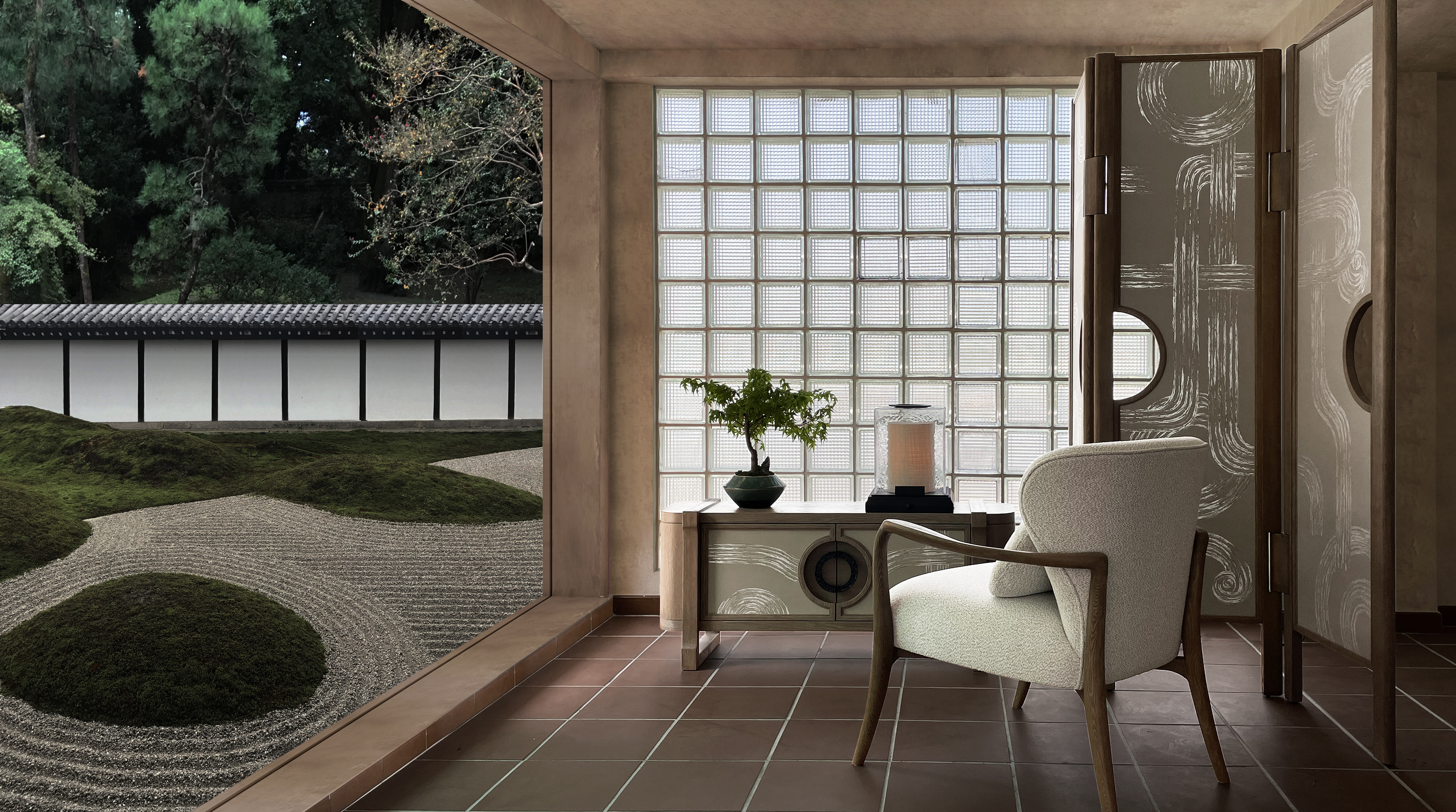 André Fu’s new furniture is inspired by Japanese gardens
André Fu Living’s Art Deco Garden is a collection of furniture, objects, wallcoverings and homeware inspired by Zen gardens and Art Deco
By Rosa Bertoli Last updated
-
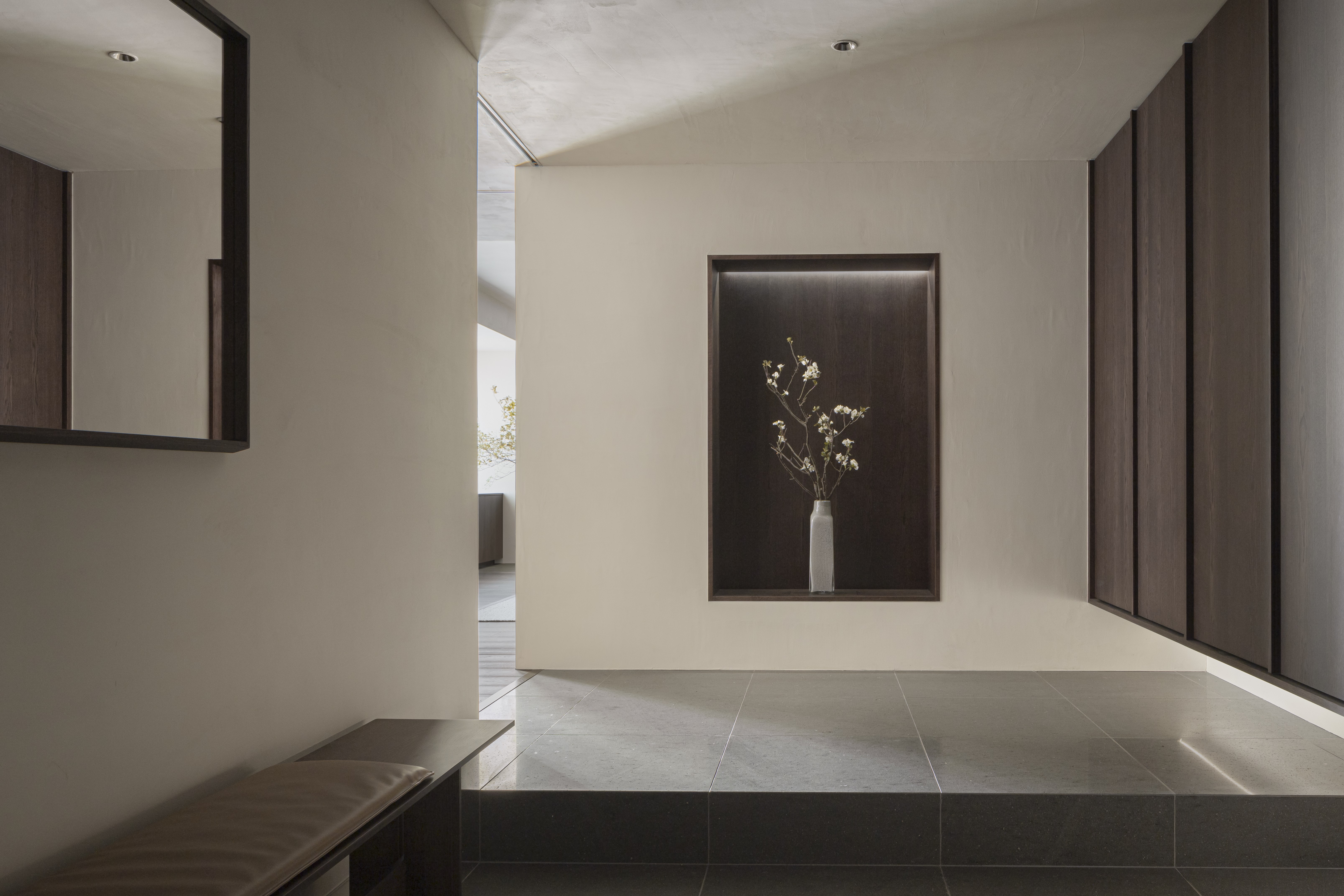 Japanese minimalism meets Scandinavian design in Karimoku Case Study
The Azabu Residence by Keiji Ashizawa and Norm Architects’ Frederik Alexander Werner is part of the Karimoku Case Study project, and features a sombre material palette and restrained colour scheme for a peaceful family interior
By Rosa Bertoli Published
-
 Snøhetta designs experimental culinary space in Tokyo
Snøhetta co-founder Craig Dykers discusses the architecture of Burnside – a Tokyo event space for art and design outfit En One and the Bronx chef collective Ghetto Gastro
By Ellie Stathaki Last updated