Waterloo Station terminal has got a new look
A clever intervention by AECOM and Weston Williamson + Partners breathes new life into the architecture of Grimshaw's iconic Waterloo Station terminal in London

Hufton + Crow - Photography
The former International Terminal at London's Waterloo Station has been given a substantial overhaul by AECOM Architects and Weston Williamson + Partners. After a year of pandemic-induced evaporation of rail travel and a decade of uncertainty about the structure and purpose of the much-altered station, the refurb brings new platforms, concourse space and retail to the station. AECOM, which is no stranger to transport infrastructure work, public realm work and conversions, had to thread many needles with this refurbishment, opting for a minimal intervention that united old and new to give fresh purpose to one of the most dramatic structures in British railway architecture, Grimshaw’s Waterloo International.
This long, arched and curved terminus building only served its true purpose for 13 years, from opening in 1994 to closure in 2007. Designed to accommodate the long Eurostar trains before they set off on a slow trundle across South London en route for the Channel Tunnel, it was received with great acclaim. However, political wrangling and complexity stalled the original southwards high-speed route so the Waterloo terminus acted as a stopgap before the new St Pancras International could be connected up to the final fast link to the coast that took trains via Stratford and Kent instead.
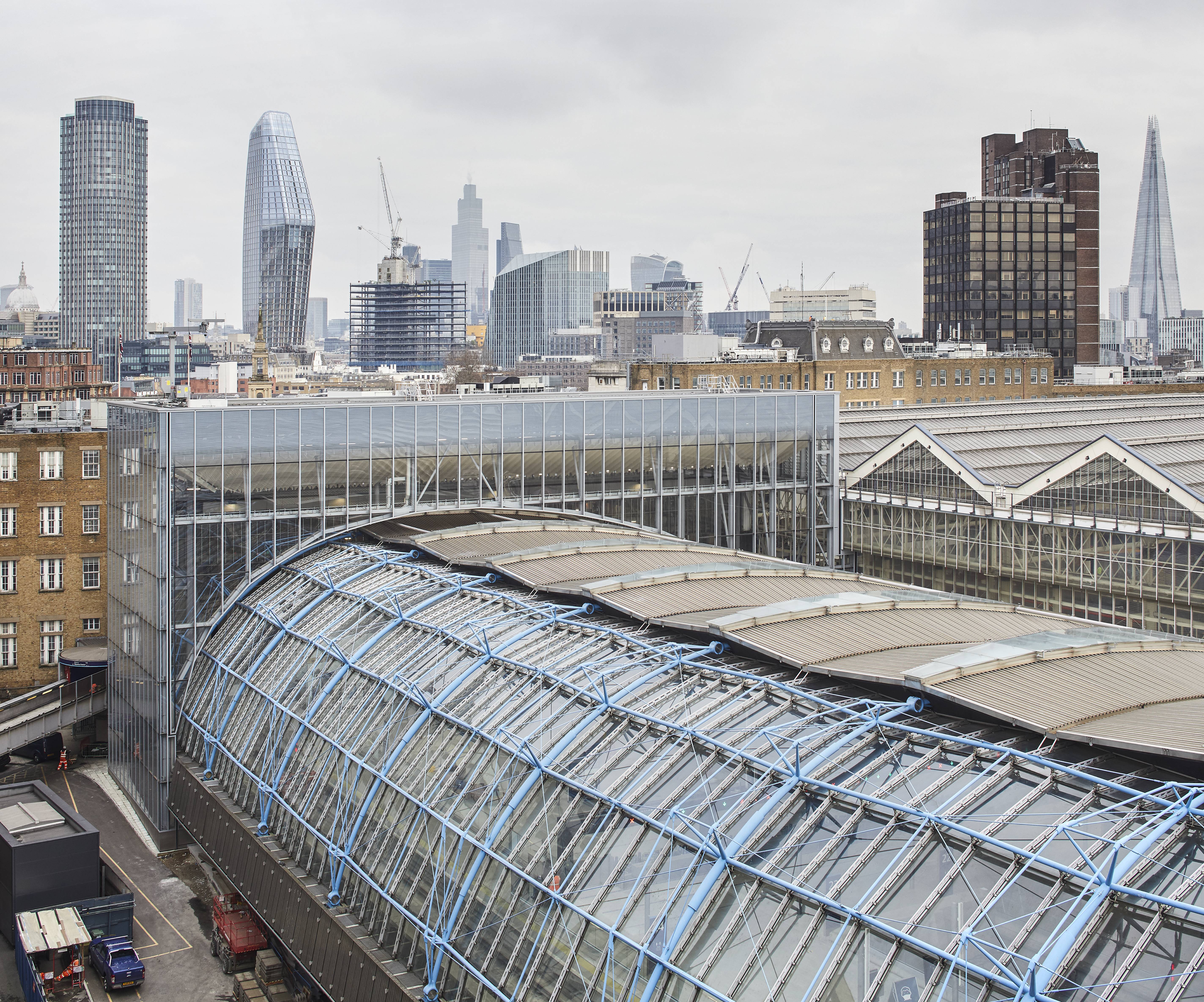
The complex curving roof of Grimshaw's Terminal Building, with its distinctive blue steelwork, had been unused for over a decade
Grimshaw’s magnificent, award-winning structure was left in a void. It took the intervention of AECOM, plus a new plan to convert the terminus to domestic trains, to ensure the building was saved and given the clean-up and polish it so desperately needed.
‘We reinvigorated a dormant beauty, one of the finest pieces of British high-tech architecture,’ says Erik Behrens, AECOM’s architecture design director and project leader. ‘The station follows the dynamic shape of the train tracks and tapers from 55m to 35m. Nicholas Grimshaw and [the engineer] Tony Hunt designed a very clever repetitive roof structure which was adjustable to fit this gradually tapering site. It was an ingenious and meticulous design, one of the most iconic roof structures of that era.’
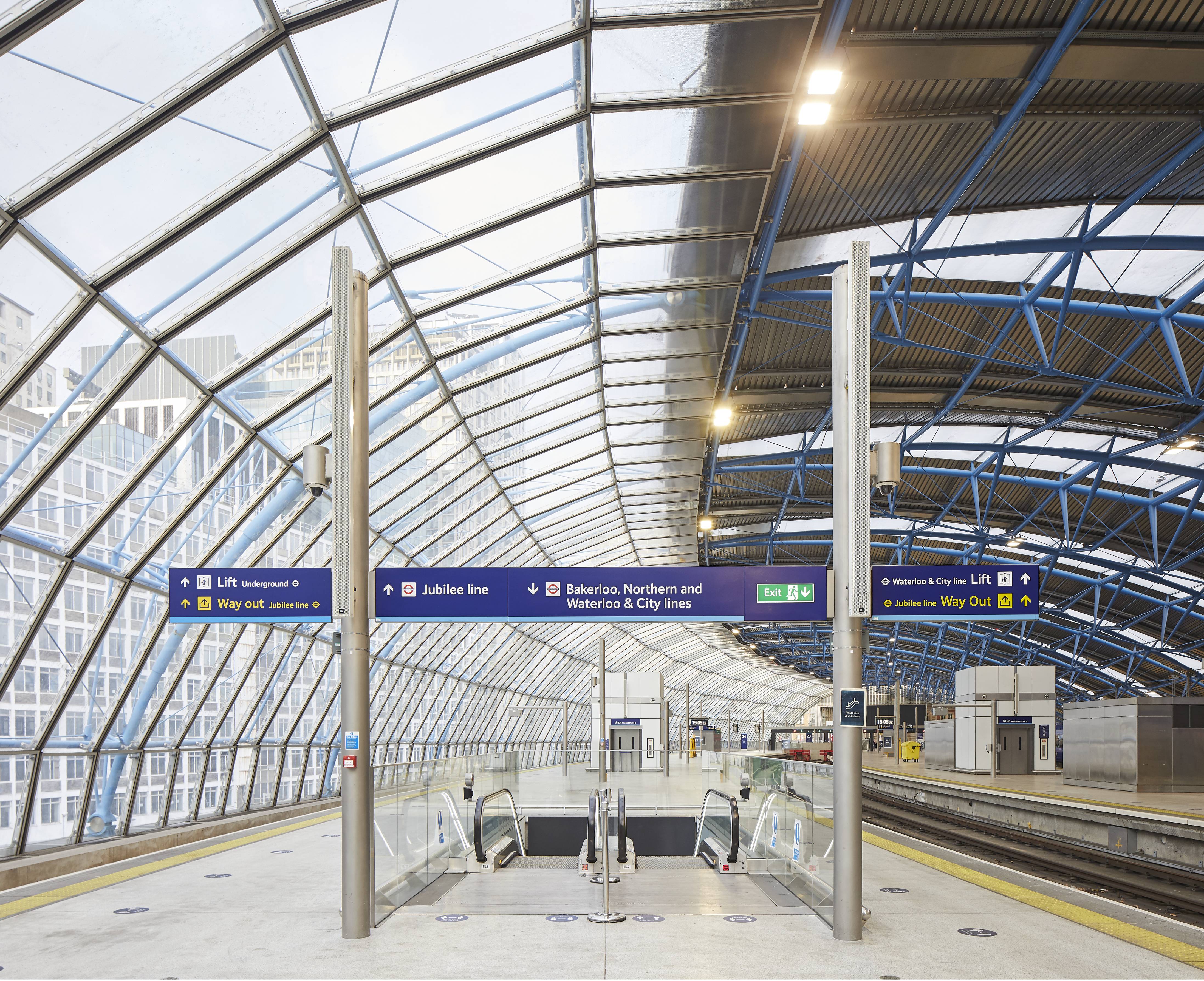
The curving original structure of the former Waterloo International has been refurbished and brought back into daily use
There has been a station on the site since 1848, but the challenge was to integrate this structure back into Waterloo’s existing concourse, a space that dates to 1922. As Behrens explains the process was not easy. Not only did a new glazed link structure have to be built, but the circulation was completely overhauled. The original building was designed to accommodate passport control and all the security requirements of international travel.
‘Integrating the Terminal into the Main Waterloo Station meant the construction of a new link bridge and infill roof over the existing London Underground,’ says Behrens, ‘we also had to refurbish all the spaces beneath the rail tracks to meet the latest standards for railway stations and incorporate new retail spaces.’
Throughout the process, AECOM was careful to remain as faithful to the original design as possible, continuing glazing details, ceiling panels and concrete finishes. ‘We spent a lot of time studying its key features like the characteristic ceiling panels and developing upgraded versions of the original design integrating the nowadays required myriad of speakers, light fittings and security cameras in a discreet fashion,’ he says.
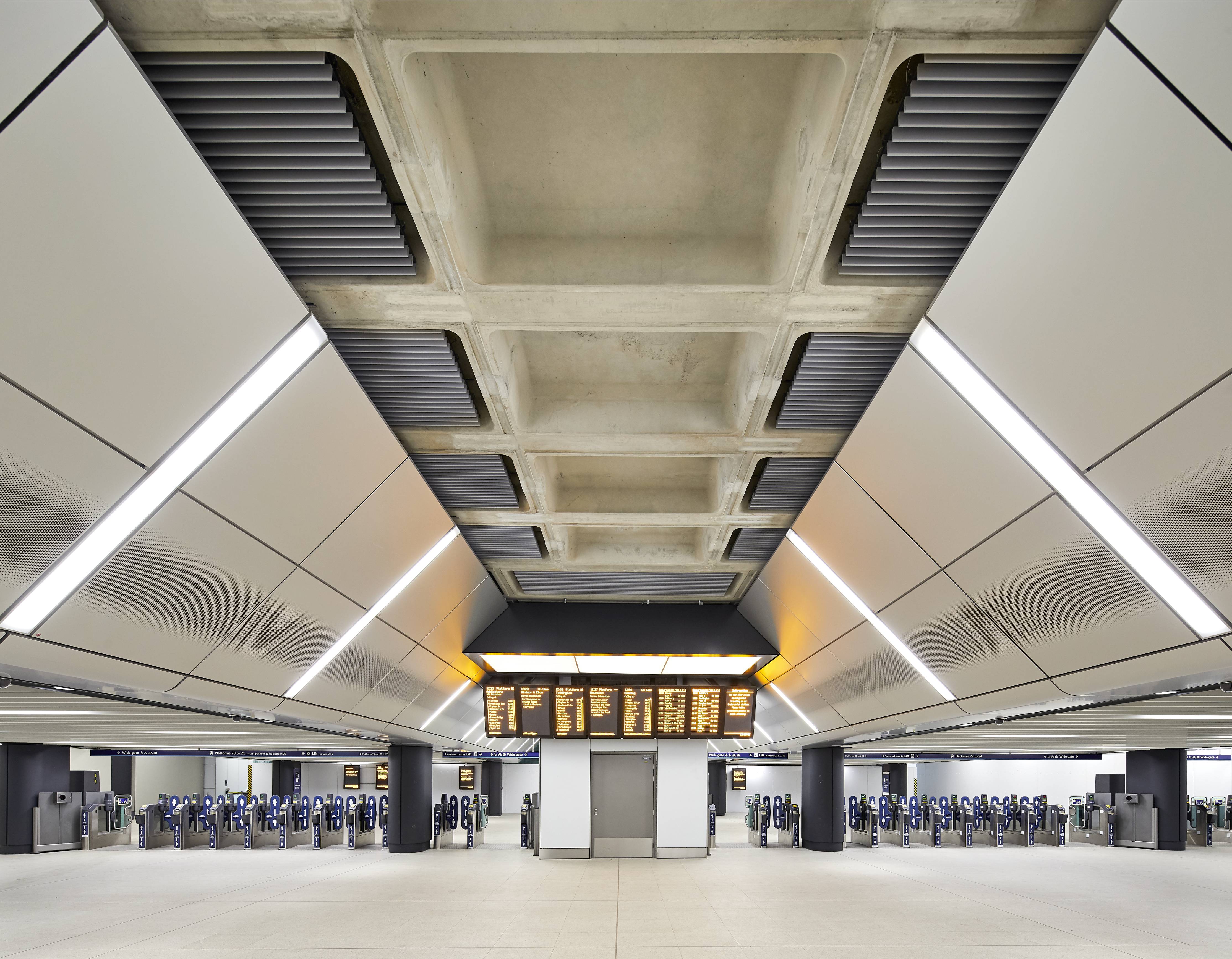
AECOM's careful attention to detail referenced the original 90s era design of the Terminal, from concrete to lighting
As rail travel starts to ramp up again, it remains to be seen whether Waterloo Station will regain its crown as one of the UK’s busiest railway stations. In the years to come, however, there’ll be even more change as Waterloo’s nearest neighbour, the Sixties-era Elizabeth House, is replaced by a new building by AHMM. This new development should vastly improve the public realm around the station, as well as increase its connectivity to the nearby South Bank. Thanks to AECOM’s intervention, the recent history of the building has now become an integral and important part of its future.
INFORMATION
Wallpaper* Newsletter
Receive our daily digest of inspiration, escapism and design stories from around the world direct to your inbox.
Jonathan Bell has written for Wallpaper* magazine since 1999, covering everything from architecture and transport design to books, tech and graphic design. He is now the magazine’s Transport and Technology Editor. Jonathan has written and edited 15 books, including Concept Car Design, 21st Century House, and The New Modern House. He is also the host of Wallpaper’s first podcast.
-
 Put these emerging artists on your radar
This crop of six new talents is poised to shake up the art world. Get to know them now
By Tianna Williams
-
 Dining at Pyrá feels like a Mediterranean kiss on both cheeks
Designed by House of Dré, this Lonsdale Road addition dishes up an enticing fusion of Greek and Spanish cooking
By Sofia de la Cruz
-
 Creased, crumpled: S/S 2025 menswear is about clothes that have ‘lived a life’
The S/S 2025 menswear collections see designers embrace the creased and the crumpled, conjuring a mood of laidback languor that ran through the season – captured here by photographer Steve Harnacke and stylist Nicola Neri for Wallpaper*
By Jack Moss
-
 An octogenarian’s north London home is bold with utilitarian authenticity
Woodbury residence is a north London home by Of Architecture, inspired by 20th-century design and rooted in functionality
By Tianna Williams
-
 What is DeafSpace and how can it enhance architecture for everyone?
DeafSpace learnings can help create profoundly sense-centric architecture; why shouldn't groundbreaking designs also be inclusive?
By Teshome Douglas-Campbell
-
 The dream of the flat-pack home continues with this elegant modular cabin design from Koto
The Niwa modular cabin series by UK-based Koto architects offers a range of elegant retreats, designed for easy installation and a variety of uses
By Jonathan Bell
-
 Are Derwent London's new lounges the future of workspace?
Property developer Derwent London’s new lounges – created for tenants of its offices – work harder to promote community and connection for their users
By Emily Wright
-
 Showing off its gargoyles and curves, The Gradel Quadrangles opens in Oxford
The Gradel Quadrangles, designed by David Kohn Architects, brings a touch of playfulness to Oxford through a modern interpretation of historical architecture
By Shawn Adams
-
 A Norfolk bungalow has been transformed through a deft sculptural remodelling
North Sea East Wood is the radical overhaul of a Norfolk bungalow, designed to open up the property to sea and garden views
By Jonathan Bell
-
 A new concrete extension opens up this Stoke Newington house to its garden
Architects Bindloss Dawes' concrete extension has brought a considered material palette to this elegant Victorian family house
By Jonathan Bell
-
 A former garage is transformed into a compact but multifunctional space
A multifunctional, compact house by Francesco Pierazzi is created through a unique spatial arrangement in the heart of the Surrey countryside
By Jonathan Bell