Apple store at Battersea Power Station prioritises sustainability and ‘universal design’
We get a first peek inside Foster + Partner’s Apple store at Battersea Power Station in London, a space pioneering sustainability and ‘universal design’ principles
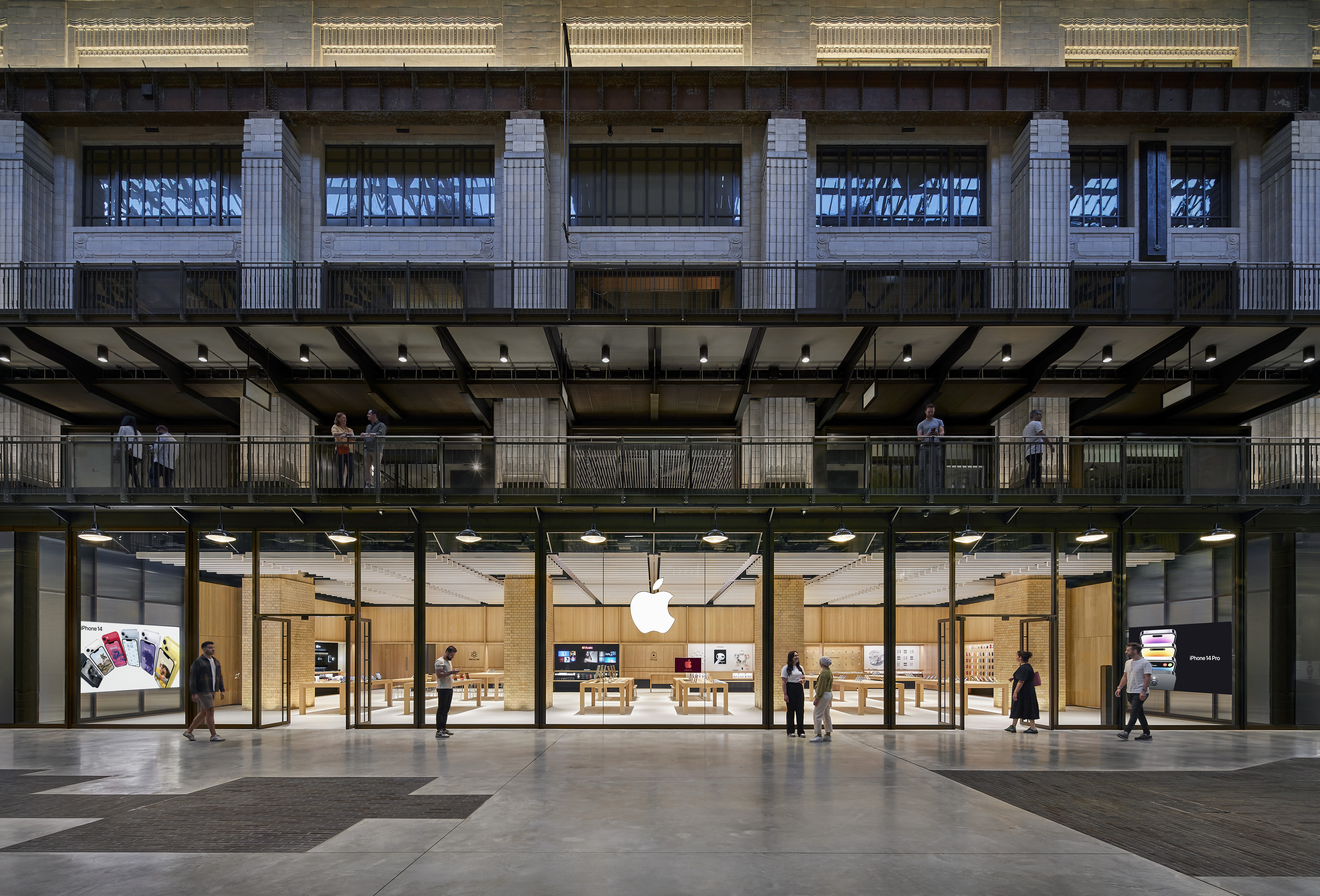
The Apple store at Battersea Power Station in London is the first sighting outside the US of the tech giant’s new, or at least evolved, retail design. A re-engineering rather than a radical facelift, the new store's design prioritises sustainability and applies, as much as possible, ‘universal design’ principles.
The usual Apple retail design tropes and systems are present and correct - the large product display tables, the mobile sales staff rather than checkout desks, the generous ceiling heights and uninterrupted sight lines, the disciplined, almost utilitarian restraint of material palette, and the meticulously handled curves and radii. At the same time, there is plenty of innovation in the use of more sustainable materials and in increasing accessibility (which is exactly what the universal design movement promotes), ensuring that the store is easy to navigate and interact with for all kinds of customers and staff.
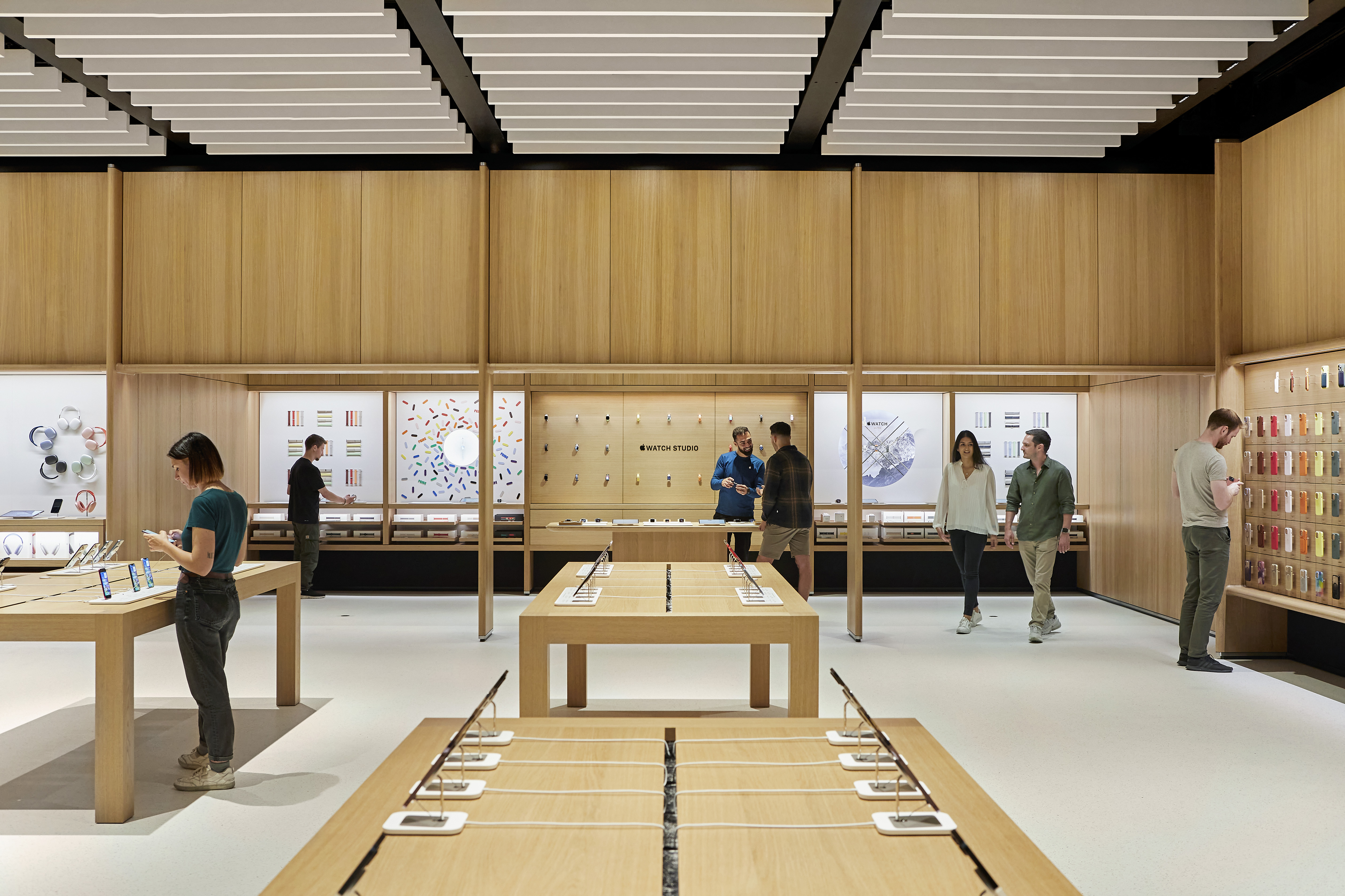
Apple store at Battersea Power Station: moving towards sustainability
'We’re moving from petrochemical-based products to very plant based [ones], or what we call biogenic,' says Bill Bergeron-Mirsky, Apple’s retail design lead. 'So the terrazzo floor is actually plant based, a bio-resin mixed with aggregates from Italy and Greece and recycled glass from the UK.' The acoustic baffles in the ceiling of the Battersea store are also plant based (rather than fiberglass) and pretty much everything else is FSC-certified wood, a solid oak and spruce composite (and like all Apple stores, the latest opening runs on renewable energy).
Bergeron-Mirsky says the application of universal design principles has meant 'really thinking about all the different abilities that people have, whether that's cognitive, mobility, hearing or sight, and trying to use that as a guide to everything. And the ideas is that if you do the right thing for people of every ability, it improves things for everyone.'
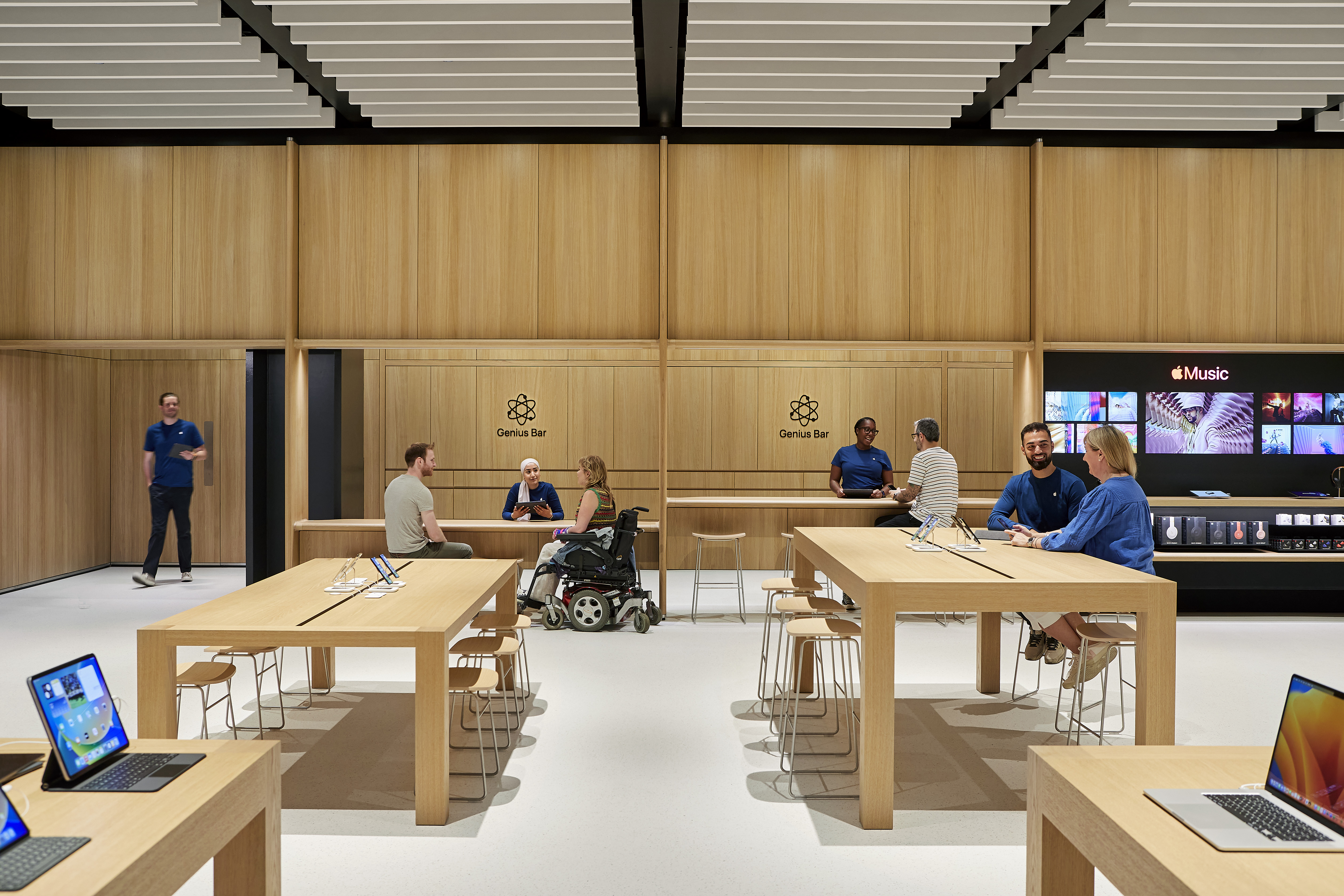
The wide-open spaces and generous ‘avenues’ of Apple stores have always been wheelchair friendly but now there are tables and counters that work for sitting and standing; those acoustic baffles reduce audio clamour and increase clarity; there is a starker visual contrast between the floor, walls and fixtures (a black insert between wooden pillars and the lighter-than-usual floor establishes a clear visual break); and signage is decluttered and more sharply outlined. Tables used for workshops now have audio induction loops. Small adjustments, perhaps, but they can radically improve the experience and enjoyment of the stores for customers with reduced mobility, sight or hearing.
Another part of that pushes towards accessibility is a greater clarity of store geography and purpose. The Genius Bar, Apple’s much imitated help desk, is again a physical bar. In many stores, The Genius Bar had become the Genius Groove, a less clearly defined area, where support staff roamed free. And for many, were harder to find. Now they are exactly where you expect them to be.
Reinventing the Genius Bar
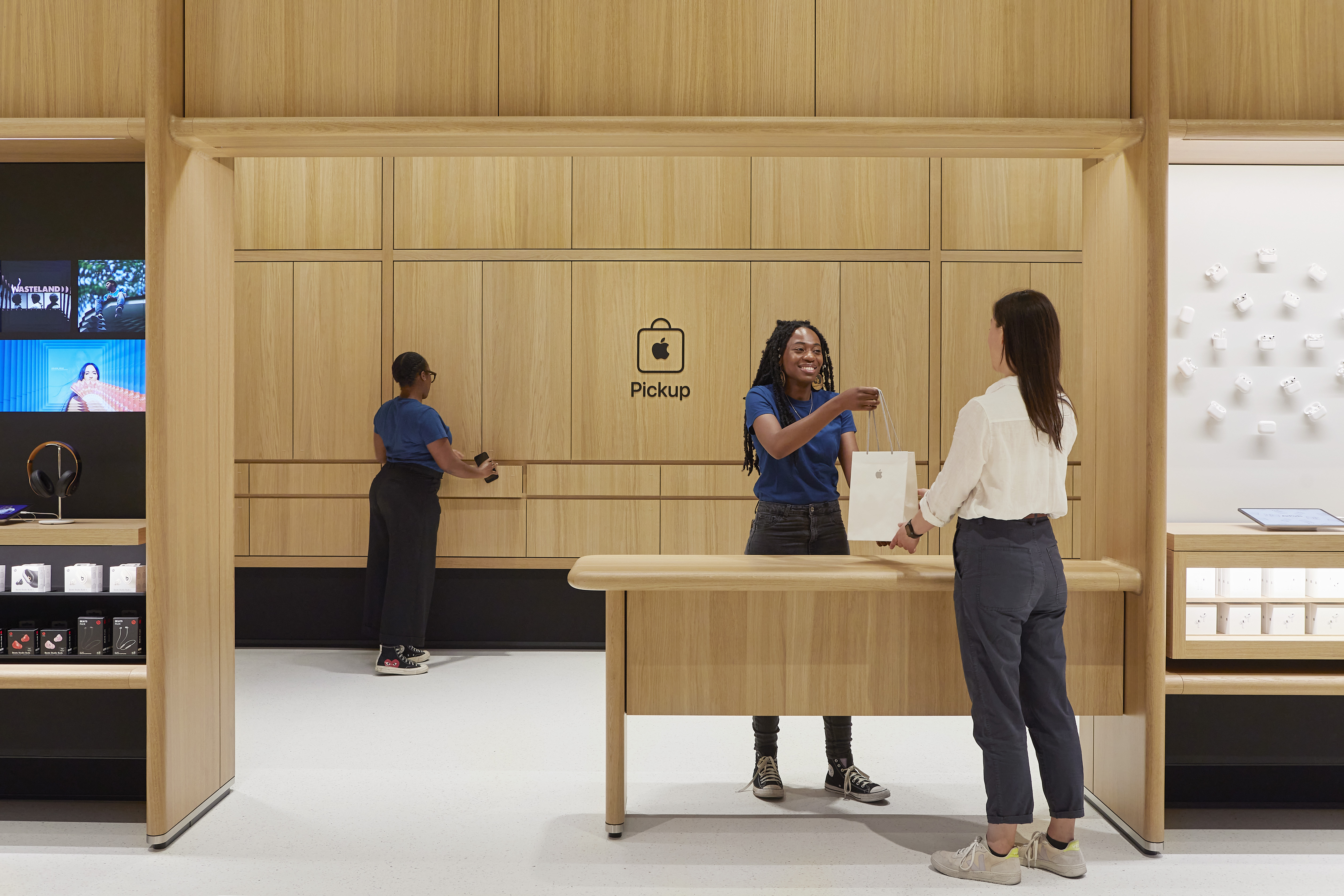
'We spent a lot of time with the Genius team,' says Bergeron-Mirsky, 'and we’re sort of reinvigorating the brand. There is a lot of ways people can get service in the store and it was getting a little lost in the noise.' That new push for visibility includes a new Genius logo and the physical bar now comes in two heights, for sitting and standing advice. The store also features a redesigned Apple Pickup station, with a particularly lovely curved wooden counter.
Wallpaper* Newsletter
Receive our daily digest of inspiration, escapism and design stories from around the world direct to your inbox.
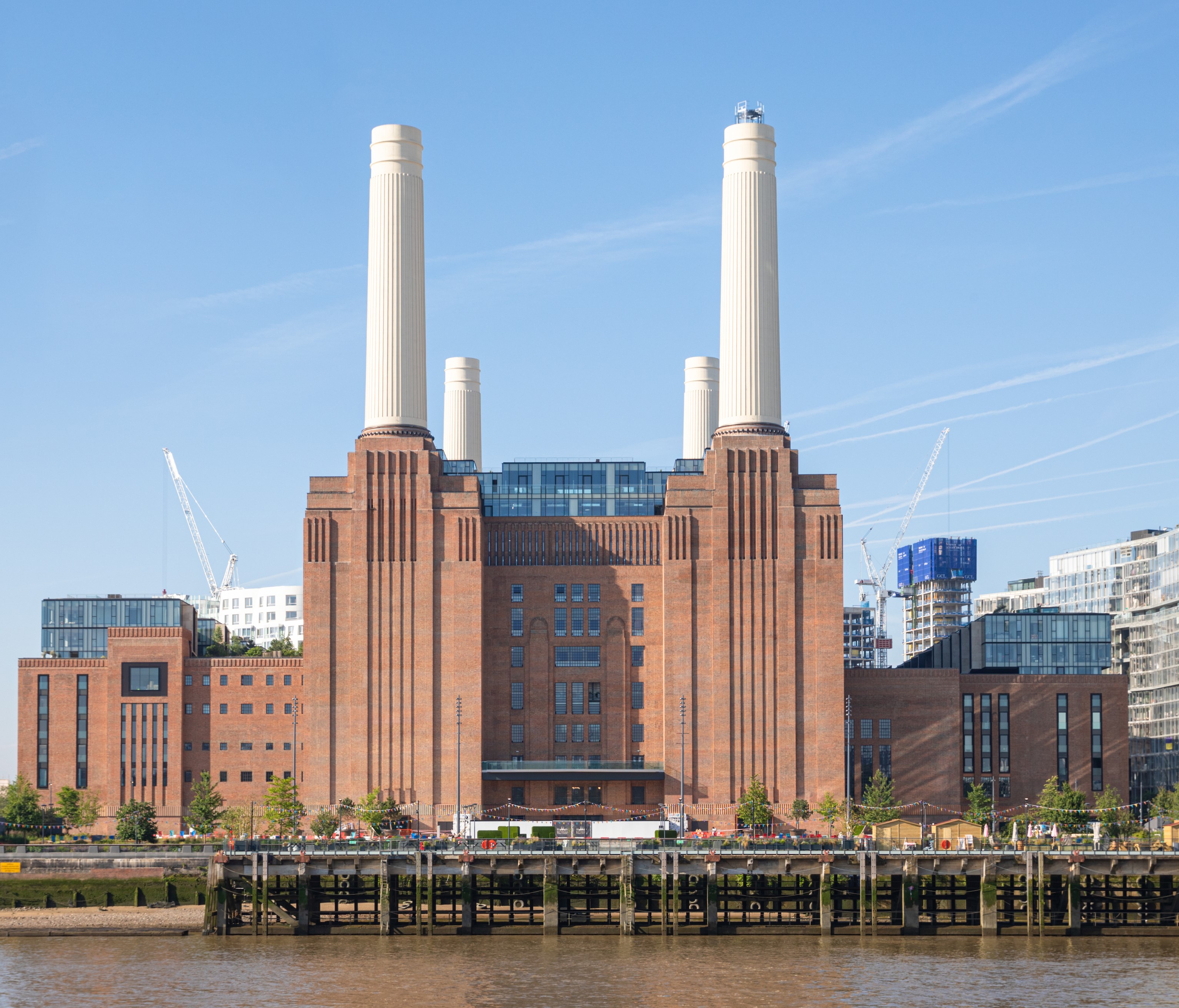
The restoration and reinvention of Battersea Power Station has been a long and hugely expensive and complex exercise in adaptive reuse. And the new store’s design aims to work with the existing building and sit lightly within it.
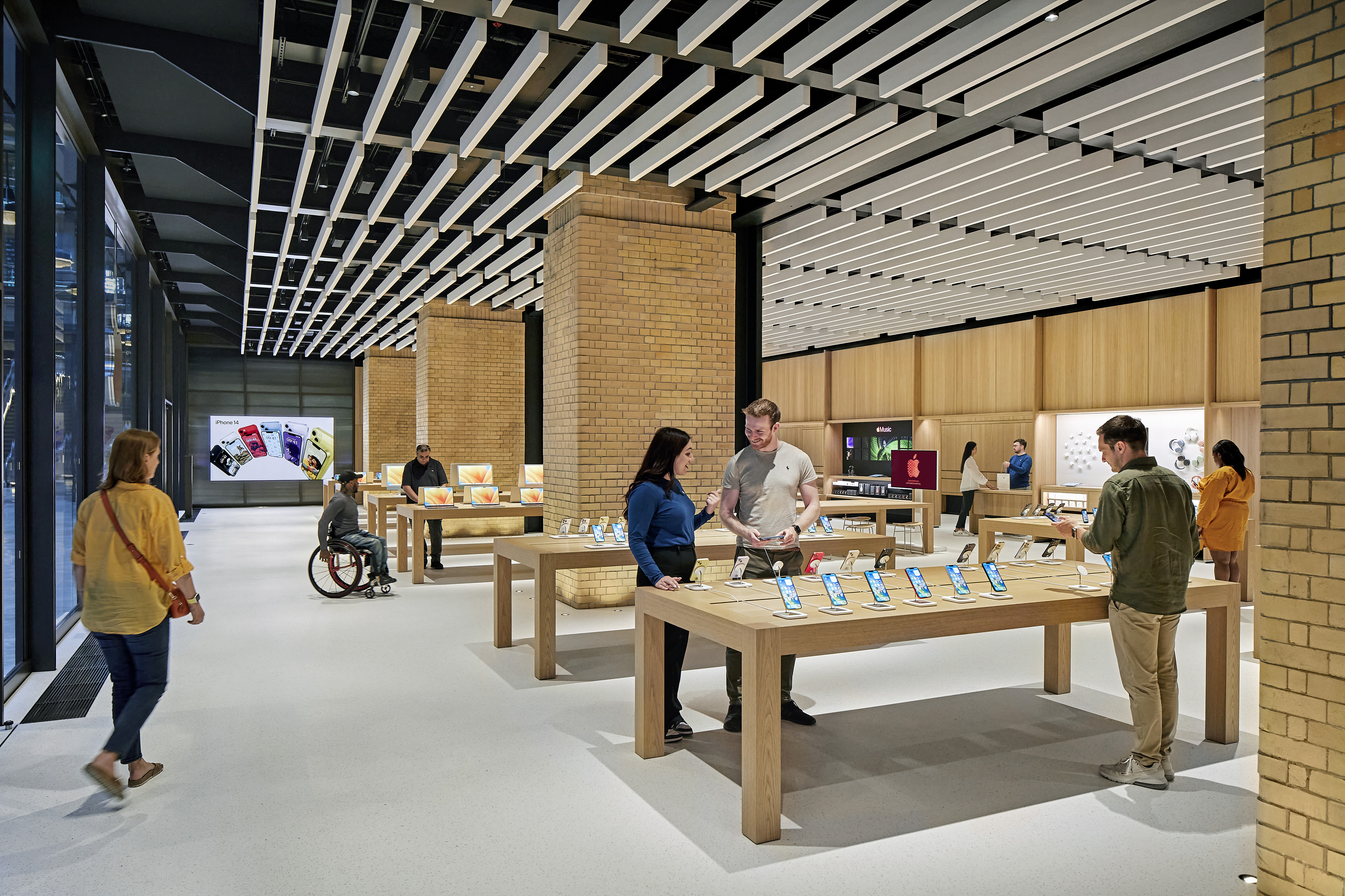
The store is essentially a 'what you see is what you get' wooden insert, says Bergeron-Mirsky, set around the hefty and beautifully restored brick columns and steel beams of the original building. 'What we’re doing is trying to give you everything up front. This is actually a solid timber structure and that expresses itself to the customer. And it’s just that idea of doing more with less.' And while the new store is definitely a retail unit within what is, in effect, a beautifully realised upmarket mini-mall, Bergeron-Mirsky says the Battersea outlet has taken a lead from Apple stores in other historic buildings.
'You really want to use as much of that original fabric as possible. And Apple has done that a lot in the past with stores like the Via del Corso store in Rome or Carnegie Library in Washington, where we go in and restore of the original fabric in a way that no one else would and then insert a store. At Grand Central Station, there’s almost no store at all. It’s mostly just tables and it's kind of the perfect store.'
Working with Foster + Partners
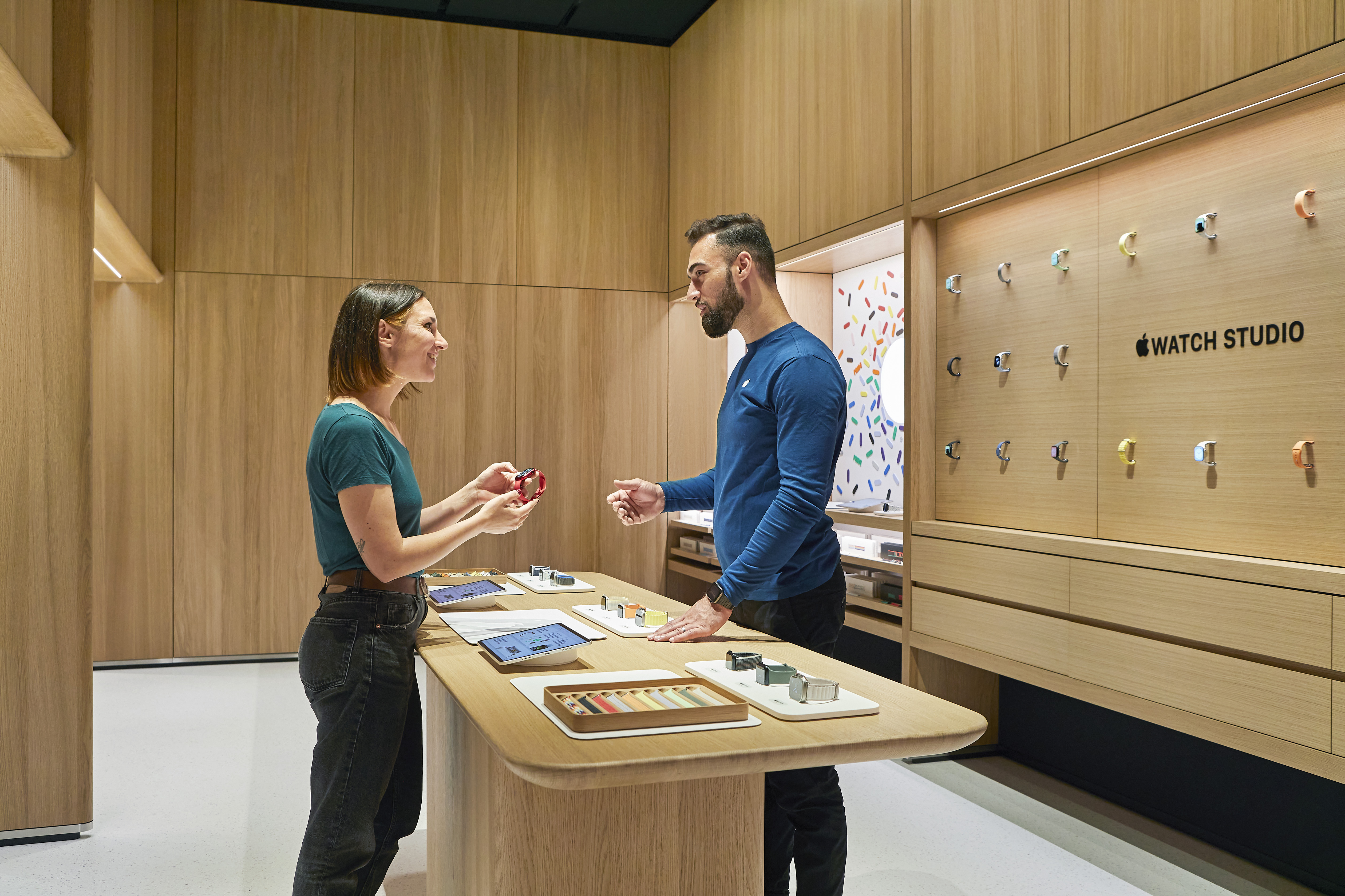
Apple has again partnered with Foster + Partners on the design and, says Bergeron-Mirsky, the architecture studio came up with a surprising reference for the new store’s design: Mayfair’s swanky store-lined cut through, Burlington Arcade. It’s not immediately apparent but the Watch Studio, an almost store-within-store, does have something of the arcade’s sense of elegance and discovery.
The new look was premiered last month at Tysons Corner in Virginia, Apple's first ever retail outlet and Battersea, taking a prime slot amongst the redeveloped behemoth’s retail offering, is only the second to employ the new design formula anywhere in the world.
Apple's home above the store
The new store is close to home for Apple. It has taken 40% of the office space available at Battersea Power station to create a centralised Foster + Partners-designed UK HQ. And Apple is determined that the Battersea store becomes a model for next level customer service and engagement with the local community.
Elle Lafaras, the store leader at Apple Battersea, says all staff at the store, and that can mean 70 or so on a busy weekend, have an average of seven years Apple retail experience and have some connection with the local area. And Kat Wong, head of today at Apple and creative studios EMEIA, says bookable-for-free Battersea Power Station art and photography tours have been added to the store’s Today at Apple sessions. 'People will actually get to go around the building and learn about its history, heritage, the architecture, as well as all the other buildings around it and how the landscape has completely changed.'
'Our stores are a place where the community can come together to discover all of Apple’s products and services, and we’re proud to be expanding to serve even more customers with the opening of Apple Battersea,' says Deirdre O’Brien, Apple’s senior vice president of retail. 'Located just below our new UK Headquarters, our amazing team is excited to provide exceptional support and help customers unleash their creativity.'
Foster + Partners has also now designed the first Apple store in Malaysia, at Tun Razak Exchange. Follow the link to look inside.
-
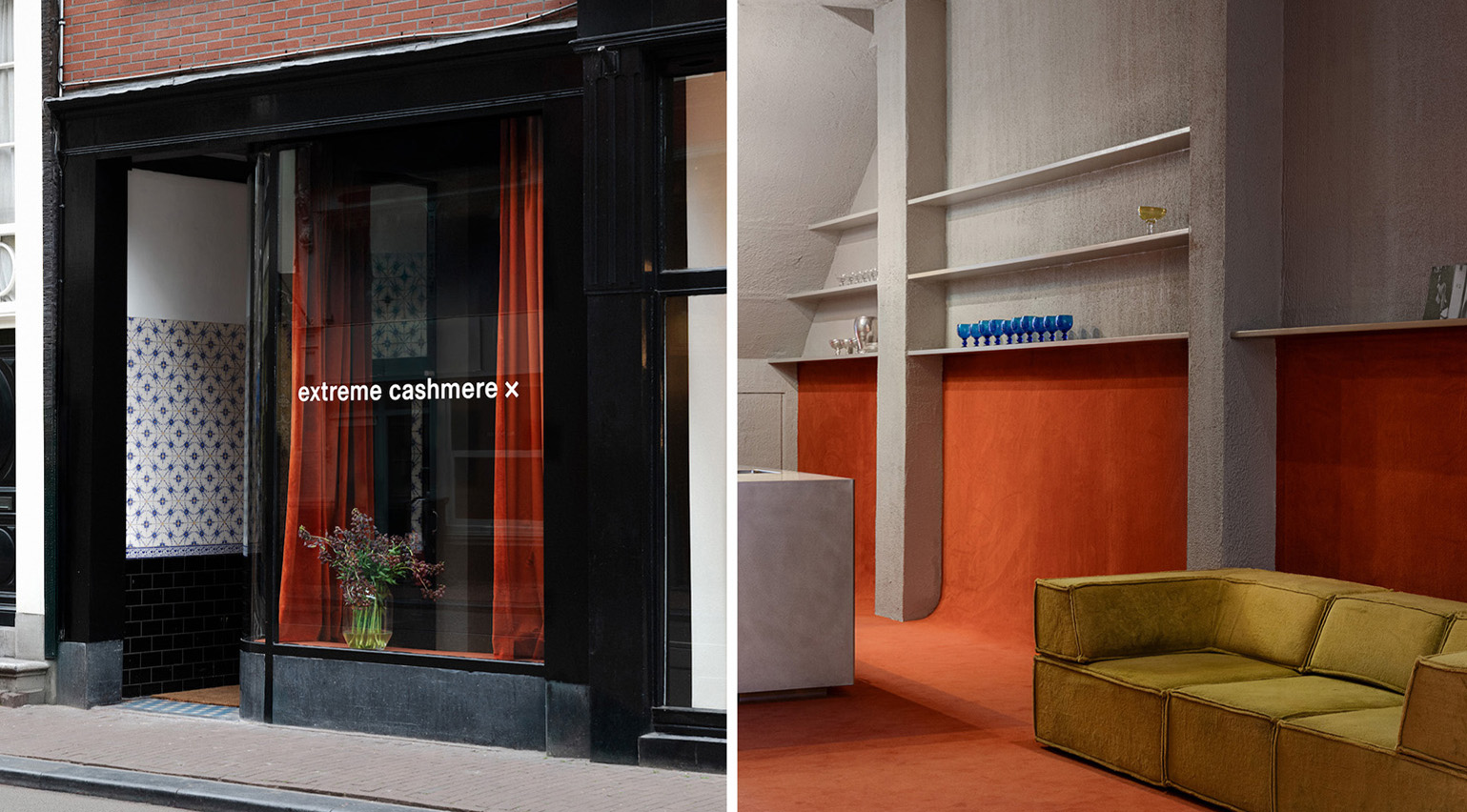 Extreme Cashmere reimagines retail with its new Amsterdam store: ‘You want to take your shoes off and stay’
Wallpaper* takes a tour of Extreme Cashmere’s new Amsterdam store, a space which reflects the label’s famed hospitality and unconventional approach to knitwear
By Jack Moss
-
 Titanium watches are strong, light and enduring: here are some of the best
Brands including Bremont, Christopher Ward and Grand Seiko are exploring the possibilities of titanium watches
By Chris Hall
-
 Warp Records announces its first event in over a decade at the Barbican
‘A Warp Happening,' landing 14 June, is guaranteed to be an epic day out
By Tianna Williams
-
 A new London house delights in robust brutalist detailing and diffused light
London's House in a Walled Garden by Henley Halebrown was designed to dovetail in its historic context
By Jonathan Bell
-
 A Sussex beach house boldly reimagines its seaside typology
A bold and uncompromising Sussex beach house reconfigures the vernacular to maximise coastal views but maintain privacy
By Jonathan Bell
-
 This 19th-century Hampstead house has a raw concrete staircase at its heart
This Hampstead house, designed by Pinzauer and titled Maresfield Gardens, is a London home blending new design and traditional details
By Tianna Williams
-
 An octogenarian’s north London home is bold with utilitarian authenticity
Woodbury residence is a north London home by Of Architecture, inspired by 20th-century design and rooted in functionality
By Tianna Williams
-
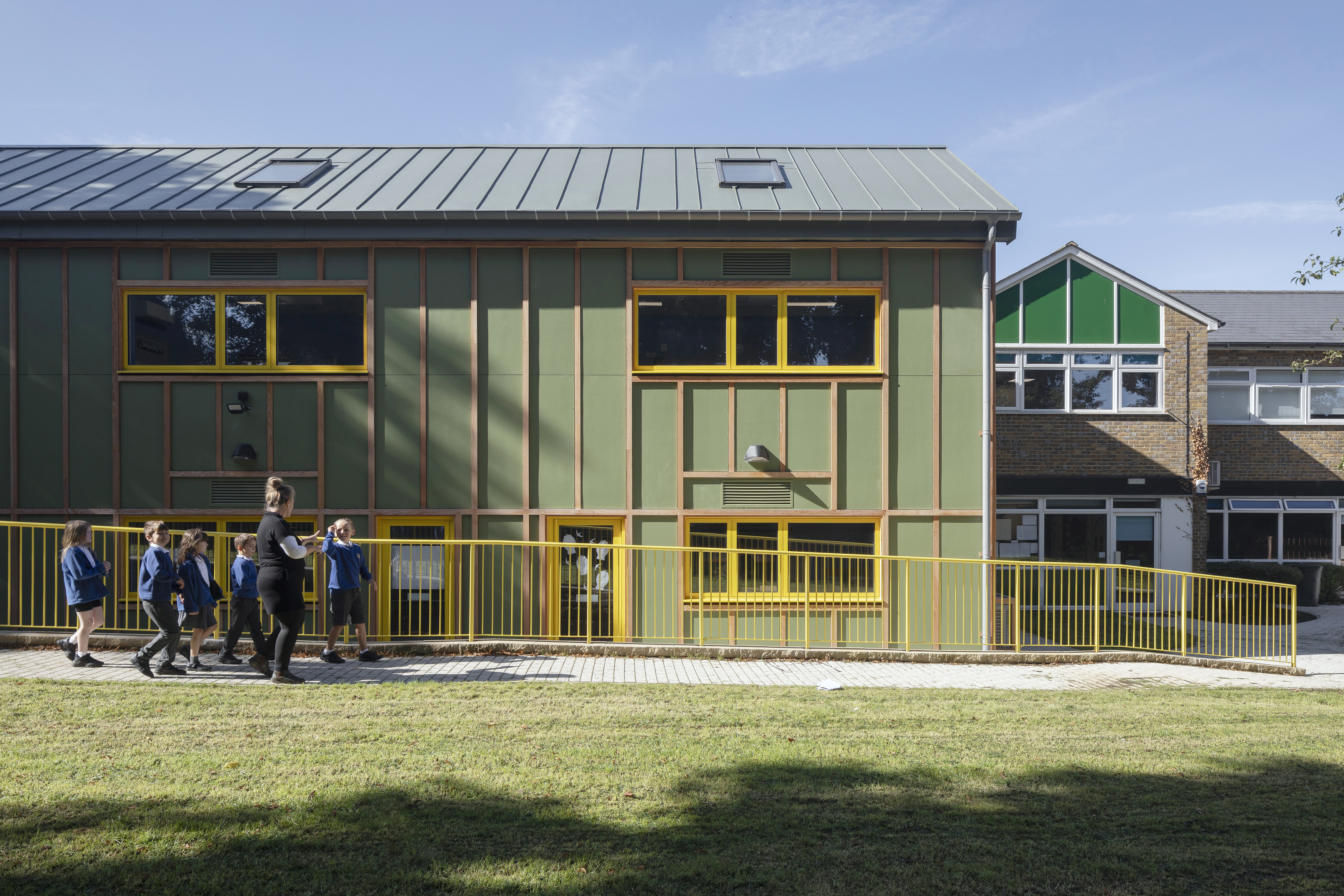 What is DeafSpace and how can it enhance architecture for everyone?
DeafSpace learnings can help create profoundly sense-centric architecture; why shouldn't groundbreaking designs also be inclusive?
By Teshome Douglas-Campbell
-
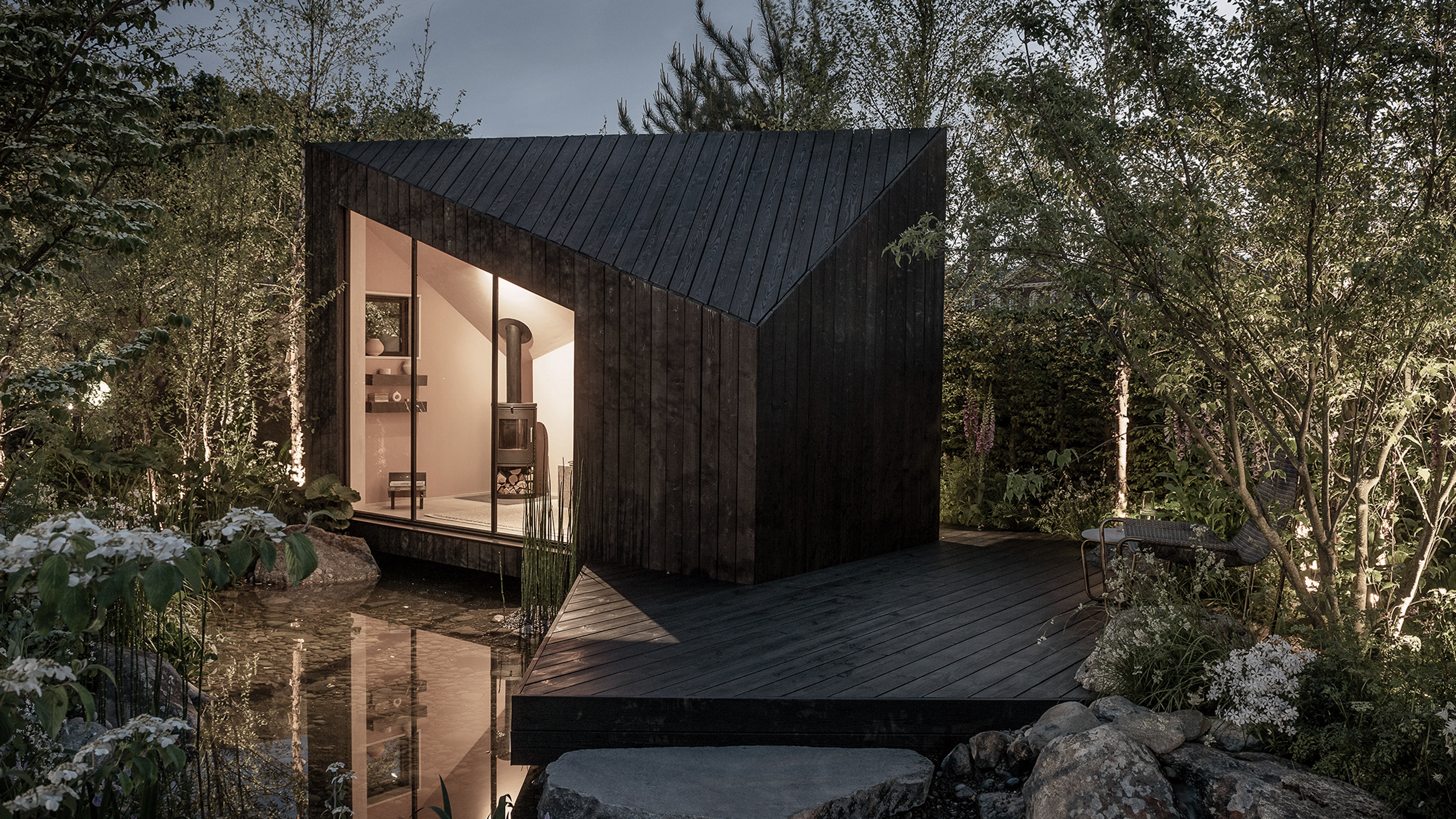 The dream of the flat-pack home continues with this elegant modular cabin design from Koto
The Niwa modular cabin series by UK-based Koto architects offers a range of elegant retreats, designed for easy installation and a variety of uses
By Jonathan Bell
-
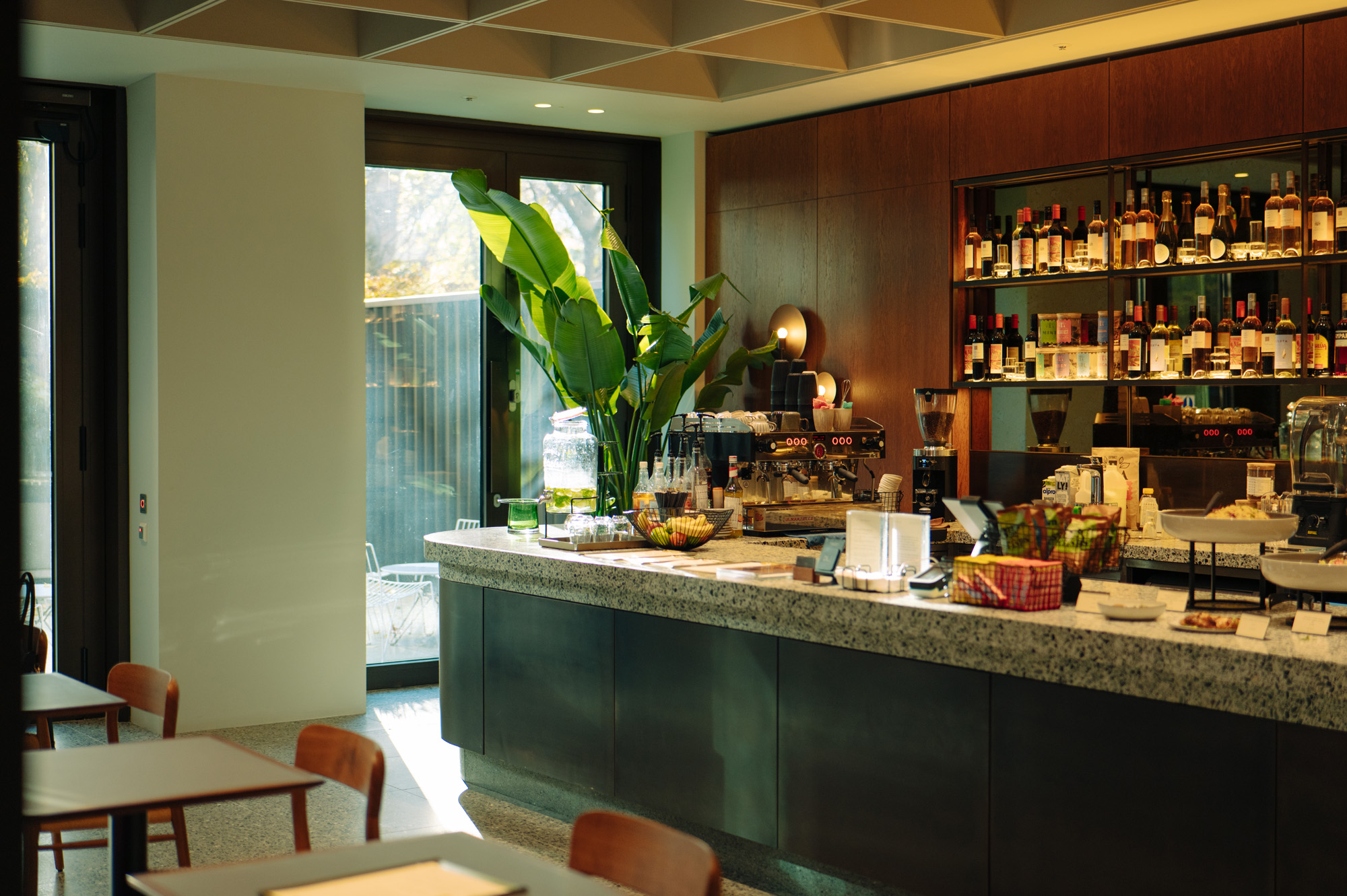 Are Derwent London's new lounges the future of workspace?
Property developer Derwent London’s new lounges – created for tenants of its offices – work harder to promote community and connection for their users
By Emily Wright
-
 Showing off its gargoyles and curves, The Gradel Quadrangles opens in Oxford
The Gradel Quadrangles, designed by David Kohn Architects, brings a touch of playfulness to Oxford through a modern interpretation of historical architecture
By Shawn Adams