Long Island City explodes architecturally ahead of Amazon’s arrival
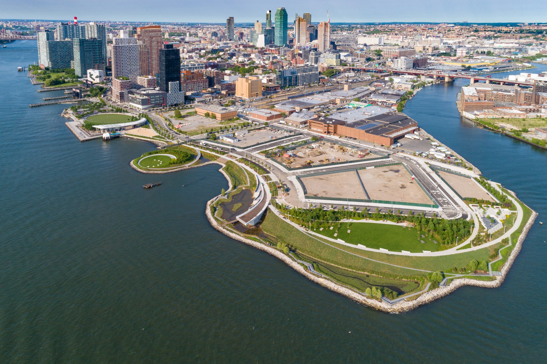
With Amazon’s announcement that it is building half of its new corporate headquarters – AKA HQ2 – in Long Island City, Queens, the world’s spotlight has focused squarely on this once low-key, low-scale industrial section of New York. But Amazon or not, for the last few years the neighbourhood has been exploding, with an abundance of new apartments, not to mention fresh offices, parks, civic spaces, and retail.
The infusion has triggered intense concerns about gentrification and over-development, and the area will become a testing ground for how to balance the impacts of growth and create a feeling of community and authenticity in a very short time. How that will shake out remains to be seen, but it’s clear that Long Island City is becoming an exciting place for architecture and design.
Yes, much of the area still feels barren, and many generic structures are rising, but so too are innovative experiments and breathtaking designs, not to mention city-enhancing landscapes and streetscapes. Here are some of the highlights.
Hunters Point South by SWA/Balsley, Weiss/ Manfredi and Arup
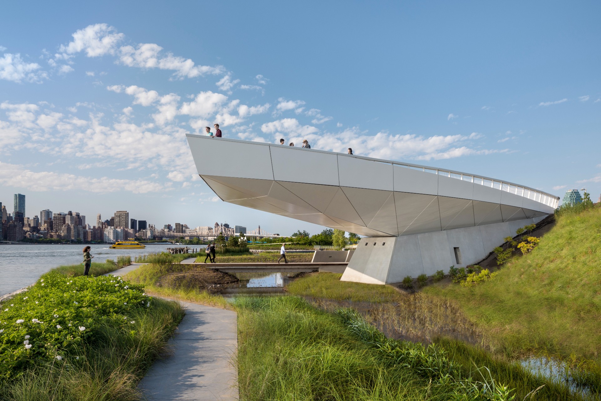
Located along the southern portion of Long Island City’s waterfront (abutting what will be the largest affordable housing development in the city in almost half a century) the park’s second phase transforms 11 acres of abandoned industrial land into a multi-layered experience, weaving infrastructure, landscape, architecture, and art. courtesy SWA/BALSLEY and WEISS/MANFREDI
Hunters Point South by SWA/Balsley, Weiss/ Manfredi and Arup
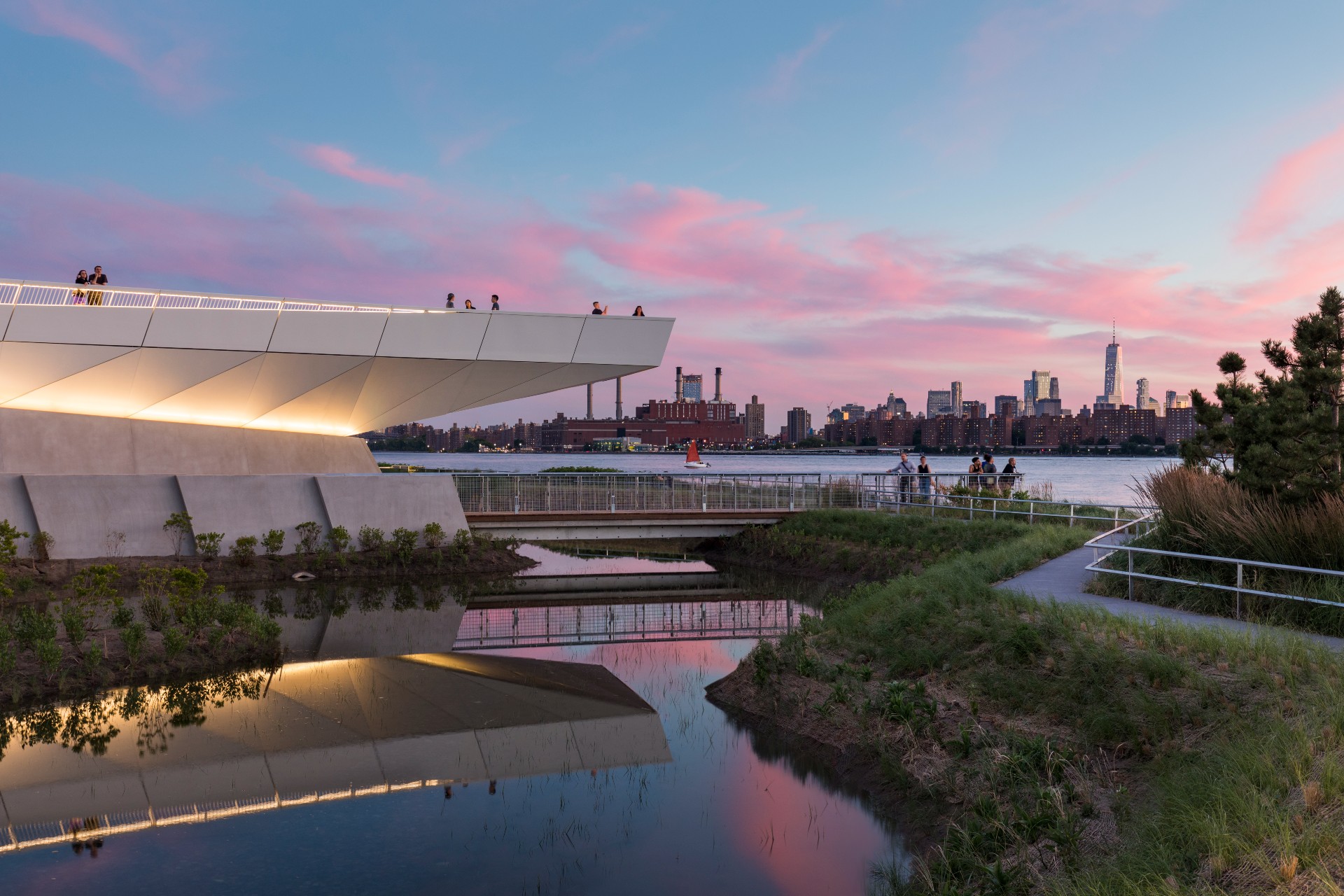
Visitors arrive by crossing a narrow bridge and come upon Luminescence, a swirling piece of land art that depicts the phases of the moon with glowing six-foot discs. From here it contains a superb variety of spaces and uses, including sculpted grasslands, cantilevered lookouts, a shaded picnic promontory, fitness terraces and a kayak launch, to name just a few. ‘It’s all about quality of life in the neighborhood,' said SWA/Balsey principal Tom Balsey. ‘That’s the business we’re in— making cities more livable'. courtesy SWA/BALSLEY and WEISS/MANFREDI
2222 Jackson by ODA
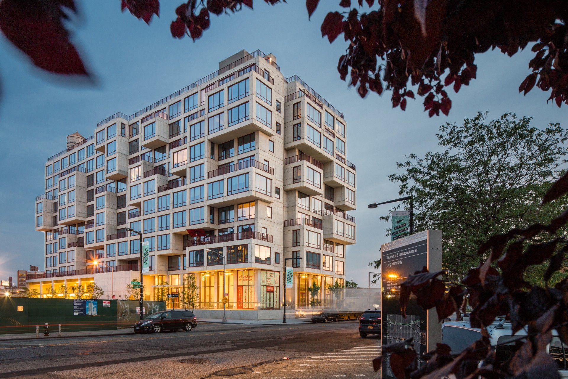
Echoing the solidity of nearby MoMA PS1 (particularly its cement courtyard, which it overlooks), 2222 Jackson Avenue has an imposing concrete façade, but with a twist: it pulls, pushes, and shifts its grid of modular volumes to create unique living spaces and enhance a sense of community. The building features three apartment typologies: studios, one-bedrooms, and two-bedrooms. Several units project well beyond the facade, creating more surface area and views and creating corner terraces for apartments above. The compilation has resulted in 50 terraced apartments and a vertical city with 30 percent more outdoor space than the footprint of the building itself.
Wallpaper* Newsletter
Receive our daily digest of inspiration, escapism and design stories from around the world direct to your inbox.
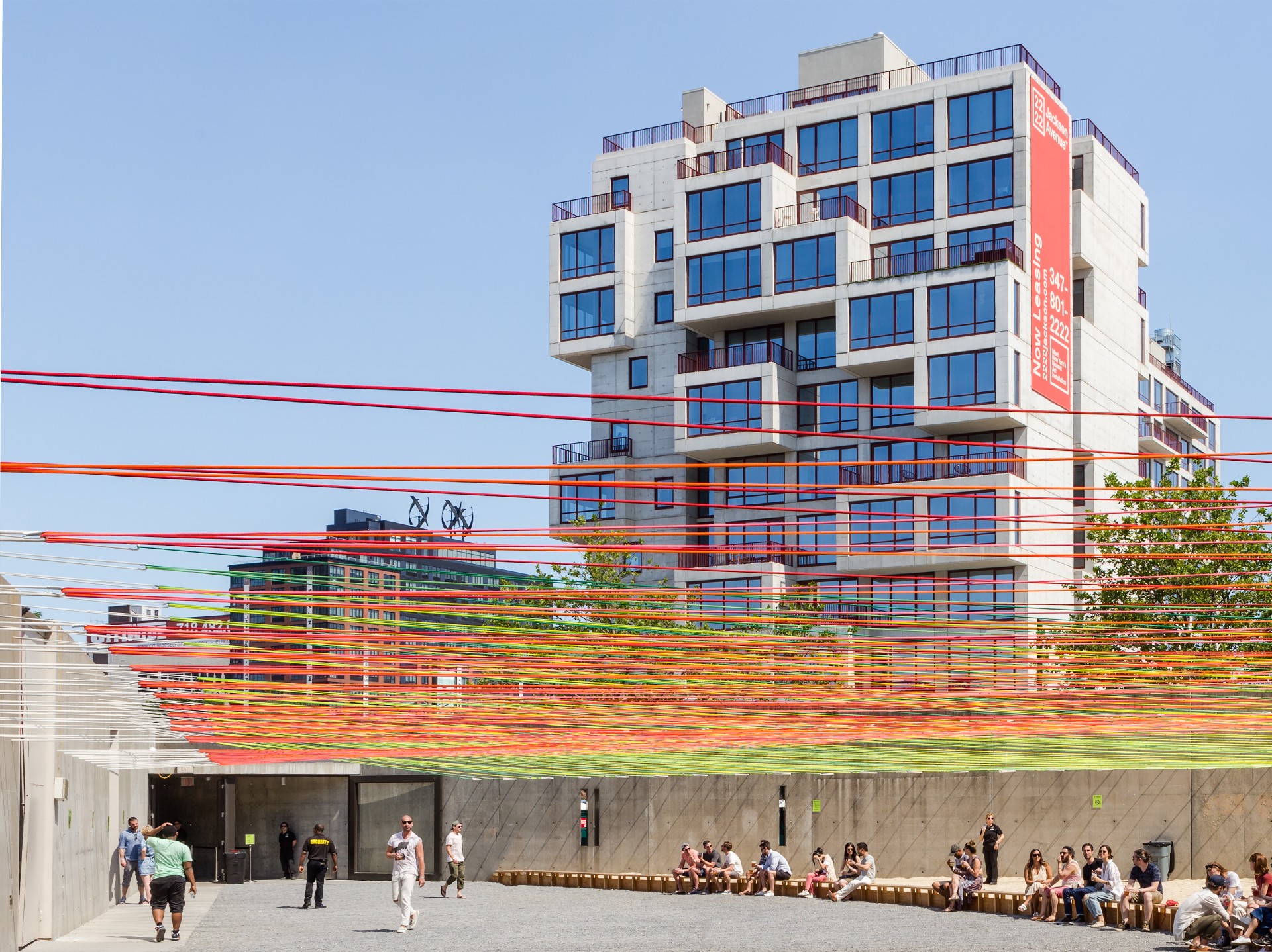
2222 Jackson by ODA
ODA has become one of the most active firms in the area, with a diverse array of community-creating concoctions. Galerie combines several types of apartments (lofts, traditional units, all-glazed frontages, etc), not to mention open space, in one development. Hunters Point South, the aforementioned affordable housing project, continues the firm’s efforts to literally push the envelope, creating what are essentially corner units for all (it will also contain its own sculpture garden); and 4220 27th Street, contains seven-story atriums at each corner, creating a unique communal condition. ‘I hope centres of uniqueness like these will define the neighbourhood for years to come,' says ODA principal Eran Chen.
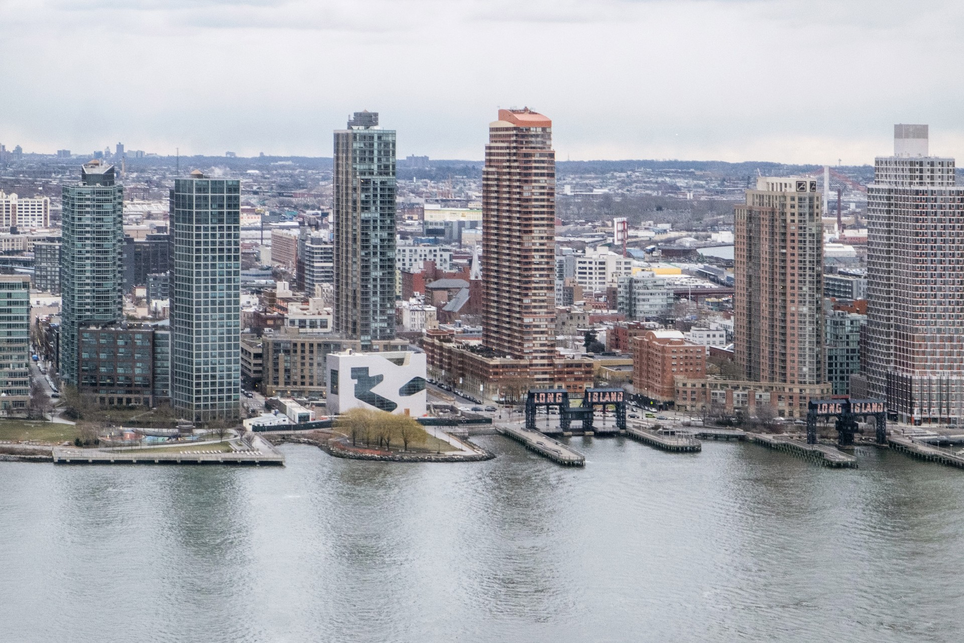
Hunters Point Library by Steven Holl
Located on a prominent site along the East River – clearly visible from Manhattan – the 22,000 sq ft Queens Library is another exposed concrete building, this time carved out (sans columns), with geometric glazed openings, following the programme and movement within. The amorphous openings allow users dramatic views toward the city, while demarcating the programme's separation into children's area, teen area and adult. Thanks to the exterior’s cement structure, the interior is open and flowing, allowing for spacious circulation and energy efficiency.
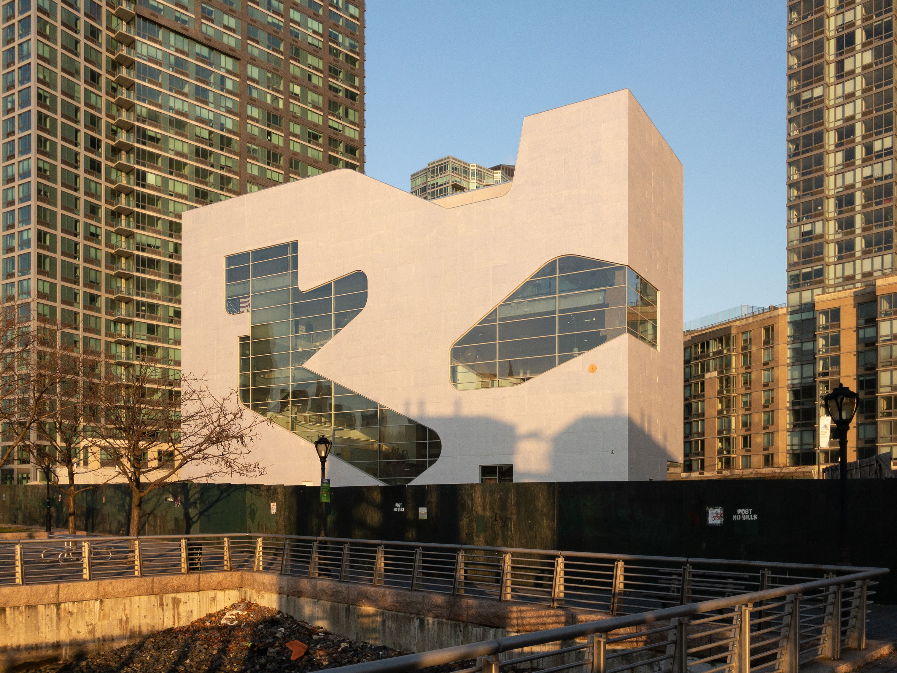
Hunters Point Library by Steven Holl
And thanks to its greater density than most libraries, the city was able to create an adjacent park. At night the glowing presence of the new library along the waterfront joins the Pepsi sign and the ‘Long Island' sign at the old Gantry to become a beacon for the area. The building was originally slated to be located on the first floors of one of the area’s many high rises, but local councilman Jimmy Van Bramer balked, opting for a community icon instead. ‘It’s a public success that the public rejected these developers who are running the world,' notes Steven Holl.
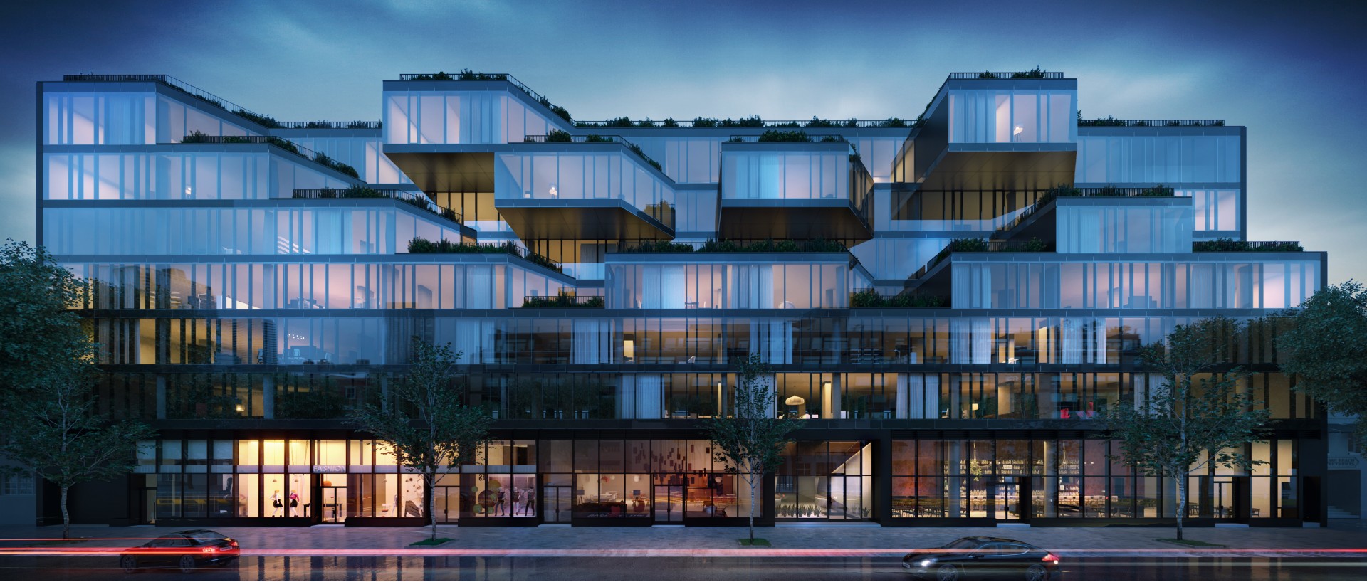
Corte by Dieguez Fridman and Beyer Blinder Belle
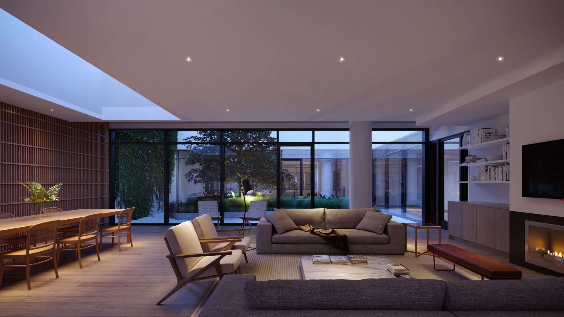
Designed by Argentina-based Dieguez Fridman Arquitectos with New York-based Beyer Blinder Belle, CORTE is a unique mix of cultures. Reflecting its South American roots, the 85-unit, 250-ft-long building, was designed to create highly varied views, and bring in maximum light and air. (‘It’s all about being drawn in by the light,’ explains Beyer Blinder Belle partner Carlos Cardoso.) It appears as a series of stacked boxes; breaking up the typical long, flat exterior surface with glassy diagonal projections, planted, stepping terraces, and a generous rooftop terrace. Image: Craft
Corte by Dieguez Fridman and Beyer Blinder Belle
The lobby’s hardwood ceilings, stone floors and rear garden enhance the warm, dynamic feeling. The New York influence appears through floor-to-ceiling glass curtain walls (with industrial-inspired charcoal grey metal mullions) that reflect neighbouring buildings, and 16,000 sq ft of glazed, storefront retail that activates the neighborhood. ‘It really fits with the context of the neighbourhood,' adds Cardoso. ‘It has a real impact, but it’s not overwhelming.' Image: Craft
Queens Plaza Park by Handel Architects
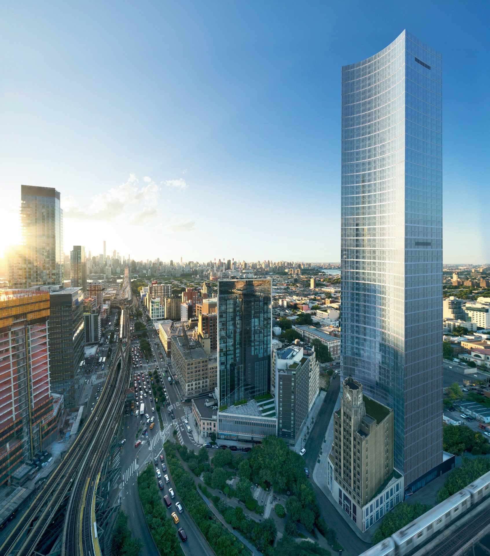
This 710-foot-tall, 67-storey tower on the north end of LIC is nearing completion of its concrete foundations, and should start climbing later this year. Located behind the historic Long Island City Clock Tower (which is being restored to include commercial and retail space), the glass-walled, 950-unit residential tower gets its curved shape from the fact that it wraps around its iconic neighbour. ‘The new tower acts as a foil to the clock tower; almost like a proscenium behind it,' says Handel principal Michael Arad, who calls the historic building the new project’s ‘front door.' Queens Plaza Park will contain several innovative sustainability technologies, including blackwater recycling, cogeneration, and glass walls lined with ‘view' glass, that shifts from transparent to opaque depending on exterior conditions. Handel recently completed Aurora, a 33-storey wedge-shaped hotel and residential tower merging angular concrete and glass volumes.
Bellwether by Giants in the Dirt
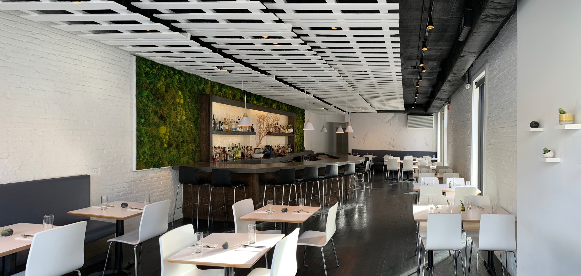
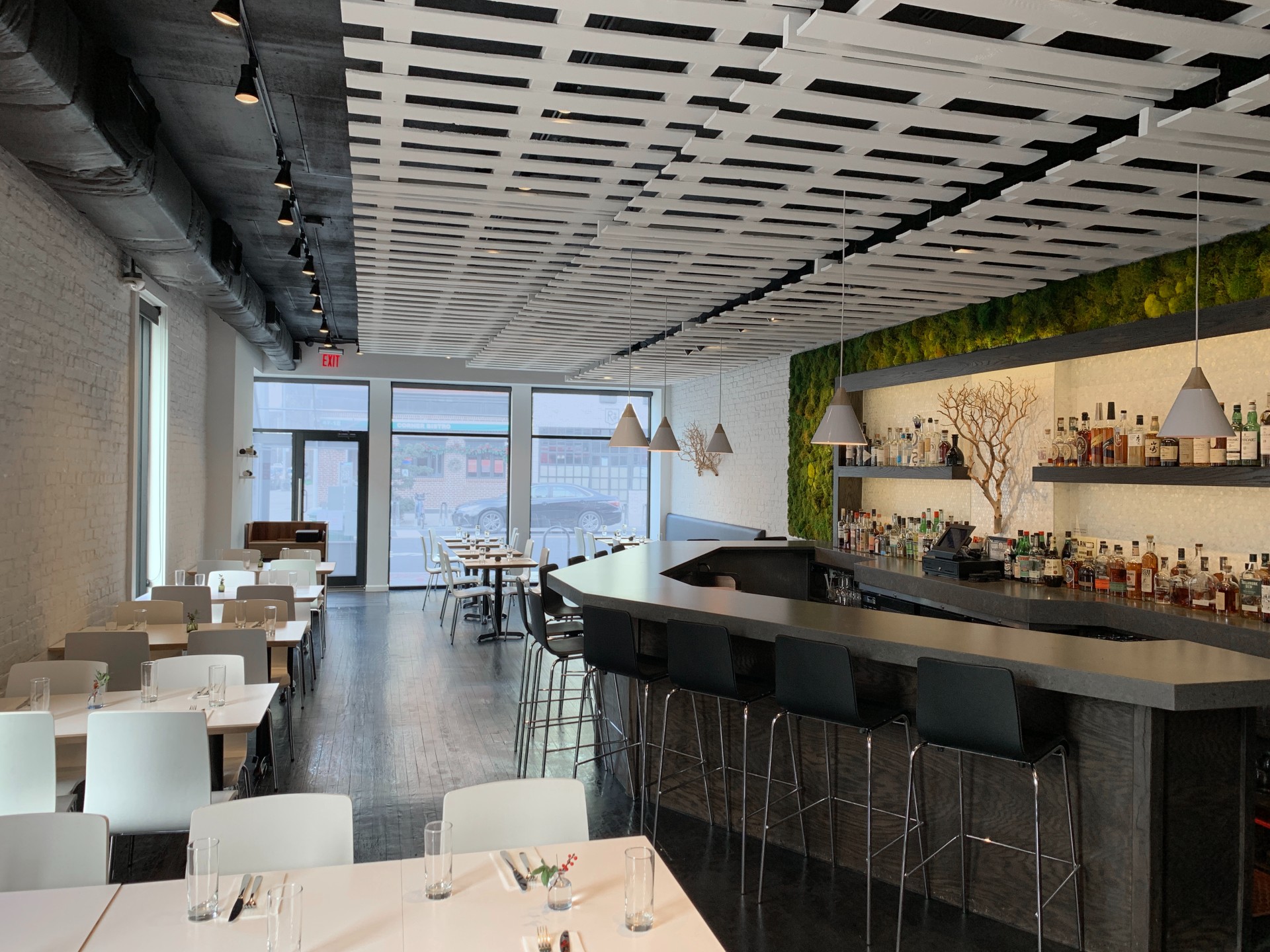
Despite its Michelin-star pedigree, Bellwether, which opened last year, is full of quirky surprises, paying homage both to chef Matthew McCormick’s California roots and to the local farms that supply much of its food. These touches include whitewashed brick walls, a bright green moss wall, white picket fence ceiling (which adds to the rural dynamic but also helps dampen noise), reclaimed wood host stand, and a mother-of-pearl bar backsplash.
Bellwether by Giants in the Dirt
‘It’s not overwhelmingly chic,’ notes Giants in the Dirt principal Elizabeth Hardwick. ‘You’re in nature and it’s calm enough that you can have a relaxed meal with the focus on the people and the food and the menu.' It’s a welcome, neighbourhood-feeing addition to a place that’s still trying to figure out what kind of neighbourhood it wants to be.
-
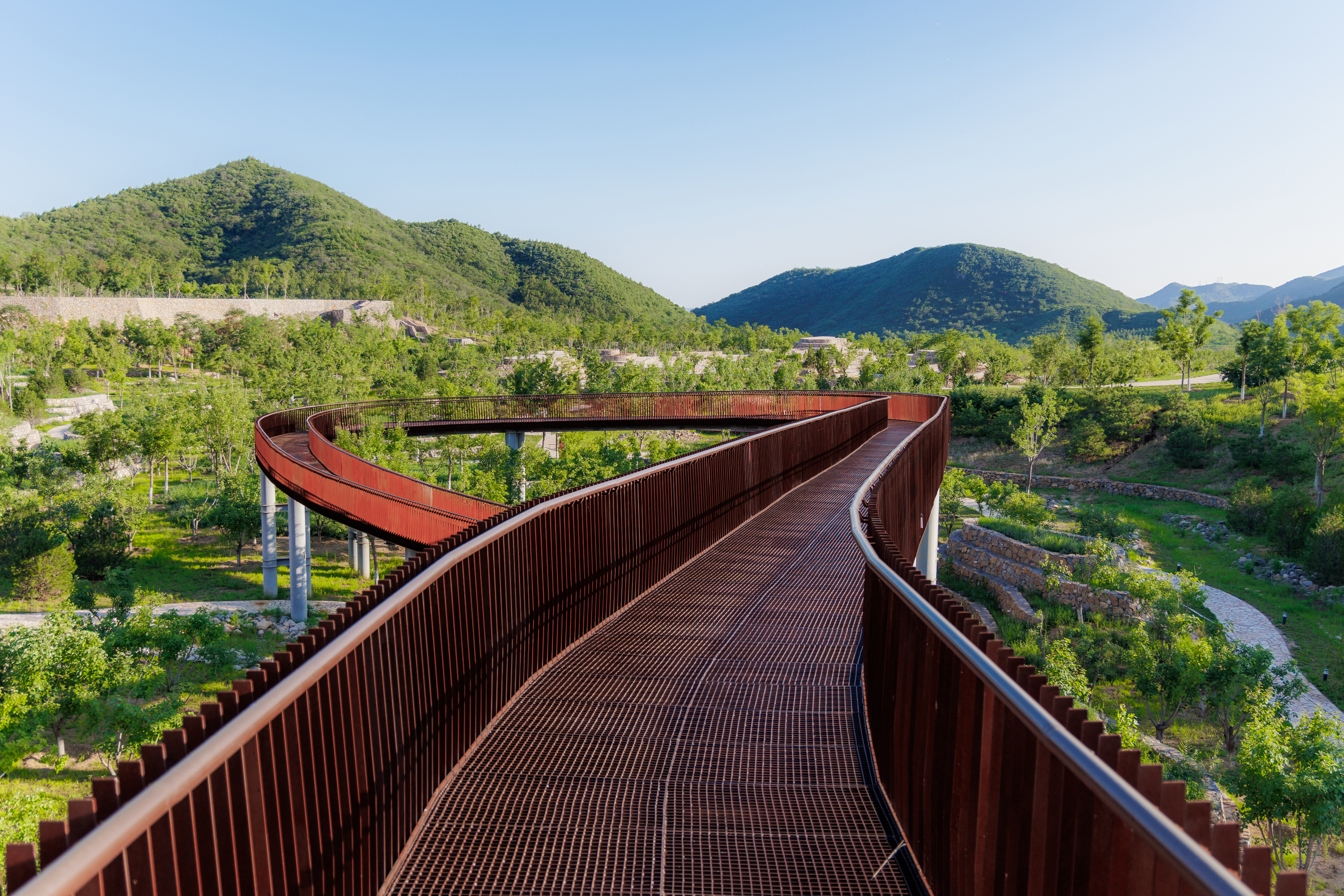 A Xingfa cement factory’s reimagining breathes new life into an abandoned industrial site
We tour the Xingfa cement factory in China, where a redesign by landscape specialist SWA Group completely transforms an old industrial site into a lush park
By Daven Wu
-
 Put these emerging artists on your radar
This crop of six new talents is poised to shake up the art world. Get to know them now
By Tianna Williams
-
 Dining at Pyrá feels like a Mediterranean kiss on both cheeks
Designed by House of Dré, this Lonsdale Road addition dishes up an enticing fusion of Greek and Spanish cooking
By Sofia de la Cruz
-
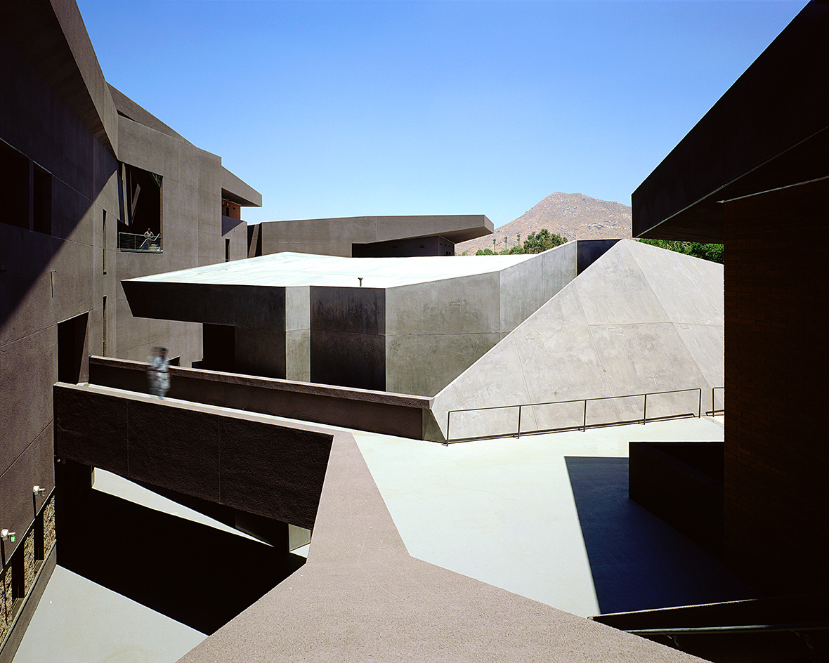 We explore Franklin Israel’s lesser-known, progressive, deconstructivist architecture
Franklin Israel, a progressive Californian architect whose life was cut short in 1996 at the age of 50, is celebrated in a new book that examines his work and legacy
By Michael Webb
-
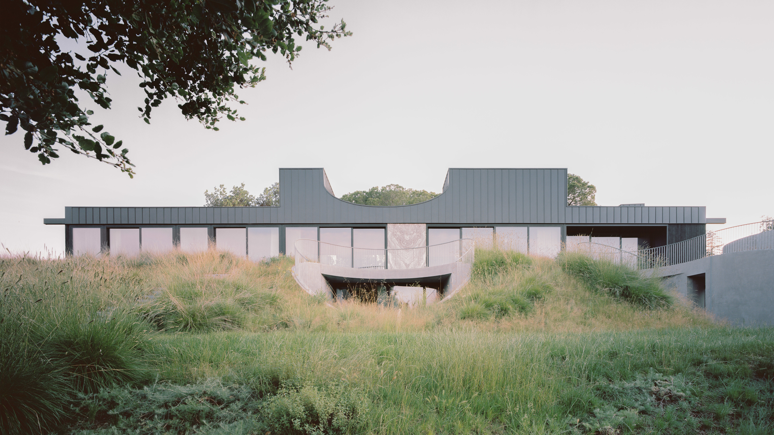 A new hilltop California home is rooted in the landscape and celebrates views of nature
WOJR's California home House of Horns is a meticulously planned modern villa that seeps into its surrounding landscape through a series of sculptural courtyards
By Jonathan Bell
-
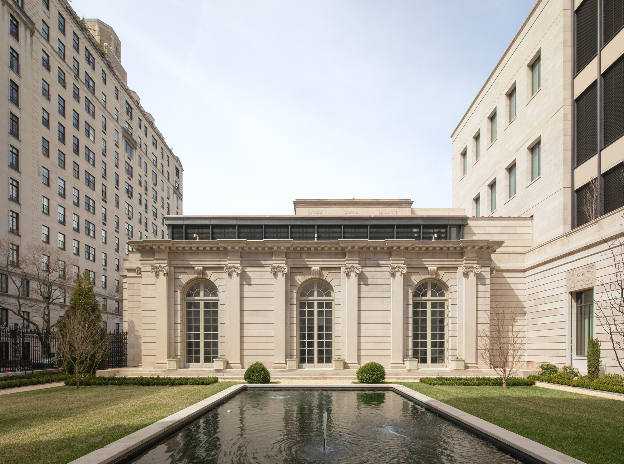 The Frick Collection's expansion by Selldorf Architects is both surgical and delicate
The New York cultural institution gets a $220 million glow-up
By Stephanie Murg
-
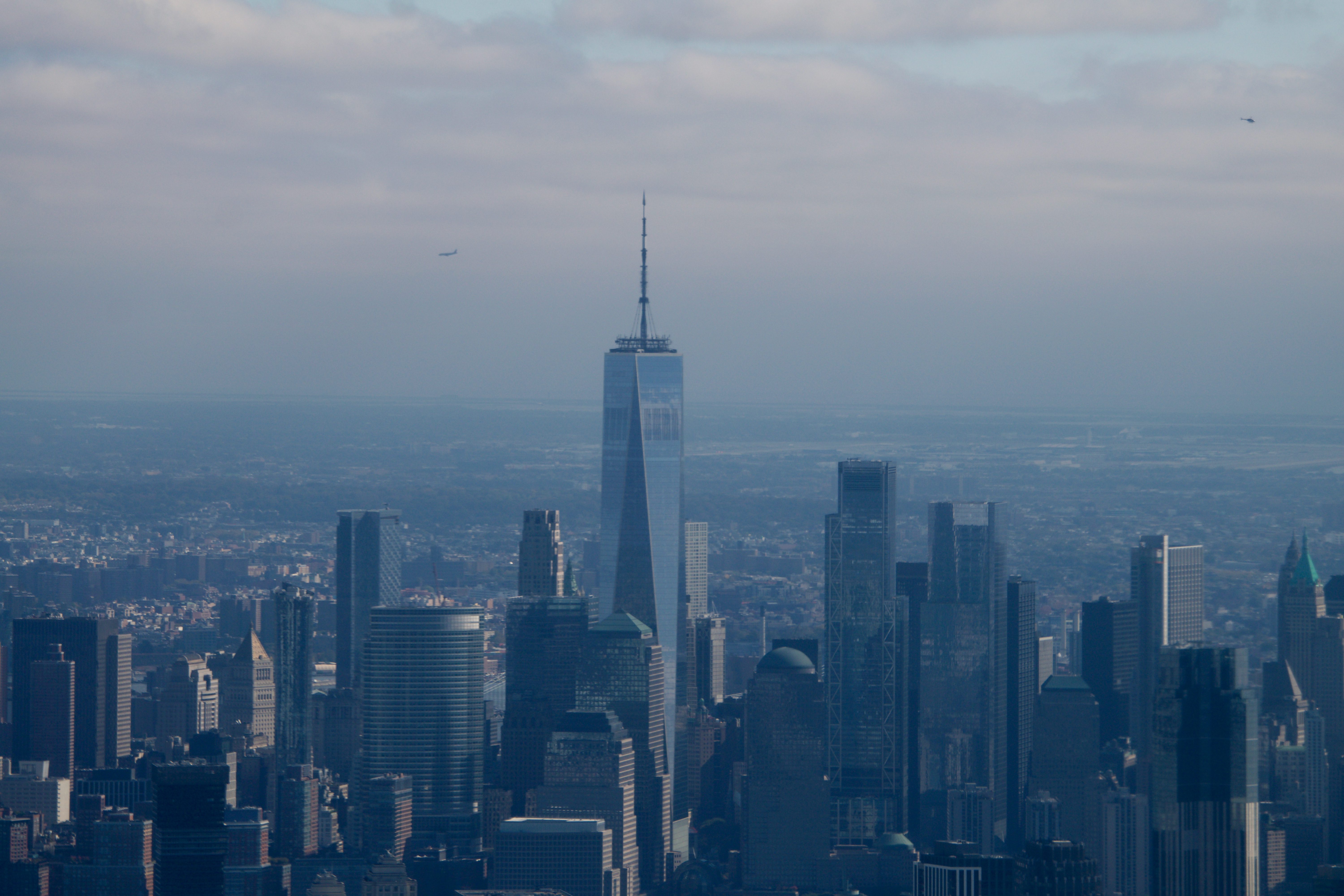 Remembering architect David M Childs (1941-2025) and his New York skyline legacy
David M Childs, a former chairman of architectural powerhouse SOM, has passed away. We celebrate his professional achievements
By Jonathan Bell
-
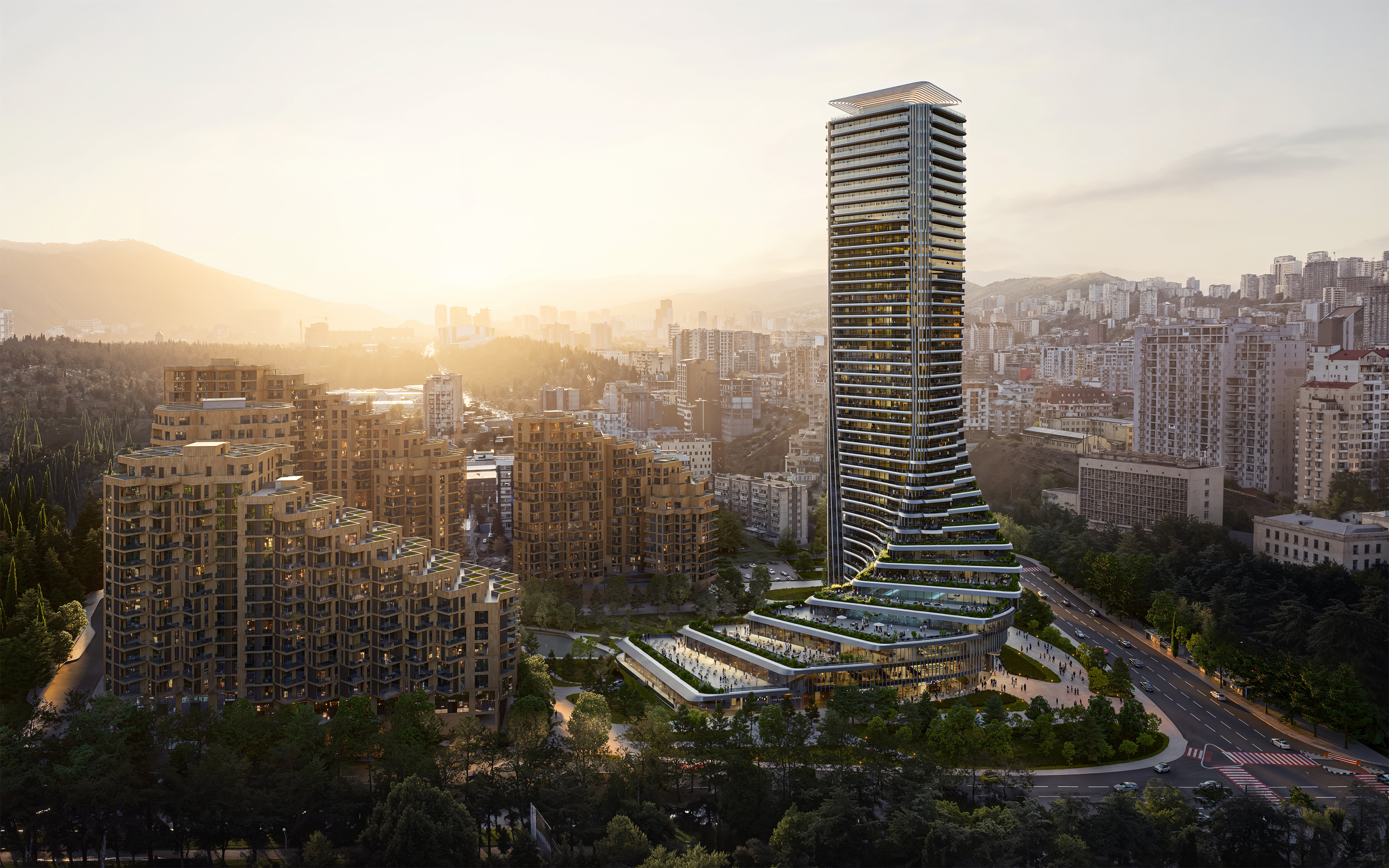 The upcoming Zaha Hadid Architects projects set to transform the horizon
A peek at Zaha Hadid Architects’ future projects, which will comprise some of the most innovative and intriguing structures in the world
By Anna Solomon
-
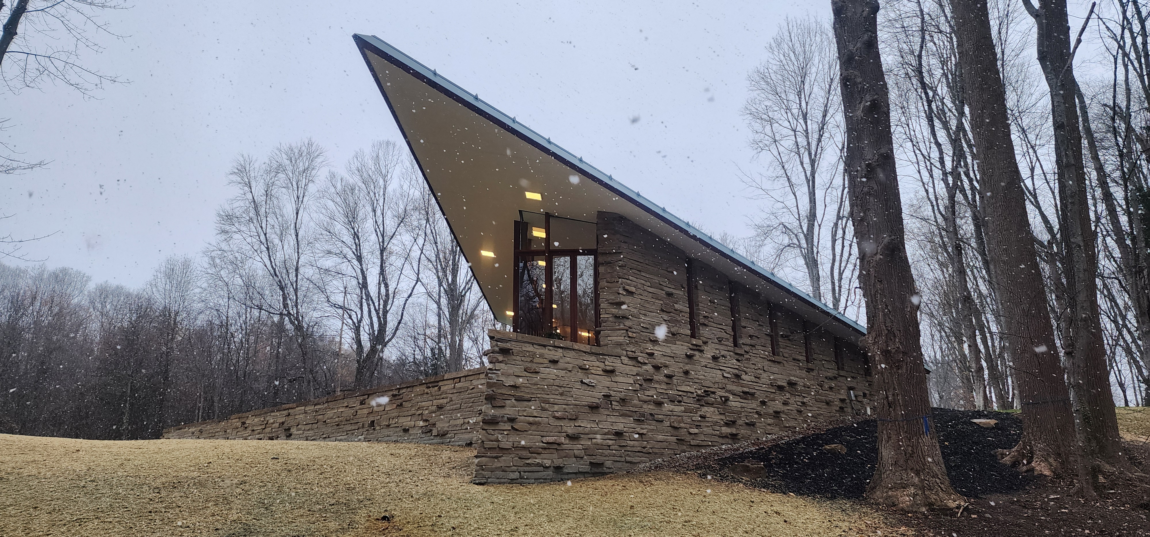 Frank Lloyd Wright’s last house has finally been built – and you can stay there
Frank Lloyd Wright’s final residential commission, RiverRock, has come to life. But, constructed 66 years after his death, can it be considered a true ‘Wright’?
By Anna Solomon
-
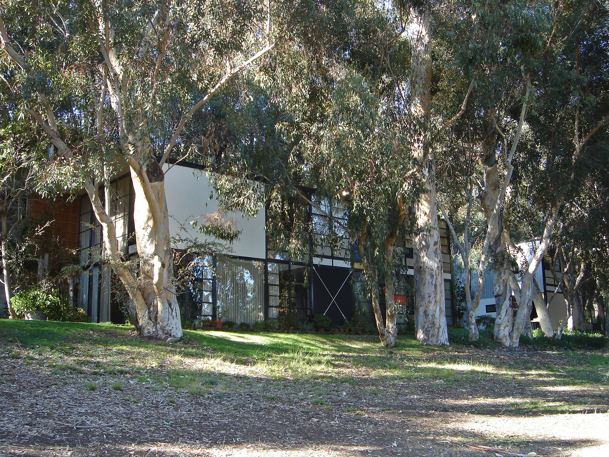 Heritage and conservation after the fires: what’s next for Los Angeles?
In the second instalment of our 'Rebuilding LA' series, we explore a way forward for historical treasures under threat
By Mimi Zeiger
-
 Why this rare Frank Lloyd Wright house is considered one of Chicago’s ‘most endangered’ buildings
The JJ Walser House has sat derelict for six years. But preservationists hope the building will have a vibrant second act
By Anna Fixsen