Magic circle: Arjaan De Feyter casts a spell over a silo in Antwerp
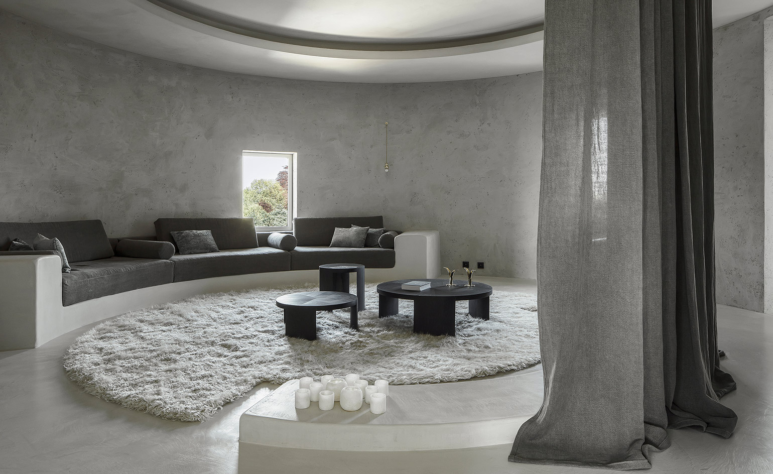
‘Why live in a silo if you don't respect the base form of a circle?’ asks Belgian interior architect Arjaan De Feyter, who embraced the challenge of designing an apartment located within eight old silos, converted by Axel Vervoordt Real Estate at the Kanaal development in Antwerp.
Fully acquainting himself with the unconventional shape, De Feyter started ‘casco’, or from scratch, with the industrial space – exposed concrete floors, concrete plaster walls and brick structure – occupying the third floor in the block across four of the silos.
‘It was directly clear to us that living in round spaces is not an ideal,’ De Feyter says. ‘The infinite character of the circle can give you a restless or confused feeling. That's why it was important to integrate the right visual pauses.’
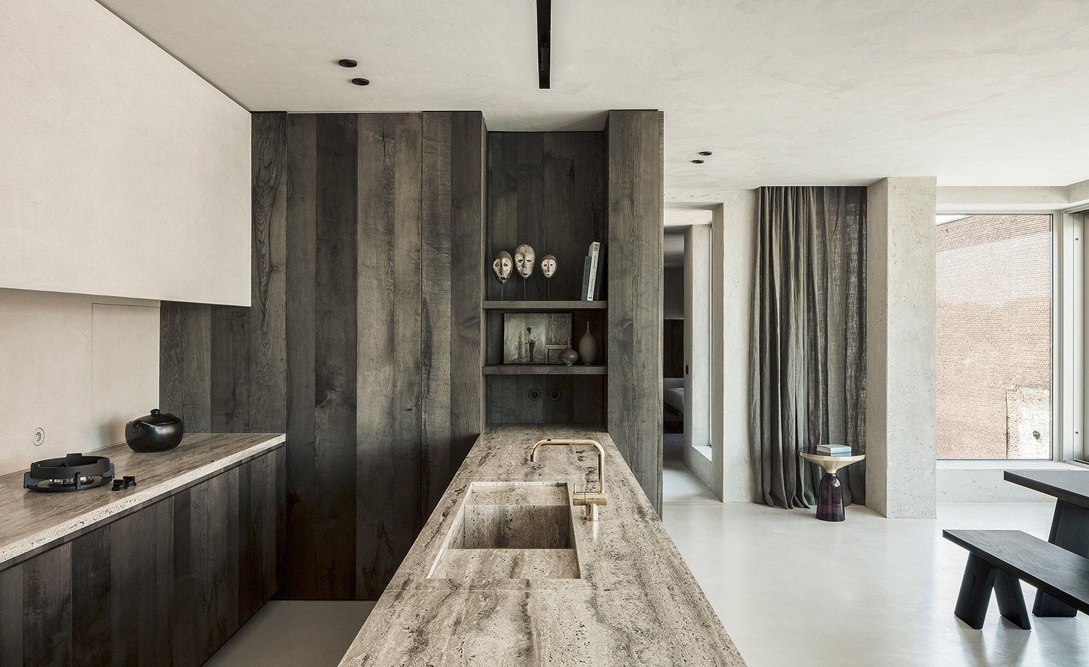
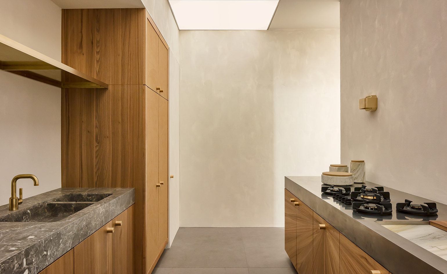
The natural stone surfaces in the kitchen are a Titanium Travertin by Van den Weghe
The original space was connected as a long corridor, but De Feyter re-circulated the space to create more of a domestic environment, redirecting the dweller into a more natural flow. With the aim of keeping interventions minimal, he added just two walls into the space. ‘We kept on puzzling, abstracting, and trying to find the right balance between functionality, space and concept. We just kept on questioning ourselves.’
De Feyter is familiar with the site where his office is located and has a long term relationship with the client – a couple with grown up children who had recently fled their family nest. When they visited him at the office, he showed them the property and three days later they had snapped it up – in celebration of their new freedom. Consequently, the design process became very personal and the clients accompanied De Feyter to craft workshops and studios in search of the right materials. ‘It's a process where we like to make our clients part of,’ says De Feyter: ‘Each material has a kind of memory now for them.’
Inspired by the site itself, and the Moroccan roots of the couple, De Feyter achieved a sense of industrial serenity through his bespoke design, by paying careful attention to texture, surface and material.
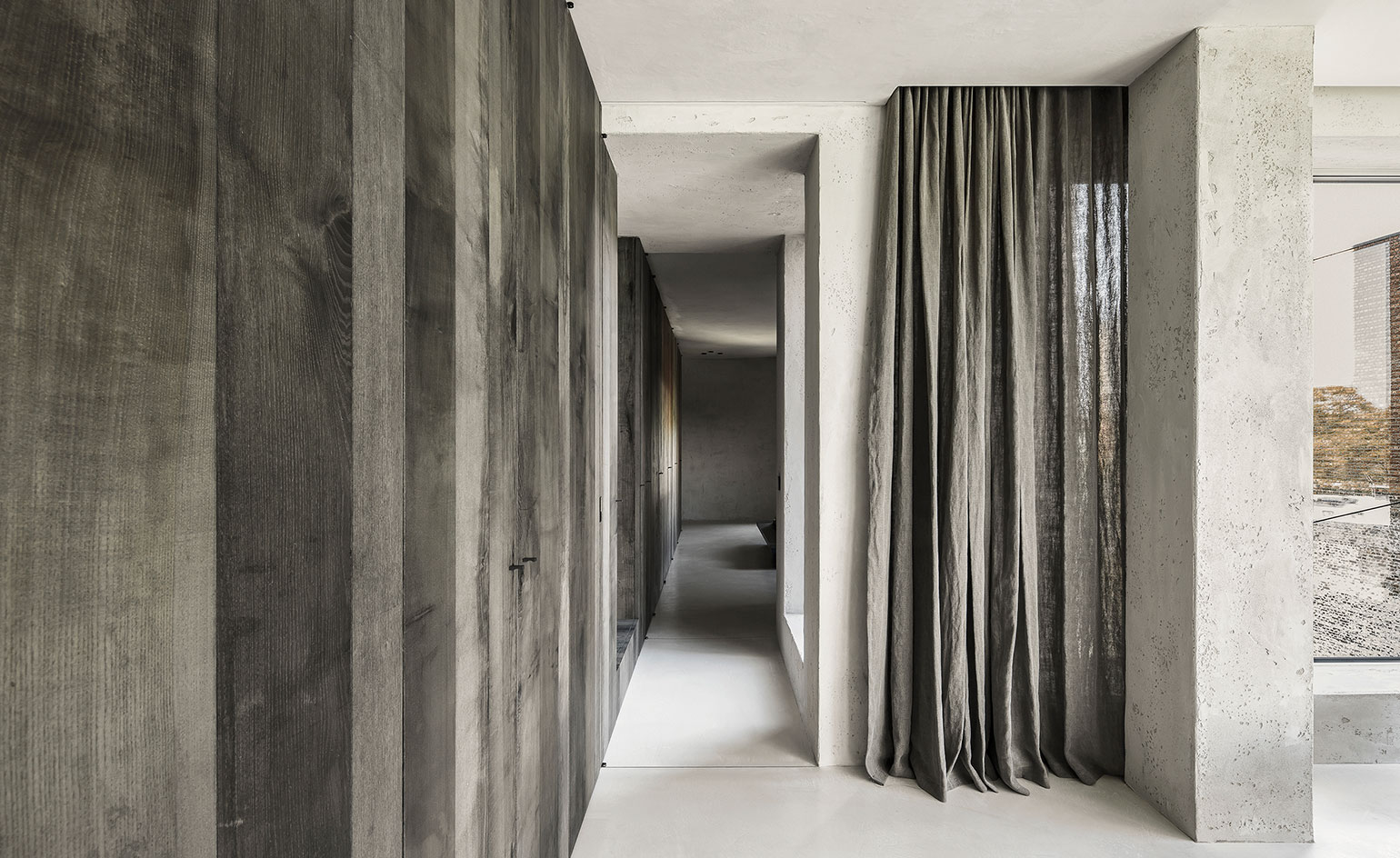
Sightlines are framed by wooden walls and warm charcoal grey-coloured linen, materials that continue throughout the apartment.
The walls are treated with a neutral mineral painting technique: ‘We've been searching a long time for the right 'brute' painting technique, which still felt cosy. This was made possible with the right craftsmanship – in this case, Texture Painting from Turnhout, Belgium.’ Similarly, the floor surfaces were installed by Texture Painting with a microtopping surface treatment, and De Feyter designed brass details in the floor seams.
The materials add warmth to the design; from the bespoke kitchen cupboards in a dark silvered ash, coloured by the ink of the gall wasp and polished manually, to the linen used on the bench textiles and curtains in the living room that acts as an acoustic softener and a subtle divider. ‘On first sight, the curtain might be nonchalant, but it's essential to our design. It brings – in a modest way – the circulation from the entrance to the day-zone, without being disturbing for the evening-zone. It creates privacy in the sitting area and the curtain obstructs the look-through to the two passages.’
Moving smoothly from the kitchen, to the living room, to the study, to the bedroom, materials repeat themselves in new manifestations, creating a visual continuum in sync with the circular shape of the silo.
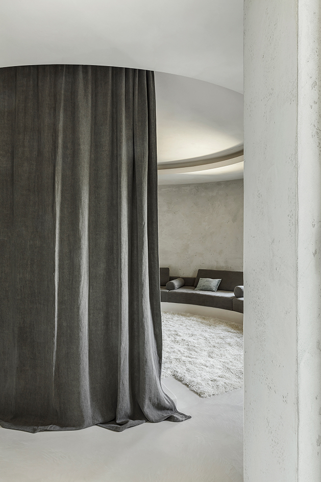
A linen curtain divides and softens the space
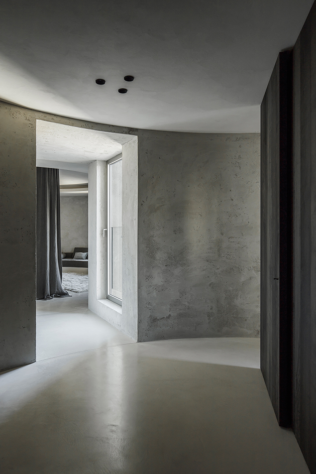
The apartment accupies 200 sq m across four of the silos, two of which were converted into rectangles for more functionality by the developers
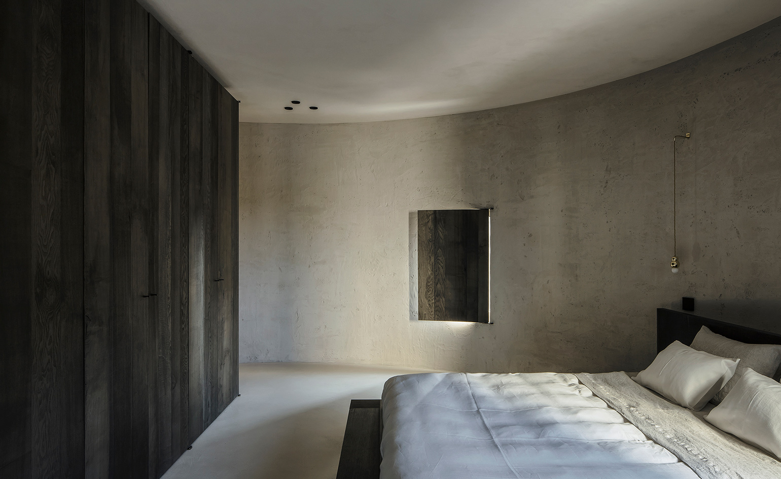
Custom carpentry across the apartment includes the hand pigmented silvered ash storage in the bedroom
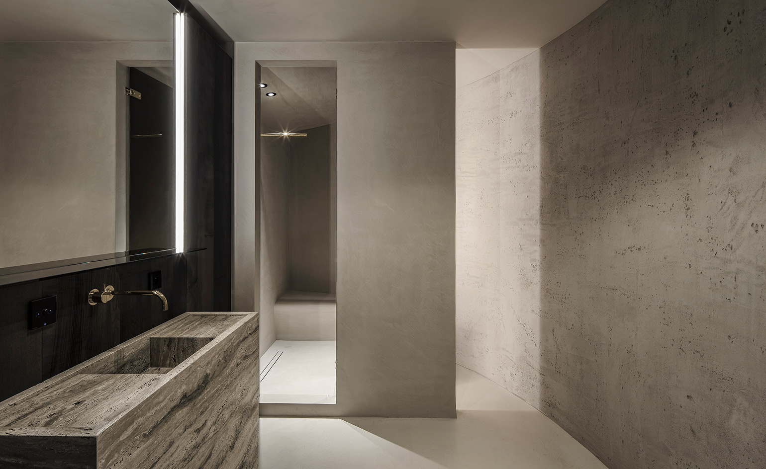
The custom-designed bathroom
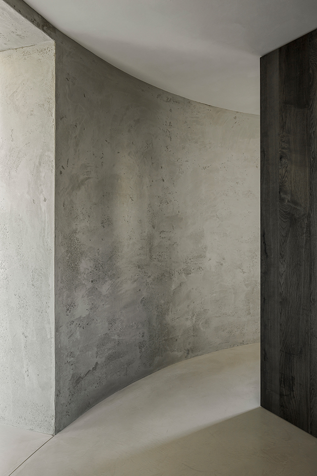
De Feyter made minimal edits to the circulation, yet built two additional walls to create a domestic setting
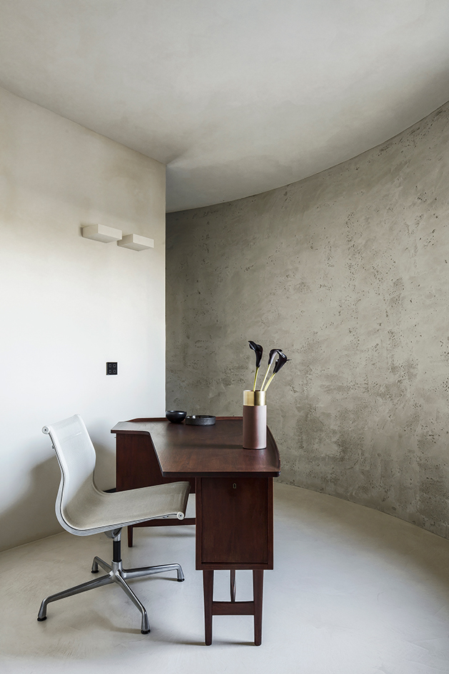
The study features a 'Boomerang' desk by Peter Lovig Nielsen from 1950, a 'Neverending Glory' pendant ;amp (Bolshoi Theatre) by Jan Plechác & Henry Wielgus and an Eames chair for Vitra
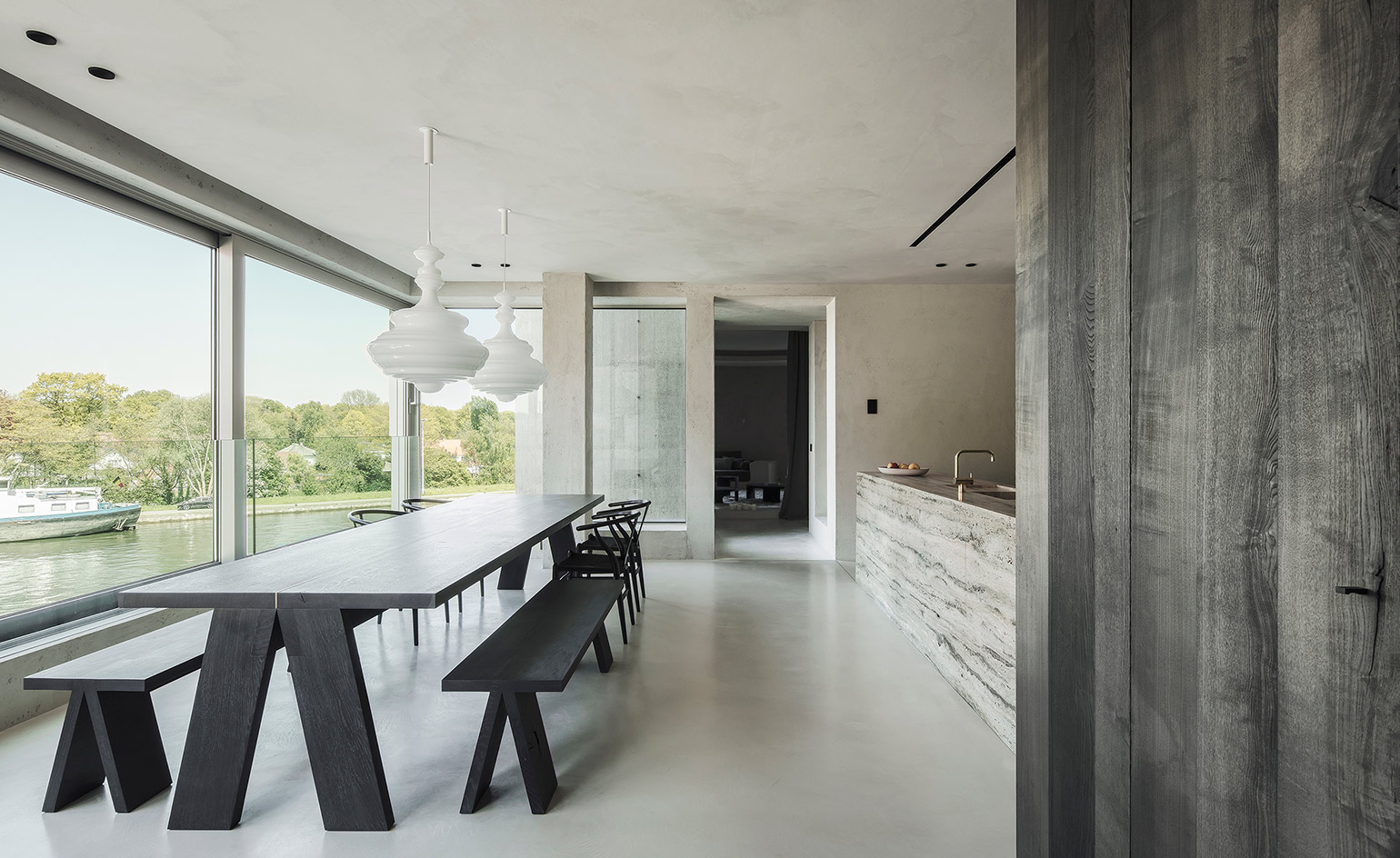
The dining room features a custom designed table in black oak by De Feyter and Tim Vranken, with 'Wishbone' chairs by Hans Wegner
INFORMATION
For more information, visit the Arjaan De Feyter website
Wallpaper* Newsletter
Receive our daily digest of inspiration, escapism and design stories from around the world direct to your inbox.
Harriet Thorpe is a writer, journalist and editor covering architecture, design and culture, with particular interest in sustainability, 20th-century architecture and community. After studying History of Art at the School of Oriental and African Studies (SOAS) and Journalism at City University in London, she developed her interest in architecture working at Wallpaper* magazine and today contributes to Wallpaper*, The World of Interiors and Icon magazine, amongst other titles. She is author of The Sustainable City (2022, Hoxton Mini Press), a book about sustainable architecture in London, and the Modern Cambridge Map (2023, Blue Crow Media), a map of 20th-century architecture in Cambridge, the city where she grew up.
-
 Naoto Fukasawa sparks children’s imaginations with play sculptures
The Japanese designer creates an intuitive series of bold play sculptures, designed to spark children’s desire to play without thinking
By Danielle Demetriou
-
 Japan in Milan! See the highlights of Japanese design at Milan Design Week 2025
At Milan Design Week 2025 Japanese craftsmanship was a front runner with an array of projects in the spotlight. Here are some of our highlights
By Danielle Demetriou
-
 Tour the best contemporary tea houses around the world
Celebrate the world’s most unique tea houses, from Melbourne to Stockholm, with a new book by Wallpaper’s Léa Teuscher
By Léa Teuscher
-
 Guiding lights: Maarten De Ceulaer stacks stones into sculptural lamps
Debuting at Brussels’ Collectible design fair in March 2025, Maarten De Ceulaer's Cairn Lights balance craftsmanship and connection to the natural world
By Ali Morris
-
 Roman ruins inspire these tables from Brussels-based Cobra Studios
Cobra Studios' breakthrough collection of roman-inspired tables
By Rosa Bertoli
-
 Ann Demeulemeester’s first foray into homeware ‘returns to the essence of things’
The Belgian fashion designer collaborates with Serax for a collection launching at Maison et Objet this week
By Siska Lyssens
-
 Neuschwanstein Castle’s servants’ kitchen inspire new utilitarian Belgian design
By Siska Lyssens
-
 A former printworks makes an impression as a gallery and home for designer Xavier Lust
By Siska Lyssens
-
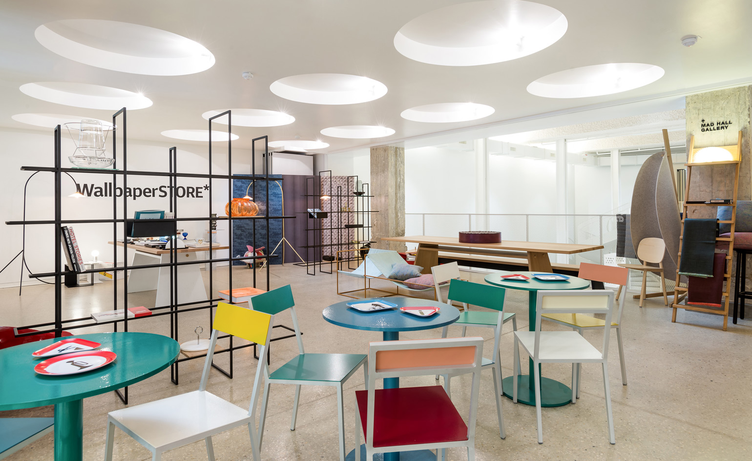 At MAD Museum in Brussels, Belgian design and a WallpaperSTORE* pop-up
By Rosa Bertoli
-
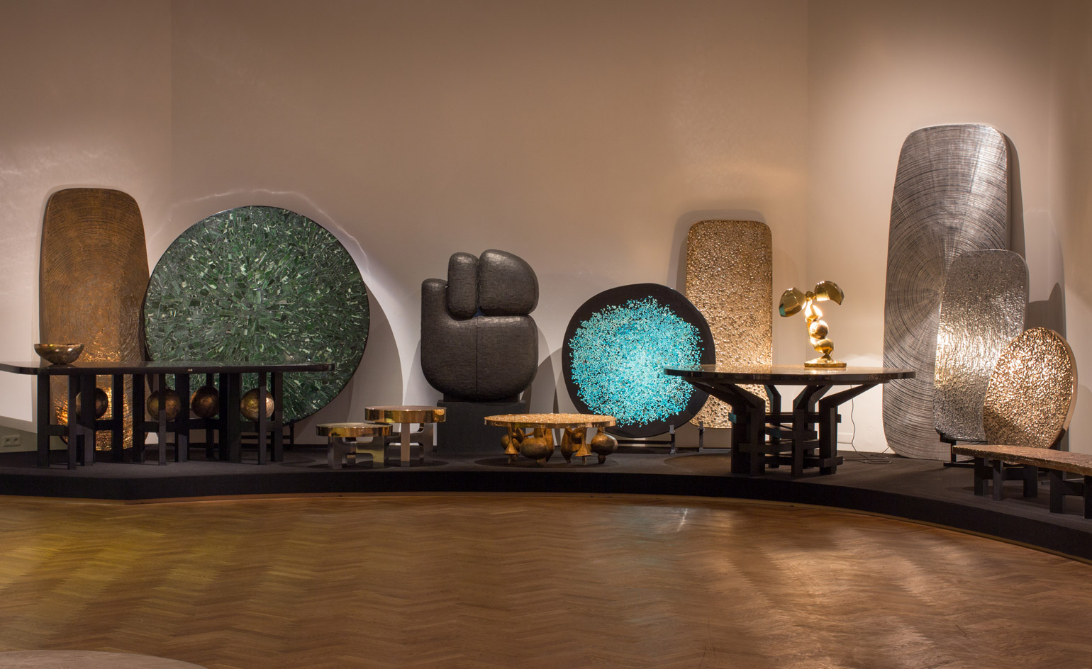 Cast in stone: Ado Chale’s lifetime of alchemy and artistry goes on show in Brussels
By Adam Štěch
-
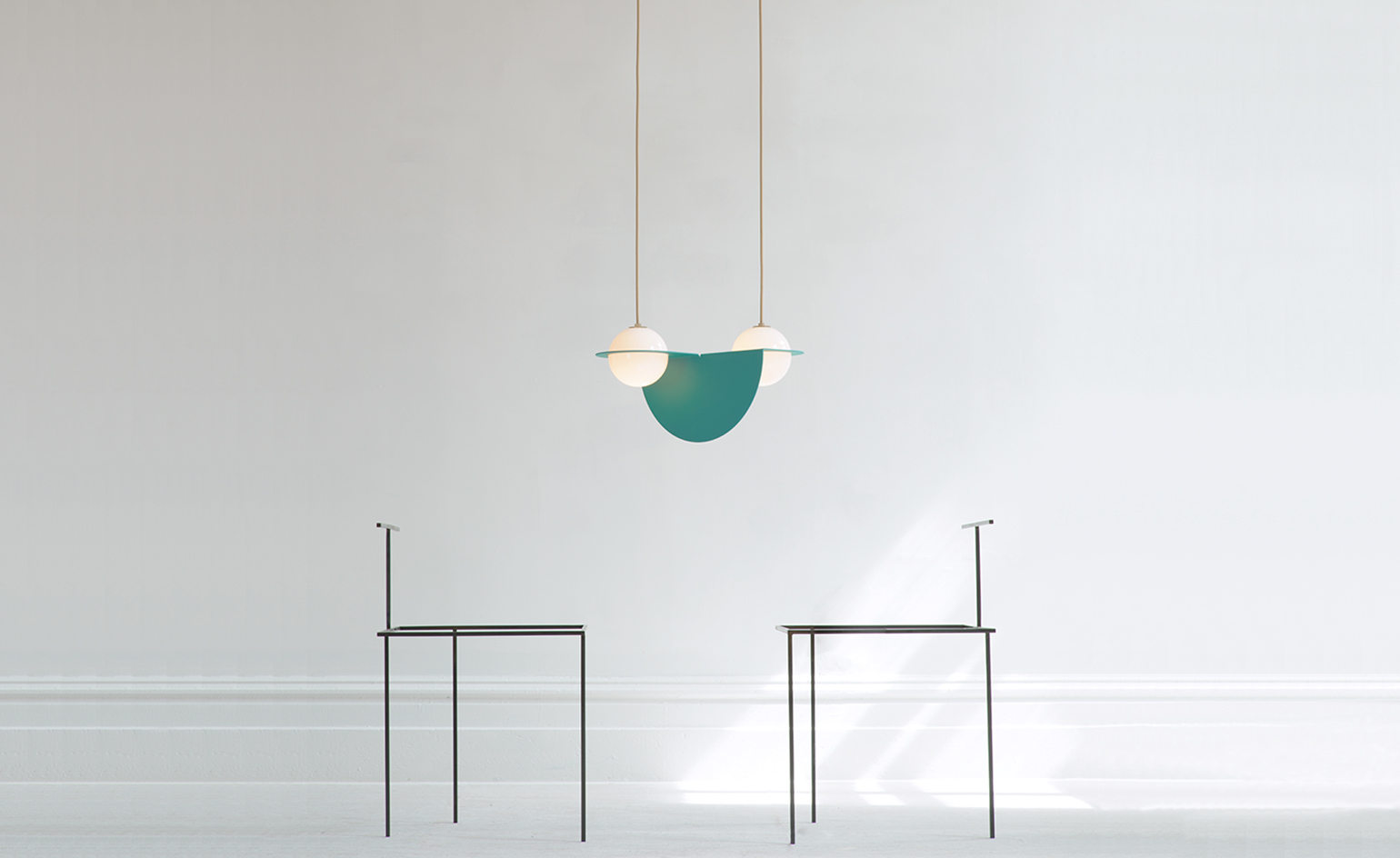 At Kortrijk’s Biennale Interieur, an air of optimism and silver linings
By Giovanna Dunmall