AstraZeneca’s Discovery Centre is ‘a landscape of different situations’
Tour AstraZeneca's brand new research and development hub, The Discovery Centre, designed by Herzog & de Meuron in Cambridge, UK
Hufton + Crow - Photography
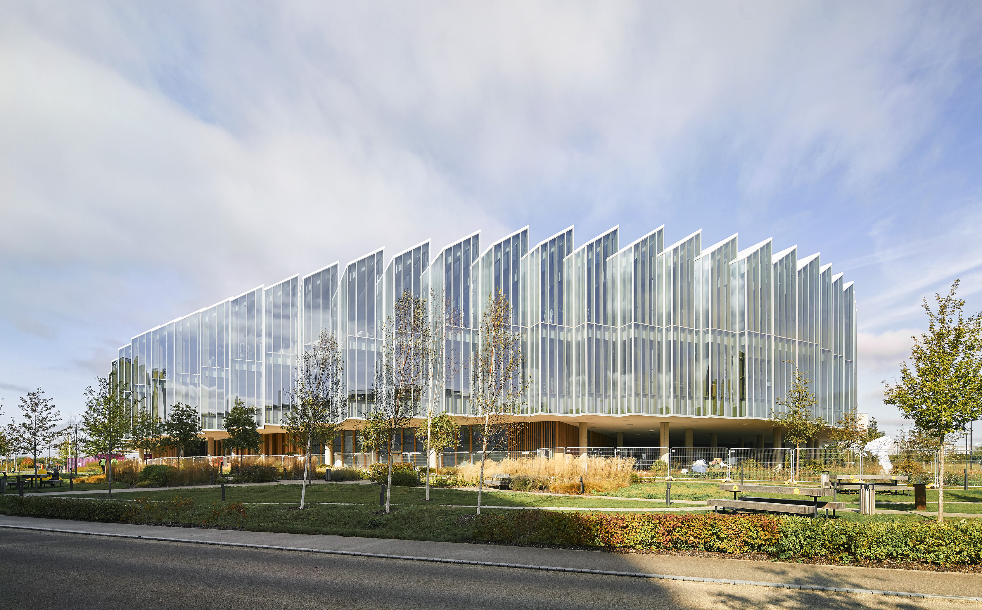
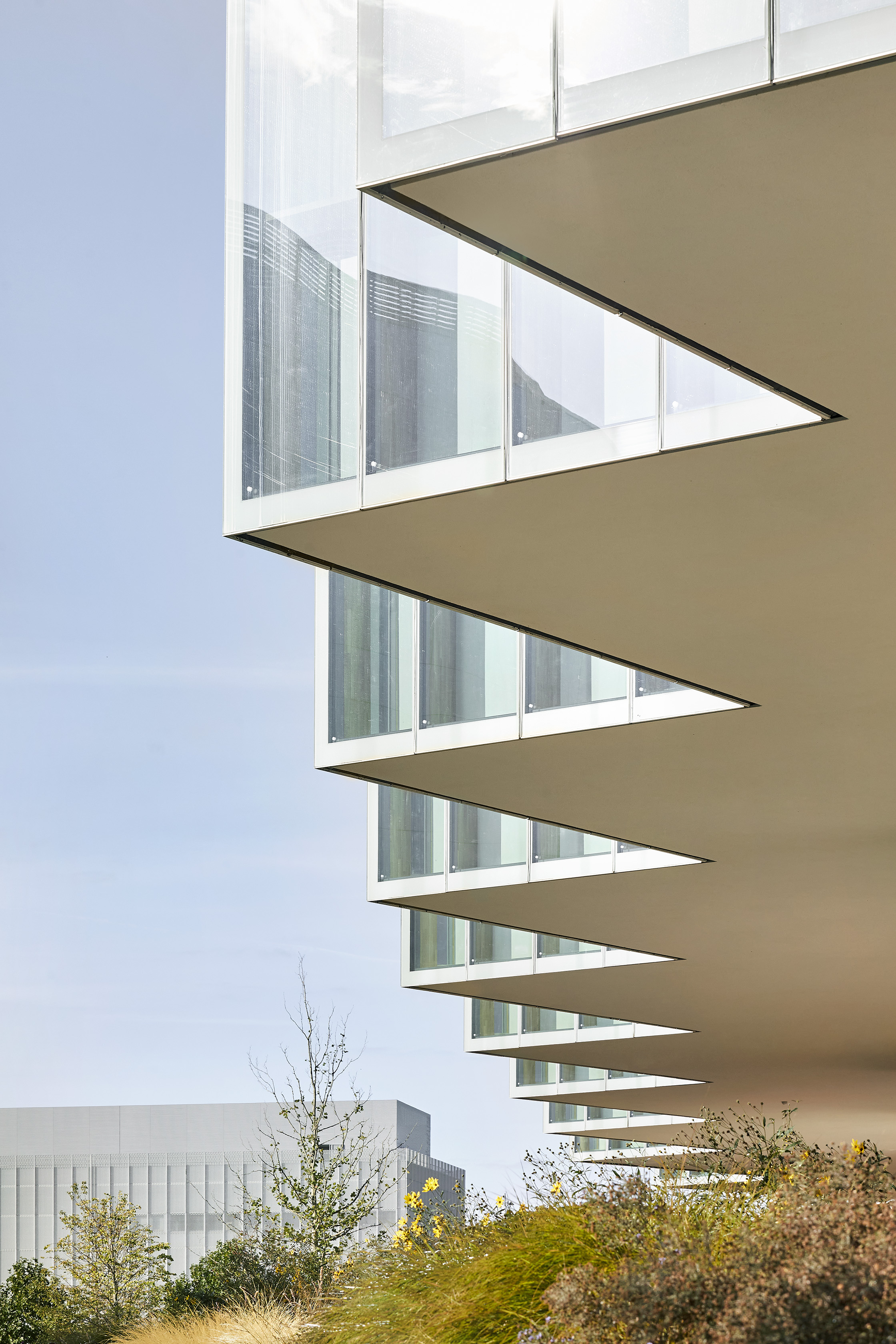
As you approach The Discovery Centre in Cambridge, designed by Herzog & Meuron for pharmaceutical giant AstraZeneca, the building clearly stands out in its immediate surroundings. Relatively low, finely carved and elegant-looking, this new research and development hub, part of the Cambridge Biomedical Campus (CBC), is located in a part of town that is currently in intense development – the Cambridge Southern Fringe Area. Modern on the inside, subtle on the outside, its design credentials cleverly belie its size.
This, along with its need for flexibility, were the key drivers for the design, explains Herzog & Meuron partner Stefan Marbach: ‘We wanted to consciously keep the building low, at three floors, to ensure there are easy connections within. Because of the round shape, it never feels too big. At the same time, it's a landscape of different situations.'
The Discovery Centre has been in the works since 2013, when British-Swedish multinational AstraZeneca commissioned the leading Swiss architecture studio for a hub that would consolidate its various research facilities and innovation labs. The building now includes these as well as offices, meeting spaces, a conference centre, an auditorium, a café and a restaurant.
AstraZeneca building champions transparency and light
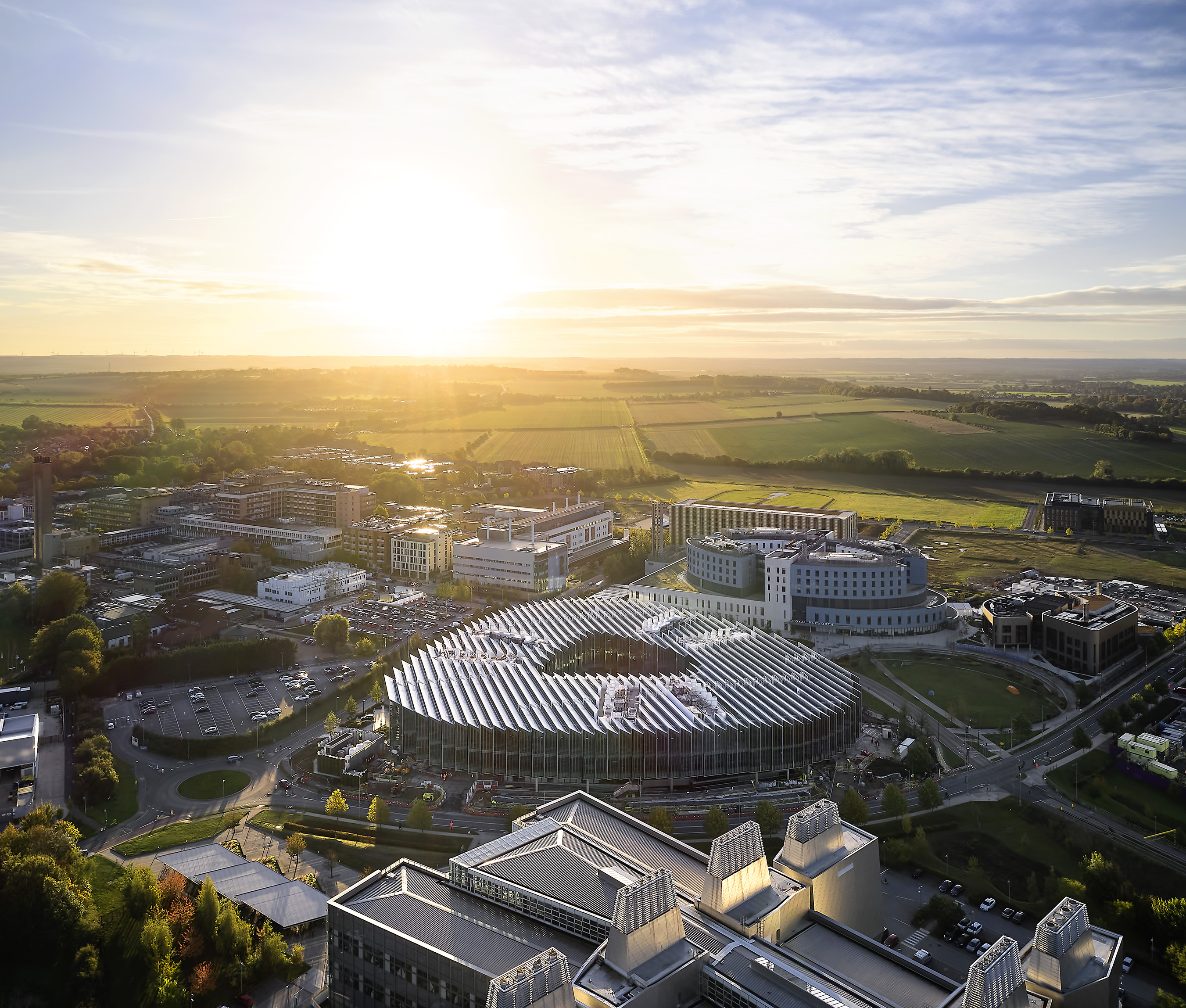
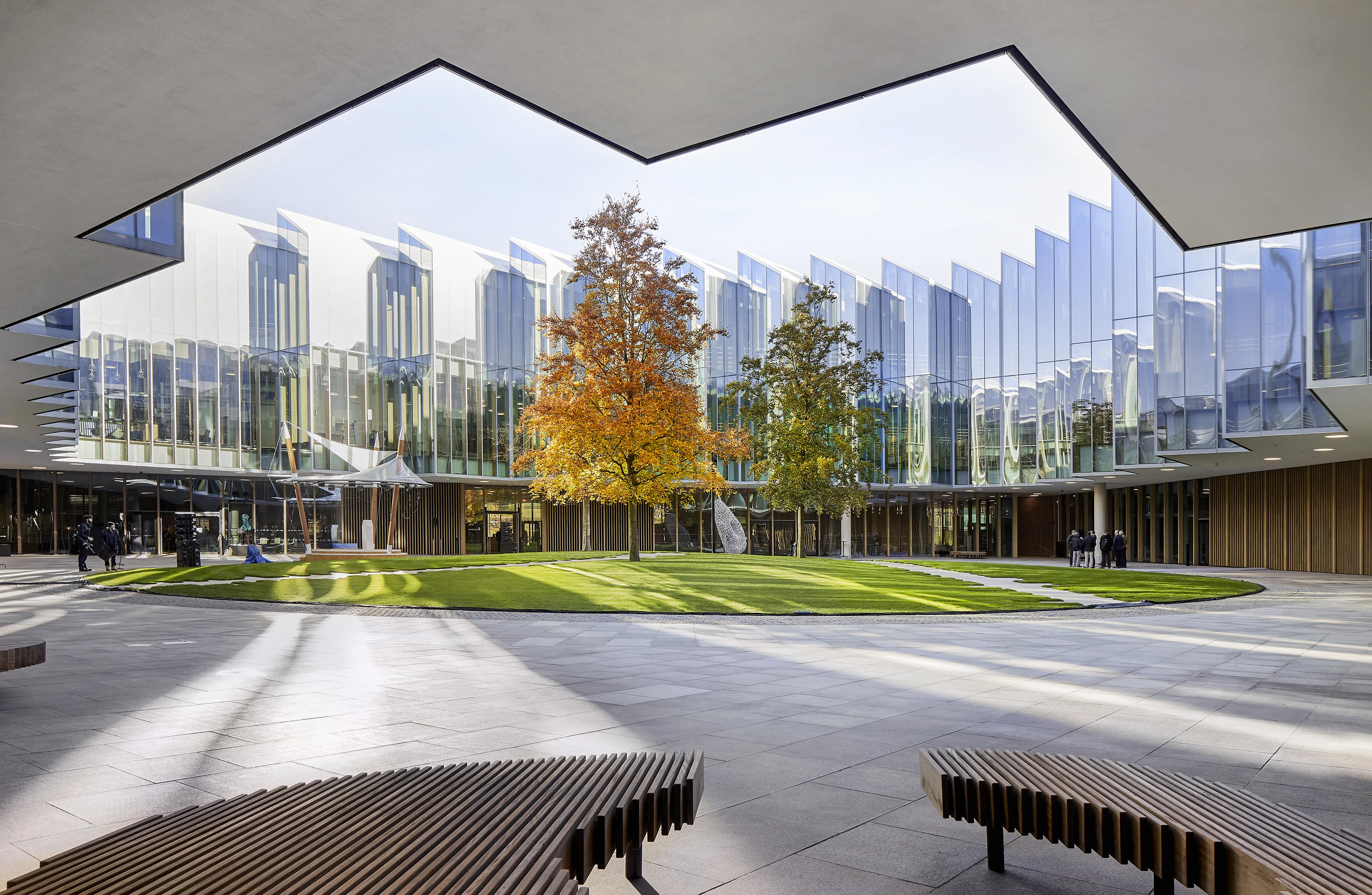
Part of the brief was to create a ‘porous' structure, a building that can be embedded in the local community and landscape; and The Discovery Centre hopes to achieve just that. Designed in a loosely circular form – or rather, perhaps more accurately, a triangular floorplan with rounded edges – it contains a green central courtyard that will remain open and accessible to the public, aiming perhaps to bust the reputation that sees science labs as more opaque, mysterious, insular places. Outside the building’s strict perimeter, lush architectural gardens, dotted by artwork, sprawl outwards and it's hard to tell where the centre ends and the public realm begins. Visitors and passers-by can sit on the lawns, wherever.
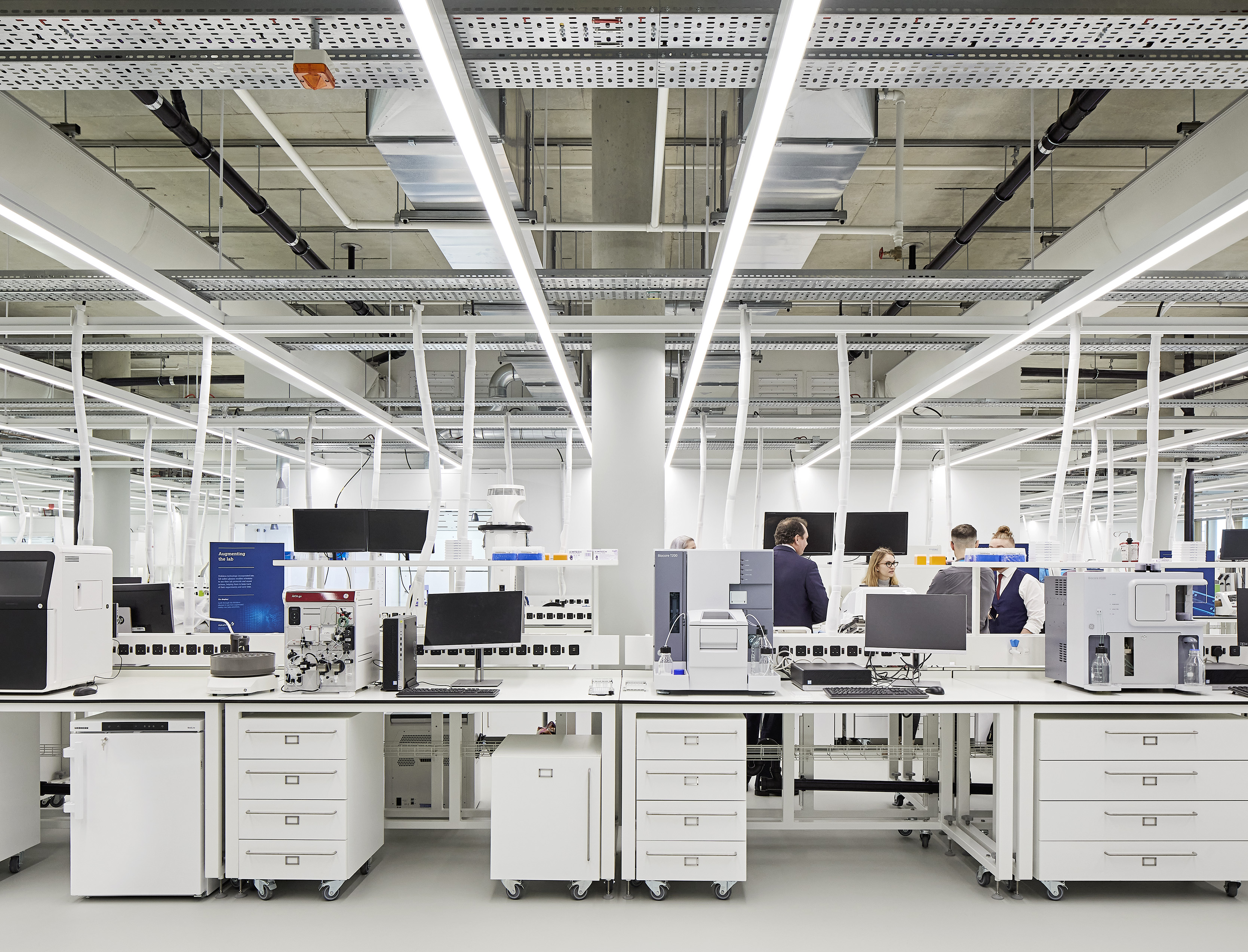
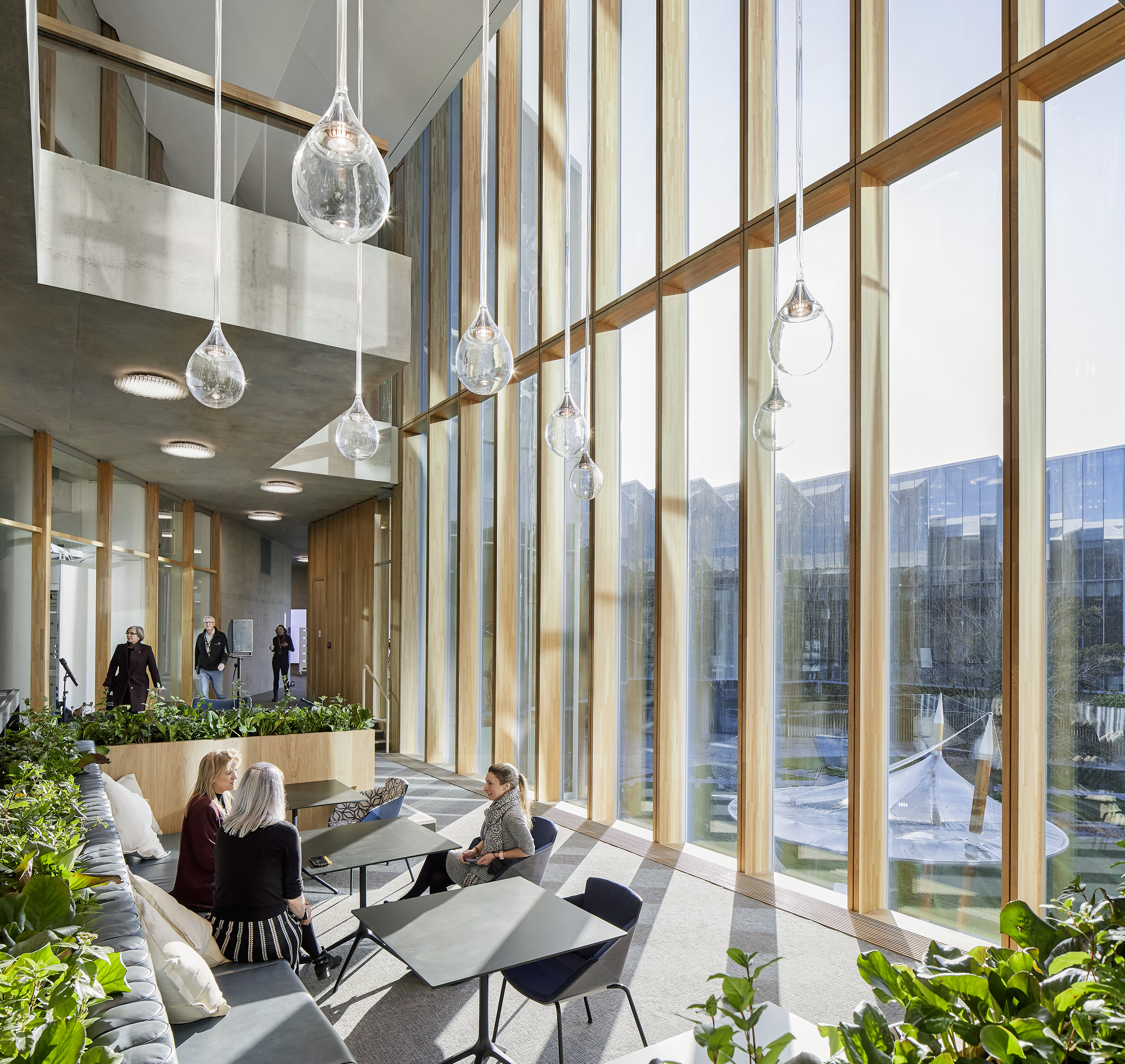
Inside, with the exception of lab areas (which are cleverly designed to be ‘plug-and-play' for utmost flexibility, Marbach explains), the interior is mostly occupied by open-plan workspaces. ‘Light and transparency were key elements in the design,' Marbach notes. Bringing natural light deep into the floorplate was a key driver for Herzog & de Meuron, which opened up views throughout the space, added glass partitions and punctured holes to connect floors, in order to enhance the idea of collaboration and cross-pollination between departments within AstraZeneca.
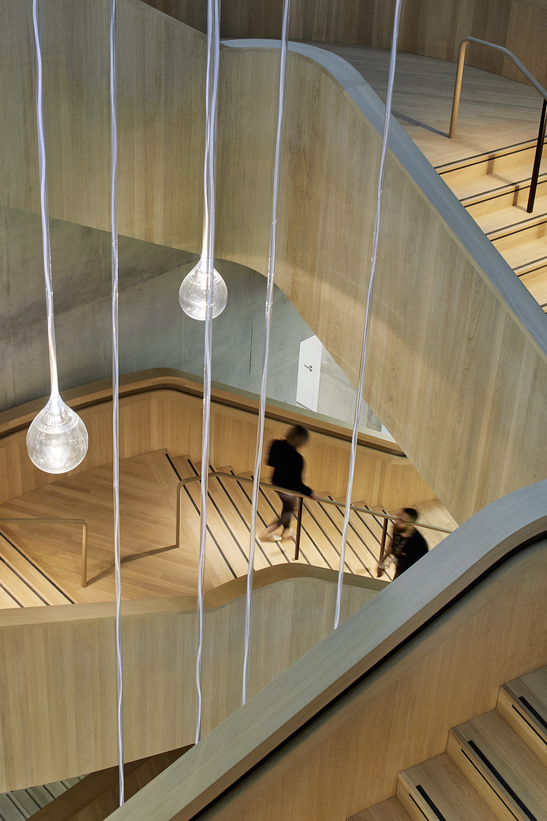
The choice of materials clearly defines different areas in the building. There is natural stone for the entrances; rough sawn solid oak for the sculptural main stairs and the inner ring area; and carpet for the offices and other workspace floors. Ducts and services are hidden under the floor in most areas, but are exposed, hanging from the ceiling, in the laboratories, signifying the change in use. Smart ventilation recycles the air inside frequently and helps keep temperatures stable.
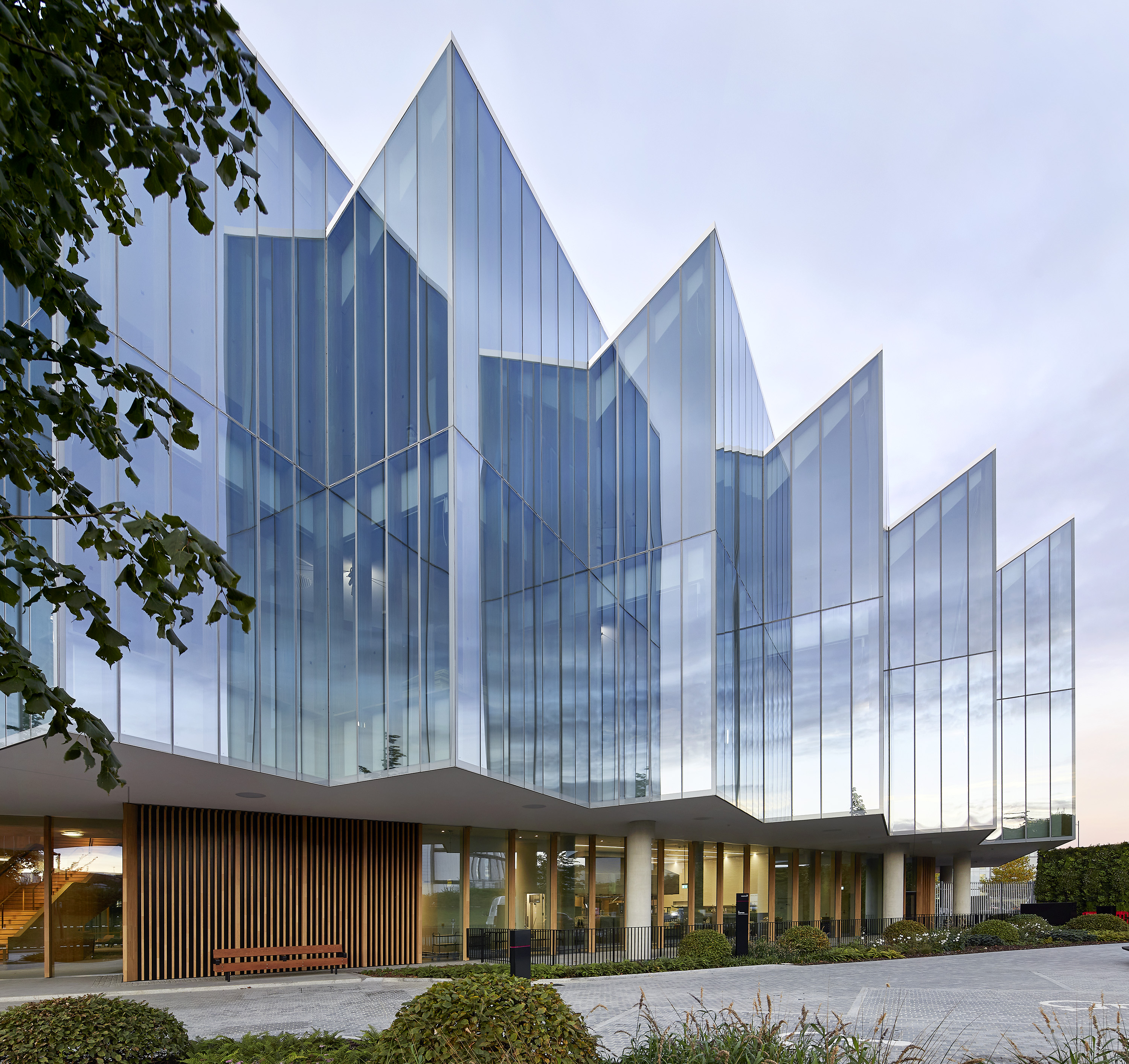
A sawtooth roof allows light to stream through openings, and continues the theme of the sawtooth, high-performance glass façade, which helps break down the overall volume. This feature also abstractly references the historical architecture of Cambridge colleges (in a similar way that the central courtyard hints at a contemporary version of the university quadrant).
Wallpaper* Newsletter
Receive our daily digest of inspiration, escapism and design stories from around the world direct to your inbox.
The building has just been inaugurated by HRH Prince Charles, who highlighted the structure's net-zero approach, citing his recently launched Terra Carta Seal, bestowed to private sector companies that distinguish themselves for their sustainability efforts. Indeed, sleek and technologically advanced, the structure also features some strong sustainable architecture credentials, such as the use of geothermal energy, recycled rainwater and smart use of natural light and shading. It’s an approach fitting of the building – with its high-spec research and high-level controlled environments – which is home to some of the world's most cutting-edge science.


INFORMATION
Ellie Stathaki is the Architecture & Environment Director at Wallpaper*. She trained as an architect at the Aristotle University of Thessaloniki in Greece and studied architectural history at the Bartlett in London. Now an established journalist, she has been a member of the Wallpaper* team since 2006, visiting buildings across the globe and interviewing leading architects such as Tadao Ando and Rem Koolhaas. Ellie has also taken part in judging panels, moderated events, curated shows and contributed in books, such as The Contemporary House (Thames & Hudson, 2018), Glenn Sestig Architecture Diary (2020) and House London (2022).
-
 The Subaru Forester is the definition of unpretentious automotive design
It’s not exactly king of the crossovers, but the Subaru Forester e-Boxer is reliable, practical and great for keeping a low profile
By Jonathan Bell
-
 Sotheby’s is auctioning a rare Frank Lloyd Wright lamp – and it could fetch $5 million
The architect's ‘Double-Pedestal’ lamp, which was designed for the Dana House in 1903, is hitting the auction block 13 May at Sotheby's.
By Anna Solomon
-
 Naoto Fukasawa sparks children’s imaginations with play sculptures
The Japanese designer creates an intuitive series of bold play sculptures, designed to spark children’s desire to play without thinking
By Danielle Demetriou
-
 Bold, geometric minimalism rules at Toteme’s new store by Herzog & de Meuron in China
Toteme launches a bold, monochromatic new store in Beijing – the brand’s first in China – created by Swiss architecture masters Herzog & de Meuron
By Ellie Stathaki
-
 Herzog & de Meuron’s Children’s Hospital in Zurich is a ‘miniature city’
Herzog & de Meuron’s Children’s Hospital in Zurich aims to offer a case study in forward-thinking, contemporary architecture for healthcare
By Ellie Stathaki
-
 Look inside Sixth&Blanco, Herzog & de Meuron’s first project in Texas
Step inside Sixth&Blanco by Herzog & de Meuron, as the Swiss studio reveals interior images of its first ever Texas design, a forward-thinking, sustainable and mixed-use scheme
By Ellie Stathaki
-
 Herzog & de Meuron’s SIP Main Campus weaves together nature and sculptural concrete
SIP Main Campus, a new workspace by Herzog & de Meuron, completes on the Swiss-French border
By Ellie Stathaki
-
 Royal Academy’s Herzog & de Meuron show in London spotlights architecture for care
The Royal Academy of Arts launches its Herzog & de Meuron exhibition in London; we speak to them about the show, their approach to healthcare architecture and caring, and their rich body of work
By Amah-Rose Mcknight Abrams
-
 Herzog & de Meuron and Piet Oudolf unveil Philadelphia’s Calder Gardens design
Herzog & de Meuron and Piet Oudolf's design for the new Calder Gardens in downtown Philadelphia is set to be a tranquil tribute to artist Alexander Calder
By Hannah Silver
-
 SongEun Art & Cultural Foundation marks Herzog & de Meuron’s South Korean debut
Herzog & de Meuron’s South Korean debut is a triangular triumph for ST International and its SongEun Art & Cultural Foundation in Seoul
By Andy St Louis
-
 Herzog & de Meuron returns to Duisburg for MKM Museum Küppersmühle extension
Tour the new extension at the MKM Museum Küppersmühle in Duisburg, Germany, a cultural hub courtesy of Herzog & de Meuron
By Ellie Stathaki