Atelier Felix expands within Oslo's iconic Kunstnernes Hus
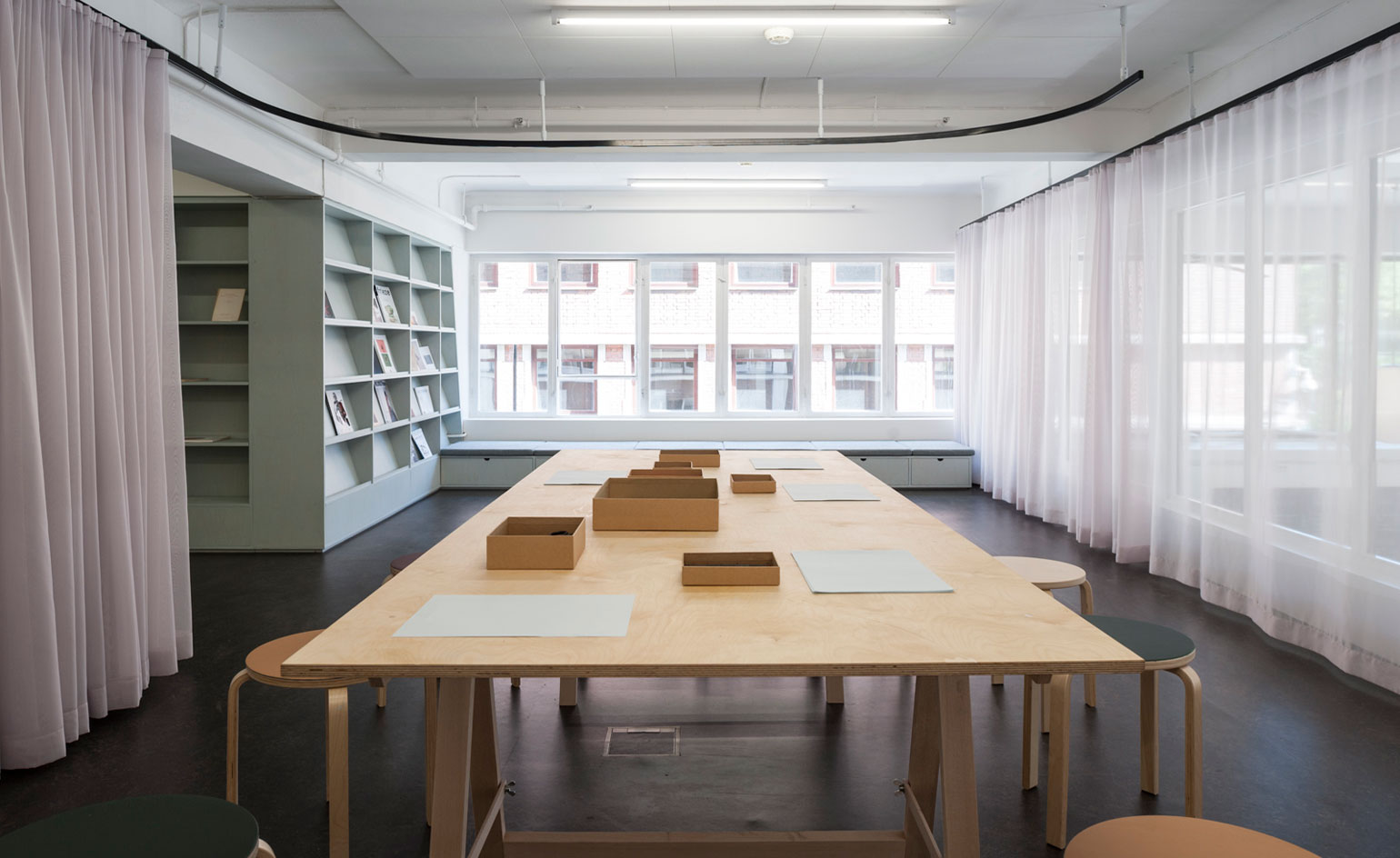
Norwegian architecture practice Superunion has designed a small, multifunctional space for Atelier Felix that serves as a workshop, reading room and exhibition space
We had them down as ones to watch in our 2014 Architects Directory and for good reason. Superunion haven't failed to deliver with their latest project, a creative space tucked away in the Kunstnernes Hus, the jewel in the crown of Oslo's art world.
The Oslo art hub is one of the earliest examples of Norwegian functionalism, designed in 1930 by architects Blakstad and Munthe-Kaas. The building continues to host some of the city's best contemporary art and can now add Superunion's design to its impressive catalogue. Atelier Felix is a flexible extension to the building's existing gallery, designed to accommodate a multitude of activities.
This small but perfectly formed room can be divided into three zones, a reading area, workshop and an exhibition space. A bespoke wall becomes a useful installation of floor-to-ceiling shelving and serves as a blank canvas for artists and the public to display temporary works. Behind, the shelving encloses a more private reading area complete with space-saving window seats.
A spiralling, sheer curtain acts as a flexible room divider and provides the option to separate the workshop area from the rest of the room. This weightless partition creates an intimate space without completely isolating it and still allows natural light to flood through. A wall-length window opens up the room, and peers onto the bustling café below, allowing visitors to soak up the creative energy without any of the disturbances.
'We were inspired by the building we worked in,' explains architect Vilhelm Christensen, and so Superunion's main concern throughout the process was to honour the history of the building whilst still creating 'a new space with unique character.' The crisp lines and Scandinavian simplicity of the design mirrors the classical cubic form of the Kunstnernes Hus. The blue wall colour chosen by the architects was also inspired by the functionalist building as 'the colours were sampled from a fresco in the building's foyer.'
Thanks to their light touch and functionalist-inspired approach, Superunion has orchestrated a modern space, befitting its historical host.
Wallpaper* Newsletter
Receive our daily digest of inspiration, escapism and design stories from around the world direct to your inbox.
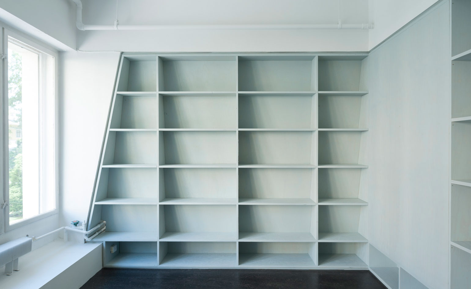
The bespoke shelving wall is a blank canvas for the public to showcase pieces of art and follows the shape of the exisiting structure of the building
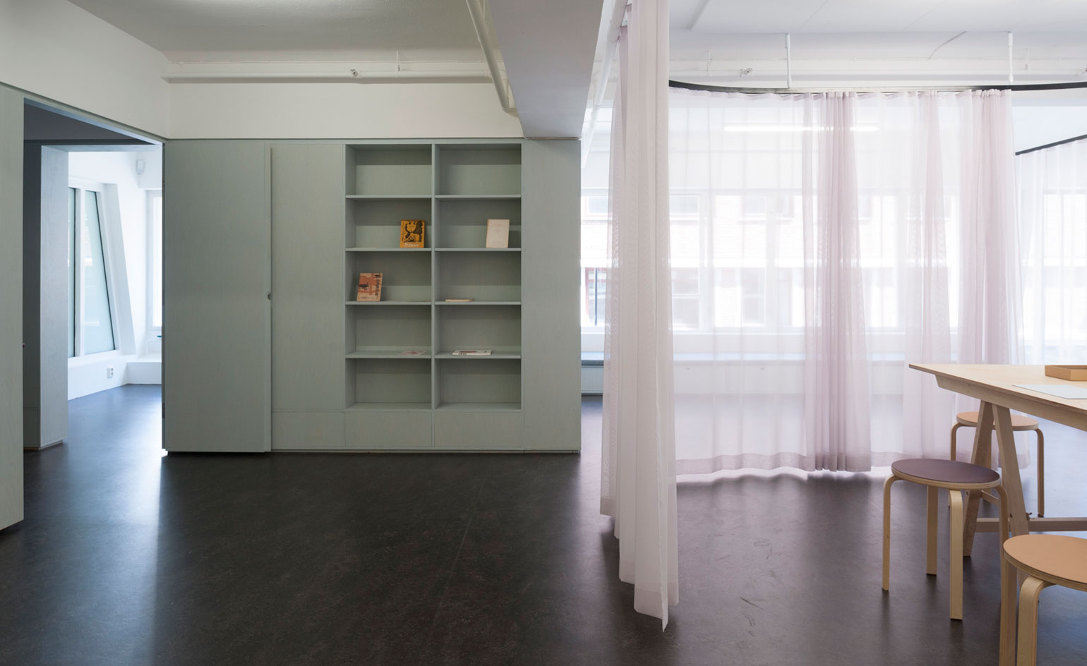
The sheer curtain is a flexible alternative to a partition wall, creating the three different zones whilst ensuring the space still feels large and open
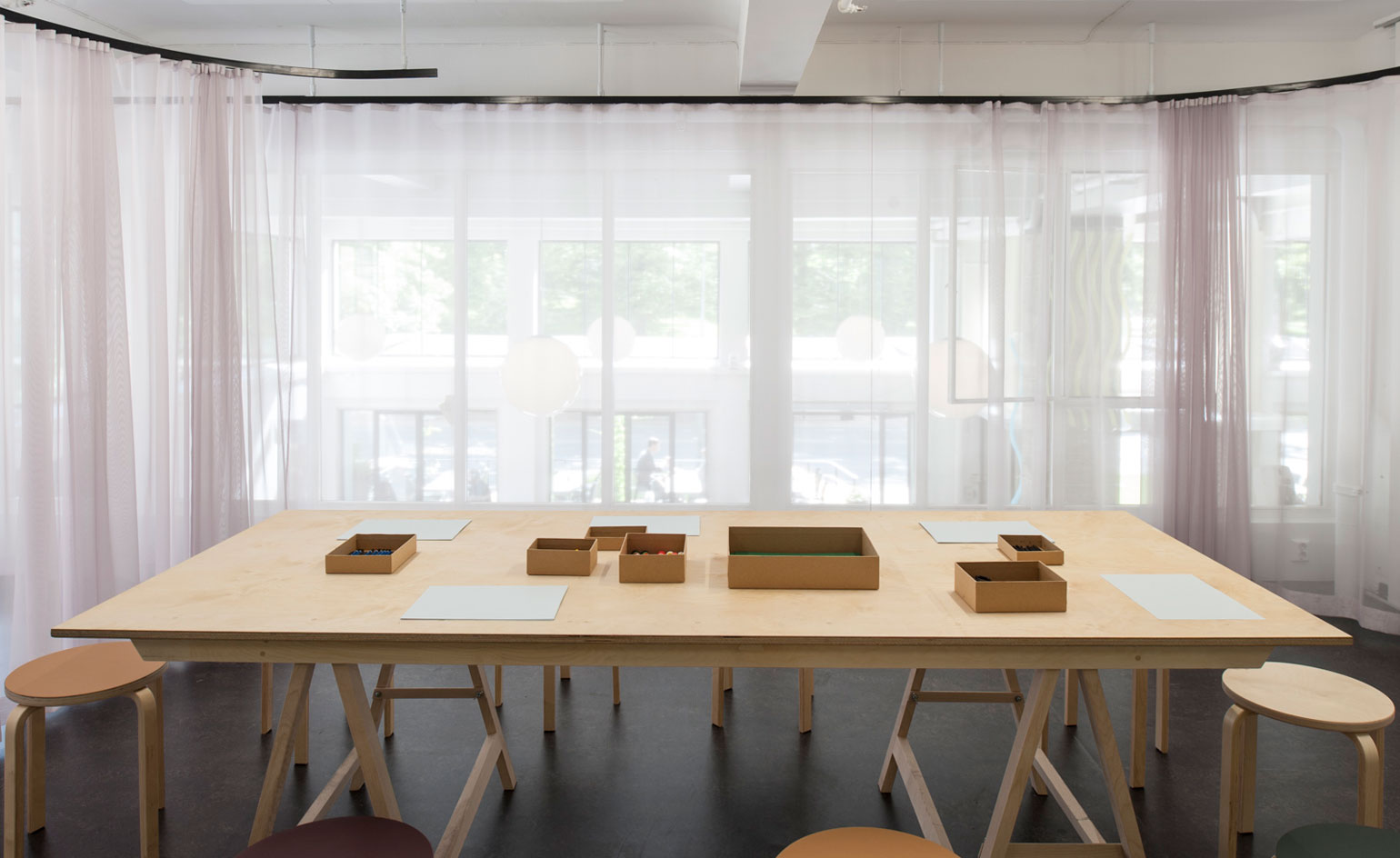
The curtain rail's soft curves are inspired by the building's original style and its era
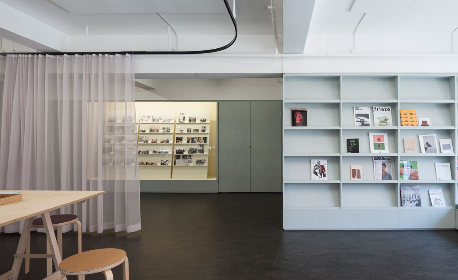
The blue walls reference the original colours used inside the functionalist Kunstnernes Hus, while the linoleum floor is a continuation of the floor found throughout the existing 1930s gallery space
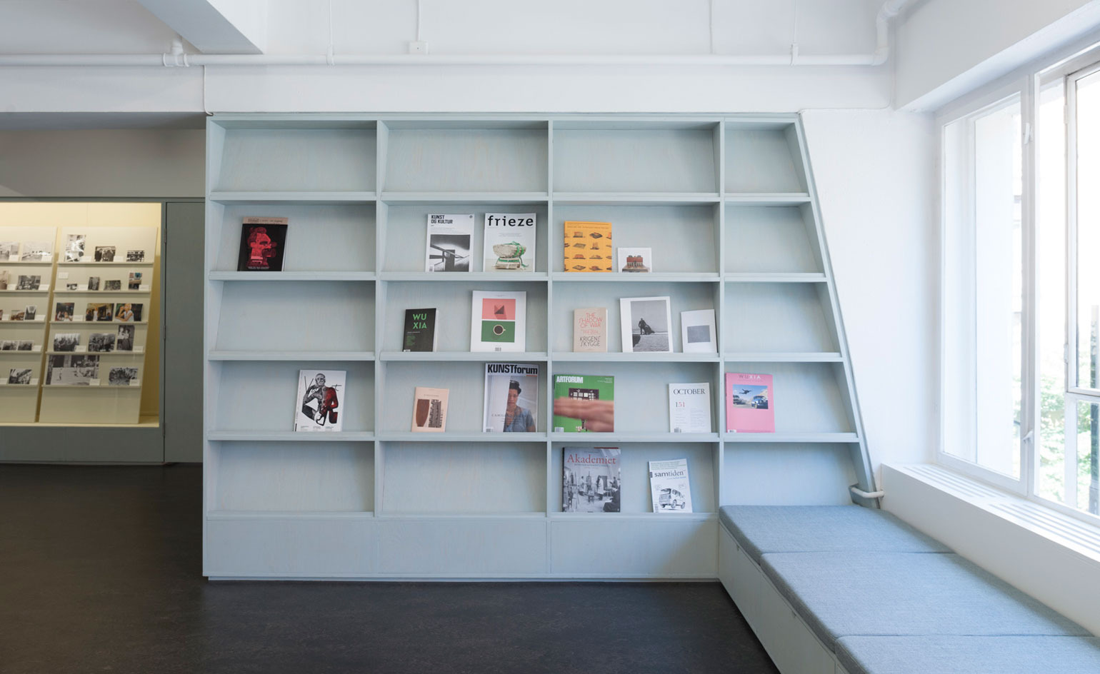
The reading area makes the most of the natural light with a long bench set underneath the large window
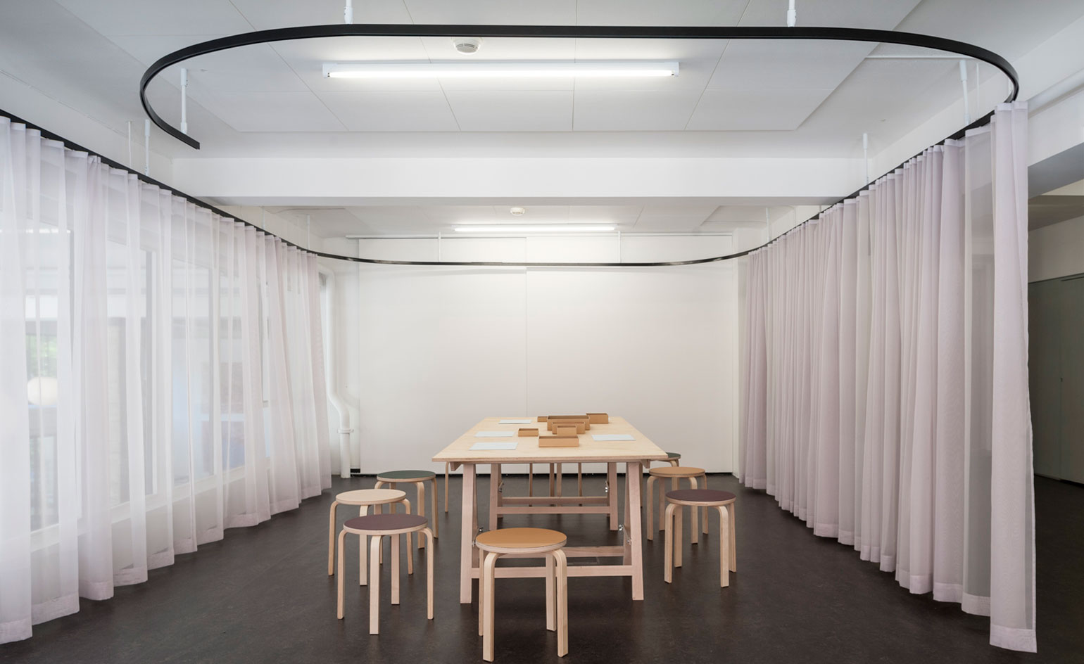
The curtain can be completely closed to create a private space for the workshops without completely shutting people off from their inspiring surroundings
ADDRESS
Atelier Felix
Wergelandsveien 17
0167 Oslo
Norway
-
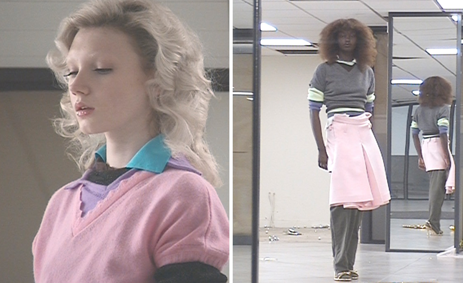 All-In is the Paris-based label making full-force fashion for main character dressing
Part of our monthly Uprising series, Wallpaper* meets Benjamin Barron and Bror August Vestbø of All-In, the LVMH Prize-nominated label which bases its collections on a riotous cast of characters – real and imagined
By Orla Brennan
-
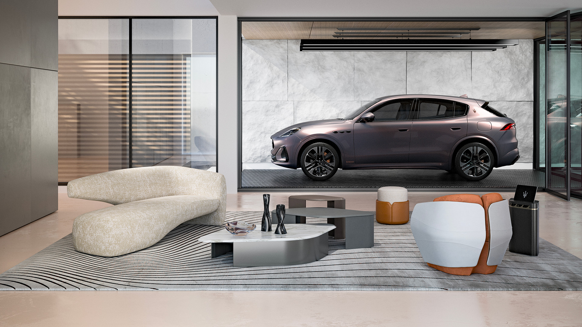 Maserati joins forces with Giorgetti for a turbo-charged relationship
Announcing their marriage during Milan Design Week, the brands unveiled a collection, a car and a long term commitment
By Hugo Macdonald
-
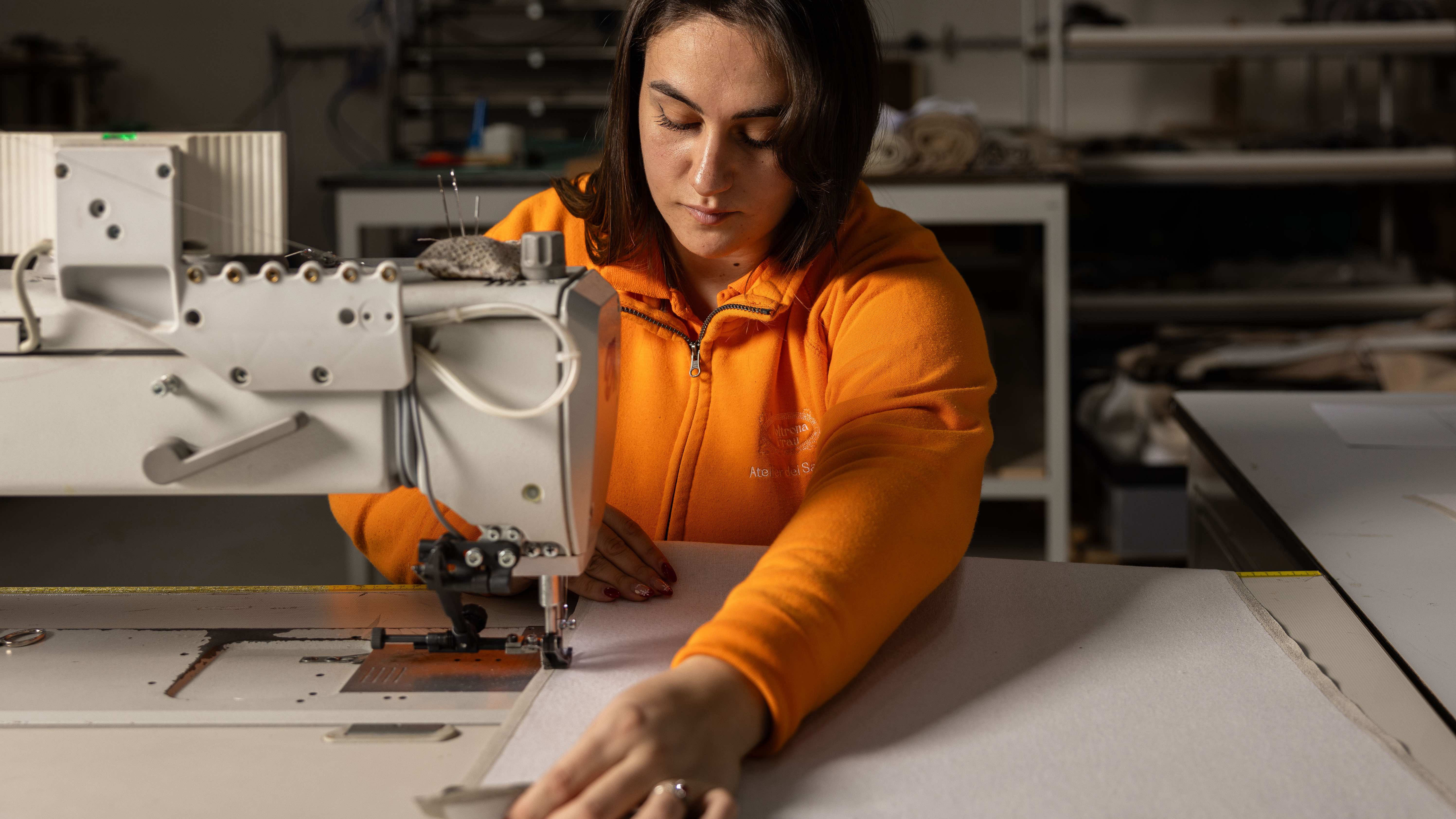 Through an innovative new training program, Poltrona Frau aims to safeguard Italian craft
The heritage furniture manufacturer is training a new generation of leather artisans
By Cristina Kiran Piotti
-
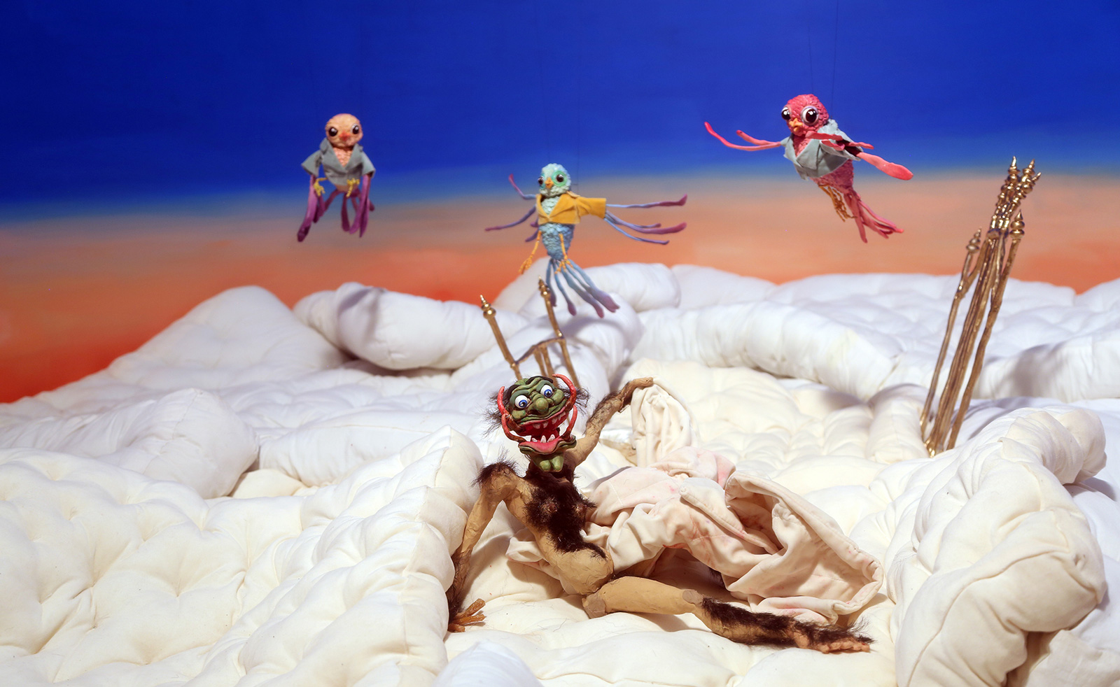 The dark fairytales of Nathalie Djurberg and Hans Berg come to life in Norway
Nathalie Djurberg and Hans Berg's exhibition ‘Death or Eternal Delight’ has now opened at Galleri F15 in Norway
By Emily Steer
-
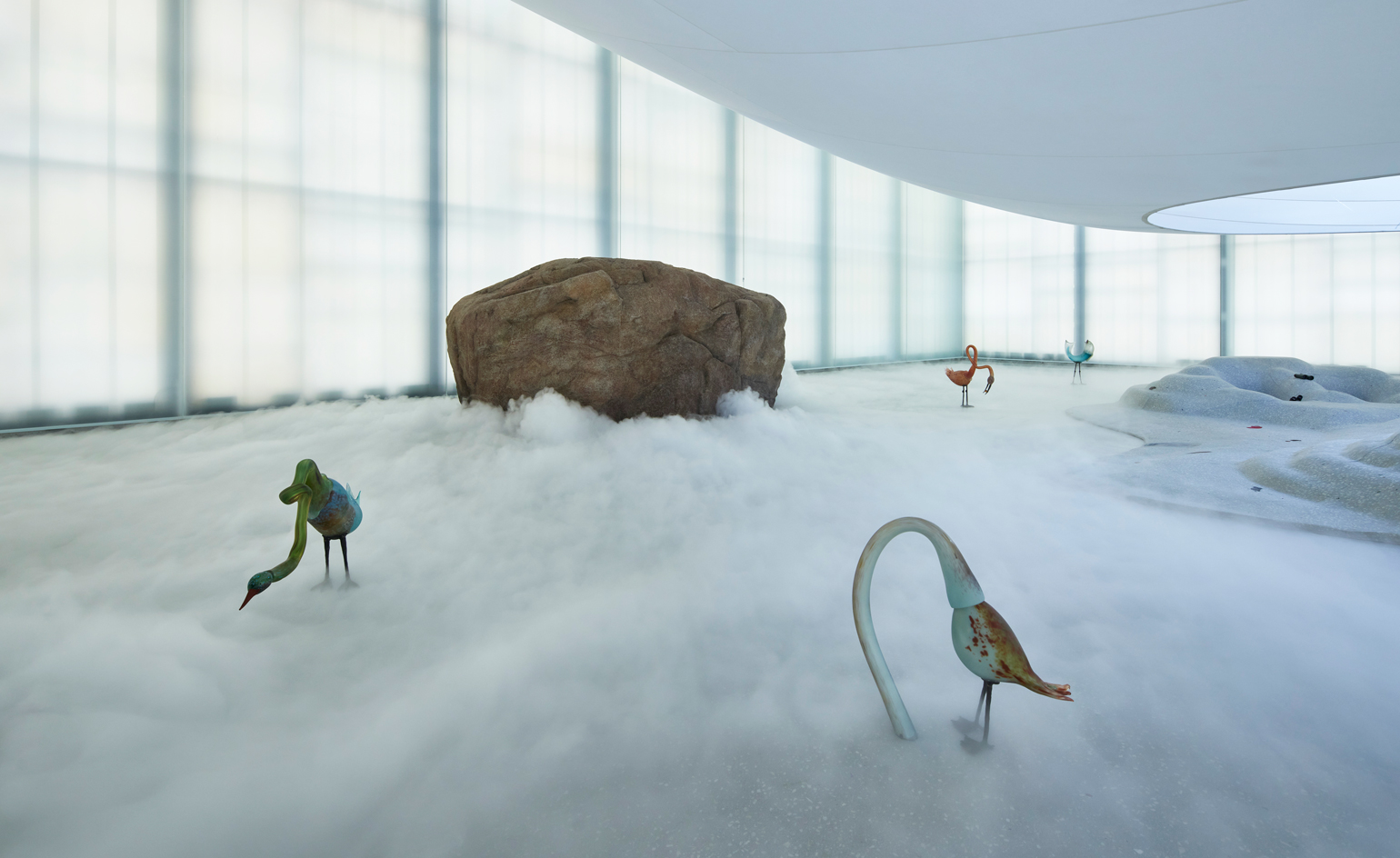 Laure Prouvost unveils inaugural Light Hall commission at National Museum in Oslo
The Turner Prize-winning artist takes over the cavernous space atop Oslo’s new National Museum with an ethereal installation
By Will Jennings
-
 A tantalising tale of art and Gothic horror in Norway’s Arctic archipelago
We visit the 2022 edition of the Lofoten International Art Festival (LIAF) in Norway's Arctic archipelago, an edition filled with myth, politics and Gothic horror.
By Louise Long