Geometry meets natural beauty at Baier Bischofberger’s Lake Zurich house
Receive our daily digest of inspiration, escapism and design stories from around the world direct to your inbox.
You are now subscribed
Your newsletter sign-up was successful
Want to add more newsletters?
Husband and wife architects, Florian Baier and Nina Baier-Bischofberger, are both highly skilled parametric designers. But, unlike other parametricists, their mathematics tends to mirror nature’s geometries, which means that Baier Bischofberger Architects aim to make buildings that are not alien spaceships within the landscape, but rather form a liveable part of it. Their latest completed project is a family house near their hometown of Zurich.
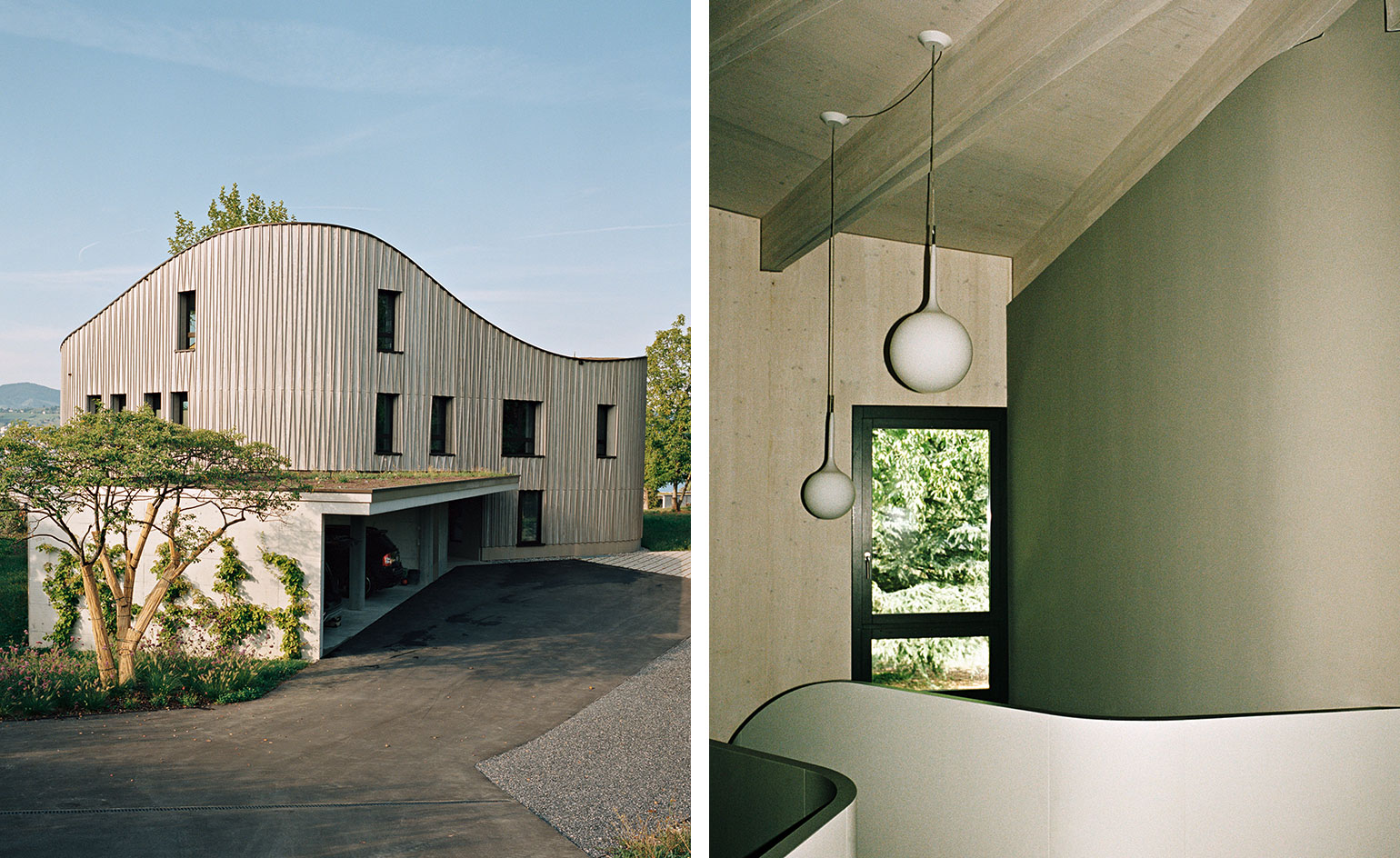
The property is in Männedorf, on the edge of Lake Zurich in Switzerland. The clients are a couple with two young children, and the husband comes from a local family who own numerous plots in the area because they were once farmers there. The clients’ chosen plot used to be an orchard and sheep meadow. It sits on a little plateau with a gentle slope down towards the lake, offering panoramic views across the lake towards the Alps.
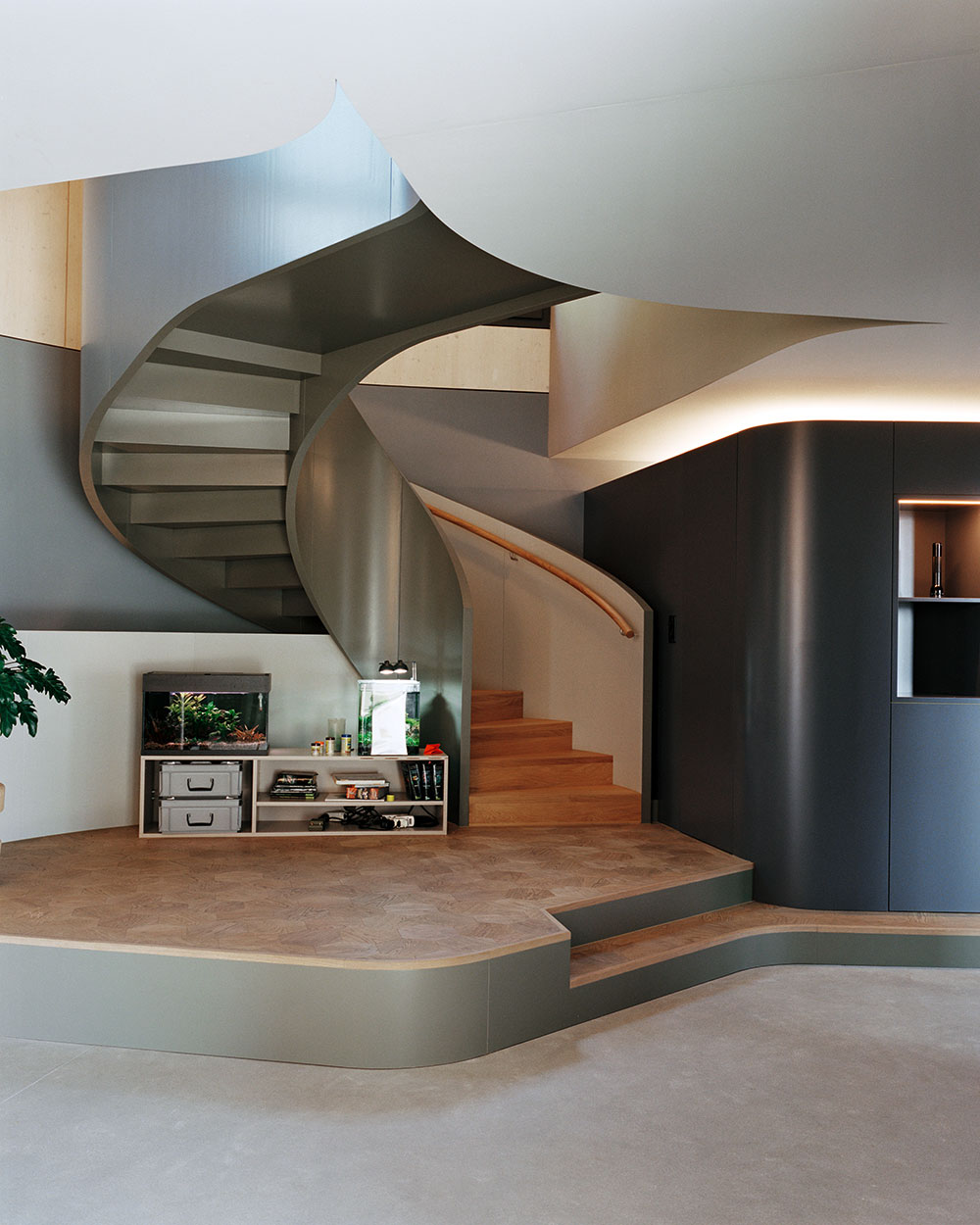
The spiral staircase is irregular in form and echoes the rounded corners of the house.
‘What is quite unusual, in the ever-densifying suburbs here, is that this family is not really interested in building on their land,’ says Nina. ‘They could have fully developed the plot, built apartments, and would never have had to work again,’ adds Florian. ‘But instead they decided to build something nice for themselves and keep that quality of wide-open space.’
The heart of both plot and house is a tree. For the garden, the architects enlisted the help of landscape architect Enzo Enea, who planted a large plane tree in the centre, around which the courtyard, and then the house itself, are wrapped. ‘Over time, the house and the tree will grow to become one,’ says Nina. The rest of the garden has been kept mostly as meadow, with some formal planting nearer to the house.
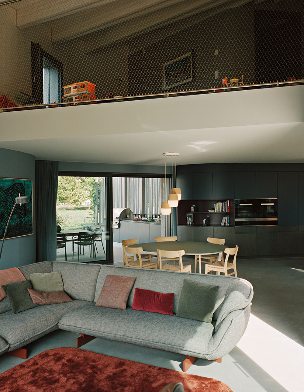
In the living room is a ‘Beam’ sofa by Patricia Urquiola, while the rug was designed by Nina Baier-Bischofberger and custom-made by Spanish company Gan.
There were a number of considerations that helped define the asymmetric C-shape of the structure. One involved looking at the landscape and the internal zoning defined by paths across the property; another was the exposed position of the house because of the size of the grassy plot around it. ‘A courtyard house allows you to communicate around that courtyard and give you privacy as well,’ says Nina. The courtyard is open at the back, facing towards the lake and framing the view. The house also has an undulating roof, which reflects the surrounding landscape and ‘brings a more exciting shape into the interior’.
The house spans 350 sq m and contains three bedrooms with an additional one-bedroom guest apartment. There is no air-conditioning; passive shading, good insulation and natural ventilation keep the house cool in hot weather. There’s also a spiral staircase, almost baroque in its grandeur, and a double-height living space with a picture window. On the top floor, a large transparent net plays the role of a traditional balustrade, helping to maintain visual and spatial connections. A more secluded master bedroom looks across the lake to the mountains.
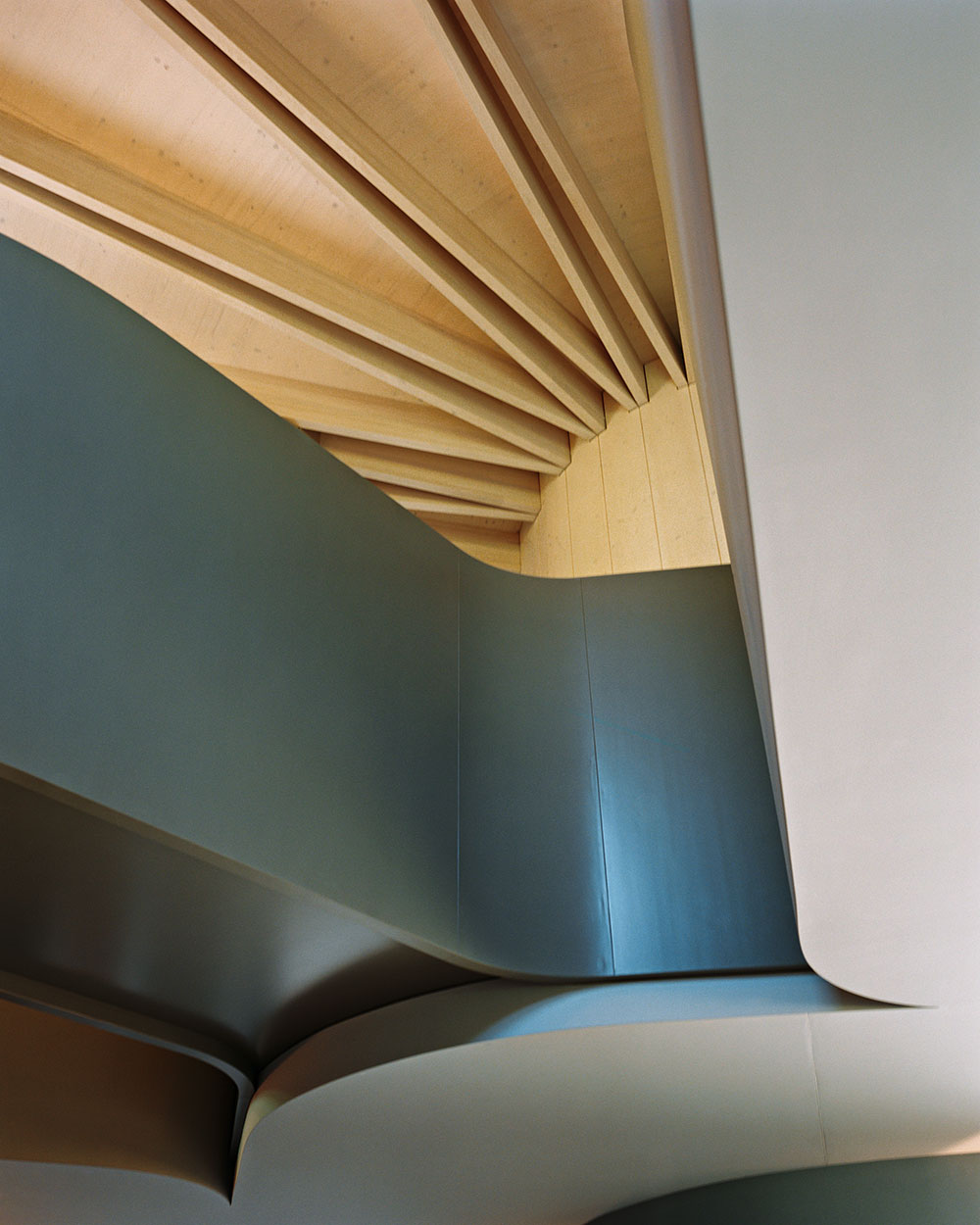
The exposed laminated ash beams in the ceiling show evidence of the house’s complex geometry.
The main timber structure was prefabricated off-site and took about three weeks to erect. ‘The geometry is quite complicated,’ says Florian. ‘The carpenter used CNC milling machines to prepare everything, and an on-site 3D model was used to help assemble the pieces.’ The zigzag forms of the exposed laminated ash beams in the ceiling are a strong feature throughout. Their shape responds to the house’s complex geometry and allowed for triangulation of the roof structure so the architects could always work with flat planes.
The pattern of the spruce façade, treated to give the weathered silver sheen of older wood, is reminiscent of traditional barn cladding. Up close, the detailing is far from rustic – it’s immaculate Swiss precision, like the pockets on a perfectly tailored pinstriped suit. ‘It’s quite subtle and you don’t consciously notice it, but every angle is different, which means that, despite the fact the roof is undulating up and down, the cladding always meets at the roof line,’ says Florian. ‘It’s not just stuck on; it really reacts to the shape of the building.’
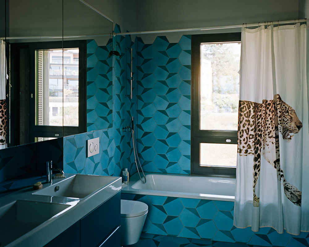
The cement tiles in the bathroom are the same shape and size as the hexagonal parquet flooring on the top level.
Another nod to the complex geometry of the house is the tessellated hexagonal European oak parquet flooring on the top level. ‘We saw this pattern in the shoe department of Selfridges in London years ago and loved it,’ says Nina. ‘And because this house is full of constantly changing angles, this is the perfect shape to accommodate that.’ Nina also came up with an interior palette of blue, green, aubergine, yellow and warm grey, and she chose many of the fabrics and furnishings. ‘It was important that these colours and shapes all fitted together because of the visual interconnectedness of the interior,’ she says.
The house is far more complex and high-tech than it looks. It also has a rich mix of materials, colours and textures flowing through its curvy spaces, but both aspects are executed in such a subtle way as to never feel overbearing. It is a fine example of parametrics being put to the service of the user, rather than just being there for visual effect. ‘People who have visited tell us that, although it is a big house, you never feel lost in it, which means we have achieved a good balance between intimacy and generosity of space,’ says Florian. ‘I think that’s quite a nice compliment.’ §
As originally featured in the December 2018 issue of Wallpaper* (W*237)
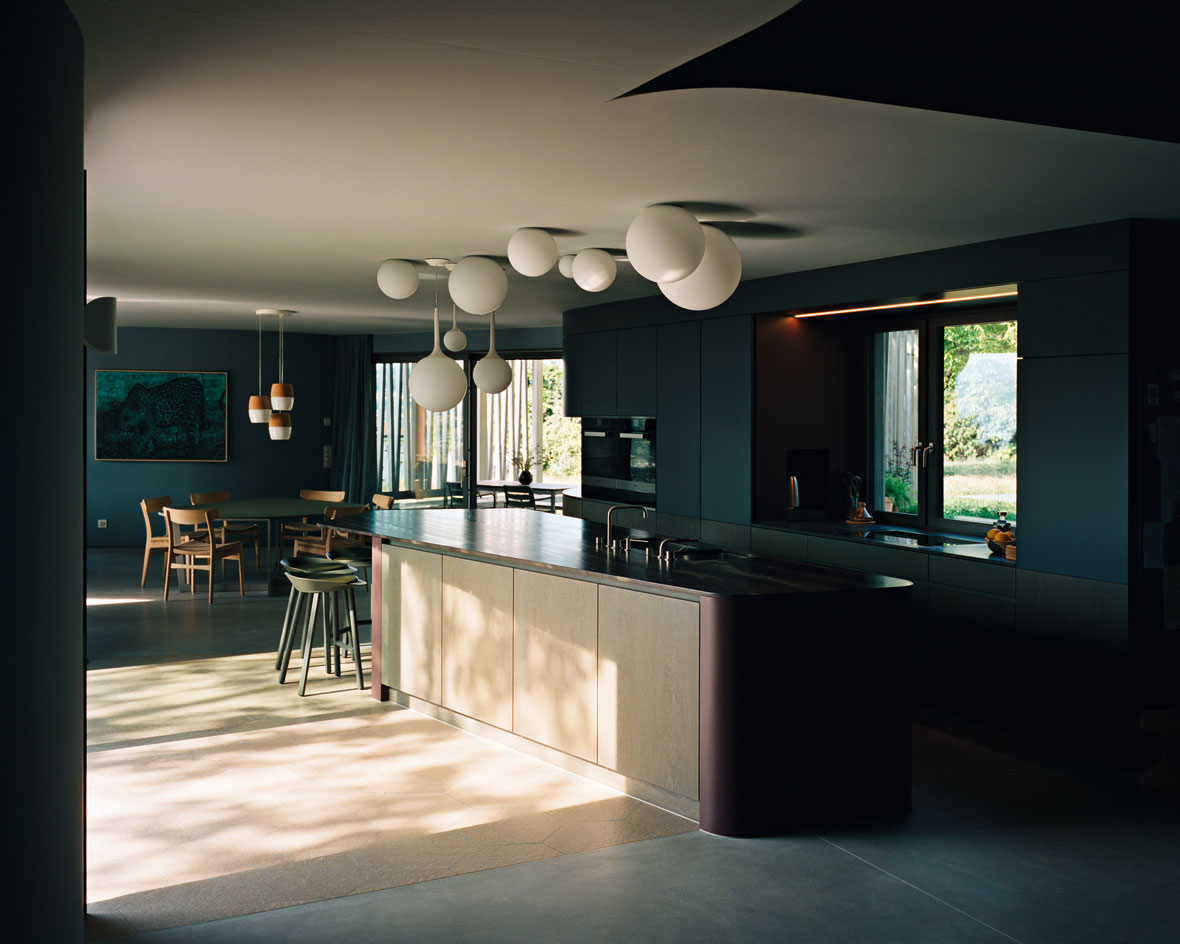
The kitchen features glass ball lighting by Artemide and a counter made of Brazilian bamboo marron VC granite, the only non-regional element in the whole building.
INFORMATION
Receive our daily digest of inspiration, escapism and design stories from around the world direct to your inbox.
For more information, visit the Baier Bischofberger Architects website