Barozzi Veiga create contrasting monochrome apartments
Barcelona-based architecture duo Barozzi Veiga have created a dark and moody, and a light and bright design, respectively, for their own homes
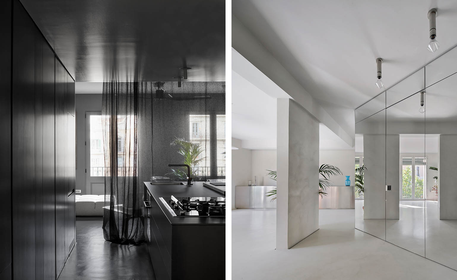
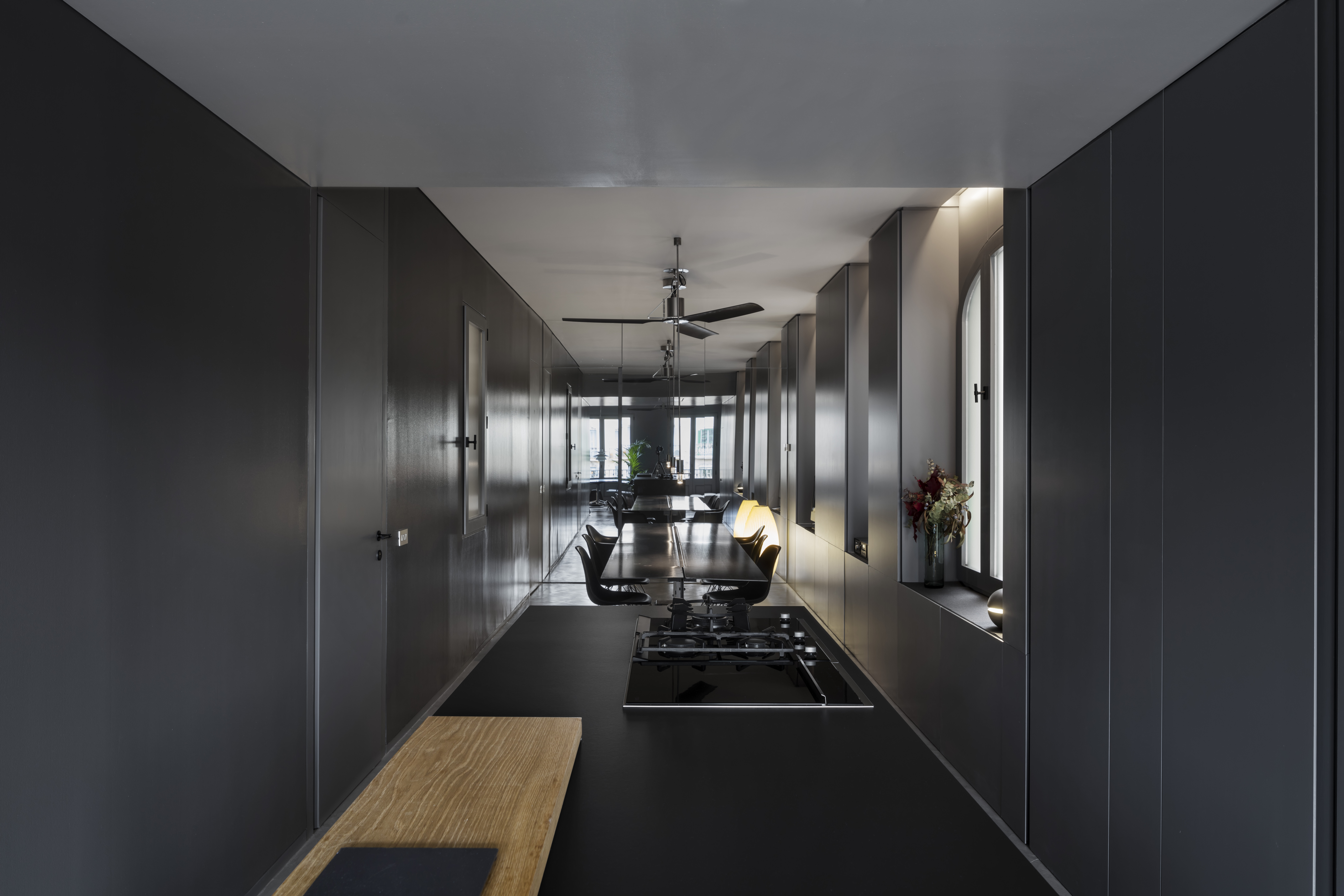
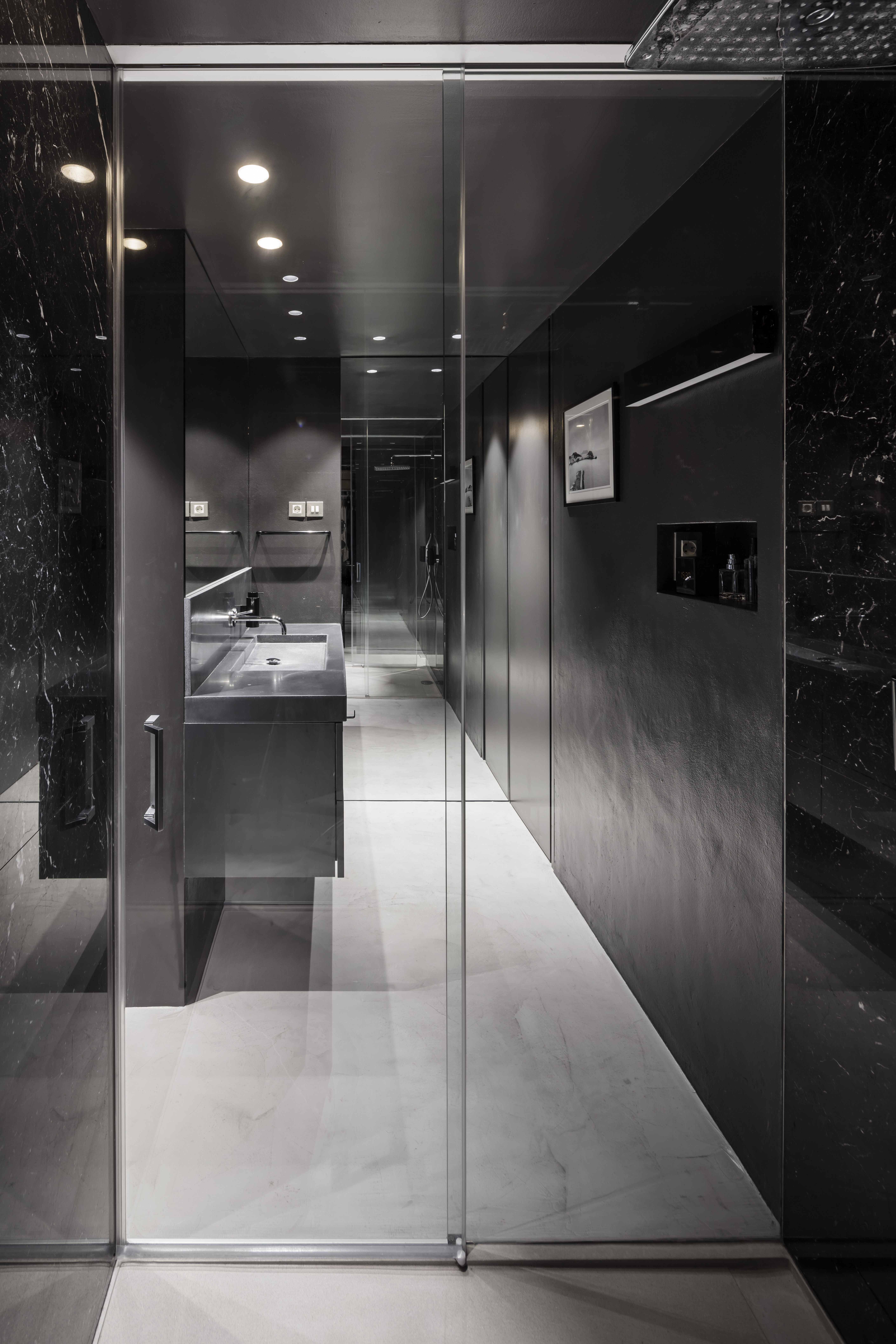
Alberto Veiga and Fabrizio Barozzi of Barcelona-based architects Barozzi Veiga, have been behind internationally acclaimed work such as Tanzhaus, a dance theatre and incubator in Zurich, and Chur’s Bündner Kunstmuseum. Their style is defined by clean, almost minimalist designs with an emphasis on light, clever use of materials and a sense of calm. Now, the dynamic duo is inviting us into their newly completed homes in Barcelona, a pair of monochrome apartment interior design works that appear contrasting – Veigas' is dark and moody, while Barozzi's appears brighter and lighter – but in reality, share common ground. The two architects have joined us to discuss their concepts, interiors work versus building architecture, their project at the Greenwich Peninsula Design District, and more.
W*: You share a professional life; did you have any influence over the design of each other's apartment?
FB: Not really. You might notice that there is a similar working method, but they are very different projects – we both worked with our respective partners.
AV: Of course, we have been working together for more than 10 years and there is a certain natural affinity in what attracts us – certain similarities in what we like or in how we would solve a problem – but our apartments were designed independently.
W*: Could you tell me a bit more about the designs?
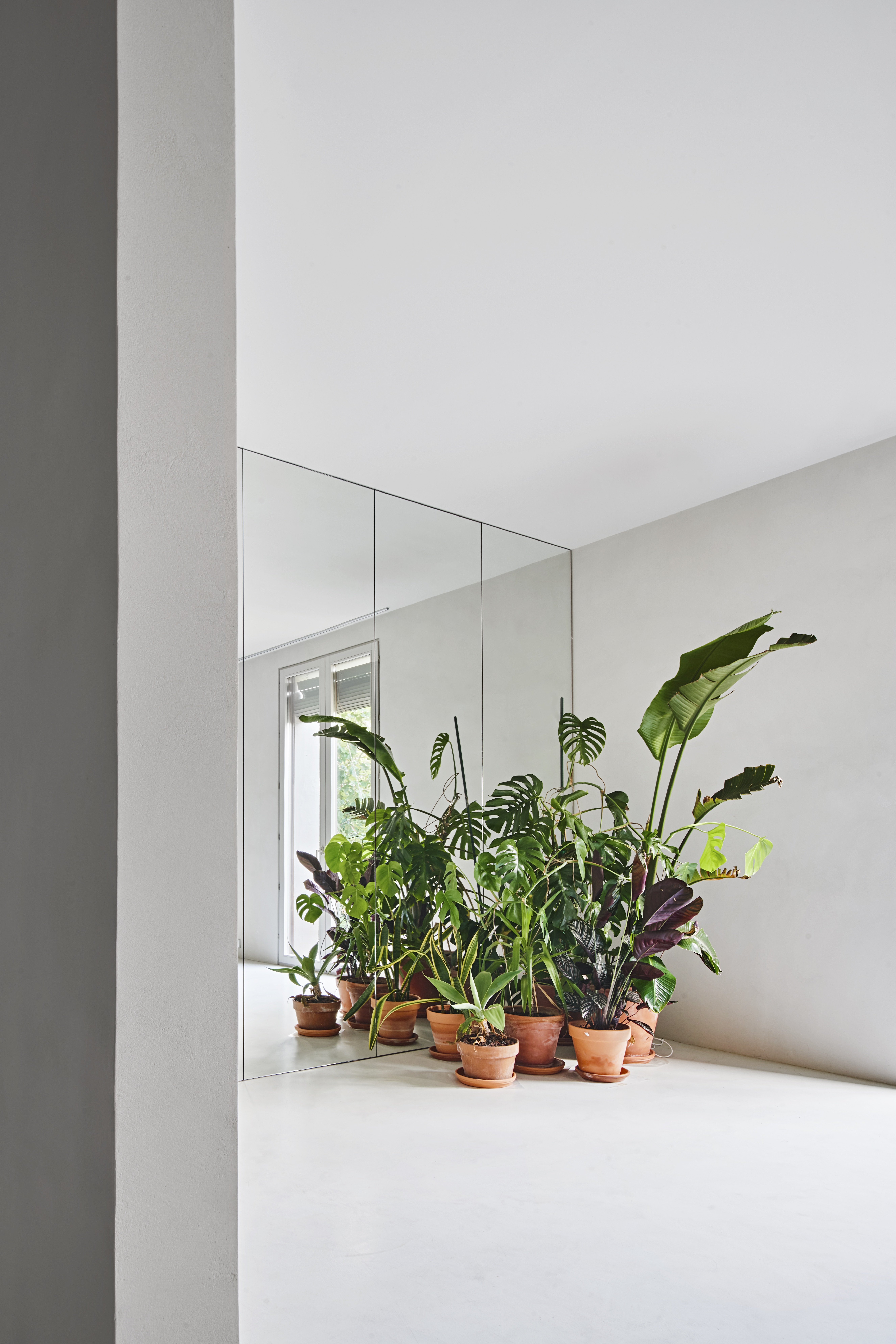
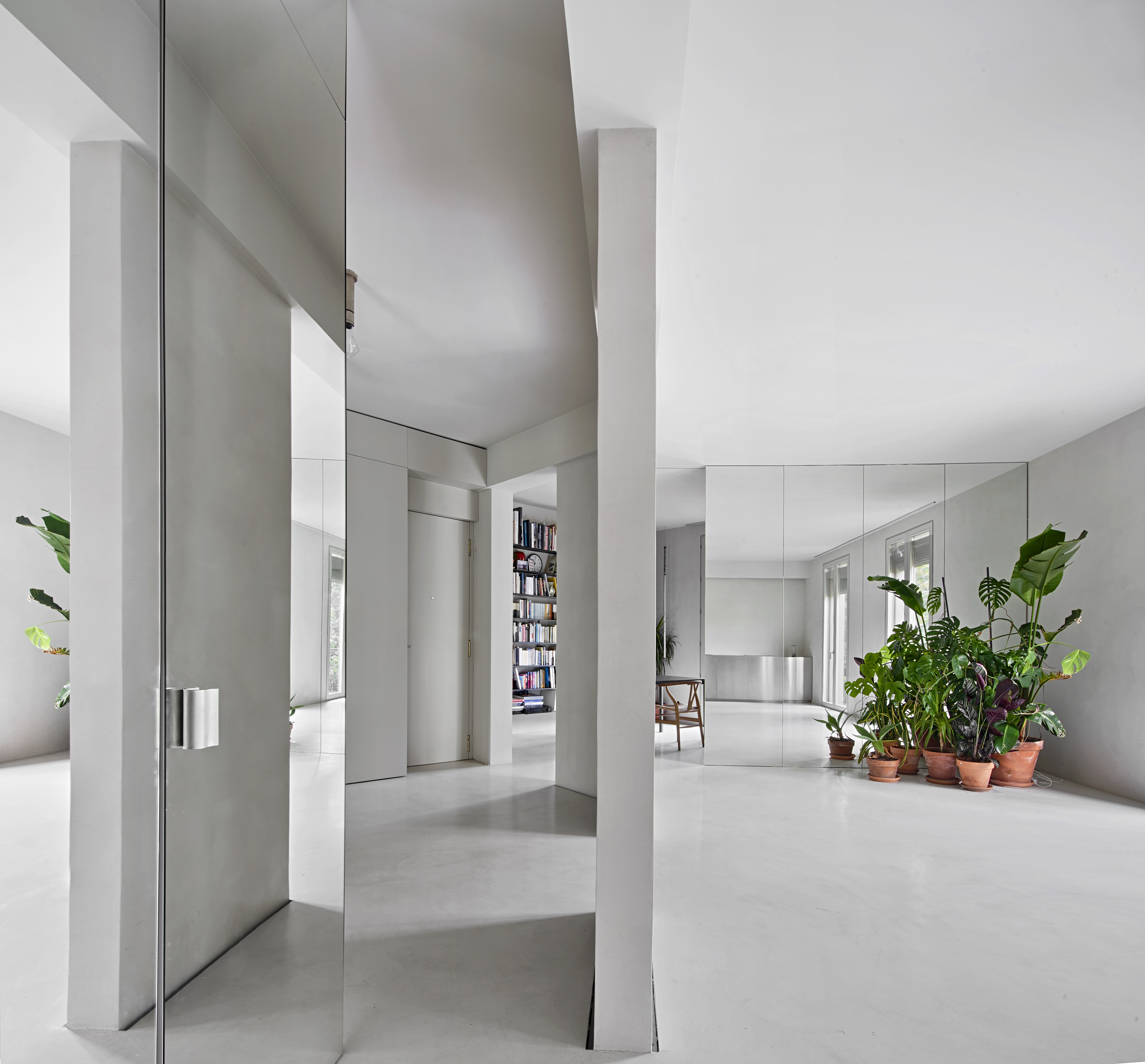
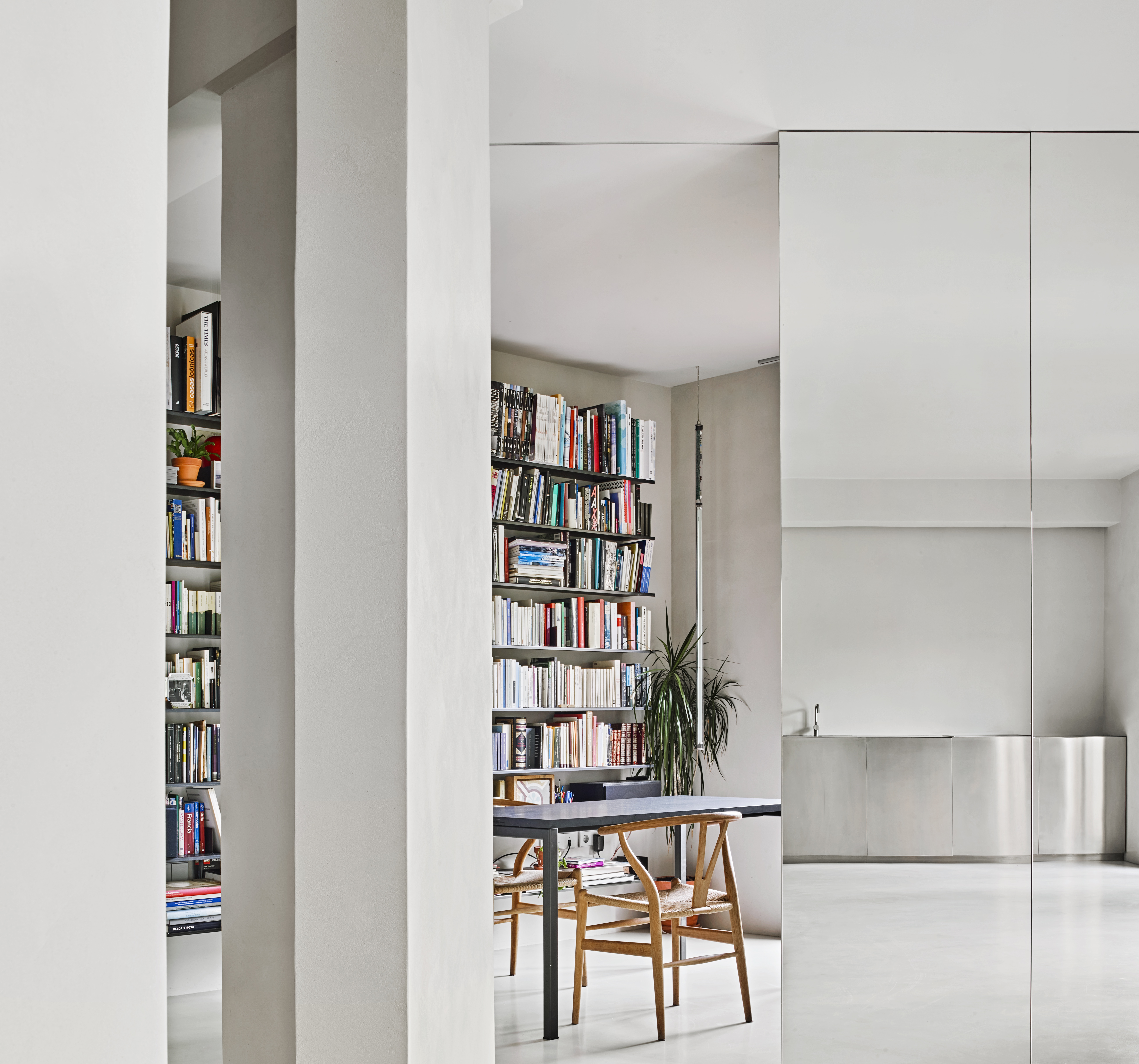
FB: In my case, the apartment is small but it’s well positioned, so it gets sunlight throughout the day. The goal was to emphasise the light and bring luminosity to the innermost part of the space. In parallel, we pursued the idea of a fluid, continuous, open-plan layout to maximise the sq m available.
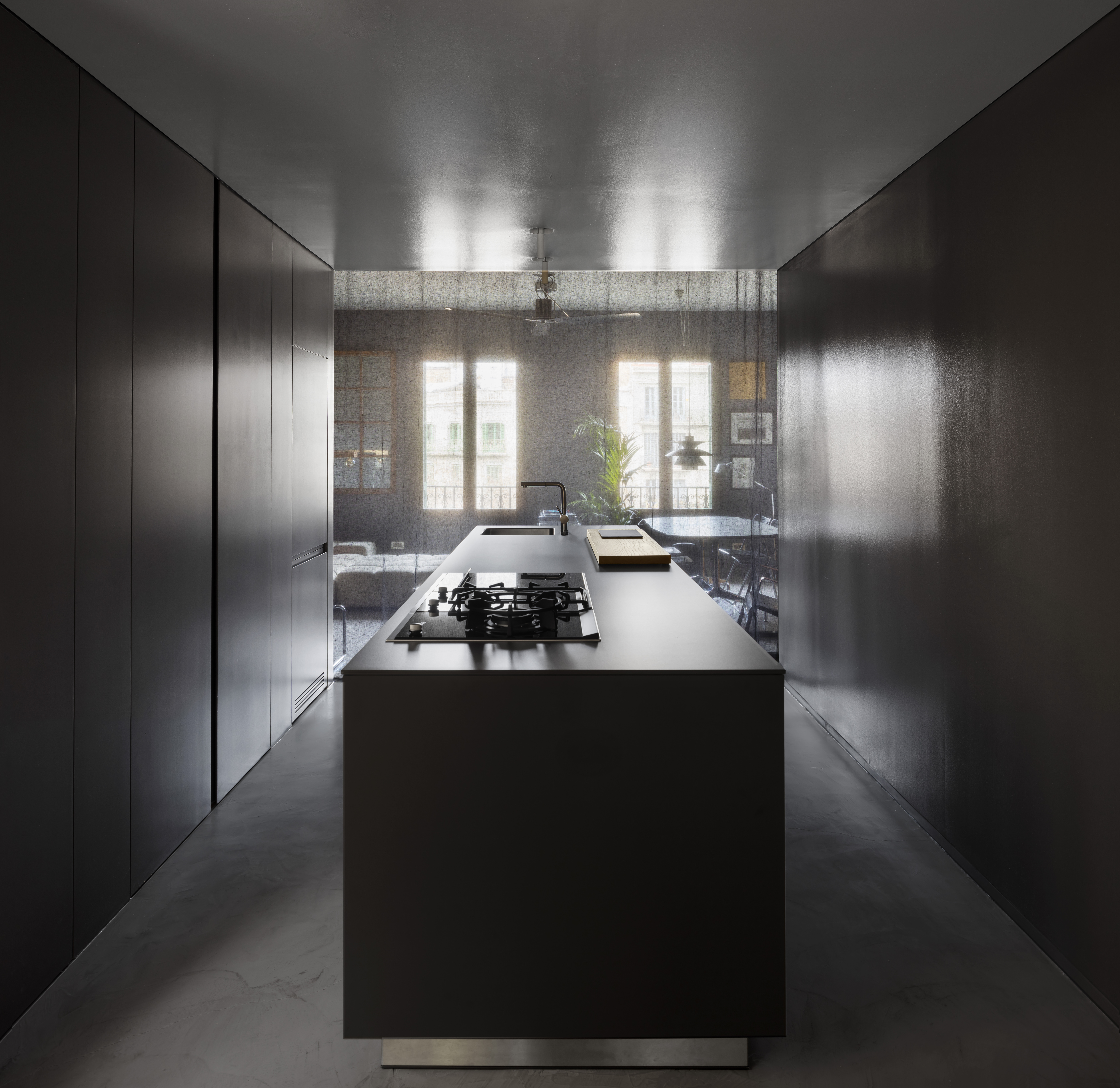
AV: The original typology of my apartment is a very typical one here in Barcelona. It consists of a sort of elongated, fragmented plan, and my goal was to transform this into a cohesive, expressive interior. The renovation pivots on the idea of getting the most from each fragment, to create a well-defined and bright series of rooms, with specific interventions to enhance the experience of the space.

W*: What materials did you use?
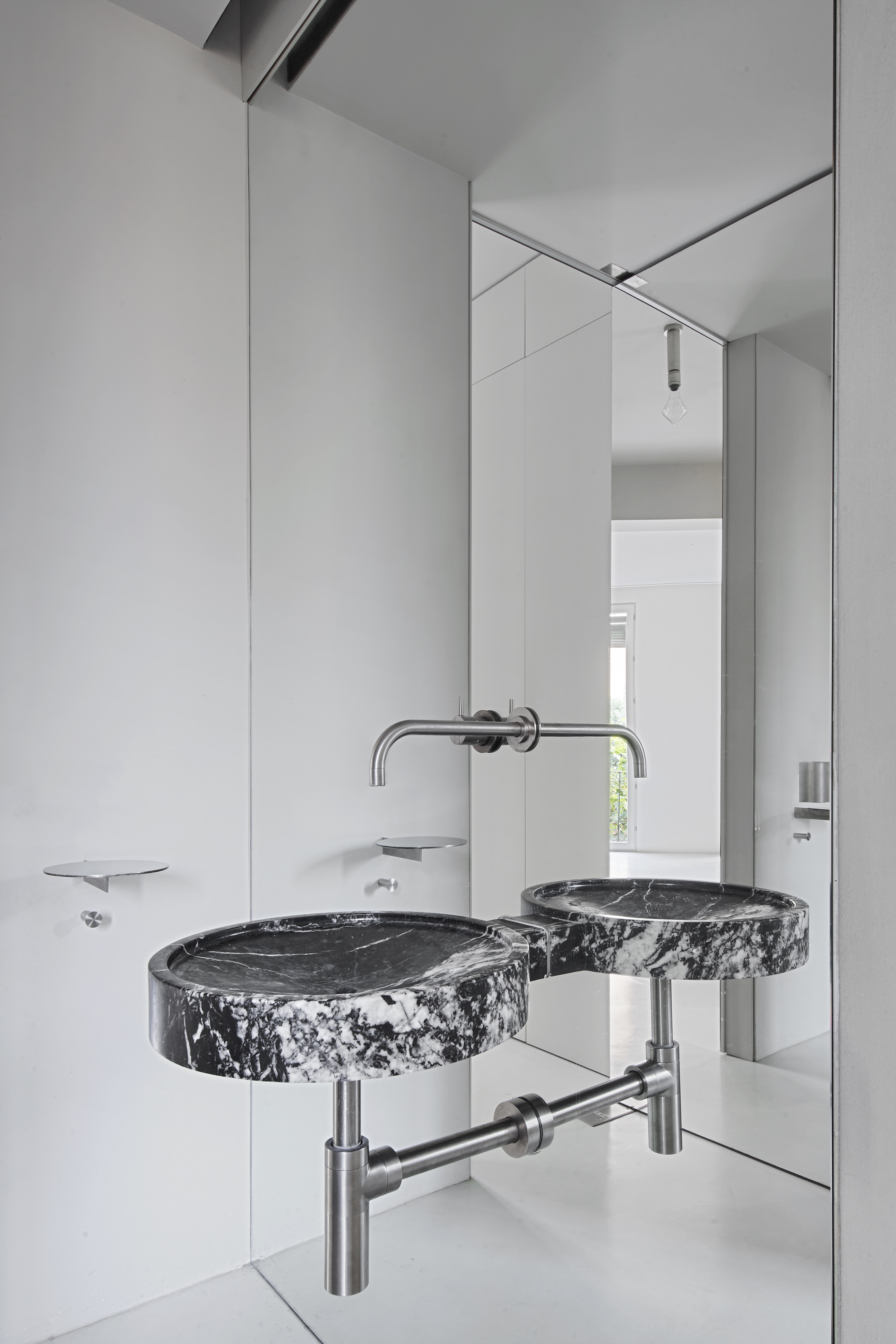
FB: We used a subtle material palette and light grey tones to create a sense of spaciousness. All the slabs have been structurally refurbished and resin cement was used to finish the heated floor. The vertical areas are characterised by slightly textured plasters or mirrored surfaces, which reflect the sunlight brought in through floor-to-ceiling windows.
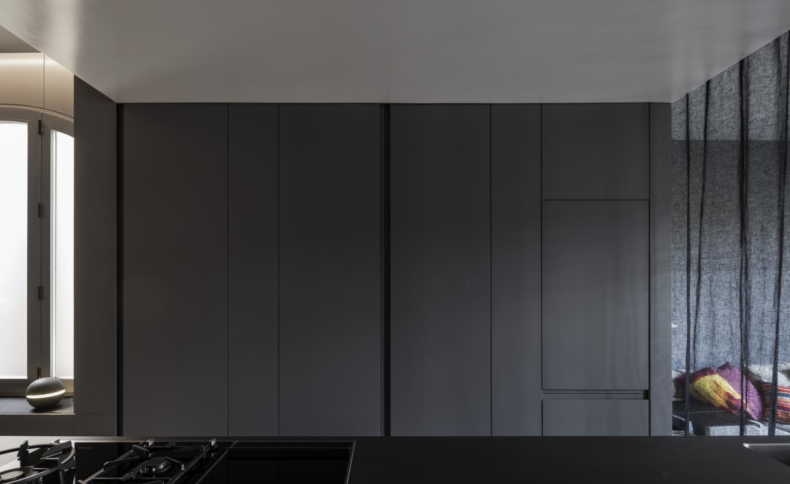
AV: We chose materials and textures that created the simplicity and comfort you need from a live/work space. The apartment’s atmosphere is defined by painted wood and a continuous micro-cement floor. Some reflective surfaces are used to symmetrically mirror the main spaces, and different light gradients and grey nuances are the results of the dark sheer curtains, which can be used to divide the main rooms.
W*: Had you designed your own space before?
FB: No, this was the first time I have designed a space for myself and my partner, Cecilia, who carried out a substantial part of the work.
AV: It’s the same for me. Maria and I developed the first phases of the project together, and then she took care of the whole construction phase.
W*: Are there any parallels in the two apartment projects?
FB: Both the apartments belong to the same district of the city – amid the classic block architecture of Eixample. Apart from that, they differ. My apartment faces the street on a chamfered corner of the block, whereas Alberto’s crosses the block, facing both the exterior and the courtyard.
AV: Both projects represent an emerging trend here in the city – the transformation of the classic Eixample residential typology to contemporary live/workspace. The two designs have practically nothing in common, but they both begin by drawing on the main features of the building – such as the structure and the disposition of holes in the façades – to obtain a flexible space, characterised by these principal architectural elements.
W*: I can see similarities in the approach, even as they appear different, almost direct opposites. How does that translate into your joint work?
FB: Both the spaces are quite neutral, with different features determined by the size and the type of plan. While working here at the office, we sometimes have divergent opinions but we always look for a certain balance between our different approaches.
AV: We often have different points of view but we always start from a shared vision, a common ground that guides us throughout all the conversations about our projects and steers our decision making.
W*: The apartment interiors feel different, but there are common themes there – would you agree?
FB: Through a series of precise and clean interventions, my apartment design seeks to resolve the different inclinations of the corner typology to create a simple, neutral space where light is the dominant element. In that sense, I agree – there is something there reminiscent of our work at the office.
AV: Our choices about the definition and materiality of the space are rooted in the objective of taking full advantage of the typology. In my case, reflective materials, continuous surfaces and homogeneous tones are responses to the aim to emphasise light and maximise the dimensions. The two apartments might have some similarities because they start from similar problems, but in the end, each design is always a new and different story.
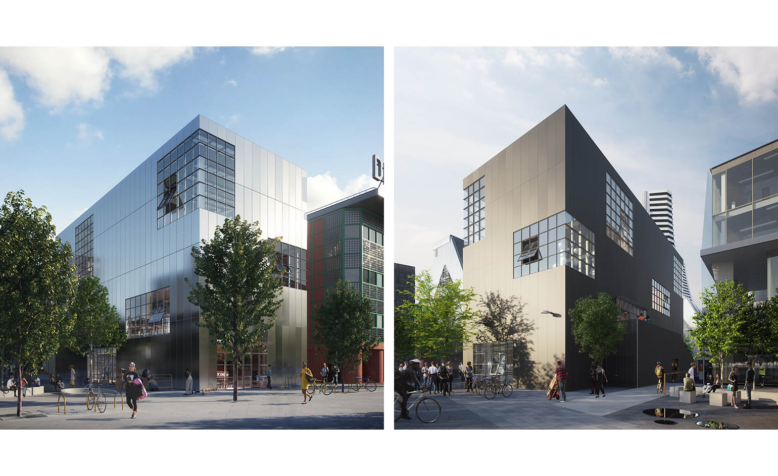
W*: Do you approach differently interiors to larger architectural work, such as the projects coming up in the Design District?
FB: I don’t think the approach is very different. There are always some common themes and a common way of proceeding in the development stage of all our projects. Each time, what makes the difference are the client and the context in which we’re working.
AV: If it’s about designing an interior, rehabilitating an existing building, or presenting a new construction, there is always the same challenge: proposing a space with the appropriate character.
W*: Speaking of the Design District, when is it completing, and what else do you have coming up?
FB: Despite all the difficulties associated with Covid-19 that have characterised the past year, our two buildings in Design District are indeed due for completion and we are looking forward to visiting the new development as soon as we can travel again. They are due to open in spring, and we’re delighted that one of the buildings will be home to Ravensbourne University’s new Institute for Creativity and Technology. We are also working on other projects in London – still confidential, I’m afraid – and we’re hoping to keep on working on more exciting commissions in this special city. In parallel, our office is currently developing cultural projects in Belgium and in the United States, as well as participating in competitions all around the world.
INFORMATION
barozziveiga.com
Wallpaper* Newsletter
Receive our daily digest of inspiration, escapism and design stories from around the world direct to your inbox.
Ellie Stathaki is the Architecture & Environment Director at Wallpaper*. She trained as an architect at the Aristotle University of Thessaloniki in Greece and studied architectural history at the Bartlett in London. Now an established journalist, she has been a member of the Wallpaper* team since 2006, visiting buildings across the globe and interviewing leading architects such as Tadao Ando and Rem Koolhaas. Ellie has also taken part in judging panels, moderated events, curated shows and contributed in books, such as The Contemporary House (Thames & Hudson, 2018), Glenn Sestig Architecture Diary (2020) and House London (2022).
-
 Nikos Koulis brings a cool wearability to high jewellery
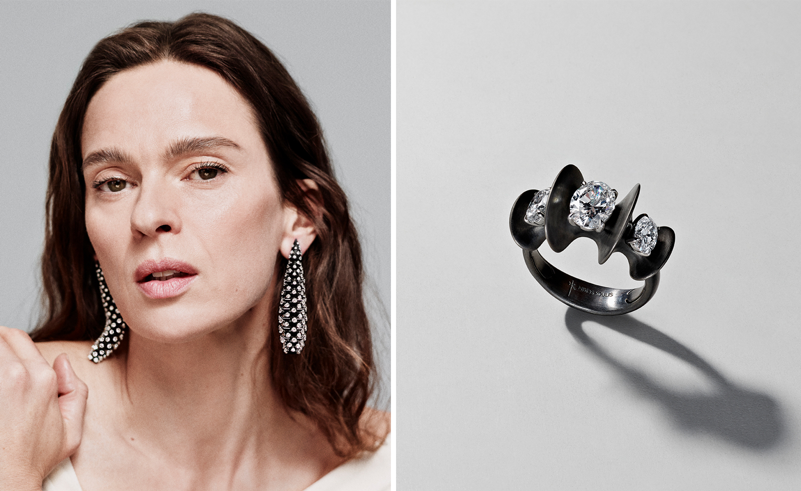
Nikos Koulis experiments with unusual diamond cuts and modern materials in a new collection, ‘Wish’
By Hannah Silver
-
 A Xingfa cement factory’s reimagining breathes new life into an abandoned industrial site
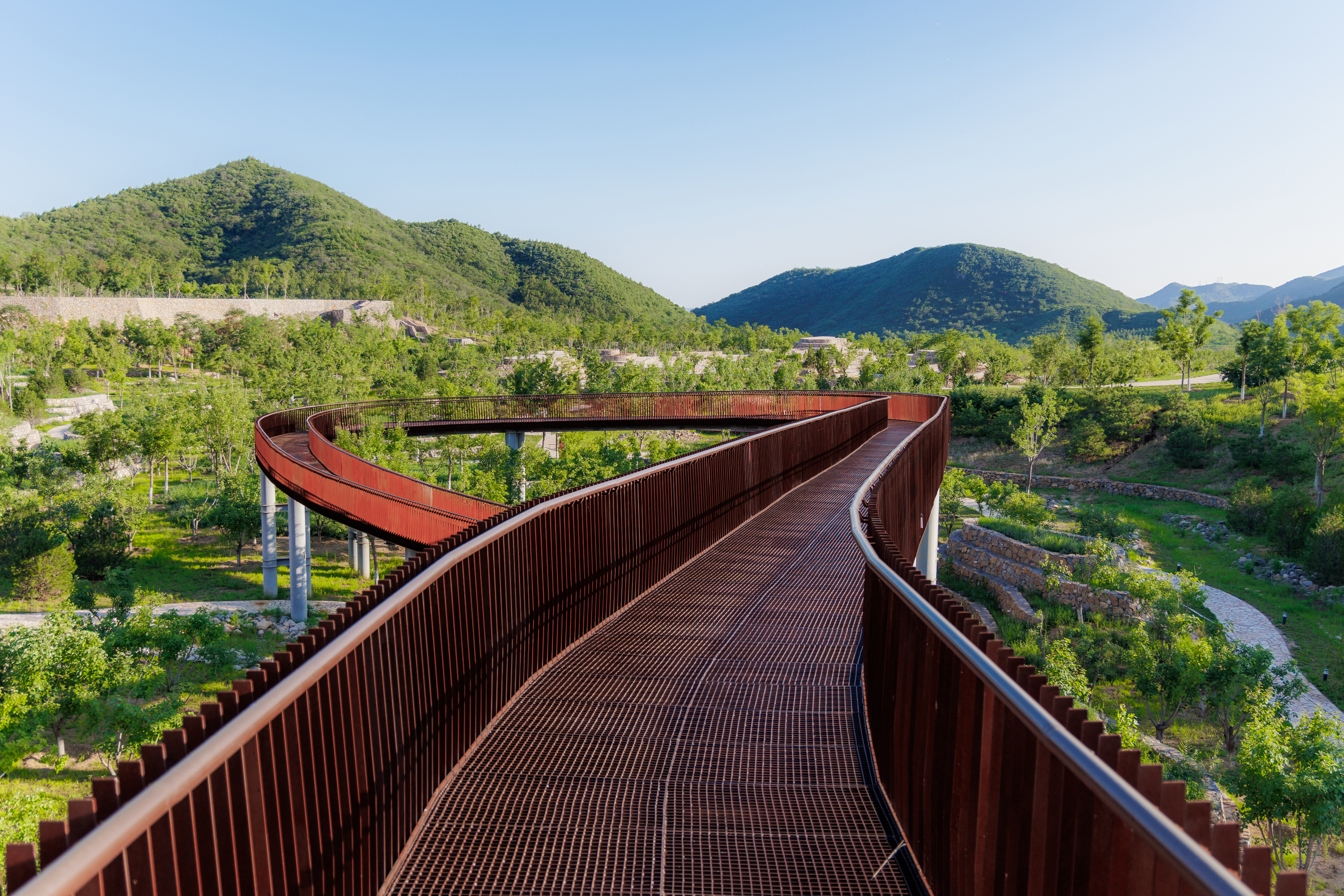
We tour the Xingfa cement factory in China, where a redesign by landscape specialist SWA Group completely transforms an old industrial site into a lush park
By Daven Wu
-
 Put these emerging artists on your radar
This crop of six new talents is poised to shake up the art world. Get to know them now
By Tianna Williams
-
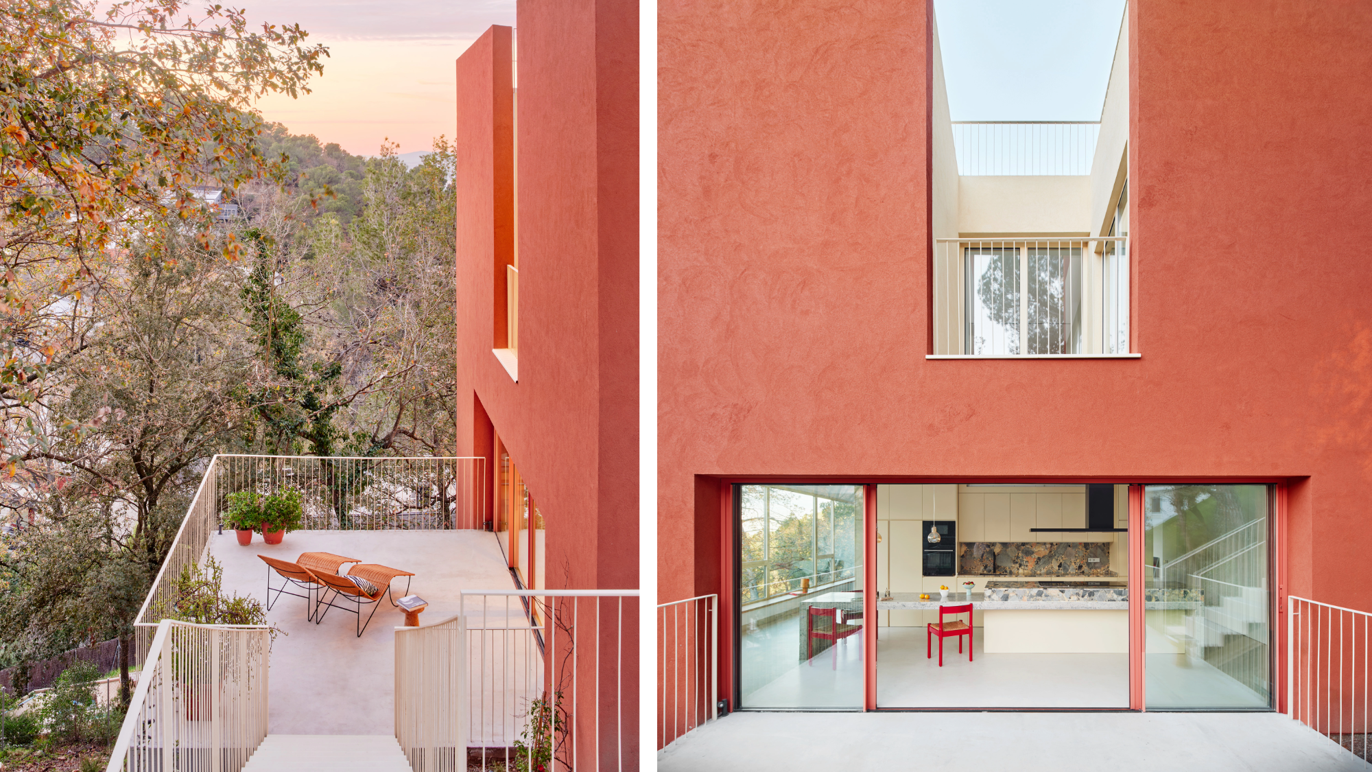 This striking Spanish house makes the most of a tricky plot in a good area
A Spanish house perched on a steep slope in the leafy suburbs of Barcelona, Raúl Sánchez Architects’ Casa Magarola features colourful details, vintage designs and hidden balconies
By Léa Teuscher
-
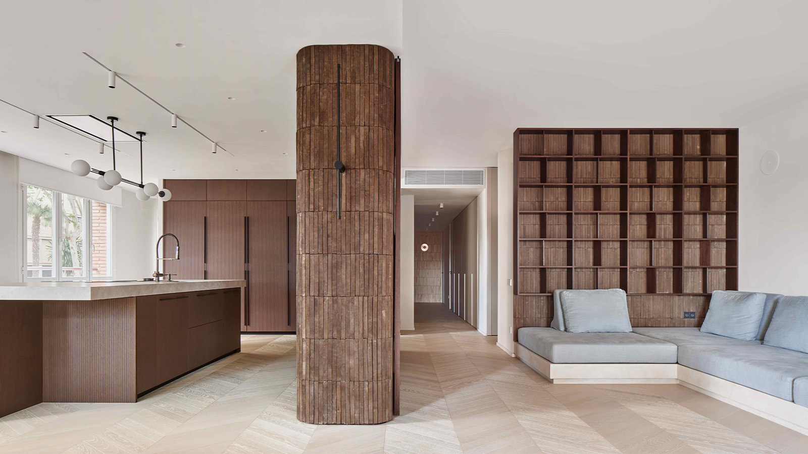 This brutalist apartment in Barcelona is surprisingly soft and gentle
The renovated brutalist apartment by Cometa Architects is a raw yet gentle gem in the heart of the city
By Tianna Williams
-
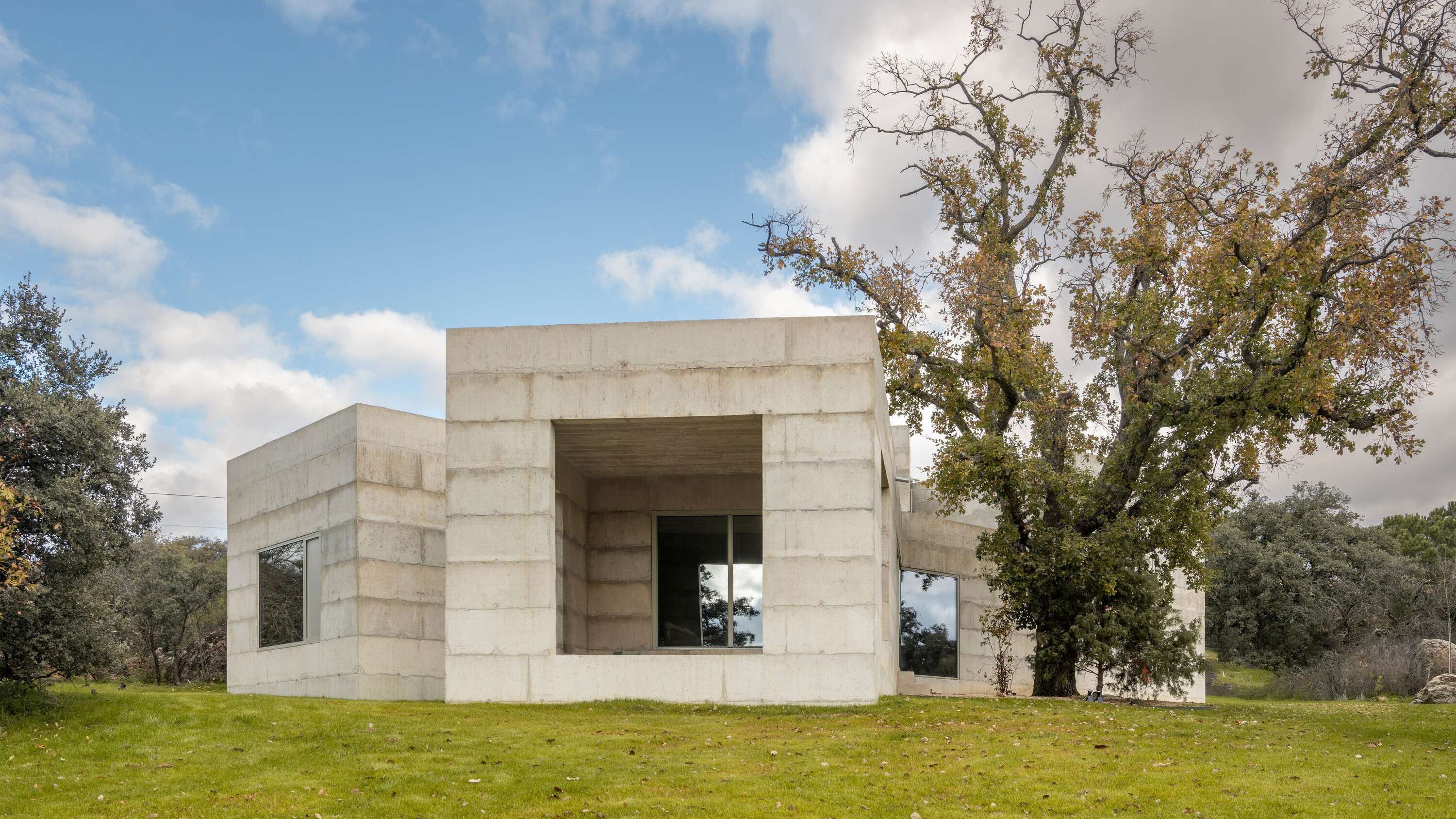 A brutalist house in Spain embraces its wild and tangled plot
House X is a formidable, brutalist house structure on a semi-rural plot in central Spain, shaped by Bojaus Arquitectura to reflect the robust flora and geology of the local landscape
By Jonathan Bell
-
 Antoni Gaudí: a guide to the architect’s magical world
Catalan creative Antoni Gaudí has been a unique figure in global architectural history; we delve into the magical world of his mesmerising creations
By Ellie Stathaki
-
 The case of Casa Batlló: inside Antoni Gaudí’s ‘happiest’ work
Casa Batlló by Catalan master architect Antoni Gaudí has just got a refresh; we find out more
By Ellie Stathaki
-
 Bodegas Faustino Winery celebrates process through its versatile vaulted visitor centre
Bodegas Faustino Winery completes extension by Foster + Partners in Spain, marking a new chapter to the long-standing history between the architecture practice and their client
By Ellie Stathaki
-
 Playball Studio's architecture balances the organic and the technical
Playball Studio, a young Indo-Spanish design practice, features in the Wallpaper* Architects’ Directory 2024
By Pallavi Mehra
-
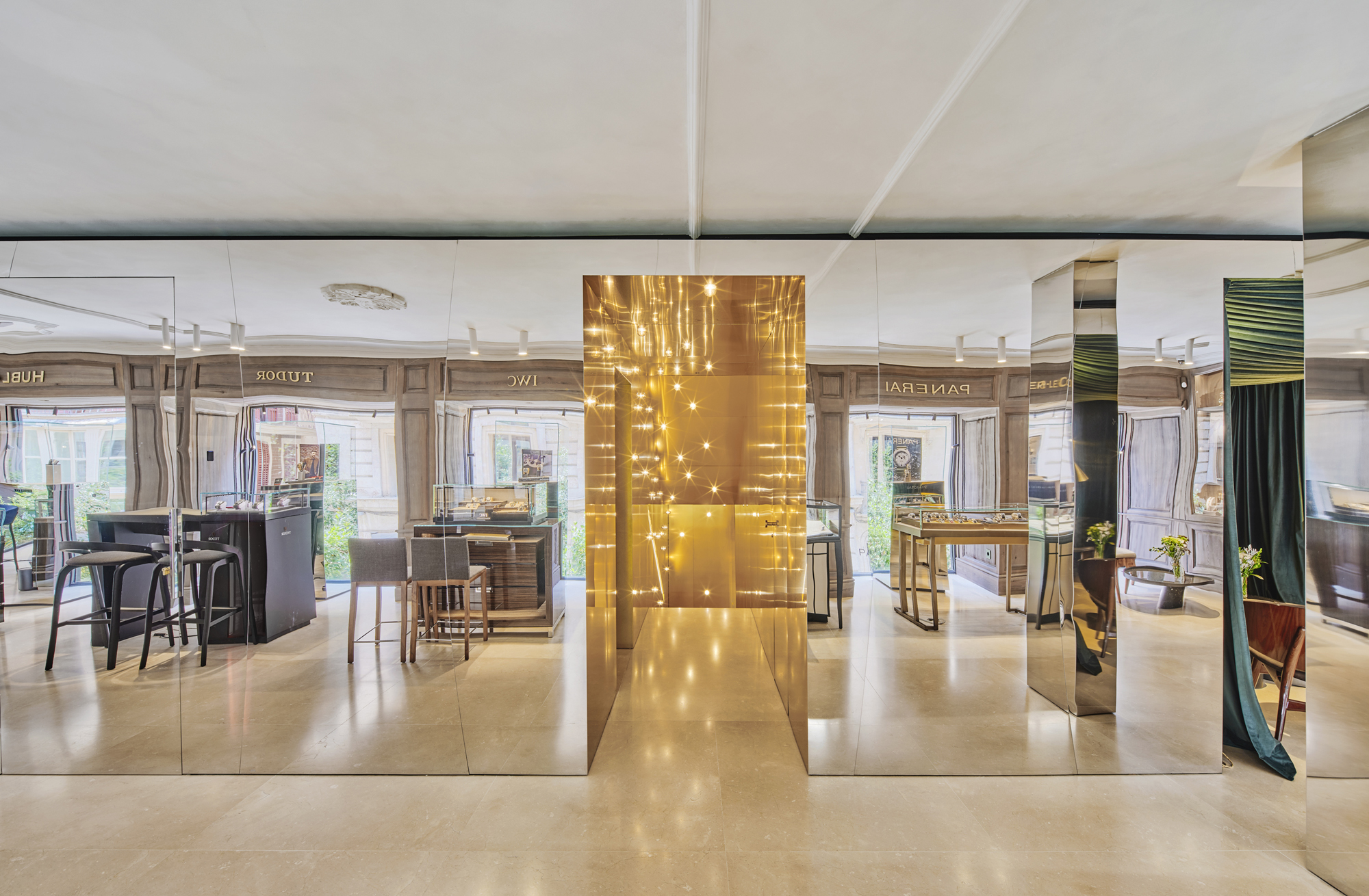 In Palma, beloved watch boutique Relojeria Alemana gets a dramatic revamp
Edificio RA for Relojeria Alemana has been redesigned by OHLAB, refreshing a historical landmark in Palma, Mallorca with a 21st-century twist
By Ellie Stathaki