V&A Dundee wins Wallpaper* Design Award for Best New Public Building
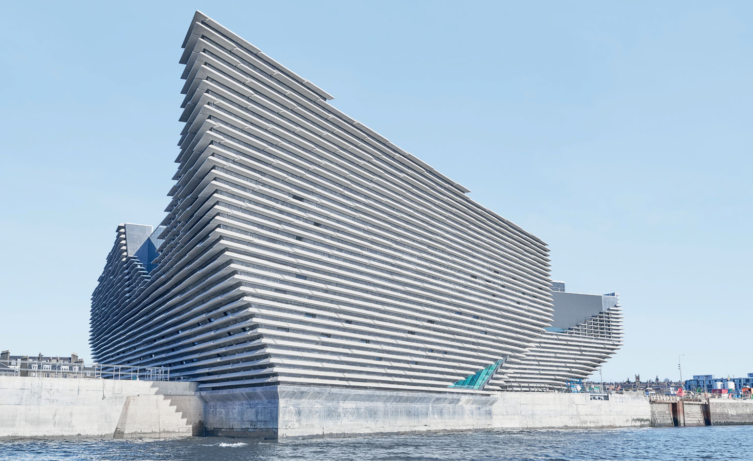
Kengo Kuma’s cast-stone clad V&A Dundee scoops Best New Public Building. View the entire Judges’ Awards winners here.
V&A Dundee, UK, by Kengo Kuma and Associates
The highly sculptural V&A Dundee is Japanese architect Kengo Kuma’s first UK building – and Scotland’s first dedicated design museum. The ragged cliffs of north eastern Scotland inspired the composition’s distinct shape, clad in some 2,500 sheets of layered horizontal cast stone panelling. Yet the concrete structure appears light, bearing an abstracted resemblance to the prow of a moored ship. Kuma wanted this building to welcome visitors with a strong design gesture. Located on the city’s waterfront, overlooking the River Tay, the new, three-storey high museum also includes a café, restaurant and learning facilities.
Key features: Resembling a moored ship, Scotland’s first design museum is clad in concrete and cast-stone panels
Architects’ previous work: LVMH HQ, Osaka; The Opposite House, Beijing; Yunfeng Spa Resort, Tengchong
See more of V&A Dundee here
BEST NEW PUBLIC BUILDING SHORTLIST
Qatar National Library, Qatar, by OMA
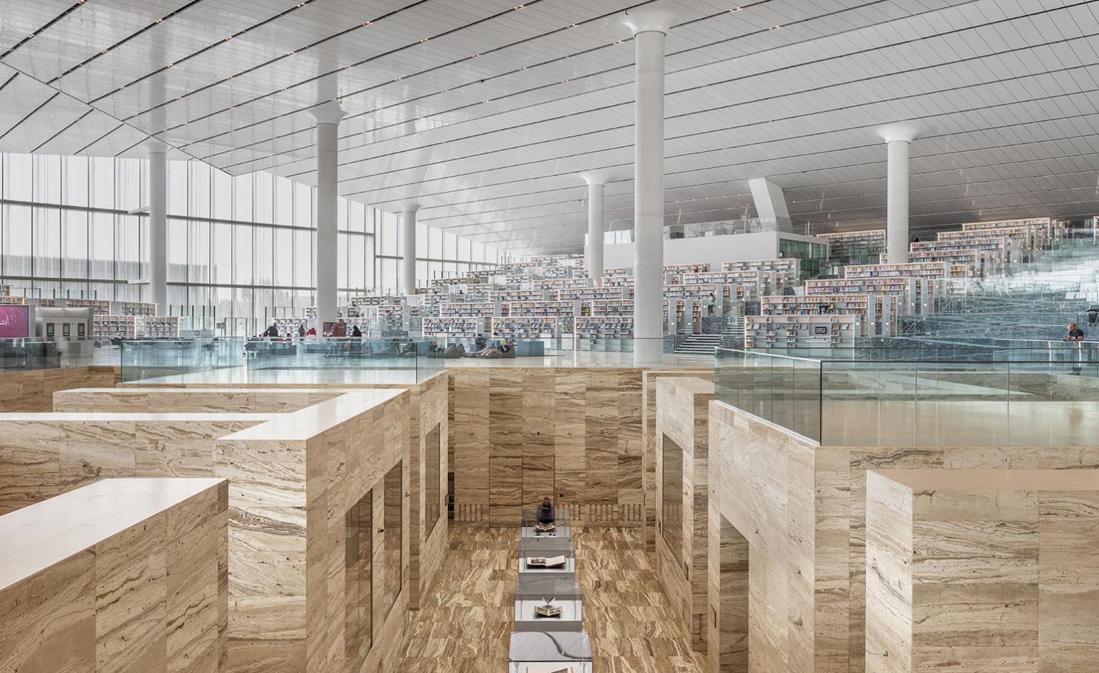
This 42,000 sq m project in Qatar encompasses the National Library, the Public Library, the University Library, and the Heritage Collection (a selection of valuable historical texts and manuscripts related to Arab-Islamic civilisation). Natural light floods the open-plan space, which features diamond-shaped glazed façades, while inside, a central triangular courtyard is defined by three large aisles flanked by shelving, serving as socialising, resting and reading areas, and offering views across the library and out. At the heart of the building, echoing the appearance of an archaeological excavation 6m below floor level, sits the Heritage Collection, symbolically placed at the complex’s very core.
Key features: A diamond-shaped, glazed building with an open-plan interior that includes a historical documents section in travertine.
Architects previous work: Blox, Copenhagen; Fondazione Prada, Milan; Lafayette Anticipations, Paris
See more of Qatar National Library here
Apple Park Visitor Center, US, by Foster + Partners
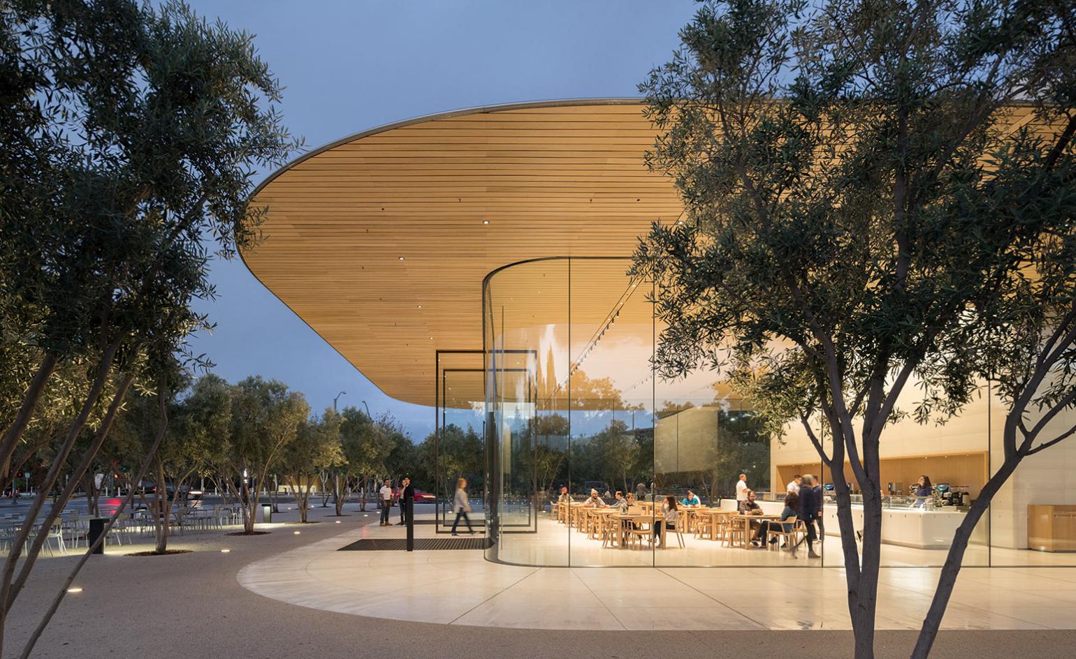
The Apple Park Visitor Center is the corporate HQ’s public gateway, offering an unmatched panoramic view of Apple Park from its expansive roof terrace, where visitors can relax beneath the shade of an awning made from thin, curved carbon-fibre fins. The architecture simulates the seamless experience of an Apple product – the transparent envelope of the building sits below a floating carbon-fibre roof, which cantilevers over outdoor seating areas on either side. Its softly lit timber soffit gives the interior an inviting warmth, while the full-height glazing minimises the building’s volume. Exclusive Apple merchandise is available to pilgrims and there is a café for resting and revering the verdant Californian landscape.
Key features: A seamless structure with full-height glazing and a carbon-fibre roof, as well as a large terrace with panoramic views
Architects’ previous work: Bloomberg HQ, London; Bund Finance Centre, Shanghai; The Murray, Hong Kong; Masdar Institute, Abu Dhabi
See more of the Apple Park Visitor Center here
Guardian Art Center, China, by Buro Ole Scheeren
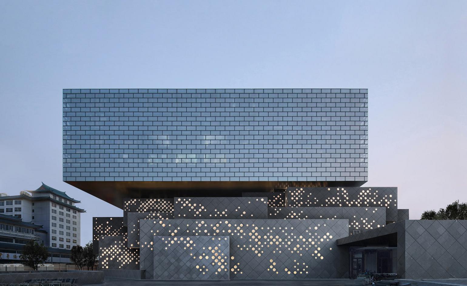
Located at the edge of Beijing’s Forbidden City, the Guardian Art Center is a new cultural anchor for the area. Constructed in a series of interlocking volumes, in grey stone, glass bricks and steel, the structure houses exhibition and event spaces, offices, auction halls, art storage and a boutique hotel. Circular openings embedded into the façade were inspired by an abstraction of a painting by the 14th-century artist Huang Gongwang, while the brick pattern of the upper volume references the Chinese hutongs (alleyways lined with courtyard housing). Scheeren’s playful stacked boxes use glass bricks that appear smooth and solid from the exterior, yet are transparent from within, tempering tradition with modernity.
Key features: A layered structure of interlocking volumes, the centre’s transparency and lightness is ensured with the use of glass bricks and circular openings
Architects’ previous work: Duo, Singapore; MahaNakhon, Bangkok; The Interlace, Singapore
See more of the Guardian Art Center here
National Kaohsiung Center for the Arts, Taiwan, by Mecanoo
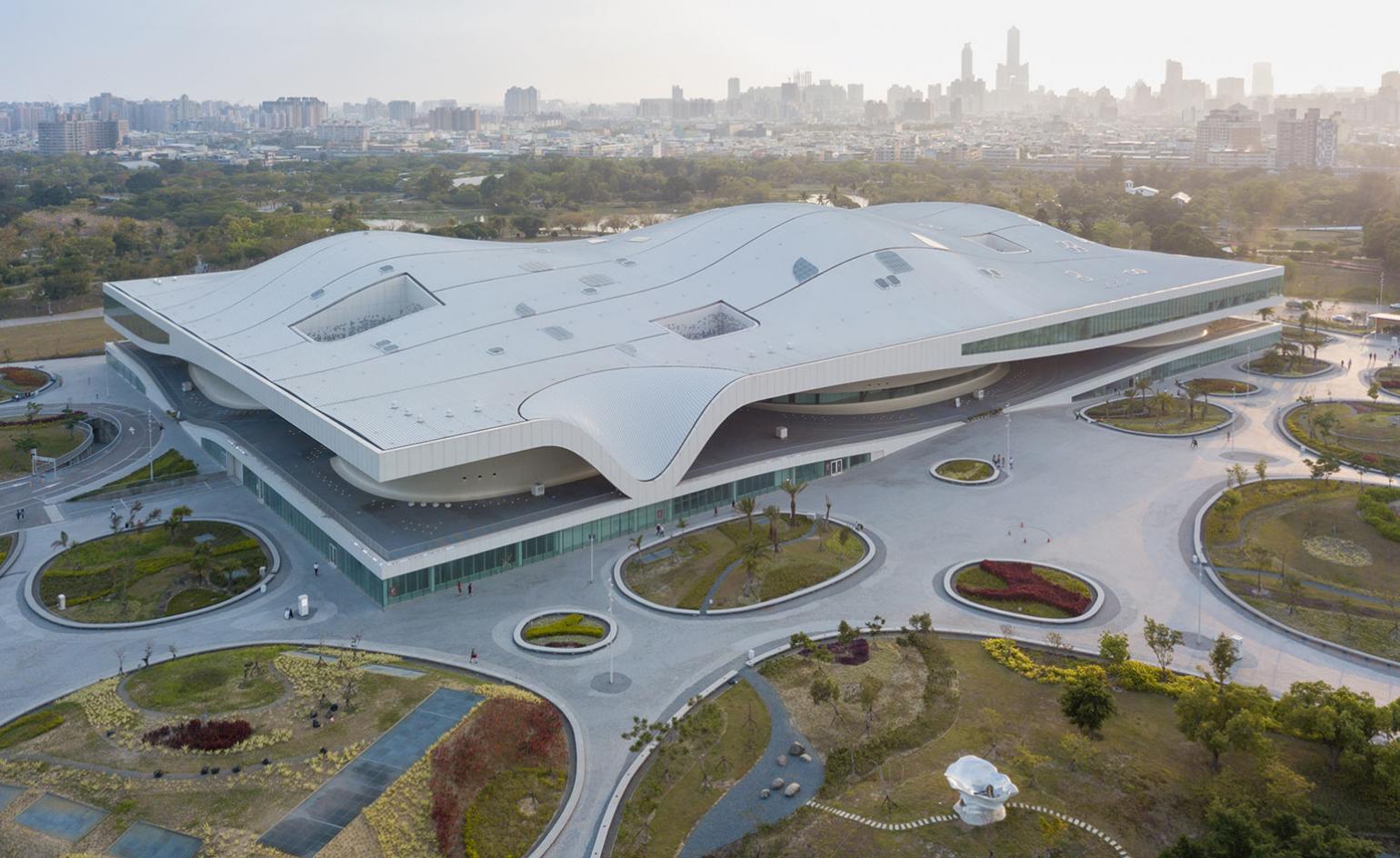
The surrounding canopies of mature Banyan trees largely inspired the undulating centre’s volume, and its long, low form includes the Banyan Plaza, a generous, sheltered public space, where people are free to wander, day and night. The 141,000 sq m complex is home to a number of performance venues, including a 2,000-seat concert hall, a 2,260-seat opera house and an open-air theatre, built into the roof at the point where it reaches towards the ground. They all connect via a series of foyers on the roof and an underground service floor, and feature acoustics by Xu-Acoustique.
Key features: A long, low undulating steel structure housing a number of theatres located in the five cores or ‘legs’ of the building where the structure meets the ground
Architects’ previous work: Library of Birmingham, Birmingham; City Hall and Train Station, Delft; Palace of Justice, Cordoba
See more of the National Kaohsiung Center for the Arts here
Wallpaper* Newsletter
Receive our daily digest of inspiration, escapism and design stories from around the world direct to your inbox.
Ellie Stathaki is the Architecture & Environment Director at Wallpaper*. She trained as an architect at the Aristotle University of Thessaloniki in Greece and studied architectural history at the Bartlett in London. Now an established journalist, she has been a member of the Wallpaper* team since 2006, visiting buildings across the globe and interviewing leading architects such as Tadao Ando and Rem Koolhaas. Ellie has also taken part in judging panels, moderated events, curated shows and contributed in books, such as The Contemporary House (Thames & Hudson, 2018), Glenn Sestig Architecture Diary (2020) and House London (2022).
-
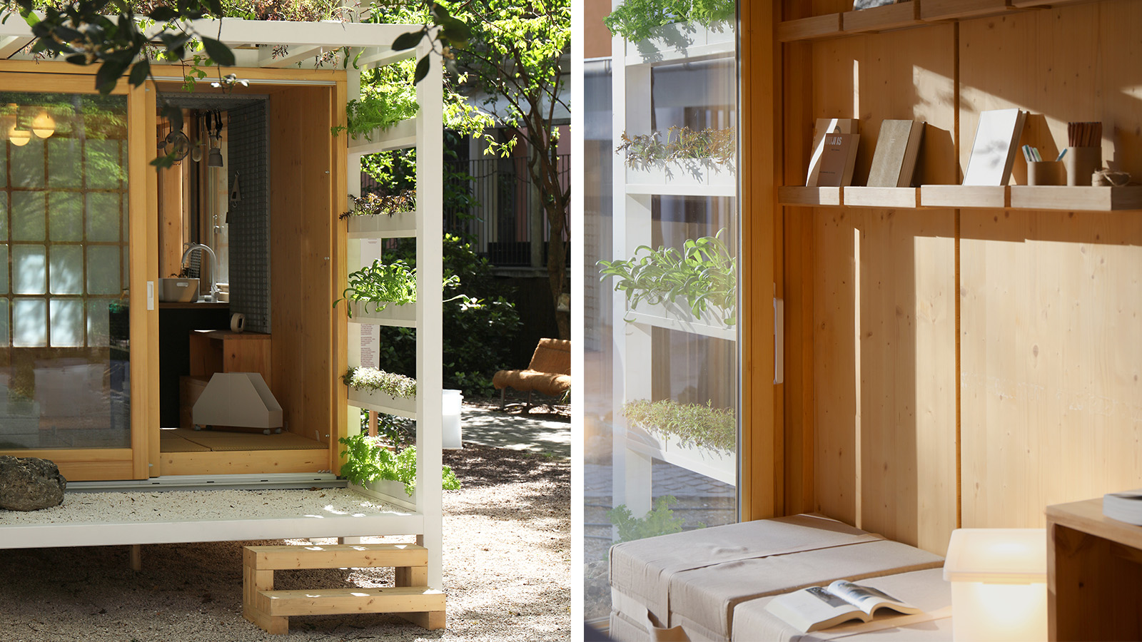 Japan in Milan! See the highlights of Japanese design at Milan Design Week 2025
At Milan Design Week 2025 Japanese craftsmanship was a front runner with an array of projects in the spotlight. Here are some of our highlights
By Danielle Demetriou
-
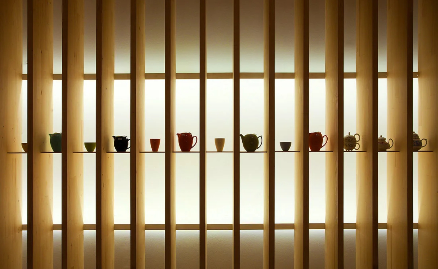 Tour the best contemporary tea houses around the world
Celebrate the world’s most unique tea houses, from Melbourne to Stockholm, with a new book by Wallpaper’s Léa Teuscher
By Léa Teuscher
-
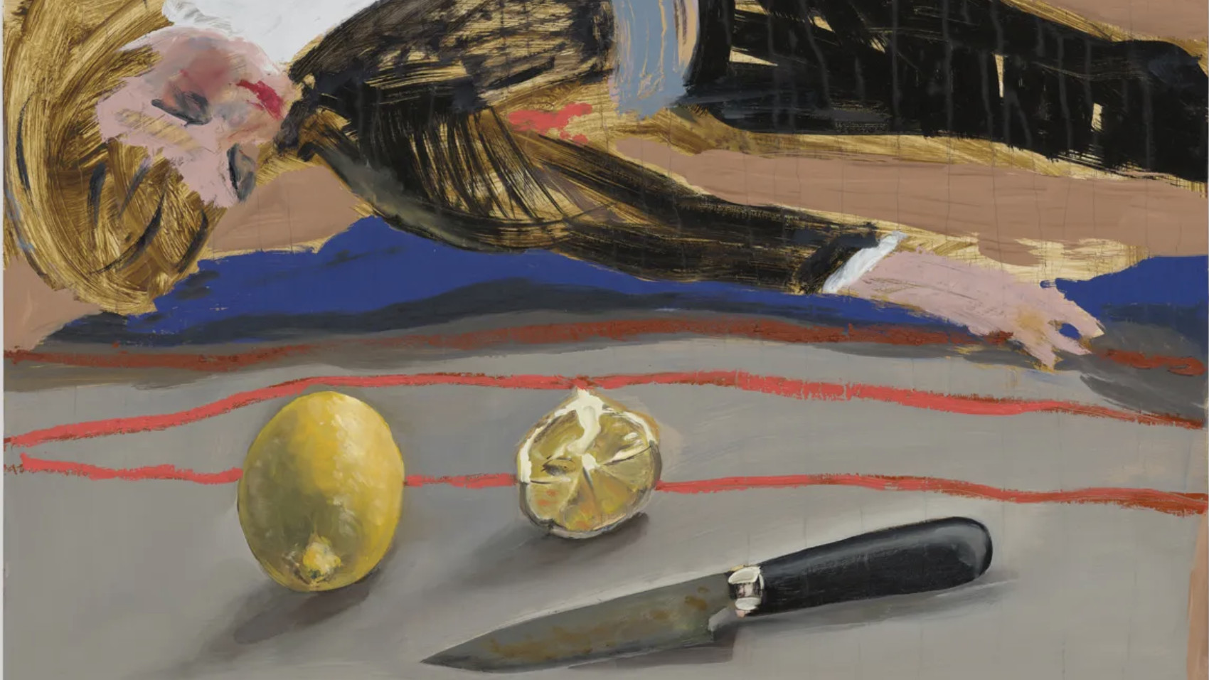 ‘Humour is foundational’: artist Ella Kruglyanskaya on painting as a ‘highly questionable’ pursuit
Ella Kruglyanskaya’s exhibition, ‘Shadows’ at Thomas Dane Gallery, is the first in a series of three this year, with openings in Basel and New York to follow
By Hannah Silver
-
 Modernist architecture: inspiration from across the globe
Modernist architecture has had a tremendous influence on today’s built environment, making these midcentury marvels some of the most closely studied 20th-century buildings; here, we explore the genre by continent
By Ellie Stathaki
-
 Minimalist architecture: homes that inspire calm
These examples of minimalist architecture place life in the foreground – clutter is demoted; joy promoted
By Ellie Stathaki
-
 The iconic British house: key examples explored
New book ‘The Iconic British House’ by Dominic Bradbury explores the country’s best residential examples since 1900
By Ellie Stathaki
-
 Loyle Carner’s Reading Festival 2023 stage presents spatial storytelling at its finest
We talk to Loyle Carner and The Unlimited Dreams Company (UDC) about the musical artist’s stage set design for Reading Festival 2023
By Teshome Douglas-Campbell
-
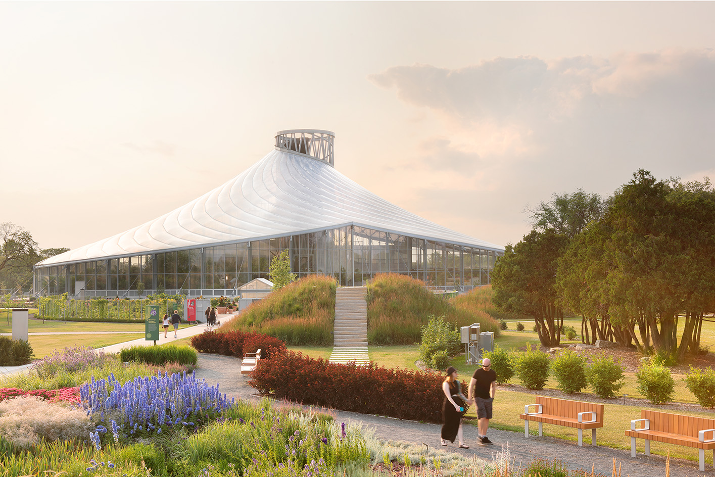 The Leaf is a feat of engineering and an ode to the Canadian Prairies
The Leaf in Winnipeg, Canada, is the first interactive horticultural attraction of its kind: a garden and greenhouse complex promoting a better understanding of how people can connect with plants
By Adrian Madlener
-
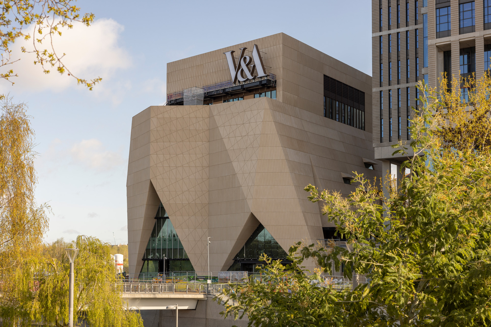 Behind the V&A East Museum’s pleated façade
Behind the new V&A East Museum’s intricate façade is a space for the imagination to unfold
By Ellie Stathaki
-
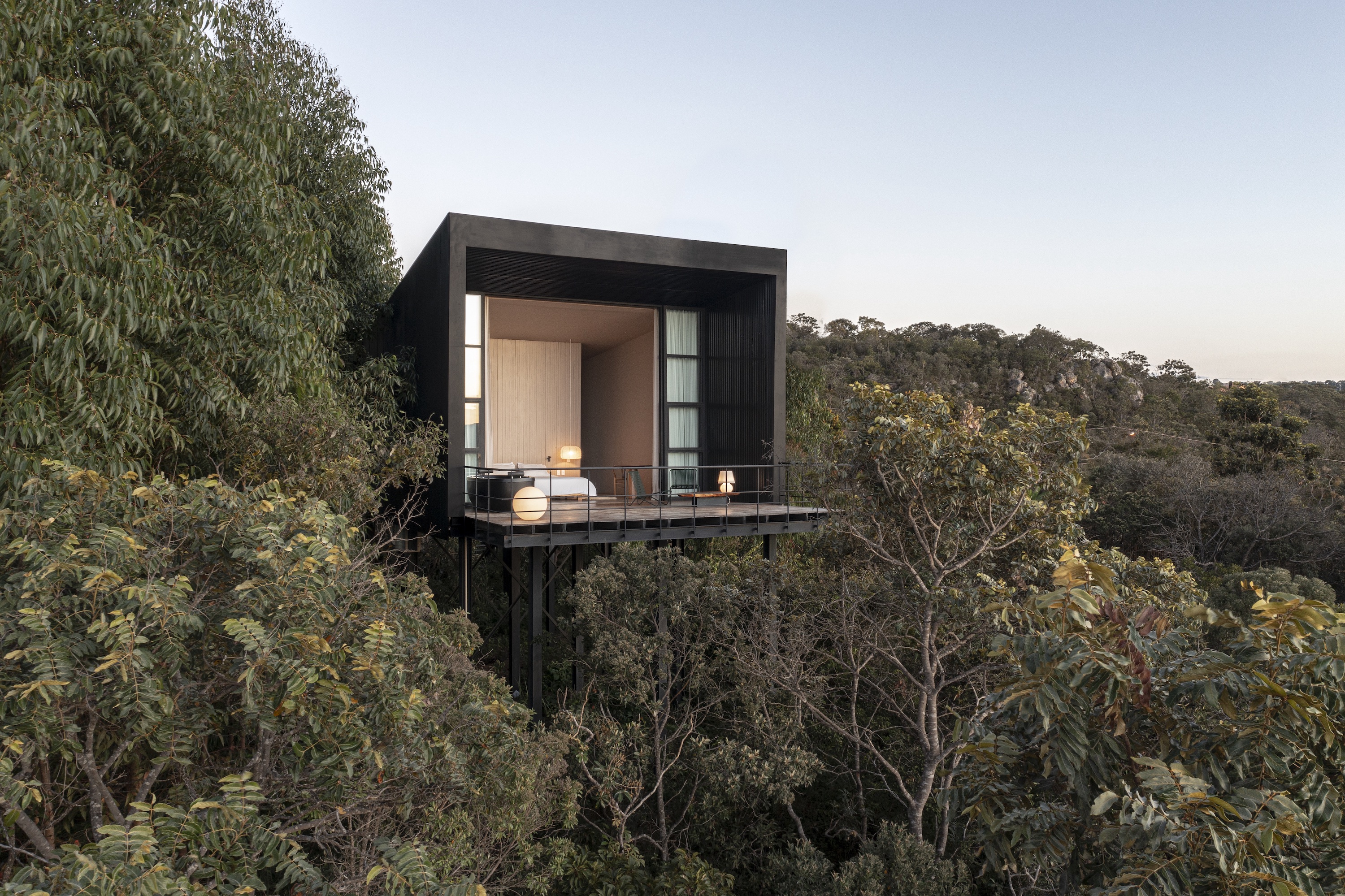 Casa Monoculo offers a take on treetop living in Brazil
Casa Monoculo by architect Alan Chu is a house raised above the treetops in Alto Paraiso City, Brazil
By Ellie Stathaki
-
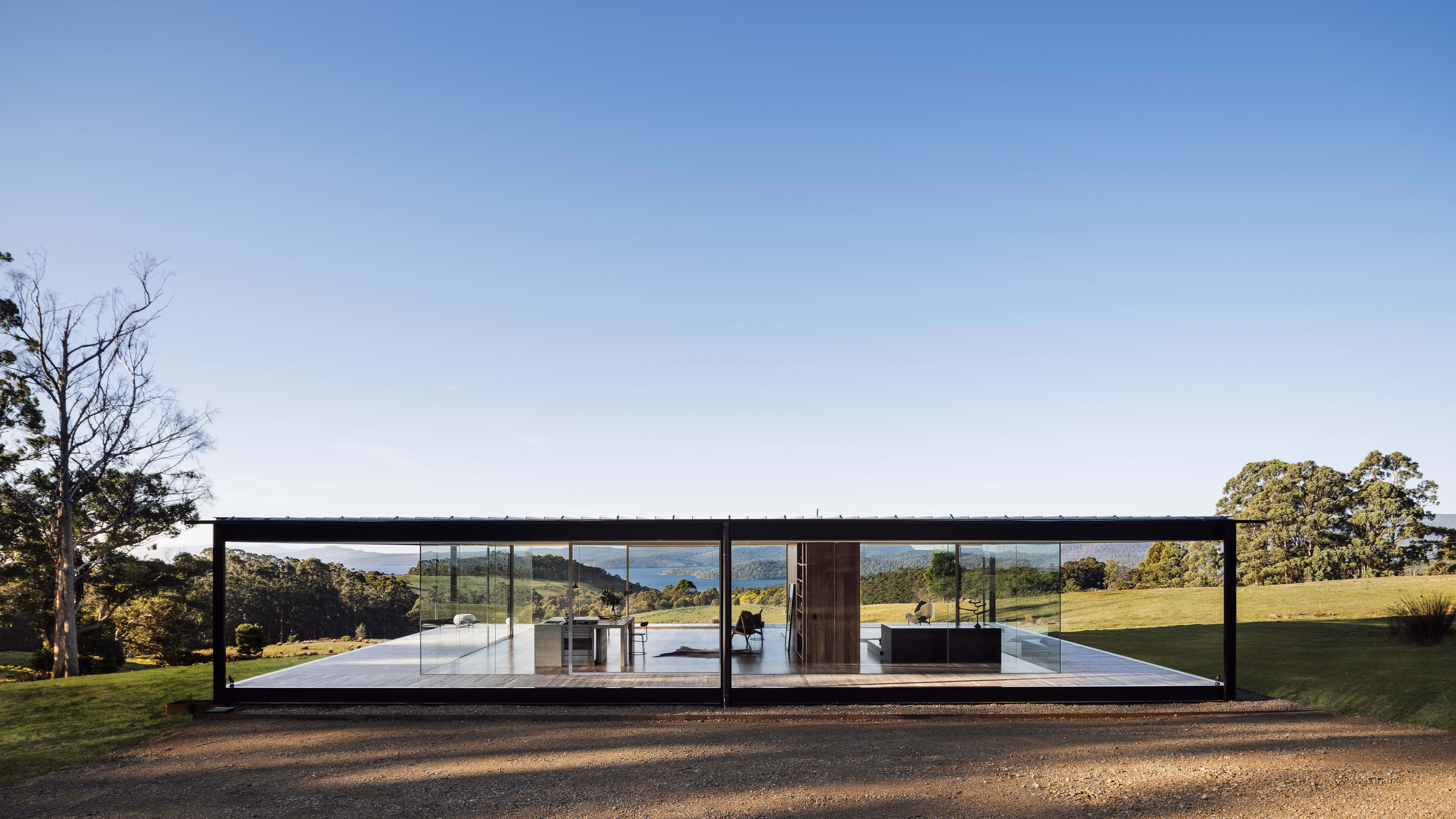 Tasmania house brings minimalist glass and concrete to rural Koonya
A Tasmania house designed in immaculate minimalist architecture by Room 11 makes the most of its idyllic Koonya location
By Stephen Crafti