Colourful Vietnamese cinema design recalls art deco glamour
Bringing blues, pinks and greens to the silver screen, a new cinema theatre in Vietnam's Ho Chi Minh City draws on the colourful design and the deco features of old Saigon, courtesy of local interiors company Module K
Do Sy - Photography
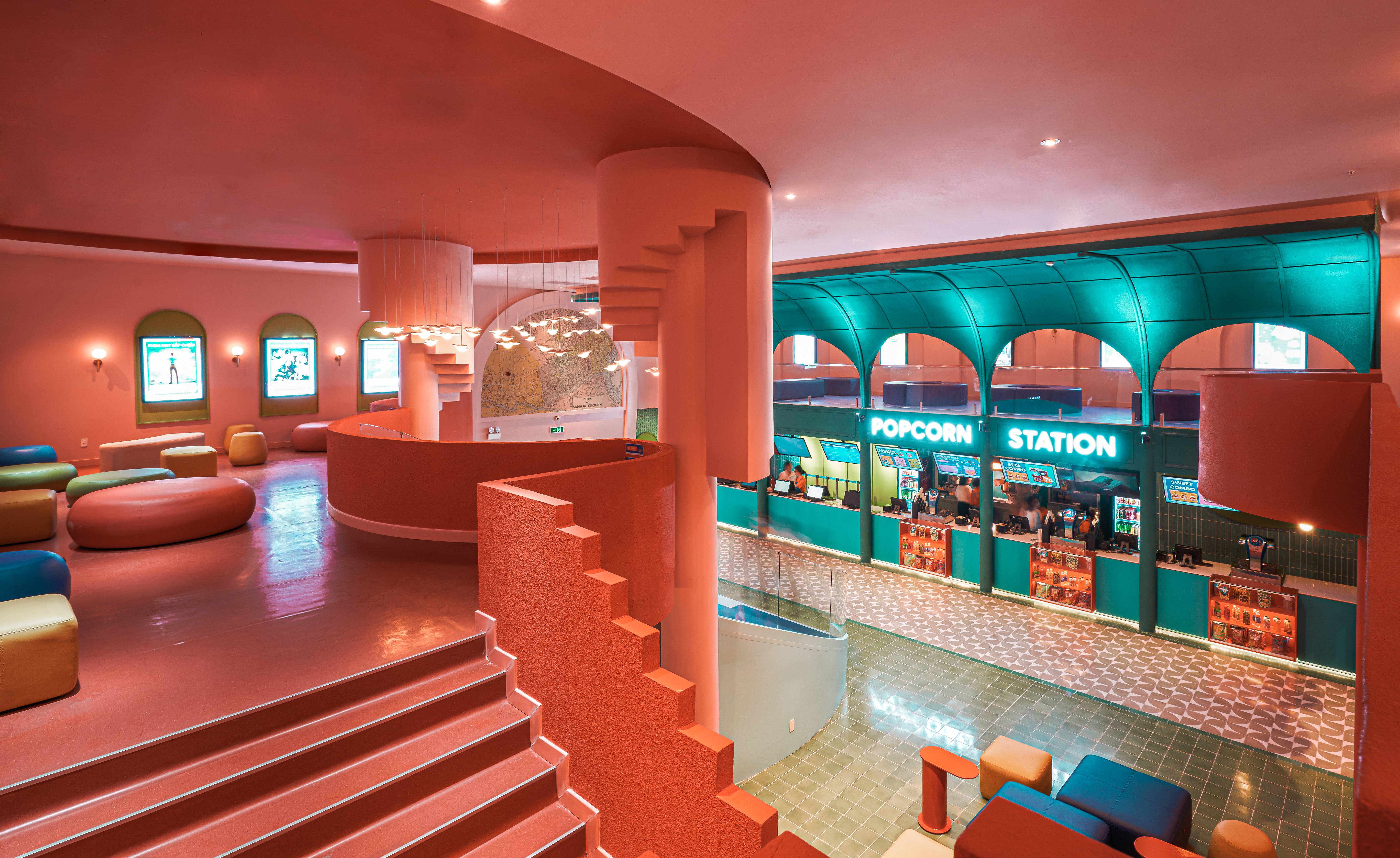
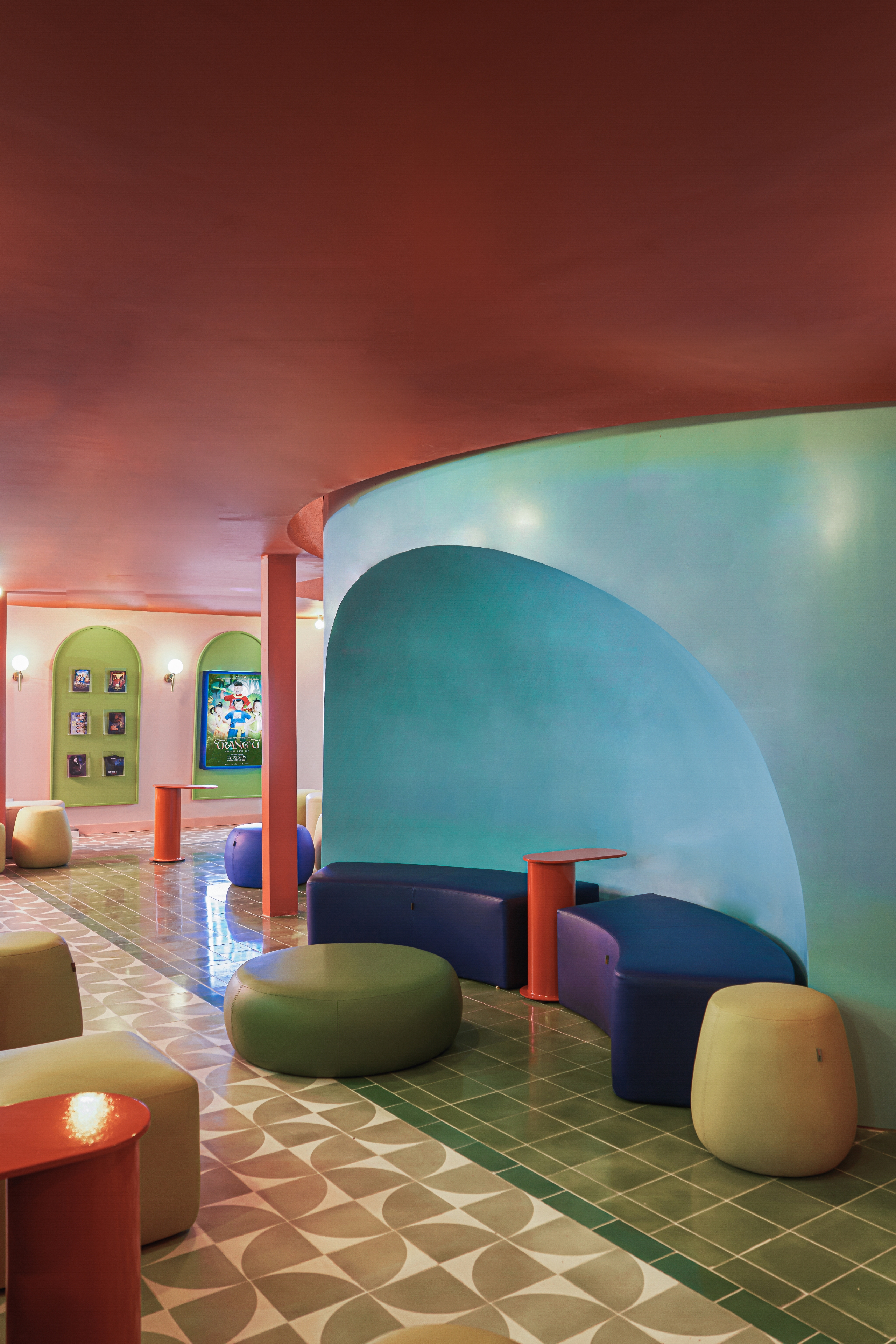
The new Beta, a 1,000-seater Vietnamese cinema located on the ground floor of a shopping centre in Ho Chi Minh City (HCMC), deliberately harks back to bold colourful architecture and deco designs of old Saigon. Shaped by local interiors company Module K, the intention was to bring back the otherworldly glamour of the cinema-going experience to a new generation of film fans in Vietnam. To do so, Module K has created a collage of colourful design and architectural references to HCMC’s past throughout the pastel-coloured interior, including the city’s flamboyant French-designed Municipal Opera House and Central Post Office, the striking pink Tan Dinh Church, the bright colours of the Ben Thanh Market and the many small alleys that thread through this fast-moving city.
Jade Nguyen, Module K’s director, describes ‘capturing the iconic features of Saigon and transforming them by stripping details, condensing the basic lines and turning them into geometric shapes. Then we applied a technique of solid colour treatment, as used in graphic design and cartoons, to bring a unifying element’.
The result is a playfully postmodern space with a healthy dose of humour. The key colours at play are flamingo pink, sea green and bright orange, with seating blocks, steps, arches, concession stands, and other details picked out in contrasting hues and different shades.
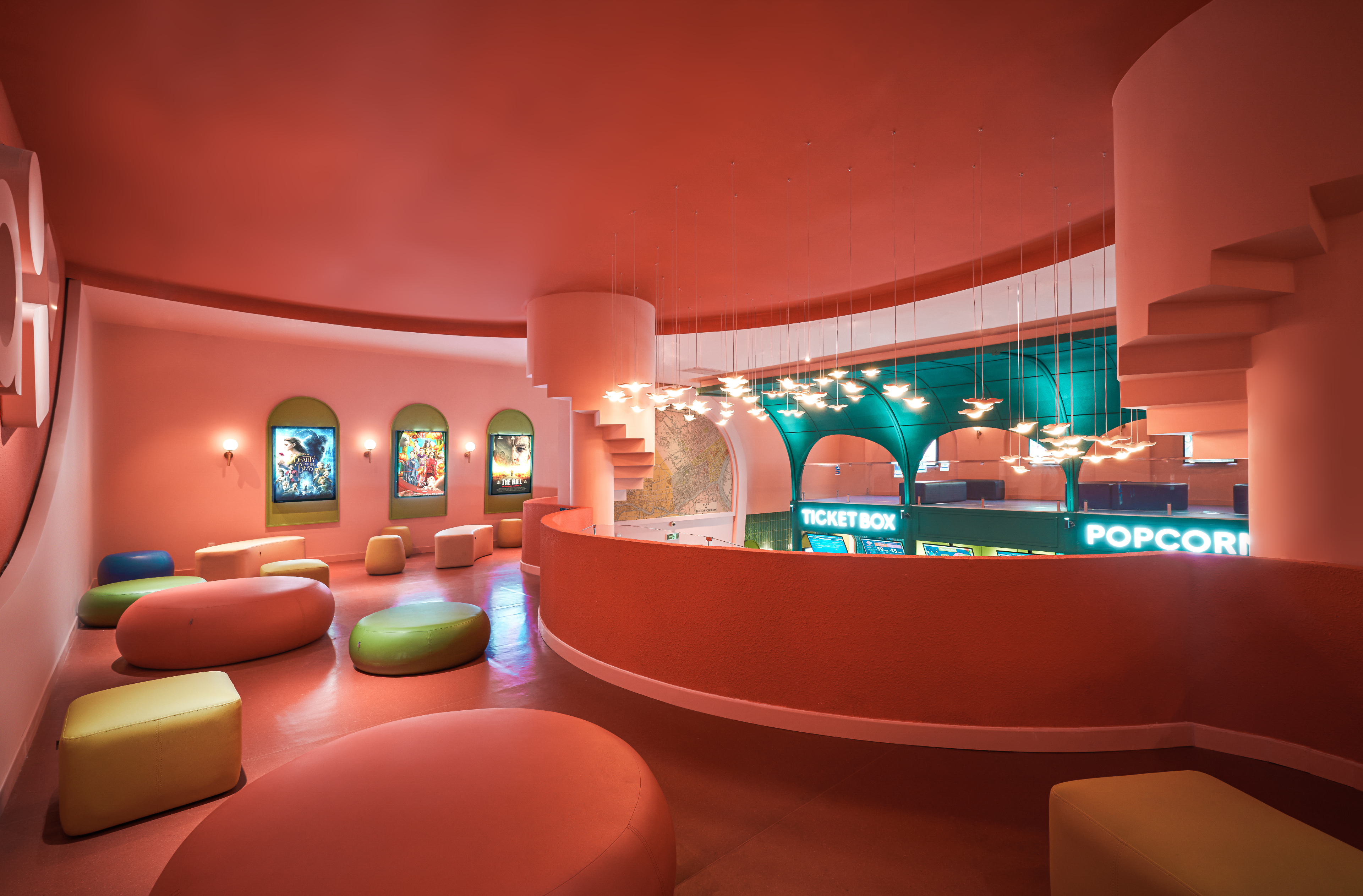
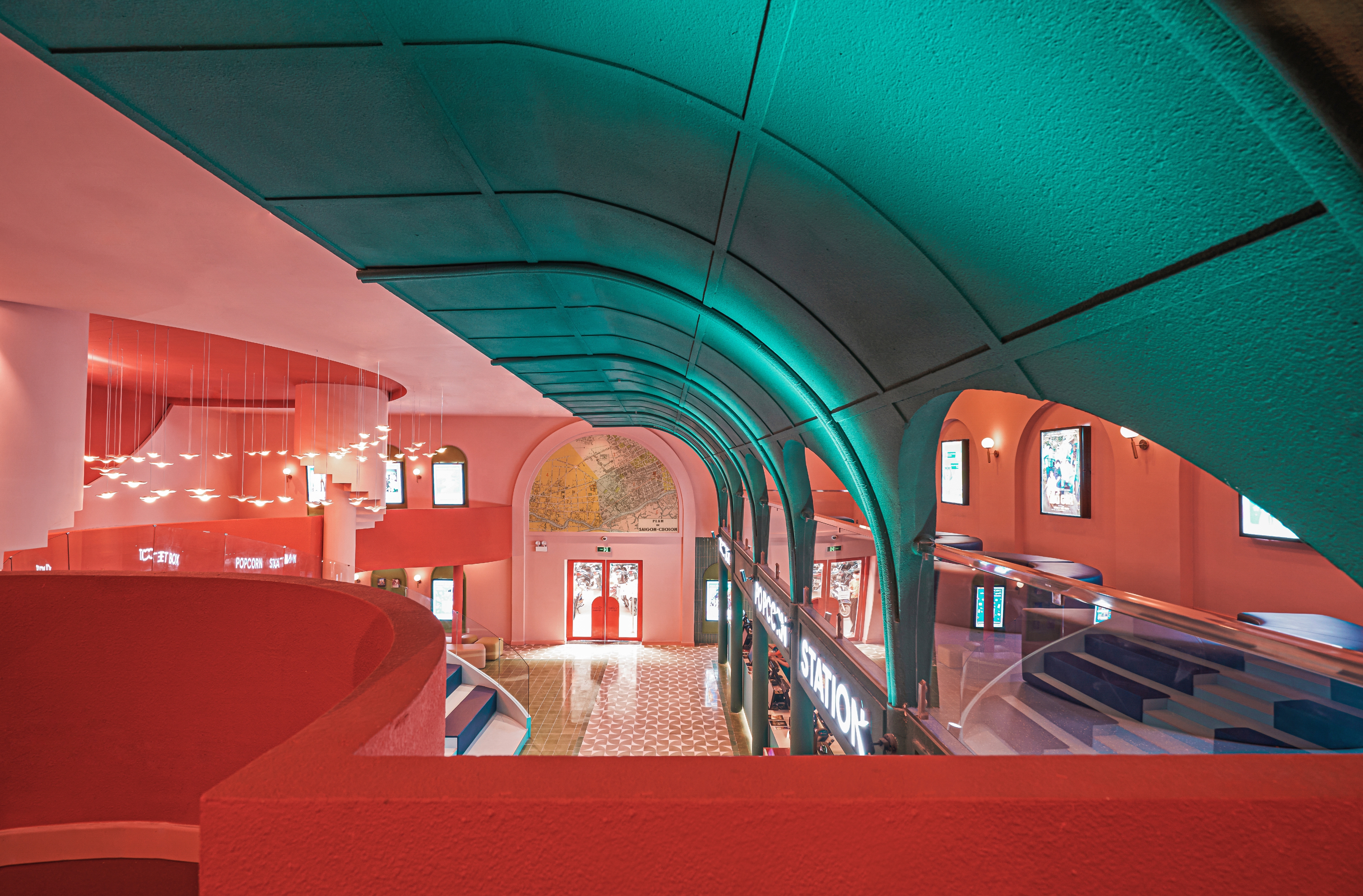
The mezzanine level at Ho Chi Minh City's new Beta Cinema by Module K
The cinema’s towering central hall is a deliberate nod to the Central Post Office’s grand colonial interiors, with circular staircase-shaped columns rising up inside the space. Even the light fittings have been shaped to recall a flock of pigeons in flight, while the aqua green ticketing booths have a rhythm and volume of the stalls in Ben Thanh Market.
Asymmetrical arch pillars are a reference to the Gothic style of Tan Dinh Church. Passages, staircases and niches are all given strong geometric volumes: a double feature of Barragán or Bofill at their most polychromatic, with a short by MC Escher to start the programme.
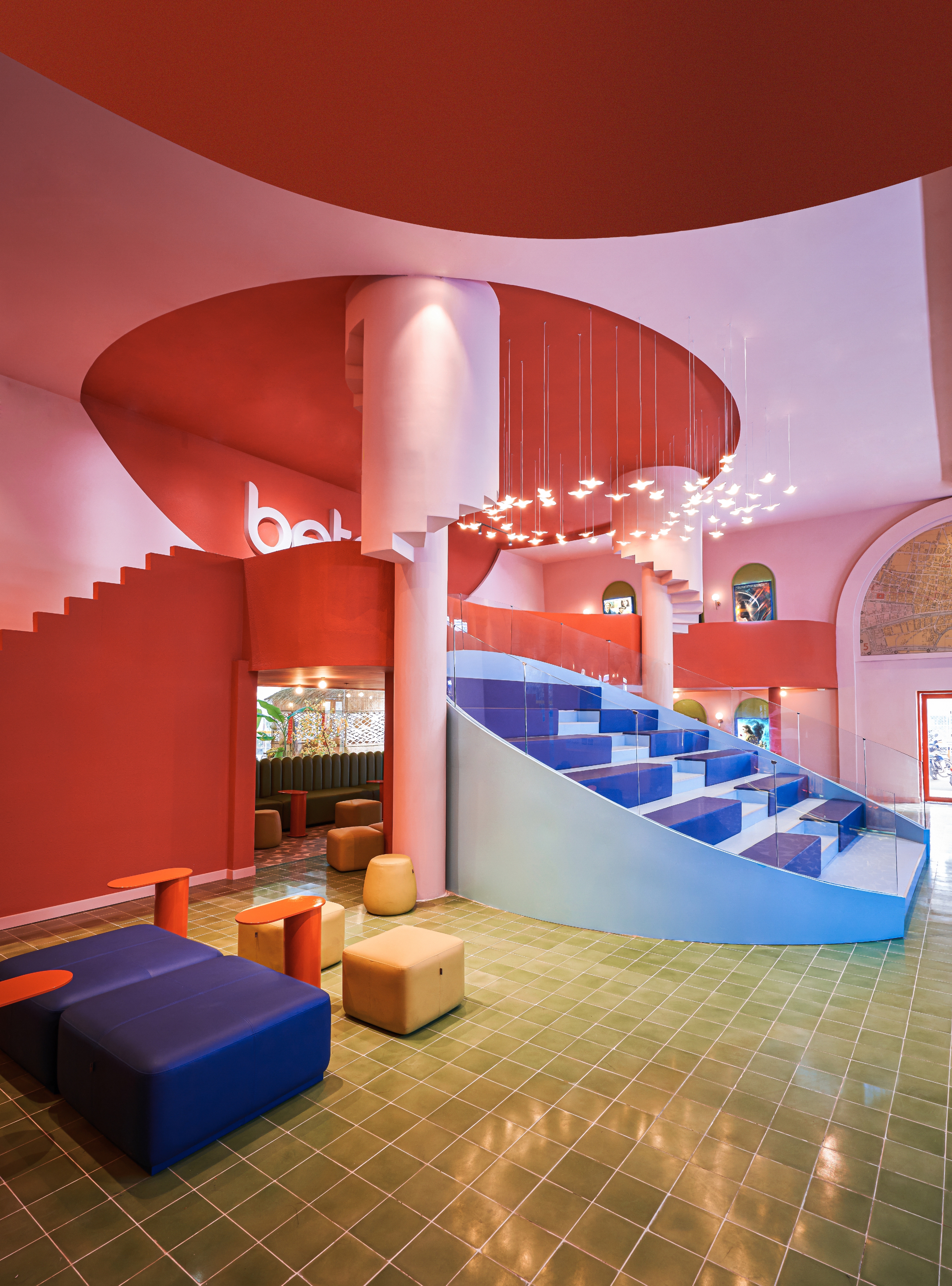
Colour and form take precedence over function at the Beta Cinema, Ho Chi Minh City, by Module K
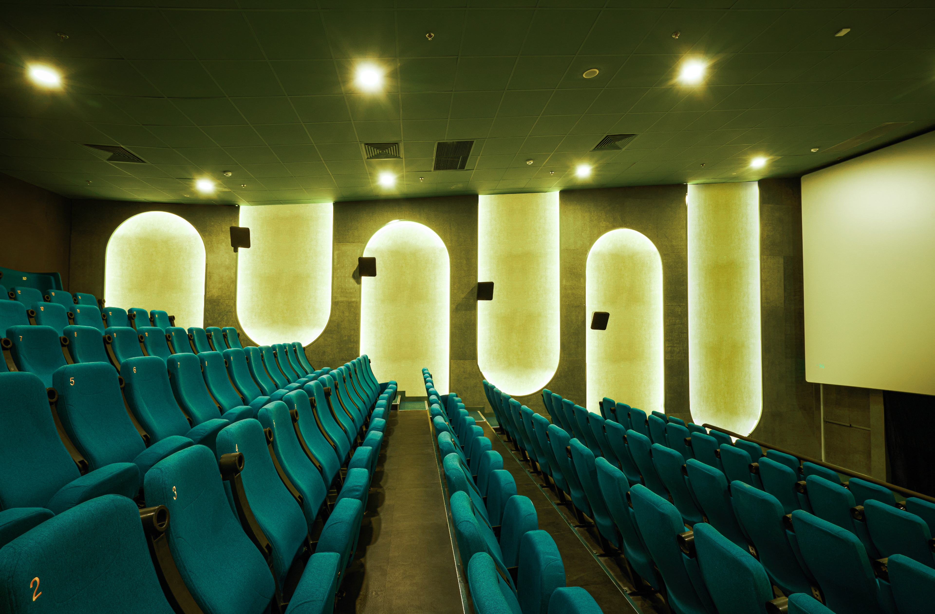
Module K has created a modern cinema in the grand tradition of the picture palace, a place where the circulation and social spaces are just as important as the screenings. The auditorium continues the geometric theme with back-lit lozenge-shaped reliefs contouring and modulating the walls.
The Beta Group has around 20 cinemas in Vietnam and Module K is currently working on bringing its approach to another location. The group admits that Module K’s synthesis of colour and form is an unashamed attempt to capture the minds (and Instagram accounts) of the younger demographic. After all, a cinema is the best place to experience vivid, out of this world imagery.
INFORMATION
Wallpaper* Newsletter
Receive our daily digest of inspiration, escapism and design stories from around the world direct to your inbox.
Jonathan Bell has written for Wallpaper* magazine since 1999, covering everything from architecture and transport design to books, tech and graphic design. He is now the magazine’s Transport and Technology Editor. Jonathan has written and edited 15 books, including Concept Car Design, 21st Century House, and The New Modern House. He is also the host of Wallpaper’s first podcast.
-
 A Xingfa cement factory’s reimagining breathes new life into an abandoned industrial site
We tour the Xingfa cement factory in China, where a redesign by landscape specialist SWA Group completely transforms an old industrial site into a lush park
By Daven Wu
-
 Put these emerging artists on your radar
This crop of six new talents is poised to shake up the art world. Get to know them now
By Tianna Williams
-
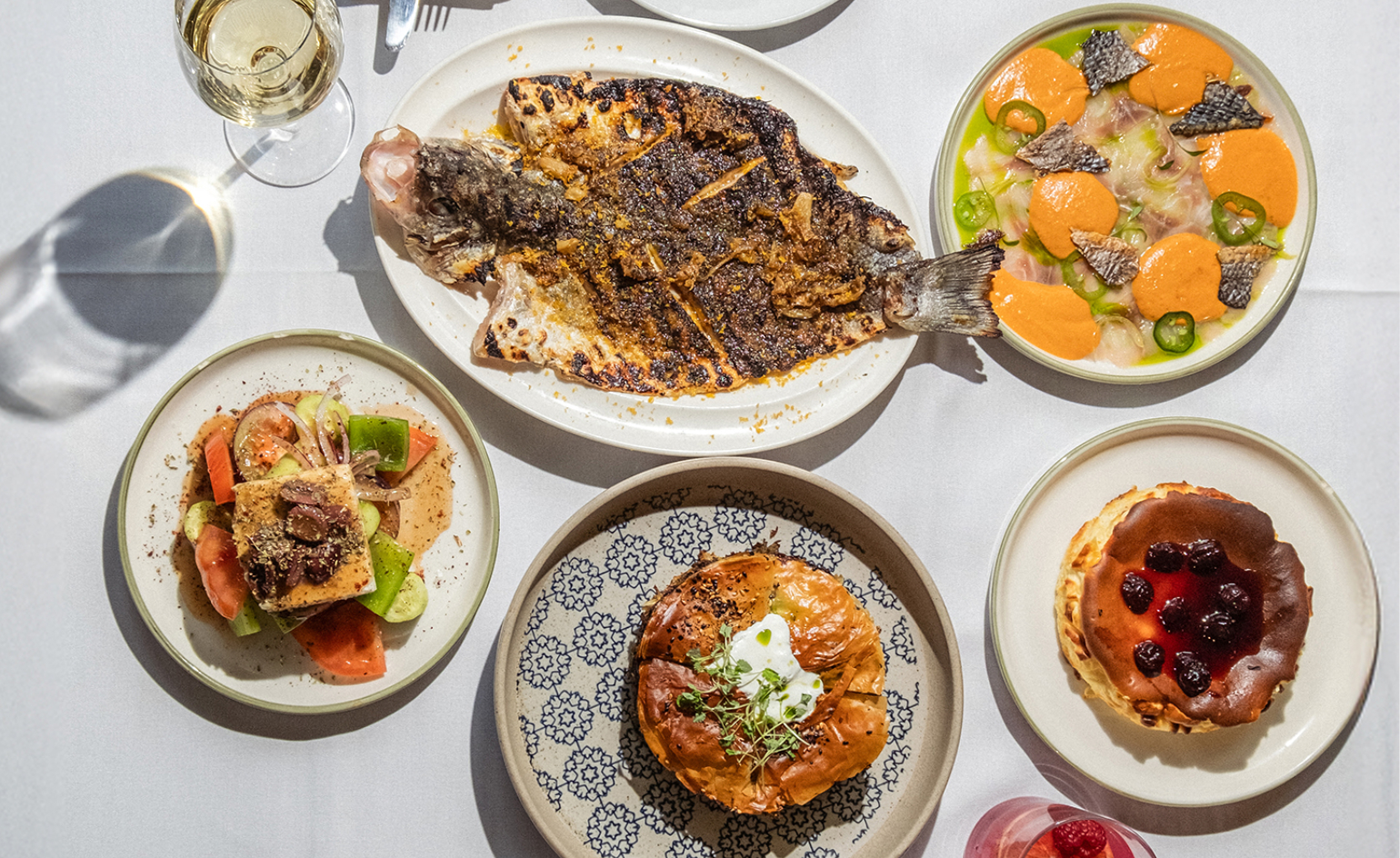 Dining at Pyrá feels like a Mediterranean kiss on both cheeks
Designed by House of Dré, this Lonsdale Road addition dishes up an enticing fusion of Greek and Spanish cooking
By Sofia de la Cruz