Booking.com campus proposes workspace wellness for the 21st century
The new Booking.com headquarters, City Campus by UNStudio in Amsterdam, bring together wellness, sustainable architecture, and new attitudes to workspace
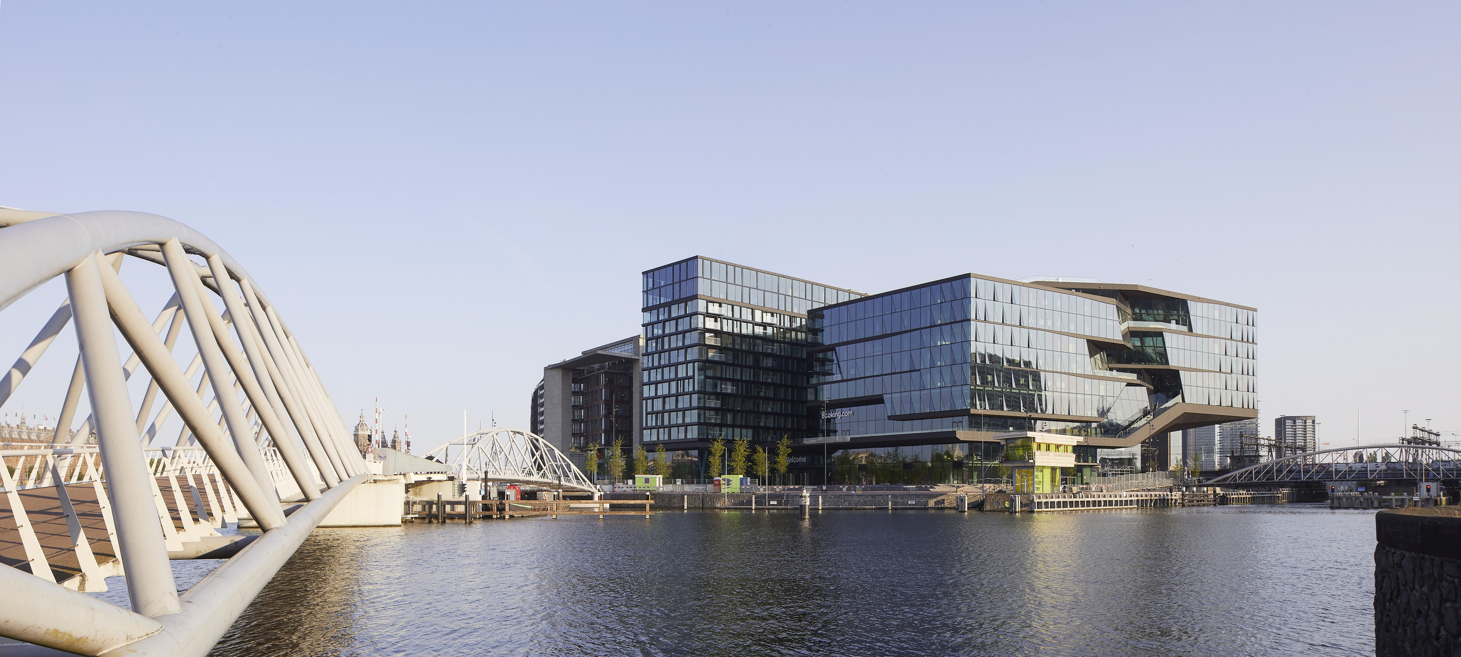
'What if work could be extraordinary?' asks Ben van Berkel. Booking.com's office in Amsterdam, named City Campus, is his response, and it's nothing if not ambitious. With its occupants now happily moved in, and a BREEAM Excellent design certificate for sustainable architecture for it under their belt, van Berkel's architecture practice UNStudio proposes this as a model for 21st century workspace.
When a Dutch student in Eastern Holland came up with the idea for Booking.com in 1996, it was a pioneering thought, and it quickly took off, becoming the global phenomenon of a travel platform it is today, as well as a state-of-the-art tech company. But as the business grew, staff and spatial needs did too, and Booking.com found itself based in several different buildings in Amsterdam, which was neither practical nor efficient. UNStudio's brief was to create a home for the company's some 6,500 staff in town – but one that would stand the test of time, and multitask too.
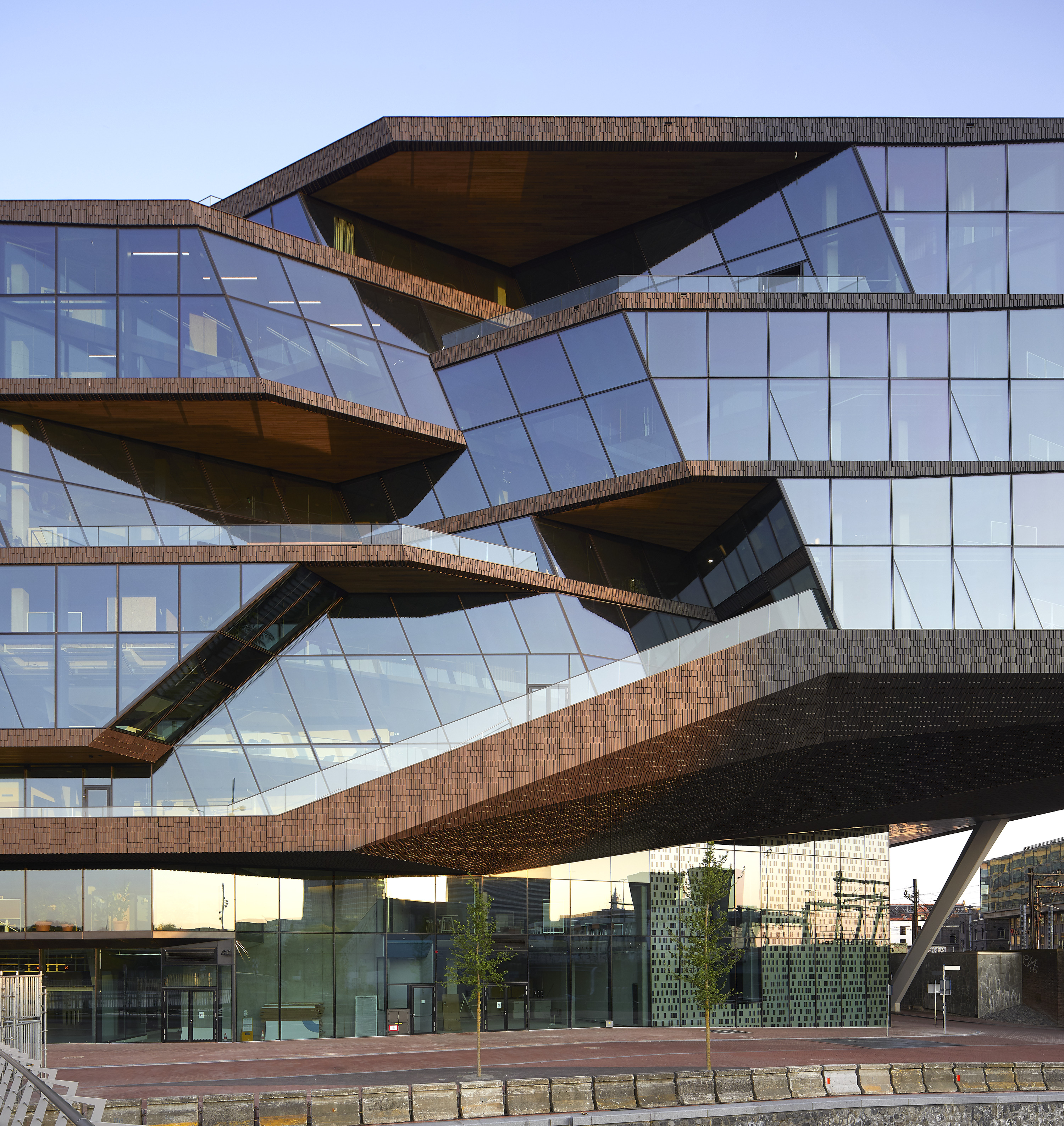
Booking.com campus: rethinking workspace for the 21st century
UNStudio landed the commission in 2015 via an invited competition for a site next to the city's busy central station. The architects' ambition was to create a space for a 'small village', as well as a building promoting wellness and community for the employees.
'It’s really a tech campus building,' van Berkel says. 'I feel it will be one of the most health-oriented offices in the world. It's an active health office, so we encourage walking, natural light and more. It also acts as a “recruiting machine”. People are happier and healthier here, so they are less likely to leave.'
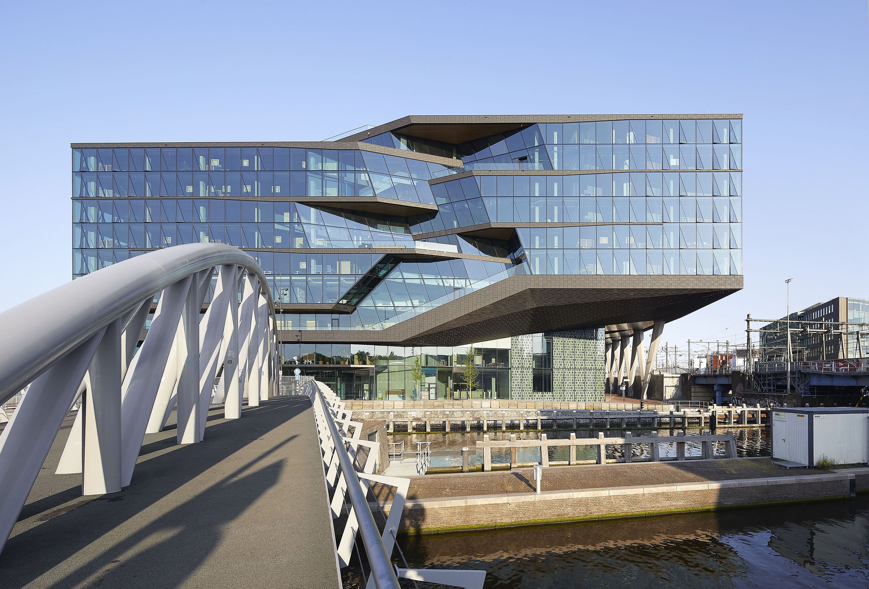
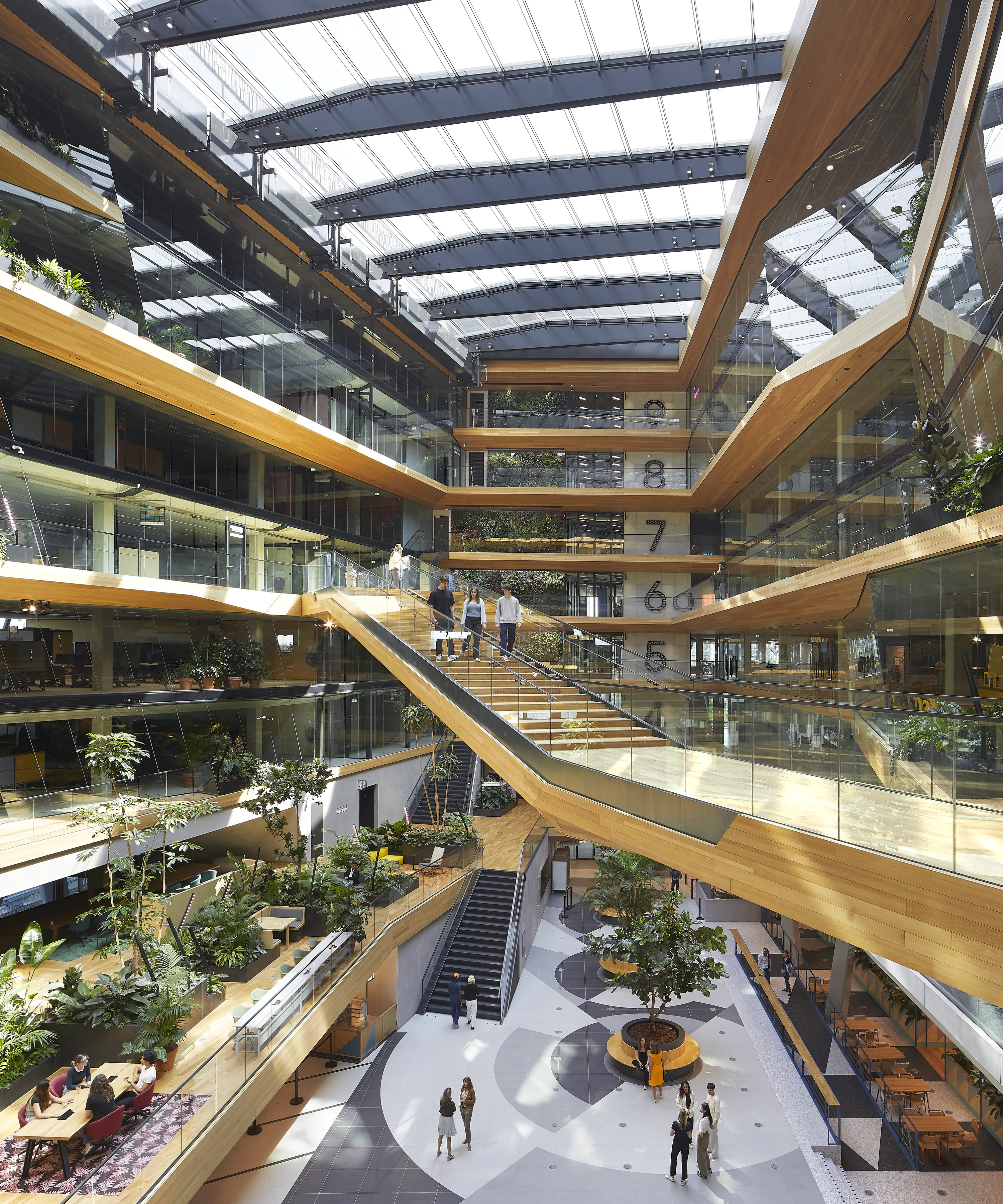
Looking at the building's flowing lines, glazed façades and dynamic volumes, you'd probably think that it's a design-led structure, one of modern aesthetics and expressive architecture gestures. Which is true; but what you won't immediately see is that van Berkel and his team spent hours upon hours perfecting elements like acoustics, climatic conditions inside, glare and material selection – much of it through features invisibly embedded into the building so cleverly you never know they're there. For example, tiny perforations on wall panels help to keep sound distribution to pleasant levels; sensors balance light in each room; sustainable bamboo wood was used for cladding; and a green wall in the dramatic main atrium ensures living plants are part of the everyday experience there.
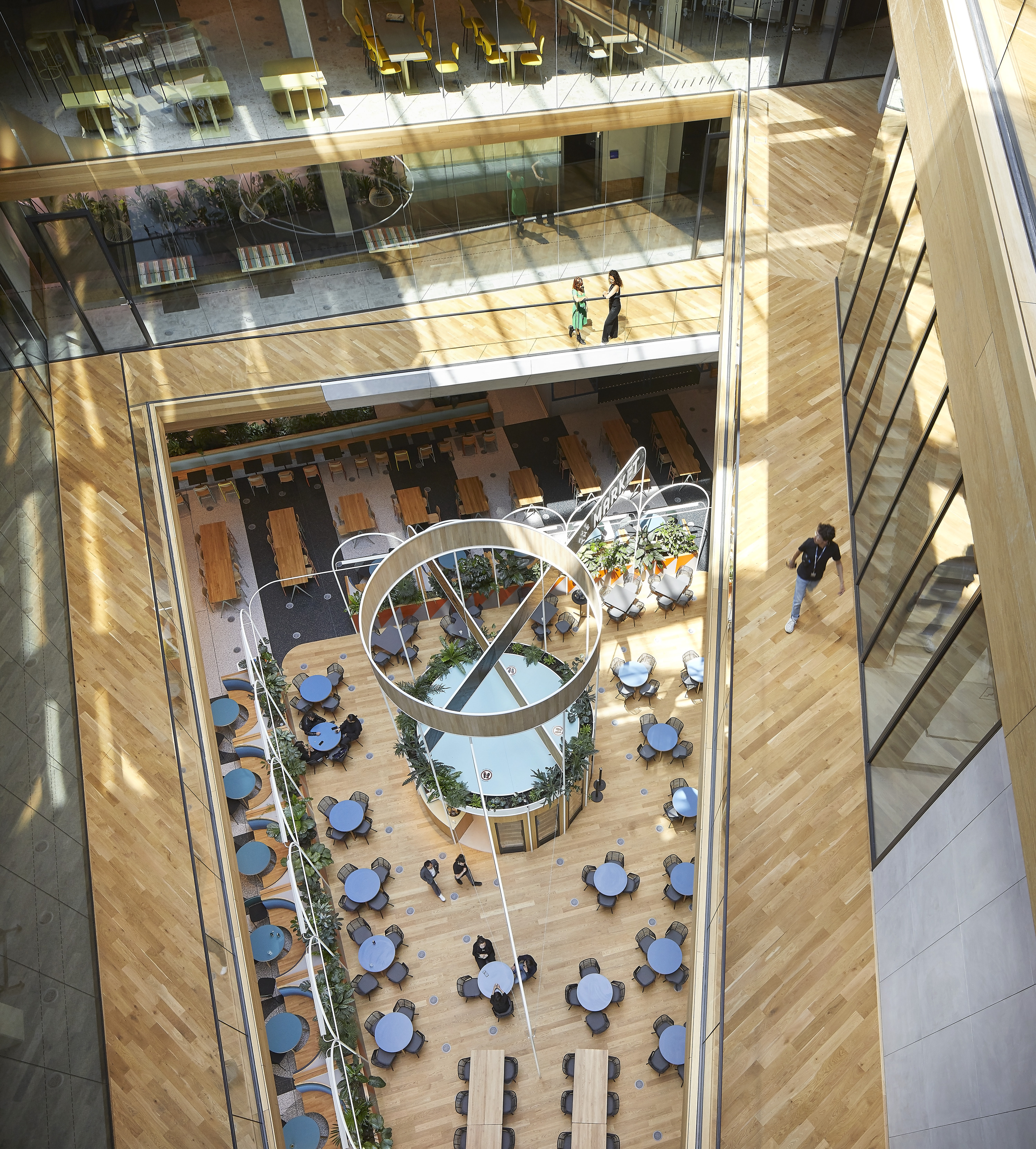
Restaurants for the employees offer healthy meals daily, lots of transparency helps with orientation and encourages interaction, while a network of bridges and walkways promotes walking – as opposed to taking the lift – between levels. All the office staples are there too – desk spaces, education and events halls, meeting rooms, private booths, and both breakout socialising areas and quiet corners. But the communal components, circulation and wellness elements are where UNStudio really applied themselves – working on a masterplan for the space, with HofmanDujardin as the lead interior architects, to enhance productivity and health in the Booking.com workforce.
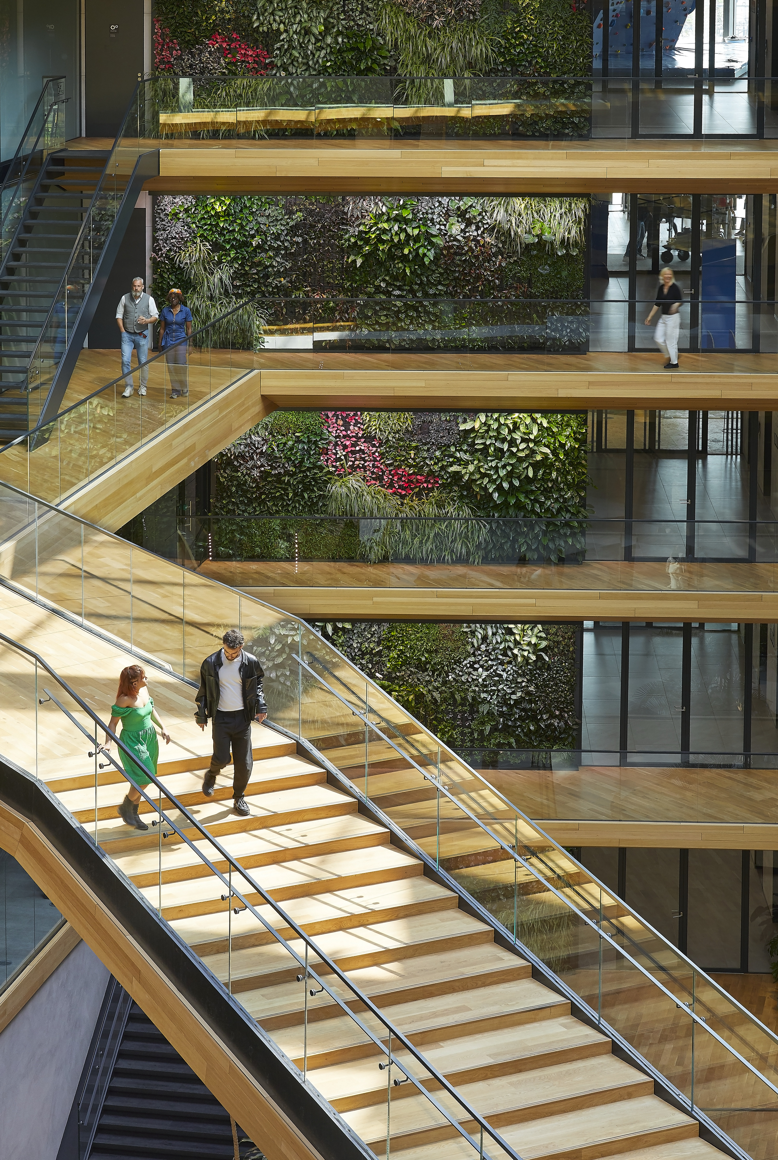
'The focus was on serving the needs and behaviour of Booking.com employees, from the moment they walk in, to the end of their working day, and all the activities in between,' says van Berkel. 'While the individual interior spaces enjoy a truly international flavour that reflects Booking.com’s core business, we wanted the overall concept for the building to serve as a reflection of Amsterdam – its location and the Dutch travel company’s home base since its inception. The architecture therefore combines the robust qualities and the industrial history of the harbour, with glazed detailing that reduces the overall immenseness of the building and gently reflects the glistening of the water and sky. The organisation of the interior, meanwhile, is designed to characterise the vibrancy of Amsterdam’s lively central neighbourhoods.'
Wallpaper* Newsletter
Receive our daily digest of inspiration, escapism and design stories from around the world direct to your inbox.



Ellie Stathaki is the Architecture & Environment Director at Wallpaper*. She trained as an architect at the Aristotle University of Thessaloniki in Greece and studied architectural history at the Bartlett in London. Now an established journalist, she has been a member of the Wallpaper* team since 2006, visiting buildings across the globe and interviewing leading architects such as Tadao Ando and Rem Koolhaas. Ellie has also taken part in judging panels, moderated events, curated shows and contributed in books, such as The Contemporary House (Thames & Hudson, 2018), Glenn Sestig Architecture Diary (2020) and House London (2022).
-
 Eight designers to know from Rossana Orlandi Gallery’s Milan Design Week 2025 exhibition
Wallpaper’s highlights from the mega-exhibition at Rossana Orlandi Gallery include some of the most compelling names in design today
By Anna Solomon
-
 Nikos Koulis brings a cool wearability to high jewellery
Nikos Koulis experiments with unusual diamond cuts and modern materials in a new collection, ‘Wish’
By Hannah Silver
-
 A Xingfa cement factory’s reimagining breathes new life into an abandoned industrial site
We tour the Xingfa cement factory in China, where a redesign by landscape specialist SWA Group completely transforms an old industrial site into a lush park
By Daven Wu
-
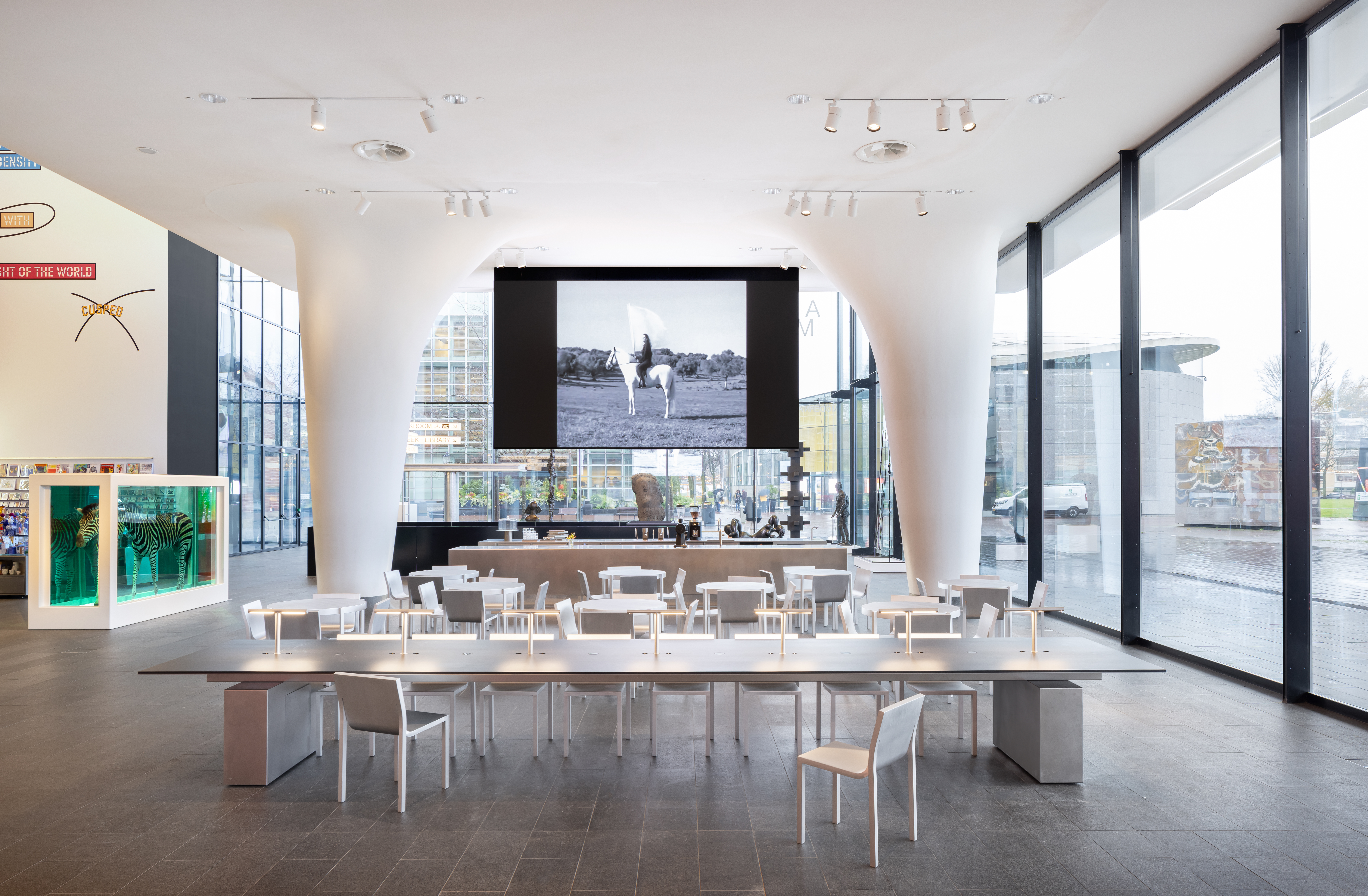 We stepped inside the Stedelijk Museum's newest addition in Amsterdam
Amsterdam's Stedelijk Museum has unveiled its latest addition, the brand-new Don Quixote Sculpture Hall by Paul Cournet of Rotterdam creative agency Cloud
By Yoko Choy
-
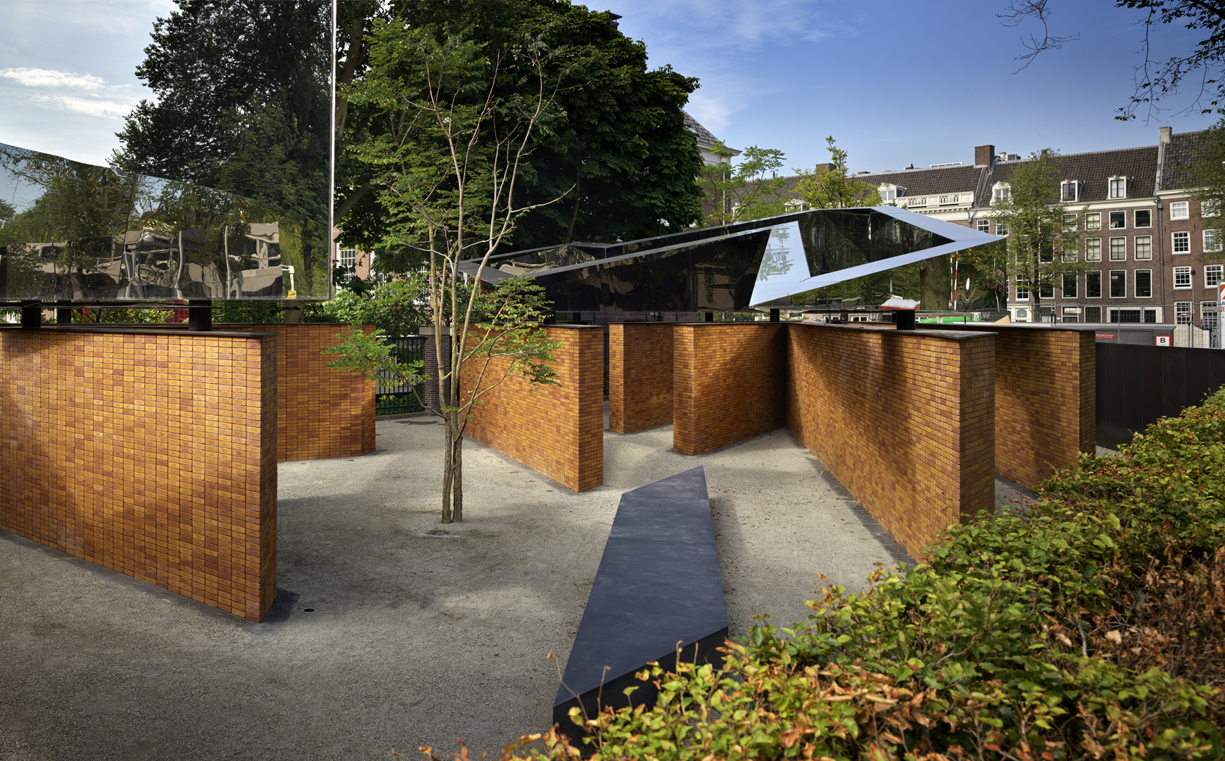 Studio Libeskind’s reflective geometries shape Holocaust memorial in Amsterdam
Studio Libeskind crafts National Holocaust Memorial of Names in Amsterdam, designing dramatic geometric shapes that carry the message of remembrance
By Ellie Stathaki
-
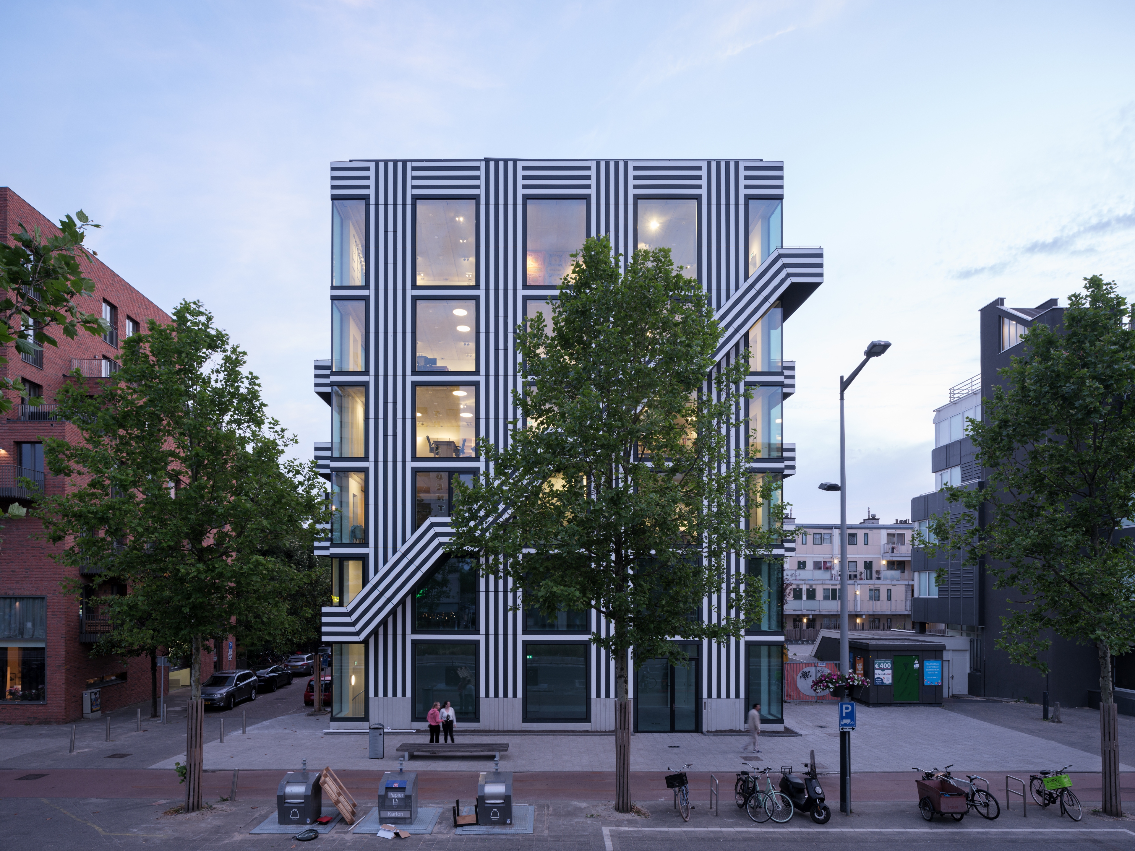 Line of work: we visit Thonik's stripy Amsterdam headquarters
Graphic design studio thonik unveils its new, custom-made office building in Amsterdam, having collaborated in its design with MMX Architects
By Giovanna Dunmall
-
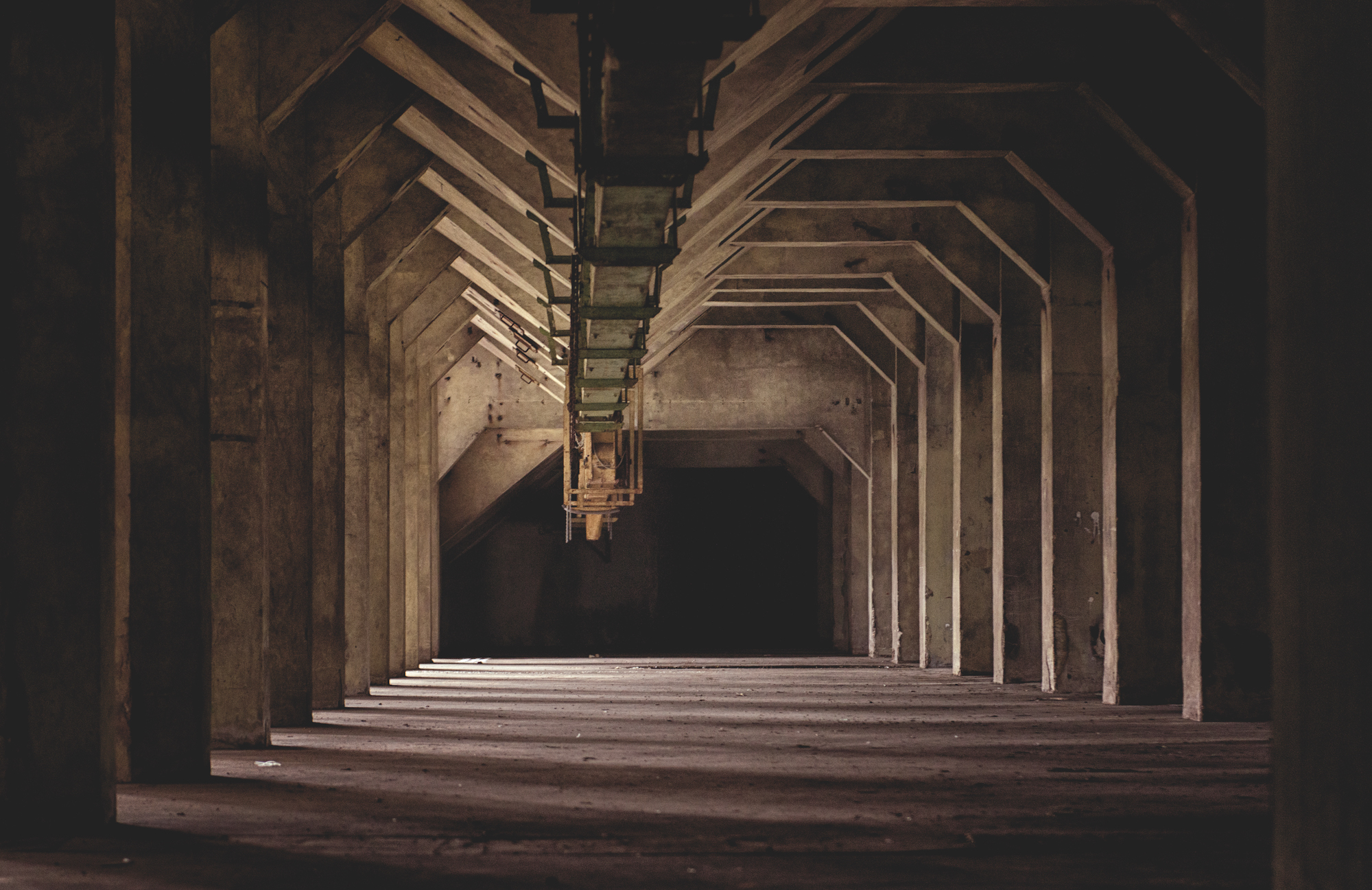 We tour the construction site of Peter Zumthor’s De Meelfabriek in Amsterdam
Peter Zumthor, Studio Akkerhuis, LOLA and Piet Oudolf come together to breathe new life into the listed monument of the De Meelfabriek in the Netherlands, at the same time revitilising a whole neighbourhood through architecture in Leiden
By Yoko Choy
-
 Amsterdam gains the first Fosbury & Sons venue outside Belgium
Co-working brand Fosbury & Sons launches Prinsengracht, its first ever venue outside of its home country of Belgium, in Amsterdam, located in a historic, redesigned hospital courtesy of interiors studio Going East
By Ellie Stathaki
-
 Amsterdam’s progressive architecture scene sees the rise of HQs, hotels and new neighbourhoods
By Ellen Himelfarb
-
 Biophilic and ocean-inspired apartment design in Amsterdam
By Luke Halls
-
 Floating architecture is a booming business, thanks to Dutch designers
By Anna Yudina