Bold graphics and clever interventions define this Barcelona house redesign
Nestled amongst the Roman archaeological remains and buzzing eateries of the Borne district of Barcelona, BSP 20 is Raul Sanchez Architects' latest residential project
José Hevia - Photography
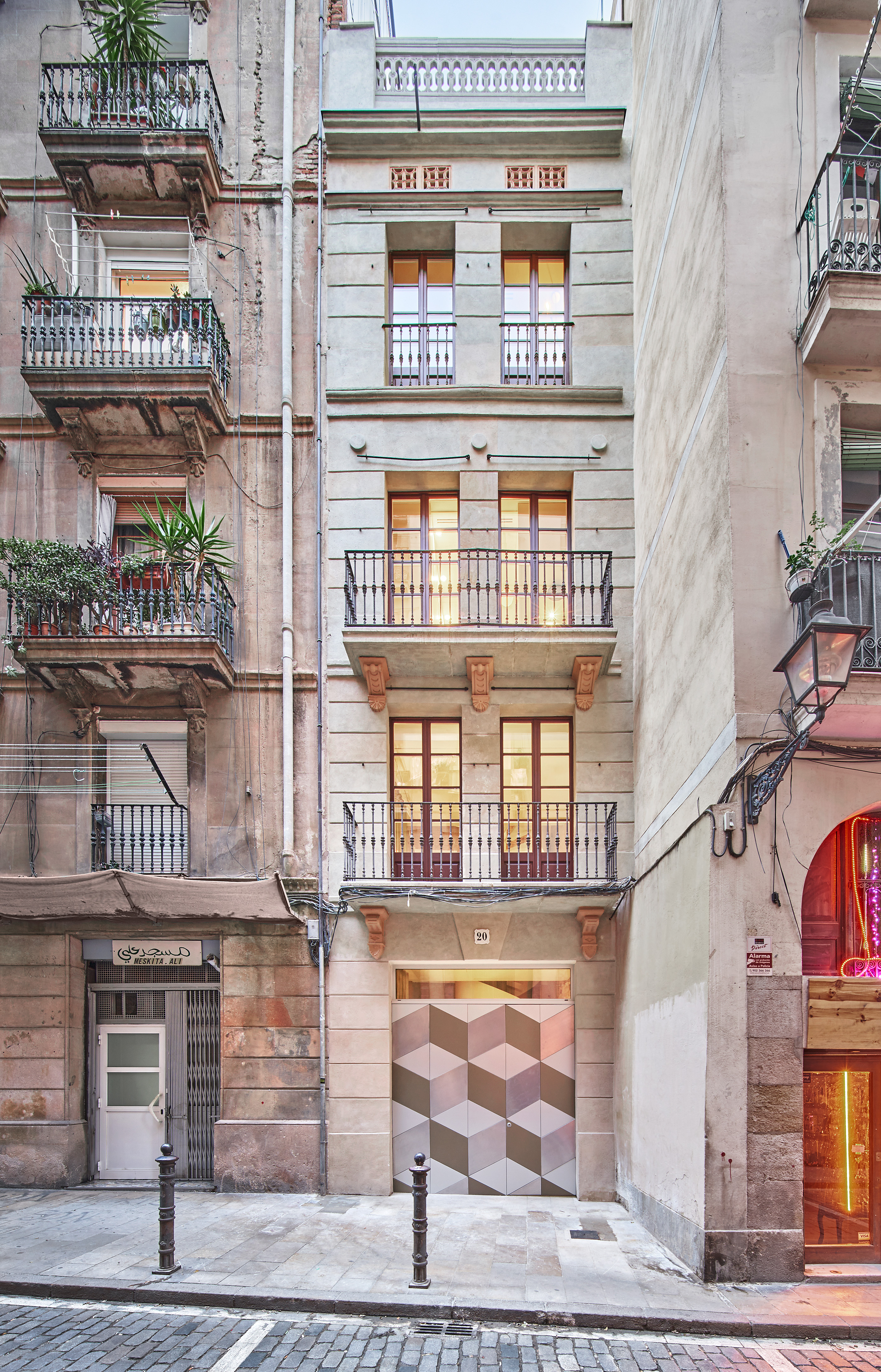
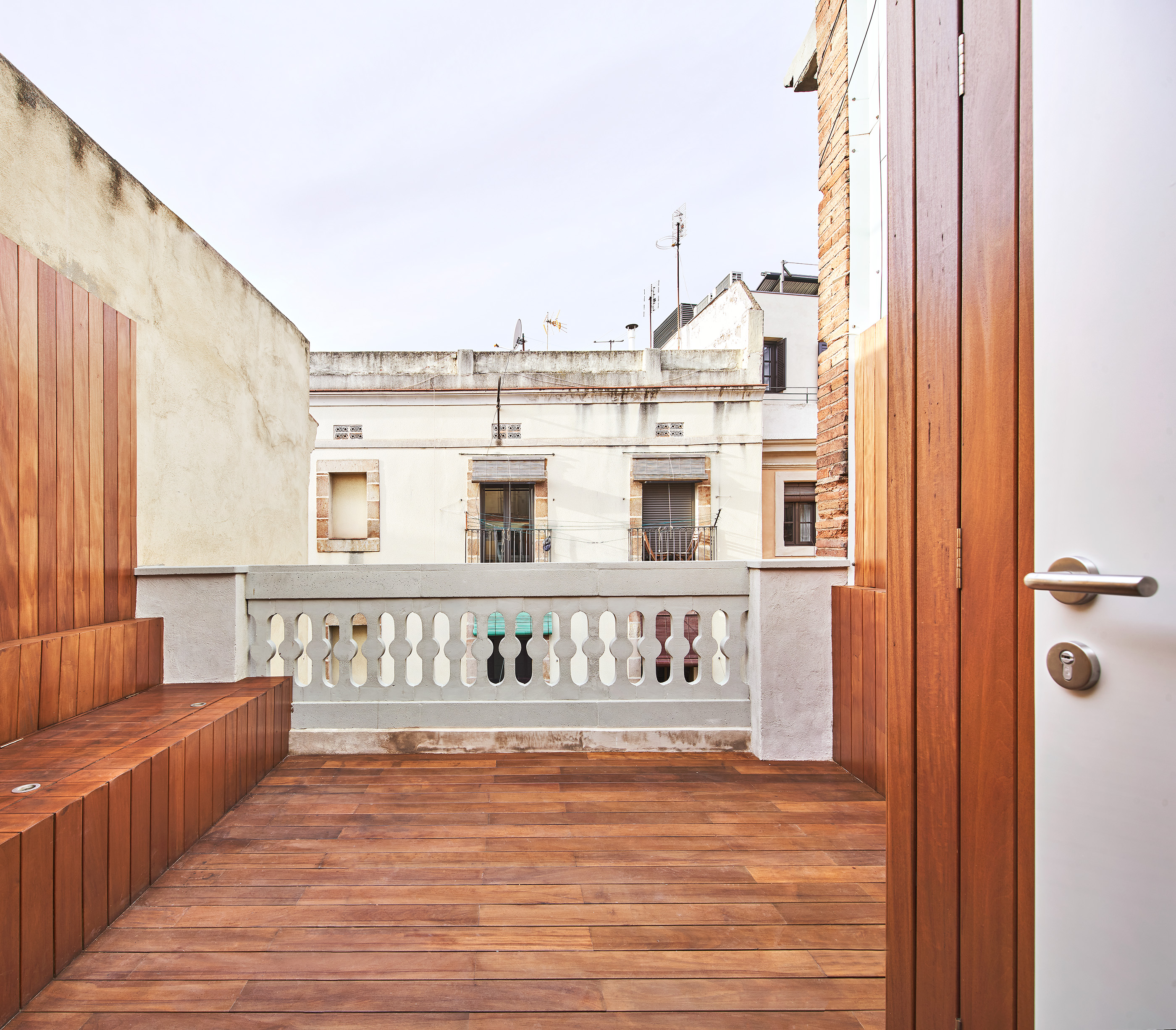
In a tight urban site, BSP 20 is a Barcelona home in the buzzing Borne district. The property results from the revamp of an existing structure, and is designed by Raul Sanchez Architects’ eponymous founder, and project architect Valentina Barberio. The house has been reimagined using bold graphics and surgical interventions, but with its architectural roots intact.
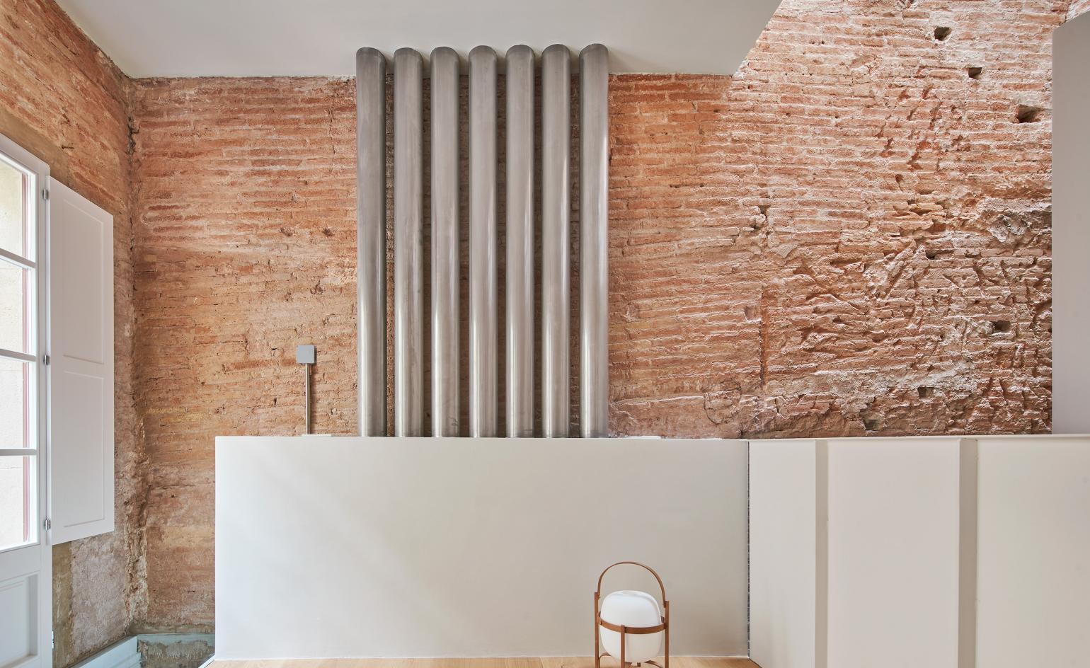
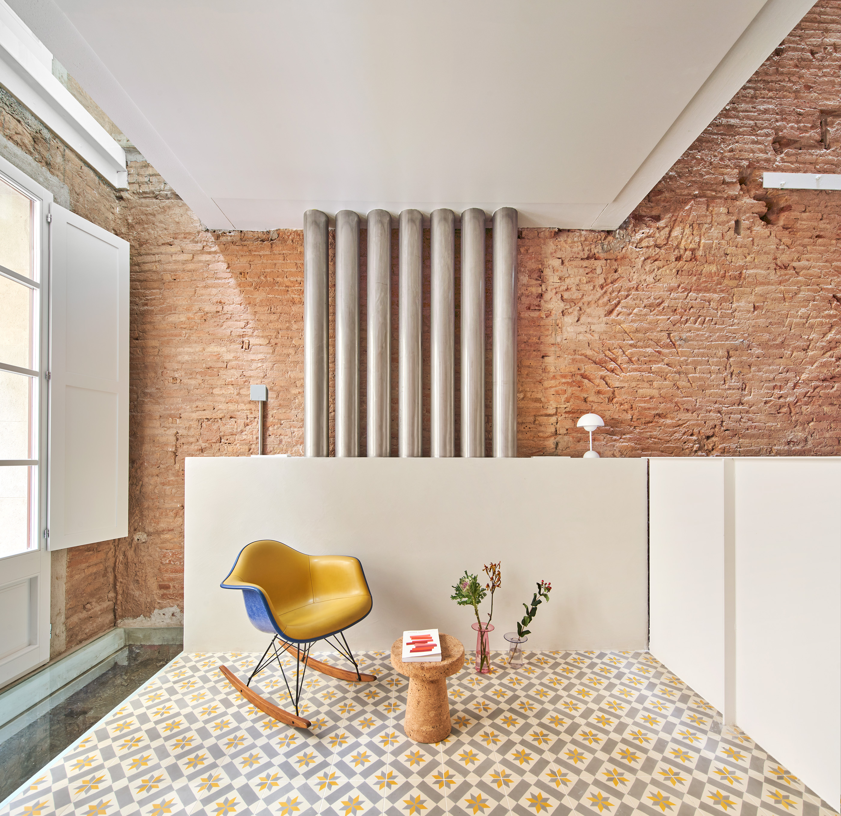
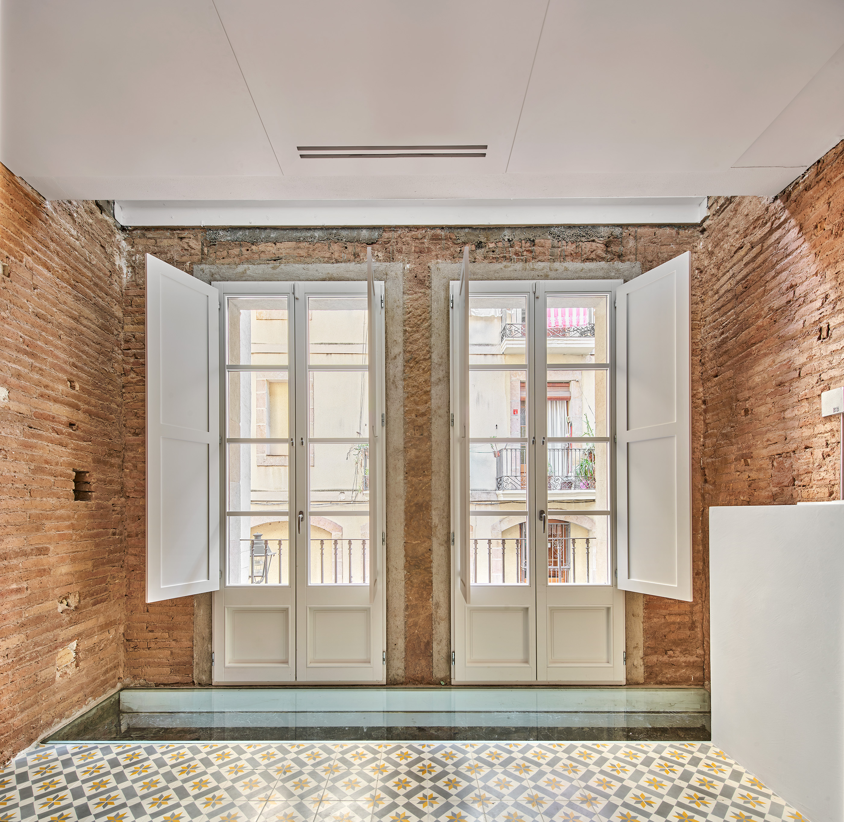
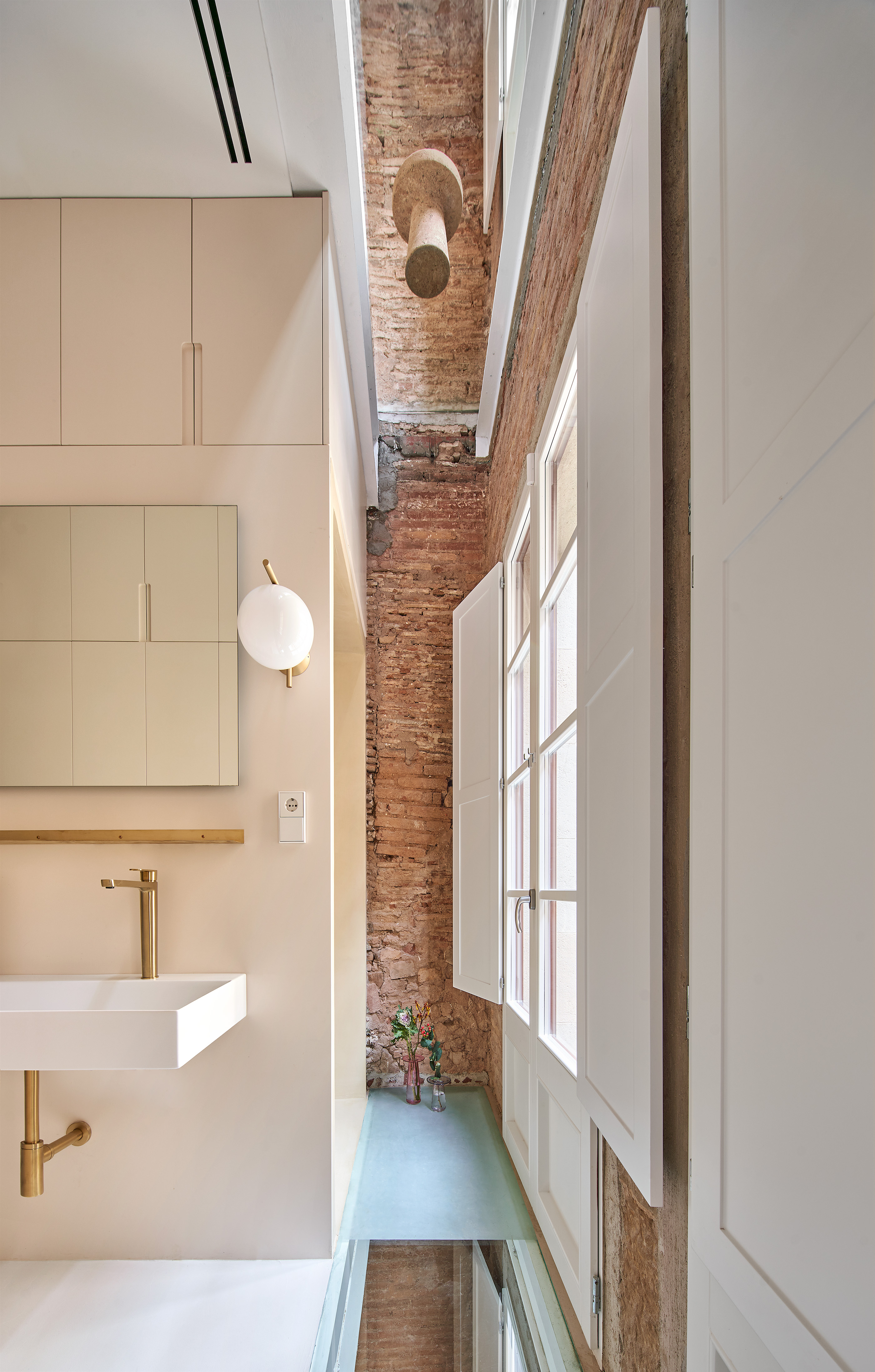
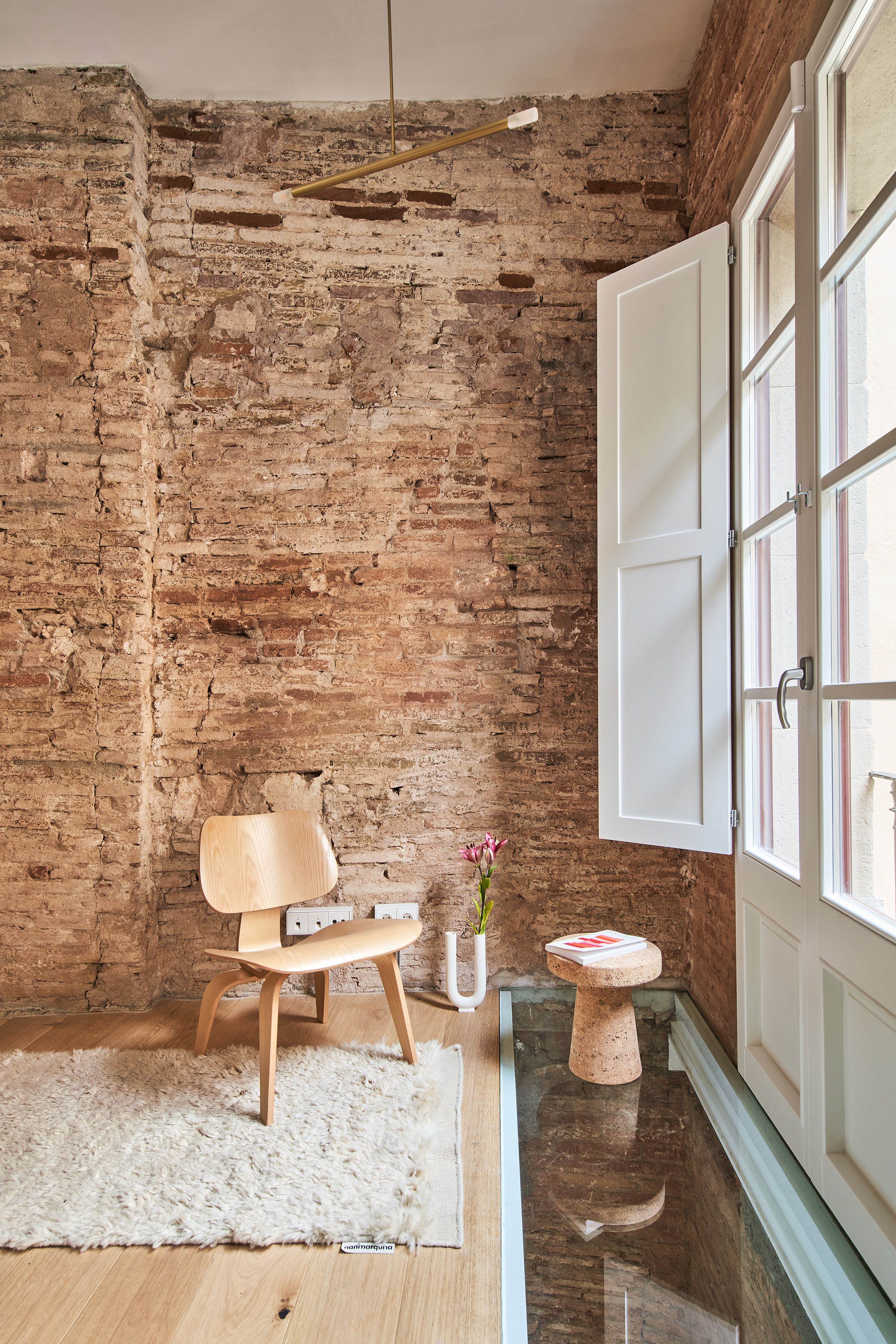
To arrive at the current design, the team reduced the building to its most basic assets. Removing damaged flooring and a semi-demolished stairwell, they were left with a promising 15m-tall blank canvas to play with. Only the façades, roof slab and dividing walls were retained, and the team rethought the property while keeping these elements central to its character. The exposed brick walls are a wink to the history of the house, celebrating the earthy ramshackle finish and textured grooves.
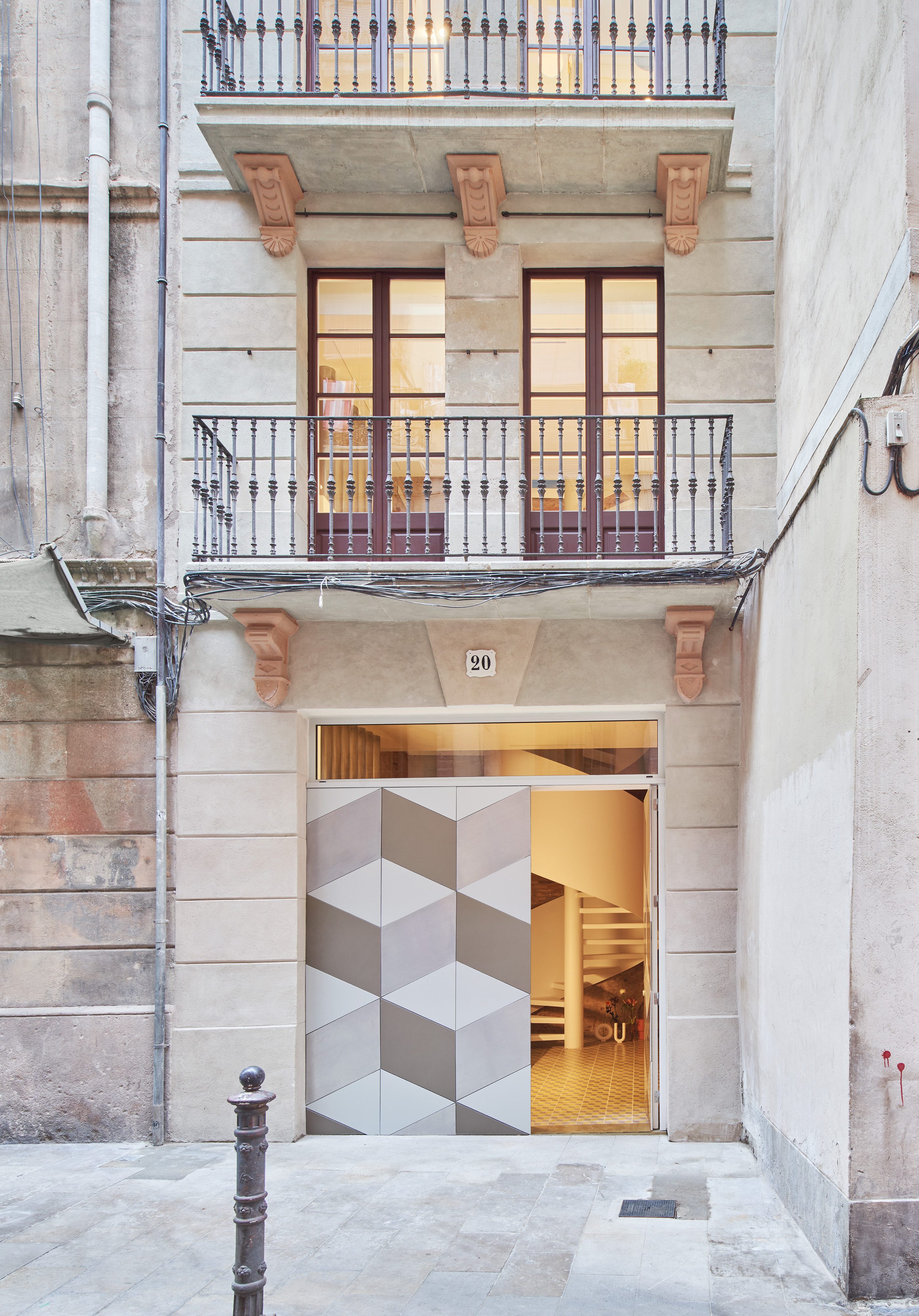
Inside the historic shell, three newly built floors are supported by beams running between the dividing walls, none of which make contact with the preserved building façades. This disconnection incites a lightness that permeates the space. Each floor is separated from the front façade by a gap covered by a sheet of glass, which creates visual portals to each room and carries sunlight throughout. The rear façade is similarly separated by an internal void, and the detachment from the front and back walls allows the floors to sit lightly in the property.
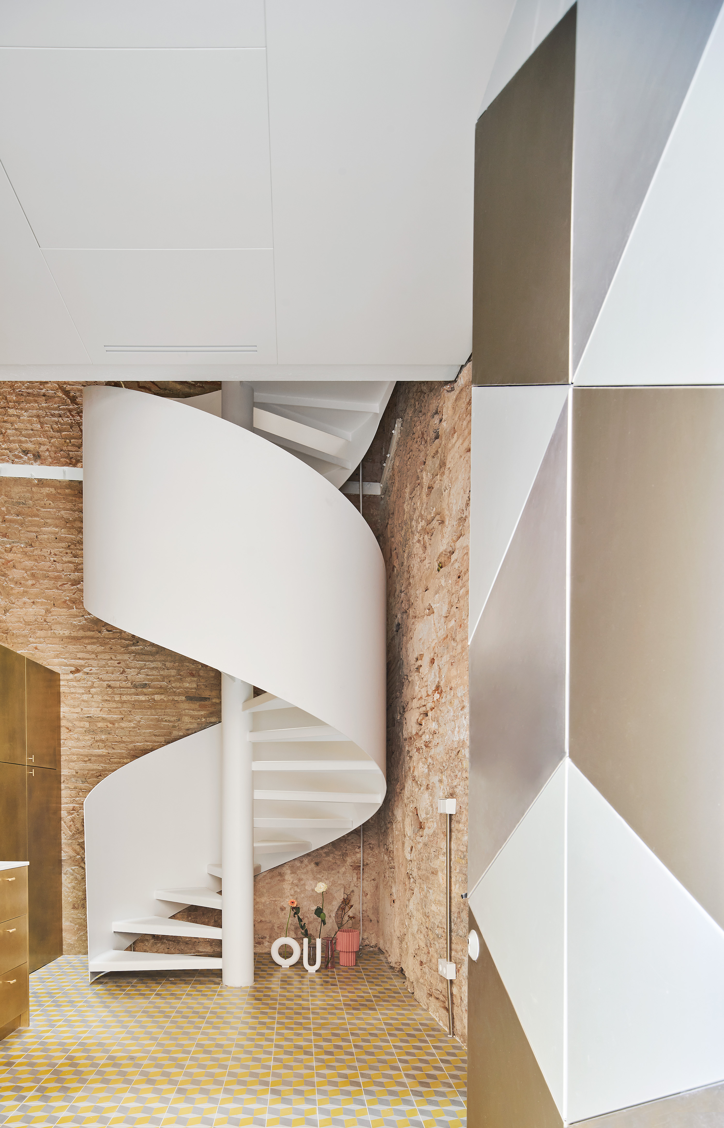
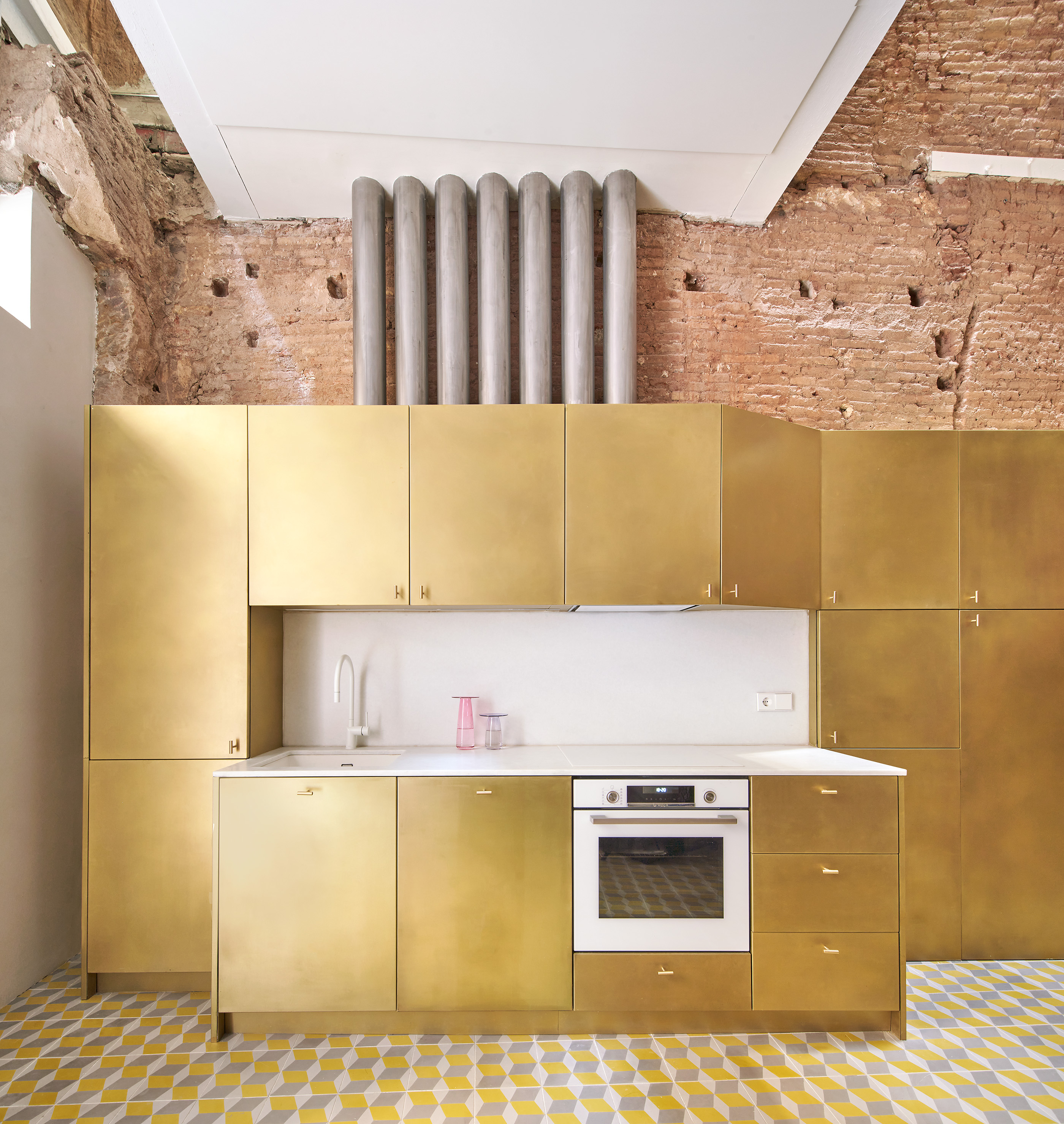
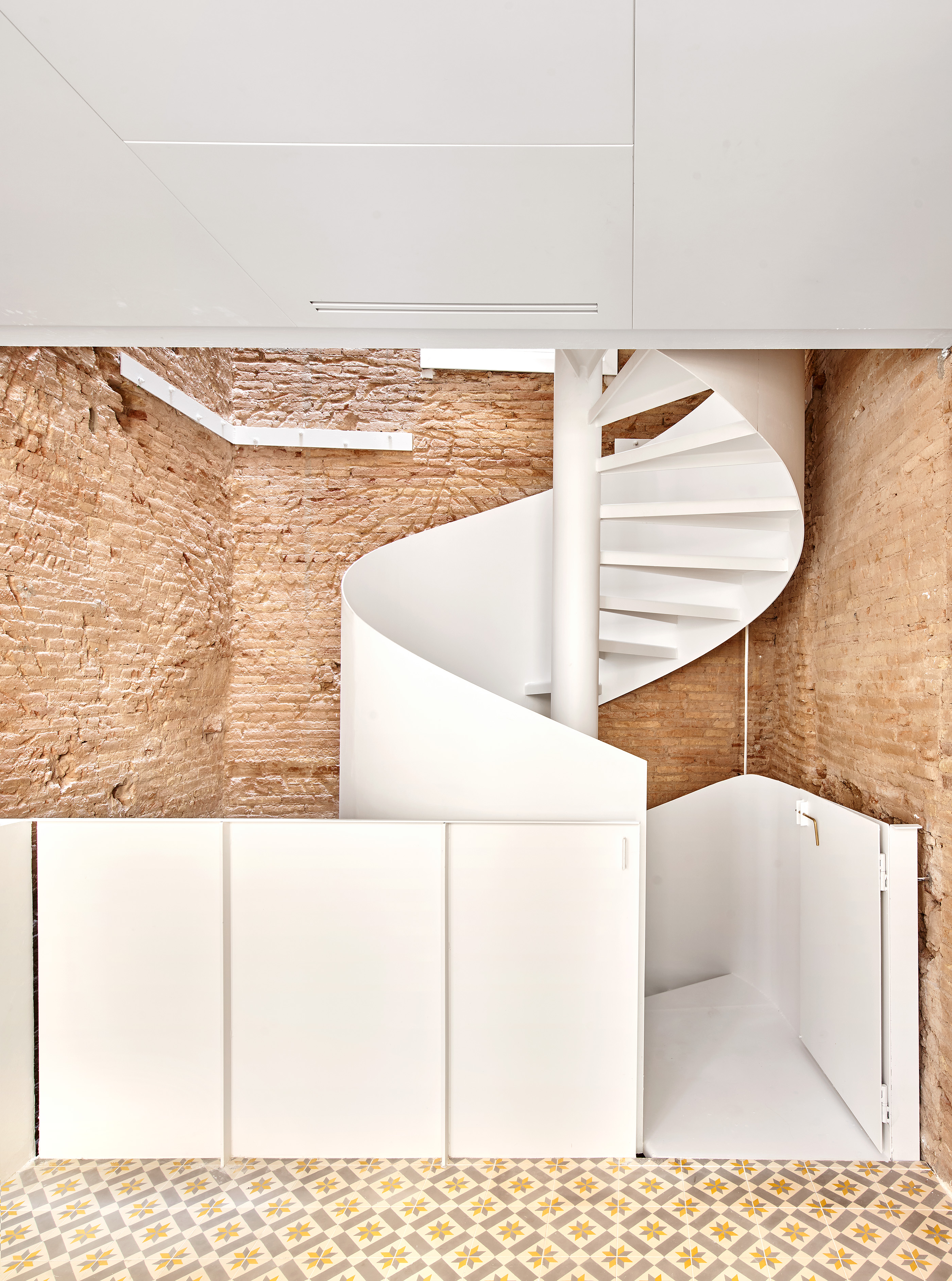
Uniting the smartly arranged floors is the home's glorious, freestanding winding staircase. Made up of seven exposed stainless steel cylinders, it runs from top to bottom of the house to connect levels and deliver utilities to all corners of the dwelling, without impacting the walls. The stair's visibility adds an industrial tone, while the white finish maintains a minimalist, calming feel. The outcome is characterful but understated, the pared-back decor punctuated by colourful elements in bold graphic designs.
The walls' roughness and utilitarian feel pairs comfortably with the decorative simplicity. Oak and microcement floors add warmth. The kitchen is perhaps the home’s brightest element, its flooring lined in accent tiles (in typical local style) and kitchen units clad in striking gold panelling, adding a flourish to this smart but understated Barcelona home.
INFORMATION
raulsanchezarchitects.com
Wallpaper* Newsletter
Receive our daily digest of inspiration, escapism and design stories from around the world direct to your inbox.
Martha Elliott is the Junior Digital News Editor at Wallpaper*. After graduating from university she worked in arts-based behavioural therapy, then embarked on a career in journalism, joining Wallpaper* at the start of 2022. She reports on art, design and architecture, as well as covering regular news stories across all channels.
-
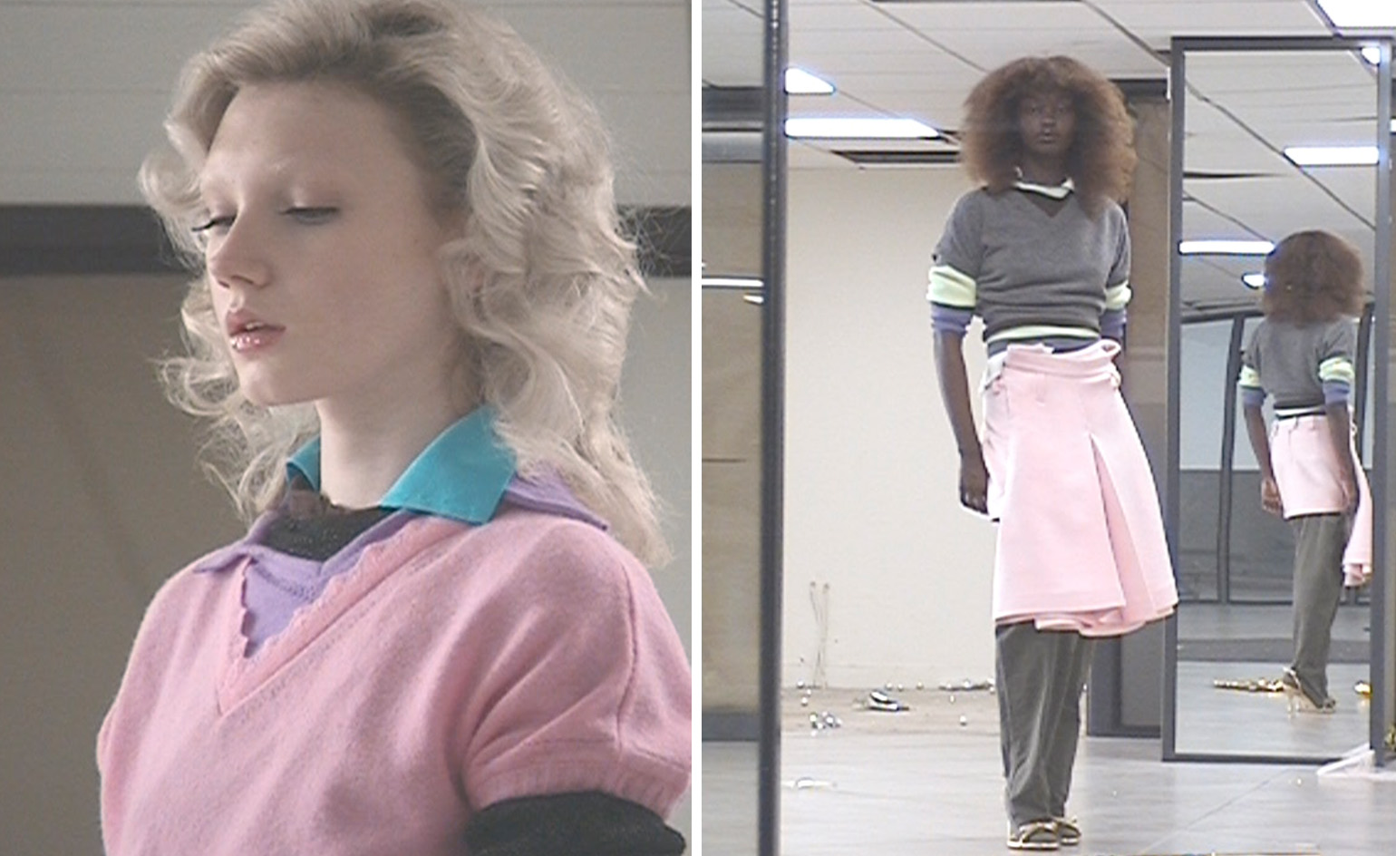 All-In is the Paris-based label making full-force fashion for main character dressing
Part of our monthly Uprising series, Wallpaper* meets Benjamin Barron and Bror August Vestbø of All-In, the LVMH Prize-nominated label which bases its collections on a riotous cast of characters – real and imagined
By Orla Brennan
-
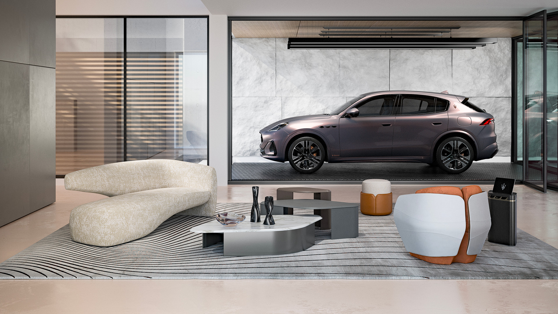 Maserati joins forces with Giorgetti for a turbo-charged relationship
Announcing their marriage during Milan Design Week, the brands unveiled a collection, a car and a long term commitment
By Hugo Macdonald
-
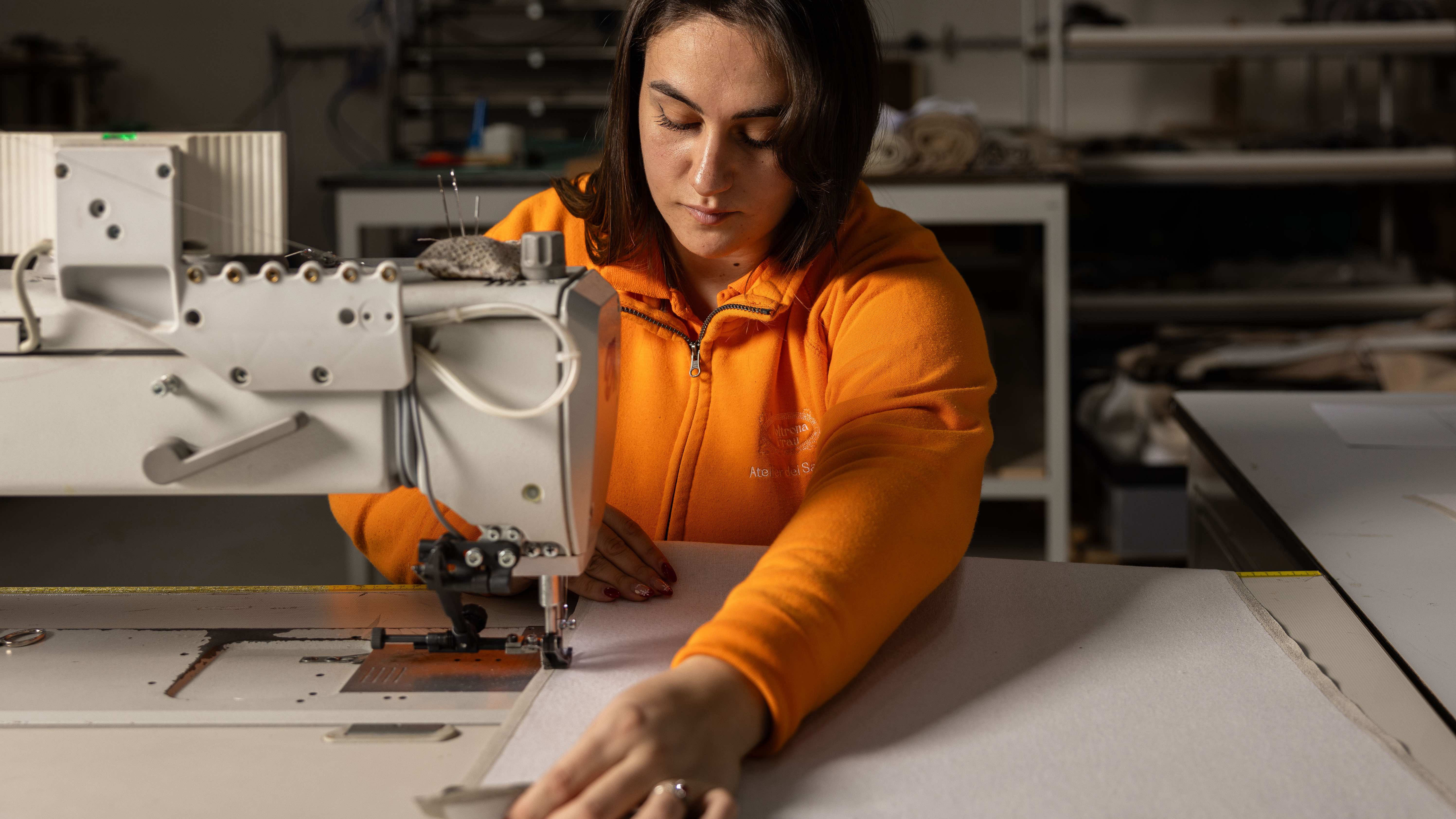 Through an innovative new training program, Poltrona Frau aims to safeguard Italian craft
The heritage furniture manufacturer is training a new generation of leather artisans
By Cristina Kiran Piotti
-
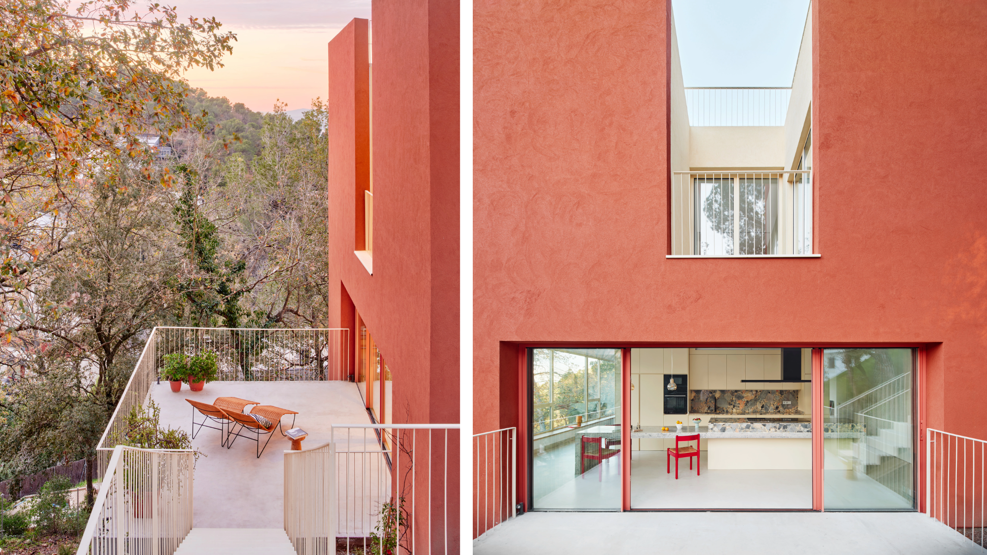 This striking Spanish house makes the most of a tricky plot in a good area
A Spanish house perched on a steep slope in the leafy suburbs of Barcelona, Raúl Sánchez Architects’ Casa Magarola features colourful details, vintage designs and hidden balconies
By Léa Teuscher
-
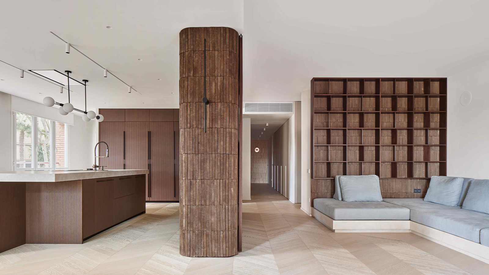 This brutalist apartment in Barcelona is surprisingly soft and gentle
The renovated brutalist apartment by Cometa Architects is a raw yet gentle gem in the heart of the city
By Tianna Williams
-
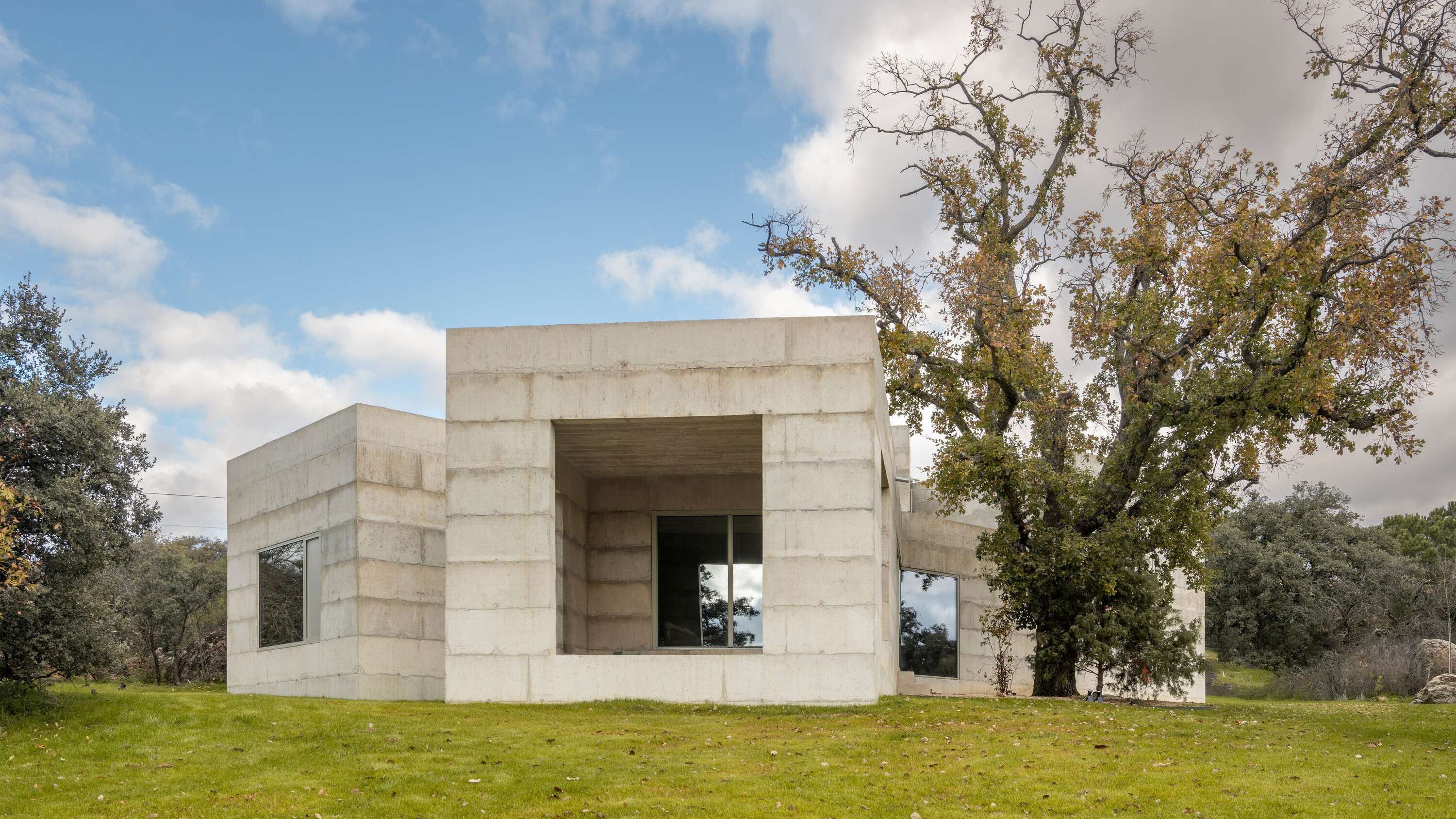 A brutalist house in Spain embraces its wild and tangled plot
House X is a formidable, brutalist house structure on a semi-rural plot in central Spain, shaped by Bojaus Arquitectura to reflect the robust flora and geology of the local landscape
By Jonathan Bell
-
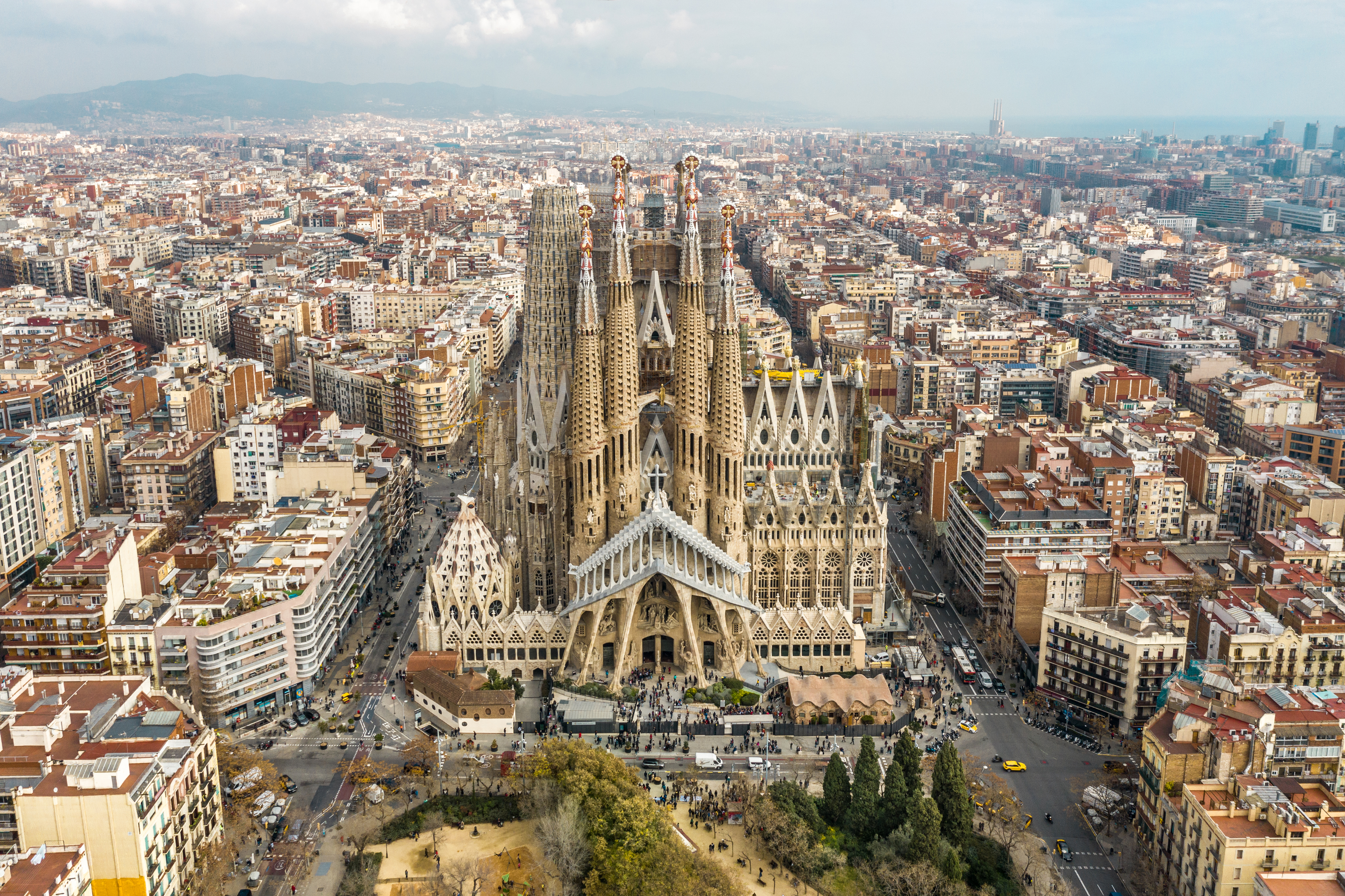 Antoni Gaudí: a guide to the architect’s magical world
Catalan creative Antoni Gaudí has been a unique figure in global architectural history; we delve into the magical world of his mesmerising creations
By Ellie Stathaki
-
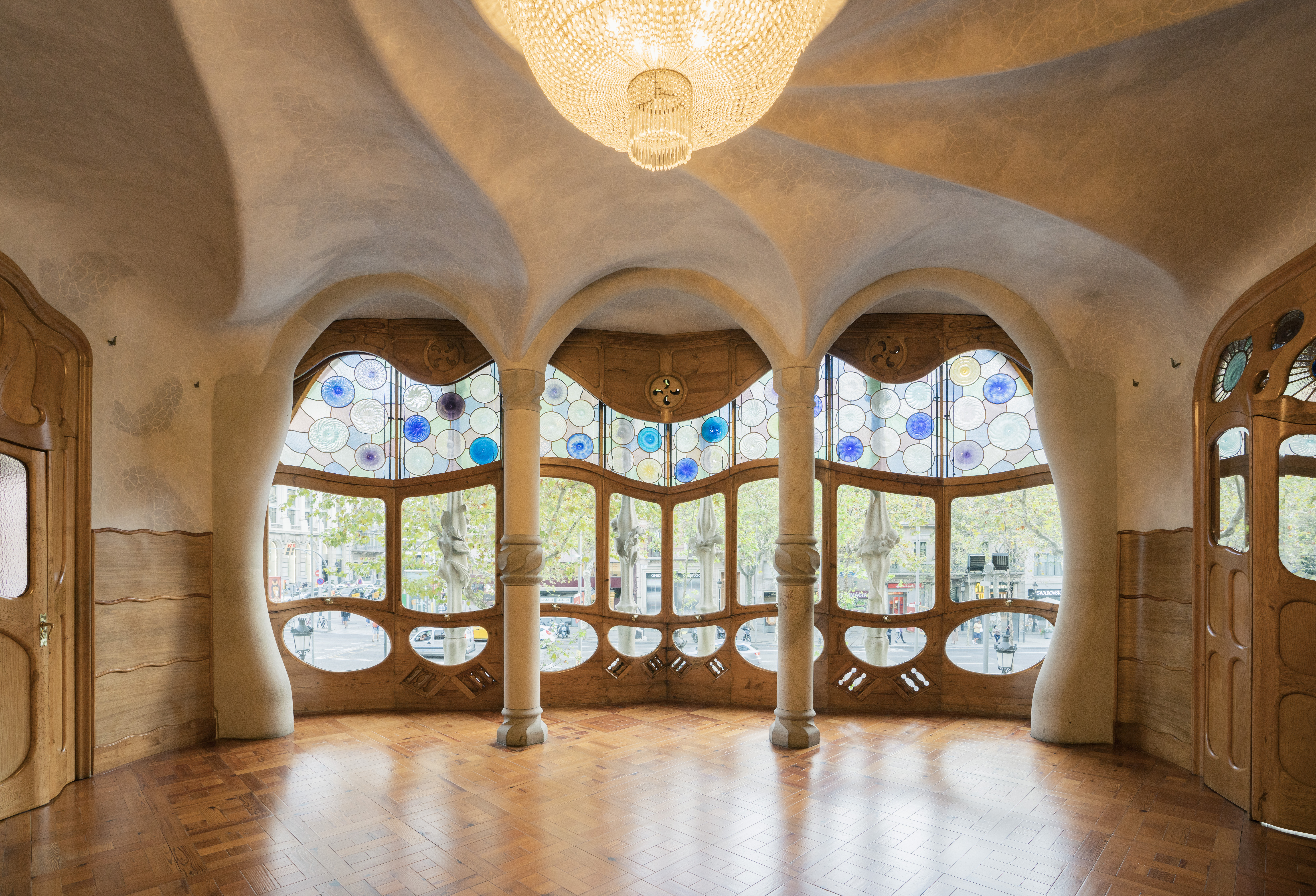 The case of Casa Batlló: inside Antoni Gaudí’s ‘happiest’ work
Casa Batlló by Catalan master architect Antoni Gaudí has just got a refresh; we find out more
By Ellie Stathaki
-
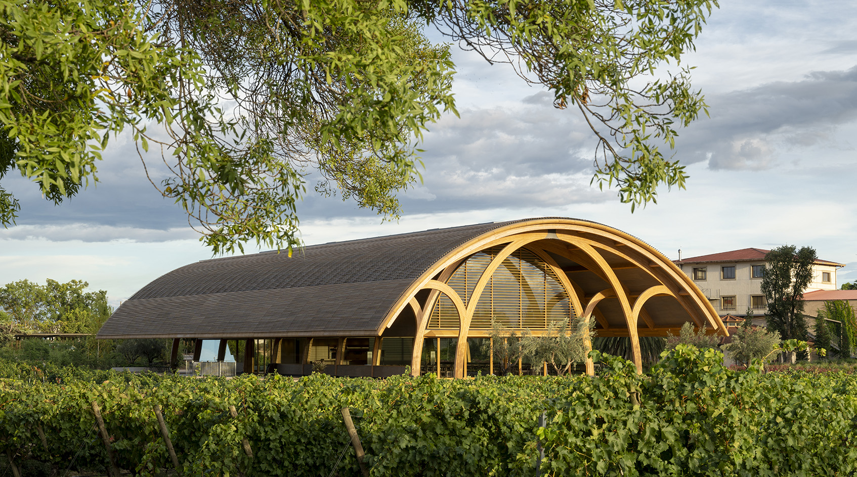 Bodegas Faustino Winery celebrates process through its versatile vaulted visitor centre
Bodegas Faustino Winery completes extension by Foster + Partners in Spain, marking a new chapter to the long-standing history between the architecture practice and their client
By Ellie Stathaki
-
 Playball Studio's architecture balances the organic and the technical
Playball Studio, a young Indo-Spanish design practice, features in the Wallpaper* Architects’ Directory 2024
By Pallavi Mehra
-
 In Palma, beloved watch boutique Relojeria Alemana gets a dramatic revamp
Edificio RA for Relojeria Alemana has been redesigned by OHLAB, refreshing a historical landmark in Palma, Mallorca with a 21st-century twist
By Ellie Stathaki