BuckleyGrayYeoman adds new layers to a 1920s building in east London
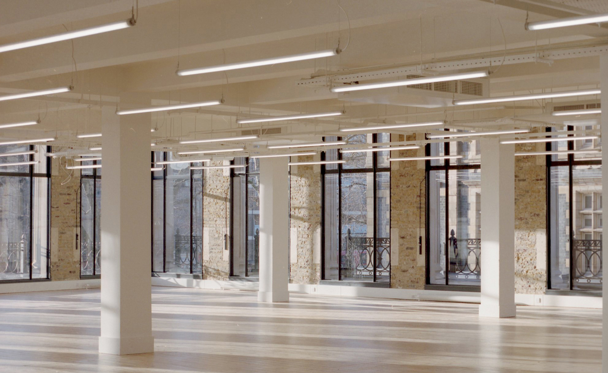
In the London neighbourhood of Whitechapel, a department store has been renovated into an office for London’s co-working community. Behind the thoughtful and elegant redesign is east London-based architecture practice BuckleyGrayYeoman (BGY), which has prided itself on preserving and celebrating the history of the building, while making it streamlined, airy and outward-looking.
Originally built in the 1920s and designed as a Wickham’s department store, this ‘Harrod’s of the east-end’ articulated its glamour and status through a grand neo-classical façade. Yet, as history has it, in the centre of the façade one stubborn clockmaker, Spiegelhalter, refused to sell up his shop and disrupted the Wickham’s vision – just one of the humourous stories to be told.
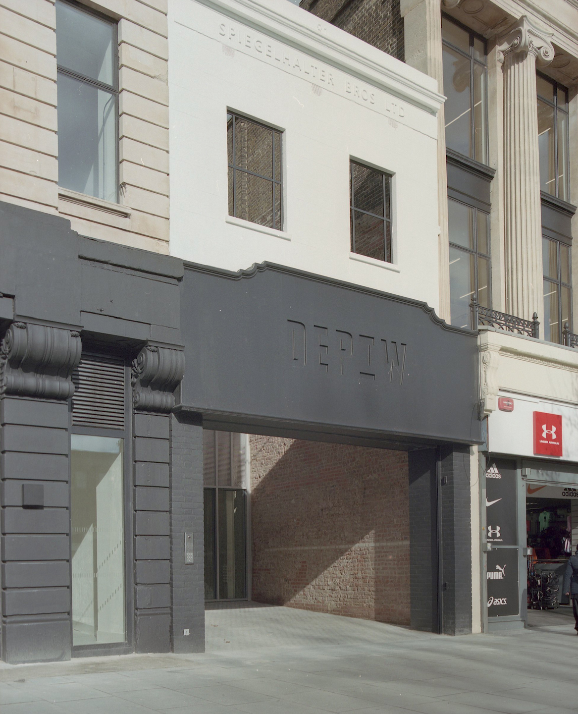
Amr Assaad, architect and associate director at BGY, made sure that these colourful stories are embedded across the design through material detailing and light layers of reconfiguration. BGY decided to preserve the Spiegelhalter shop façade, polishing up its typographic signage, and even drawing attention to it, by making this the entry to the office known as Dept W. ‘It’s a David and Goliath story,’ says Assaad.
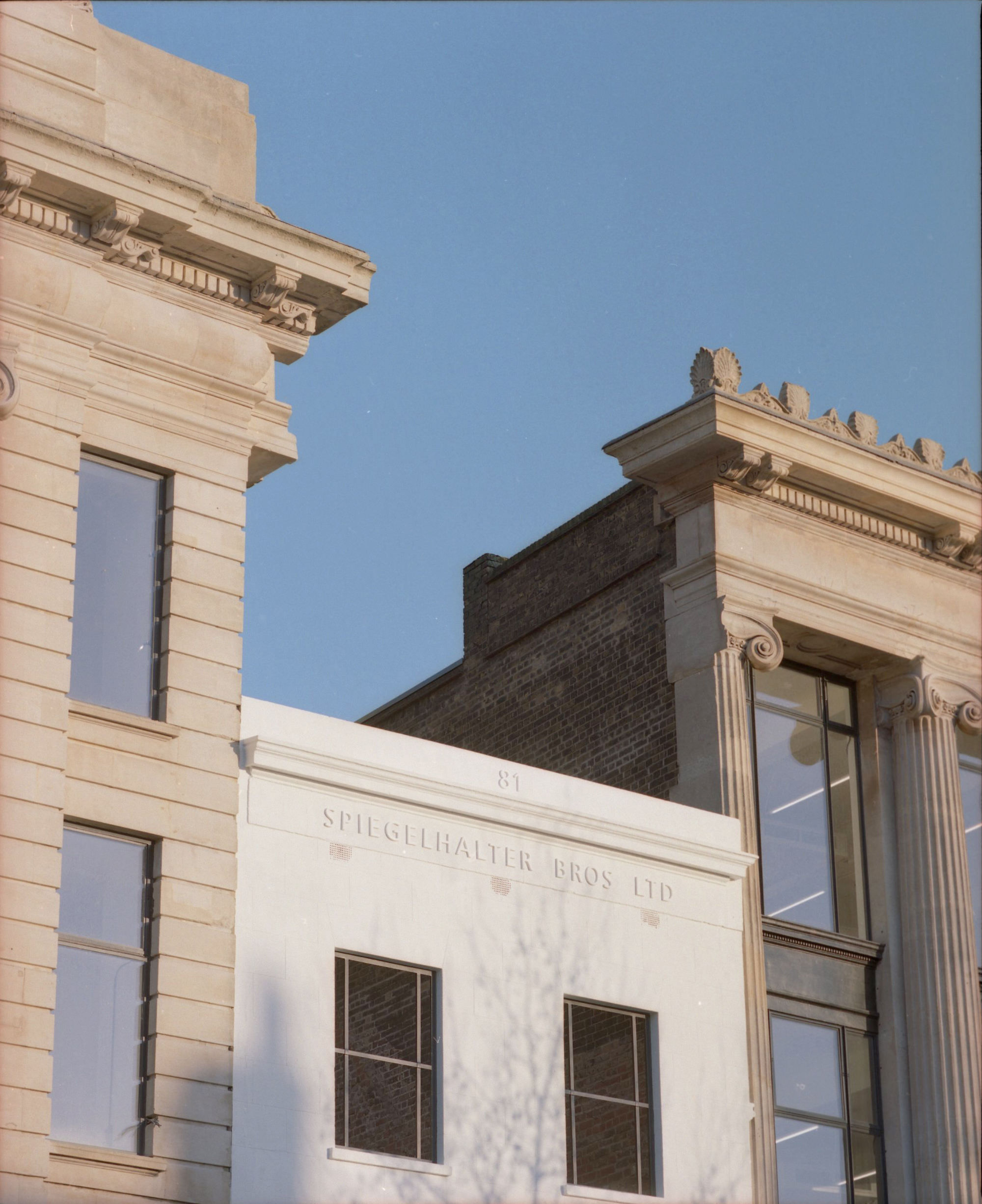
Exterior of the building showing the restored ‘Spiegelhalter Bros ltd’ sign.
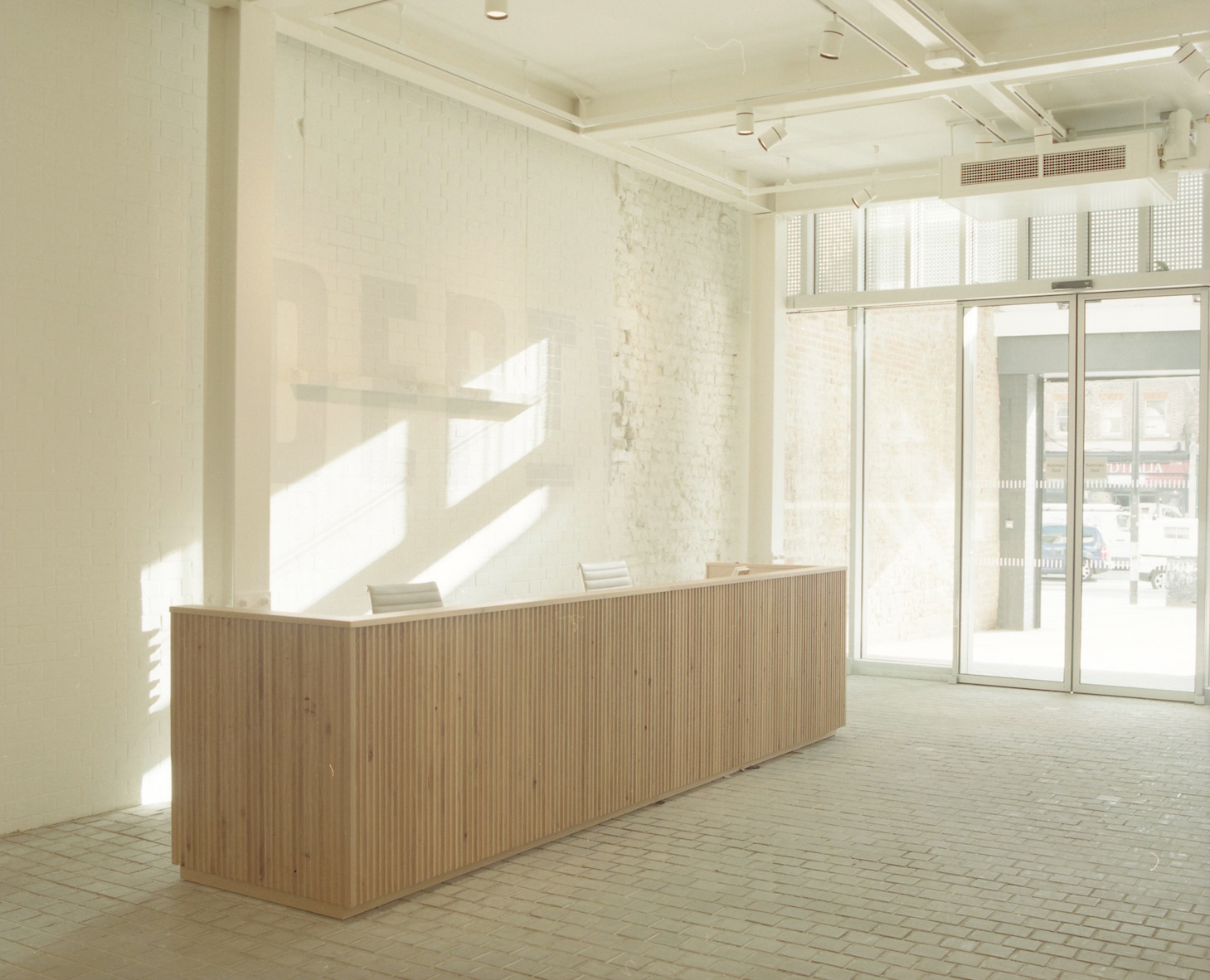
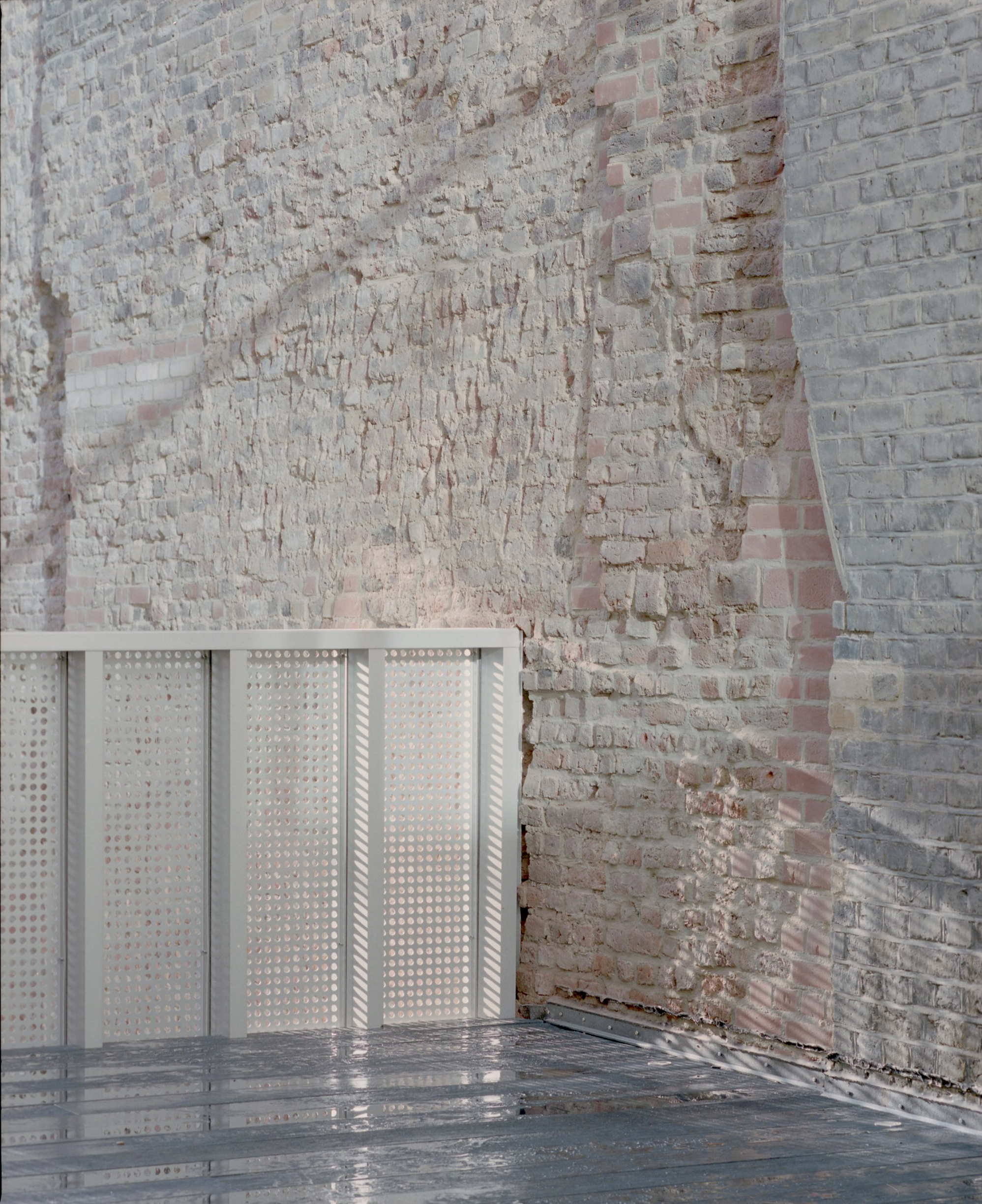
Restored original brickwork welcomes visitors into the open-air cobbled entry, tucked just behind the Spiegelhalter façade. A short journey through this friendly courtyard, a little retreat from the busy high street, and a metal-framed glazed inner façade marks entry to the minimal lobby, where again architectural details such as the brickwork and a timber staircase beyond, are allowed to do the talking. It’s remarkable how this simple space-making move changes the experience of entering the office – it could now be compared to that of entering a gallery or cultural space.
A public café with a with a glazed façade beside the office entrance creates even more openness on the high street. Inside, there are high ceilings and original terrazzo floors in the events space, as well as some smart meeting rooms for hire.

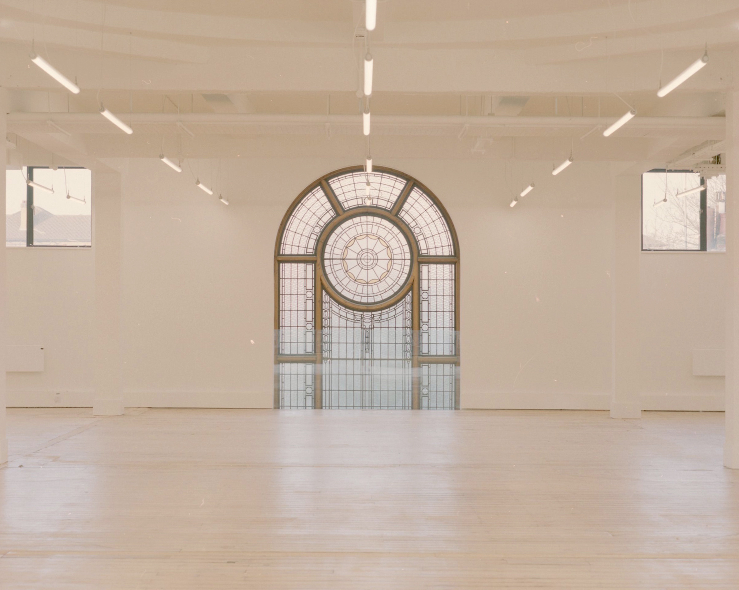
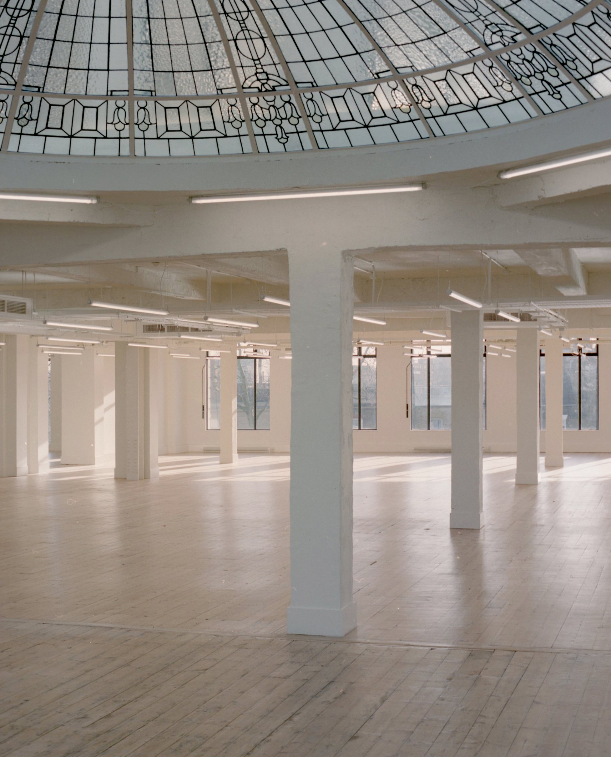
The restoration of the original 1920s oculus.
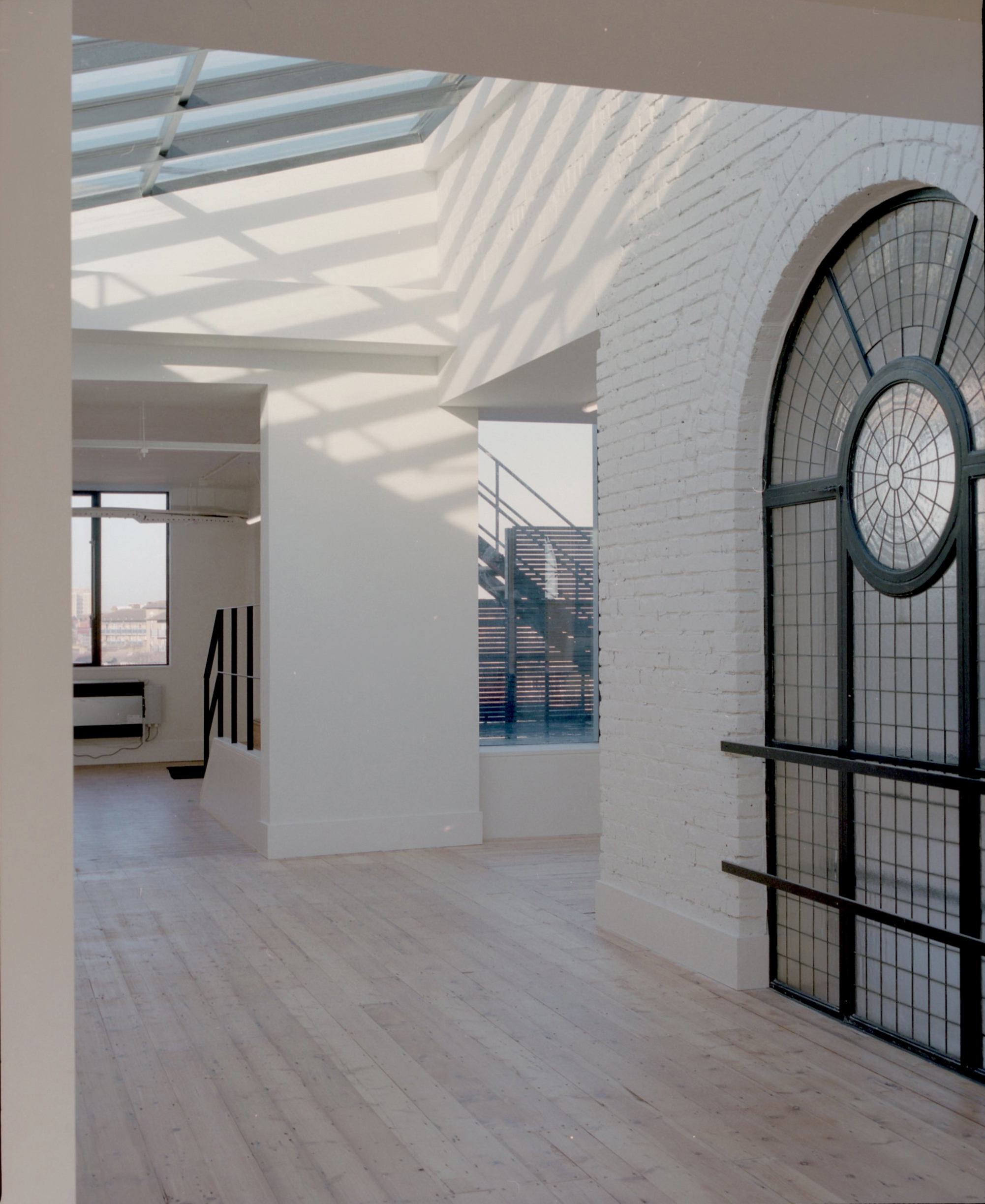
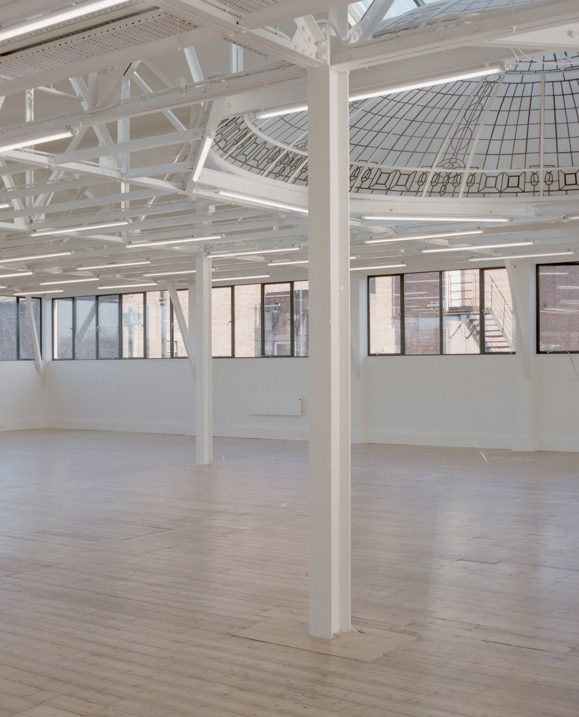
Across the rest of the building, the new BGY design brings order to a previously chaotic arrangement. Interior walls were removed at every opportunity to create vast open plan spaces with original wooden flooring restored. New outdoor terraces have been woven into the fabric of the building by strengthening existing roof space, and a central double lift shaft opens up at each level to light-filled spaces connected to outdoor access. The beauty of the space lies in how unique architectural moments of history have been combined with contemporary design.
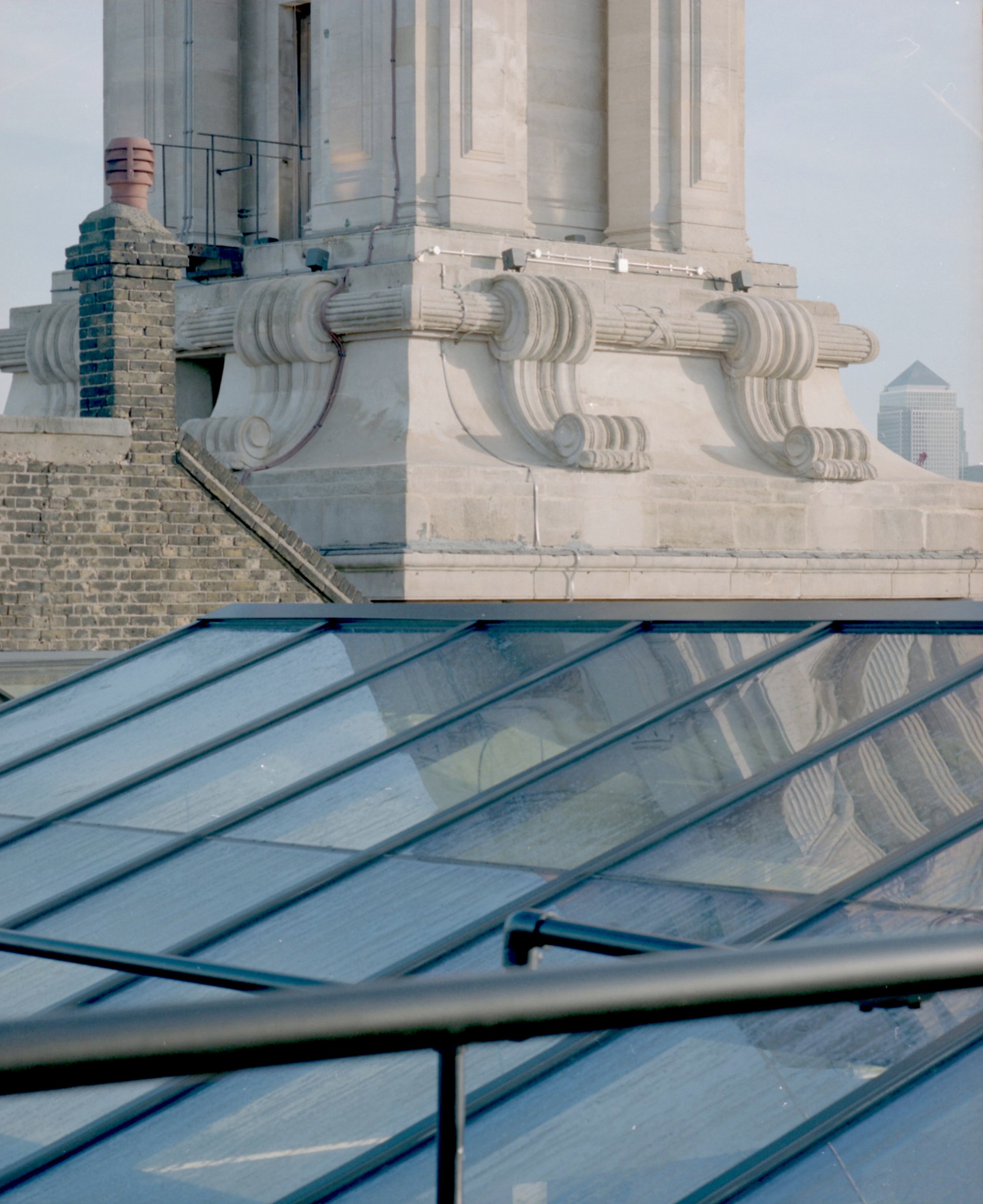
The crowning glories on the third floor are the two restored concave stained-glass oculi, preserved and supported with new structures that allows light to positively bounce through the space between the new sky-lights opened up by BGY – it's heavenly. In the 1920s department store, these oculi would have crowned elaborate staircases. Quite modestly, Assaad sees the BGY design as just another layer of history onto the building and the patchwork fabric of Whitechapel high street.

INFORMATION
For more information, visit the BuckleyGrayYeoman
Wallpaper* Newsletter
Receive our daily digest of inspiration, escapism and design stories from around the world direct to your inbox.
Harriet Thorpe is a writer, journalist and editor covering architecture, design and culture, with particular interest in sustainability, 20th-century architecture and community. After studying History of Art at the School of Oriental and African Studies (SOAS) and Journalism at City University in London, she developed her interest in architecture working at Wallpaper* magazine and today contributes to Wallpaper*, The World of Interiors and Icon magazine, amongst other titles. She is author of The Sustainable City (2022, Hoxton Mini Press), a book about sustainable architecture in London, and the Modern Cambridge Map (2023, Blue Crow Media), a map of 20th-century architecture in Cambridge, the city where she grew up.
-
 Extreme Cashmere reimagines retail with its new Amsterdam store: ‘You want to take your shoes off and stay’
Wallpaper* takes a tour of Extreme Cashmere’s new Amsterdam store, a space which reflects the label’s famed hospitality and unconventional approach to knitwear
By Jack Moss
-
 Titanium watches are strong, light and enduring: here are some of the best
Brands including Bremont, Christopher Ward and Grand Seiko are exploring the possibilities of titanium watches
By Chris Hall
-
 Warp Records announces its first event in over a decade at the Barbican
‘A Warp Happening,' landing 14 June, is guaranteed to be an epic day out
By Tianna Williams
-
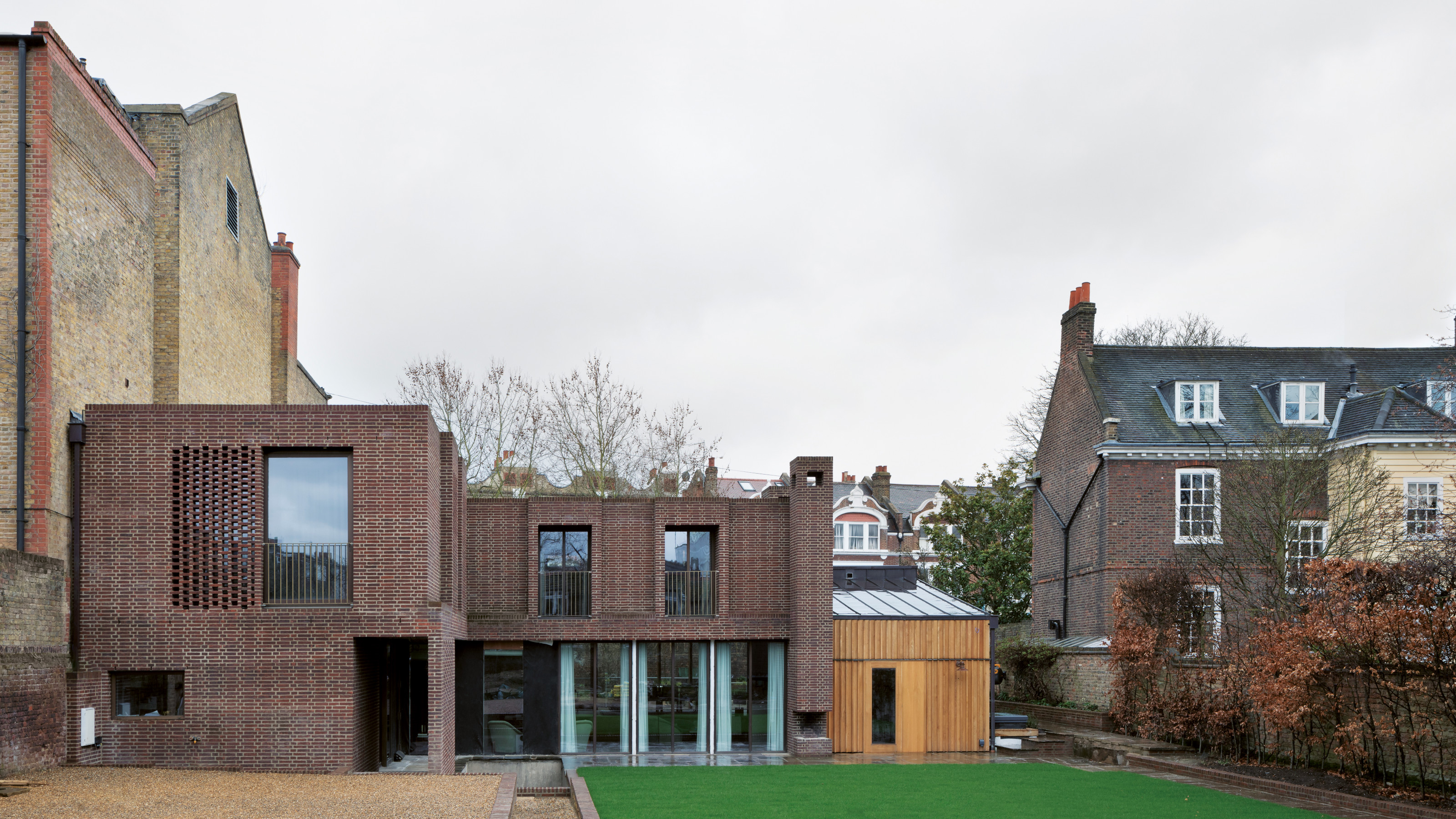 A new London house delights in robust brutalist detailing and diffused light
London's House in a Walled Garden by Henley Halebrown was designed to dovetail in its historic context
By Jonathan Bell
-
 A Sussex beach house boldly reimagines its seaside typology
A bold and uncompromising Sussex beach house reconfigures the vernacular to maximise coastal views but maintain privacy
By Jonathan Bell
-
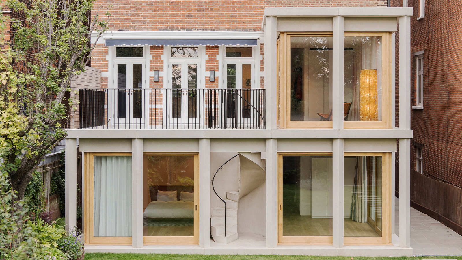 This 19th-century Hampstead house has a raw concrete staircase at its heart
This Hampstead house, designed by Pinzauer and titled Maresfield Gardens, is a London home blending new design and traditional details
By Tianna Williams
-
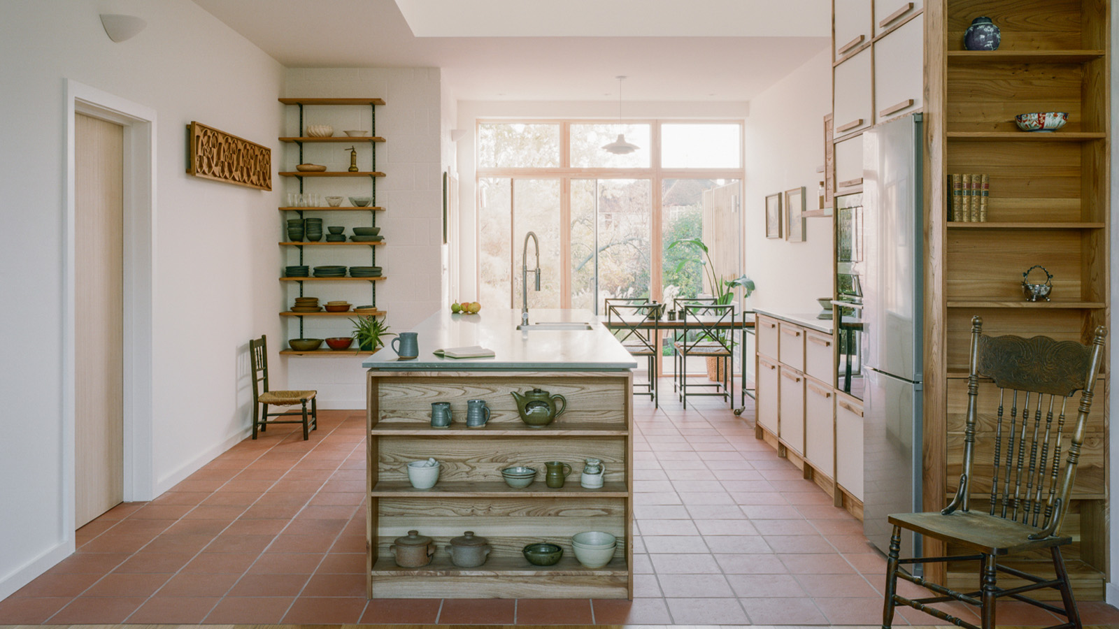 An octogenarian’s north London home is bold with utilitarian authenticity
Woodbury residence is a north London home by Of Architecture, inspired by 20th-century design and rooted in functionality
By Tianna Williams
-
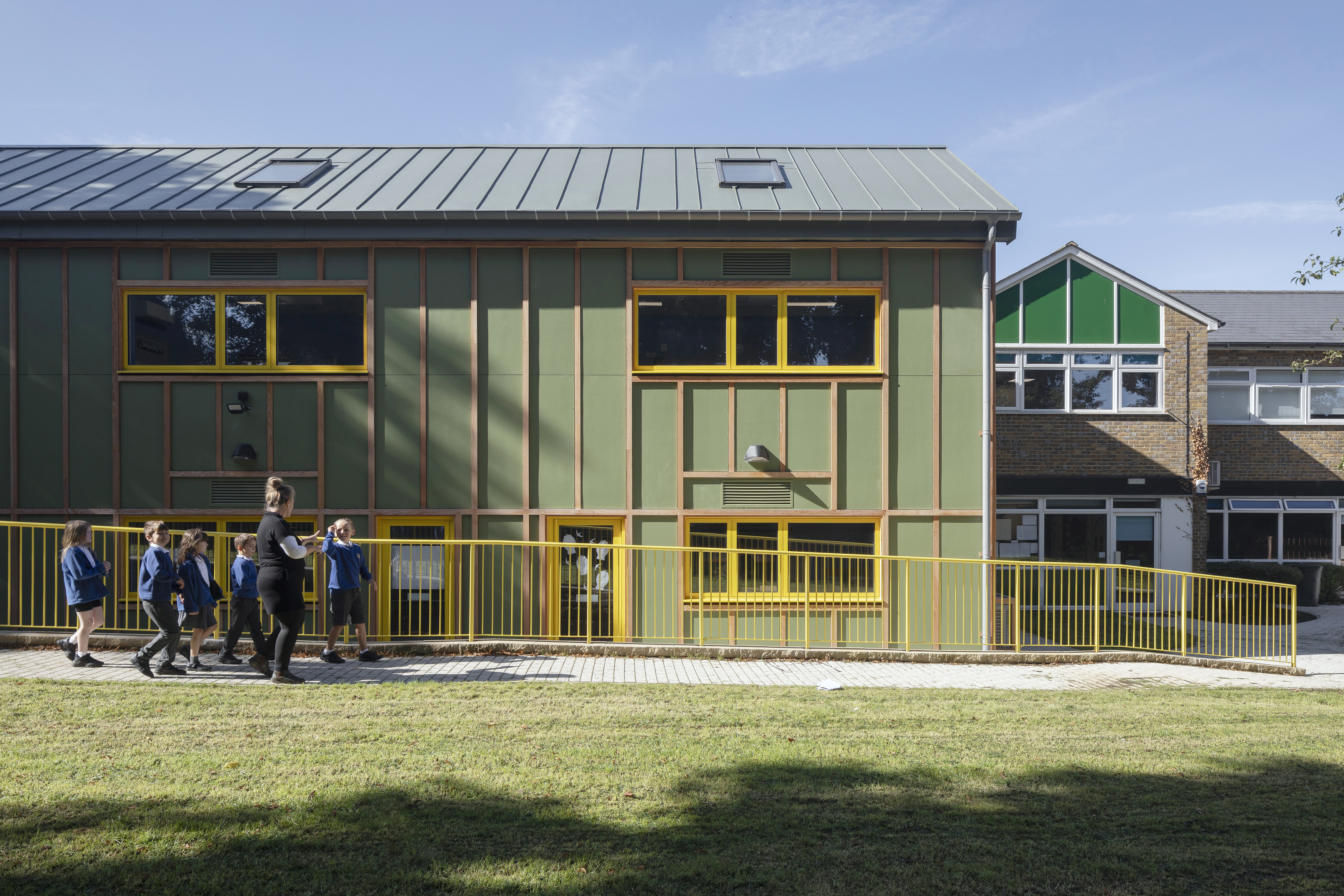 What is DeafSpace and how can it enhance architecture for everyone?
DeafSpace learnings can help create profoundly sense-centric architecture; why shouldn't groundbreaking designs also be inclusive?
By Teshome Douglas-Campbell
-
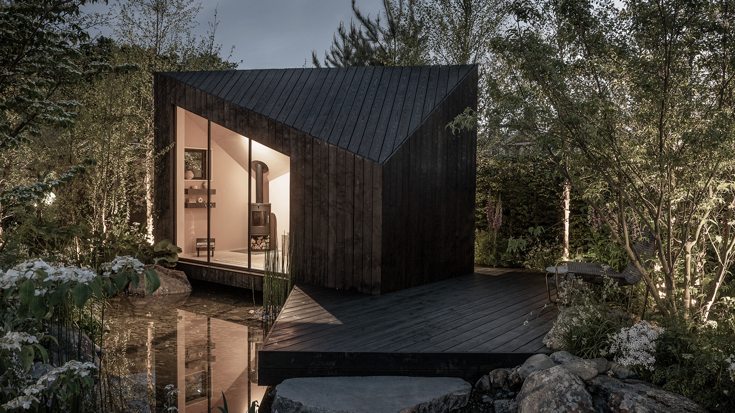 The dream of the flat-pack home continues with this elegant modular cabin design from Koto
The Niwa modular cabin series by UK-based Koto architects offers a range of elegant retreats, designed for easy installation and a variety of uses
By Jonathan Bell
-
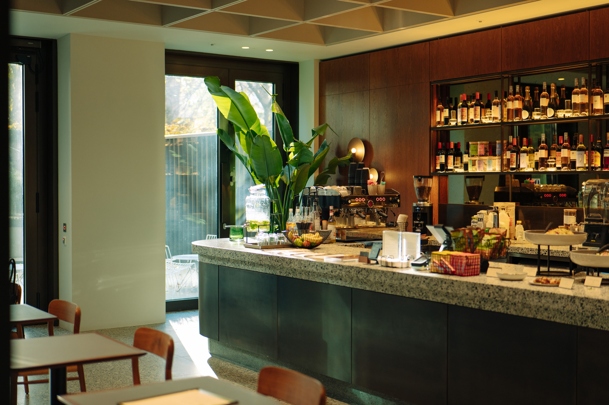 Are Derwent London's new lounges the future of workspace?
Property developer Derwent London’s new lounges – created for tenants of its offices – work harder to promote community and connection for their users
By Emily Wright
-
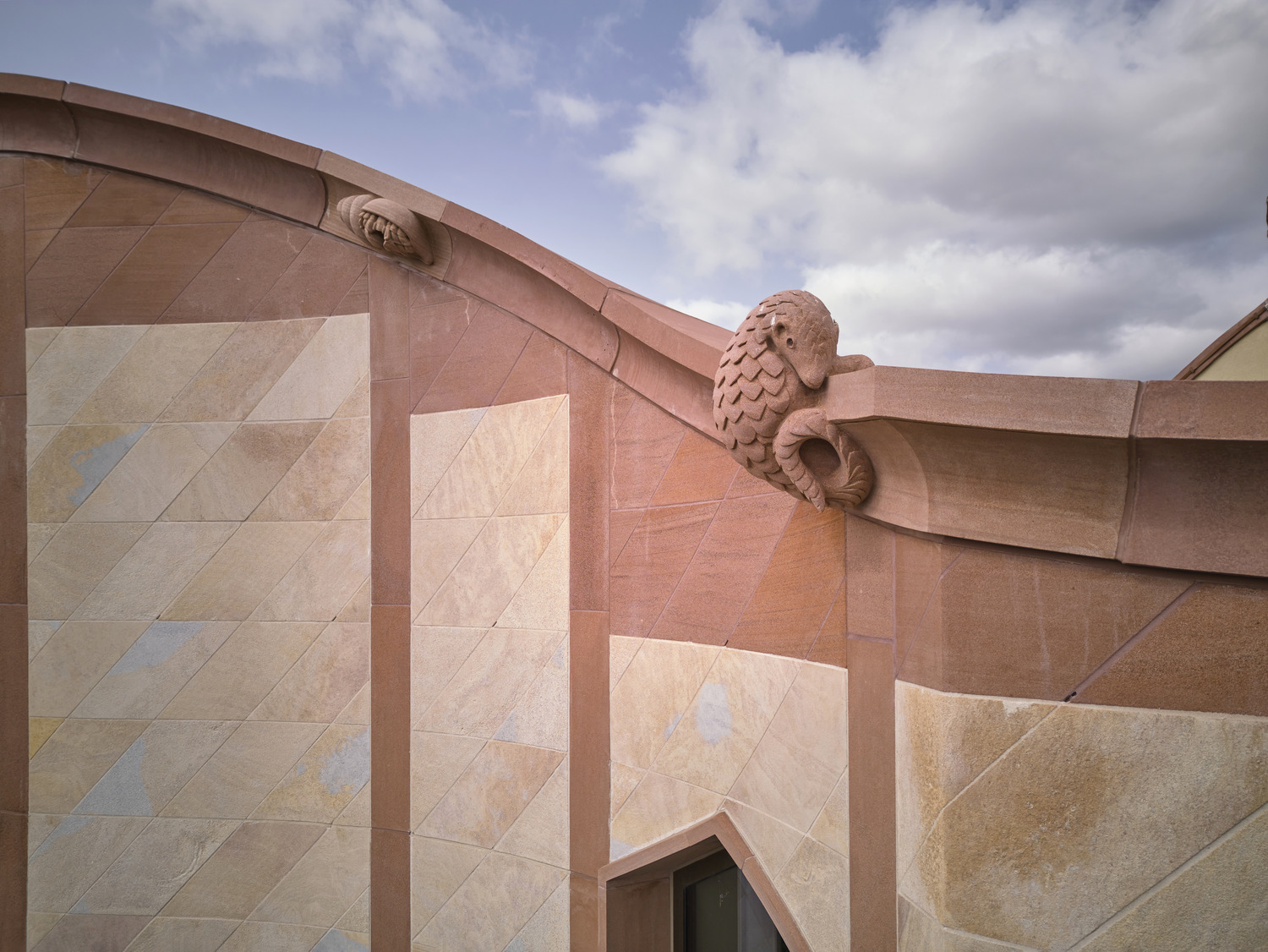 Showing off its gargoyles and curves, The Gradel Quadrangles opens in Oxford
The Gradel Quadrangles, designed by David Kohn Architects, brings a touch of playfulness to Oxford through a modern interpretation of historical architecture
By Shawn Adams