Buffalo AKG Art Museum by OMA looks to the future
The Buffalo AKG Art Museum (formerly the Albright-Knox Art Gallery) is reborn with a striking OMA-designed extension, site-specific installations, and a new focus on the local community
Gregory Halpern - Photography
Receive our daily digest of inspiration, escapism and design stories from around the world direct to your inbox.
You are now subscribed
Your newsletter sign-up was successful
Want to add more newsletters?
When I was growing up in Buffalo, New York, it was in a decades-long post-industrial slump, and known mainly for chicken wings, act-of-God blizzards, and a beloved, often heartbreaking football team. But it had a glorious past as one of America’s most prosperous cities, and an exceptional legacy of art and architecture, including the world-renowned Albright-Knox Art Gallery. Now, Buffalo is experiencing a long-awaited rebirth, along with a stunning overhaul for this gem of a cultural institution.
The sixth-oldest museum in the United States, the Albright-Knox Art Gallery was established in 1862 as the Buffalo Fine Arts Academy to showcase the art of its day. Architect Edward Brodhead Green designed its first permanent building, a Greek Revivalist structure inaugurated in 1905, on the edge of the Frederick Law Olmsted-designed Delaware Park. Several visionaries helped make the museum great, including Anson Conger Goodyear, who pushed for the acquisition in 1926 of Picasso’s La Toilette (its nudity temporarily cost him his place on the board). In 1939, Goodyear established the Room of Contemporary Art. ‘That became a boost to the original DNA of “we live with our times”,’ notes current director Janne Sirén, poached from the Helsinki Art Museum in 2013. ‘Or, as the saying goes, “when the paint is still wet”.’ From 1938 onwards, under Seymour H Knox Jr and Gordon M Smith, the museum built up its holdings hungrily and intelligently, acquiring masterpieces by the likes of Matisse, Pollock, Rothko, Bacon, de Kooning and Warhol, and amassing one of the world’s top collections of abstract expressionism, pop art and minimalism.
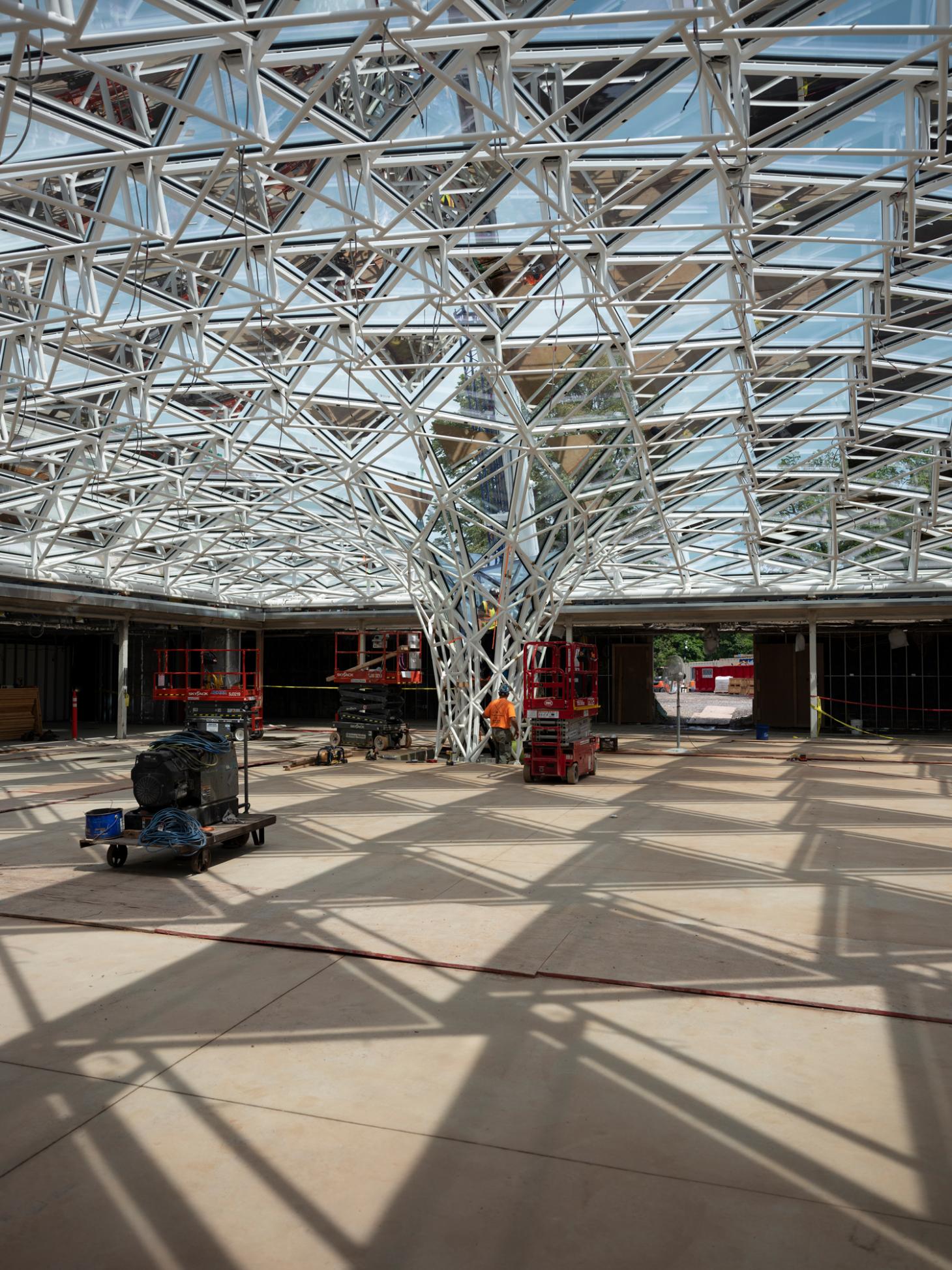
Olafur Eliasson and Sebastian Behmann of Studio Other Spaces designed a glass-and- steel canopy installation for the courtyard of the 1962 extension. This new Town Square will offer free public access.
To display its acquisitions, the museum commissioned Buffalo native Gordon Bunshaft to design a sleek, modernist glass box with an auditorium in 1962. Renamed the Albright-Knox Art Gallery (after two philanthropists who donated generously to the institution), the museum tripled its collection between 1960 and 2000, again overwhelming the space. (At one point, Sirén had a Cézanne and a Monet hanging in his office.) By the turn of this century, the Bunshaft addition no longer met conservation standards or ADA regulations. Art itself was changing, becoming bigger. The Albright-Knox even lacked a loading dock – Sirén says a crane would hoist larger artworks to an opening in the side of the building: ‘There are pictures of Pollocks literally flying through the air, with four art handlers holding the ropes so they don’t fling too much!’
In 2012, the museum asked Snøhetta to draw up a master plan for a new addition. But when Sirén was hired, he took a step back. Buffalo has a nearly 30 per cent poverty rate, and he wanted to involve the local community in the process. ‘Many people appreciate the Albright-Knox in a castle-on-the-hill way, like, “it’s not my museum”,’ he says. ‘Museums can be many things, but they have to be of, and for, the community.’ He held nine months of town hall meetings, and found that people supported an expansion as long as it did not encroach on the park. During the architecture competition, he told the five finalists: ‘We will ask you to flex your design muscle, but we’re probably not going to build anything you propose, because we’re looking for partners.’ The winner was OMA with the New York office’s Shohei Shigematsu as the partner in charge, for a proposal to build an extension over the Bunshaft courtyard (with executive architects Cooper Robertson), and the humility to throw it away.
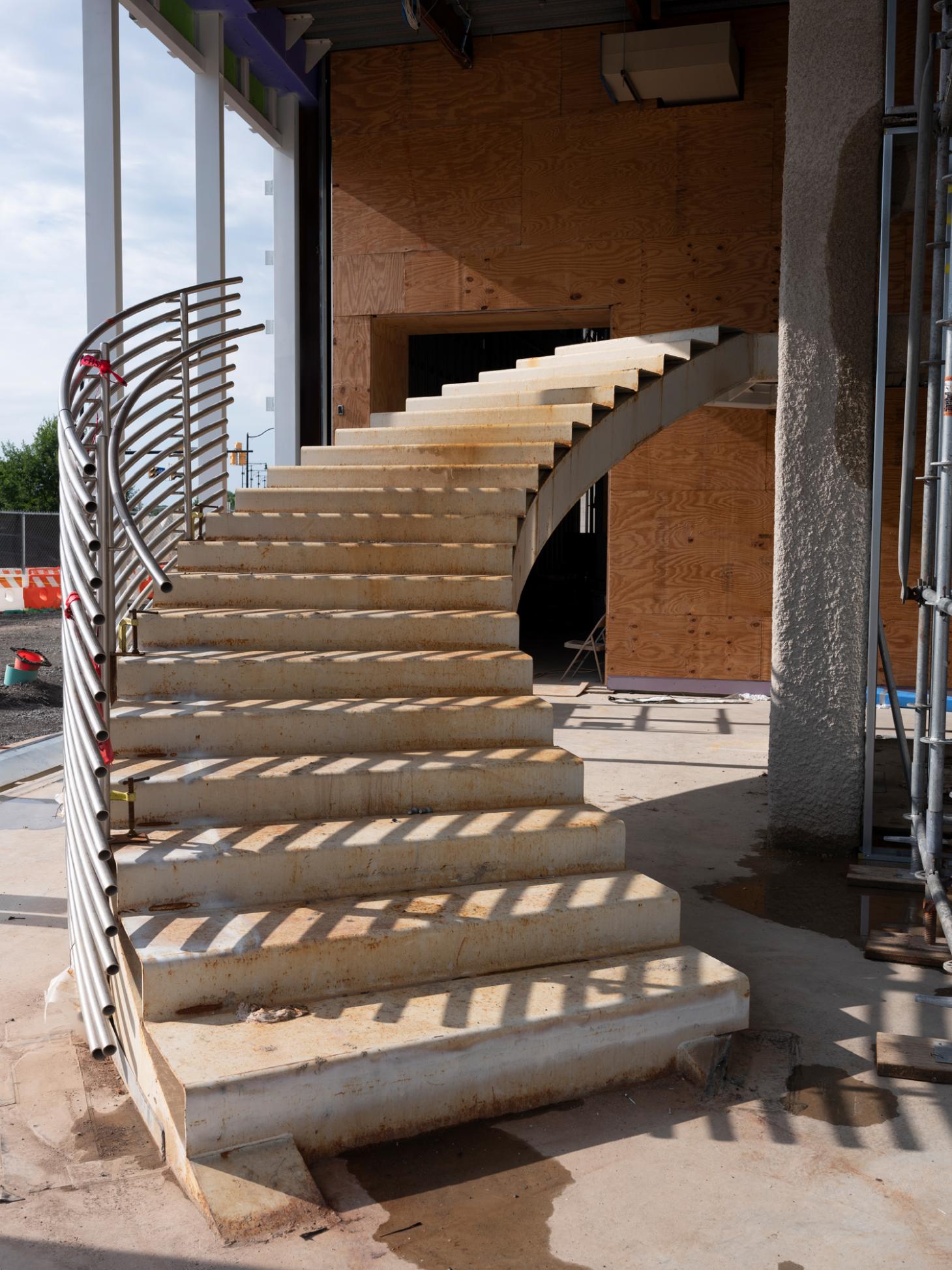
A curved staircase will lead visitors from the entrance lobby to the galleries and scenic bridge.
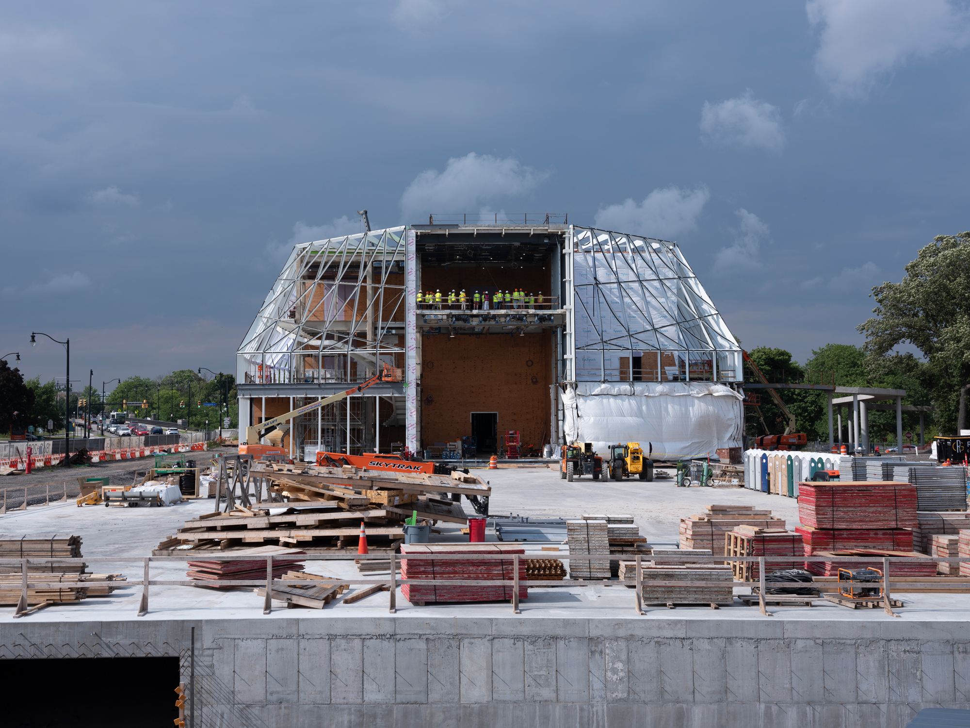
Instead, the new addition is a standalone building located where a parking lot once stood. Last summer, as I drove on the Scajaquada Expressway to visit the site, the three-storey, geometric building suddenly loomed into view on my left. Beyond it, the 1905 building stood like a proud parent, attached by the umbilical cord of a curving bridge. Each floor of the new addition will provide between 7,000 and 9,500 sq ft of exhibition space, with the galleries growing smaller and less defined as you move upwards. The ground floor features a 38ft-high space, while the third floor contains an immense 7,530 sq ft gallery with only two permanent supporting columns.
On the second floor, a sculpture terrace will wrap around the building between the exterior walls and a clear glass curtain wall, offering 360-degree views. Walking on it, I took in Olmsted-era trees, a Jaume Plensa sculpture temporarily wrapped in blue plastic on the lawn, the copper roof crest of the 1905 building, and a new architectural artwork by Studio Other Spaces reflected in the dark glass of the 1962 building.
Shigematsu says the addition responds to the role of 21st-century museums as drivers of community build-up through art: ‘Our focus was to present those efforts as a sign of openness, by having a space where people can improvise, and activities visible from outside – not about a closed authoritarian façade.’ He explains that they arrived at the shape by creating the core of the building, the ground-floor galleries, like a plus sign, opening up the corners to transparency. ‘If you occupied the ground level with the galleries, then it would become another fortress,’ he says.
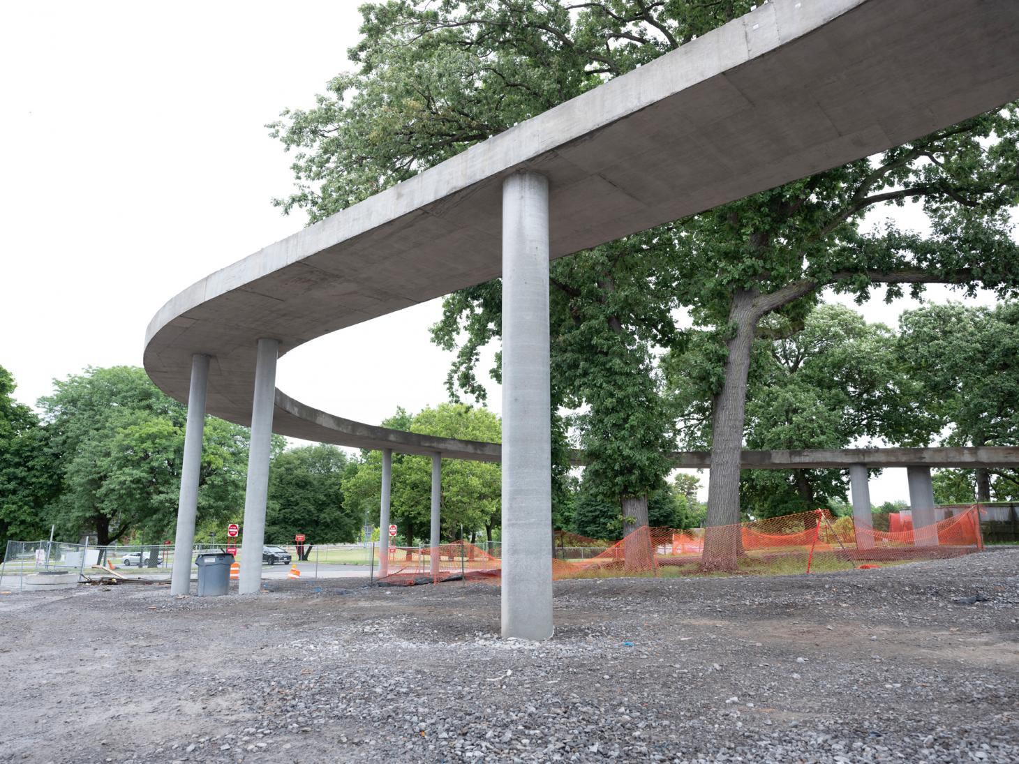
The meandering bridge, soon to be enclosed in glass walls, bypasses a grove of centenary oaks to connect the new structure with the 1905 building.
The second floor ‘interstitial’ space behind the glass wall can be used for events. Art that is not susceptible to sunlight can be hung on the exterior gallery walls, visible from the street or park below. ‘I think this promenade space will be amazing,’ says Shigematsu. ‘You can have art on one side and the park on the other, and that’s really embodying the potential of the site and the collection.’
Receive our daily digest of inspiration, escapism and design stories from around the world direct to your inbox.
The courtyard of the 1962 building, formerly largely inaccessible to visitors, will now be the Town Square, the heart of the museum’s community engagement programme and free to enter. Olafur Eliasson and Sebastian Behmann of Studio Other Spaces have designed a site-specific artwork to cover it. Called Common Sky, it resembles an enormous glass-and-steel tree. ‘There’s an element of social consciousness,’ explains Eliasson, ‘and of bringing the outside and the weather in, and all of that kaleidoscopically.’ At the underground parking entrance, visitors will encounter another commissioned artwork, a digitally-designed tapestry by Swedish artist Miriam Bäckström.
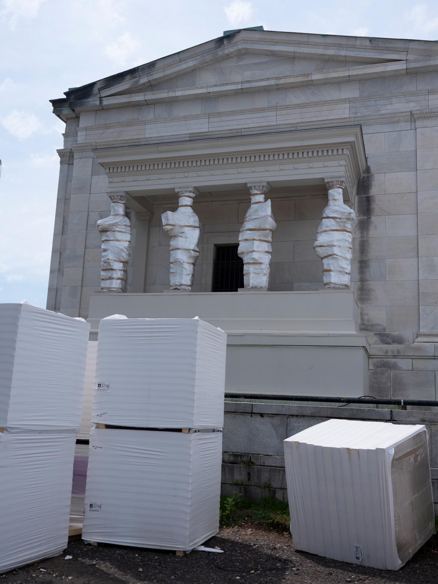
The gallery's existing 1905 building.
The museum is slated to reopen in spring 2023 with a show highlighting the permanent collection and a new name, the Buffalo AKG Art Museum. The ‘G’ stands for Jeffrey Gundlach, a Buffalo native and financier who ended up donating $65m of the roughly $190m budget. The scale of the project would not have been possible otherwise, says Sirén: ‘It’s been a Buffalo Bills game, where we move the ball down the field one yard at a time,’ he says, laughing. ‘Several touchdowns.’
INFORMATION
Amy Serafin, Wallpaper’s Paris editor, has 20 years of experience as a journalist and editor in print, online, television, and radio. She is editor in chief of Impact Journalism Day, and Solutions & Co, and former editor in chief of Where Paris. She has covered culture and the arts for The New York Times and National Public Radio, business and technology for Fortune and SmartPlanet, art, architecture and design for Wallpaper*, food and fashion for the Associated Press, and has also written about humanitarian issues for international organisations.