Canada Pavilion reveals restoration during 2018 Venice Architecture Biennale

Receive our daily digest of inspiration, escapism and design stories from around the world direct to your inbox.
You are now subscribed
Your newsletter sign-up was successful
Want to add more newsletters?
The Canadian Pavilion is not only the symbolic home for Canadian art and architecture within the Venice Biennale site, and the literal grounds where the country showcases its creative clout during one of ‘the great show windows of the world’; it is also a heritage site of Italian modernism. The pavilion, set in the Giardini park, where most of the national pavilions stand, was designed by Enrico Peressutti of the architectural collective BBPR (Banfi, Belgiojoso, Peressutti, Rogers). Opening during the 29th Art Biennale in 1958, the structure was received at the time as ‘a small jewel of a showcase’, its architecture hailed as one of the most ‘advanced’ among the pavilions.
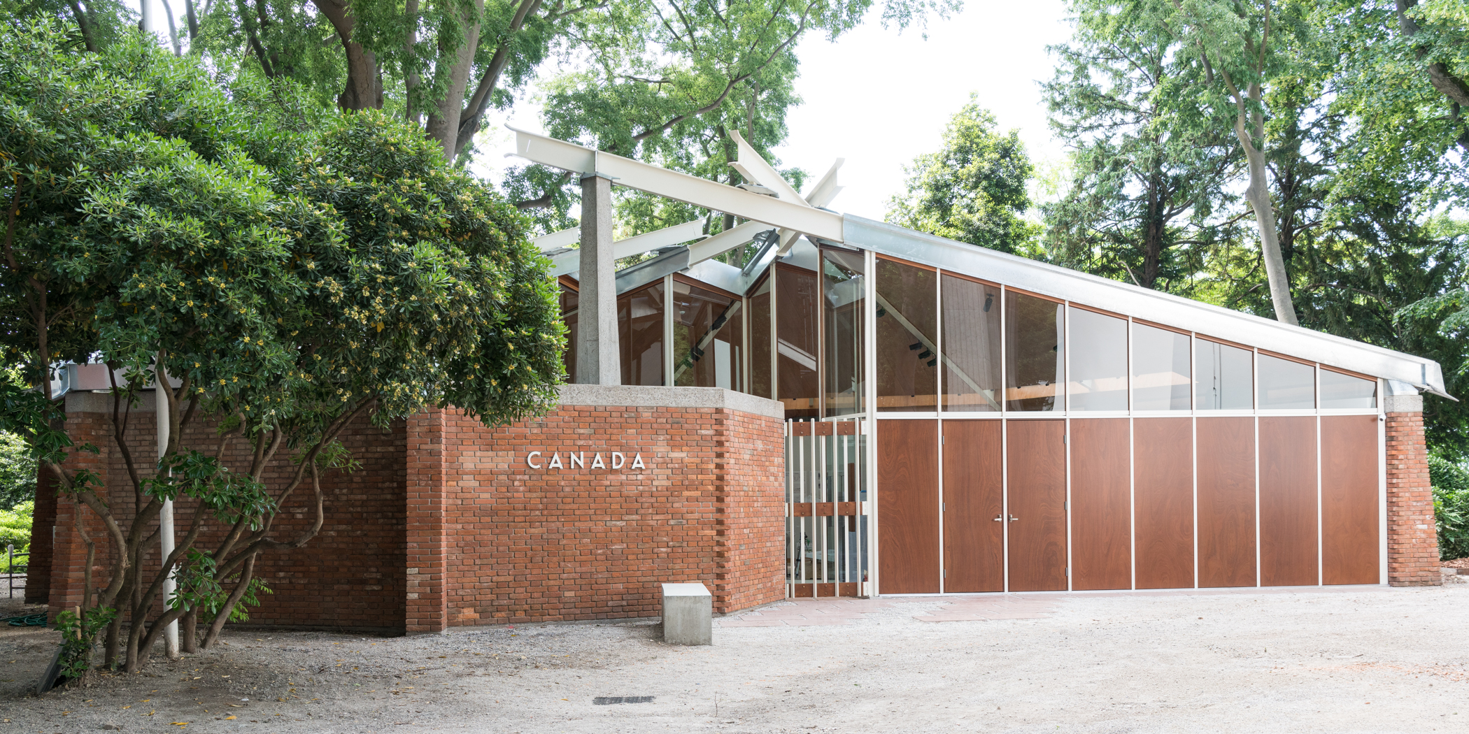
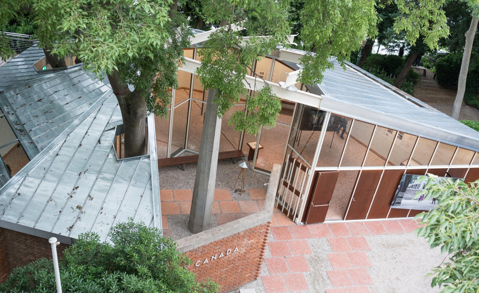
After six decades of exhibitions took their toll on the building, leaving it in a precarious state, the structure has now been restored true to form by BBPR heir, Alberico Barbiano di Belgiojoso. The initial proposal by Studio Belgiojoso explored the possibility of a below-ground addition. Instead, to honour the pavilion’s architectural significance and heritage, the infrastructure was painstakingly updated and the building fabric restored in alignment with the original design. The surrounding area was extended by landscape architect Cornelia Oberlander with Bryce Gauthier to connect the neighbouring pavilions and open up vistas on to the lagoon, as part of a larger renewal project in the Gardini.
Canada’s first official presentation in the Venice Biennale wasn’t until 1952 and took place in the Italian Pavilion. This international exposure for Canadian art led the director of the National Gallery of Canada to raise the idea that the country had its own space in the Gardini. This proposal was in alignment with a recent government commission, advocating for the development of the (then-young) country’s culture. Gaining ground in the Gardini also symbolised the post-war ambitions of Canada. At the time the pavilion was commissioned, Canada did not yet have its own flag (the maple leaf did not replace the Canadian Red Ensign aka the British flag with Canadian coat of arms until 1965). A pavilion in the Gardini for Canada was a leap onto the world stage.
The design and construction were covered by wartime relief funds owed to Canada in lire, which could only by spent in Italy. Enrico Peressutti had met and made a great impression on Donald W Buchanon, the assistant director and director of the country’s Design Centre, so BBPR studios was commissioned in 1955 by the National Gallery – a real architectural coup for Canada.
And so the dialogue between Canadian artists and architects and the form and space of the pavilion began, as they embraced, transformed or fought against it for over 60 years. The space is occasionally referred to as the maple leaf-shaped gallery (it’s actually a spiral), its idiosyncratic form some times mis-attributed to the Italian architects’ interpretation of Canadian identity. David Altmedj engaged the design and movement through the pavilion with site-specific sculptures responding to the space in 2007; Shary Boyle shrouded its interior in black fabric in 2009, literally denying the architecture to present her work in a cave-like blackness; and more recently Geoffrey Farmer dismantled the decaying pavilion in 2017, scattering planks of its wooden remains amidst a giant exploding fountain bursting through its dramatic roof. Or what was left of it.
Peressutti always aimed for his designs to respond to the historical context, physical site, and technical conditions of each project. In the case of this pavilion, the site presented two significant design challenges. Canada was offered a place neighbouring the British and German pavilions – both imposing, potentially overshadowing structures. On the other hand, the site was in Montagnola di Sant’Antonio, a grove of mature trees next to the lagoon. After the design’s first presentation to the municipality of Venice in 1956, a drawn-out negotiation ensued. ‘The Venetians are jealous of every tree’, Peressutti wrote in a letter to the National Gallery. It took another year for the design to arrive at its final form.
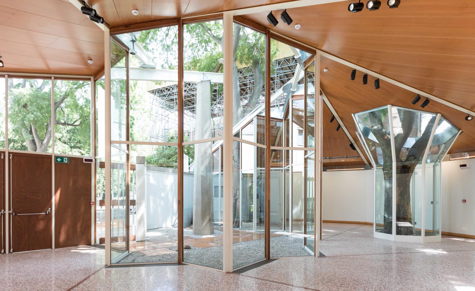
Addressing its monumental neighbours and pre-existing site conditions, the Canadian Pavilion is a low rise structure literally wrapped around two tall living trees from the original grove. Contrary to urban Gardini myth, while Peressutti definitely did not have the maple leaf in mind when imagining his genuine garden pavilion, he was looking at First Nations architecture such as tipis, where the Canadiana influence can actually be attributed. The dynamic radiating roof structure at the end of the day is (of course) based on the geometry of the Archimedean spiral; the plan of the pavilion takes the form of a nautilus shell.
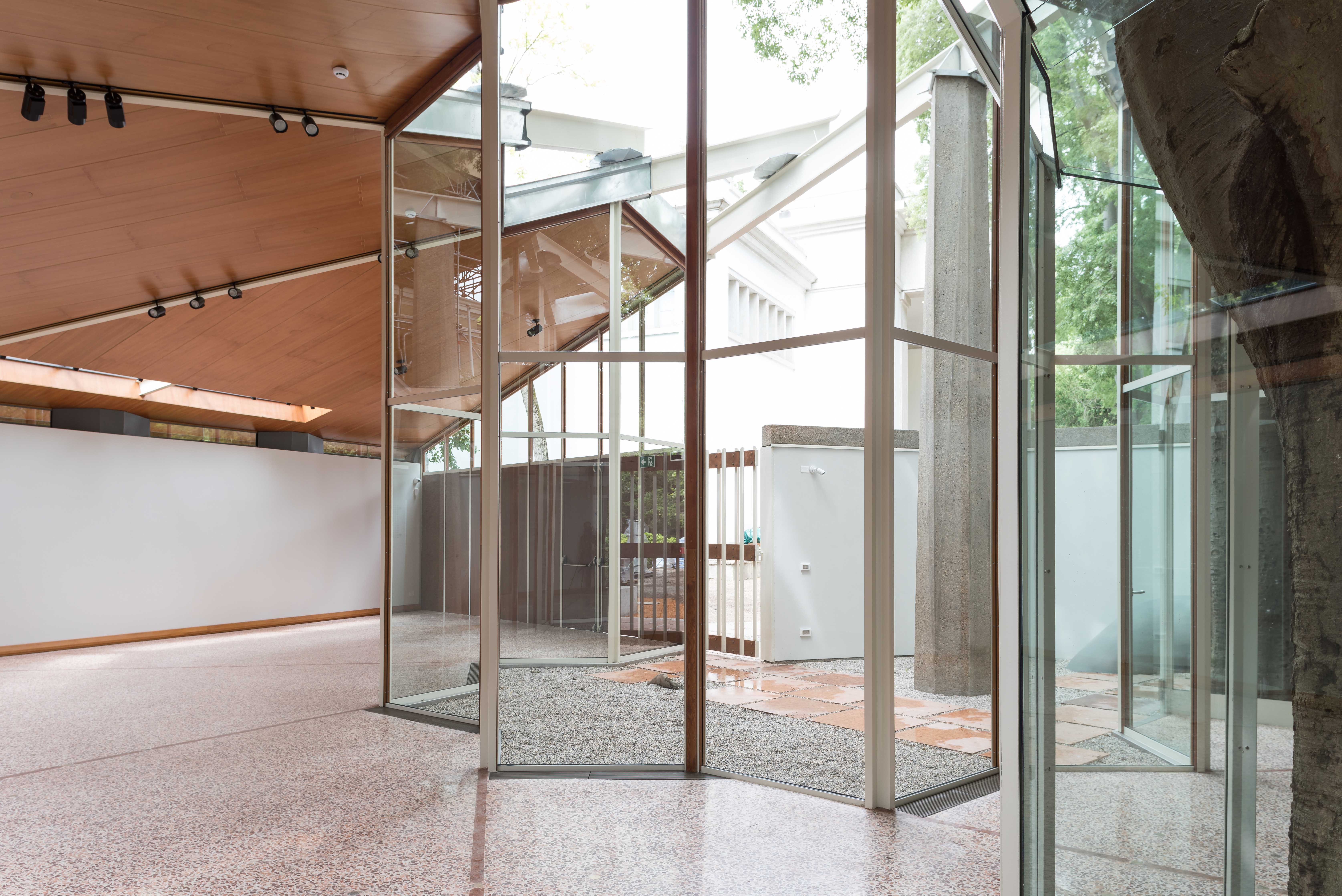
But the central design element of the pavilion – spiralling steel beams resting on an octagonal column – is similar to tent-like forms fanning out from a central mast. This defines the architectural character of the pavilion, along with its exposed raw materials of glass, brick, wood and steel. The pavilion answered brief of the National Gallery, the constraints of the custodians of the Giardini, while giving form to the ideals of modern architecture. The recent re-enactment of building the original project remains a leap (not a leaf) onto the world stage.
See all the latest news and stories from Venice Architecture Biennale here

The works were led by Alberico Barbiano di Belgiojoso, the son of one of the original architects, BBPR (Banfi, Belgiojoso, Peressutti, Rogers).

The pavilion had first opened during the 29th Art Biennale in 1958.

The structure and fabric were restored in alignment with the original design.

The area surrounding the pavilion was extended by landscape architect Cornelia Oberlander with Bryce Gauthier.
INFORMATION
For more information visit the Venice Biennale website
Receive our daily digest of inspiration, escapism and design stories from around the world direct to your inbox.