Light house: Bruno Freschi gives a new lease of life to the Staples House
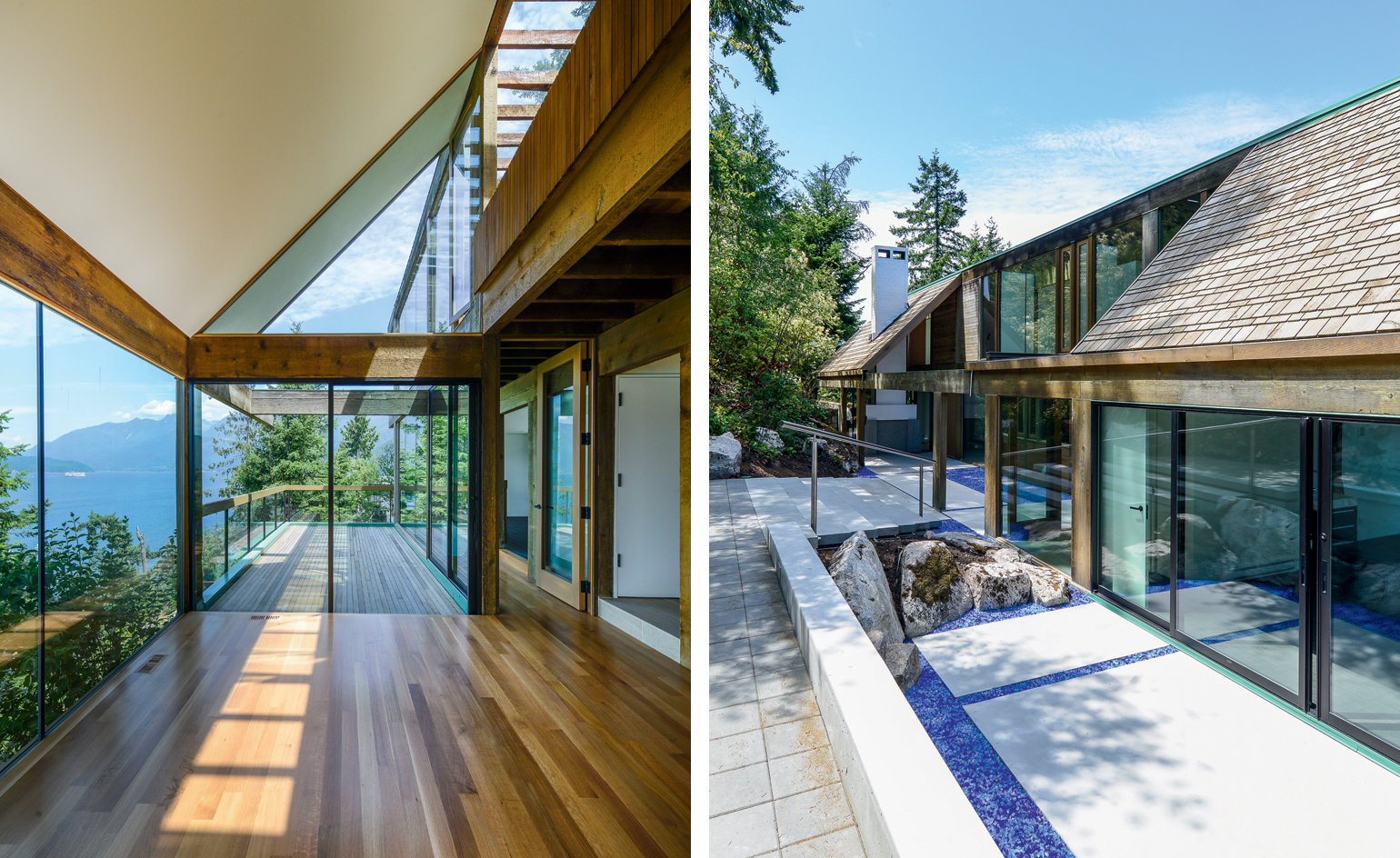
It’s not every day that architects get to renovate their own designs. The clash of the creator’s original vision with that of often well-meaning new owners is all too frequent as buildings age and change hands.
So for septuagenarian Bruno Freschi, updating his 1966 West Coast modernist classic, the Staples House, for its new owners was a unique opportunity not to be missed.
Not only did this project offer a sense of continuity for the clifftop home, it also, says Freschi, ‘allowed me to correct my mistakes’. Working in association with the office of Nick Milkovich, Freschi got rid of the pond at the entranceway that kept leaking through the bedrock, as well as a plastic ledge under the skylights that had always irked him. This second chance also gave him the opportunity to reflect on the value of the original design, which he conceived as a young protégé of Arthur Erickson, and on ways to enhance it.
In 1966 the young Freschi, newly back in Canada after a stint in Europe, where he designed a luxury home with an indoor/outdoor glass-covered pool in the Italian Alps, was ‘relieved’ to be working on a simple family home, and on familiar terrain. As a young architecture student he had swum in the waters below and climbed the surrounding Howe Sound’s cliffs.
Freschi – who would go on to work with Erickson at the Osaka World’s Fair on the Canadian pavilion, as well as design a mosque in a Vancouver suburb for the Aga Khan – created a kind of British Columbia version of a Shinto shrine. Stripping down the essentials of West Coast modernism to its minimalist bare bones, he employed a simple post-and-beam structure, which he wrapped in extensive glazing to bring the outside in.
The result was a modest family home that doubles as a perfect space for entertaining, transporting guests into the surrounding forest, mountains and the Pacific Ocean, which are visible from every room. Heavy fir beams reach beyond the limits of the house in flying extensions, their horizontal lines accentuating the verticality of the towering trees. A spine of skylights makes the north-facing home bright even in the rainy Vancouver winters, while north and south glazing offers framed views of water and greenery.
The true genius of the design lies in the use of interstitial space, especially in the upper level axis of the house, the long east/west corridor. As you move along the upper passage, an architectural choreography unfolds that blurs indoor and outdoor, reflections and views, and solidity and transparency.
The wabi-sabi element of the original design, the combination of the rough and the refined, is updated in the renovation. Bush-hammered concrete and smooth oak flooring (replacing of-the-era green shag carpet), glass and unfinished fir and cedar help old and new elements blend with the same elegant simplicity. An upstairs master bathroom was enlarged to contain a modern tub, while a skylight-topped shower creates a sense of bathing in the forest. The downstairs kitchen, initially oriented towards a south-facing courtyard where Mrs Staples could watch her young children at play, now faces north to take in the view of sea and mountains. It features a hi-tech stove that fits into a below-counter-level compartment when not in use, as well as an adjoining glassed-in wok kitchen for the new owners (who originate from the south of China).
Freschi added 80 sq m to the house’s original 260 sq m by bringing the outdoors in – quite literally: a garage was turned into a study area with views of fir trees on the south side and water on the opposite end; all the upper level bedroom balconies became extensions of the interior space; an east side deck was enlarged; and a north-facing balcony addition on the upper floor has become a delightful crow’s nest.
An early Erickson home on the same street, the 1963 Graham House, met with a very different fate, and was demolished in 2007. But a new civic bylaw to encourage buyers to renovate rather than replace West Vancouver’s ample stock of midcentury modernist homes was a deciding factor in this architectural happy ending. In exchange for relatively faithful renovations, the new owners are allowed to build a second home on the 2,500 sq m site. Plans by the same architect are now in the works for a three-storey glass edifice with interior wood elements – perhaps an inside-out version of the Staples House – perched on bedrock 15m down the cliffside. ‘It will be like a giant lens for Howe Sound,’ says Freschi, with the glint of the young architecture student who used to roam this beautiful landscape still in his eyes.
As originally featured in the January 2016 issue of Wallpaper* (W*202)
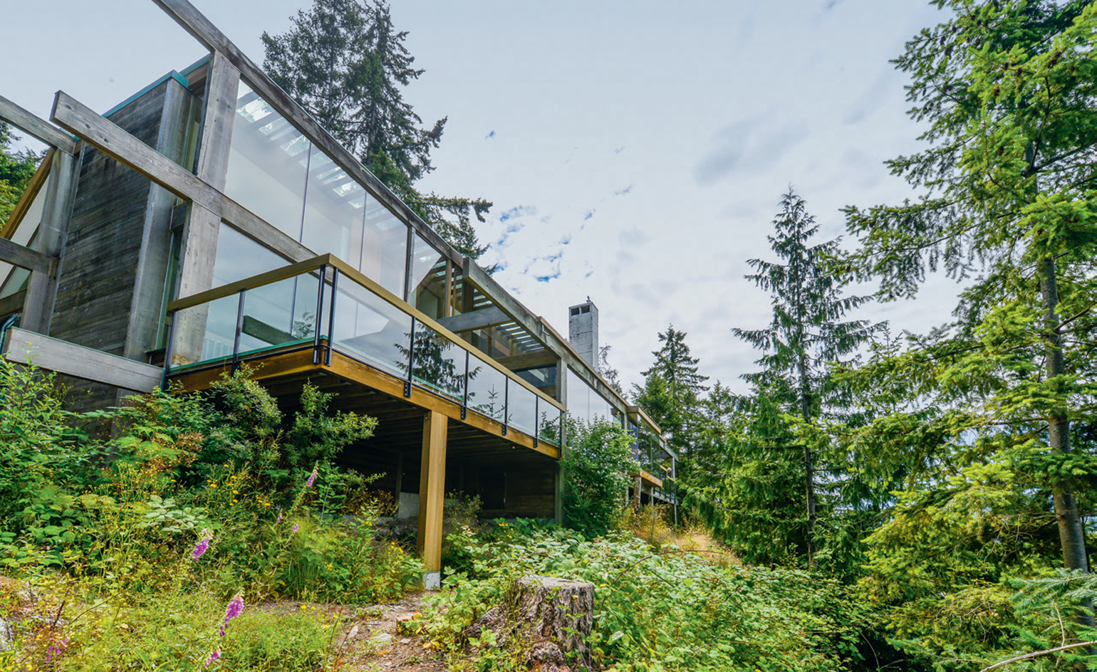
The house’s original fir beams jut out in flying extensions, while a new terrace provides additional outdoor space
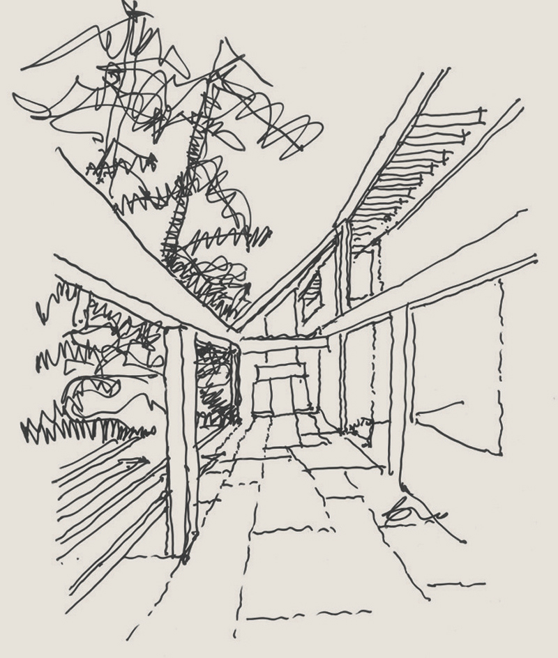
One of Freschi’s original sketches, dating back to 1965–66
INFORMATION
Photography: Kenneth Dyck
Wallpaper* Newsletter
Receive our daily digest of inspiration, escapism and design stories from around the world direct to your inbox.
-
 All-In is the Paris-based label making full-force fashion for main character dressing
Part of our monthly Uprising series, Wallpaper* meets Benjamin Barron and Bror August Vestbø of All-In, the LVMH Prize-nominated label which bases its collections on a riotous cast of characters – real and imagined
By Orla Brennan
-
 Maserati joins forces with Giorgetti for a turbo-charged relationship
Announcing their marriage during Milan Design Week, the brands unveiled a collection, a car and a long term commitment
By Hugo Macdonald
-
 Through an innovative new training program, Poltrona Frau aims to safeguard Italian craft
The heritage furniture manufacturer is training a new generation of leather artisans
By Cristina Kiran Piotti