Trousdale Estate modernism revamped in this Carla Ridge house
Surrounded by a rippling infinity pool, this art- and design-filled Beverly Hills villa by design studio Lucas is already making waves
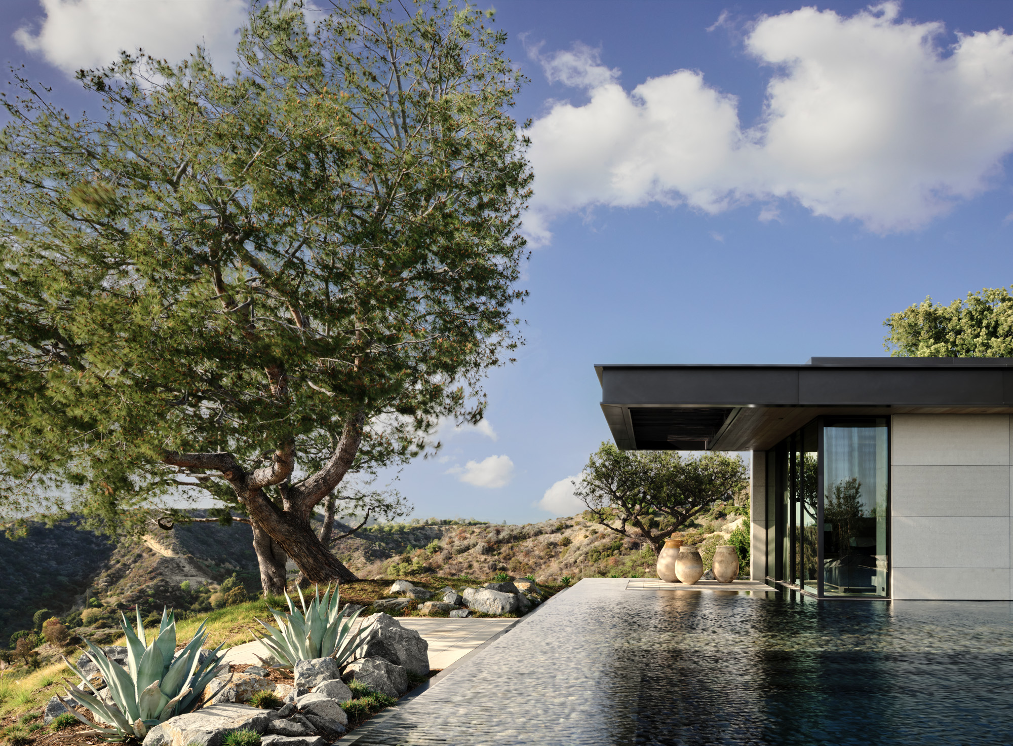
Carla Ridge snakes through Los Angeles’ Trousdale neighbourhood, with Laurel Canyon to the north-east, Beverly Hills to the south. The developer Paul Trousdale put a stamp on this sliver of the 90210 zip code in the 1950s and 1960s, building elegant, simple, low-profile homes with enviable views of a land of movie studios, myth-making and money.
One of Carla Ridge’s highly sought-after residential properties has recently undergone an exquisite overhaul. Its new owners, who were moving from New York to LA to be closer to their grandchildren, enlisted the Seattle-based interior architecture and design studio Lucas. Founded by siblings Suzie and David Lucas (their sister Rachel joined them later and now runs the business operations), Lucas has carved a niche for creating understated elegant environments, with a particular proclivity for midcentury design. As native New Yorkers, Suzie and David had an intuition for how their clients wanted to live and function in their new West Coast surroundings. In fact, Lucas was quickly given the reins to drive the full design of the house, including the architectural details. Given the notoriously demanding building regulations in Beverly Hills, they worked with a local project architect to execute.
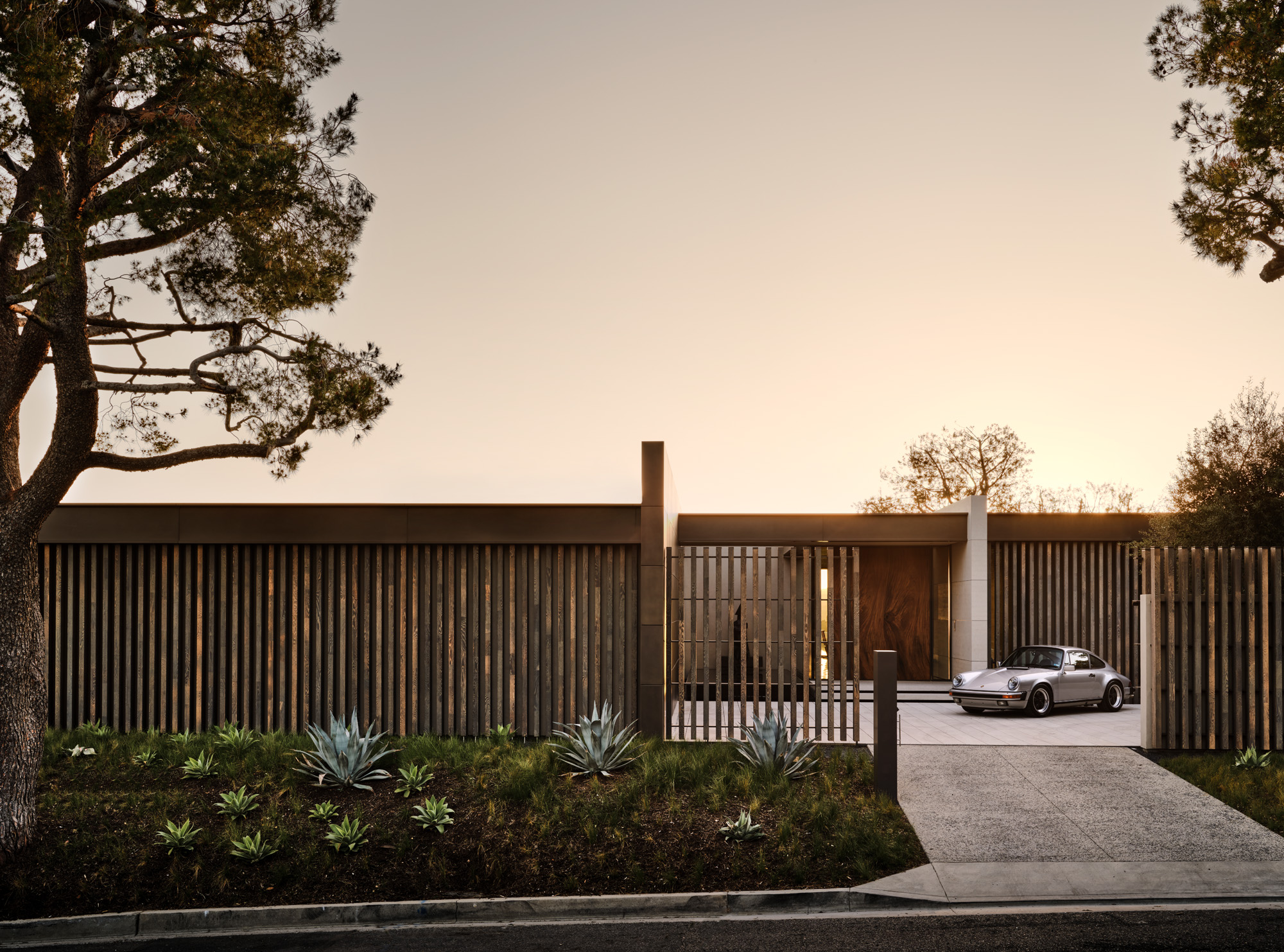
The driveway, with a silver Porsche Carrera bought new in 1984 and kept in mint condition since. The front fence’s vertical oak slats are a nod to the midcentury aesthetic of the neighbourhood
There was an existing property on the land, which had not been touched since it was first built in 1967. The team originally thought a robust remodel might answer all the clients’ wishes, but they quickly deduced it was going to take a full redesign and rebuild. ‘It was completely outdated. Everything from windows to electricals needed to be redone,’ says David. ‘At that point, you have to consider if you’re trying to do a historical preservation and if there is value in that. On this occasion the answer was no, because it wasn’t a building of any significance. It just happened to be on a really great site on a really great lot. When we showed up, we were blown away by the view. It’s incredible.’
Construction started in 2018, a year after planning began. The new home almost matches its predecessor in intention and footprint, although the insides have been reconfigured to make more sense for contemporary life. ‘The original house was sited so well that it made sense to leave the master bedroom where it was, tucked up against the beautiful trees that are on the property, which makes it feel private and protected,’ says David. Nevertheless, they had to abide by the strict Trousdale regulations for low-profile properties that don’t interfere with any neighbouring sight lines. Ceilings were raised, vast expanses of glass replaced walls. The 6,500 sq ft single-storey residence was generously proportioned up into two bedrooms, four bathrooms, a gym and open-plan living space and kitchen, with a wine cellar in the basement.
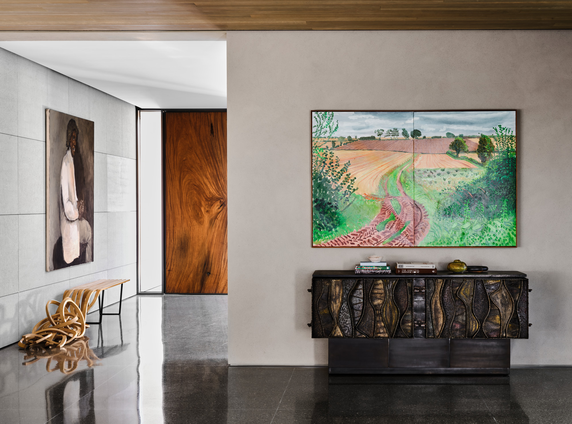
The main entrance with, from left, Vertical Bench, 2016, by Pablo Reinoso; Vachement, 2009, by Lynette Yiadom-Boakye; the front door, made of a solid slab of natural wood; Between Kilham and Langtoft, 2006, by David Hockney; and a vintage sculpted sideboard by Paul Evans
Four natural materials became foundational in the design: terrazzo, for its midcentury spirit; combed textured limestone; flame-sprayed nickel panels; and brushed rift oak. ‘A handful of natural materials became the entire house. We went through multiple rounds of samples to perfect the warm but not too dark terrazzo mix,’ Suzie says of the meticulous balancing act of exposing just the right amount of chips in the aggregate. The Lucas team worked by shipping samples back and forth between subcontractors, sending photos and making in-person visits. ‘This is how we have always worked, as most projects are long-distance and clients usually don’t stay in one place,’ says David.
Combed limestone walls were pieced together like a jigsaw puzzle. The slabs have a subtle variation in colour, so David visited the stone yard and numbered every single slice of stone to establish the placement before it was installed. ‘When things have to be this precise, that’s what you have to do,’ he says frankly. ‘It was a little risky doing a nickel finish on an exterior,’ explains Suzie of the flame-sprayed nickel walls, which continue inside the property. ‘We had to make sure it would hold up to the weather so we built a mock-up and let it live outside during the construction process. It really gets hot up there; there is ocean salt in the air.’
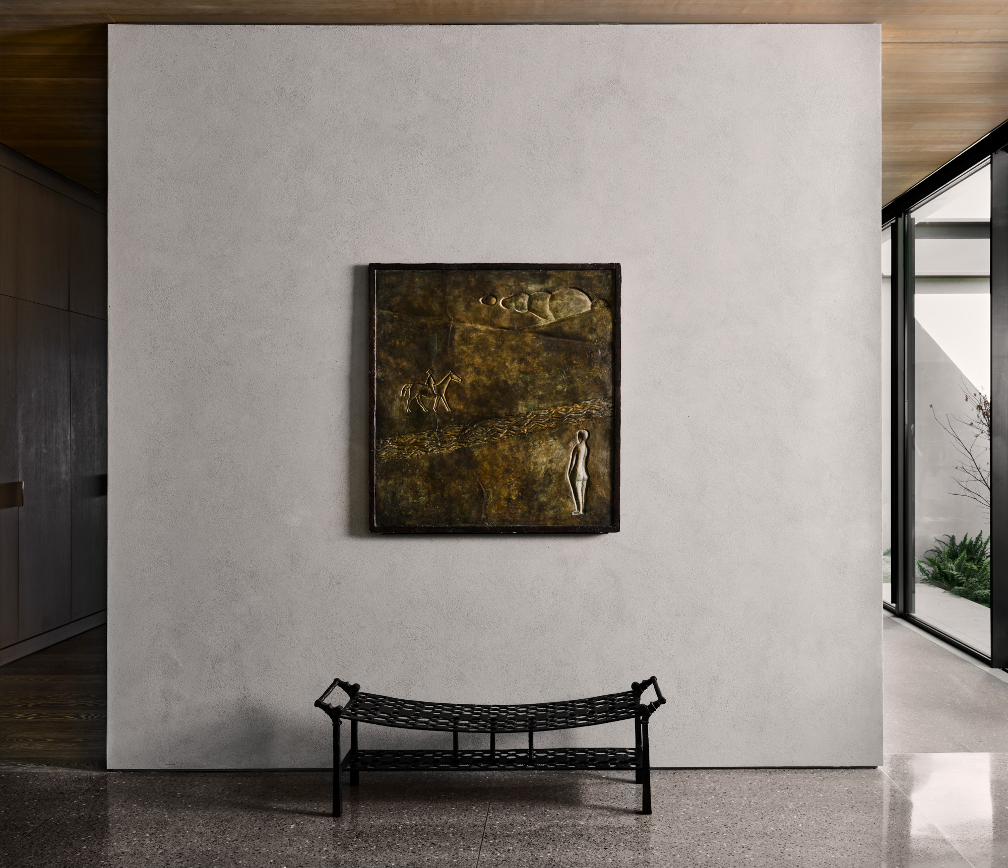
The main hallway, with a 1930s panel by Alberto Giacometti, and a bench by contemporary artist Ingrid Donat
The cabinetry, doors, millwork and casework are all crafted from brushed rift oak, meaning they have barely visible grain. ‘We knew we would have these moments, such as the front door, which is a chunky slab of natural wood and feels like a piece of furniture, so we wanted the cabinetry to be quieter,’ says Suzie.
Wallpaper* Newsletter
Receive our daily digest of inspiration, escapism and design stories from around the world direct to your inbox.
Central to the project was creating a sensitively deferential backdrop for the clients’ extensive art and design collection. David and Suzie flew to the clients’ house in Florida where many of the works were kept. ‘They had a lot of incredible pieces, but we had to be really specific, picking only the best, most interesting, unique things. They wanted to use this as a new chapter, to boil down to the essentials,’ says David. The result? Lynette Yiadom-Boakye’s Vachement hangs above a Pablo Reinoso bench that unfurls onto the floor in the entry hall. A vibrant David Hockney landscape is placed above a decorative Paul Evans dresser, in rich contrast to the polished terrazzo stone floor and cool limestone walls. A sizeable Philip Guston painting overlooks the sunken living room space.
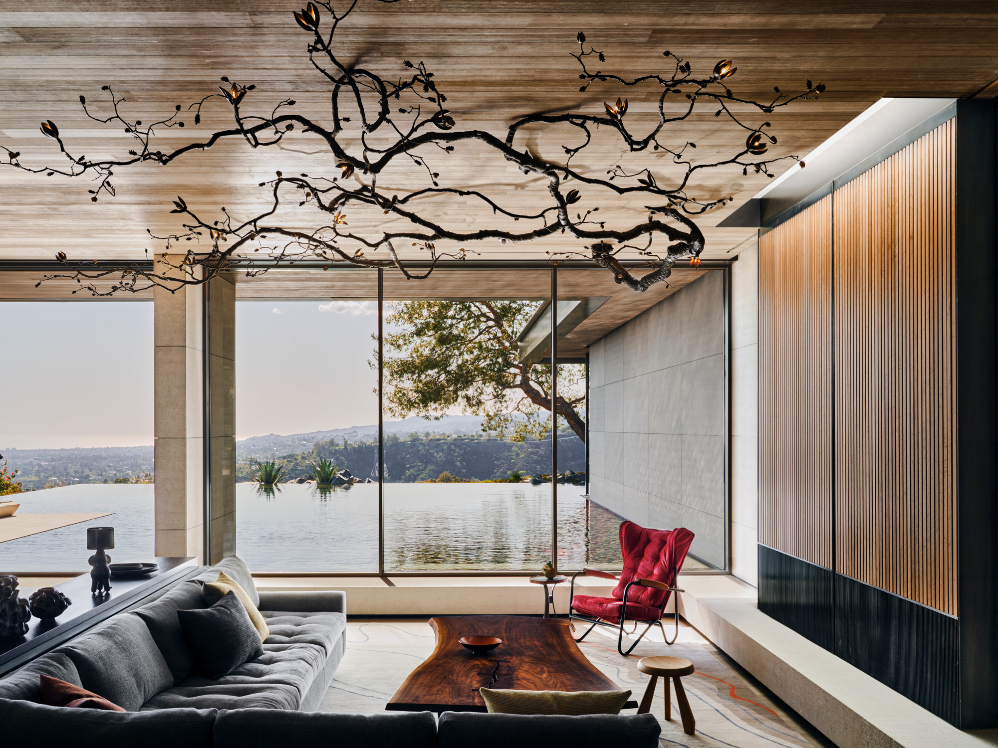
The sunken TV lounge, with a bespoke sculpture by David Wiseman hanging from the ceiling; a sectional sofa covered by Jonas Upholstery; a ‘Prefacto’ armchair by Pierre Guariche; and a coffee table by George Nakashima
The architectural plans were largely finalised when the art and design selection took place, so each chair, each table, was chosen with a specific location in mind. The glorious floor-to-ceiling windows came at the expense of wall-hanging space. ‘There was no “we’ll just find a place for it”,’ says Suzie.
A handful of additional works were commissioned or judiciously sourced, such as the Vladimir Kagan sofa by the fireplace, which had to fit precise dimensions. ‘The client is fastidious about provenance,’ they say. The team went on a pilgrimage to George Nakashima’s workshop in Pennsylvania and spent the day with his daughter Mira, who now runs the business, selecting wood and discussing which part of the timber should be the most prevalent for a table and chairs.
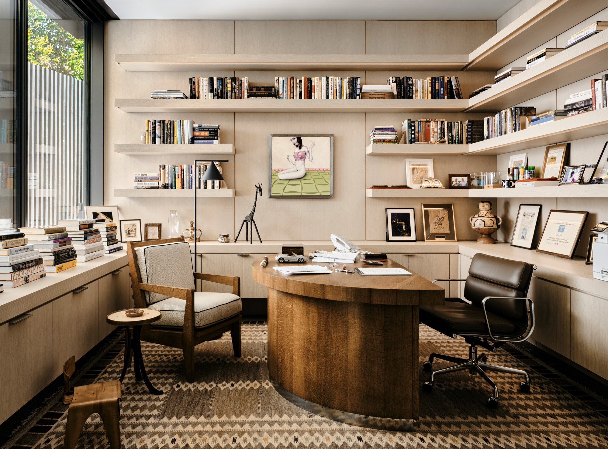
The cosy study is furnished with a custom French-style chair sourced from Parish Hadley and an art deco desk. On the wall hangs Art of Young Woman, a painting by the Spanish artist Gino Rubert, while on the floor is a 1948 ‘Salerno’ handwoven rug by Swedish textile artist Barbro Nilsson
Sculptor David Wiseman was commissioned to create a large 18ft-wide sculpture of tree branches, which sprawl across the ceiling of the sunken living room. ‘It breaks the main line of the space and feels like it’s creeping outside of the boundaries,’ says David Lucas, who explains that Wiseman cast acorns from the tree just outside the window for the sculpture. ‘It was an incredibly beautiful surprise to discover that, at night, when the light reflects off the water from the pool onto the ceiling, you get this shimmery glow with the Wiseman sculpture. It’s amazing.’
David Lucas designed a game table, using a continuation of materials already in play in the house – a base of flame-sprayed nickel and a cerused oak top. ‘I wanted it to be able to hold its own but not fight with the Nakashima chairs at the table. It’s designed to be the quiet, stoic friend in the room.’
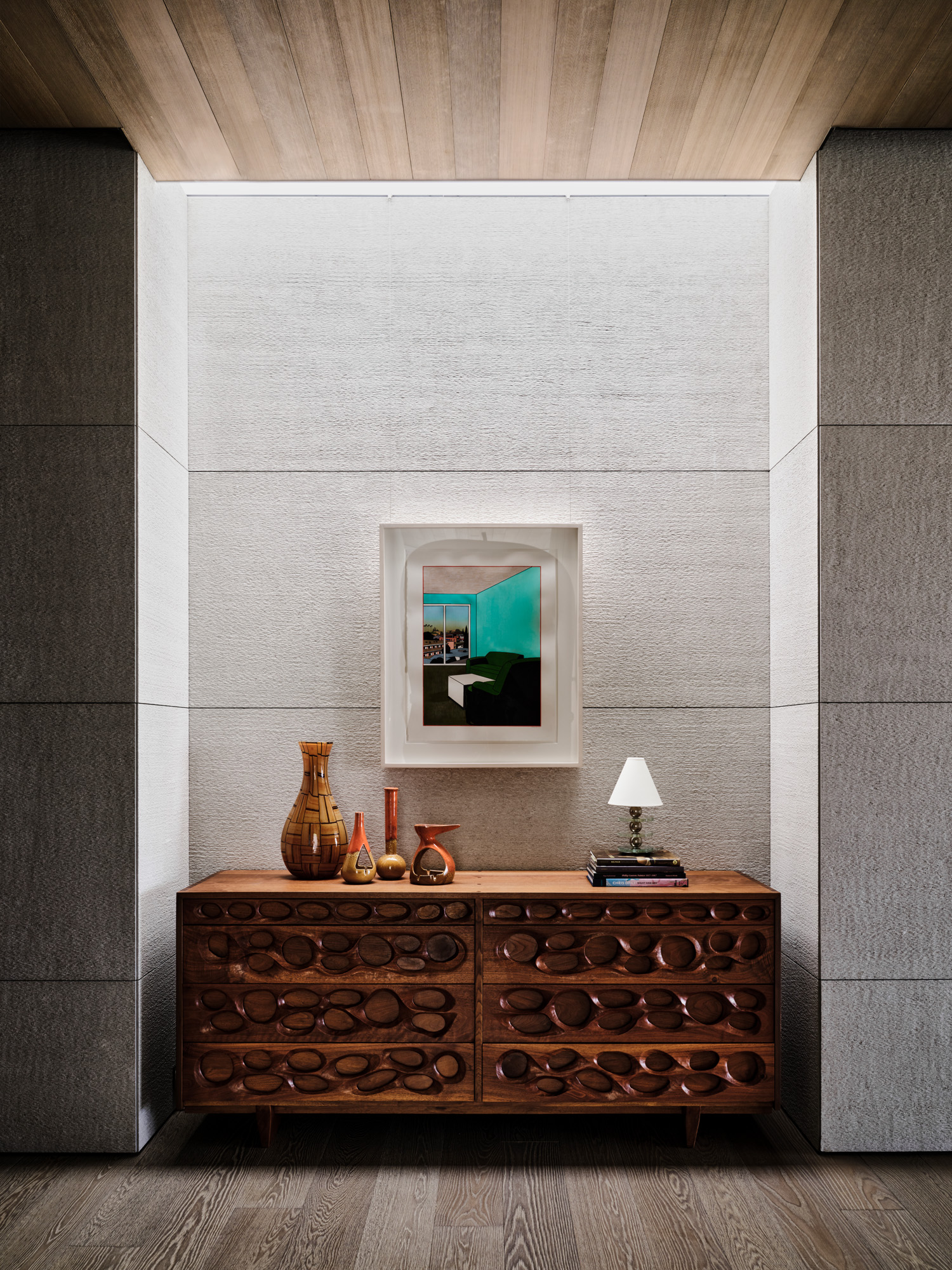
A Ken Price watercolour hangs above a wooden console by Phillip Lloyd Powell in the master suite’s hallway
Lighting the house was challenging due to the expanse of glass: ‘You either have too much or not enough,’ says Suzie. They strategised lighting in layers: firstly, illuminating the art correctly. Secondly, on a conceptual level, ‘I wanted all of the ceilings in this house to float away from the walls,’ says David. He cleverly ‘held back’ the walls from the ceiling to create a gap, where subtle ambient light appears to pool. The result? ‘Everything feels like it has this brightness and levity.’ Further tricks, such as stretching fabric over an LED light, created a soft ambient glow in the kitchen and master closet.
Lucas partnered with Jonas Upholstery for certain items, such as covering the large sectional sofa in the sunken living space. All the rugs were new, designed in partnership with Fedora and woven in India, except for two midcentury buys for the office and guest bedroom. ‘Originally, the cabinets in the office went down to the ground, but after the client bought the incredible rug, we elevated the cabinetry to accommodate its size perfectly,’ says David.
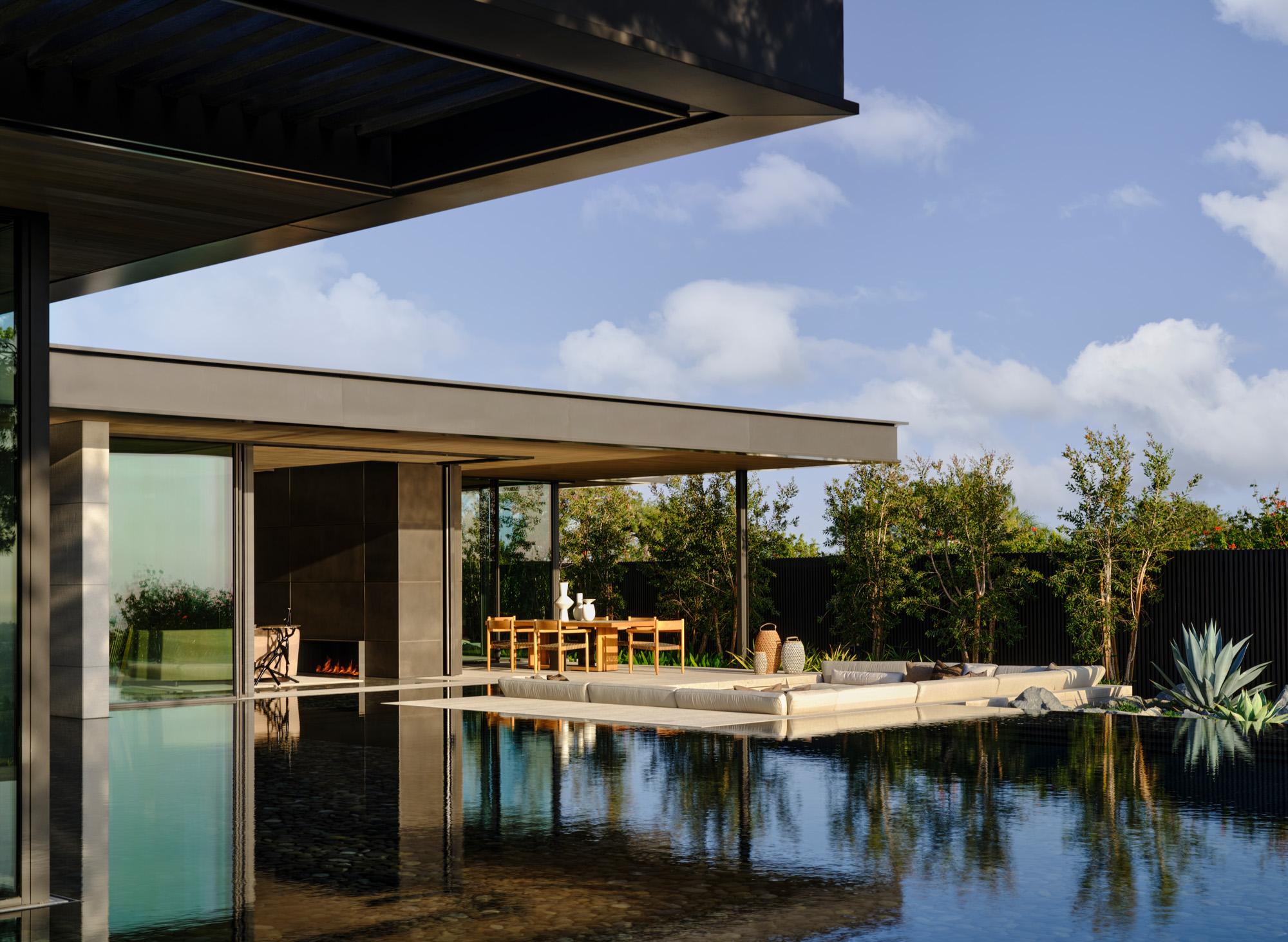
Instead of a large garden, the clients went for an infinity pool that goes right up to the living room window. The landscaping, by David Hocker, includes a sunken seating area
His ambition was to better connect the property with the vista and, to do so, he enlisted landscape architect David Hocker. The pair worked on a versatile sunken seating area. ‘I like to set any furniture or pool down low so that they don’t obstruct the view,’ says David Lucas. He credits Hocker with coming up with the ‘genius idea’ to bring the pool right up to the living room window. It meant doing away with a yard area entirely. The client was willing – it was a ‘baller move’, says David. ‘Who is going to be OK with you completely getting rid of their yard?’
The overall finished project is almost exactly as planned. ‘Suzie Lucas doesn’t play games,’ jokes David. ‘I’m slightly OCD,’ she says, ‘but seriously, the technology available these days to make 3D models helps so much.’ A client’s appetite to ‘go on the journey’ with their designer is often influenced by their stage of life, their experience of renovation projects, and the desire for a house to be hyper-functional or lend itself to more unconventional living. ‘They knew this would likely be their last house design project and they wanted it to be fun,’ says David. ‘They really let this house be approached as a piece of sculpture.’
INFORMATION
Tilly is a British writer, editor and digital consultant based in New York, covering luxury fashion, jewellery, design, culture, art, travel, wellness and more. An alumna of Central Saint Martins, she is Contributing Editor for Wallpaper* and has interviewed a cross section of design legends including Sir David Adjaye, Samuel Ross, Pamela Shamshiri and Piet Oudolf for the magazine.
-
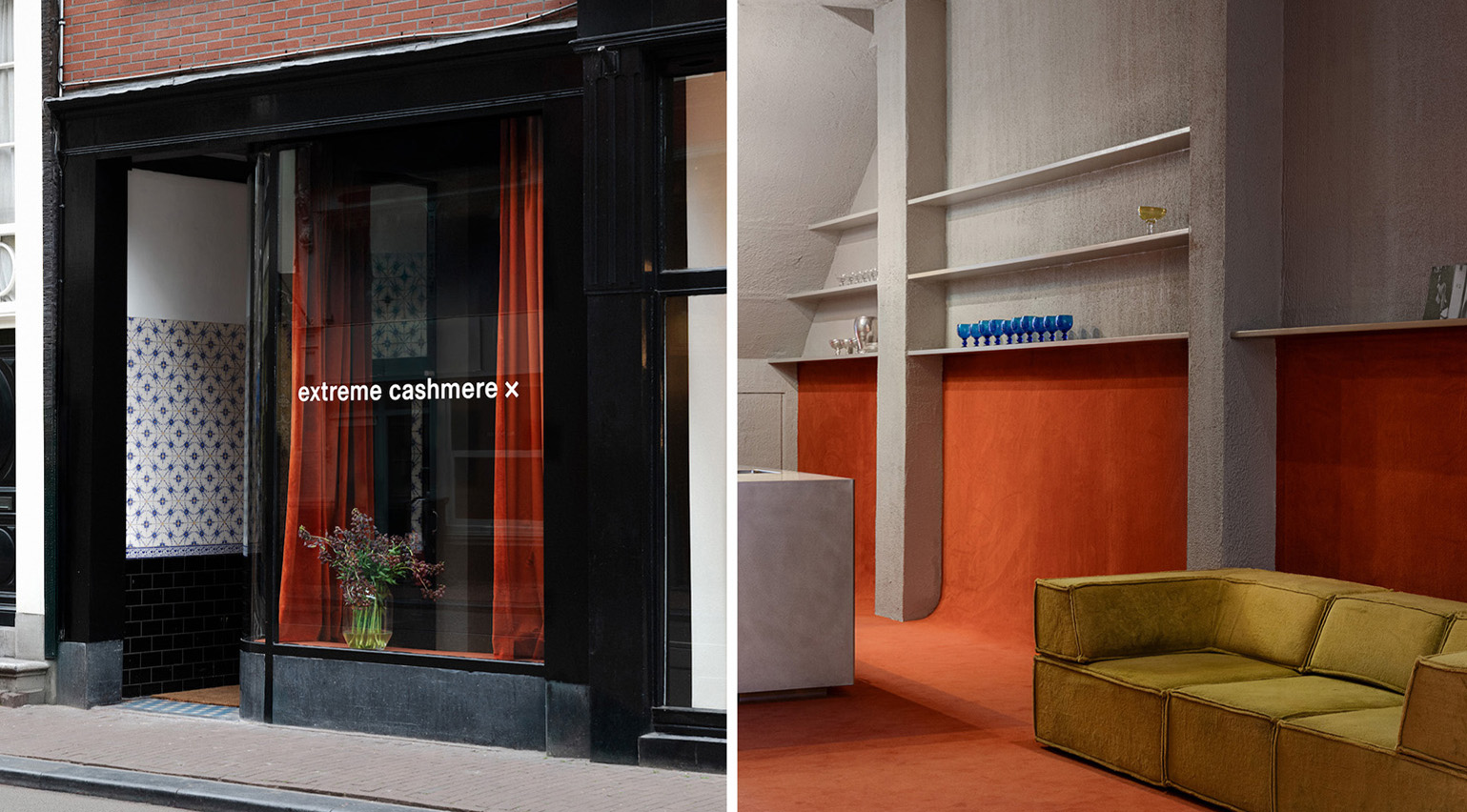 Extreme Cashmere reimagines retail with its new Amsterdam store: ‘You want to take your shoes off and stay’
Wallpaper* takes a tour of Extreme Cashmere’s new Amsterdam store, a space which reflects the label’s famed hospitality and unconventional approach to knitwear
By Jack Moss
-
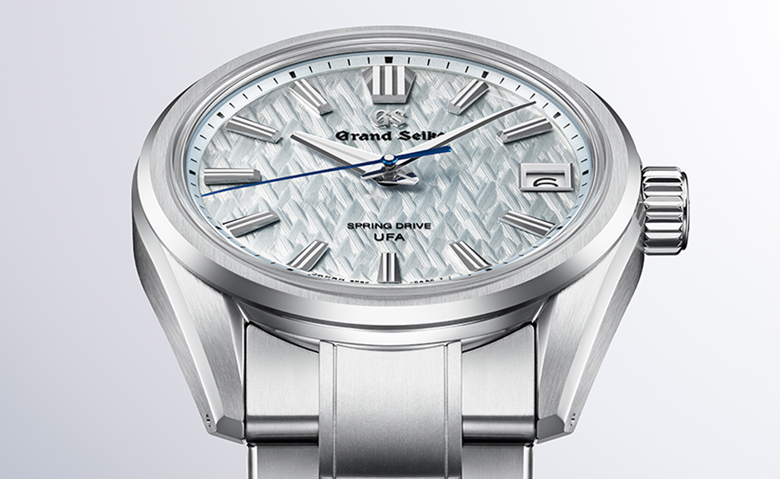 Titanium watches are strong, light and enduring: here are some of the best
Brands including Bremont, Christopher Ward and Grand Seiko are exploring the possibilities of titanium watches
By Chris Hall
-
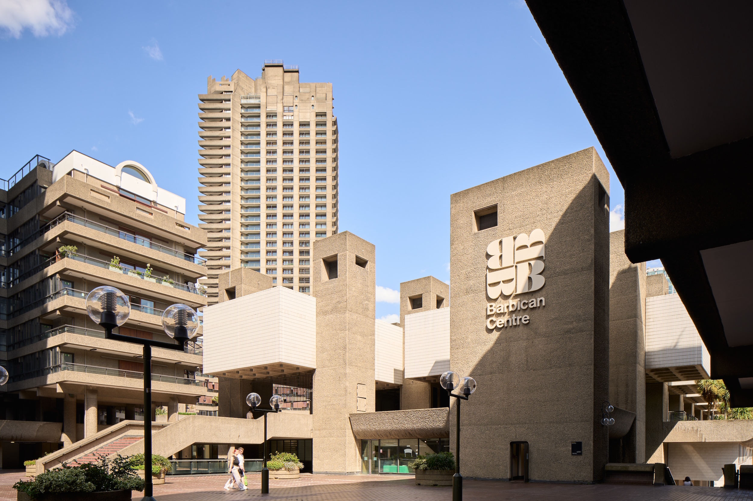 Warp Records announces its first event in over a decade at the Barbican
‘A Warp Happening,' landing 14 June, is guaranteed to be an epic day out
By Tianna Williams
-
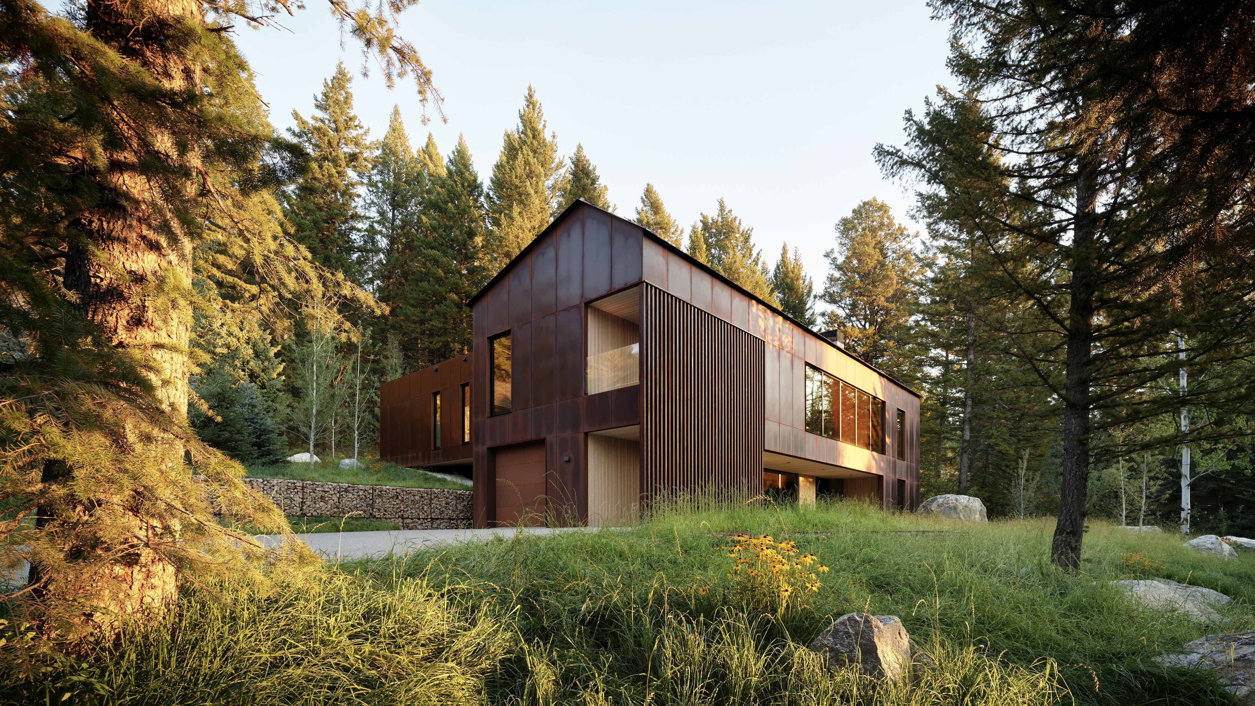 This minimalist Wyoming retreat is the perfect place to unplug
This woodland home that espouses the virtues of simplicity, containing barely any furniture and having used only three materials in its construction
By Anna Solomon
-
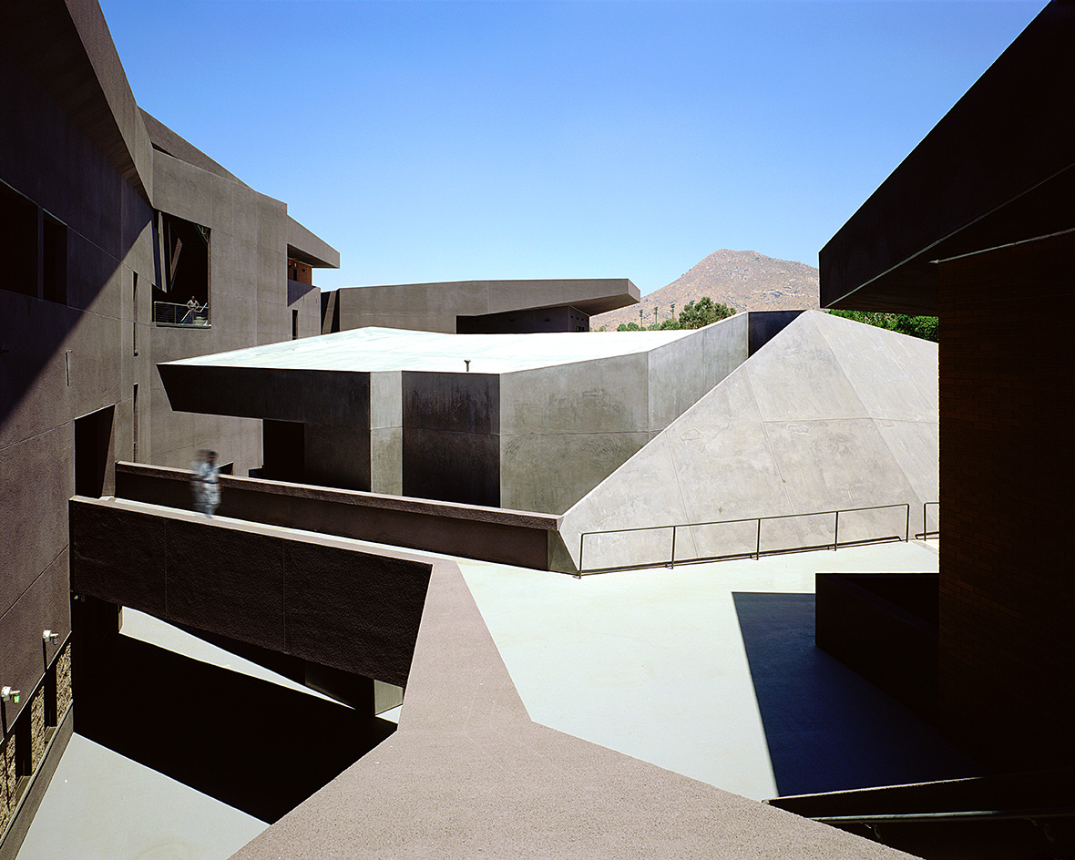 We explore Franklin Israel’s lesser-known, progressive, deconstructivist architecture
Franklin Israel, a progressive Californian architect whose life was cut short in 1996 at the age of 50, is celebrated in a new book that examines his work and legacy
By Michael Webb
-
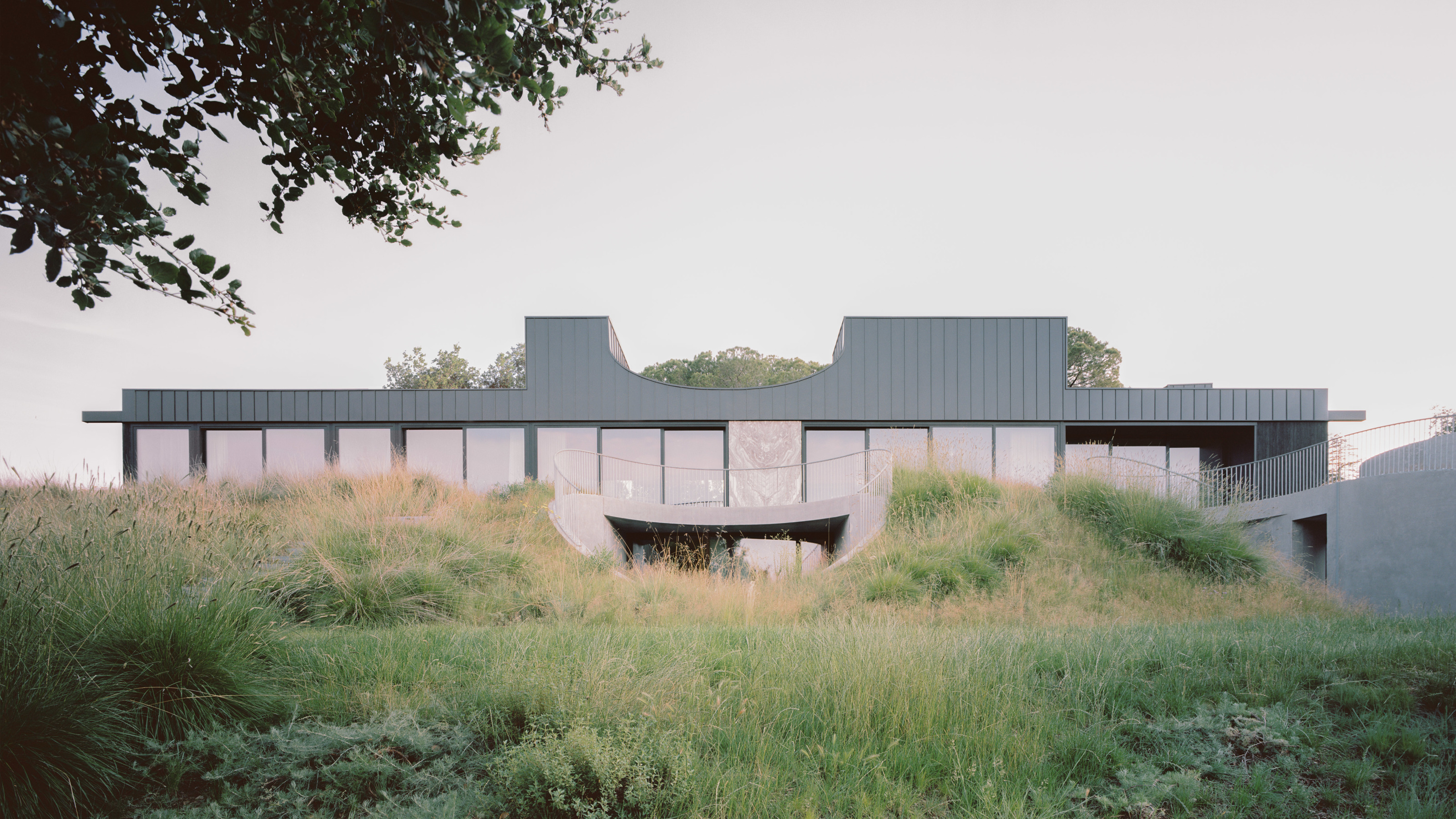 A new hilltop California home is rooted in the landscape and celebrates views of nature
WOJR's California home House of Horns is a meticulously planned modern villa that seeps into its surrounding landscape through a series of sculptural courtyards
By Jonathan Bell
-
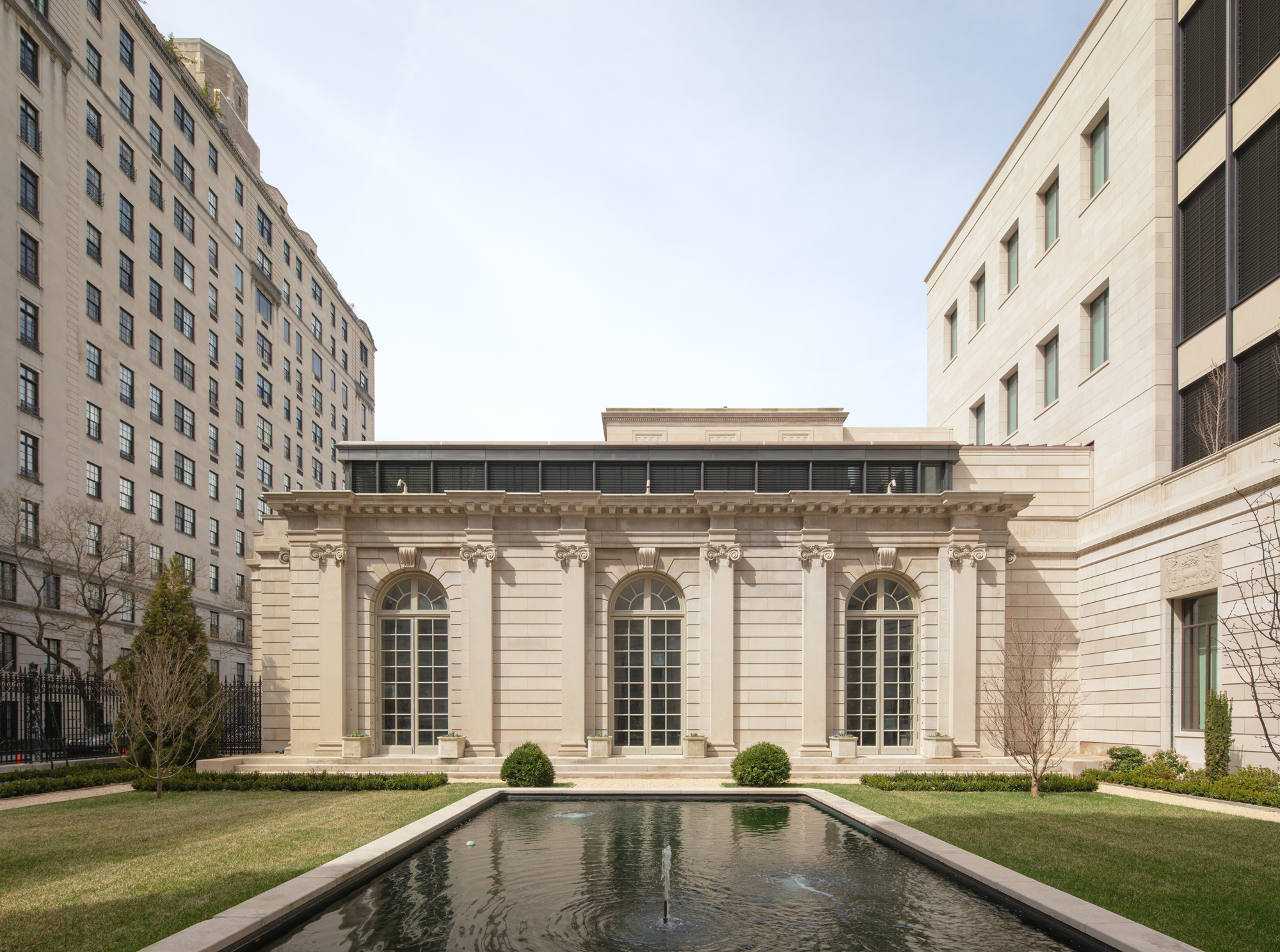 The Frick Collection's expansion by Selldorf Architects is both surgical and delicate
The New York cultural institution gets a $220 million glow-up
By Stephanie Murg
-
 Remembering architect David M Childs (1941-2025) and his New York skyline legacy
David M Childs, a former chairman of architectural powerhouse SOM, has passed away. We celebrate his professional achievements
By Jonathan Bell
-
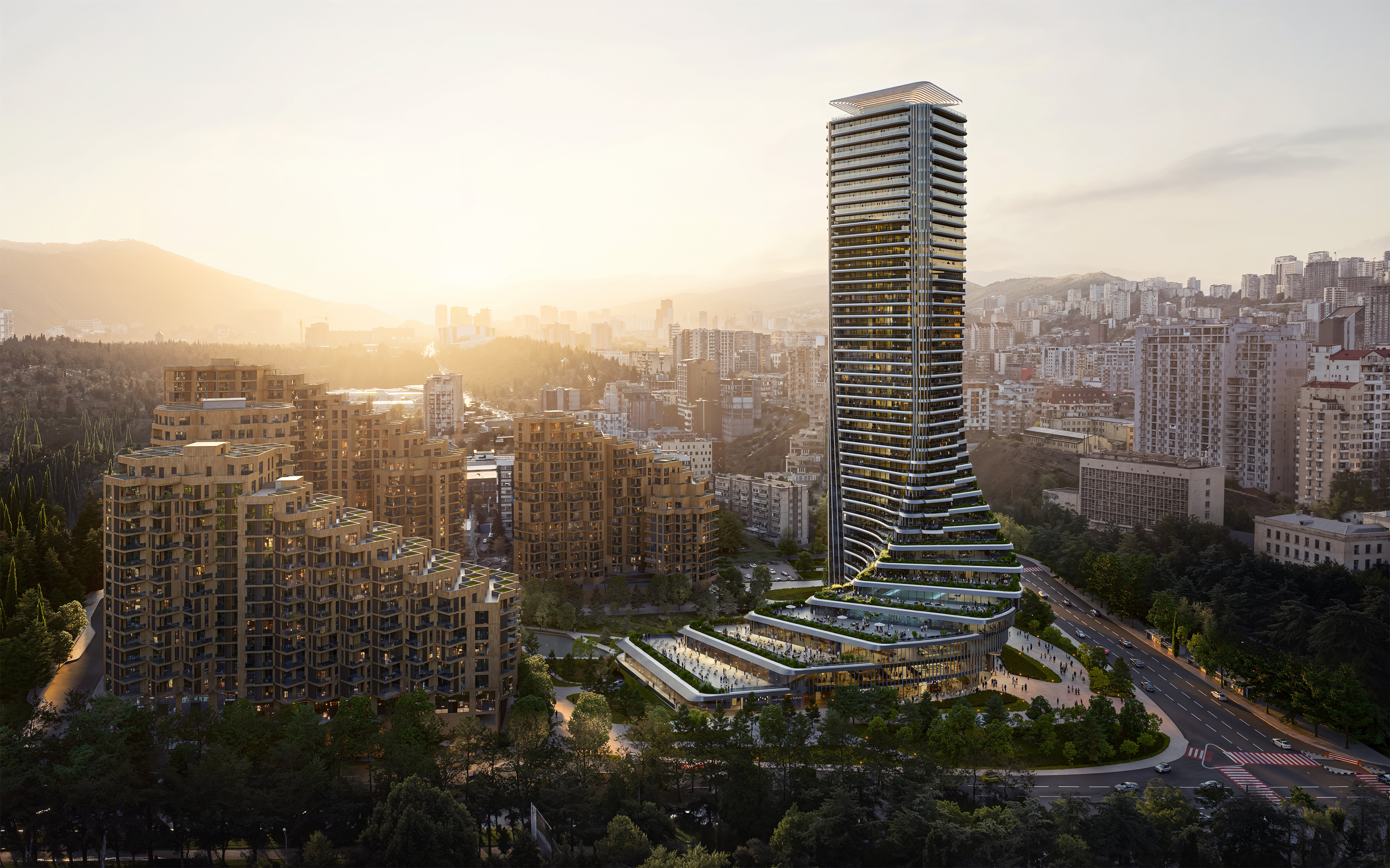 The upcoming Zaha Hadid Architects projects set to transform the horizon
A peek at Zaha Hadid Architects’ future projects, which will comprise some of the most innovative and intriguing structures in the world
By Anna Solomon
-
 Frank Lloyd Wright’s last house has finally been built – and you can stay there
Frank Lloyd Wright’s final residential commission, RiverRock, has come to life. But, constructed 66 years after his death, can it be considered a true ‘Wright’?
By Anna Solomon
-
 Heritage and conservation after the fires: what’s next for Los Angeles?
In the second instalment of our 'Rebuilding LA' series, we explore a way forward for historical treasures under threat
By Mimi Zeiger