Minimalist Cartier Guest Lounge enriches the brand’s Tokyo headquarters
An elegant Cartier Guest Lounge has been added to the brand’s minimalist Tokyo offices, courtesy of studio I IN

A dedicated Cartier Guest Lounge greets those visiting the brand’s Tokyo HQ in the Hanzomon quarter on business. In it, guests can cool their heels before being ushered into the marque’s inner sanctum of meeting and conference rooms. The newly minted space adds another sleek layer to Cartier’s tony Chiyoda-Ku address, courtesy of local studio I IN, which also refurbished the main offices of Cartier’s Japanese headquarters, in 2022.

Designing the Cartier Guest Lounge
I IN proposed the lounge as an additional space to receive visitors, somewhere they ‘can feel immersed in the elegance and luxury of the brand, even though it really is an office lounge’, say the studio’s co-founders, Yohei Terui and Hiromu Yuyama. Balancing these branding objectives in the context of an existing physical space that had just been vacated by a previous tenant was challenging, even for a five-year-old boutique studio that has made its name creating small, perfectly formed worlds within constrained spaces. In the case of the Cartier Guest Lounge, the key was the lighting, and I IN bathed the room in an approximation of diffused daylight that Terui says softens not just shadows, but also the colours, shapes and materials, and creates a sensation of floating.
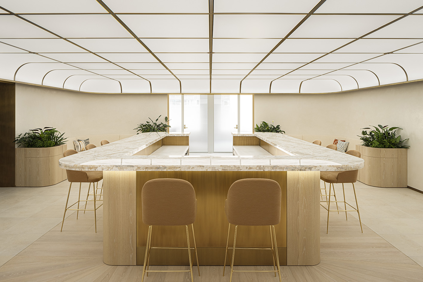
Adding to the effect are two centrepieces. One is a broad rectangular counter in the centre of the lounge, its bulk sheathed with customised oak panels and capped with a slab of marble streaked with champagne-gold accents. Encircling this are slender high-top stools that their designer, the Hokkaido-based furniture maker Time & Style, has upholstered in a ridge-patterned Kvadrat fabric. ‘Textured materials create depth,’ Terui says. The second centrepiece is a faux skylight that blankets the entire length and breadth of the room, its glowing surface striated with a matt grid pattern that bends elegantly at the edges like the lid of a box.
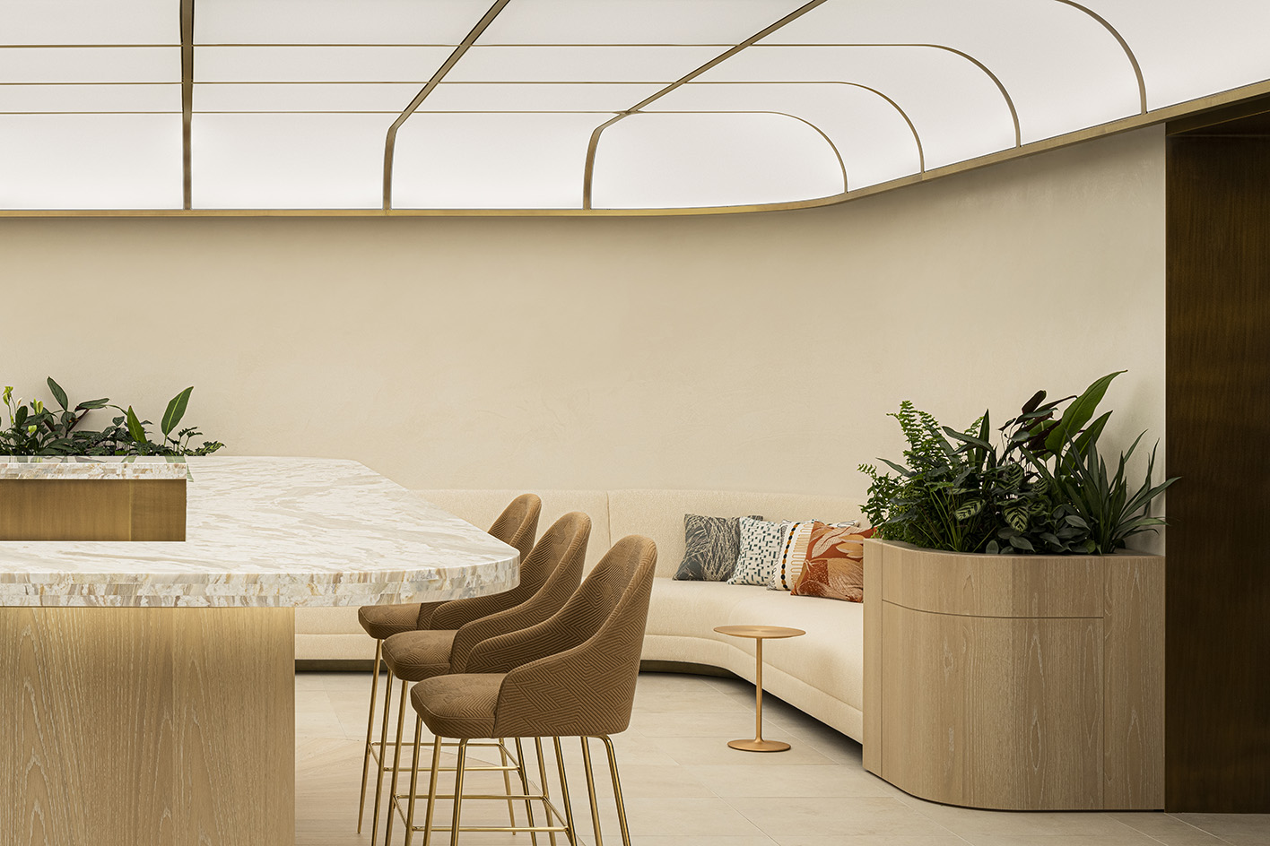
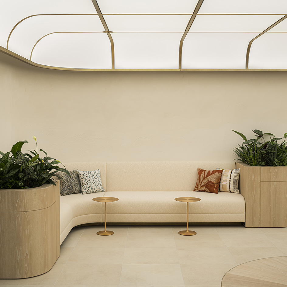
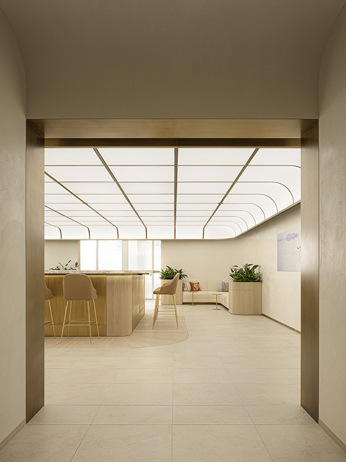
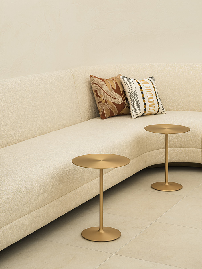
Together, the two features elongate the space, especially when the side doors are open, pulling one’s eye out towards the adjoining meeting rooms with their vertiginous views of Tokyo’s skyscrapers beyond. At the edges of two diagonal corners of the lounge are bespoke curved settees which, in turn, are paired with round side tables designed by Time & Style, and bookended by planter-boxes, their leafy foliage mirrored in the patterns and colours of the sofa cushions.
‘Though the whole space is dedicated to meeting rooms, we felt we needed a connecting foyer in which visitors can be introduced into Cartier’s world. This guest lounge is the point where they can really experience the luxury of the brand,’ say Terui and Yuyama. ‘What we’ve tried to achieve is a kind of quiet beauty, but in the context of the work environment of a prestigious luxury brand.’ Consider this mission accomplished.
Wallpaper* Newsletter
Receive our daily digest of inspiration, escapism and design stories from around the world direct to your inbox.
Daven Wu is the Singapore Editor at Wallpaper*. A former corporate lawyer, he has been covering Singapore and the neighbouring South-East Asian region since 1999, writing extensively about architecture, design, and travel for both the magazine and website. He is also the City Editor for the Phaidon Wallpaper* City Guide to Singapore.
-
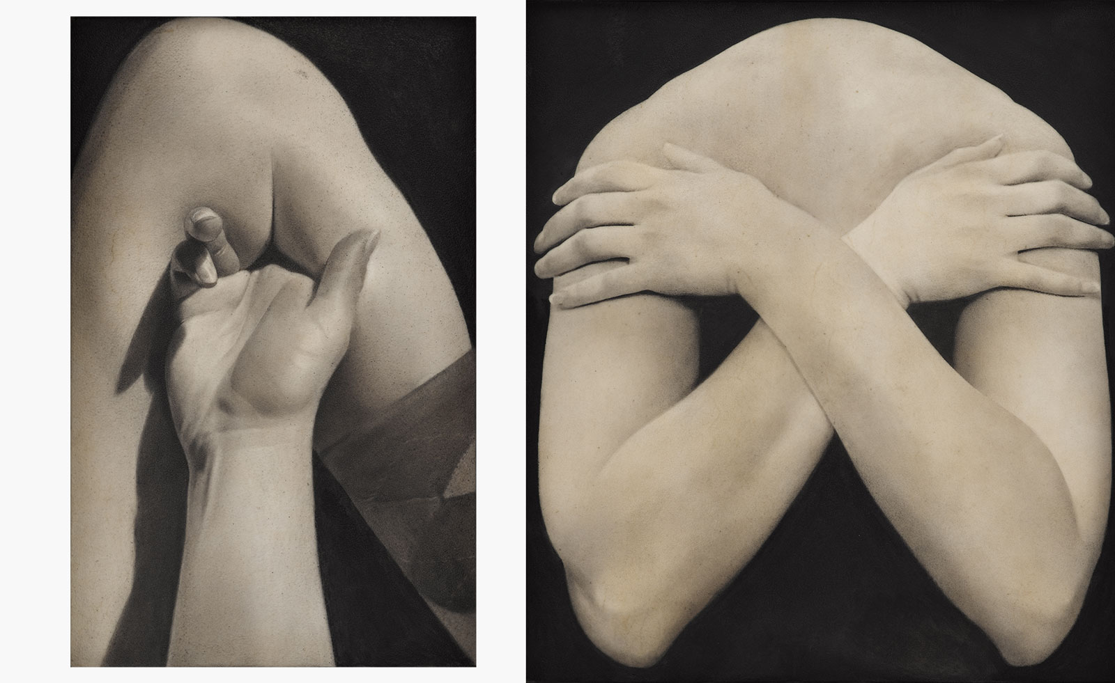 Put these emerging artists on your radar
This crop of six new talents is poised to shake up the art world. Get to know them now
By Tianna Williams
-
 Dining at Pyrá feels like a Mediterranean kiss on both cheeks
Designed by House of Dré, this Lonsdale Road addition dishes up an enticing fusion of Greek and Spanish cooking
By Sofia de la Cruz
-
 Creased, crumpled: S/S 2025 menswear is about clothes that have ‘lived a life’
The S/S 2025 menswear collections see designers embrace the creased and the crumpled, conjuring a mood of laidback languor that ran through the season – captured here by photographer Steve Harnacke and stylist Nicola Neri for Wallpaper*
By Jack Moss
-
 2025 Expo Osaka: Ireland is having a moment in Japan
At 2025 Expo Osaka, a new sculpture for the Irish pavilion brings together two nations for a harmonious dialogue between place and time, material and form
By Danielle Demetriou
-
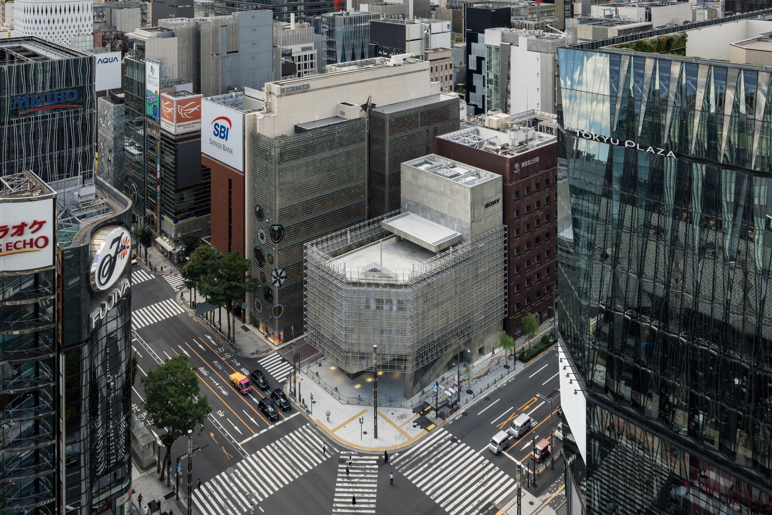 Tour the brutalist Ginza Sony Park, Tokyo's newest urban hub
Ginza Sony Park opens in all its brutalist glory, the tech giant’s new building that is designed to embrace the public, offering exhibitions and freely accessible space
By Jens H Jensen
-
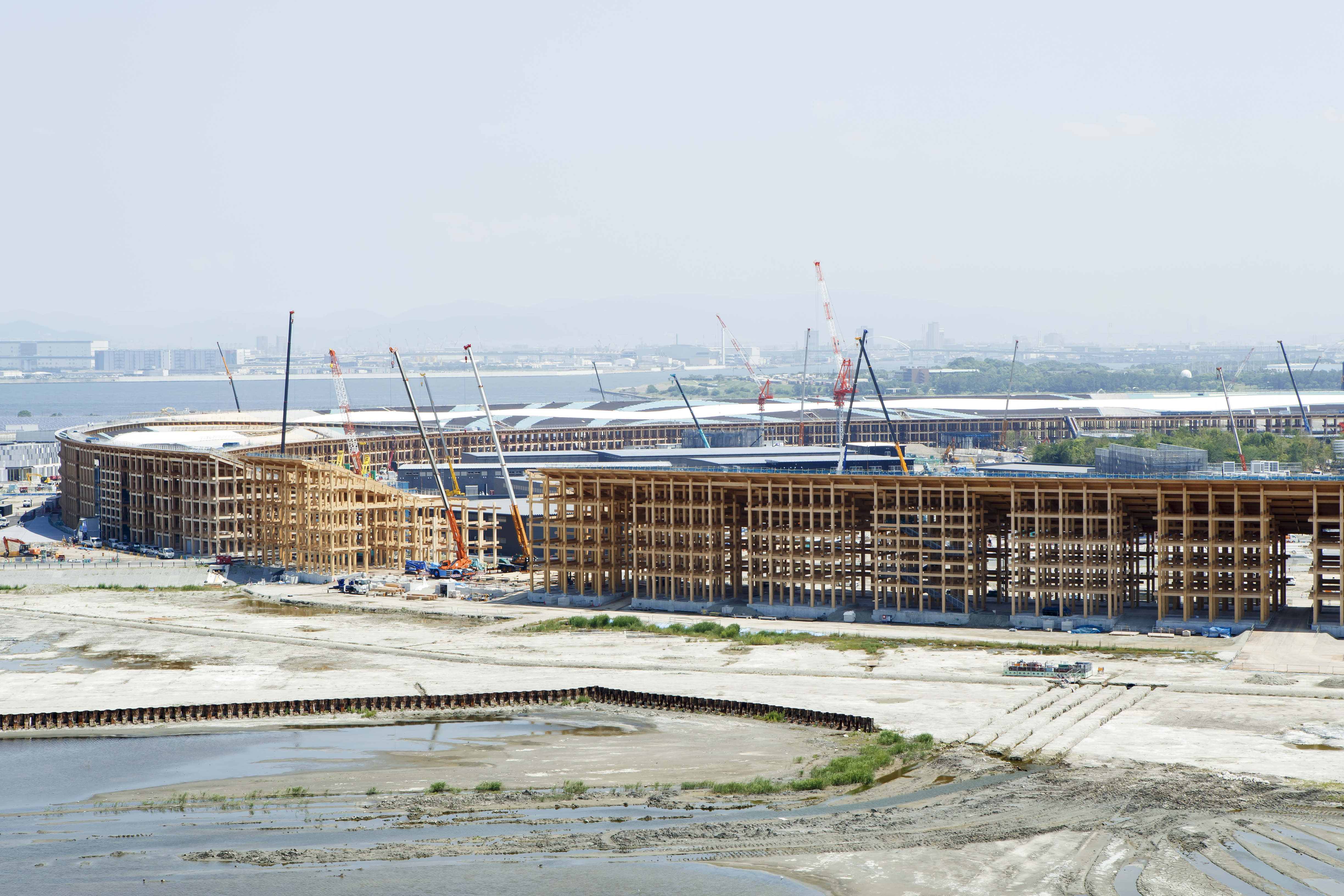 A first look at Expo 2025 Osaka's experimental architecture
Expo 2025 Osaka prepares to throw open its doors in April; we preview the world festival, its developments and highlights
By Danielle Demetriou
-
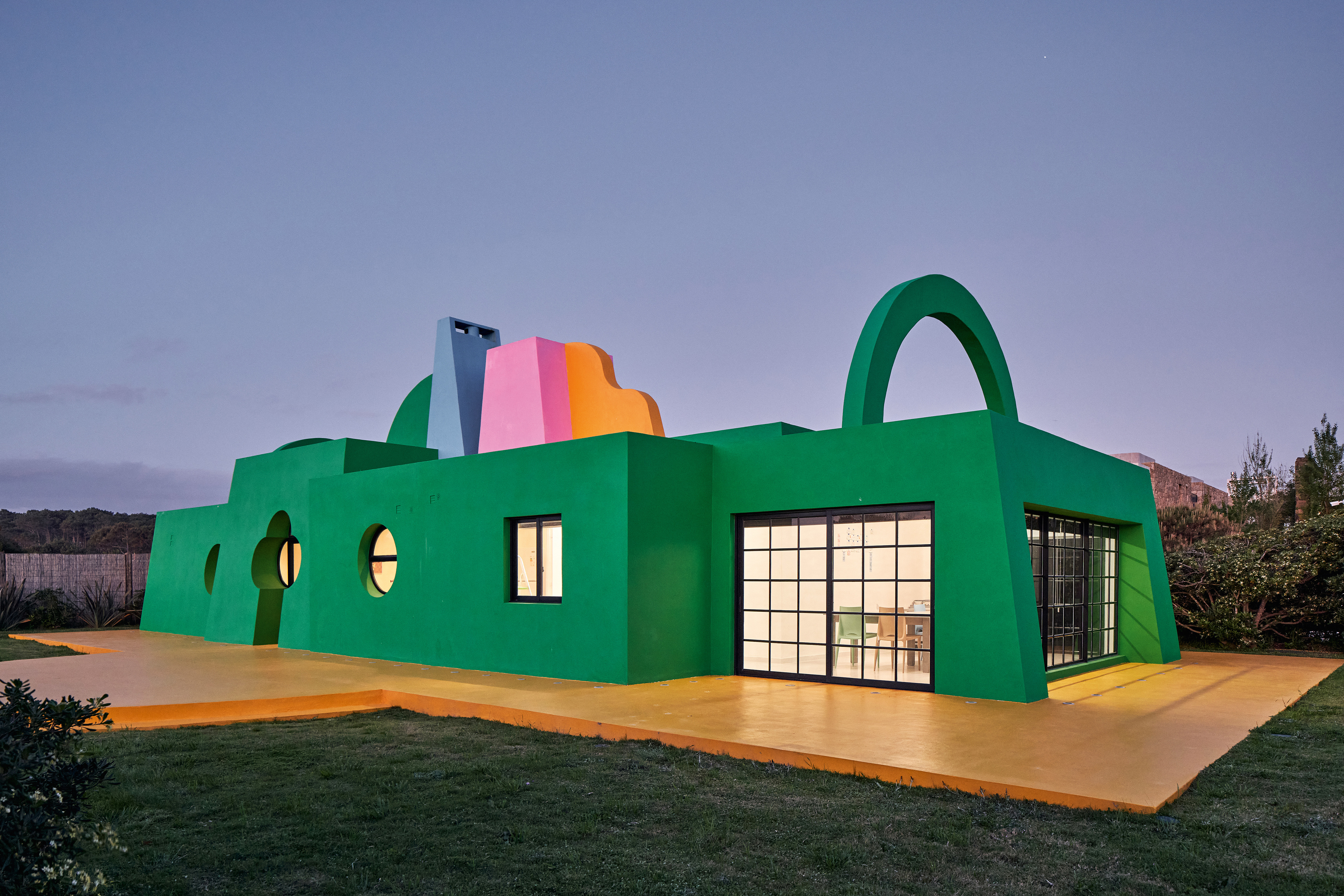 Ten contemporary homes that are pushing the boundaries of architecture
A new book detailing 59 visually intriguing and technologically impressive contemporary houses shines a light on how architecture is evolving
By Anna Solomon
-
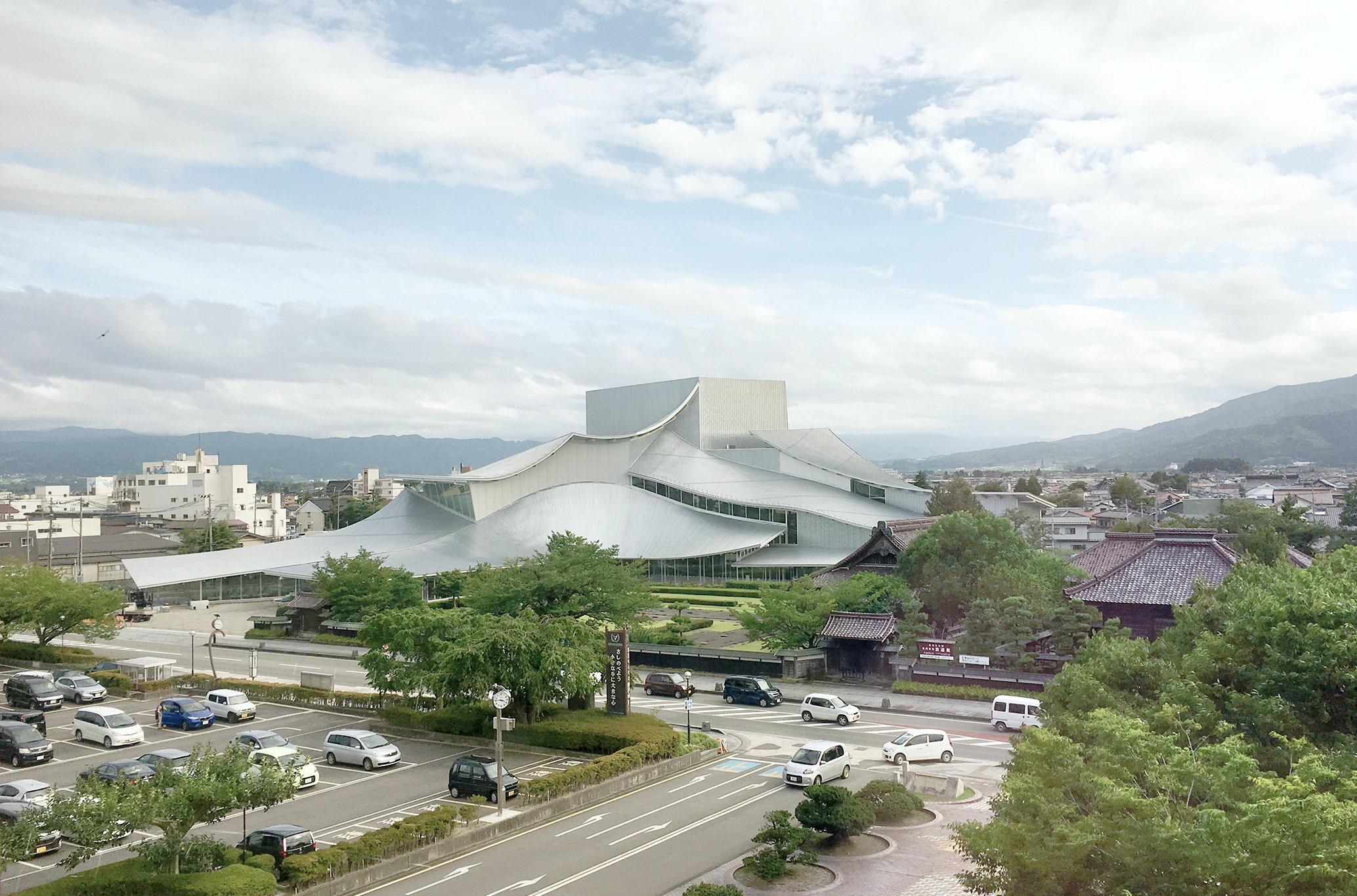 And the RIBA Royal Gold Medal 2025 goes to... SANAA!
The RIBA Royal Gold Medal 2025 winner is announced – Japanese studio SANAA scoops the prestigious architecture industry accolade
By Ellie Stathaki
-
 Architect Sou Fujimoto explains how the ‘idea of the forest’ is central to everything
Sou Fujimoto has been masterminding the upcoming Expo 2025 Osaka for the past five years, as the site’s design producer. To mark the 2025 Wallpaper* Design Awards, the Japanese architect talks to us about 2024, the year ahead, and materiality, nature, diversity and technological advances
By Sou Fujimoto
-
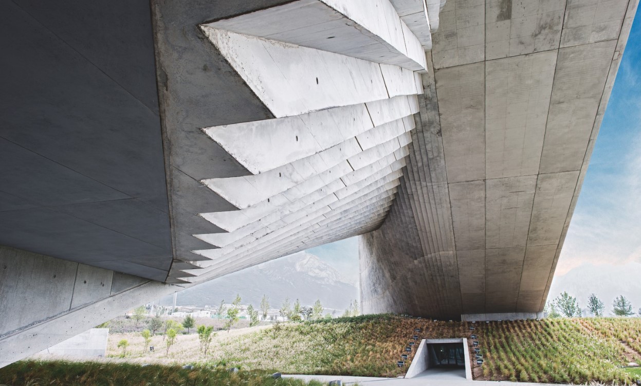 Tadao Ando: the self-taught contemporary architecture master who 'converts feelings into physical form’
Tadao Ando is a self-taught architect who rose to become one of contemporary architecture's biggest stars. Here, we explore the Japanese master's origins, journey and finest works
By Edwin Heathcote
-
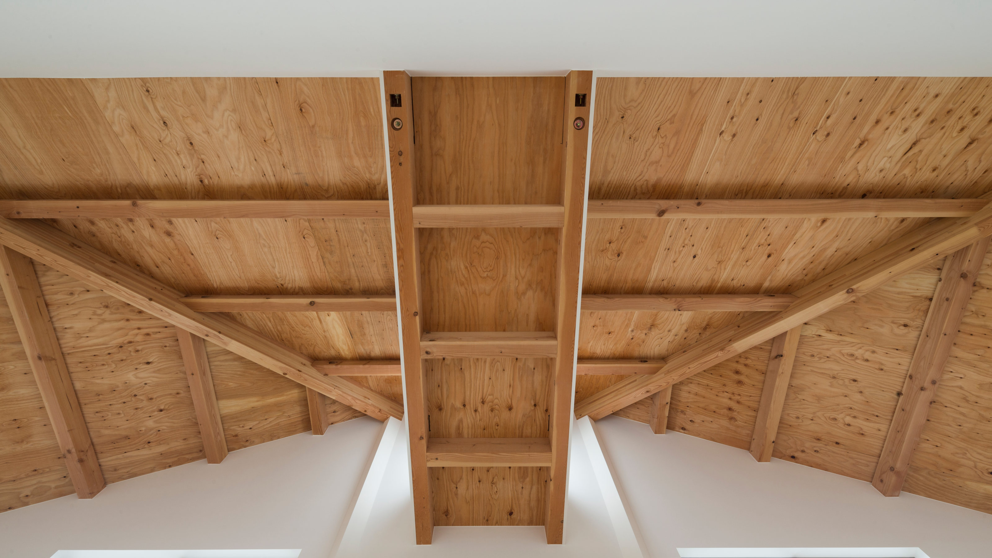 The Kumagaya House in Saitama is a modest family home subdivided by a soaring interior
This Kumagaya House is a domestic puzzle box taking the art of the Japanese house to another level as it intersects a minimal interior with exterior spaces, balconies and walkways
By Jonathan Bell