Spanish residence Casa OS is a superb lesson in modernist architecture
Spanish architect Pablo Oriol founded Nolaster in 2005 with colleague Fernando Rodriguez. Working together since 2002, the firm racked up an impressive portfolio of collaborators including Fujikawa, Johnson & Associates and MVRDV. In 2008, Oriol and Rodriguez took the next career step by forming new practice FRPO, a ‘natural evolution of their personal experiences.’ Prior to this, in 2006 (W*96), Wallpaper* visited Nolaster’s Casa OS, a camouflaged modernist residence designed for Oriol’s parents.

About 15km east of Santander, in northern Spain, as the suburbs and holiday homes start to give way to rocky cliffs and windswept scrubby bluffs, nestles as neat an exercise in camouflage as you’re likely to find in a modernist black box of steel and zinc.
The Casa OS can be hard to find, and first time visitors often find they have to call from the road to ask for fresh directions. Given its striking lines and brooding colouring, this is quite a testament to the architect’s sympathy for a wonderfully rugged location.
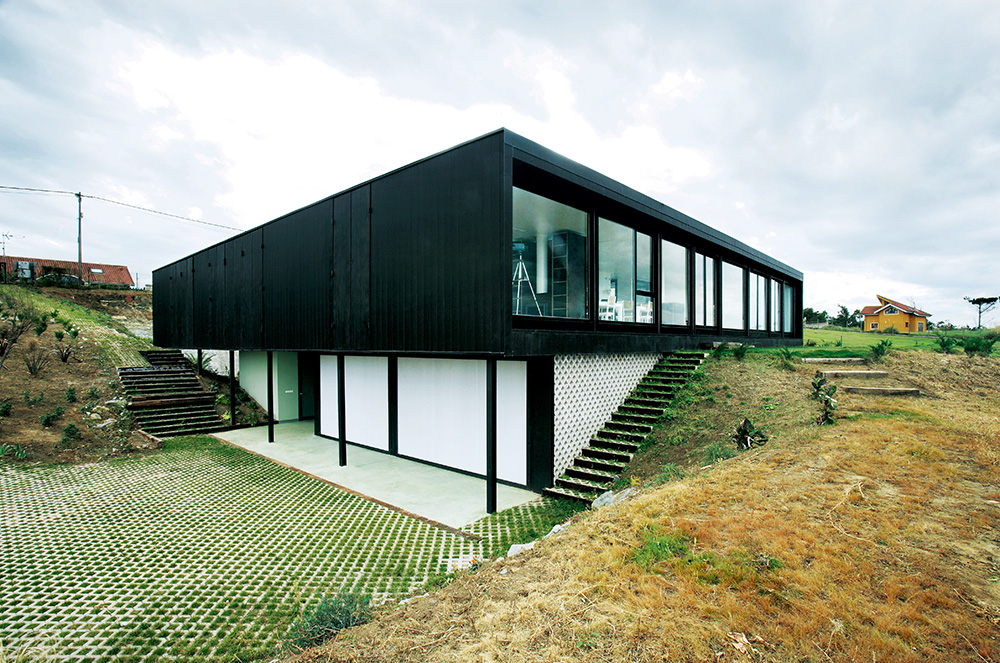
The glass wall, running the length of one side, looks out to sea.
It was designed primarily by 29-year-old Pablo Oriol, of the young Madrid partnership Nolaster, with assistance from five of his colleagues. The clients, with some demanding requirements, were his parents.
The house is the last plot in a residential sub-section – further east the land is protected and wild. A turf roof ensures the view of the building from behind is much like the grass that surrounds it. ‘There is a romantic notion to taking the grass from the land where you build and placing it on the roof,’ says Oriol.
The choice of black for the building’s zinc shutters and steel posts is also, in its own odd way, a matter of blending into the natural surroundings. ‘It’s not typical Spanish weather on this north-facing coast,’ says Oriol. ‘The sky is mostly shades of black and grey.’
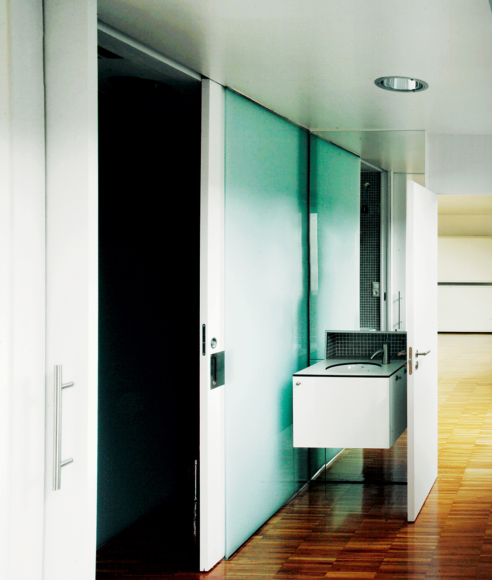
The inside of the simple box is much more complex than its delicately framed exterior. Oriol’s parents, who are clearly a hospitable pair, requested the house sleep 40. After some negotiation, this dropped to 24, but still took some extensive manipulation of space.
The house is divided into six strips that run parallel to a glass wall. The first strip is the living and dining area, with its large wood-burning fires. The next strip is comprised of bedrooms, accessed directly by sliding doors to minimise the loss of space to high traffic areas like hallways. Then, as you progress deeper into the house, the rooms begin to lose their obvious purpose. White frames attached to the walls house foldout beds, and rooms are accessed by passing through each other. The rooms can be used as playrooms or offices during the day, then revert back to bedrooms at night.
RELATED STORY
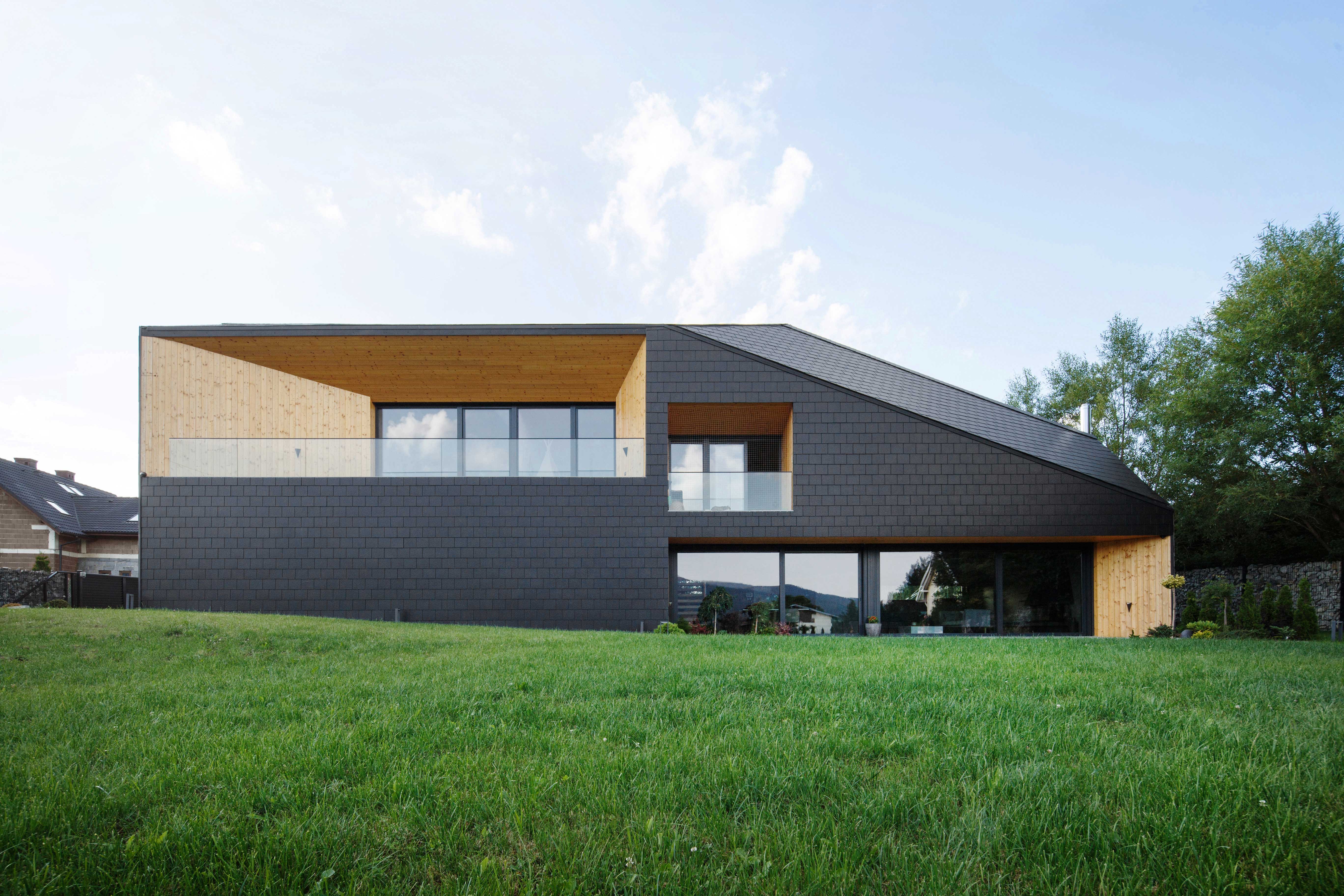
Back to black: the best in contemporary black architecture
‘The main issue was organising the space to allow for different rates of occupancy,’ says Oriol. ‘Some rooms you move through to find your path through the house. Some rooms you can access through exterior courtyards that also serve to bring light into the centre of the house. It can be as simple or as complex as the number of people in the house so that, as the house fills up, more of it is used.’
The materials used also bear direct relationship to the house’s planned use. The floor is a hard industrial parquet made from oak, which is more normally found in high-traffic public spaces and is designed to be easy to maintain. The perforated zinc shutters, which are the same height as the building’s facade and which enclose the windows and courtyards on the side and back, also speak of its changeable status. ‘It was important to be able to see from the outside that the house is close off when no one is there,’ says Oriol. ‘That it is either open or closed can be seen straight away because of the shutters, which is important for a home that is not lived in every day of the year.’
The six partners established Nolaster this year, but have been working together on and off since 2002. All are graduates of Madrid University’s Escuela Técnica Superior de Arquitectura and have a background of working with US and European firms such as Fujikawa, Johnson & Associates in Chicago, MVRDV in Rotterdam, and Ábalos & Herreros in Madrid. Disarmingly, when asked his architectural inspirations, Oriol says, ‘I could mention a few names, but it wouldn’t really be true. This is our first completed building. We are too young to claim-such-and-such as a philosophy. We just use the things we see around us, the things that we like.’ Luckily, all the partners at Nolaster seem to like things that are classy and camouflaged, simple and sleek, yet teeming with hidden complexities.
As originally featured in the December 2006 issue of Wallpaper* (W*96)
Wallpaper* Newsletter
Receive our daily digest of inspiration, escapism and design stories from around the world direct to your inbox.
INFORMATION
For more information, visit the FRPO website
-
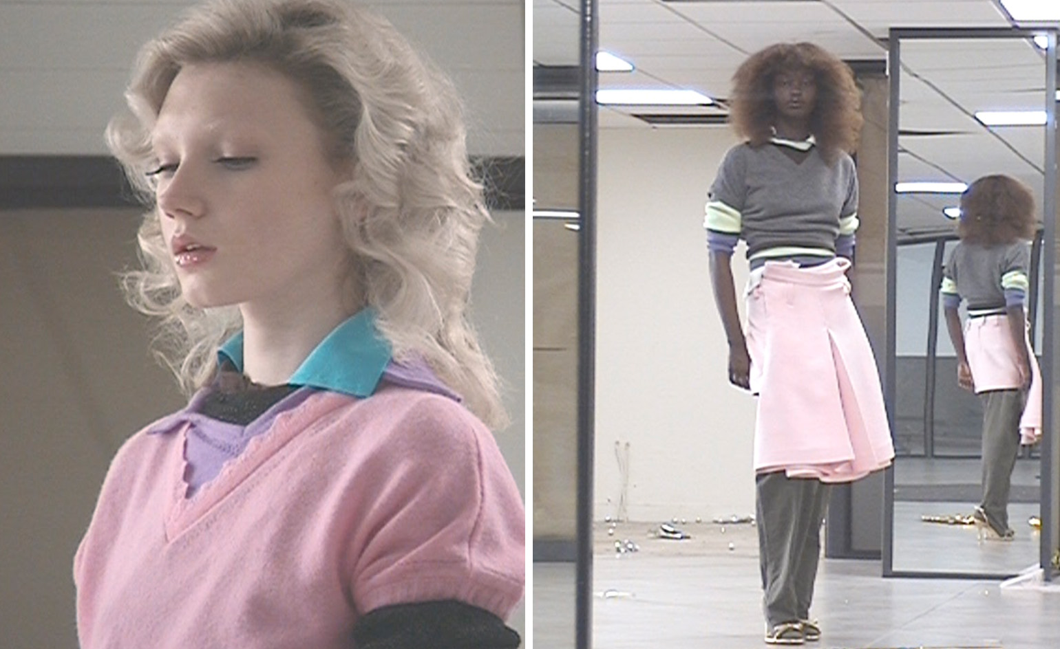 All-In is the Paris-based label making full-force fashion for main character dressing
Part of our monthly Uprising series, Wallpaper* meets Benjamin Barron and Bror August Vestbø of All-In, the LVMH Prize-nominated label which bases its collections on a riotous cast of characters – real and imagined
By Orla Brennan
-
 Maserati joins forces with Giorgetti for a turbo-charged relationship
Announcing their marriage during Milan Design Week, the brands unveiled a collection, a car and a long term commitment
By Hugo Macdonald
-
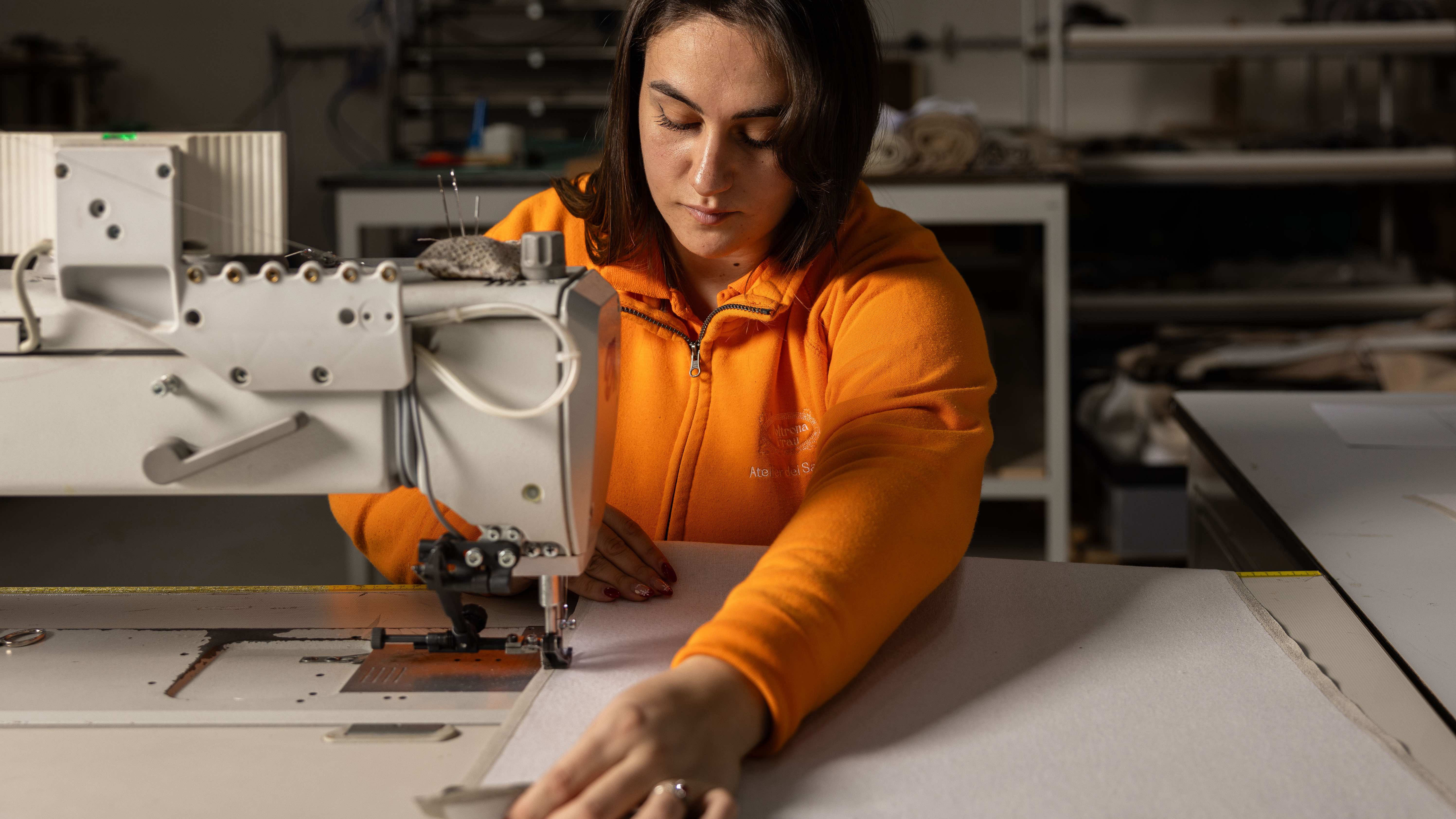 Through an innovative new training program, Poltrona Frau aims to safeguard Italian craft
The heritage furniture manufacturer is training a new generation of leather artisans
By Cristina Kiran Piotti
-
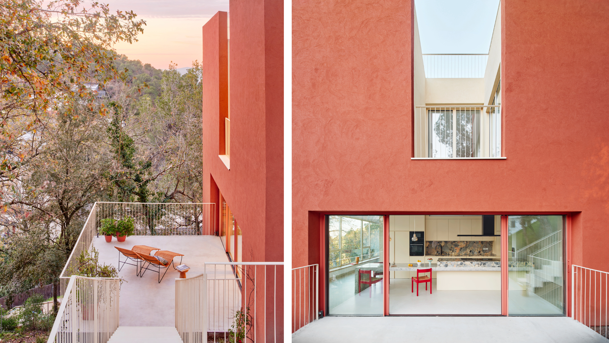 This striking Spanish house makes the most of a tricky plot in a good area
A Spanish house perched on a steep slope in the leafy suburbs of Barcelona, Raúl Sánchez Architects’ Casa Magarola features colourful details, vintage designs and hidden balconies
By Léa Teuscher
-
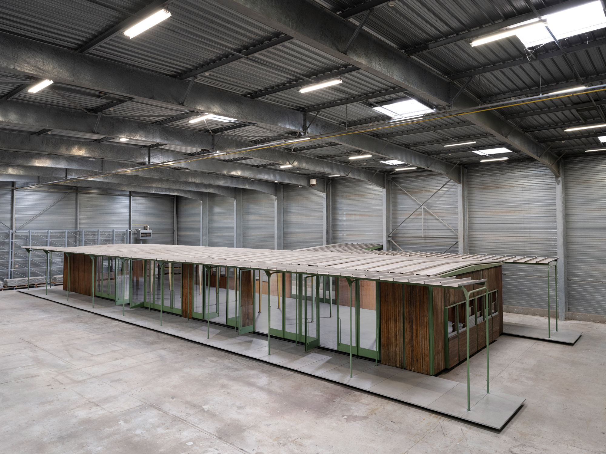 Croismare school, Jean Prouvé’s largest demountable structure, could be yours
Jean Prouvé’s 1948 Croismare school, the largest demountable structure ever built by the self-taught architect, is up for sale
By Amy Serafin
-
 Jump on our tour of modernist architecture in Tashkent, Uzbekistan
The legacy of modernist architecture in Uzbekistan and its capital, Tashkent, is explored through research, a new publication, and the country's upcoming pavilion at the Venice Architecture Biennale 2025; here, we take a tour of its riches
By Will Jennings
-
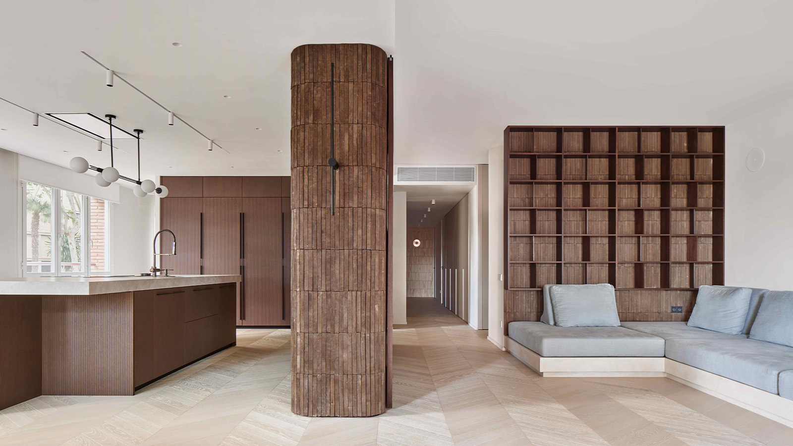 This brutalist apartment in Barcelona is surprisingly soft and gentle
The renovated brutalist apartment by Cometa Architects is a raw yet gentle gem in the heart of the city
By Tianna Williams
-
 At the Institute of Indology, a humble new addition makes all the difference
Continuing the late Balkrishna V Doshi’s legacy, Sangath studio design a new take on the toilet in Gujarat
By Ellie Stathaki
-
 How Le Corbusier defined modernism
Le Corbusier was not only one of 20th-century architecture's leading figures but also a defining father of modernism, as well as a polarising figure; here, we explore the life and work of an architect who was influential far beyond his field and time
By Ellie Stathaki
-
 How to protect our modernist legacy
We explore the legacy of modernism as a series of midcentury gems thrive, keeping the vision alive and adapting to the future
By Ellie Stathaki
-
 A 1960s North London townhouse deftly makes the transition to the 21st Century
Thanks to a sensitive redesign by Studio Hagen Hall, this midcentury gem in Hampstead is now a sustainable powerhouse.
By Ellie Stathaki